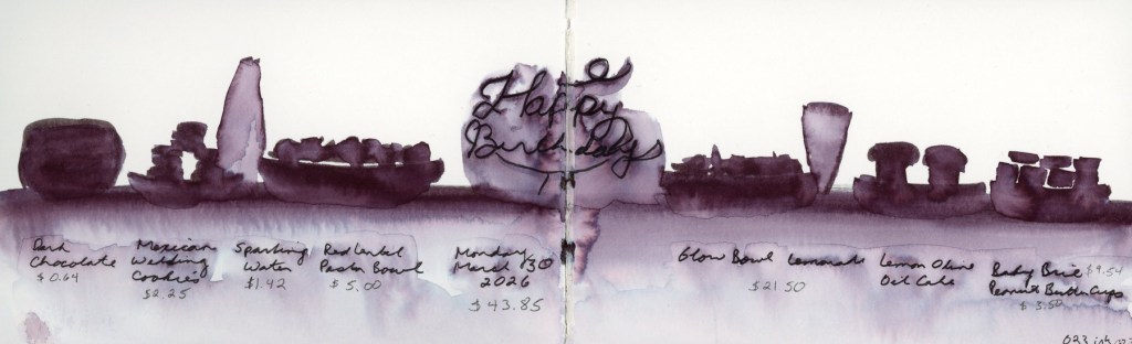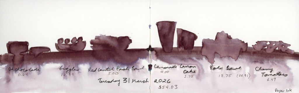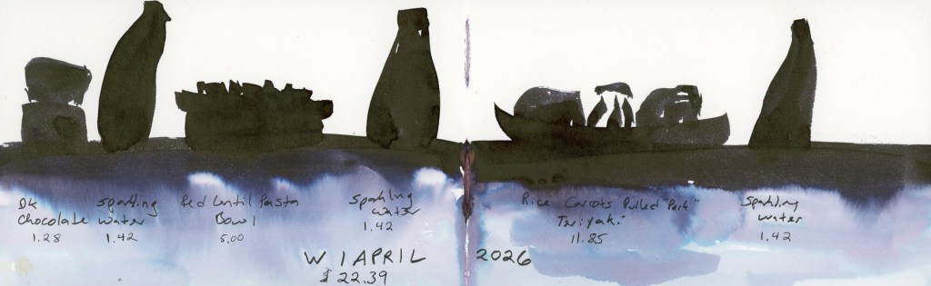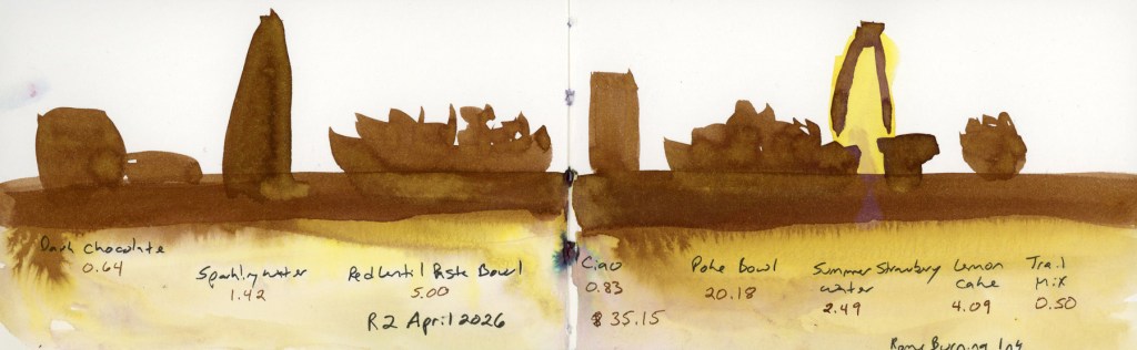
The Messy Middle

Not every sketchbook page is ready for its close-up.

Right now my sketchbook is deep in what I’m calling the messy middle — pages that are made, but not finished. Collage laid down, journaling written, tape applied in anticipation. Color promised but not yet delivered. And I’ve decided that’s worth a post, because this is what a sketchbook actually looks like when it’s being lived in.

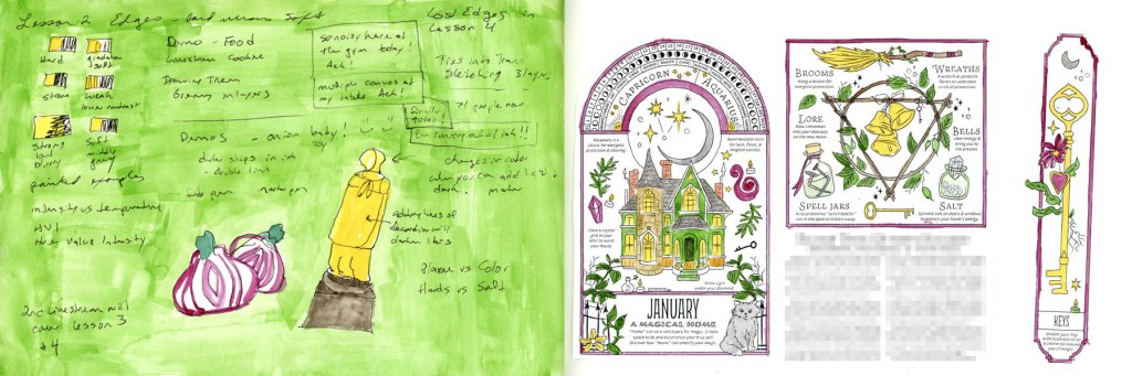
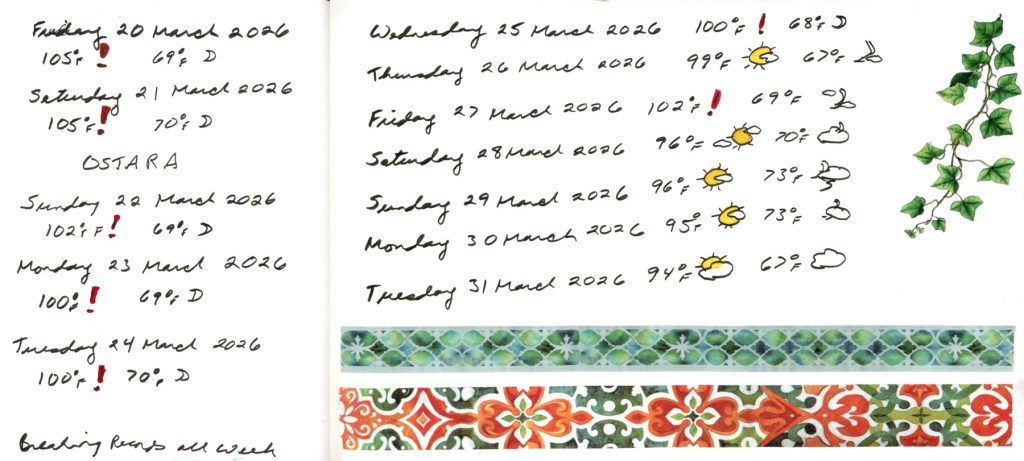
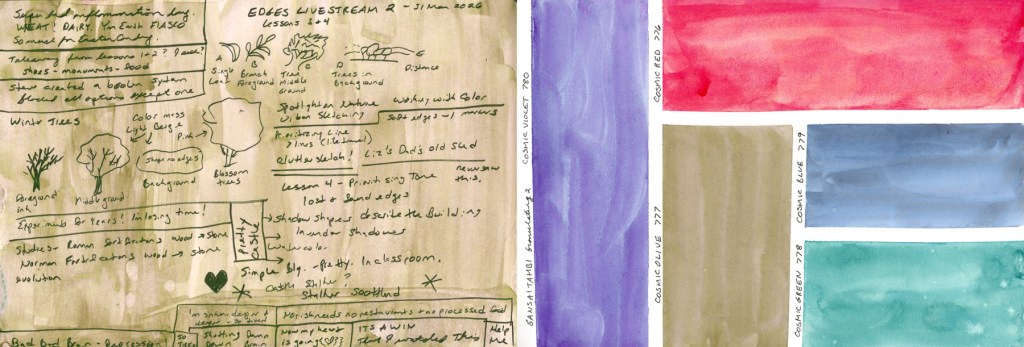
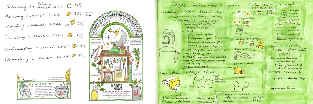
A dual page sketchbook spread in black ink — dates, weather, and temperature log for February 28 through March 5 with collage images from the 2026 Coloring Book of Shadows by Amy Cesari on the left, and handwritten notes and sketches from an Edges course livestream on the right.

I’m a little behind on my seasonal pages — this first spread catches up on the tail end of February and the first days of March. Dates, weather, temperatures. The facing page is covered in handwritten notes and sketches from the Edges course livestream. Messy and functional and very much in progress.

A dual page sketchbook spread in black ink — continued handwritten notes and sketches from an Edges course livestream on the left, and collage images from the January 2026 Coloring Book of Shadows by Amy Cesari on the right.

And speaking of catching up — that’s the January collage on the right. Yes, in March. I forgot it at the time, I like the images, so in it went. No apologies.

The collage images throughout these pages are from the 2026 Coloring Book of Shadows by Amy Cesari. They’re pasted in and waiting to be painted. That painted version is coming. Eventually is the operative word.

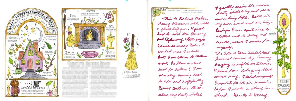
A dual page sketchbook spread — February collage images from the 2026 Coloring Book of Shadows by Amy Cesari with touches of spot color in Robert Oster's Cherry Blossom ink on the left, and a handwritten journal entry in the same pink ink with smaller collage images on the right.

This is where a little color starts sneaking in. I’ve been reaching for Robert Oster’s Cherry Blossom ink — a soft rosy pink — for both spot color on the collage images and for journaling. It wasn’t an accident. I’ve been thinking about sketchbook design, using a single ink color across multiple spreads to create a visual thread through this section of the book. Even in the messy middle, there are intentional choices happening.

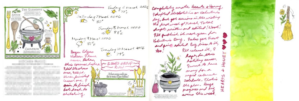
A dual page sketchbook spread — March collage images from the 2026 Coloring Book of Shadows by Amy Cesari with spot color, dates and weather log for March 6 through 10, and a handwritten note in Robert Oster's Cherry Blossom ink on the left, and a handwritten journal entry in Cherry Blossom ink with small decorated collage images on the right, with  half of the page left blank.

The Cherry Blossom ink continues here — more dates and weather, a note marking the start of the Edges course, and a half page of journaling with small collaged images tucked into the corners. The pages are full. They’re just not painted yet.

There’s also a half page left blank — and I’m genuinely undecided whether that’s a space waiting for a sketch, or whether it should stay as white space. Sketchbook design is something I’m always thinking about and not always getting right. White space does not come naturally to me!

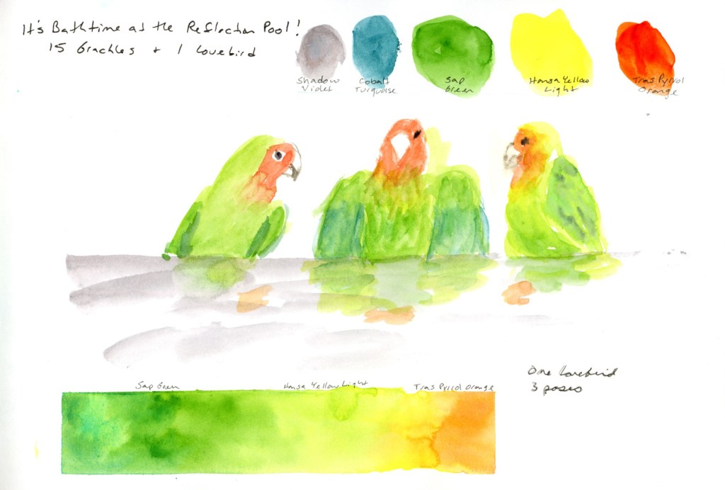
A dual page sketchbook spread — handwritten journal notes from an on location sketching outing to Frank Lloyd Wright Commemorative Park on the left, and a page header reading 'Bathtime at the Reflection Pool' with the remainder left blank and edges dotted with narrow green masking tape on the right.

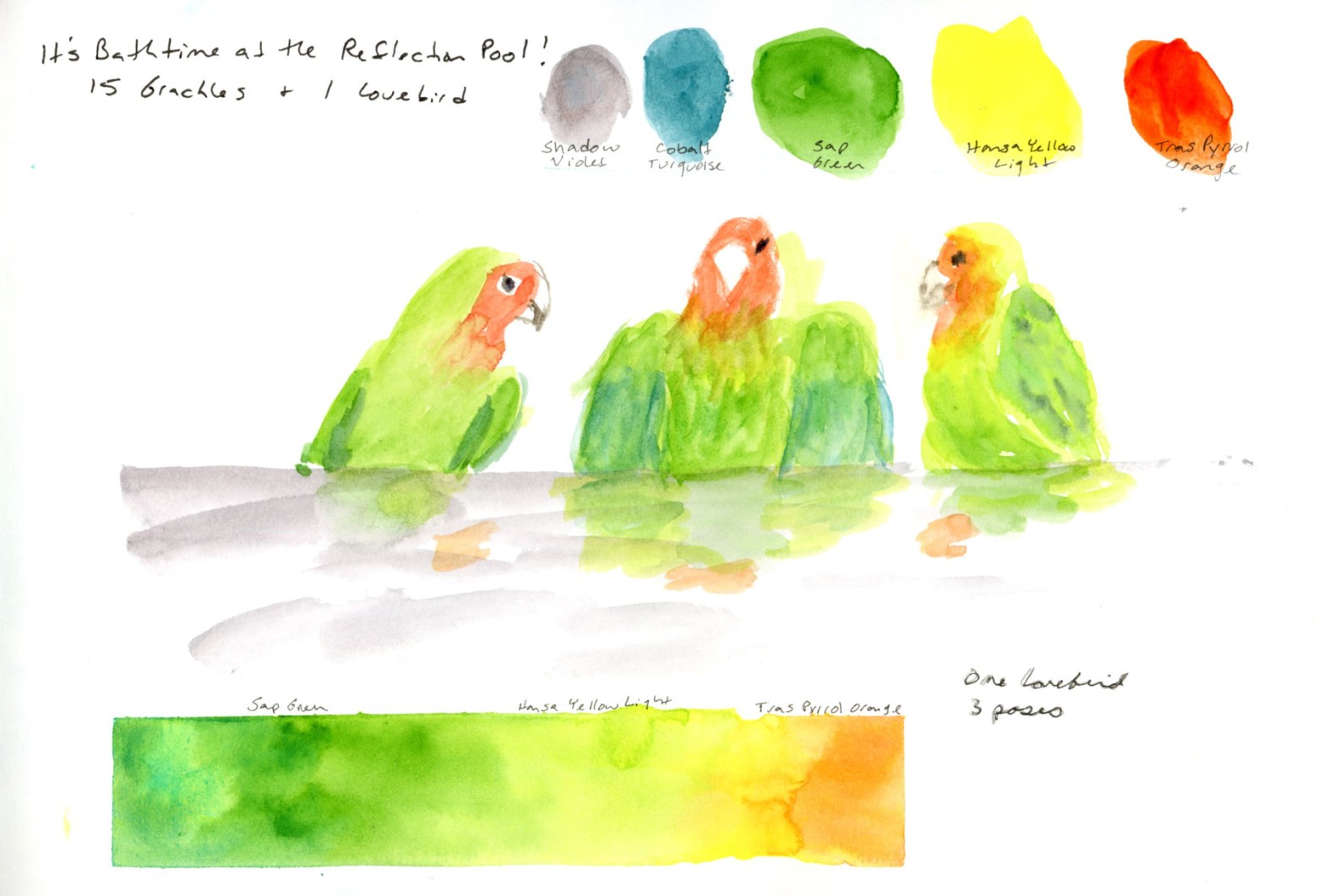
You might recognize the right hand page from my last post — the header for the lovebird sketch that’s still waiting to be drawn. The green masking tape dotting the edges is there because the other side of the page is already taped up for something else. The blank space is intentional. It’s waiting.

A single sketchbook page prepared with a 4 by 5 grid of narrow green masking tape, ready for the One Week 100 People sketching challenge.

And this is my favorite kind of messy middle image — a page that’s completely empty but completely ready. Narrow green masking tape laid out in a grid, waiting for this week’s One Week 100 People challenge. No sketches yet. Just intention and tape and anticipation.

This is what a sketchbook in motion looks like. Not every page is finished. Not every page is painted. Some pages are still becoming what they’re going to be.

And that’s fine. That’s actually the whole point.

Sketching the Spire


Sketching the Spire (A Chaotic Victory)

Yesterday, I went out and sketched on location, which I rarely do

This was Lesson One of my Edges sketching course — the outdoor assignment. I picked the Frank Lloyd Wright spire in Scottsdale. I’ve photographed it many times, but never tried to sketch it. The assignment was to sketch a monument, and this spire came to mind. I had no idea how complicated that thing actually is.

The base and lower section of the Frank Lloyd Wright spire, showing the angular architectural details, with desert cactus landscaping at its base, Frank Lloyd Wright Commemorative Park, Scottsdale, Arizona.

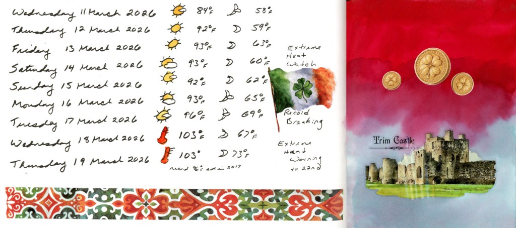
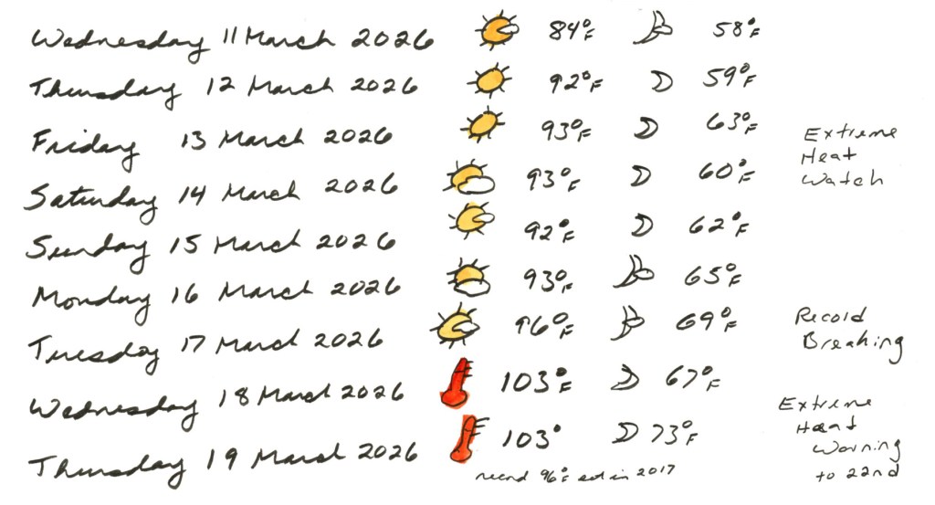
I picked the best possible day for it, keeping a sharp eye on the swings in temperature lately. Clouds were big and plentiful, temperatures a gorgeous 74°F, with plenty of shade. I knew I had to grab it — next week is forecast to hit 100°F, which would be the earliest I’ve ever seen it that high. So Tuesday it was.

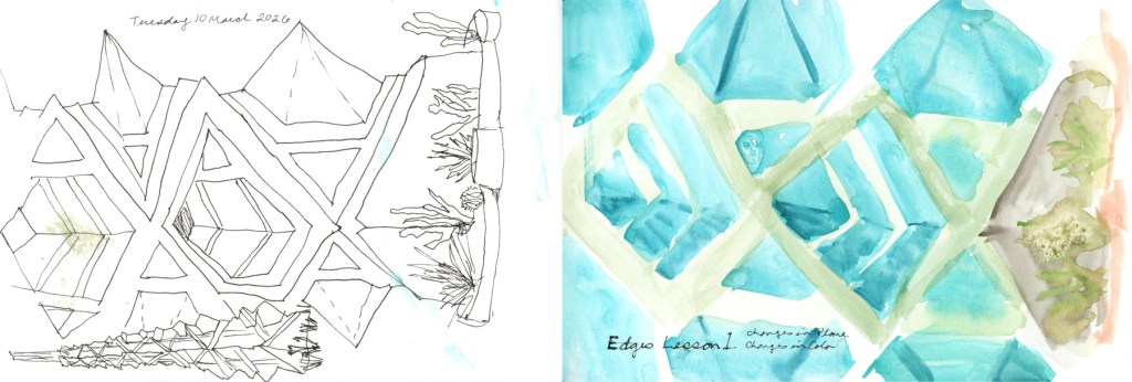
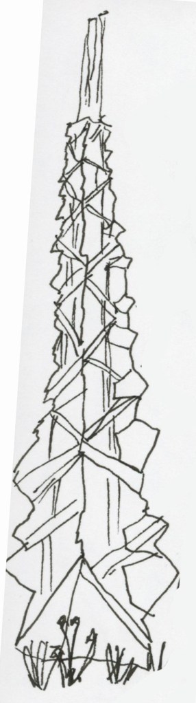
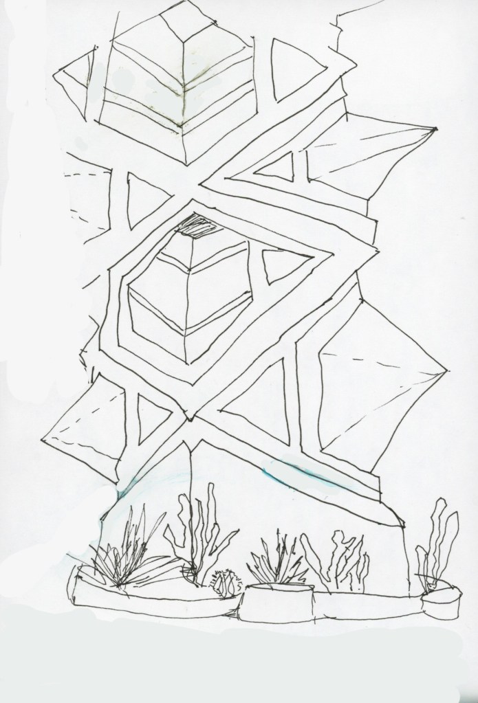
I did two ink sketches first — the assignment was to sketch edges where planes change, so I did one thumbnail of the whole spire and one attempting a closer view. I liked how the plants came out. The angles on the spire itself? Not so much. It is genuinely, mercilessly complex and I had completely missed that fact until I was sitting in front of it with a pen in my hand.

Ink and line sketches of the Frank Lloyd Wright spire — a thumbnail of the full spire and a closer view of the lower section with cactus, with paint smudges.

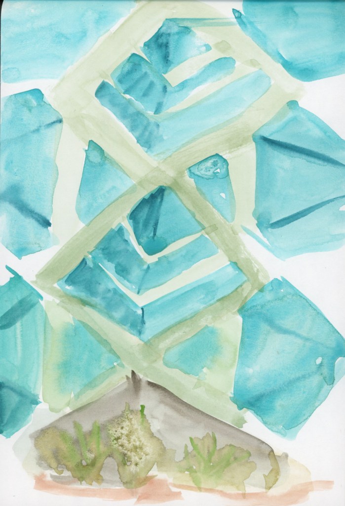
Then I moved on to a direct watercolor sketch to do the changes is color assignment. This became a wet, blobby situation. And then the wind caught the wet page, flipped it over, and smeared wet paint all over the ink sketches on the other side. Ack!

Of course it did.

A loose direct watercolor sketch of the base of the Frank Lloyd Wright spire, painted on location, in sage green and turquoise, Frank Lloyd Wright Commemorative Park, Scottsdale, Arizona.
A dual page sketchbook spread showing ink and line sketches of the Frank Lloyd Wright spire on the left page, and a loose direct watercolor sketch of the spire base on the right, painted on location in Scottsdale, Arizona.

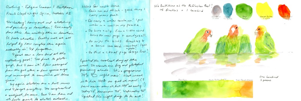
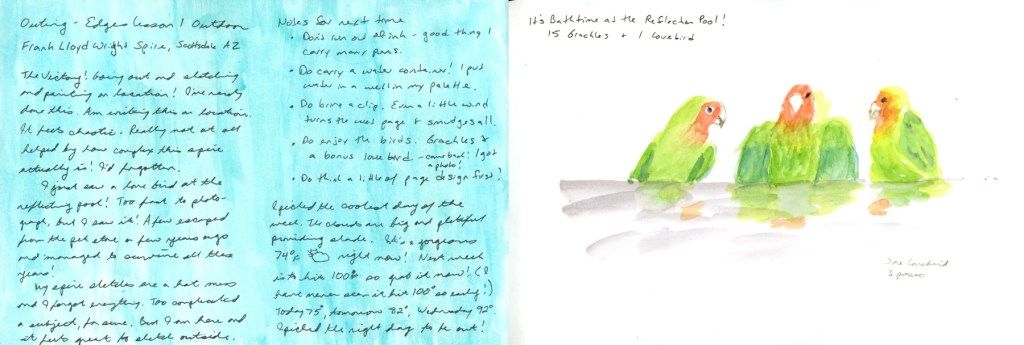
The wind had danced with my page, and I had a puddle of water in my palette because I forgot a water container, but I had water. Oh yeah, I also forgot to refill my fountain pen, so I ran out of ink and had to use a fineliner. I was lucky I had my paint! I wrote my notes for next time right there on the page, on location, because some lessons need to be recorded immediately:

  • Don’t run out of ink — good thing I carry many pens
  • Do carry a water container — I was using a well in my palette
  • Do bring a clip — even a little wind will flip a wet page and ruin everything
  • Do think about page design a little first
  • Do enjoy the birds

That last one is important.

A handwritten journal page describing a sketching outing to the Frank Lloyd Wright Commemorative Park, with a list of notes for next time, from the Edges sketching course outdoor assignment.

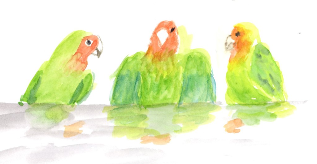
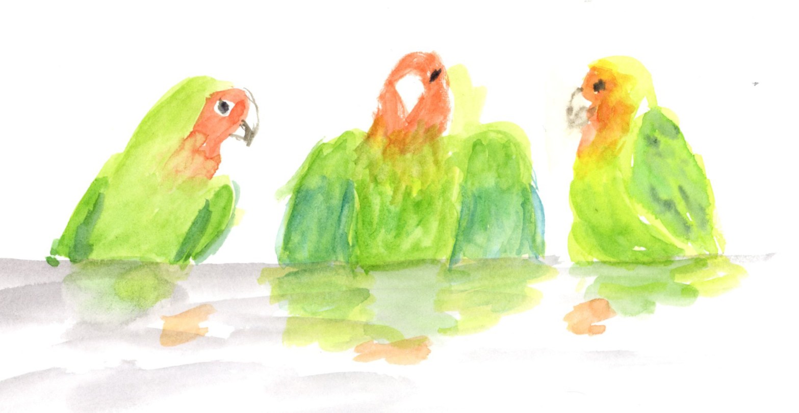
There were fifteen grackles at the reflecting pool while I was sketching. And then — a lovebird. A few escaped from a local pet store years ago and a small flock has somehow survived in Scottsdale ever since. It came and went so fast I barely registered it. I thought I’d missed my chance.

It came back. I got a photo.
A lovebird perched on the edge of the reflecting pool at Frank Lloyd Wright Commemorative Park, Scottsdale, Arizona, one of a small flock of escaped pet store lovebirds that have survived in the wild locally.
I have a spot waiting on the page next to my journal notes for a proper lovebird sketch. That’s a whole other post.

A sketchbook held open to show ink sketches and a direct watercolor painting of the Frank Lloyd Wright spire, with the actual spire visible in the background — Frank Lloyd Wright Commemorative Park, Scottsdale, Arizona.

My sketches are a mess. The watercolor is blobby, the angles on the spire are wrong, the wind made a disaster of my pages. And I sat there on location and wrote in my sketchbook that it felt chaotic, and also that it felt great.

Both are true. That’s the joy of sketching on location, isn’t it?

I will have many chances to improve my rate of on location sketching this year. Not only do I have the four outdoor assignments for the Edges course. but this year is rich with Sketching Now courses that are outdoor. The Travel Sketching course is running in May, and the Watercolor On Location will run this summer. In the heat. Oh dear. I’ll need some strategies for that!

One Week 100 People 2026 Starts

One Week, One Hundred People

Every year, -ish, I do this challenge. I love it. And every year, before I start, I get a bit stressed how hard people are to draw.

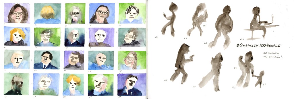
This is One Week 100 People — a challenge that runs annually in the Urban Sketchers community, where sketchers commit to drawing one hundred people in one week. It sounds challenging. It is, a little. But when you start, and something loosens up, and the faces start coming.

I always do better at faces than I think I will. Even the hilariously misshapen ones are somehow delightful. I don’t often get a genuine resemblance, but if it looks like a person at all, I’m happy with it. Once I get into it, I always feel that faces are fun, and why was I so resistant?

A little history

I first did this challenge in 2021. I’d never drawn people before — not once. I picked up a brush pen, found an episode of Edwardian Farm (a British documentary where living historians recreate life on an Edwardian farm, which is exactly as charming as it sounds), and started drawing. I didn’t get to 100, and that was fine. I loved these little gestures.

I skipped 2022 and 2023. Life happened. Or maybe I was too intimidated to begin.

In 2024 I came back with a Faber Castell dual markers portrait set and spent the week with Murdoch Mysteries, Oak Island, and Death in Paradise keeping me company. You can see the 2024 entry here.

2025 was my favorite year so far — I experimented with materials, mostly using the Inktense Shade and Tone Mixed Media Set, and the full color pages are ones I’m genuinely proud of. You can see all of those pages in last year’s post.

And this year?

This year’s faces will be coming from Stargate SG1, mostly. It’s what I’m streaming right now. I have my sketchbook taped up and ready — a grid of narrow green masking tape waiting to be filled with faces. This I plan to sketch in the business center of my gym and attempt to sketch people live. Quick gestures, people in motion, no time to overthink it.

Maybe that’s the best possible way to start. One hundred people. One week. Here we go.

End of a Series (and a lot of Red Lentil Pasta)

The End of a Series (and a Lot of Red Lentil Pasta)

It’s March, and I’m sketching food again. If you’ve been following along, you might notice that February and March seem to have a strange gravitational pull for sketching food! My first food sketchbook started 1 February 2020, my second picked up again 1 February 2021, and here I am in 2026, wrapping up my fifth. I genuinely did not plan that.

This post covers March 1–8, the final eight days in this little sketchbook — Volume 24 overall, Food Sketchbook No. 5. It’s a 3.5×5.5 inch Stillman & Birn Epsilon, softcover, 150gsm smooth white paper. I’ve used a few different Stillman & Birn papers across the five food sketchbooks, and this one has been a pleasant surprise — it handles ink beautifully, and the watercolor behaves better than you’d expect from a smooth paper. It allows for harder, crisper marks, which suits food sketching well.

Watercolor and ink food sketch on a double page spread, Sunday 1 March 2026. Plates of food are arranged along a bold dark horizontal band across both pages, including a green plate of yellow pasta with orange and green vegetables, a small dark bowl, a purple shape, and a large oval plate with colorful vegetables. Handwritten notes on the left list foods, prices, and nutrition data.
Watercolor and ink food sketch on a double page spread, Monday 2 March 2026. Four individual food portraits are arranged in a grid of framed panels across the top of both pages, showing dark chocolate, a green plate of red lentil pasta with roasted tomatoes, a plate of rice cakes with cheese and jam, and a blue plate with a bean burger and pickles. A framed panel at the bottom left shows the daily total cost and nutrition data.

These eight pages are a bit of a mixed bag stylistically, and I’ll be honest about why: I got behind and had to catch up. Six of the eight are loose, direct watercolor without nutritional data, because that’s simply much faster to do. The two more structured pages — the panoramic spread on Sunday March 1st, and the grid of four individual food portraits on Monday the 2nd — are closer to what I’d do if I had unlimited time. The Monday page even has the full daily cost and nutrition totals at the bottom, which is the whole point of the exercise, really.

One ounce of dark chocolate chips is a must to start the day, of course. I do have a shocking amount of the red lentil sedanini every week, month, year. What can I say, it’s easier on the glucose hits, and carries a nut cheese sauce well. Food allergies, so I’m gluten free and vegan as much as possible. And let’s face it, scanning through sketches is far easier when finding a culprit!

Watercolor and ink food sketch on a double page spread, Tuesday 3 March 2026, with a corrected date visible. A large bordered rectangle frames both pages. On the left, a small dark bowl of chocolate and a blue circle sit beside a large yellow pasta bowl on a green plate. On the right, small sketches of coconut date bars sit beside two more green plates — one with red lentil spaghetti marinara and one with trail mix. Food labels are handwritten throughout.
Loose watercolor food sketch on a double page spread, Wednesday 4 March 2026. On the left page, dark chocolate shapes and a teal oval sit beside a large yellow pasta bowl rendered in fluid, gestural brushwork. On the right, a loosely painted My Bacon sits centrally, with scattered sketches of cherry tomatoes on the vine, green cucumbers, a bean burger with ketchup, a bowl of strawberries, and more strawberries rendered in bright red. Handwritten food labels throughout.
Watercolor food sketch on a double page spread, Thursday 5 March 2026, with a bright turquoise border wash across both pages. On the left, a dark chocolate piece and a blue oval sit beside a yellow pasta bowl on a turquoise plate. On the right, two golden olive oil lemon cakes sit beside a grey bowl with a colorful glow bowl of vegetables and a plate of bright orange sweet potato fries. Food names are handwritten on both pages.

The highlight of the week was Thursday, when I ate out at Flower Child with a friend who was heading off on vacation. The olive oil lemon cake on that page was hers — I did not eat two desserts, though I won’t say the thought didn’t cross my mind. The glow bowl and sweet potato fries were very good.

Watercolor and ink food sketch on a double page spread, Friday 6 March 2026, with a soft purple border wash. On the left page, dark chocolate pieces and blue-purple ovals sit beside a bold yellow and orange pasta bowl. On the right, a striking cluster of deep red cherry tomatoes on the vine dominates the center, with a plate of loosely painted orange red lentil spaghetti marinara beside it. Food names are handwritten below each item.
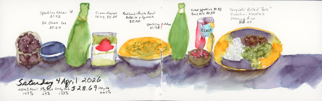
Watercolor and ink food sketch on a double page spread, Saturday 7 March 2026, with a blue border. A row of food items stretches across both pages: dark chocolate and a navy oval on the far left, followed by a green bowl of yellow pasta, a red-rimmed bowl of trail mix, a small dark bowl of chocolate, a sketch of tomatoes on the vine with strips of vegan bacon, and a red-rimmed plate with a bean burger and dill pickles. Food labels are handwritten above each item, with the date written at the bottom left.

Saturday brought a treat of a different kind: I’ve recently discovered My Bacon, a vegan bacon made from mycelium (soy-free, wheat-free, and genuinely delicious), and it shows up twice this week. Highly recommend if you’re navigating similar dietary constraints.

Watercolor food sketch on a double page spread, Sunday 8 March 2026, with a soft grey-purple border wash. On the left, dark chocolate pieces and a blue oval sit beside a large yellow-green pasta bowl. In the center, a small red-rimmed bowl holds a colorful trail mix. On the right, a pale grey bowl of red lentil spaghetti in a cheesy lemon sauce sits beside bright orange wedges of fresh orange. Food names are handwritten throughout.

And then Sunday the 8th, and that’s it. The book is full.

This is the fifth time I’ve filled one of these little landscape books with food, and I have no plans to stop — I’ll just be doing it within my regular daily sketchbook from here on, rather than in a dedicated volume. There will be one more post from this sketchbook: the wireframe page design diagrams I used to plan these layouts, which feels like a fitting way to close it out properly.

If you want to browse the whole food sketching journey, here are the starting points:

Finally Taking Edges

Finally Taking Edges

There’s a sketch in my files from 2019 — a small, loose drawing of a little elephant jade plant I’d just bought for the yard. I was proud of it at the time. It was my “current sketch” for Sketching Now Edges, Liz Steel’s intermediate drawing course, which I was just about to start.

I did not start it.

A loose direct watercolor sketch of a small elephant jade plant with ink line details, with color swatches alongside, drawn in 2019.

Life happened, as it does. The class ran again in 2021, which was not a good year for me. I kept thinking I’d wait for the next live run. And then I kept waiting. And waiting.

This year I decided I was done waiting.

A sketch of half a heart painted in purple and pink with gold thorns twisting around the outer edge and piercing into the heart, drawn from the cover of Losers by Harley Laroux, January 2026.

This is my current sketch for 2026 — a book cover drawing I did in late January, a thorny heart with thorns digging into its edges. And honestly? Other than assignments for my watercolor course, it’s just about the only thing I’ve sketched all year. That’s not a confession I make proudly, but I’m making it anyway, because it’s exactly why taking this class right now matters.

My drawing skills feel weak to me. I want them better. I’m probably too hard on myself — but wanting more is also what keeps me moving forward.

So here we are. Finally taking Edges.

What is Edges?

Sketching Now Edges is Liz Steel’s intermediate drawing course, and it’s built around one deceptively simple idea — that understanding edges is the key to convincing, expressive drawing. The four lessons break it down:

  • Lesson One: Edges as changes in plane versus changes in color
  • Lesson Two: Hard versus soft edges
  • Lesson Three: Prioritizing edges in line
  • Lesson Four: Prioritizing edges in tone

If you’ve spent any time around Liz’s work or teaching you’ll have heard her talk about lost edges — edges that disappear, that suggest rather than define. That concept lives especially in Lesson Four, and it’s one of the things I’m most looking forward to exploring.

The class is running as a group run right now rather than a full live session, but Liz is doing two bonus livestreams, which is a lovely addition. I’ve taken all of her Sketching Now classes multiple times — except this one. That changes now.

It’s going to be a good class. Even if it took me seven years to start it.

February Wrap-Up: Cupcakes and Color Swatches

Spring is bringing better energy! Despite a challenging start to the year, I’m thrilled to announce I’ve officially wrapped up my Watercolor course. This month was all about marking moments—from Valentine’s cupcakes to the early blooms in my weed-filled (but vibrant!) backyard.

Watercolor Course Completed!

I’ve continued working through my Watercolor course, and I finally crossed the finish line! Honestly, completing this despite such a difficult couple of months feels like a huge win.

A completed sketchbook page featuring watercolor exercises from Lesson Four, including the cupcake sketch and backyard study integrated with handwritten notes.

To celebrate, I painted these Valentine cupcakes from a photo I found online. It was a fun way to mark the holiday and just play with color (Quin Rose and Pyroll Scarlet.)

A cheerful watercolor sketch of four cupcakes with pink frosting and small heart-shaped sprinkles, painted from a reference photo to celebrate Valentine’s Day.

Record-Breaking Heat & Overgrown Weeds

My yard has officially been taken over by weeds this year! We are experiencing record-breaking temperatures, so everything bloomed a full month earlier than usual. It’s a bit chaotic out there, but it makes for interesting sketching.

A loose watercolor sketch of a backyard featuring a vibrant pink blooming bougainvillea bush in Quinacridone Rose. The scene includes overgrown weeds, a leafless pomegranate bush, and a couple of broken-down planters, capturing the early spring growth.

Paint Experiments and Palettes

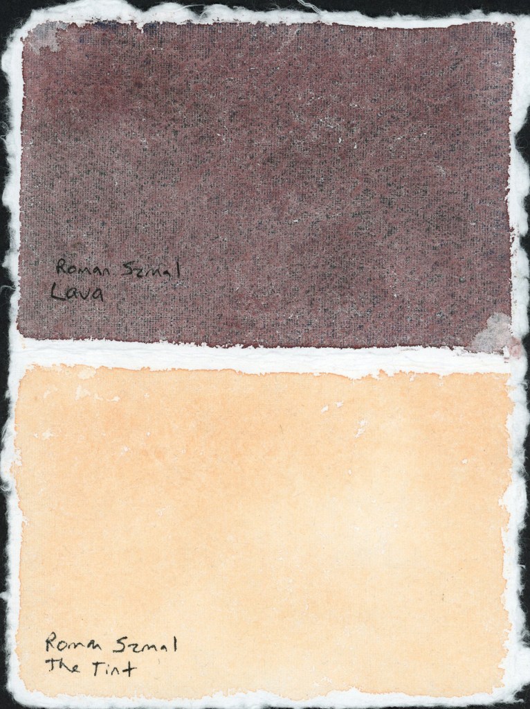
I spent some time diving into the technical side of things this month. I wanted to see the true differences between Naples Yellow Reddish from Schmincke and Roman Szmal, as well as The Tint (Roman Szmal). They look so similar at first glance!

A double-page sketchbook spread. The left page features technical watercolor swatches of Naples Yellow Reddish (Schmincke vs. Roman Szmal) and The Tint. The right page displays an 8-color palette of Gansai Tambi paints in muted, dusty purple and violet shades, including a shimmering Opal Violet.

I also swatched a cute little 8-color palette of Gansai Tambi paints that I’d intended to use for February. Even though I only managed this one swatch page, these muted, dusty shades are so inspiring. The palette includes: Purple (37), Mauve Taupe (303), Opal Violet (638), Graphite Violet (261), Alizarin Crimson (304), Lilac (13), Cobalt Violet (139), and Old Mauve (301). That Opal Violet adds just the right hint of shine!

An 8-color palette of Gansai Tambi paints in muted, dusty purple and violet shades, including a shimmering Opal Violet.

For the color blocks over my notes, I also played with a gorgeous gradient between the two Naples Yellows Reddish. But the real star? Roman Szmal Lava. That shading and granulation are just incredible—what a fun, moody color to work with! 

A sketchbook page featuring a color-blocked text areas, one  painted with Roman Szmal and Schmncke Naples Yellow Reddish, and one with Roman Szmal Lava watercolor, showcasing its unique heavy granulation and earthy shading

The Return of Food Sketches

With my health still being a bit troublesome, I’ve decided to restart my food sketching habit. I’ve picked up my 3.5×5.5 Epsilon landscape book from last summer. I’m diving back in and focusing on making the page designs more visually interesting this time around.

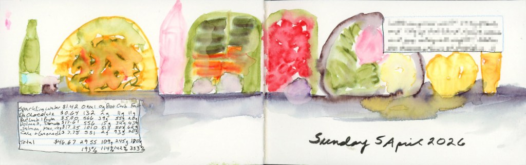
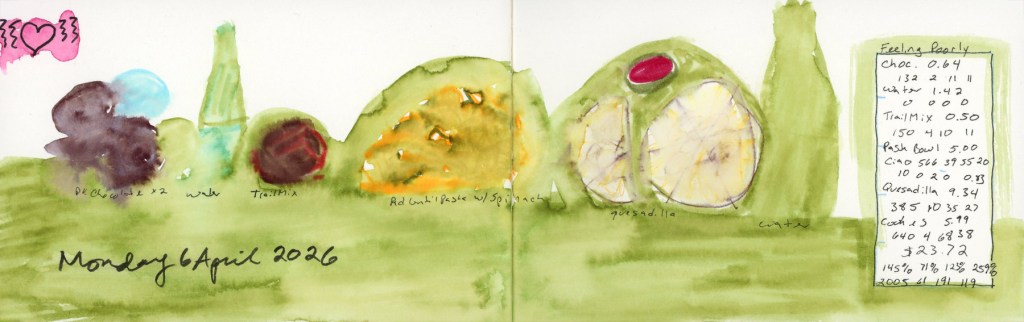
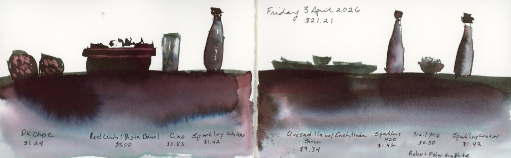
A pocket sketchbook spread in an Epsilon landscape book featuring grocery costs.
A pocket sketchbook spread in an Epsilon landscape book featuring ink and watercolor sketches of daily meals, including handwritten nutritional data and grocery costs.

Looking Ahead

What’s next? The “Edges” course from Sketching Now starts next week! I’ve never made it past lesson one before, but I’m joining the group run this time to stay motivated. My skills feel a little rusty after the last few months, but I’m ready to get back into the flow.

Watercolor 2026

This is my 6th run through this course! Sketching Now Watercolor was my very first Sketching Now course, back in 2018. I also did it in 2021, 2022, 2023, and 2024

Here are all the exercises I did this year for it. I used a handmade paper for some of the assignments that was so very different to work with. Colors are luminous on it, and it is highly absorbent. It takes forever to dry, and so colors really merge and blend. Detail is lost and I was too impatient to go back and try to add more details after it had dried, so my work has a very soft, and blended look. It has taught me a lot about the paper, and how much of impact paper really does have on watercolor. With each new practice I’m getting better and better at it.

My biggest takeaway this time through was the effect of paper on how watercolor performs. I think if I use that handmade paper my sketches will need some lines to bring out the subjects, but for class, I enjoyed experimenting with direct watercolor, no lines.

Next up with be Edges and I’ve never done that course. I think I did the first half of lesson one the last time it was run live, in 2021. I’m really looking forward to shifting my focus from watercolor, to line and practicing my drawing.

Mid-January and Inktense Explorations

January is moving by so fast! I did work on Alex Boon’s Inktense course in his Nature Journaling Circle. He offers a recommended set of 12, and an optional 12 he recommends to make it 24 set.

These swatching exercises were extremely helpful in learning how to work with these, and how they color mix.

For the watercolor course, I did one of my favorite exercises, the wardrobe. My wardrobe is mostly black, but for this winter I did add this festive plaid shirt that was so fun to paint!

Here are the spreads:

Early January 2026

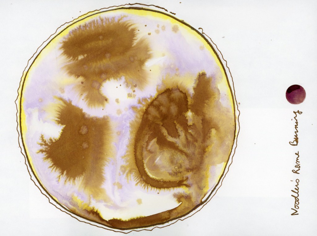
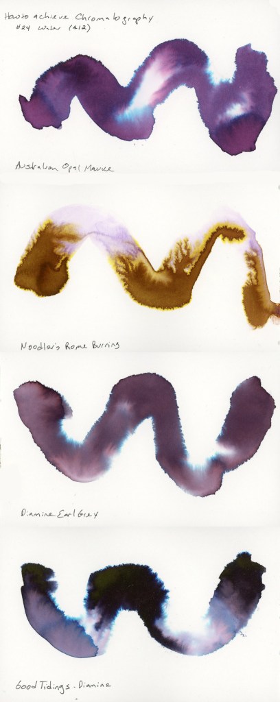
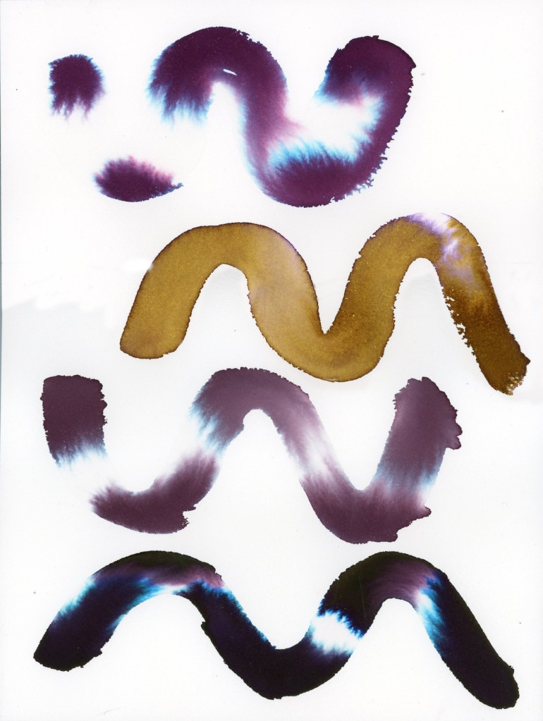
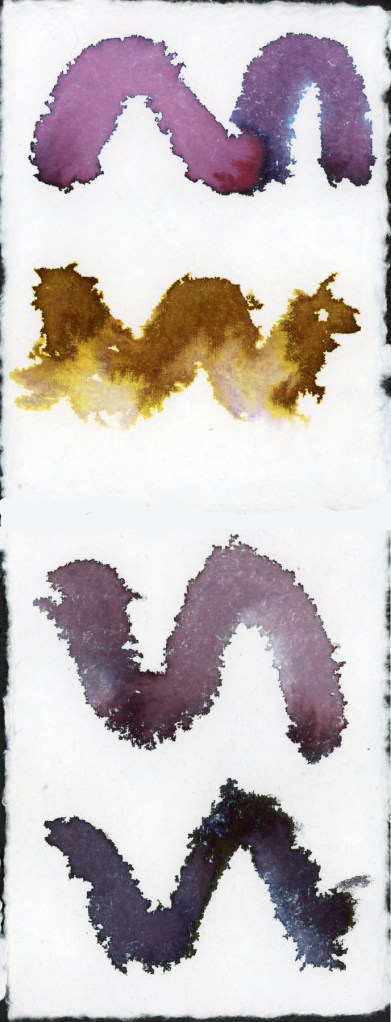
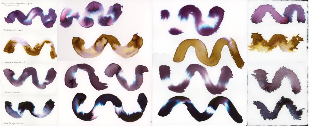
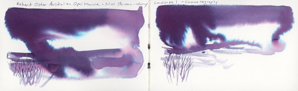
The first days of January. Still working with inks, especially those that explode so beautifully when dropped into water, like Noodler’s Rome Burning. This is an exercise from Nick Stewart’s Udemy course on Fountain Pen Ink.

Lupine and Laughter continues each Friday and I had more inks to test.

The new live round of the watercolor course started, and I did some of exercises in my S&B Alpha sketchbook. I also did the exercises on a handmade watercolor paper that is turning out very interesting to work with.

I am always fascinated by mixing greys and how varied they can be with different colors.

A collage page, with printed stickers, for the end of the Lupine and Laughter series.