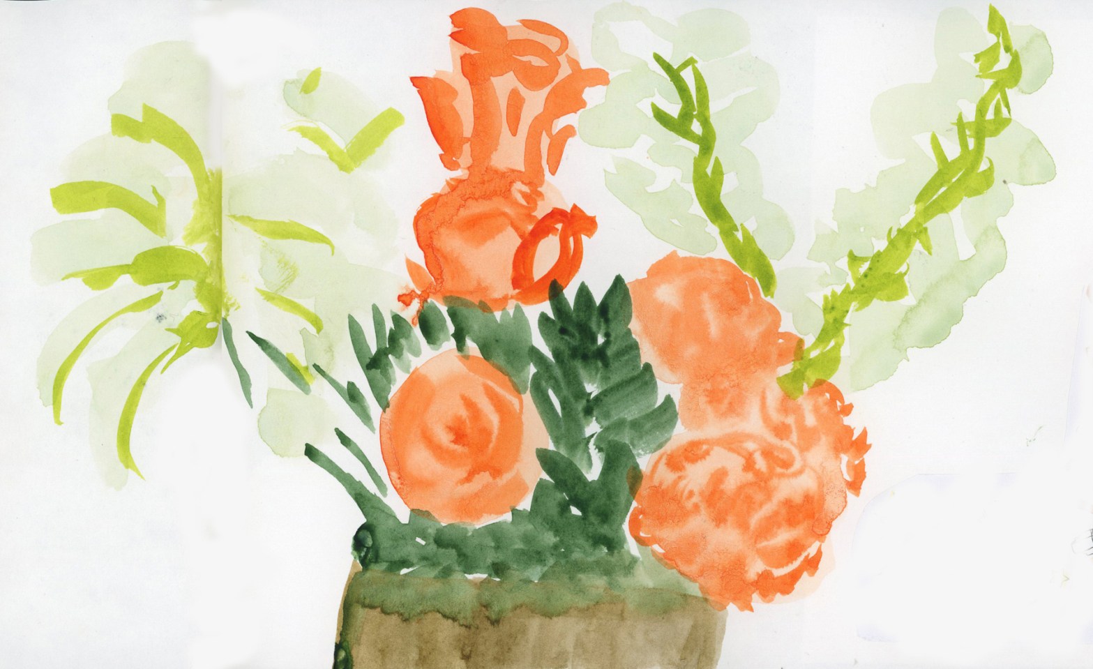
Beltane comes and you can feel the season changing. I needed a week off. (Burnout persists!) I tried to clear the decks. I ordered a soft peachy floral display with sage colored leaves for the soothing soft vibes. (The order promised peach roses, white Asiatic lilies, peach miniature carnations, and white stock, accented with pitta negra, dusty miller, and a soft green echeveria succulent.)
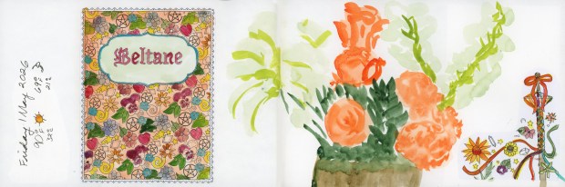
I printed my Coloring Book of Shadows Beltane images and the start of May as well, and distributed them through the remaining 12 pages (six spreads) of sketchbook volume 28. So close to the end I can taste it! I’m eager! I’m ready to move out of this year plus long series of landscape sketchbooks, testing the various Stillman and Birns papers. It’s been great, and I learned a lot about the papers. I am ready for a bigger page! I left room for sketches and hoped the spread-out collage pieces would create harmony on the pages. (The jury is still out on that.)
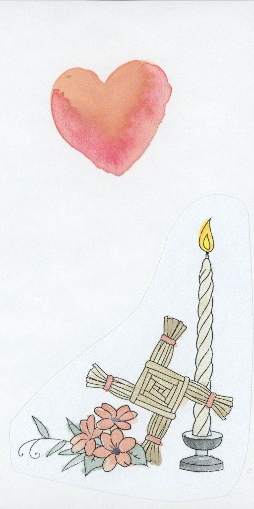
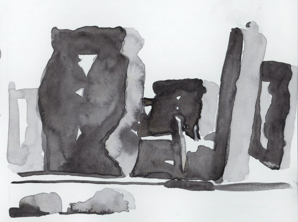
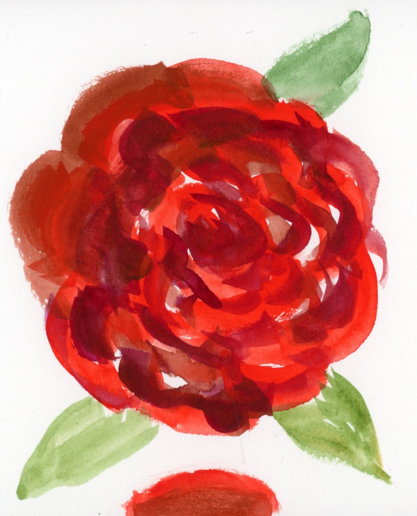
Direct watercolor, Beltane bouquet, 1 May 2026
My flowers arrived, and I received vibrant orange and dark green instead. “Flowers may be substituted.” (Tropicana roses, white Asiatic lilies, orange carnations, and white stock with leatherleaf fern and salal, and a dark green echeveria succulent.)
Well, I guess we’re doing Transparent Pyrrol Orange today!
Beltane Flowers. 1 May 2026
These are the flowers I received, so I’ll paint them as they came. I tried to capture the white Asiatic lilies and the white stock flowers. White flowers are hard to paint! The Transparent Pyrrol Orange was the perfect shade for the orange flowers, with no mixing needed. I did not paint it as bright as those Tropicana roses, though. I carried that color palette over to the Beltane collage sticker, as the new color story of the day.
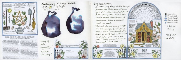
Ink Wash Bags for Declutter, 2 May 2026
Naturally, the weather threatened a crazy heat wave coming, and working in a hot garage is a bad idea, so I pushed to finish the garage declutter while the cooler temperature held one last weekend.
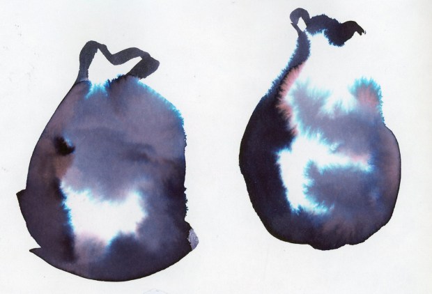
Robert Oster Graphite ink wash sketch, 2 May 2026
I love doing these Robert Oster Graphite inky chromatography garbage bags to document the decluttering. They are so expressive, and that color separation is delicious. Another big day of decluttering, and that settles the garage for the next eight months.
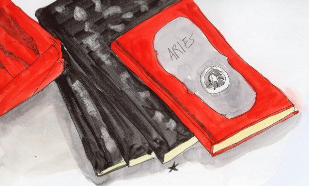
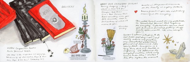
Book Still-life — ink and watercolor. 2 May 2026
The Start Your Sketchbook Journal course by Danny Gregory is exactly what I want to be doing with my sketchbook practice, but I keep putting off the course. Maybe because I’m terrible at taking time off, and when I need a break, I end up decluttering garages, so the self-paced courses get put off so easily? Yeah. That.
Notebooks still life, 2 May 2026
But I sketched the new delivery of composition books and Aries Journal from Coloring Book of Shadows. I even sketched one of the corner designs by hand! I really need to practice illustration-style sketching!
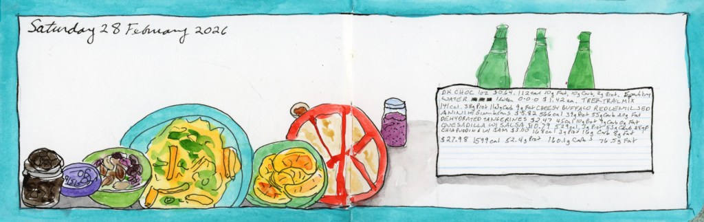
Time for a catch-up post on the food diary. I’m still using the Shikiori markers. Four days, four very different spreads, and a peek into what happens when I sketch under varying degrees of brain function.
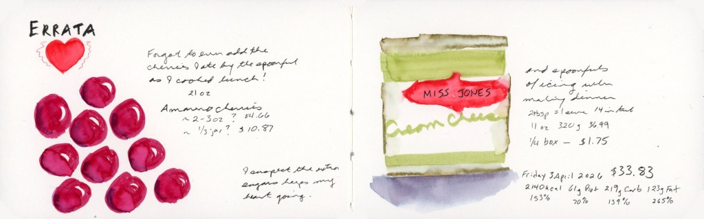
I forgot to log the Amareno cherries I ate by the spoonful while cooking lunch. Those deep jewel reds were so fun to paint, and drawing bigger than usual suited them. The Miss Jones cream cheese icing on the right got its own sketch too, because apparently I also ate several spoonfuls of that while making dinner. I have regrets. I suspect the extra sugar gets my heart going. And yes, for mysterious reasons I have been bingeing more sugar lately. Trying to rein that in.
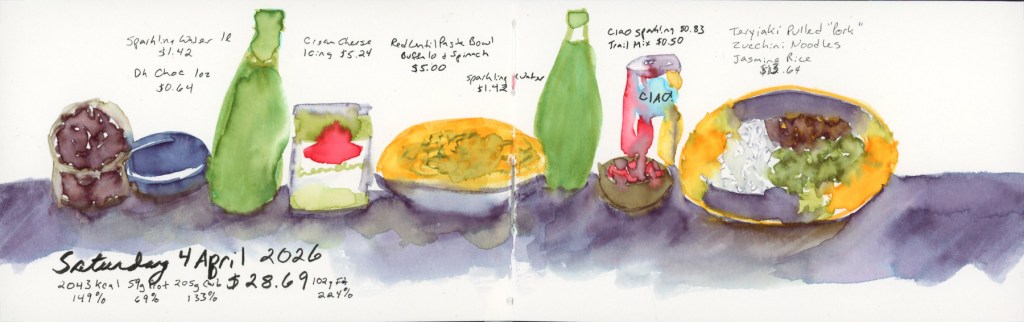
Saturday 4 April 2026 — Food Sketch in Stillman & Birn Delta
Saturday was a proper cooking day with teriyaki vegan pulled pork, jasmine rice, and zucchini noodles. It was very good and I was pleased with the sketch. I did this day’s sketches in the moment! My sunflower plate with the purple shadow wash underneath is one of my favorite things I’ve painted in this book so far. (And I didn’t forget to include the rest of the icing I finished off on the second day of it being open!)
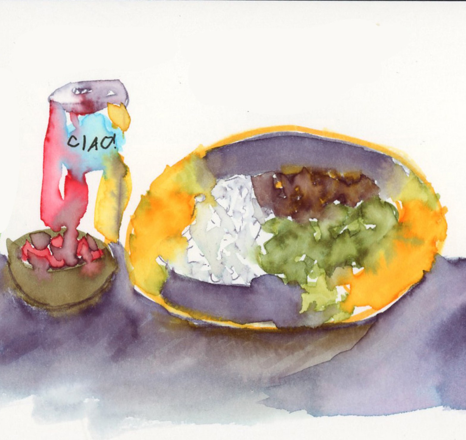
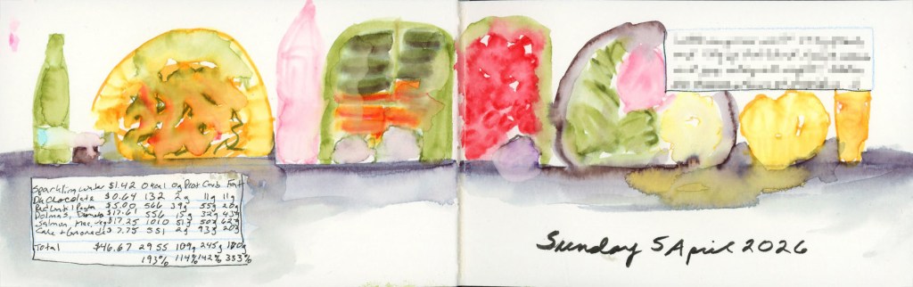
Sunday was a big food day. Bento box with dolmas, baby carrots, hummus and herb garlic cheese (vegan) in one half, cherry tomatoes and kalamata olives in the other, then salmon with roasted vegetables and mac and cheese for dinner, finished off with lemon olive oil cake muffins and a lemonade. It looks like a cheerful parade of colorful shapes across the page, which is exactly what it was.
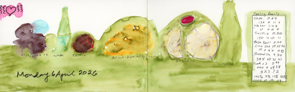
And then Monday. I was not feeling well, and it shows. The whole spread went down in a loose green wash and I forgot to sketch the cookies entirely. The little pink heart in the corner was doing its best. Some days the diary is a beautiful detailed record, and some days it’s an honest green blob. That I’m keeping up is a miracle, when the bad brain hits. I blame the sugar and the allergens I had eating out on Sunday. Which is the whole reason I like to sketch my food, so it’s easier to find the culprits, when the body crashes or outbreaks or flares up days later.
Concluding The Messy Middle from last week, you saw a sketchbook in progress — pages waiting, spaces held open, intentions taped into place. This is the update. The pages are filled. Titles are added.
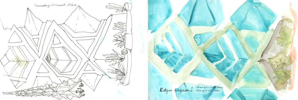
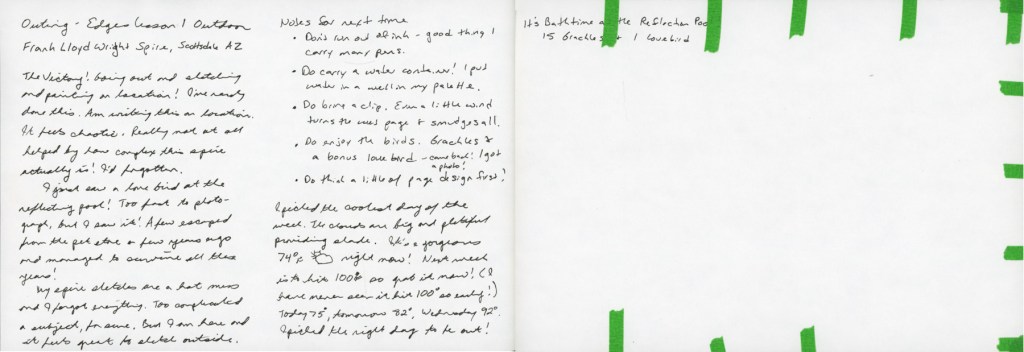
Frank Lloyd Wright Spire, three sketches
This is my Edges Lesson One outdoor outing — the Frank Lloyd Wright Spire at the little commemorative park at Scottsdale Road and Frank Lloyd Wright Blvd, sketched on location. I knew it was going to be the last good weather day for a while, so there was no hesitation — I had to get out there while I could.
The sketches are chaotic in the best way — three poses of the spire, which also happens to tie in perfectly with Liz Steel’s Patreon March Challenge of three things. The outing felt messy and alive, and I wrote all of it down right there on the page while I was still sitting in the shade. I finished this page by adding the date and the Title to it. I also tried to lift the wet paint transfer that the wind had put on the ink sketches.
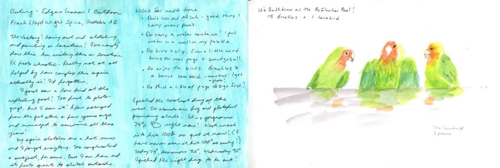
Bathtime at the Reflection Pool — 15 grackles and 1 lovebird
But this is the page that made the whole outing. I’d gone to sketch the spire, and I found a lovebird.
Fifteen grackles and one lovebird, bathing at the reflection pool. A few escaped from a pet store years ago, apparently, and they’ve been surviving in the wild ever since. I spotted it, grabbed some photos, and left the blank page so I could paint these birds at home.
One lovebird, three poses — green, orange, and full of personality
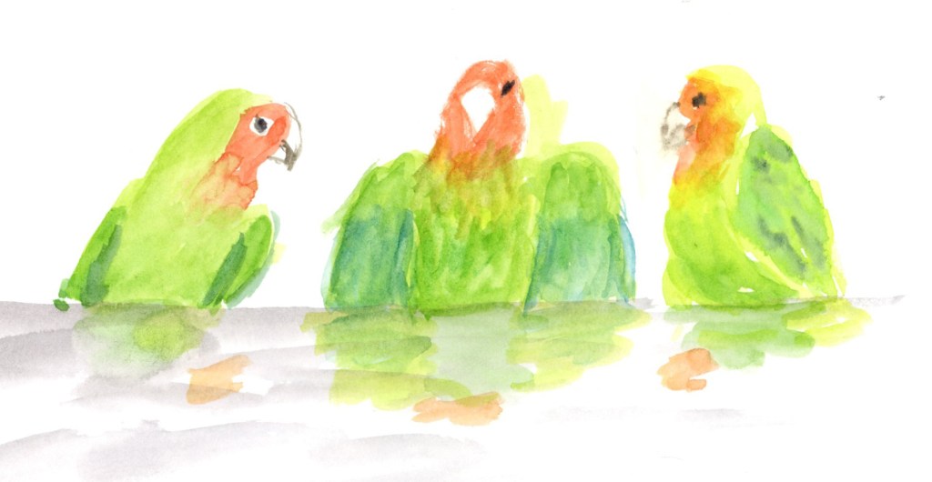
Three lovebirds — one lovebird in three poses, because it was there taking a bath. They’re green and orange and yellow and absolutely full of personality. The journaling on the left is written in that teal colour block wash, and it holds the whole story of the outing: the victory of getting outside, the chaos of the spire, the unexpected gift of the birds.
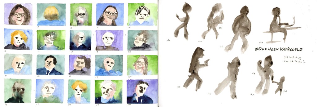
One Week 100 People — 30 done, faces and figures
The One Week 100 People page got its finishing touches too — thirty people including the children, faces in watercolour on the left, ink figures on the right. I added the numbers and the titles to finish off this page.
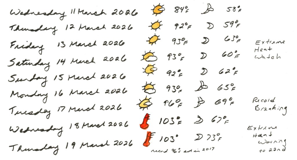
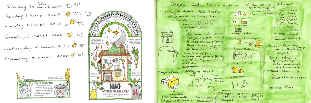
Weather log 11–19 March 2026 — record breaking heat in March
I knew my outing day was the last cooler day for awhile, but wow has the heat spiked! Breaking records by a mile! And it’s just going to get hotter, if you can believe that. I don’t usually see these kind of temperatures until May. We went from a warm pleasant 84°F on Wednesday the 11th to 103°F — record breaking — by Wednesday the 18th, with an Extreme Heat Warning extending through the 22nd. In March. The thermometer icon I drew in red says everything. And it’s only getting hotter!
Titles and notes help complete pages, and aid in telling the story of the everyday life I’m documenting with my sketchbook. This mini series of posts has shown a bit of the process for what is usually only shown completed. It’s easy to think I should complete pages in just one sitting, all perfect, but the truth is that isn’t how it’s done, really, if you are going to add a little sketchbook design to your pages.
Last week I wrote The Messy Middle, with these pages in their unfinished state — collage laid down, journaling written, color promised but not yet delivered. Well. The color has arrived.
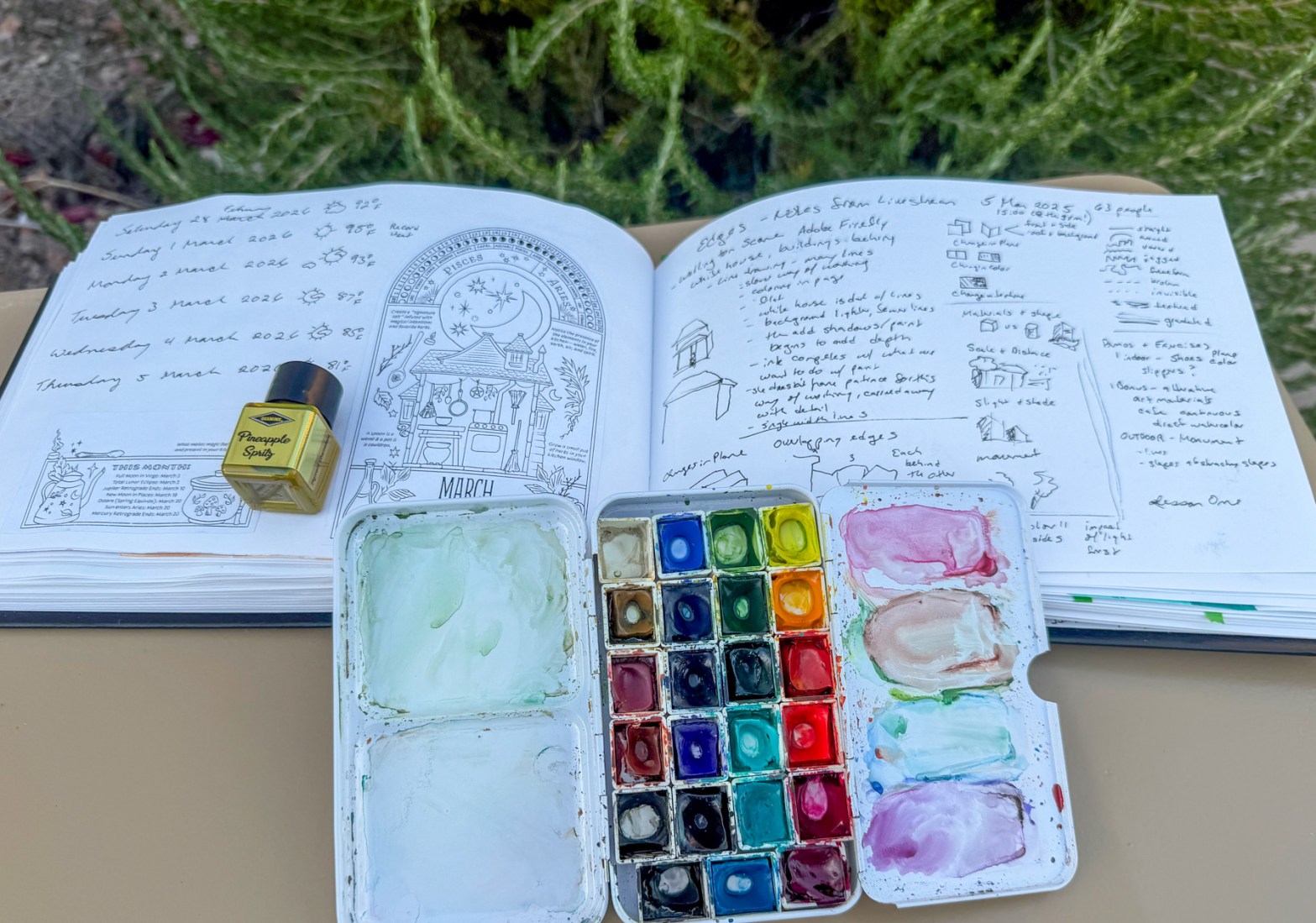
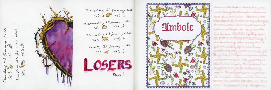
February tail end and March — A Witch’s Kitchen, CBOS 2026
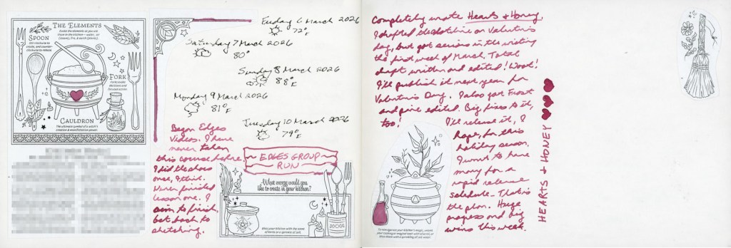
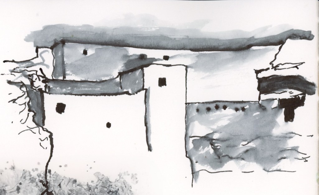
This first spread is the one that started the catching up. Dates and weather for the last days of February and the first days of March, alongside the March Coloring Book of Shadows page — A Witch’s Kitchen. The facing page is still doing its job as an Edges course notes page, now with that bright green wash making all those handwritten diagrams and observations feel like a proper sketchbook page rather than a notepad.
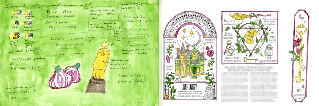
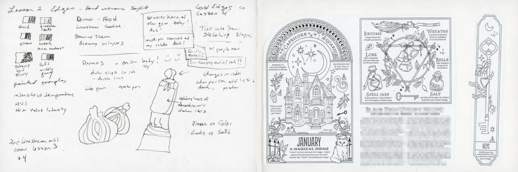
Edges Lesson notes and January CBOS — A Magical Home
The January CBOS page finally got its color too — yes, in March, and I stand by it. The Edges Lesson Two notes on the left with the red onion and the figure in yellow are a good reminder that messy working pages can be beautiful ones.
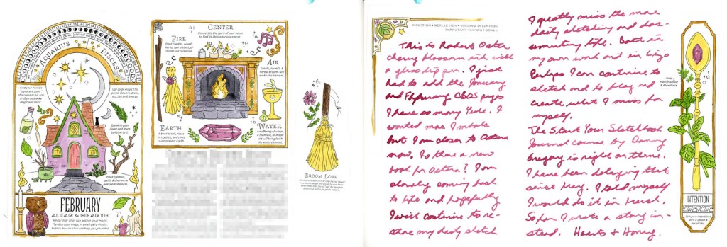
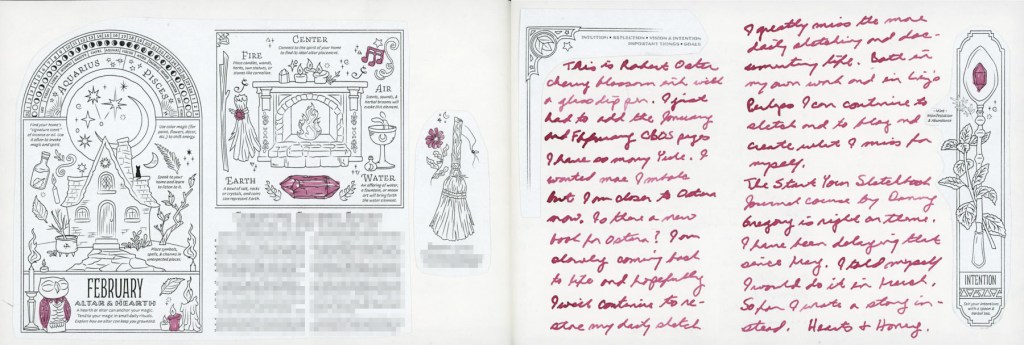
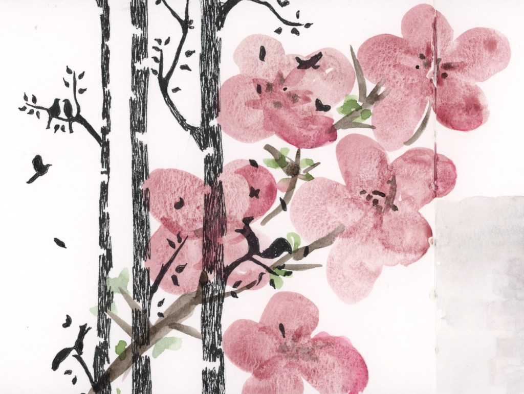
February CBOS — Altar and Hearth, with Cherry Blossom ink journaling
This is the spread I’m most pleased with. The February CBOS page painted up beautifully, and the Cherry Blossom ink journaling on the right ties it all together. Reading back through what I wrote there — missing daily sketching, thinking about Ostara, the mention of Danny Gregory’s Start Your Sketchbook Journal course that I’ve been putting off since May — it’s a good reminder of why I keep this kind of sketchbook. It holds things.
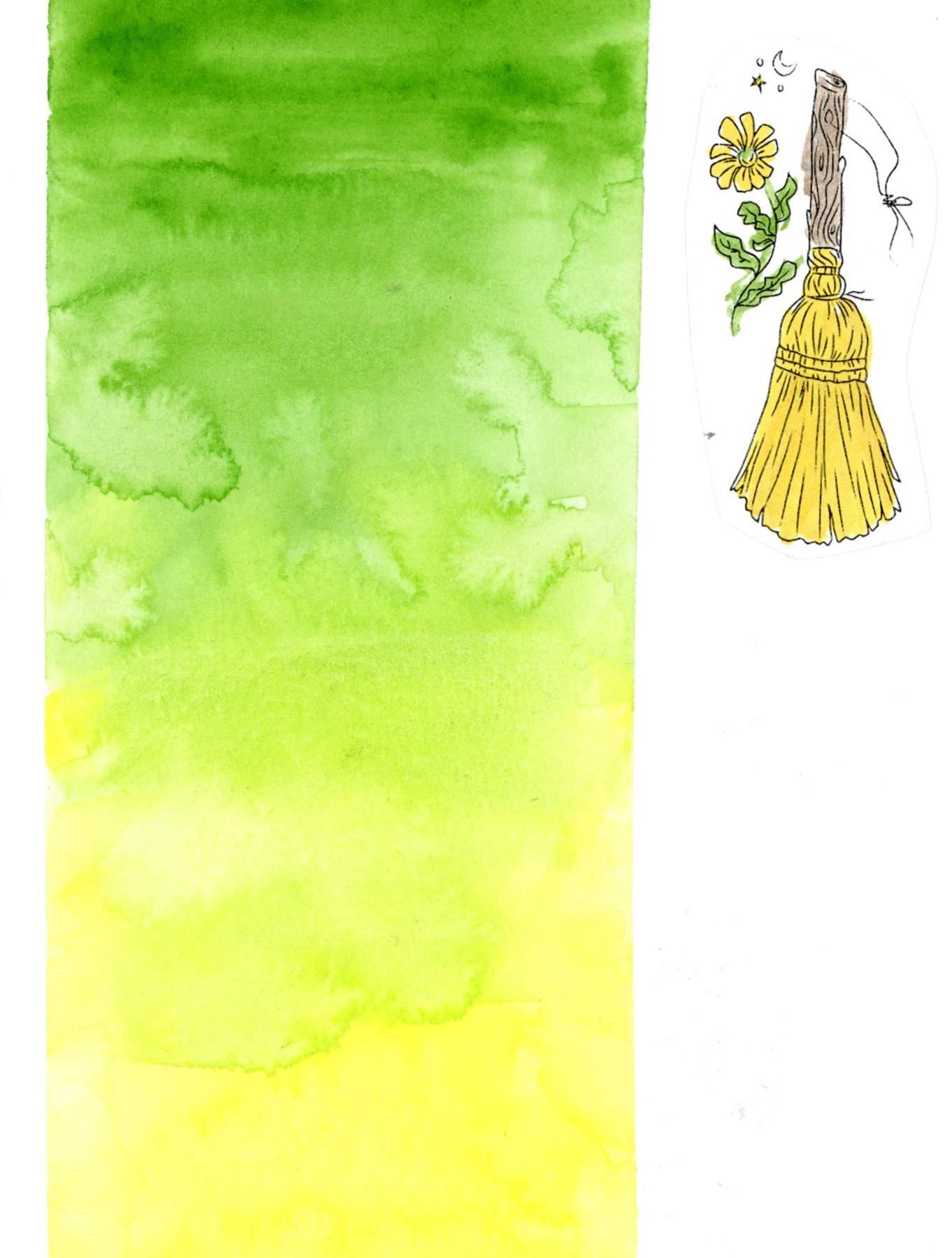
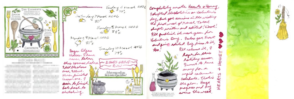
March CBOS — The Elements, and a Hearts & Honey gradient closing page
And this is the one that closed the loop. More dates and weather, more journaling about Hearts & Honey and the Edges group run, and that final wash of green fading to yellow with Hearts & Honey written vertically down the side. It’s the most designed page of the section and it feels like a proper ending. The pinks of February moving into the spring colors of March!
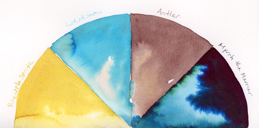
A note on materials: the bright yellow you see in the CBOS images is ink — Diamine Pineapple Spritz from the 2025 Inkvent calendar, and it is exactly as cheerful as it sounds. The rest is watercolor from my usual palette. The greens throughout — the frames, the notes pages, and that final gradient block — are Winsor & Newton Sap Green, with Daniel Smith Hansa Yellow Light pulling the gradient toward that warm yellow finish.
The pages aren’t perfectly painted. Some of the CBOS collage images have text I’ve blurred for copyright reasons, and there are spots where I rushed. But color does something that no amount of careful collage and journaling can do on its own.
Not every sketchbook page is ready for its close-up.
Right now my sketchbook is deep in what I’m calling the messy middle — pages that are made, but not finished. Collage laid down, journaling written, tape applied in anticipation. Color promised but not yet delivered. And I’ve decided that’s worth a post, because this is what a sketchbook actually looks like when it’s being lived in.
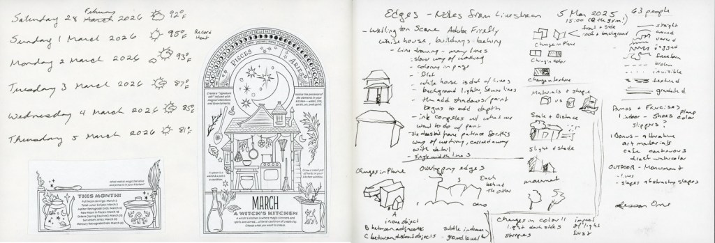
I’m a little behind on my seasonal pages — this first spread catches up on the tail end of February and the first days of March. Dates, weather, temperatures. The facing page is covered in handwritten notes and sketches from the Edges course livestream. Messy and functional and very much in progress.
And speaking of catching up — that’s the January collage on the right. Yes, in March. I forgot it at the time, I like the images, so in it went. No apologies.
The collage images throughout these pages are from the 2026 Coloring Book of Shadows by Amy Cesari. They’re pasted in and waiting to be painted. That painted version is coming. Eventually is the operative word.
This is where a little color starts sneaking in. I’ve been reaching for Robert Oster’s Cherry Blossom ink — a soft rosy pink — for both spot color on the collage images and for journaling. It wasn’t an accident. I’ve been thinking about sketchbook design, using a single ink color across multiple spreads to create a visual thread through this section of the book. Even in the messy middle, there are intentional choices happening.
The Cherry Blossom ink continues here — more dates and weather, a note marking the start of the Edges course, and a half page of journaling with small collaged images tucked into the corners. The pages are full. They’re just not painted yet.
There’s also a half page left blank — and I’m genuinely undecided whether that’s a space waiting for a sketch, or whether it should stay as white space. Sketchbook design is something I’m always thinking about and not always getting right. White space does not come naturally to me!
You might recognize the right hand page from my last post — the header for the lovebird sketch that’s still waiting to be drawn. The green masking tape dotting the edges is there because the other side of the page is already taped up for something else. The blank space is intentional. It’s waiting.
And this is my favorite kind of messy middle image — a page that’s completely empty but completely ready. Narrow green masking tape laid out in a grid, waiting for this week’s One Week 100 People challenge. No sketches yet. Just intention and tape and anticipation.
This is what a sketchbook in motion looks like. Not every page is finished. Not every page is painted. Some pages are still becoming what they’re going to be.
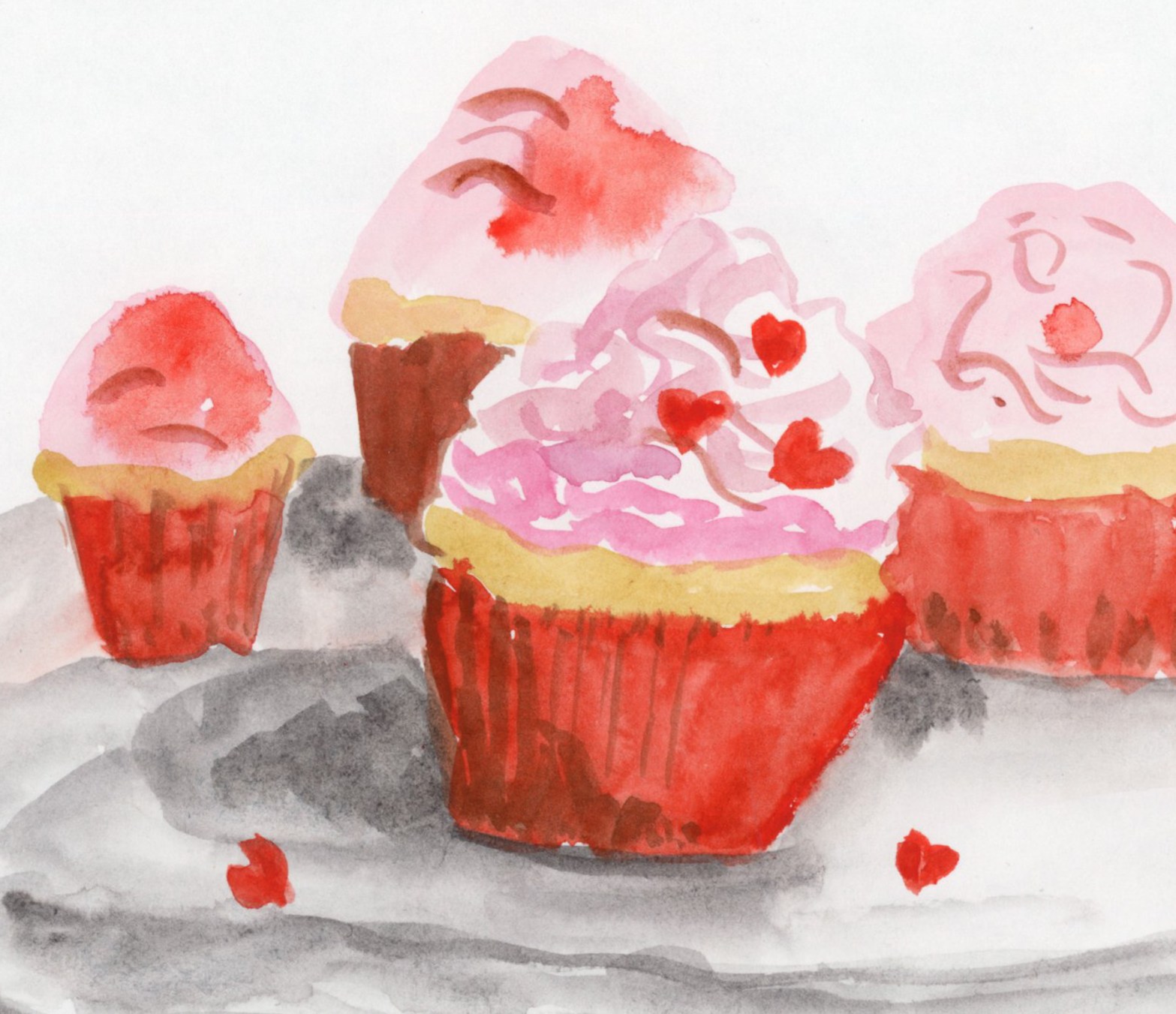
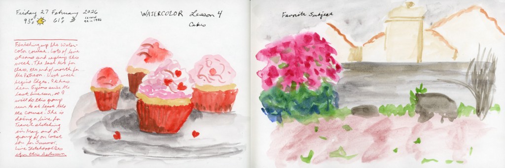
Spring is bringing better energy! Despite a challenging start to the year, I’m thrilled to announce I’ve officially wrapped up my Watercolor course. This month was all about marking moments—from Valentine’s cupcakes to the early blooms in my weed-filled (but vibrant!) backyard.
Watercolor Course Completed!
I’ve continued working through my Watercolor course, and I finally crossed the finish line! Honestly, completing this despite such a difficult couple of months feels like a huge win.
To celebrate, I painted these Valentine cupcakes from a photo I found online. It was a fun way to mark the holiday and just play with color (Quin Rose and Pyroll Scarlet.)
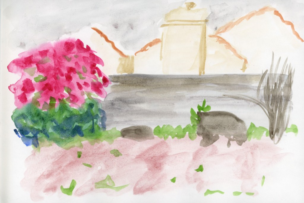
Record-Breaking Heat & Overgrown Weeds
My yard has officially been taken over by weeds this year! We are experiencing record-breaking temperatures, so everything bloomed a full month earlier than usual. It’s a bit chaotic out there, but it makes for interesting sketching.
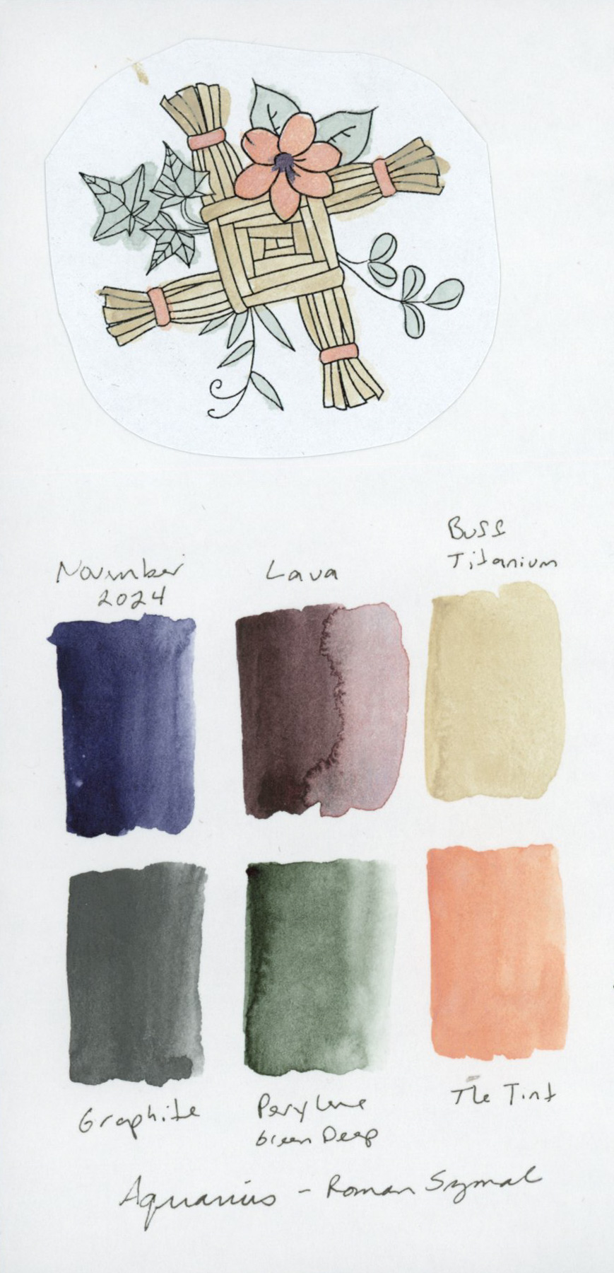
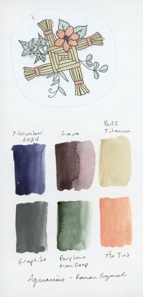
Paint Experiments and Palettes
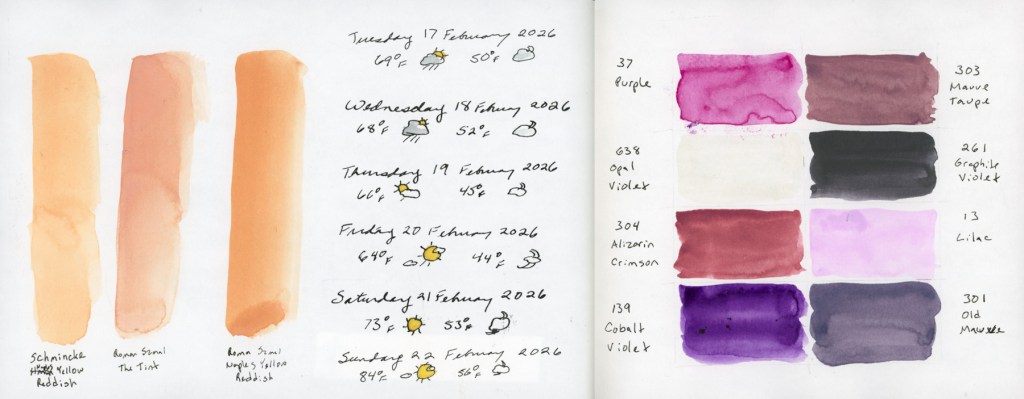
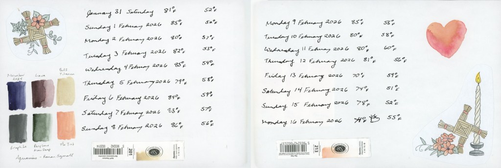
I spent some time diving into the technical side of things this month. I wanted to see the true differences between Naples Yellow Reddish from Schmincke and Roman Szmal, as well as The Tint (Roman Szmal). They look so similar at first glance!
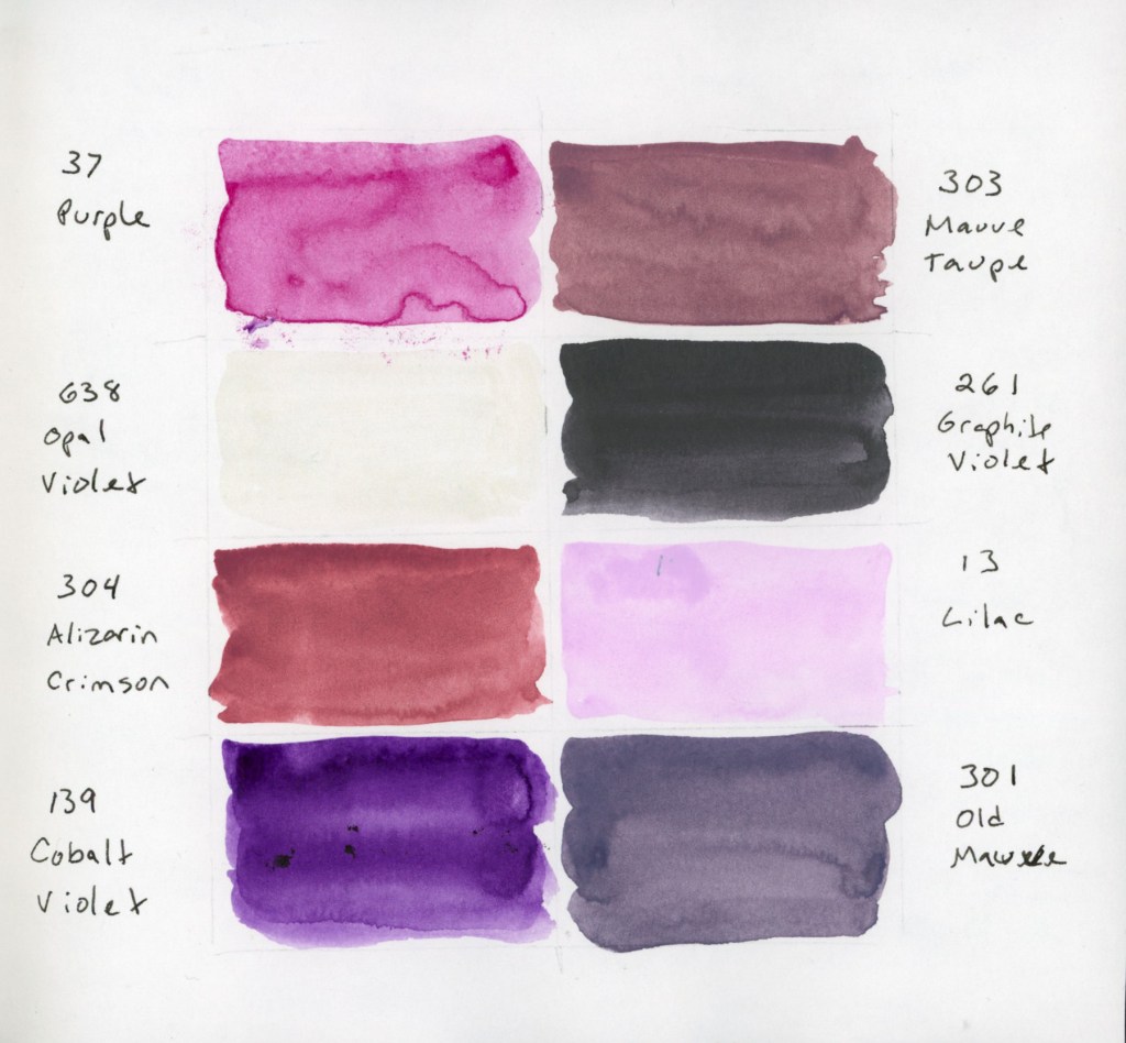
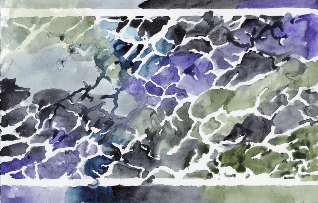
I also swatched a cute little 8-color palette of Gansai Tambi paints that I’d intended to use for February. Even though I only managed this one swatch page, these muted, dusty shades are so inspiring. The palette includes: Purple (37), Mauve Taupe (303), Opal Violet (638), Graphite Violet (261), Alizarin Crimson (304), Lilac (13), Cobalt Violet (139), and Old Mauve (301). That Opal Violet adds just the right hint of shine!
For the color blocks over my notes, I also played with a gorgeous gradient between the two Naples Yellows Reddish. But the real star? Roman Szmal Lava. That shading and granulation are just incredible—what a fun, moody color to work with!
The Return of Food Sketches
With my health still being a bit troublesome, I’ve decided to restart my food sketching habit. I’ve picked up my 3.5×5.5 Epsilon landscape book from last summer. I’m diving back in and focusing on making the page designs more visually interesting this time around.
Looking Ahead
What’s next? The “Edges” course from Sketching Now starts next week! I’ve never made it past lesson one before, but I’m joining the group run this time to stay motivated. My skills feel a little rusty after the last few months, but I’m ready to get back into the flow.
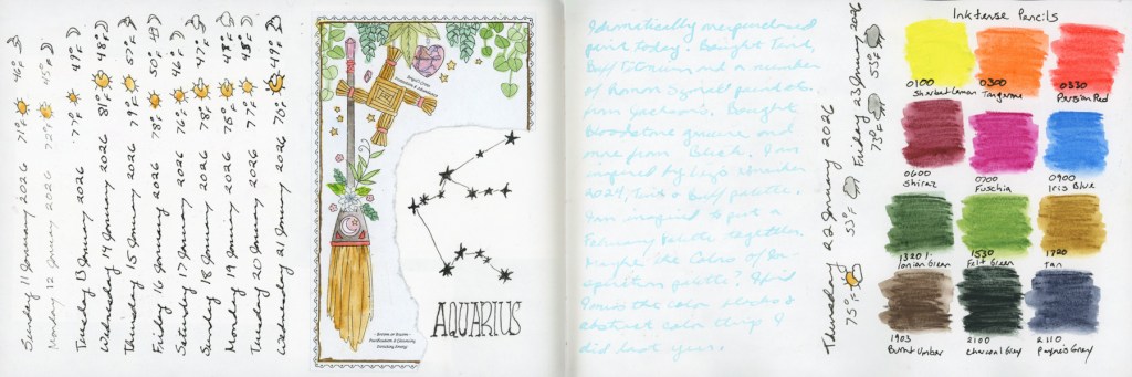
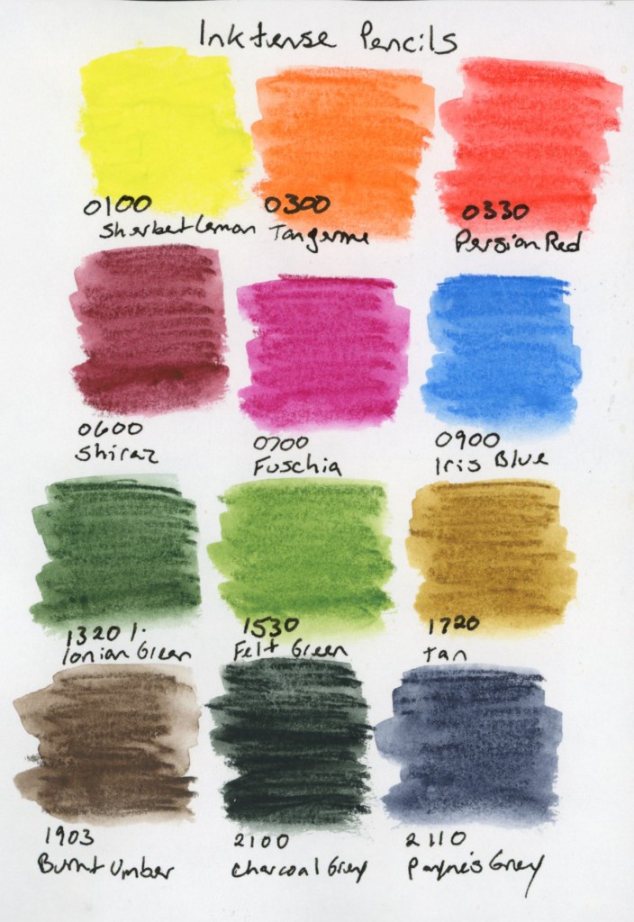
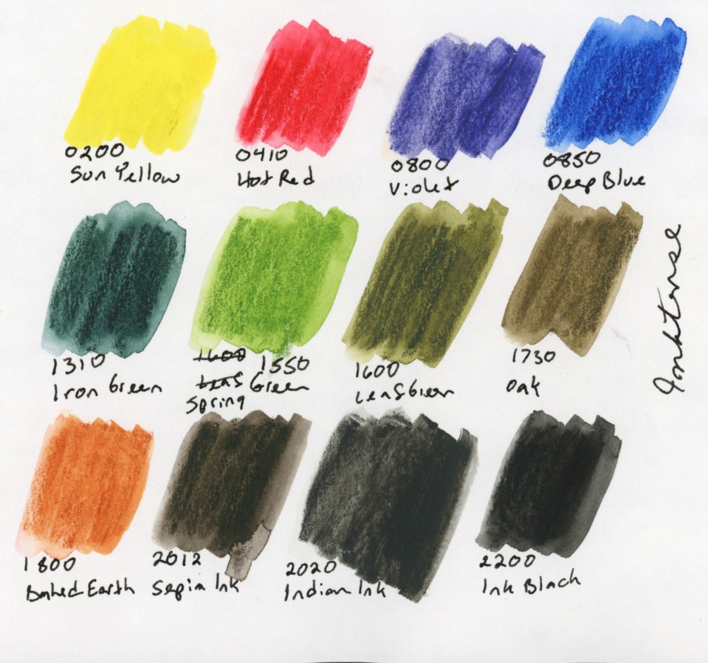
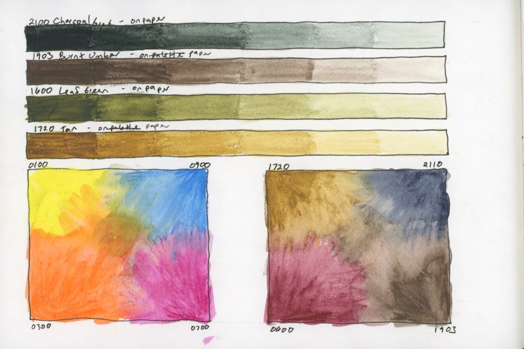
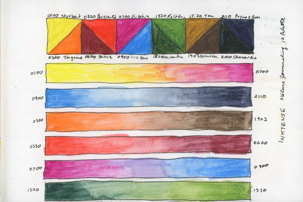
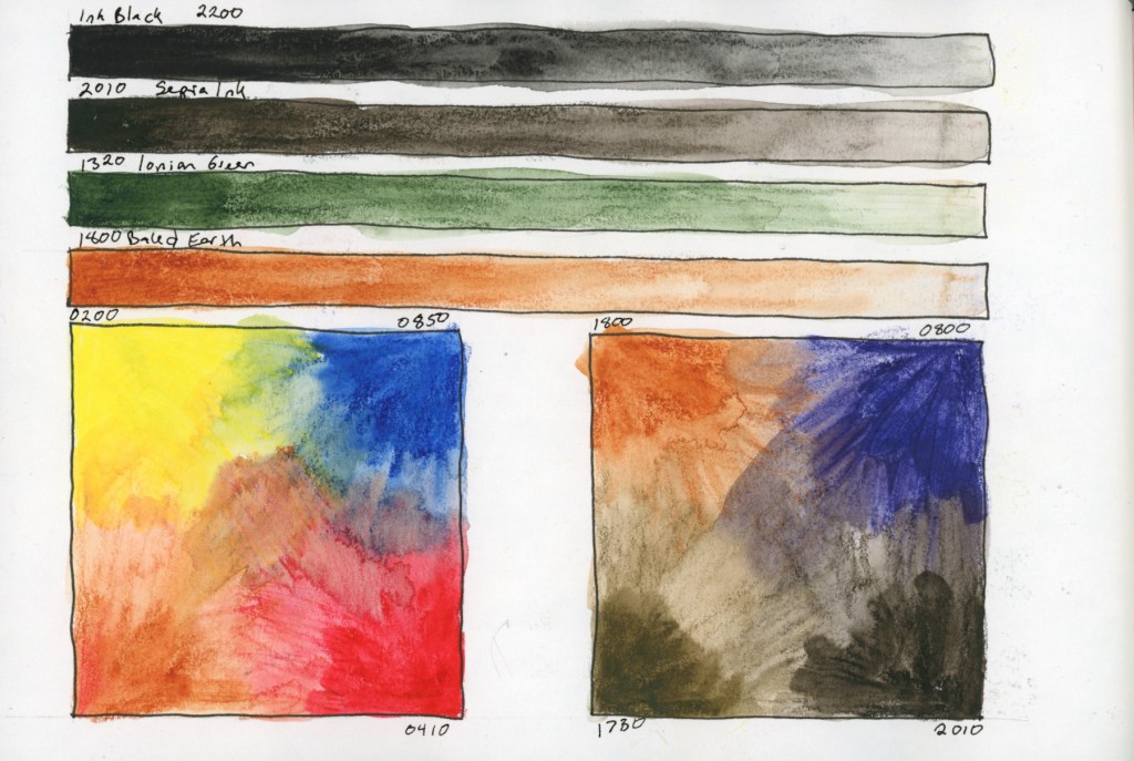
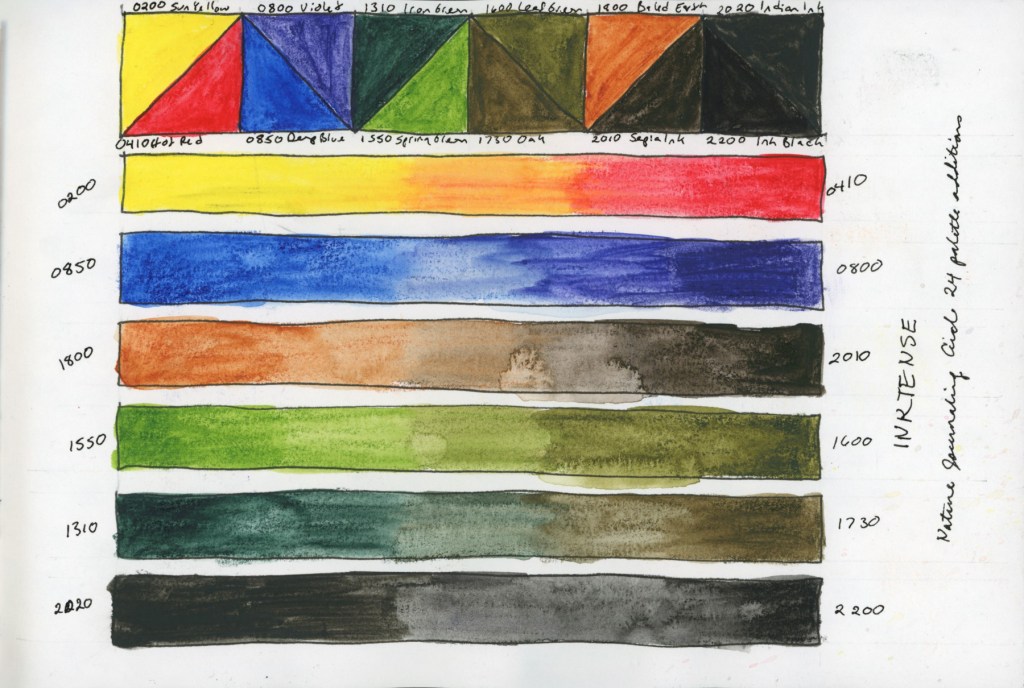
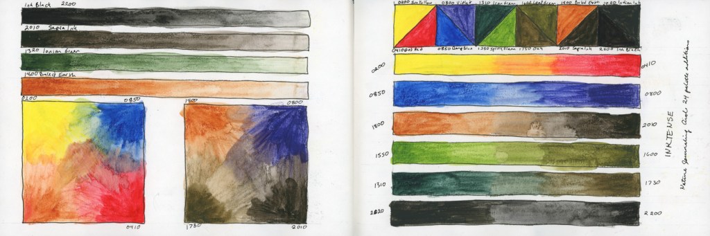
January is moving by so fast! I did work on Alex Boon’s Inktense course in his Nature Journaling Circle. He offers a recommended set of 12, and an optional 12 he recommends to make it 24 set.
These swatching exercises were extremely helpful in learning how to work with these, and how they color mix.
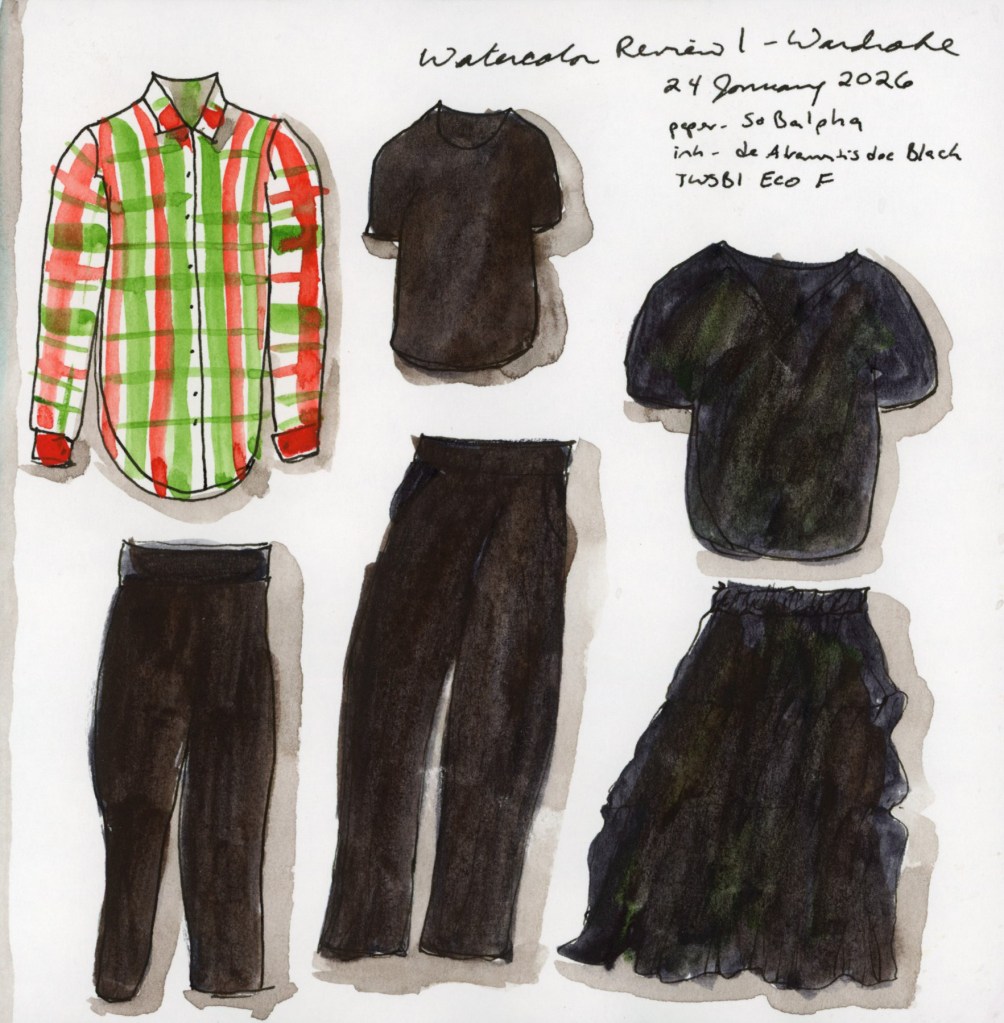
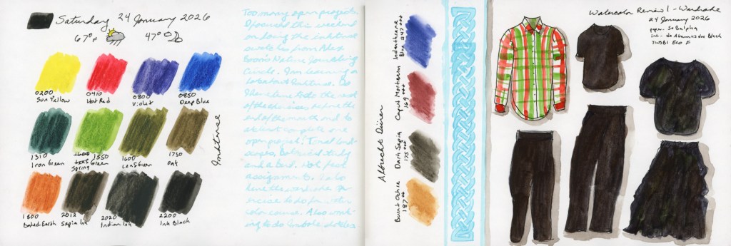
For the watercolor course, I did one of my favorite exercises, the wardrobe. My wardrobe is mostly black, but for this winter I did add this festive plaid shirt that was so fun to paint!
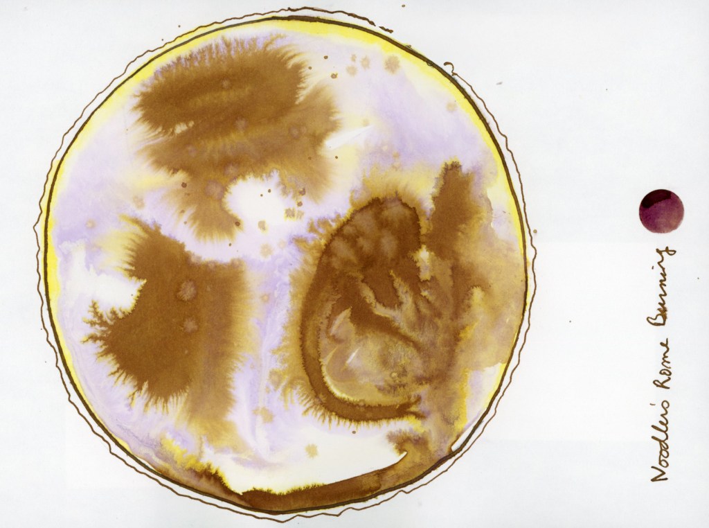
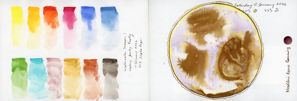
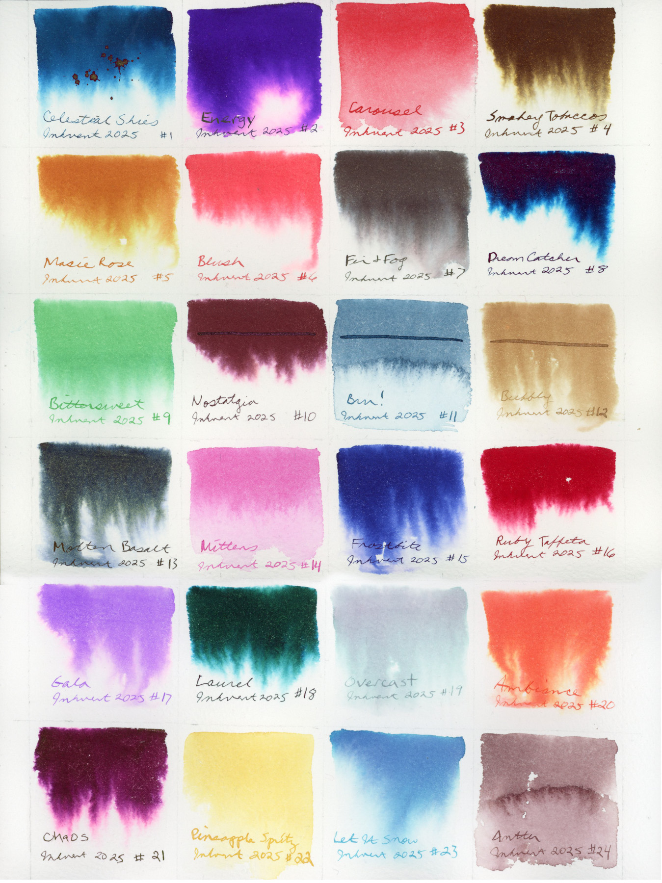
The first days of January. Still working with inks, especially those that explode so beautifully when dropped into water, like Noodler’s Rome Burning. This is an exercise from Nick Stewart’s Udemy course on Fountain Pen Ink.
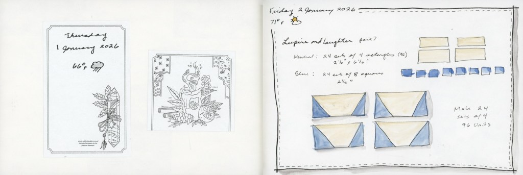
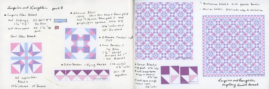
Lupine and Laughter continues each Friday and I had more inks to test.
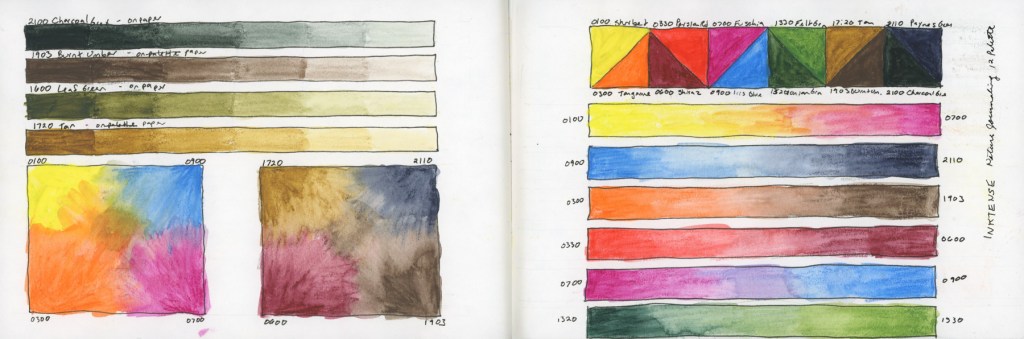
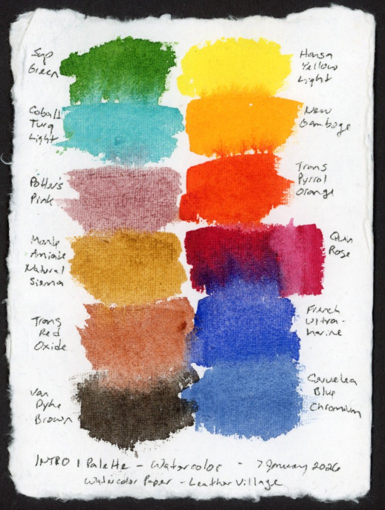
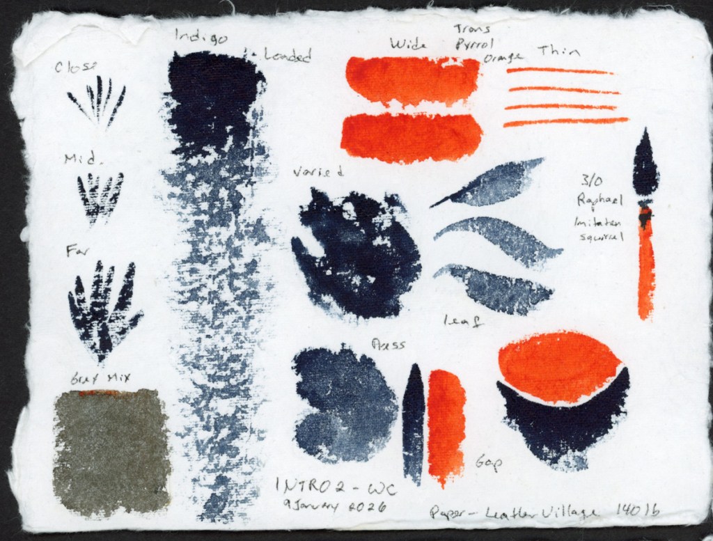
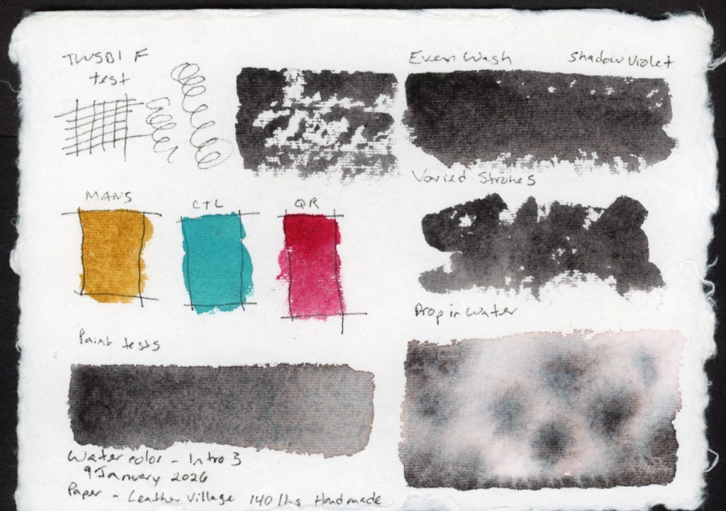
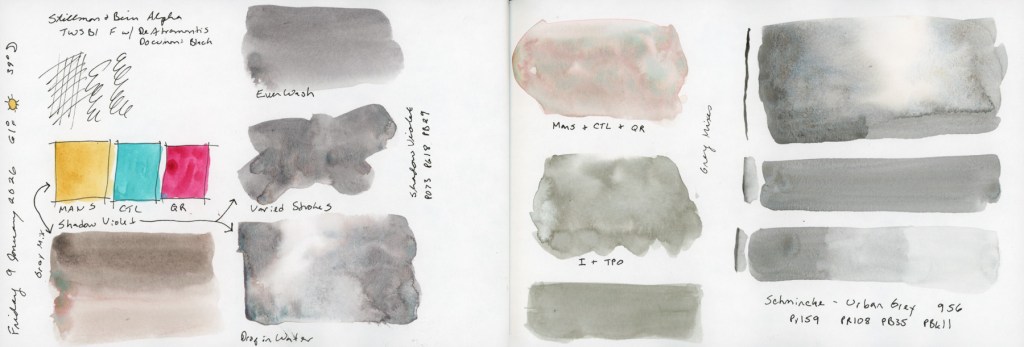
The new live round of the watercolor course started, and I did some of exercises in my S&B Alpha sketchbook. I also did the exercises on a handmade watercolor paper that is turning out very interesting to work with.
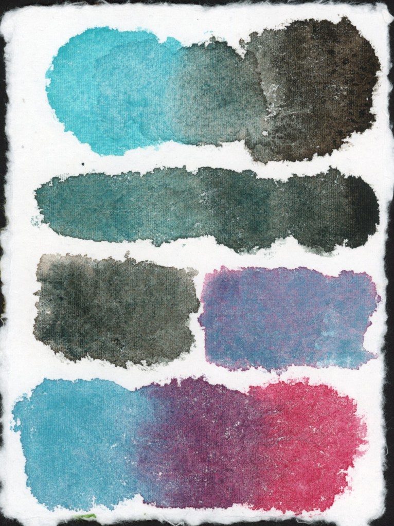
I am always fascinated by mixing greys and how varied they can be with different colors.
A collage page, with printed stickers, for the end of the Lupine and Laughter series.
They say a year in review should be a highlight reel—a collection of my best sketches, crispest lines, and most vibrant colors. But when I look back at my stacks of sketchbooks from the last twelve months, I don’t see a gallery of masterpieces.
I see a graveyard of the unfinished.
I see where life went sideways and I simply stopped. I see half-finished classes left and never touched again. I see “failed” sketches where my lines just wouldn’t click. For a while, this felt like a lack of discipline. I felt like I was falling behind.
But as I sit down to write this, I realize something important: You can’t have a “failed” sketch unless you actually sat down to draw. Every incomplete page is proof that I showed up. Every “bad” drawing was a risk I was brave enough to take. This year wasn’t about the finish line; it was about the messy, frustrating, and ultimately beautiful process of staying in the game. Even when there were long gaps where all I did was write down the date and the weather.
Today, I’m celebrating the journey. Let’s look back at my year of incompletes—and why they might be the most important things I’ve ever drawn. I showed up anyway, in a year where life rather kicked my ass with illness, accidents, and a major death in the family. So many losses, so maybe not finishing most of the classes I started, isn’t such a bad thing. Maybe it isn’t failure at all.
The year started strong for me, I was feeling good and actually accomplishing the lessons in Sketching Now Foundations.
I was ready to go strong and do Sketching Now Travel Sketching during my family trip to Mund’s Park, but this is when things began to go awry. I did however, do some travel sketches even if I didn’t manage to participate in the class itself. Admittedly most of these sketches I did once I got home.
The summer was a mix of color palettes, a few attempts at sketches, amid the missed days.
Autumn fell completely apart. I had hoped to sketch buildings during my family vacation, and thusly sketch during my trip and do the Sketching Now Buildings course, but devastating disaster struck.
Coping with grief as well as recovering my own health issues, brought me to December with grand ideas for a December Daily. I did sample my Diamine Inkvent, and I did do a lot of collage in my sketchbook.
Stillman and Birn Sketchbooks
I set out this year to test each type of paper in the Stillman and Birn sketchbook line, and I did accomplish all but the Nova. Final verdict, Alpha remains my favorite. I did like the ivory colored papers more than I expected to, however. I liked the Delta paper the least, as I found it seemed to pill under water, which was not desirable for me. The smoother papers, Epsilon and Zeta were also nice. Better for ink work, than watercolor. Beta was fine, but with heavy paper, I expected smoother washes, so Alpha remains top for me with my preferred ink and watercolor. I still have to test the Nova range, with the tinted papers, and I’m looking forward to that in the future. I stuck with the 5.5×8.5 inch landscape, and as the year closes, I’ll admit, I’m really jonesing for a bigger page and for a portrait layout!
Improvements
I admit, I’m hard on myself, and I never see my own improvements until years later when I look back. I do feel I learned a lot this year about how paper affects results, and about the various materials and palettes and did color swatches with. I worked with Inktense a bit, and I sampled a lot of different paints. I would have liked to see more improvement with my drawing skills, but I also did not draw that much, when it comes down to it.
I did complete eight sketchbooks this year! Two of them were begun in 2024, and several of them were thicker paper, so only a few pages at 26 sheets.
Vol 17 – Travel Sketching for 2024, then Watercolor Pencil Magic, then in January 2025 I picked it up for my daily sketchbook and Foundations.
Vol 19 – Gamma. Mid-February 2025 to early April 2025. Foundations. Color studies.
Vol 20 – Delta. April to June 2025.
Vol 21 – Food
Vol 22 – Beta. June to July 2026
Vol 23 – Food (Page Design)
Vol 24 – Zeta. August to December 2025.
TAKEAWAY
My chief takeaway might be to simply return to the page. Regardless of how it feels, or however long it has been with nothing, just return to the page. Do some color tests, or play with ink. I found peace in those moments, when it seemed there was little peace to be had personally, or in the world. You can learn a lot about art and your tools and your mediums just from color swatches. Return to the page and you’ve showed up, you are continuing the journey. This is about progress not perfection. A few years from now, I will see the progress, and the memory of the pain and the struggle will have faded. But I will be very glad I showed up to the page, even just to mark the date.
GOALS FOR 2026
I’d like a bit more consistency. I always aim to finish the classes I start, but maybe I can also find ways to give myself permission to sketch small things, just to keep the practice in.
Document the everyday. This is always my chief objective. Document life as it really happens. Sketch the everyday moments, or objects, or even abstractly capture the feelings in color.
Share and participate a bit more in the online communities and classes I’m part of. Share more here in my blog as well as touch base with what I am learning as I go along.
CONCLUSION
In a nutshell, I did more than I think I did this year! I struggled to keep sketching when life hit hard, but I am glad I sketched, and painted, and experimented.