Why Page Design Makes All the Difference (Even for a Food Diary)

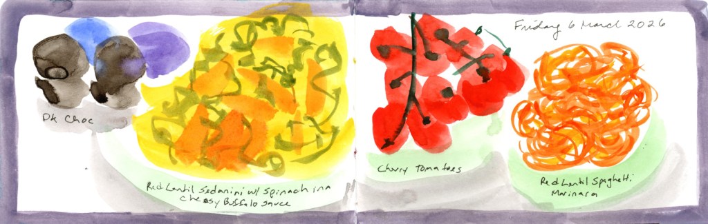
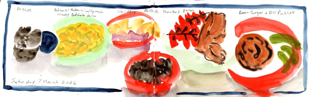
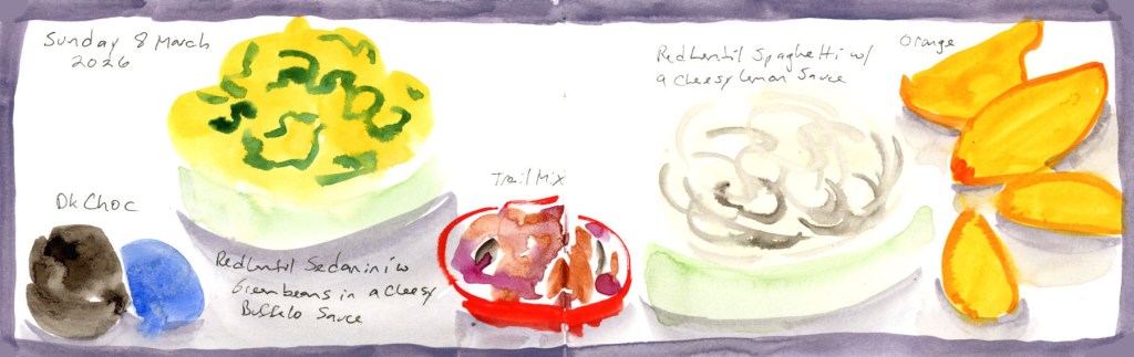
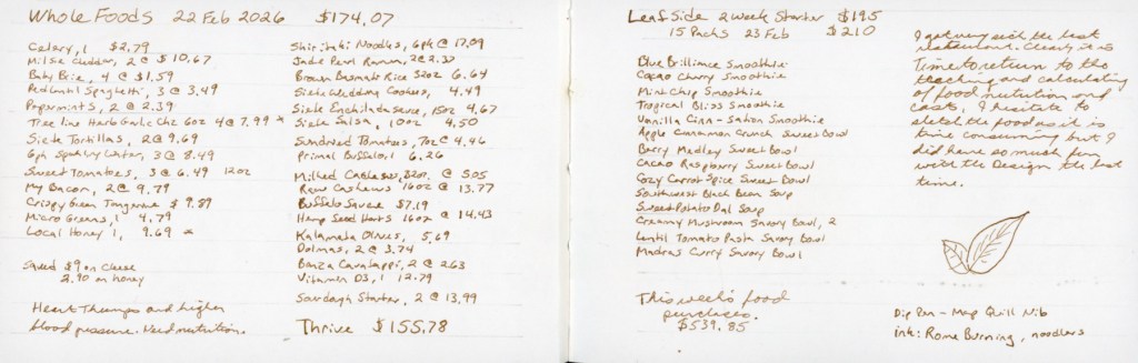
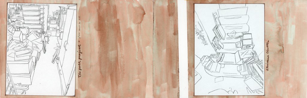
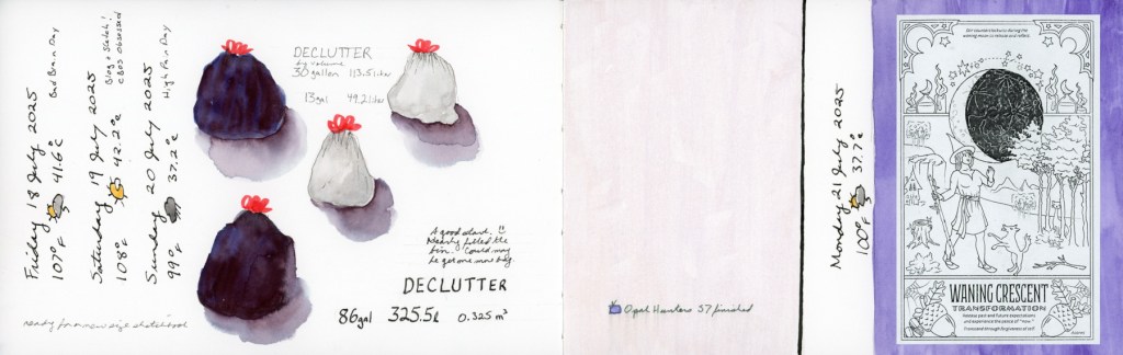
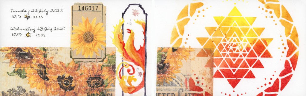
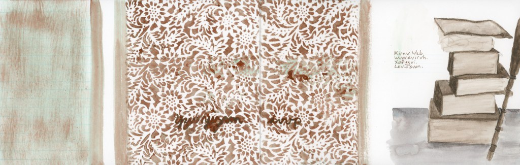
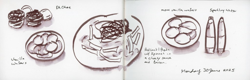
If you’ve been following the Illustrated Food Diary for a while, you know the premise is pretty simple: I sketch what I eat, sometimes with calories, carbs, and cost noted alongside. Same subject, every single day. Plates, bowls, bottles of sparkling water, the occasional bag of chips.

It could get very repetitive very fast. And honestly, without some intentional page design, it does.

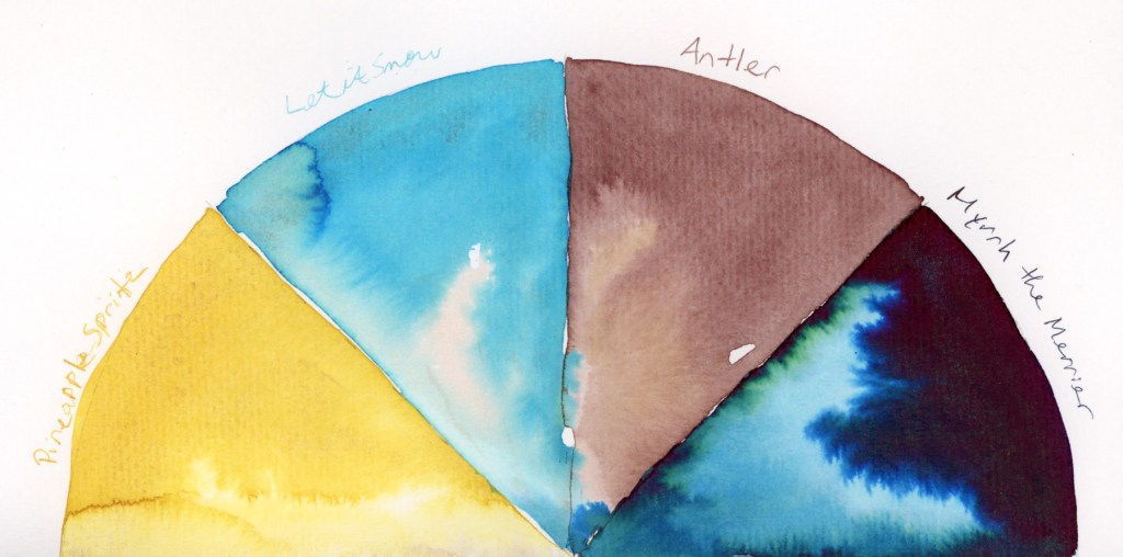
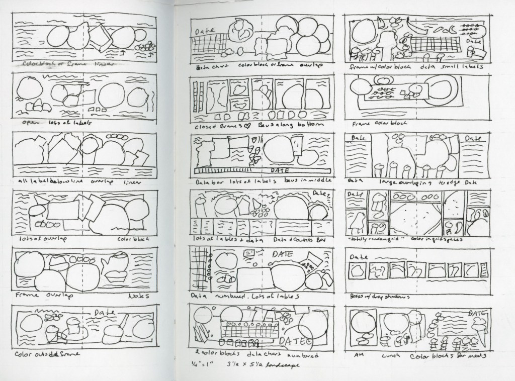
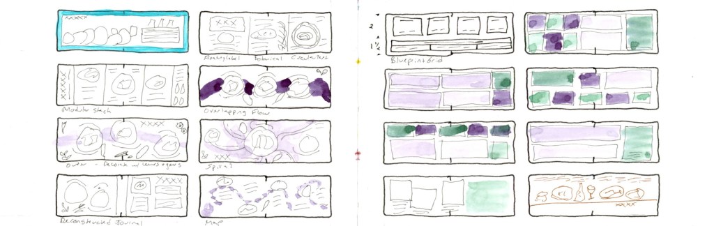
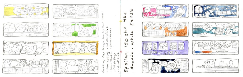
I’ve been thinking about page design since taking Liz Steel’s Sketching Now course — Sketchbook Design — and with Sketchbook Volume 24 (my 5th food sketchbook,) I got serious about actually applying it to the food diary. Near the back of the book I filled a few pages with wireframe sketches: little thumbnail layouts exploring different ways to organise a page. What Liz called recipe book in the Sketchbook Design class. Some ideas came from Liz, some from scrapbooking, and some I just made up. The note I wrote on the title spread still holds: design makes it look so much better.

Watercolour title page in purple reading "Page Design" with handwritten notes citing Liz Steel, scrapbooking, and personal ideas as sources, beside a page of small coloured thumbnail layout sketches for food diary pages
Page Design — sources and first thumbnails, Vol. 024
Two pages of hand-drawn wireframe thumbnail sketches showing named food diary page layout concepts including Modular Stack, Overlapping Flow, Spiral, Deconstructed Journal, Blueprint Grid, and Map, with watercolour colour studies
Wireframe page design layout concepts.
Two pages of food diary layout wireframe thumbnails in various colour combinations including pink, blue, orange, purple, teal and green, with handwritten notes reading "Food Diary Page Design from Liz Steel 2008" and Epsilon sketchbook specifications.
Wireframe page design layouts for S&B Epsilon 5.5 x 3.5-inch Landscape sketchbook.

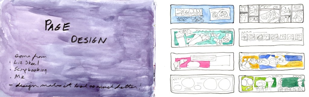
Here’s what I landed on as my toolkit.

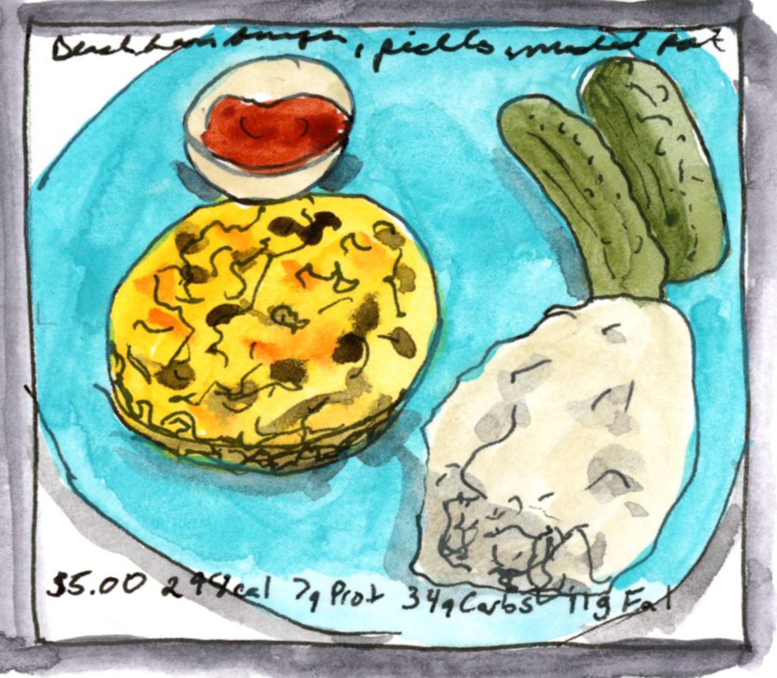
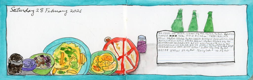
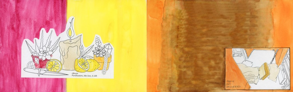
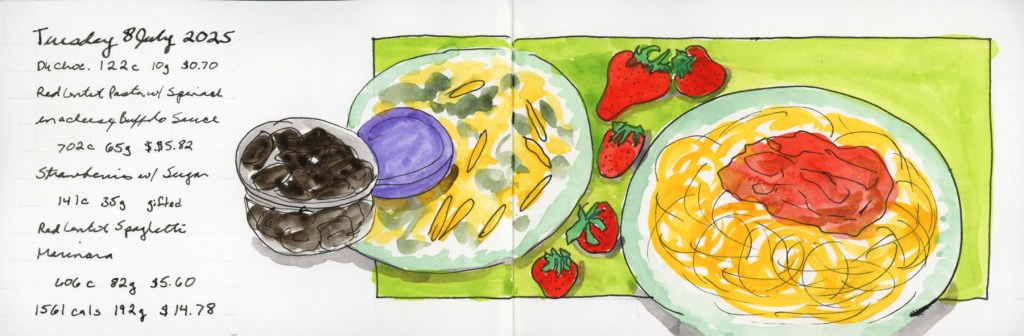
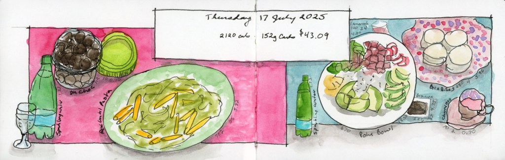
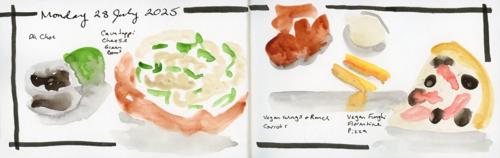
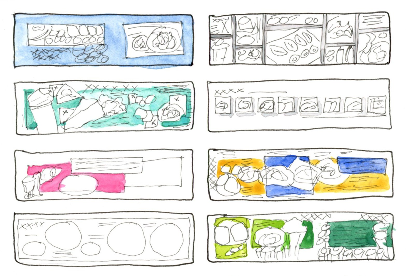
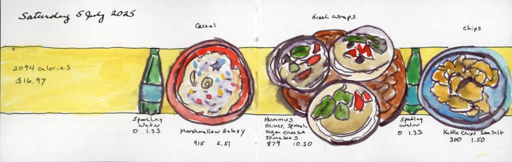
Colour blocking is my favourite for making plates really pop. A solid band of colour behind the food — yellow, teal, pink — does something almost magical: suddenly the sketches read as a designed page rather than a collection of doodles.

Illustrated food diary page for Saturday 5 July 2025 using a yellow colour block band, with watercolour sketches of cereal, Greek wraps, and kettle chips, annotated with calories and costs
Saturday 5 July — Food Sketch page with yellow colour block

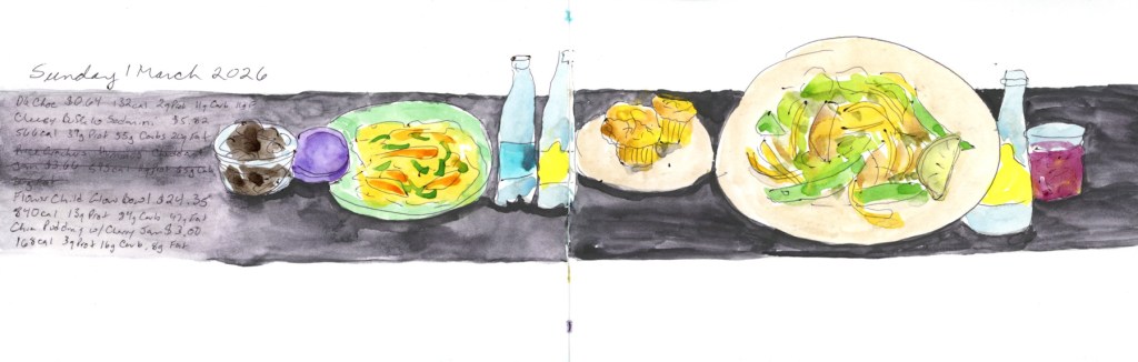
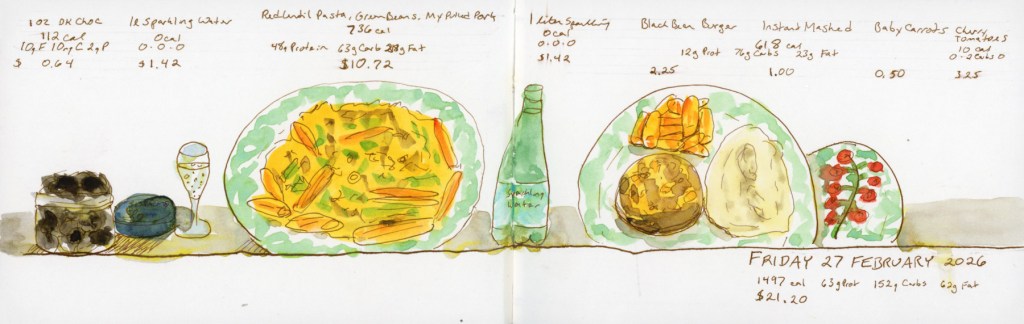
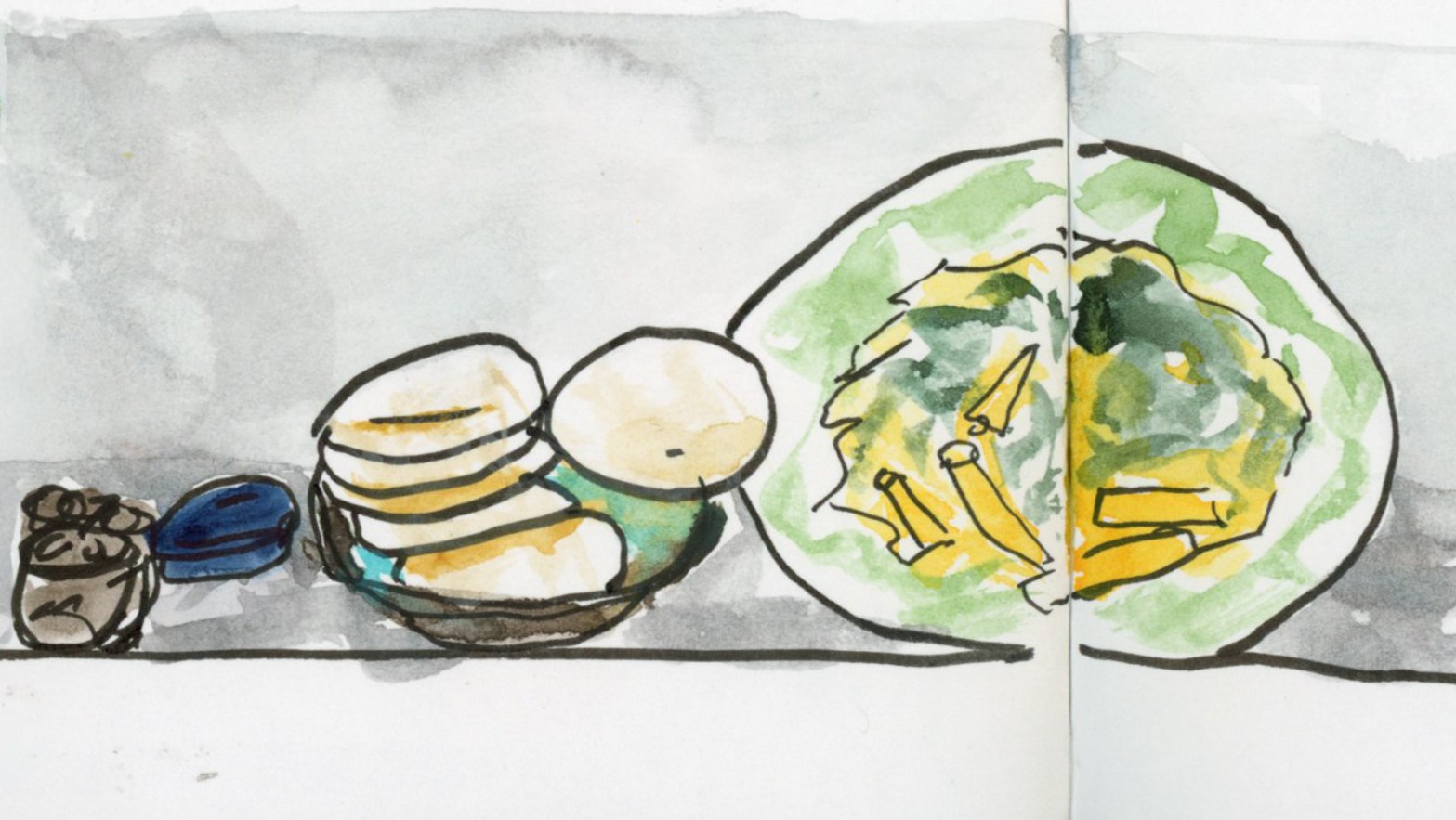
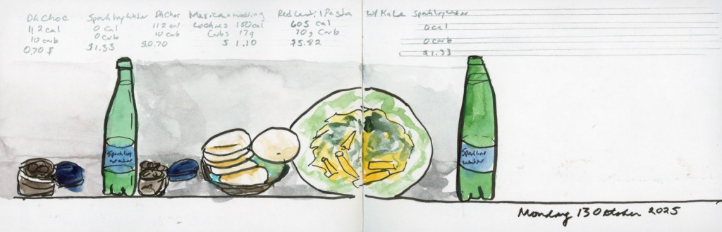
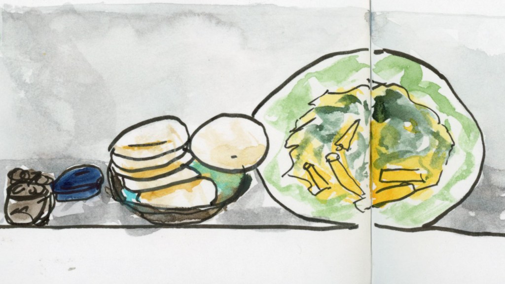
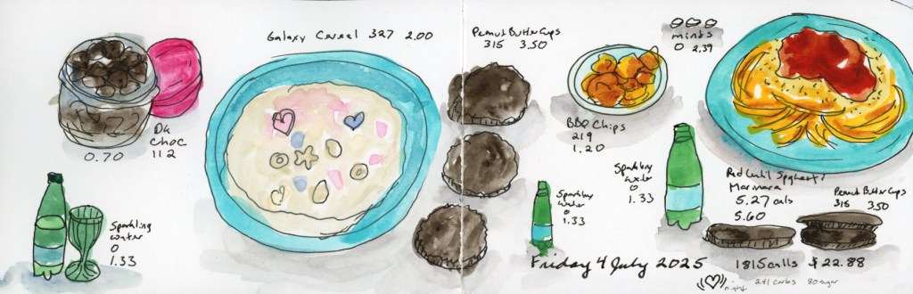
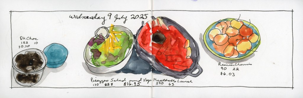
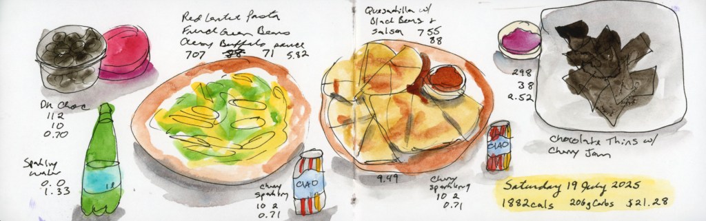
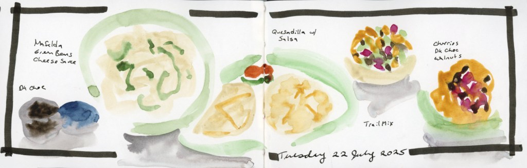
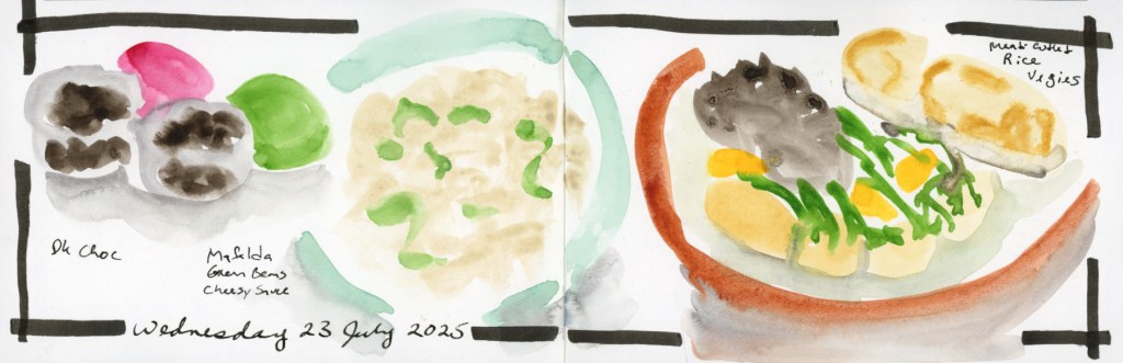
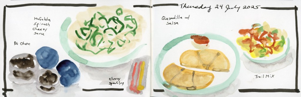
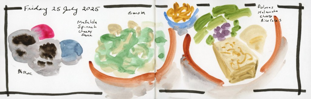
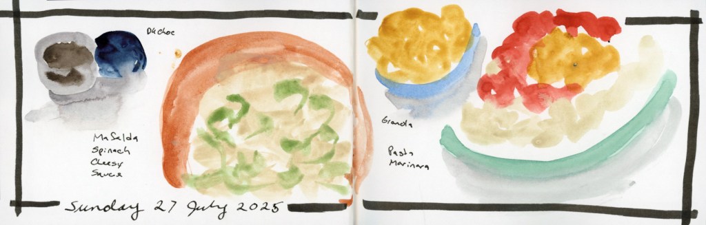
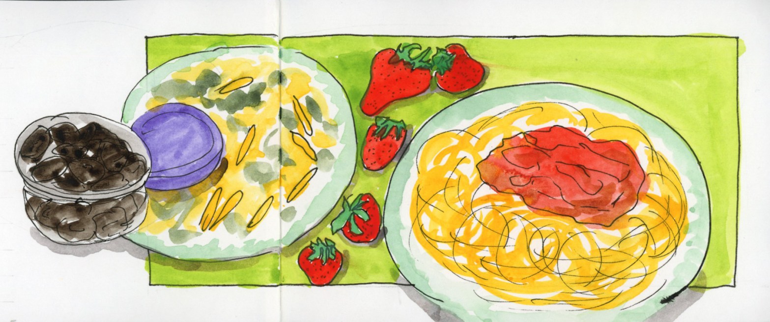
The baseline layout — everything lined up along a common ground line — gives a page a clean, almost theatrical feel, like the food is on a little stage. The variety of shapes along that line (round bowls, wedges of quesadilla, tall bottles) creates a natural rhythm without any extra effort.

Illustrated food diary page for Monday 7 July 2025 with all food items lined up along a common baseline, including dark chocolate, red lentil pasta, watermelon, quesadillas, and sparkling water, annotated with calories and costs.
Monday 7 July — Food Sketch page with baseline layout.

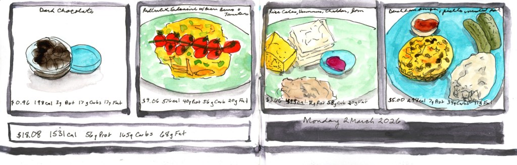
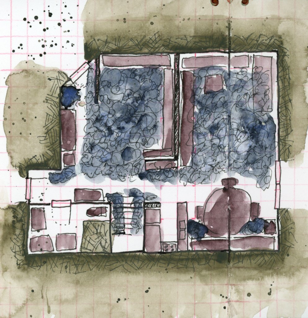
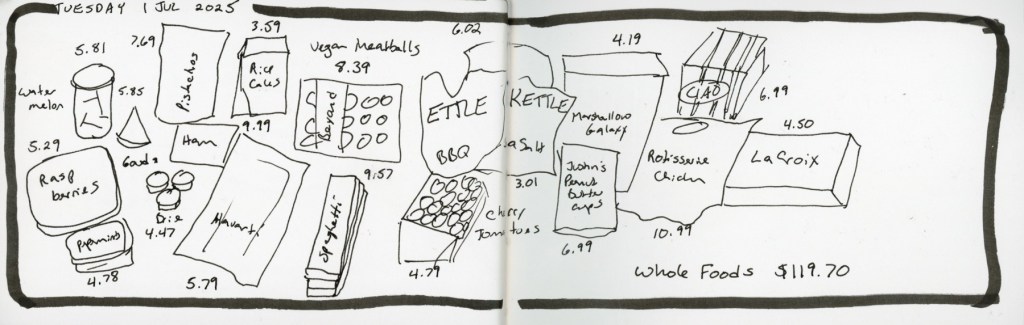
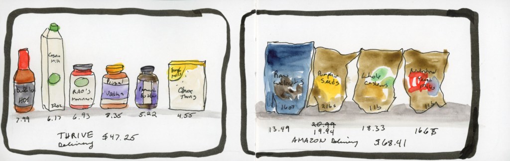
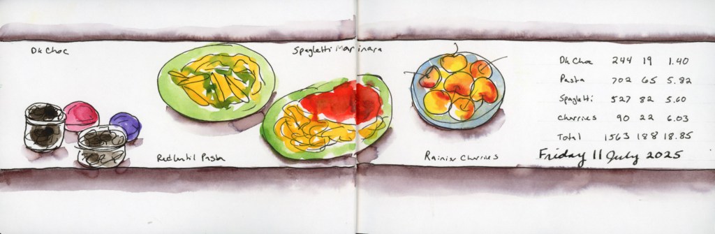
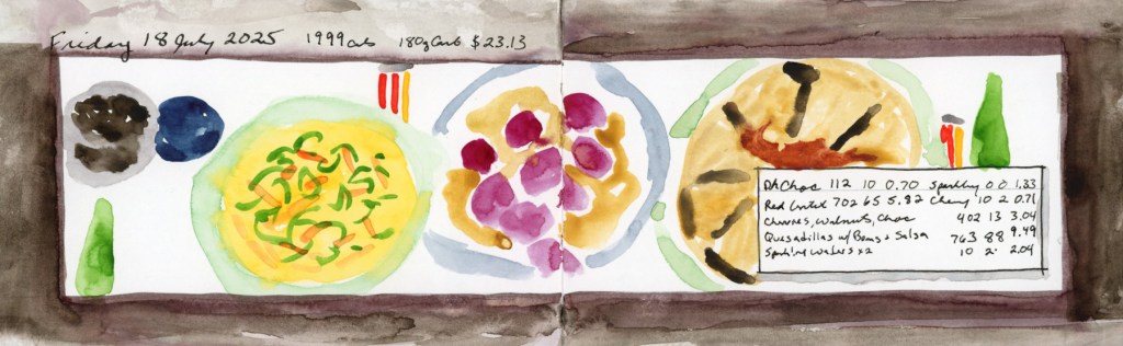
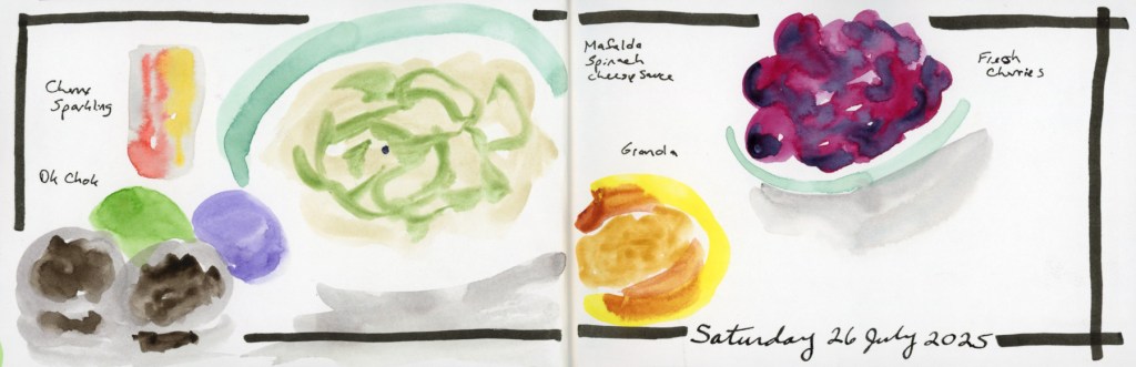
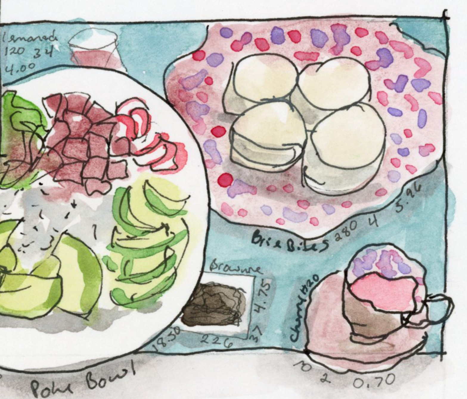
Column dividers are great when you have a lot of items and want to create clear sections without things feeling cluttered. Vertical bands separate the day into distinct moments, and it ends up reading almost like a magazine layout.

Illustrated food diary page for Saturday 12 July 2025 using green vertical column dividers to separate meals, with watercolour sketches of dark chocolate, red lentil pasta pizza, cherries, and a Greek-style mezze plate
Saturday 12 July — Food Sketch page with column dividers.

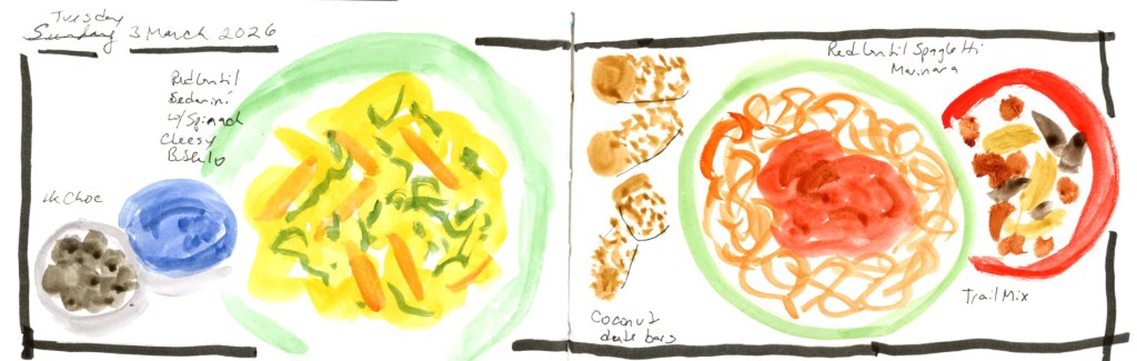
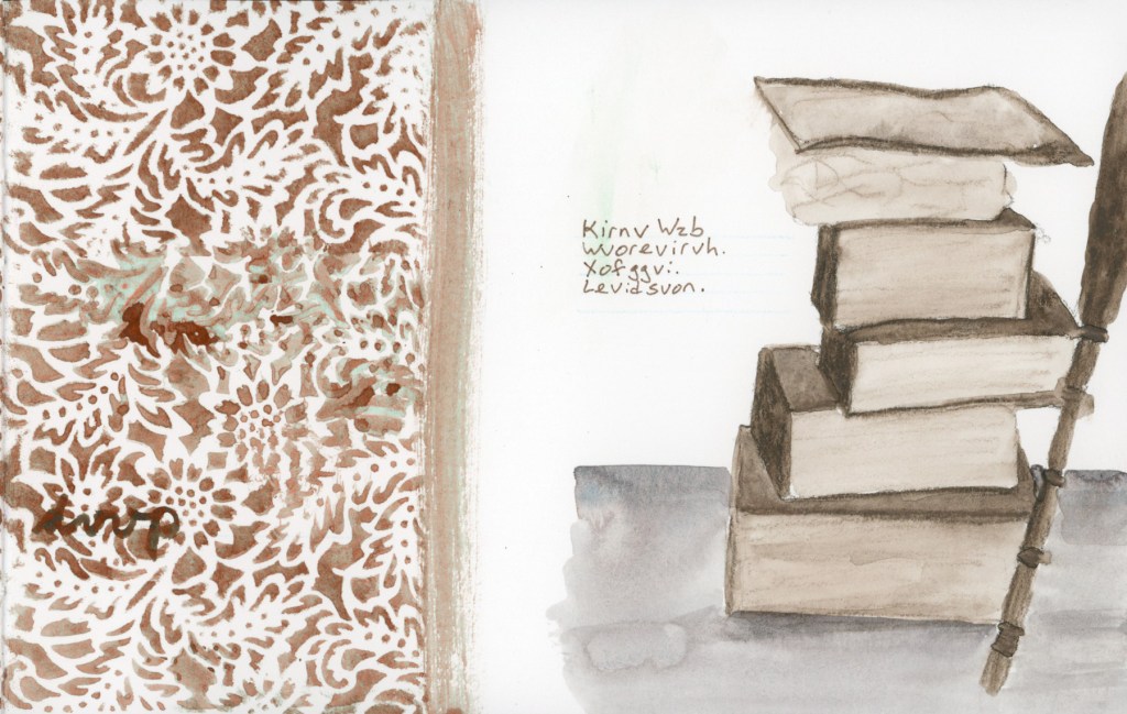
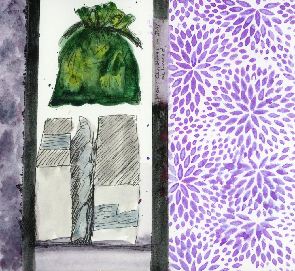
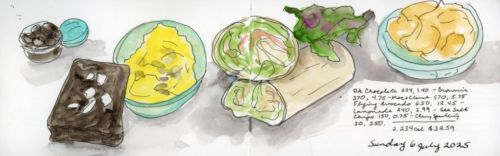
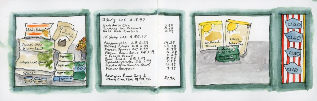
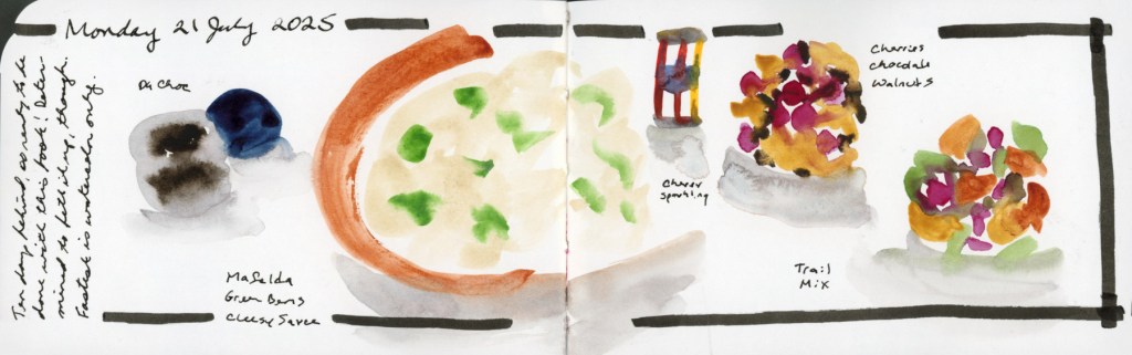
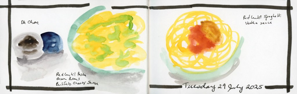
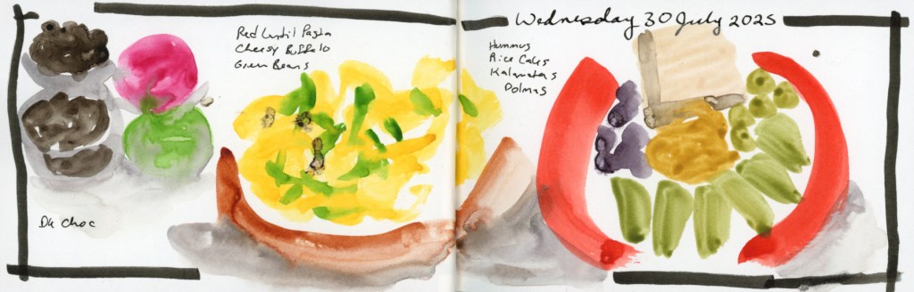
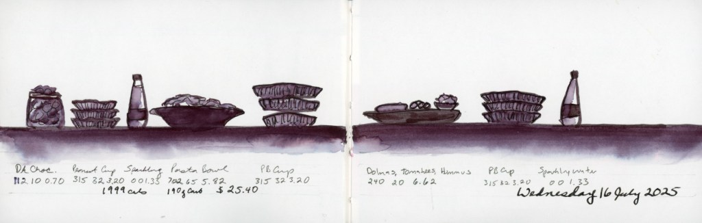
And then there’s direct watercolour with a simple frame — no planning, just paint. This is what I reach for on a busy day, or when I’m catching up after falling behind. It’s the fastest approach, and even a simple frame lifts a page considerably. That Wednesday the 16th spread — done entirely in one deep plum — is a good reminder that design doesn’t have to mean colour variety. Monochrome with a strong layout is its own kind of striking.

Illustrated food diary page for Wednesday 16 July 2025 entirely in deep plum monochrome watercolor marker, showing a full day of meals arranged along a baseline across a two-page spread.
Wednesday 16 July — Food Sketch Page in Watercolor Marker, monochrome.

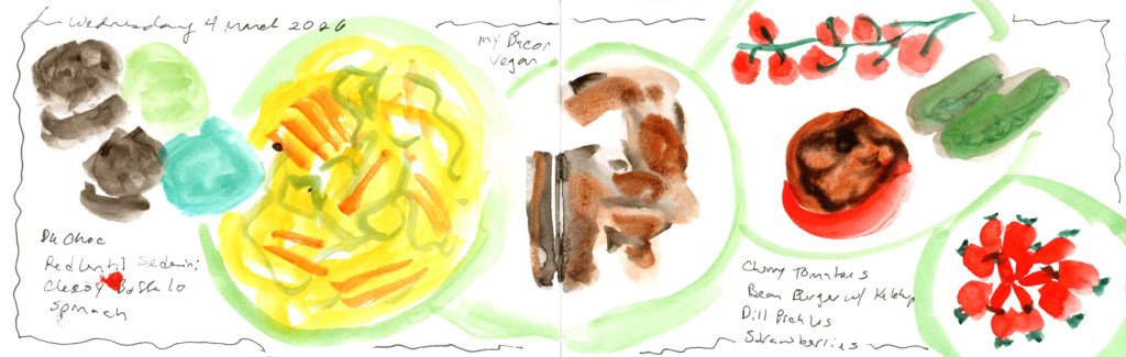
Here are a couple of recent examples from the current volume. Wednesday 4 March is a good fast-day page — loose, direct, just a simple wavy frame holding everything together.

Loose watercolor food sketch on a double page spread, Wednesday 4 March 2026. On the left page, dark mushroom shapes and a teal oval sit beside a large yellow pasta bowl rendered in fluid, gestural brushwork. On the right, a loosely painted brown shape sits centrally, with scattered sketches of cherry tomatoes on the vine, green cucumbers, a bean burger with ketchup, a bowl of strawberries, and more strawberries rendered in bright red. Handwritten food labels throughout.
Wednesday 4 March 2026 — Food sketch page in direct watercolour, simple frame

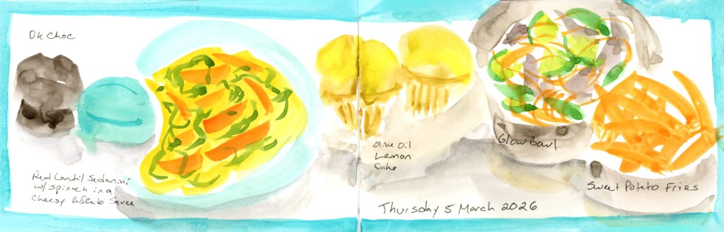
Thursday 5 March captures a dining out day — the teal colour block gives it just enough structure to feel intentional, and it nicely documents that mix of restaurant and home food in one spread.

Watercolor food sketch on a double page spread, Thursday 5 March 2026, with a bright turquoise border wash across both pages. On the left, a dark chocolate piece and a blue oval sit beside a yellow pasta bowl on a turquoise plate. On the right, two golden olive oil lemon cakes sit beside a grey bowl with a colorful glow bowl of vegetables and a plate of bright orange sweet potato fries. Food names are handwritten on both pages.
Thursday 5 March 2026 — Food Sketch page with teal frame including a dining out dinner.

The wireframe sketches aren’t precious — they’re just a menu I made for myself, so that when I sit down with the book I’m not starting from zero. I can glance at them and think colour block day or baseline day and just get on with it. Variety of layouts keeps it interesting for me, and on days when I just can’t, a simple frame and loose direct watercolour is still a page worth keeping.

If you want the full backstory on how I first approached page design recipes for this sketchbook size, I wrote about it back in Food Sketches Week 27.

You can see all posts of this food sketchbook volume 24 here

End of a Series (and a lot of Red Lentil Pasta)

The End of a Series (and a Lot of Red Lentil Pasta)

It’s March, and I’m sketching food again. If you’ve been following along, you might notice that February and March seem to have a strange gravitational pull for sketching food! My first food sketchbook started 1 February 2020, my second picked up again 1 February 2021, and here I am in 2026, wrapping up my fifth. I genuinely did not plan that.

This post covers March 1–8, the final eight days in this little sketchbook — Volume 24 overall, Food Sketchbook No. 5. It’s a 3.5×5.5 inch Stillman & Birn Epsilon, softcover, 150gsm smooth white paper. I’ve used a few different Stillman & Birn papers across the five food sketchbooks, and this one has been a pleasant surprise — it handles ink beautifully, and the watercolor behaves better than you’d expect from a smooth paper. It allows for harder, crisper marks, which suits food sketching well.

Watercolor and ink food sketch on a double page spread, Sunday 1 March 2026. Plates of food are arranged along a bold dark horizontal band across both pages, including a green plate of yellow pasta with orange and green vegetables, a small dark bowl, a purple shape, and a large oval plate with colorful vegetables. Handwritten notes on the left list foods, prices, and nutrition data.
Watercolor and ink food sketch on a double page spread, Monday 2 March 2026. Four individual food portraits are arranged in a grid of framed panels across the top of both pages, showing dark chocolate, a green plate of red lentil pasta with roasted tomatoes, a plate of rice cakes with cheese and jam, and a blue plate with a bean burger and pickles. A framed panel at the bottom left shows the daily total cost and nutrition data.

These eight pages are a bit of a mixed bag stylistically, and I’ll be honest about why: I got behind and had to catch up. Six of the eight are loose, direct watercolor without nutritional data, because that’s simply much faster to do. The two more structured pages — the panoramic spread on Sunday March 1st, and the grid of four individual food portraits on Monday the 2nd — are closer to what I’d do if I had unlimited time. The Monday page even has the full daily cost and nutrition totals at the bottom, which is the whole point of the exercise, really.

One ounce of dark chocolate chips is a must to start the day, of course. I do have a shocking amount of the red lentil sedanini every week, month, year. What can I say, it’s easier on the glucose hits, and carries a nut cheese sauce well. Food allergies, so I’m gluten free and vegan as much as possible. And let’s face it, scanning through sketches is far easier when finding a culprit!

Watercolor and ink food sketch on a double page spread, Tuesday 3 March 2026, with a corrected date visible. A large bordered rectangle frames both pages. On the left, a small dark bowl of chocolate and a blue circle sit beside a large yellow pasta bowl on a green plate. On the right, small sketches of coconut date bars sit beside two more green plates — one with red lentil spaghetti marinara and one with trail mix. Food labels are handwritten throughout.
Loose watercolor food sketch on a double page spread, Wednesday 4 March 2026. On the left page, dark chocolate shapes and a teal oval sit beside a large yellow pasta bowl rendered in fluid, gestural brushwork. On the right, a loosely painted My Bacon sits centrally, with scattered sketches of cherry tomatoes on the vine, green cucumbers, a bean burger with ketchup, a bowl of strawberries, and more strawberries rendered in bright red. Handwritten food labels throughout.
Watercolor food sketch on a double page spread, Thursday 5 March 2026, with a bright turquoise border wash across both pages. On the left, a dark chocolate piece and a blue oval sit beside a yellow pasta bowl on a turquoise plate. On the right, two golden olive oil lemon cakes sit beside a grey bowl with a colorful glow bowl of vegetables and a plate of bright orange sweet potato fries. Food names are handwritten on both pages.

The highlight of the week was Thursday, when I ate out at Flower Child with a friend who was heading off on vacation. The olive oil lemon cake on that page was hers — I did not eat two desserts, though I won’t say the thought didn’t cross my mind. The glow bowl and sweet potato fries were very good.

Watercolor and ink food sketch on a double page spread, Friday 6 March 2026, with a soft purple border wash. On the left page, dark chocolate pieces and blue-purple ovals sit beside a bold yellow and orange pasta bowl. On the right, a striking cluster of deep red cherry tomatoes on the vine dominates the center, with a plate of loosely painted orange red lentil spaghetti marinara beside it. Food names are handwritten below each item.
Watercolor and ink food sketch on a double page spread, Saturday 7 March 2026, with a blue border. A row of food items stretches across both pages: dark chocolate and a navy oval on the far left, followed by a green bowl of yellow pasta, a red-rimmed bowl of trail mix, a small dark bowl of chocolate, a sketch of tomatoes on the vine with strips of vegan bacon, and a red-rimmed plate with a bean burger and dill pickles. Food labels are handwritten above each item, with the date written at the bottom left.

Saturday brought a treat of a different kind: I’ve recently discovered My Bacon, a vegan bacon made from mycelium (soy-free, wheat-free, and genuinely delicious), and it shows up twice this week. Highly recommend if you’re navigating similar dietary constraints.

Watercolor food sketch on a double page spread, Sunday 8 March 2026, with a soft grey-purple border wash. On the left, dark chocolate pieces and a blue oval sit beside a large yellow-green pasta bowl. In the center, a small red-rimmed bowl holds a colorful trail mix. On the right, a pale grey bowl of red lentil spaghetti in a cheesy lemon sauce sits beside bright orange wedges of fresh orange. Food names are handwritten throughout.

And then Sunday the 8th, and that’s it. The book is full.

This is the fifth time I’ve filled one of these little landscape books with food, and I have no plans to stop — I’ll just be doing it within my regular daily sketchbook from here on, rather than in a dedicated volume. There will be one more post from this sketchbook: the wireframe page design diagrams I used to plan these layouts, which feels like a fitting way to close it out properly.

If you want to browse the whole food sketching journey, here are the starting points:

February Wrap-Up: Cupcakes and Color Swatches

Spring is bringing better energy! Despite a challenging start to the year, I’m thrilled to announce I’ve officially wrapped up my Watercolor course. This month was all about marking moments—from Valentine’s cupcakes to the early blooms in my weed-filled (but vibrant!) backyard.

Watercolor Course Completed!

I’ve continued working through my Watercolor course, and I finally crossed the finish line! Honestly, completing this despite such a difficult couple of months feels like a huge win.

A completed sketchbook page featuring watercolor exercises from Lesson Four, including the cupcake sketch and backyard study integrated with handwritten notes.

To celebrate, I painted these Valentine cupcakes from a photo I found online. It was a fun way to mark the holiday and just play with color (Quin Rose and Pyroll Scarlet.)

A cheerful watercolor sketch of four cupcakes with pink frosting and small heart-shaped sprinkles, painted from a reference photo to celebrate Valentine’s Day.

Record-Breaking Heat & Overgrown Weeds

My yard has officially been taken over by weeds this year! We are experiencing record-breaking temperatures, so everything bloomed a full month earlier than usual. It’s a bit chaotic out there, but it makes for interesting sketching.

A loose watercolor sketch of a backyard featuring a vibrant pink blooming bougainvillea bush in Quinacridone Rose. The scene includes overgrown weeds, a leafless pomegranate bush, and a couple of broken-down planters, capturing the early spring growth.

Paint Experiments and Palettes

I spent some time diving into the technical side of things this month. I wanted to see the true differences between Naples Yellow Reddish from Schmincke and Roman Szmal, as well as The Tint (Roman Szmal). They look so similar at first glance!

A double-page sketchbook spread. The left page features technical watercolor swatches of Naples Yellow Reddish (Schmincke vs. Roman Szmal) and The Tint. The right page displays an 8-color palette of Gansai Tambi paints in muted, dusty purple and violet shades, including a shimmering Opal Violet.

I also swatched a cute little 8-color palette of Gansai Tambi paints that I’d intended to use for February. Even though I only managed this one swatch page, these muted, dusty shades are so inspiring. The palette includes: Purple (37), Mauve Taupe (303), Opal Violet (638), Graphite Violet (261), Alizarin Crimson (304), Lilac (13), Cobalt Violet (139), and Old Mauve (301). That Opal Violet adds just the right hint of shine!

An 8-color palette of Gansai Tambi paints in muted, dusty purple and violet shades, including a shimmering Opal Violet.

For the color blocks over my notes, I also played with a gorgeous gradient between the two Naples Yellows Reddish. But the real star? Roman Szmal Lava. That shading and granulation are just incredible—what a fun, moody color to work with! 

A sketchbook page featuring a color-blocked text areas, one  painted with Roman Szmal and Schmncke Naples Yellow Reddish, and one with Roman Szmal Lava watercolor, showcasing its unique heavy granulation and earthy shading

The Return of Food Sketches

With my health still being a bit troublesome, I’ve decided to restart my food sketching habit. I’ve picked up my 3.5×5.5 Epsilon landscape book from last summer. I’m diving back in and focusing on making the page designs more visually interesting this time around.

A pocket sketchbook spread in an Epsilon landscape book featuring grocery costs.
A pocket sketchbook spread in an Epsilon landscape book featuring ink and watercolor sketches of daily meals, including handwritten nutritional data and grocery costs.

Looking Ahead

What’s next? The “Edges” course from Sketching Now starts next week! I’ve never made it past lesson one before, but I’m joining the group run this time to stay motivated. My skills feel a little rusty after the last few months, but I’m ready to get back into the flow.

Reviewing 2025

They say a year in review should be a highlight reel—a collection of my best sketches, crispest lines, and most vibrant colors. But when I look back at my stacks of sketchbooks from the last twelve months, I don’t see a gallery of masterpieces.

I see a graveyard of the unfinished.

I see where life went sideways and I simply stopped. I see half-finished classes left and never touched again. I see “failed” sketches where my lines just wouldn’t click. For a while, this felt like a lack of discipline. I felt like I was falling behind.

But as I sit down to write this, I realize something important: You can’t have a “failed” sketch unless you actually sat down to draw. Every incomplete page is proof that I showed up. Every “bad” drawing was a risk I was brave enough to take. This year wasn’t about the finish line; it was about the messy, frustrating, and ultimately beautiful process of staying in the game. Even when there were long gaps where all I did was write down the date and the weather.

Today, I’m celebrating the journey. Let’s look back at my year of incompletes—and why they might be the most important things I’ve ever drawn. I showed up anyway, in a year where life rather kicked my ass with illness, accidents, and a major death in the family. So many losses, so maybe not finishing most of the classes I started, isn’t such a bad thing. Maybe it isn’t failure at all.

The year started strong for me, I was feeling good and actually accomplishing the lessons in Sketching Now Foundations

I had a lot of fun with 100 People One Week and successfully achieved that. 

I was ready to go strong and do Sketching Now Travel Sketching during my family trip to Mund’s Park, but this is when things began to go awry. I did however, do some travel sketches even if I didn’t manage to participate in the class itself. Admittedly most of these sketches I did once I got home. 

The summer was a mix of color palettes, a few attempts at sketches, amid the missed days. 

Autumn fell completely apart. I had hoped to sketch buildings during my family vacation, and thusly sketch during my trip and do the Sketching Now Buildings course, but devastating disaster struck.

Coping with grief as well as recovering my own health issues, brought me to December with grand ideas for a December Daily. I did sample my Diamine Inkvent, and I did do a lot of collage in my sketchbook.

Stillman and Birn Sketchbooks

I set out this year to test each type of paper in the Stillman and Birn sketchbook line, and I did accomplish all but the Nova. Final verdict, Alpha remains my favorite. I did like the ivory colored papers more than I expected to, however. I liked the Delta paper the least, as I found it seemed to pill under water, which was not desirable for me. The smoother papers, Epsilon and Zeta were also nice. Better for ink work, than watercolor. Beta was fine, but with heavy paper, I expected smoother washes, so Alpha remains top for me with my preferred ink and watercolor. I still have to test the Nova range, with the tinted papers, and I’m looking forward to that in the future. I stuck with the 5.5×8.5 inch landscape, and as the year closes, I’ll admit, I’m really jonesing for a bigger page and for a portrait layout!

Improvements

I admit, I’m hard on myself, and I never see my own improvements until years later when I look back. I do feel I learned a lot this year about how paper affects results, and about the various materials and palettes and did color swatches with. I worked with Inktense a bit, and I sampled a lot of different paints. I would have liked to see more improvement with my drawing skills, but I also did not draw that much, when it comes down to it.

I did complete eight sketchbooks this year! Two of them were begun in 2024, and several of them were thicker paper, so only a few pages at 26 sheets.

  • Vol 17 – Travel Sketching for 2024, then Watercolor Pencil Magic, then in January 2025 I picked it up for my daily sketchbook and  Foundations. 
  • Vol 18 – Everyday sketchbook for Autumn 2024 – Mid-January 2025. Sketchbook Design. Inks. 
  • Vol 19 – Gamma. Mid-February 2025 to early April 2025. Foundations. Color studies.
  • Vol 20 – Delta. April to June 2025. 
  • Vol 21 – Food
  • Vol 22 – Beta. June to July 2026
  • Vol 23 – Food (Page Design)
  • Vol 24 – Zeta. August to December 2025. 

TAKEAWAY

My chief takeaway might be to simply return to the page. Regardless of how it feels, or however long it has been with nothing, just return to the page. Do some color tests, or play with ink. I found peace in those moments, when it seemed there was little peace to be had personally, or in the world. You can learn a lot about art and your tools and your mediums just from color swatches. Return to the page and you’ve showed up, you are continuing the journey. This is about progress not perfection. A few years from now, I will see the progress, and the memory of the pain and the struggle will have faded. But I will be very glad I showed up to the page, even just to mark the date.

GOALS FOR 2026

  1. I’d like a bit more consistency. I always aim to finish the classes I start, but maybe I can also find ways to give myself permission to sketch small things, just to keep the practice in. 
  2. Document the everyday. This is always my chief objective. Document life as it really happens. Sketch the everyday moments, or objects, or even abstractly capture the feelings in color. 
  3. Share and participate a bit more in the online communities and classes I’m part of. Share more here in my blog as well as touch base with what I am learning as I go along. 

CONCLUSION

In a nutshell, I did more than I think I did this year! I struggled to keep sketching when life hit hard, but I am glad I sketched, and painted, and experimented.

Illustrated Food Diary Week 28

The ink and watercolor drawing style definitely takes more time that looser and sketchier styles. However, I am enjoying focusing on the principles of design for these. Applying page design, and the various elements, to the same daily subject definitely helps see what these elements can do for design purposes.

I am continuing my way through the various options on the design page sampler I posted last week. The variety is very interesting, and I really like these pages. Each of these took between 30 to 60 minutes each.

Food Sketches Week 27

I finished volume 21 and decided I’d continue to sketch the food. To go along with the Sketching Now group run of Sketchbook Design I plan to focus on improving my page designs to make the pages more interesting.

When I took the Sketchbook Design course in January of 2022, I had collected a number of “recipes” for this size sketchbook, specifically with the intent of using for food sketches. These were drawn from Liz’s food diary pages, which was my original inspiration for how I wanted to keep an illustrated food diary.