February Wrap-Up: Cupcakes and Color Swatches

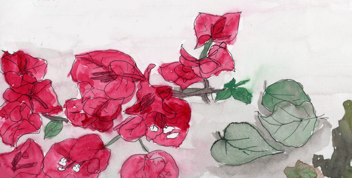
Spring is bringing better energy! Despite a challenging start to the year, I’m thrilled to announce I’ve officially wrapped up my Watercolor course. This month was all about marking moments—from Valentine’s cupcakes to the early blooms in my weed-filled (but vibrant!) backyard.

Watercolor Course Completed!

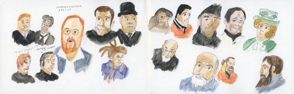
I’ve continued working through my Watercolor course, and I finally crossed the finish line! Honestly, completing this despite such a difficult couple of months feels like a huge win.

A completed sketchbook page featuring watercolor exercises from Lesson Four, including the cupcake sketch and backyard study integrated with handwritten notes.

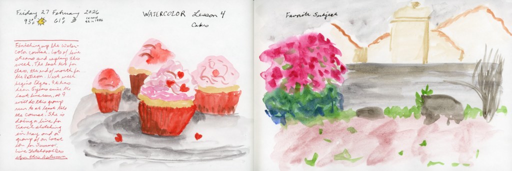
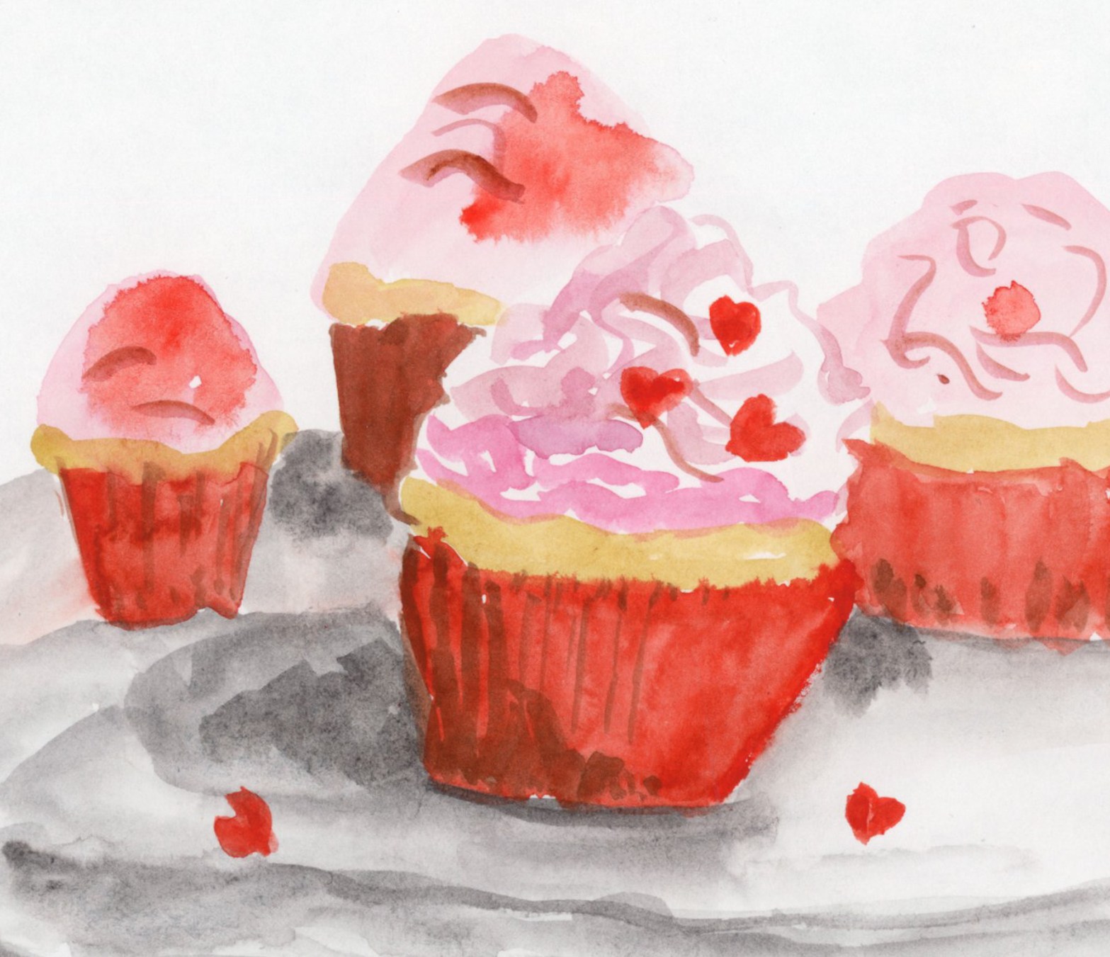
To celebrate, I painted these Valentine cupcakes from a photo I found online. It was a fun way to mark the holiday and just play with color (Quin Rose and Pyroll Scarlet.)

A cheerful watercolor sketch of four cupcakes with pink frosting and small heart-shaped sprinkles, painted from a reference photo to celebrate Valentine’s Day.

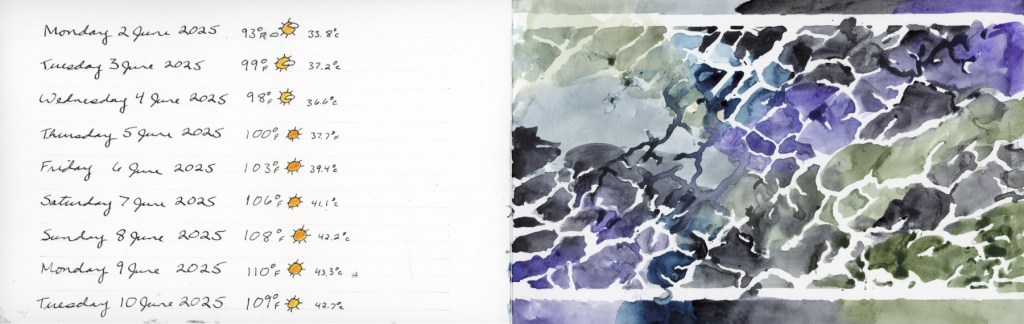
Record-Breaking Heat & Overgrown Weeds

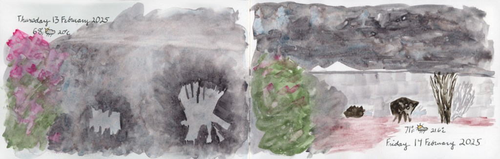
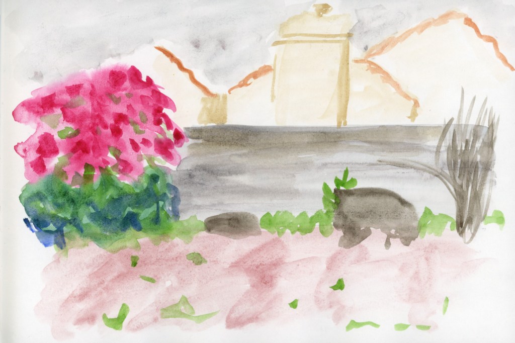
My yard has officially been taken over by weeds this year! We are experiencing record-breaking temperatures, so everything bloomed a full month earlier than usual. It’s a bit chaotic out there, but it makes for interesting sketching.

A loose watercolor sketch of a backyard featuring a vibrant pink blooming bougainvillea bush in Quinacridone Rose. The scene includes overgrown weeds, a leafless pomegranate bush, and a couple of broken-down planters, capturing the early spring growth.

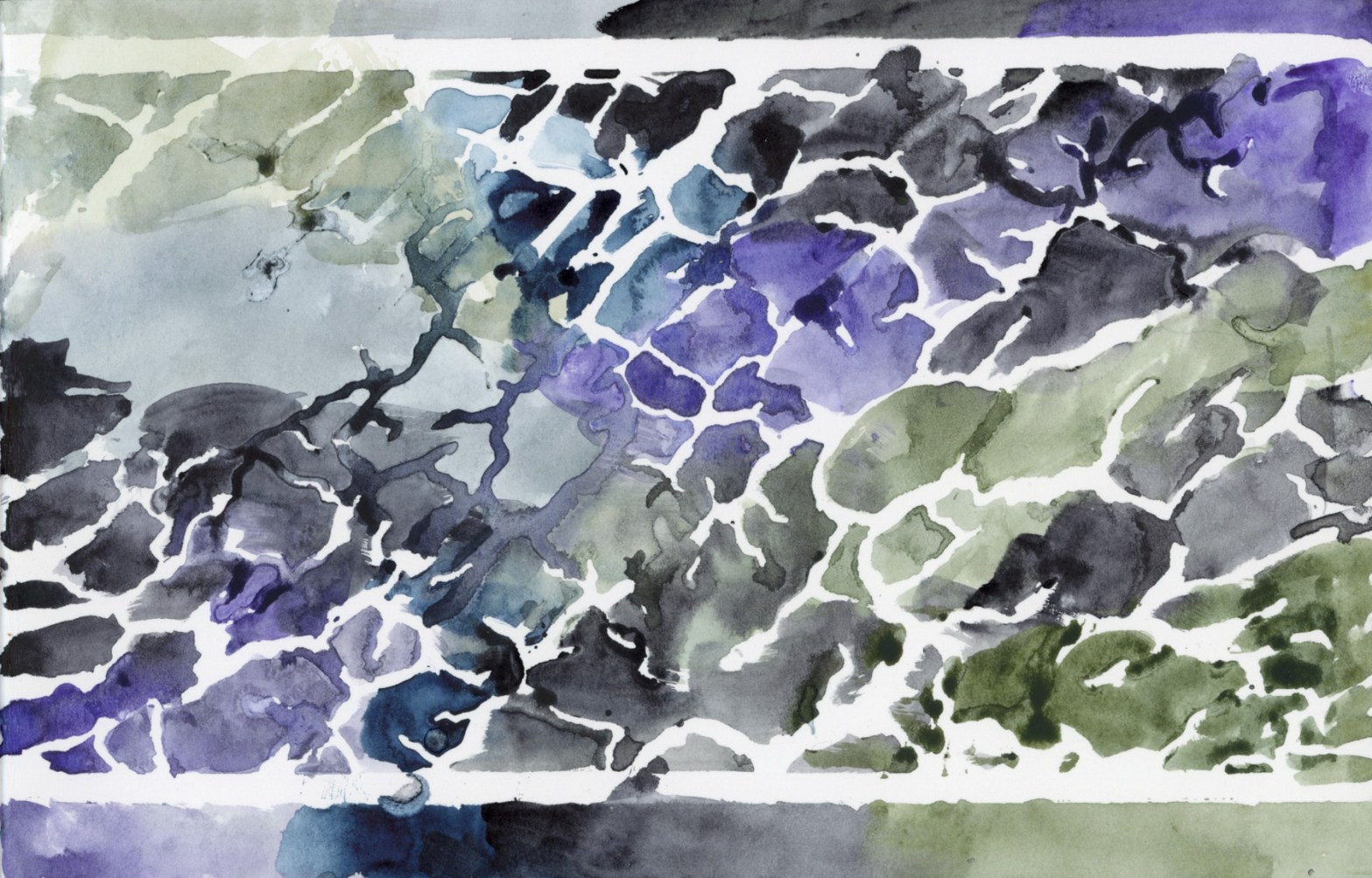
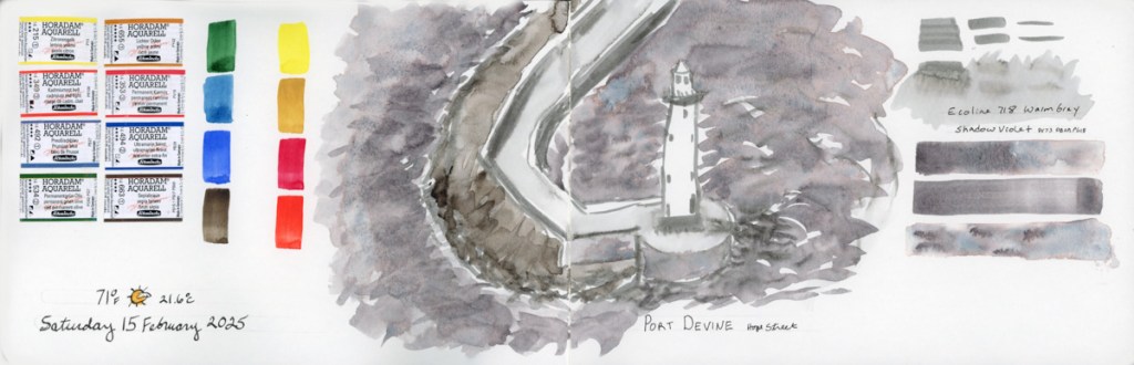
Paint Experiments and Palettes

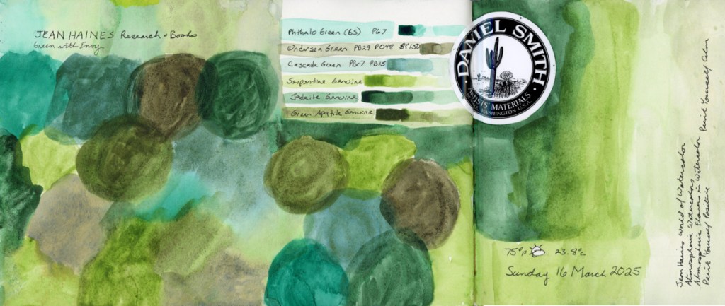
I spent some time diving into the technical side of things this month. I wanted to see the true differences between Naples Yellow Reddish from Schmincke and Roman Szmal, as well as The Tint (Roman Szmal). They look so similar at first glance!

A double-page sketchbook spread. The left page features technical watercolor swatches of Naples Yellow Reddish (Schmincke vs. Roman Szmal) and The Tint. The right page displays an 8-color palette of Gansai Tambi paints in muted, dusty purple and violet shades, including a shimmering Opal Violet.

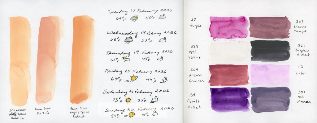
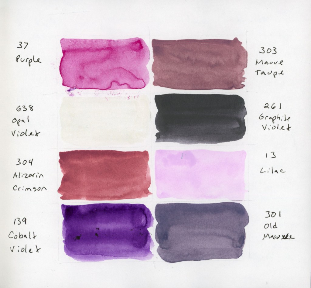
I also swatched a cute little 8-color palette of Gansai Tambi paints that I’d intended to use for February. Even though I only managed this one swatch page, these muted, dusty shades are so inspiring. The palette includes: Purple (37), Mauve Taupe (303), Opal Violet (638), Graphite Violet (261), Alizarin Crimson (304), Lilac (13), Cobalt Violet (139), and Old Mauve (301). That Opal Violet adds just the right hint of shine!

An 8-color palette of Gansai Tambi paints in muted, dusty purple and violet shades, including a shimmering Opal Violet.

For the color blocks over my notes, I also played with a gorgeous gradient between the two Naples Yellows Reddish. But the real star? Roman Szmal Lava. That shading and granulation are just incredible—what a fun, moody color to work with! 

A sketchbook page featuring a color-blocked text areas, one  painted with Roman Szmal and Schmncke Naples Yellow Reddish, and one with Roman Szmal Lava watercolor, showcasing its unique heavy granulation and earthy shading

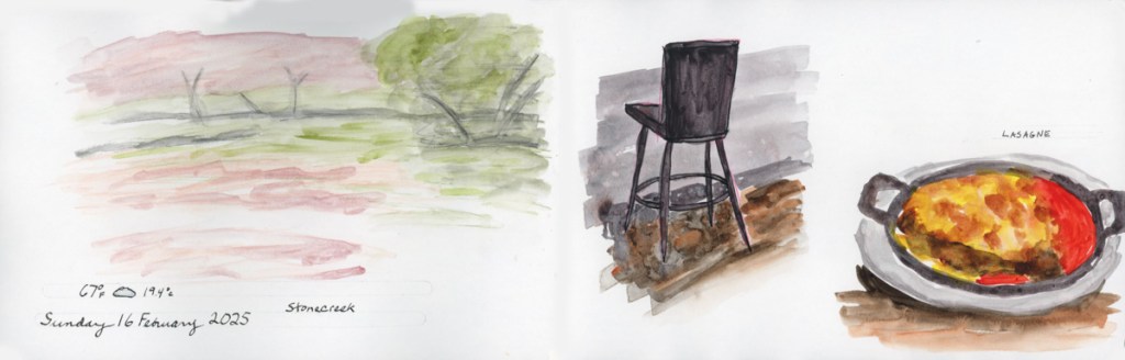
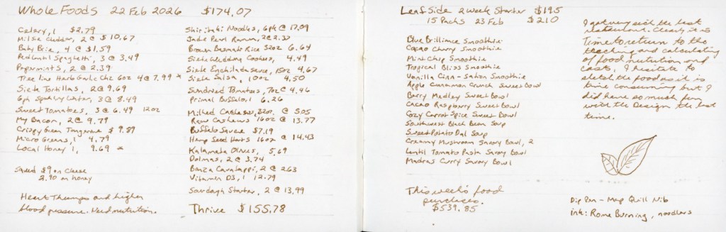
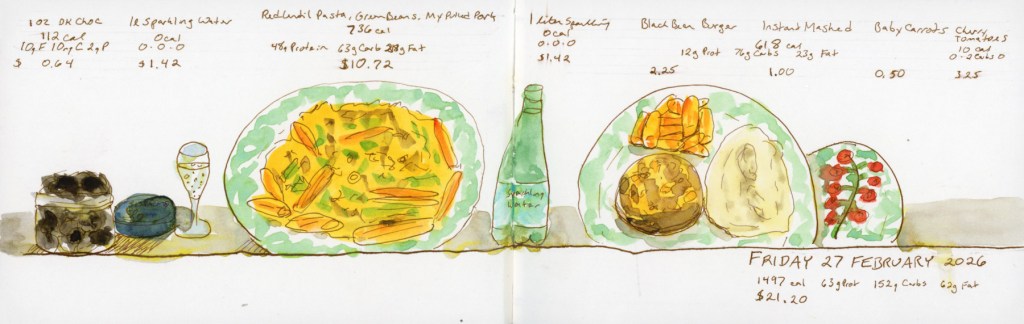
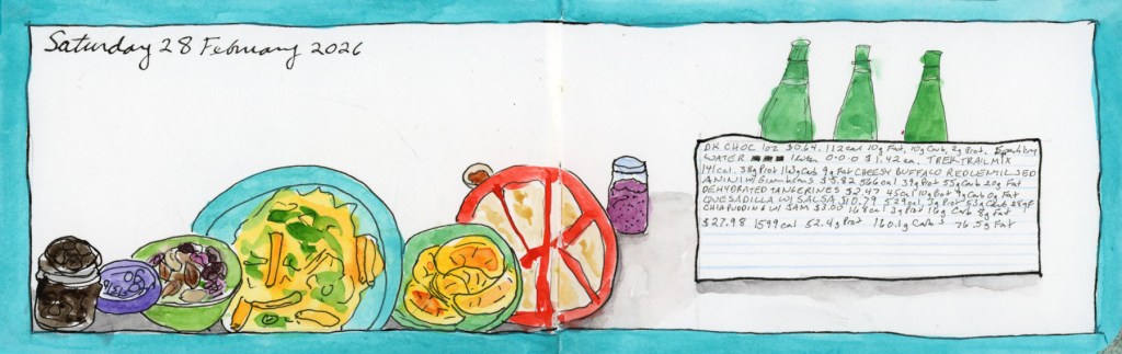
The Return of Food Sketches

With my health still being a bit troublesome, I’ve decided to restart my food sketching habit. I’ve picked up my 3.5×5.5 Epsilon landscape book from last summer. I’m diving back in and focusing on making the page designs more visually interesting this time around.

A pocket sketchbook spread in an Epsilon landscape book featuring grocery costs.
A pocket sketchbook spread in an Epsilon landscape book featuring ink and watercolor sketches of daily meals, including handwritten nutritional data and grocery costs.

Looking Ahead

What’s next? The “Edges” course from Sketching Now starts next week! I’ve never made it past lesson one before, but I’m joining the group run this time to stay motivated. My skills feel a little rusty after the last few months, but I’m ready to get back into the flow.

Everyday Sketching Week 23

The start of the Stillman and Birn Beta softcover, 8.5 x 5.5 inch sketchbook. I have used this paper before, but it has been a while. Already I notice it doesn’t have the same problem when it gets extra wet that the Delta had, so I’m glad about that.

I begin my sketchbook with my palette or other tools, and I thought this time I’d document my regular watercolor palette, especially as I’m thinking of a lot of color changes to this. There are a number of colors I’m not using. I put this together as a combination of Jane Blundell’s Ultimate Mixing palette, and the color recommendations for a watercolor course I was enrolled in. I never completed that course, now that I think about it. Hmmm. Nevertheless, this is my palette. The only color I use frequently that is not in this palette is Quin Gold.

The new Gansai Tambi Granulating 2 color set arrived and I had to test these colors immediately! Some really beautiful separation is happening in some of these.

A week went by without any sketching, and to get the mojo flowing again, I reached for the stencils. Using watercolor with the stencils is really fun. They bleed and warp, but the color blends I can achieve, and the abstract feel of them suits the days they are representing.

This week’s full page spreads:

Everyday Sketching 2025 Week 11

A very experimental week.

I first tried doing a Nature Journaling style of page inspired by a You Tuber named My Nature Diaries. I love her work. I had even cut a fresh branch off the Bougainvillea before I pruned it, for sketching from a live specimen. Plants are hard! I love the layout of the page. I used the Schmincke Retro Palette, but I feel the greens really dried super flat. That cochineal red is gorgeous by itself, but doesn’t not seem to hold its vibrance when mixed. I missed using Quin Rose for this.

So I used Quin Rose for the pajamas and door sketch, and proved the vibrancy does hold up better when mixing. The color swatches was the paint left over in my palette from the Nature Journal page, and indeed have that muted, dull look, which is why I sketched a line drawing over it.

A color chart of the Art Nouveau Gansai Tambi palette. Instead of squares I was attempting merging the organic rounds, but my paper dried far too fast for any bleeds. So I did a second one attempting to add water. I did not get the results I thought I would, which definitely makes this a learning experience. I don’t hate how responsive Gansai Tambi is to water drops, actually. Then I did a second attempt at the sort of soft colors, and blended background I had tried in the Nature Journal page. Much better.

I also did a color chart, still attempting the organic circles, of the Green With Envy palette that Jean Haines did with Daniel Smith. Love, love, love these greens!

Pen tests, and Foundations exercises, and then another walk at Stonecreek. The Stonecreek page is an exploration of media. I used the Albrect Durer watercolor pencils for the birds, but then got curious how the Inktense would look next to it, so I extended the background using the Inktense. Then I decided to paint my usual Stonecreek Pond in Gansai Tambi. Love what the water effects did in the pond water. I did this at home, from a photo, as the Gansai Tambi are not easily transportable.

There were many turtle sightings in the pond on this particular spring day, so I had to document that with their little heads in the waters.

One Week 100 People 2025

I did it! I sketched 100 people in one week! I sketched mostly from television, mostly Murdoch Mysteries (costumes are fun to draw!) I used a variety of media and enjoyed the exploration. The first page took me 3 hours to complete, the Pitt Pastel Sanguine page, took 1 hour. The rest fell somewhere in the middle.

100 People One Week — 2025

I did it! I sketched 100 people in one week!

Well — one week spread across a few sessions, with a lot of good television keeping me company. This was my most experimental year yet, and I loved every messy, discovery-filled minute of it.

I sketched mostly from television — mostly Murdoch Mysteries, because the costumes are just so fun to draw — but also The Curse of Oak Island, and a show called Unexplained and Unexplored, which turned out to be surprisingly good drawing material. Lots of interesting faces.

A composite image showing all the sketchbook pages from the 2025 One Week 100 People challenge, arranged in a grid. The pages show a variety of media and styles including watercolor, sanguine pastel, fineliner pen, and mixed media, with faces drawn from Murdoch Mysteries, The Curse of Oak Island, and Unexplained and Unexplored.

The Materials

This was a mixed media year, and I leaned into that fully. I used more different tools and materials than any previous year, and I learned things along the way.

The anchor of the year was the Derwent Shade and Tone Mixed Media Set — a gorgeous set with a full range of warm and cool tones across Inktense, Graphitint, Tinted Charcoal, and Pastel Shade media. The first page I completed used this set, with the Murdoch Mysteries faces arranged in a light hexagon grid. That page took about three hours. I also did detailed color swatches of the entire set — all twelve colors and media — which became its own little design on the left page.

A double page sketchbook spread. The left page features large painted color blocks and a detailed list of named swatches from the Derwent Shade and Tone Mixed Media Set, with the set name written vertically along the edge. The right page shows faces from Murdoch Mysteries arranged against a lightly drawn hexagon grid, with the handwritten title '100 People One Week' and the label 'Murdoch Mysteries.'

I also worked with the Derwent Drawing Terracotta 6400 — a rich sanguine drawing pencil — and the Pitt Pastel 1122-138, a sanguine pastel. Both on the same spread, one page each. That spread took one hour. The difference between the two is fascinating — the pencil gives fine detail, the pastel is looser and warmer. Both are entirely in that beautiful terracotta red.

A double page sketchbook spread worked entirely in warm sanguine tones. The left page features faces sketched from television using Derwent Drawing Terracotta 6400, with faces scattered loosely across the page. The right page uses Pitt Pastel 1122-138, with faces arranged in two rows, labeled with the date Monday 3 March 2025 and a weather stamp showing 64°F."

One of my favorite pages featured the Gansai Tambi Granulating Aurora Orange — such a gorgeous paint! I used it for the background wash and the portrait itself. The granulating effect it makes in the skin tones is just beautiful. This is my third self-portrait, and I remain unconvinced it looks much like me, but I love the page.

A self-portrait with a soft, blooming background wash in Gansai Tambi Granulating Aurora Orange watercolor. The portrait is rendered in the same paint with black ink linework, showing a figure wearing glasses and a hat. The granulating quality of the paint creates a delicate, mottled texture throughout."

For the Oak Island pages I switched to the Faber-Castell Pitt Artist Fineliner in Dark Sepia 175 — a lovely warm brown line that suits those weathered, cap-wearing Oak Island faces perfectly. This spread is packed — faces, notes, measurements, show details. It has a wonderful chaotic energy.

A double page sketchbook spread drawn entirely in Faber-Castell Pitt Artist Fineliner Dark Sepia 175. Faces from The Curse of Oak Island are scattered densely across both pages alongside handwritten notes about the show, materials, and measurements. The handwritten title 'The Curse of Oak Island' and the date Wednesday 5 March 2025 appear among the portraits."

I found a new favorite paint on the Thursday pages — Holbein Sepia watercolor, which I tested in a set of swatches alongside more Unexplained and Unexplored pen drawings on the left and Murdoch Mysteries faces in the Shade and Tone set on the right.

A double page sketchbook spread with three distinct areas. The left portion features faces drawn in sepia fineliner pen from the TV show Unexplained and Unexplored, with handwritten notes about Meriwether Lewis. The center features vertical swatch strips of Holbein Sepia watercolor in a range of tones. The right portion features faces from Murdoch Mysteries drawn with the Derwent Shade and Tone Mixed Media Set, with the date Thursday 6 March 2025 and a weather stamp showing 70°F.

The page featuring faces from Unexplained and Unexplored also has a little painted pencil case and color block done in that Aurora Orange — I was clearly smitten with that paint all week. Look at those colors, the oranges and greens, all from one paint!

A double page sketchbook spread. The left page features a painted illustration of a pencil case and a vertical color block, all in Gansai Tambi Granulating Aurora Orange watercolor. The right page shows faces drawn in black fineliner pen, sketched from the TV show Unexplained and Unexplored, with the show name handwritten below the portraits."

The final pages brought everything together — portraits 84 through 100, Murdoch Mysteries again, using the Shade and Tone set with a little blue and green watercolor for accent. I also made a useful discovery: Unipin pens bleed with watercolor, but Rapidograph ink does not. Noted for next time!

A double page sketchbook spread featuring portraits 84 through 100, sketched from Murdoch Mysteries using the Derwent Shade and Tone Mixed Media Set with blue and green watercolor accents. Faces are scattered across both pages in a mix of warm and cool tones. Handwritten notes record materials discoveries, including observations about Unipin and Rapidograph ink behavior with watercolor.

Best year yet! And the first time I did all 100 people! I did it! One hundred people. And I already can’t wait to do it again.

February 2025 Everyday Sketching

I started the new sketchbook, volume 19, with a Stillman and Birn Gamma, 8.5 x 5.5 inch, softcover landscape. This book has Ivory pages, but is the same weight and texture as the Alpha paper I usually use. I’m curious to see how the ivory paper goes for me.

This month has a challenge suggested within Liz Steel’s Patreon, to paint using negative shapes. So I tried that with my backyard on a very grey and rainy day. Not sure I got the planters very well, using negative shapes, but they are certainly expressive of the grey day!

I really began to explore a lot of color charts, and palettes, from a variety of media. With the color charts, I am beginning to explore means of using the colors in some sort of painting to see what they can do. The Colors of Inspiration watercolor palette from Daniel Smith. Gansai Tambi paints are quite interesting to work with. I warmed up with a couple people sketches, since the 100 People One Week challenge is coming up the first week of March. I swatched my current set of Inktense pencils, as I’m curious how are they different from watercolor pencils?

I did select colors to match the Travel Sketching Palette of pencils I’ve been using, so I could do a fair test of like colors.

To test them out, I took them out for my walk to Stonecreek and used them where I’ve been using the Albrect Durer pencils. They are a bit softer of a lead, and it easier to go over them after they’ve been activated with water. Once they dry the literature says they are permanent. I rarely go back over work, but it’s good to know. You can get the same vibrancy of color with both, but it perhaps takes less work with the Inktense.