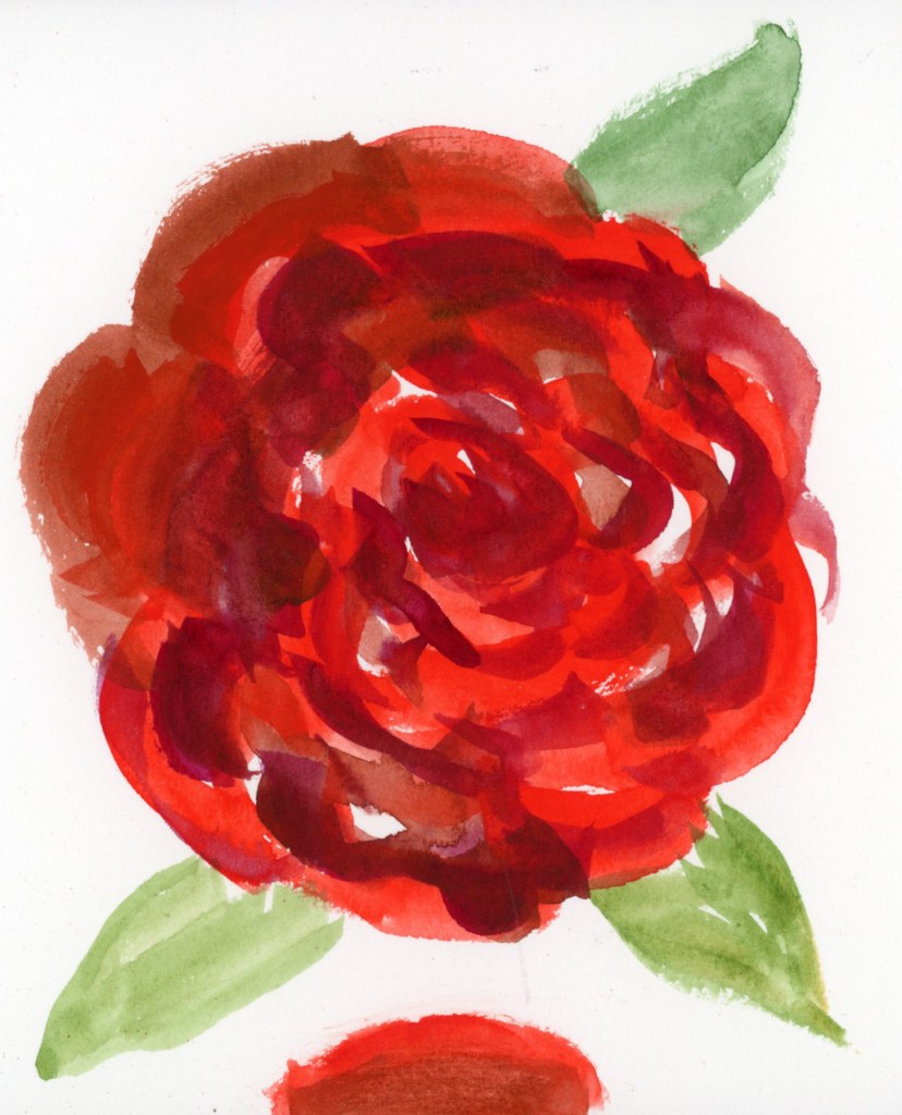
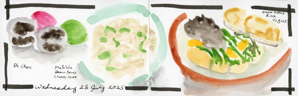
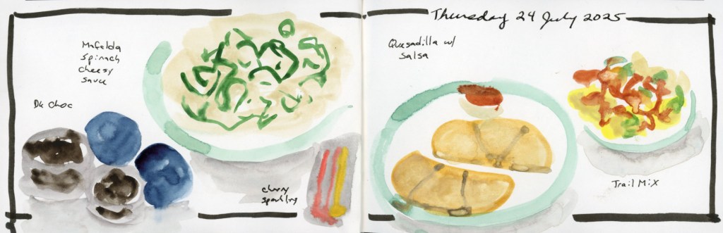
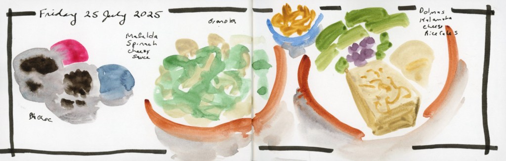
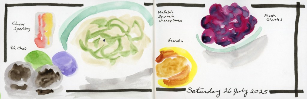
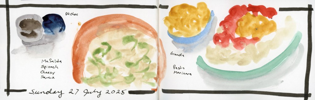
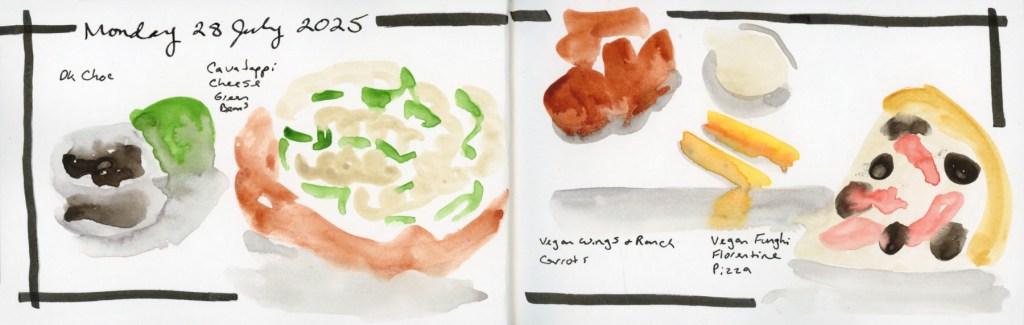
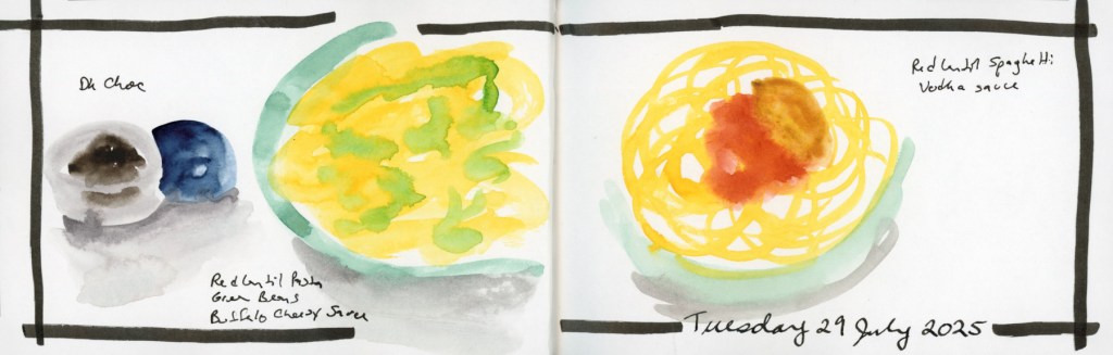
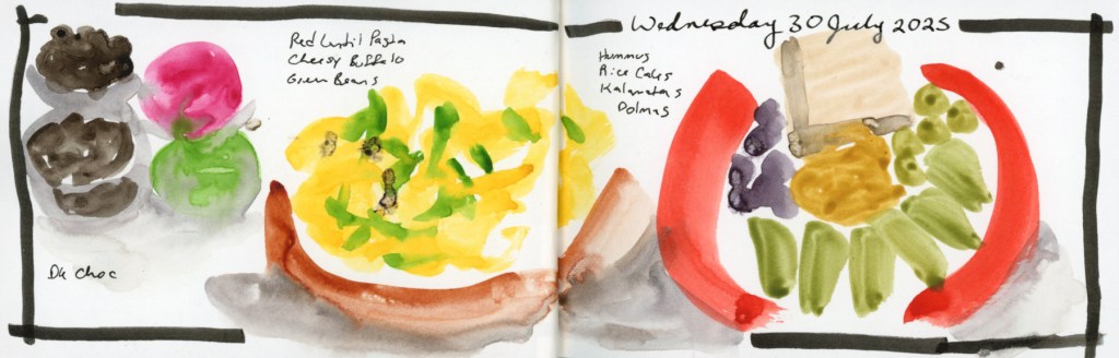
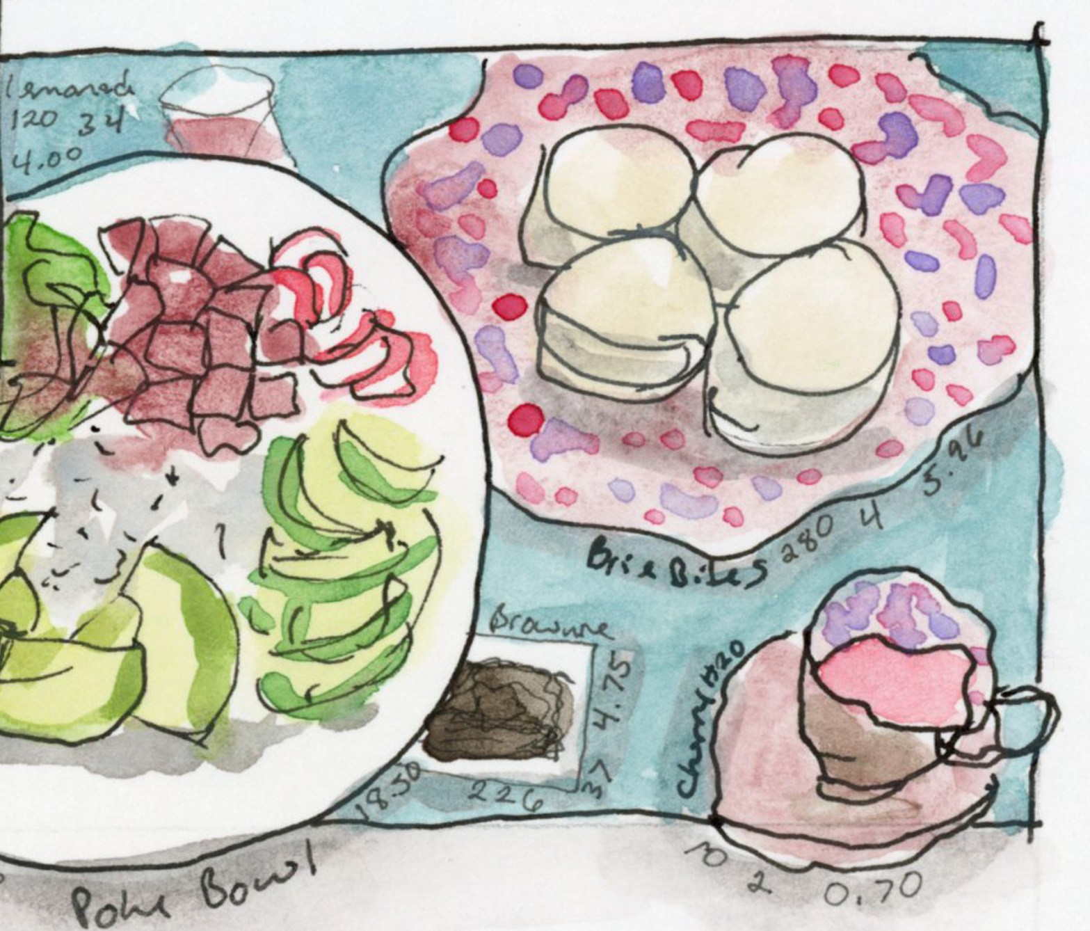
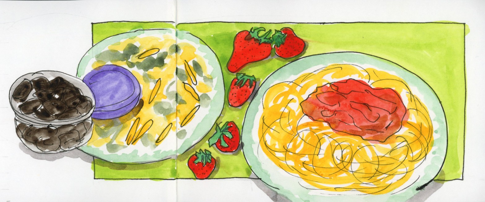
What do you do with a bag of many different types of markers, all in the same palette? Draw food, of course.
Well, I draw the food anyway. I’d been loving the Sailor Shikiori markers for food sketching — those gorgeous watery effects! But I’d also just finished building the same Travel Sketching palette six ways. Or eight. (What? I got obsessed.)
I knew the palette worked for landscapes and cityscapes. But food? I had to find out.
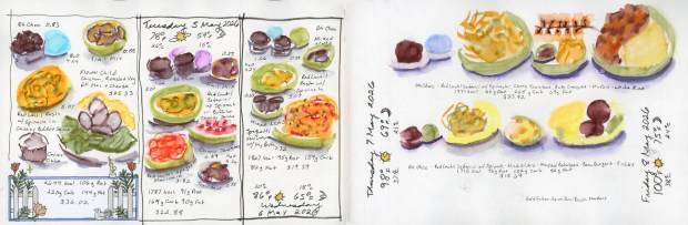
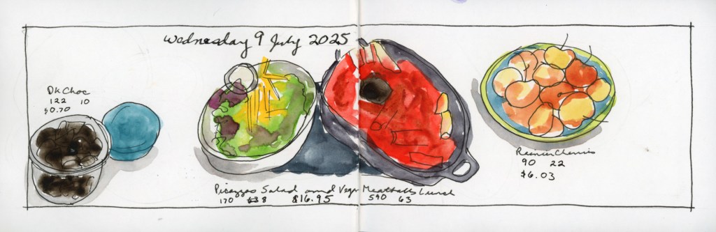
Food sketches in Shikiori and Goldfaber Aqua Dual Brush Markers, 5–8 May 2026
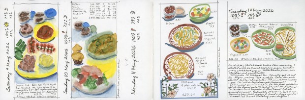
Shikiori markers for the first few days as I had been doing previously, then the Goldfaber Aqua Dual Brush Markers, then the Albrecht Dürer Watercolor Markers, and finally the Faber-Castell Pitt Artist Brush Pens — my first time ever using those in color.
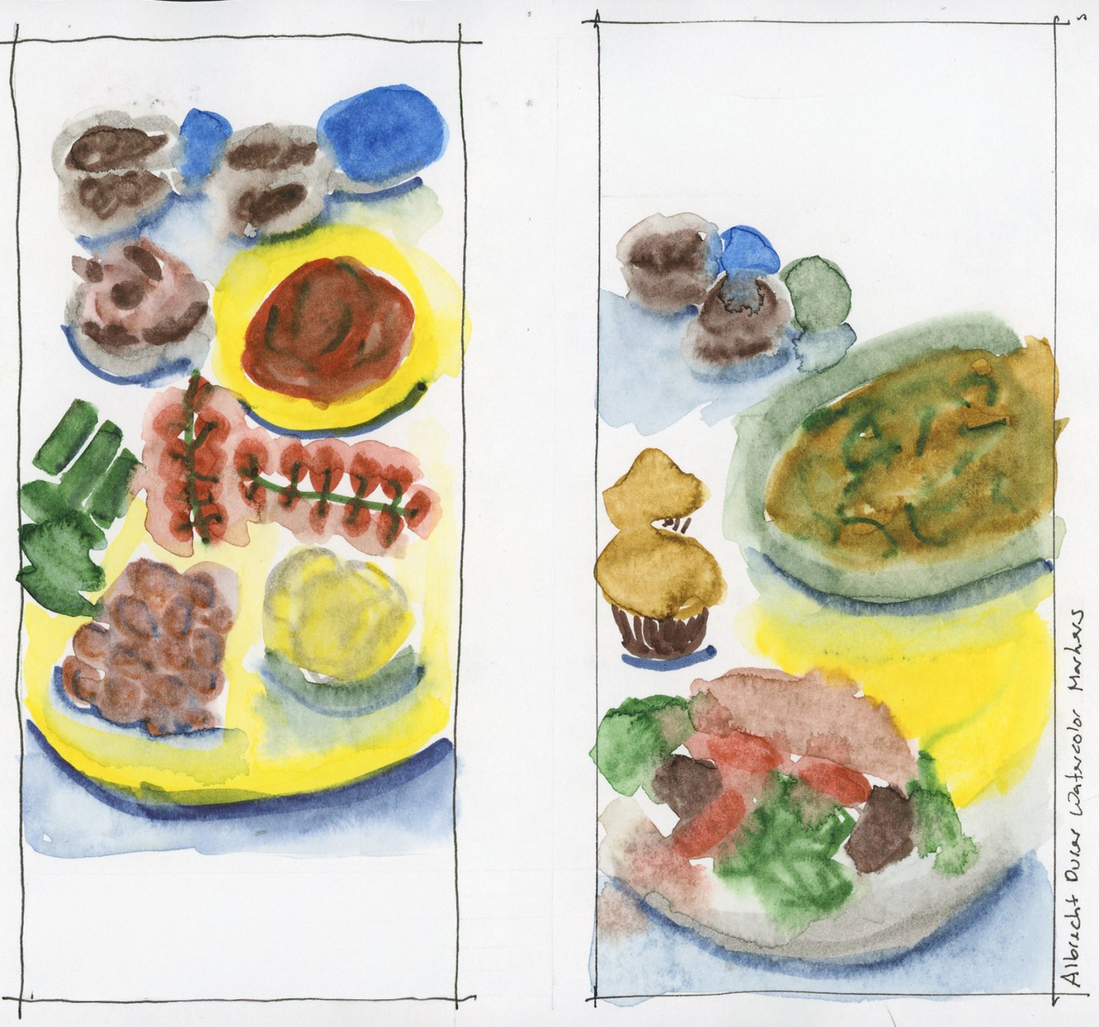
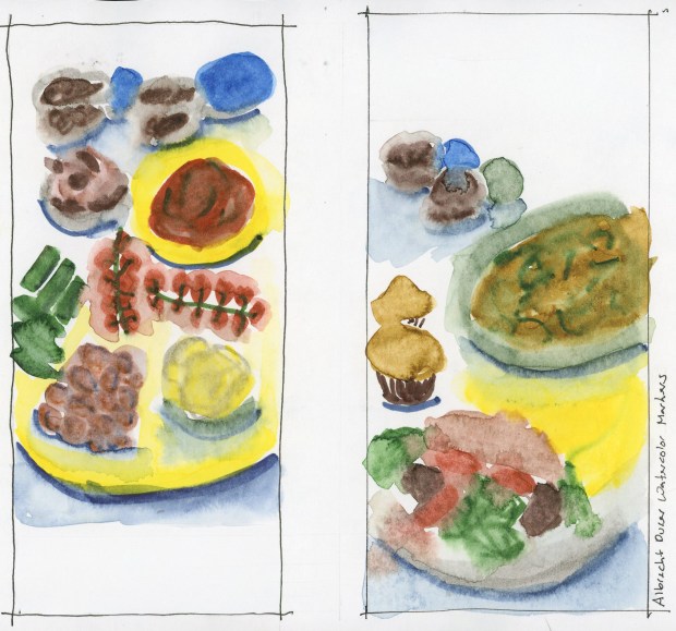
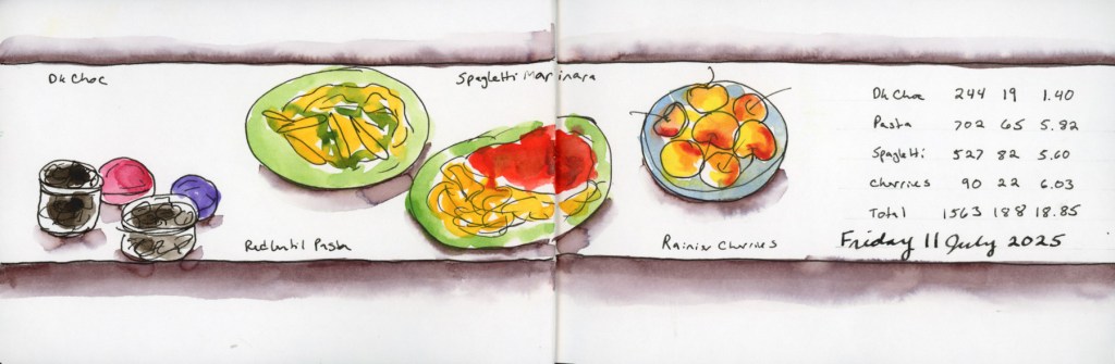
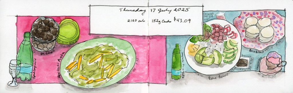
Ink on Paper — Albrecht Dürer Watercolor Markers, food diary, 9–10 May 2026
Not too bad, actually! The water-based markers end up more similar than different — the palette mostly wins. Except those tomatoes. You have to think about it to realize they’re tomatoes, because the sanguine is just not red enough. Every single person who looked at my sketchbook squinted at them. Sorry, tomatoes. You deserved better.
Food Sketches in Albrect Dürer Watercolor Markers, and Pitt Artist Brush Pens, 9–12 May 2026
In other news — I started indexing all my sketchbook pages. Can you imagine? A searchable index so I can find when I last sketched a particular subject, or when I sampled a paint color and then never used it again. Oh yes.
It wasn’t a bad month exactly, but it was a rocky one with symptoms flaring, energy unreliable, the kind of month where keeping up with a daily sketchbook practice just wasn’t in the cards. I kept eating dinner. I just wasn’t drawing it.
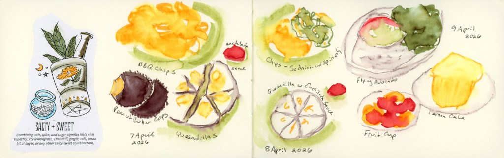
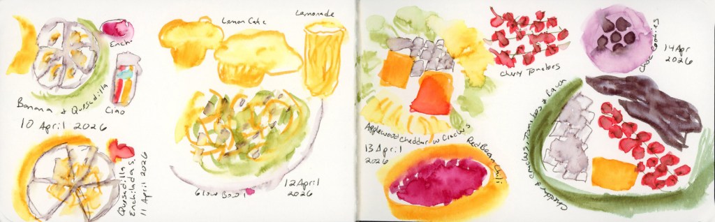
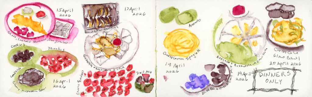
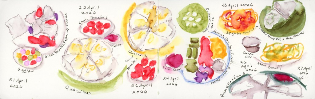
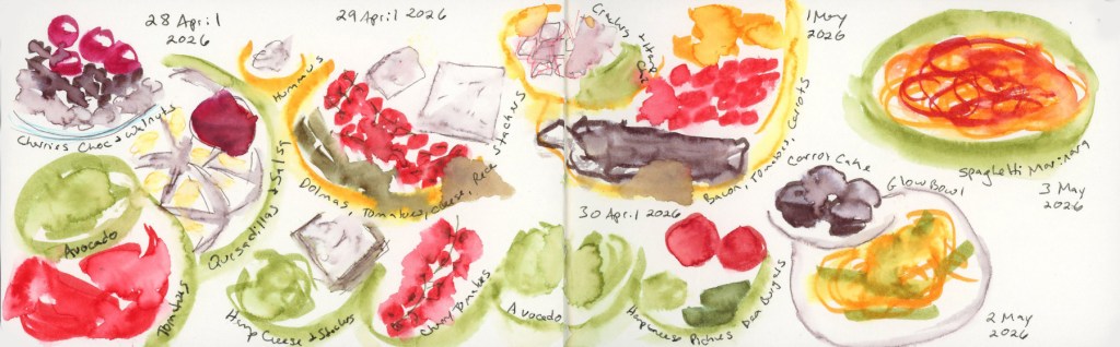
So yesterday I sat down with my phone, pulled up my photos, and drew twenty-six days of dinners in one go. Two and a half hours with the Shikiori markers, then another fifty minutes going back over everything with water to activate the color. I do love the blooms that activating watercolor markers can generate! Five pages. April 7th through May 3rd, all in one long, slightly meditative catch-up session.
I’ve done dinners-only before, back in 2022, but not since. The logic is the same now as it was then: breakfast and lunch don’t vary enough to sketch, and if something in my diet is causing a flare, it’s almost certainly lurking in dinner. The food diary is part creative practice, part detective work.
Drawing from photos all at once gave the pages a consistency I don’t usually get from in-the-moment sketching. Same hand, same markers, same energy — everything has a kind of visual unity that I actually like. It’s a different flow from the day-by-day record, but it’s still a record.
April 9th has a flying avocado, a fruit cup, and lemon cake, and I’m pleased with how cheerful it came out. April 12th’s glow bowl is one of the better-looking plates in the whole run. The cheesy lemon spaghetti on April 18th was delicious and the sketch knows it.
The DINNERS ONLY box that appears mid-April — I lettered it right there on the page as a label to remind myself I did still eat lunches! It has a slightly resigned, slightly determined energy that I feel captures the month accurately.
And then there’s the quesadilla. It shows up nine times. Nine. Quesadilla with enchilada sauce, quesadilla with salsa, quesadilla solo, quesadilla as a supporting player. It has practically become a character in this sketchbook. My Whoop has been giving me pointed looks about it. I asked about my poor sleep, and the theory offered is that a high fat and high carb dinner combination might be doing my sleep no favors. I did not buy tortillas on my last shopping trip. Let’s test this theory and see what happens. (But what will I eat on high brain fog, low energy days?)
This also concludes the small Delta Sketchbook that is my 29th sketchbook and my 6th food volume.
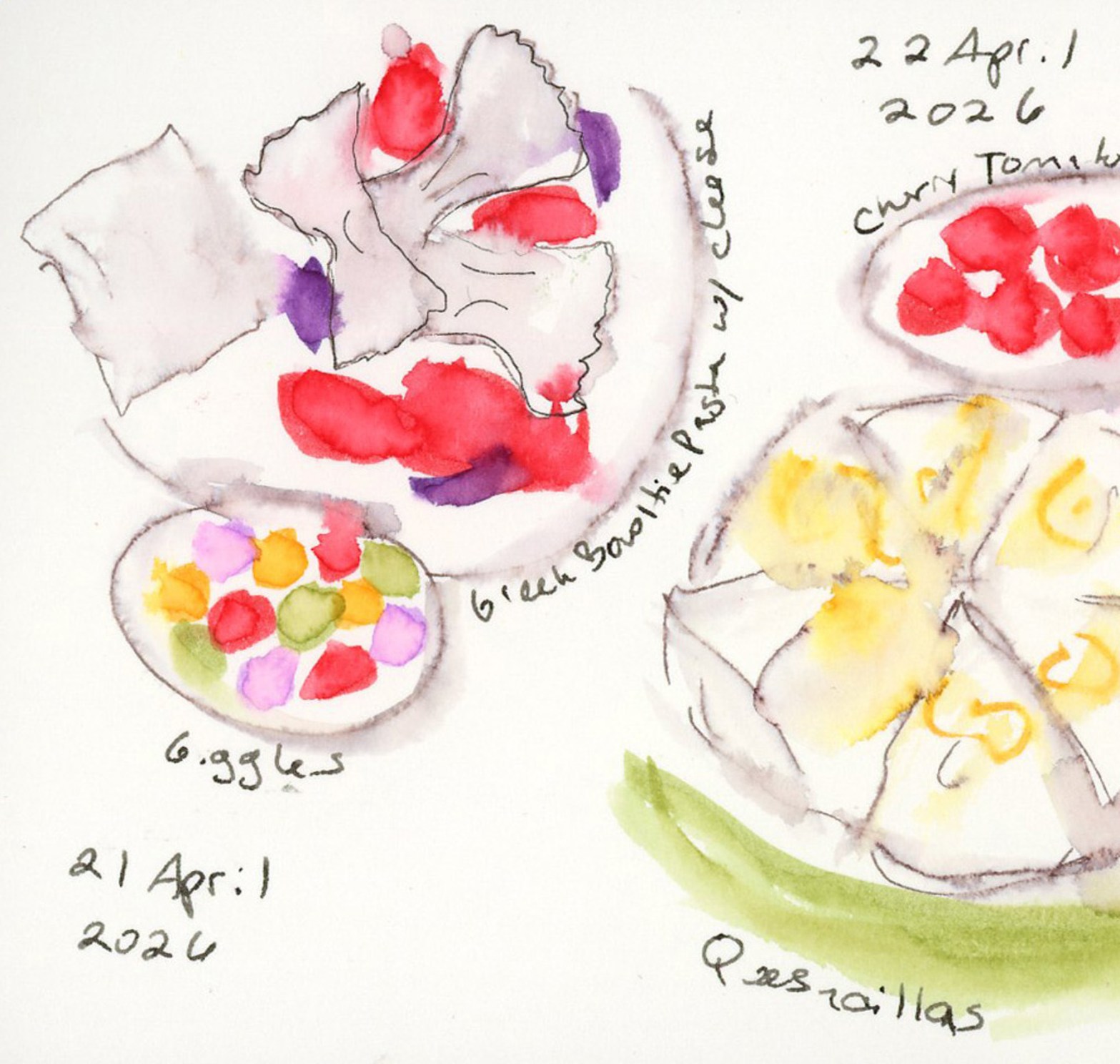
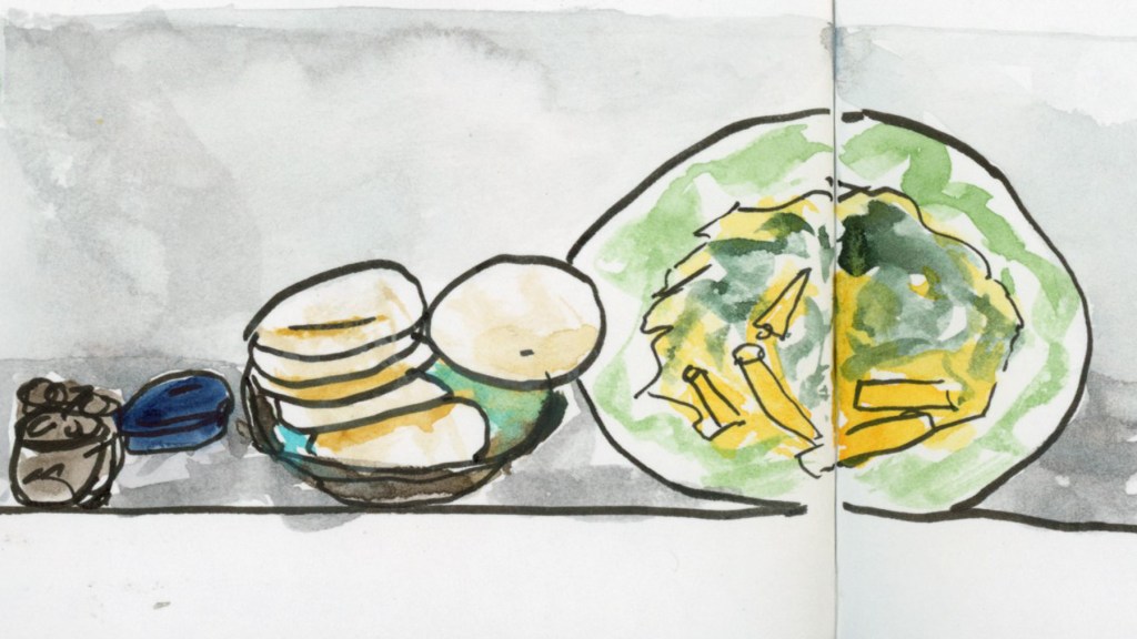
The featured image up top is from the April 21st spread — Greek bowtie pasta, and a little bowl of Giggles (allergen-friendly candy, think Skittles) with those bright confetti dot colors. It’s one of my favorites from the whole batch. Twenty-six dinners, one sitting, five pages. The record exists. On to May. Without my go to quesadillas!
I did not plan to start another food sketchbook so soon. I said at the end of the last one that I’d be folding food sketching into my regular daily sketchbook going forward. But then I didn’t. Ha! I grabbed this Delta thinking it has fewer pages, and would be great for March. Also, tracking my allergens is genuinely easier in a dedicated book, and here we are. Food Sketchbook No. 6.
This one is a Stillman & Birn Delta, softcover, 5.5 × 3.5 inches, 270gsm cold press in ivory. I’ve tried the Delta paper before, one year ago exactly! I did not love it for watercolor. However, for ink it’s been great. Very wet ink washes with loads of water, it doesn’t even buckle!
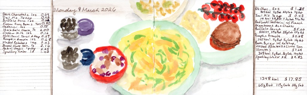
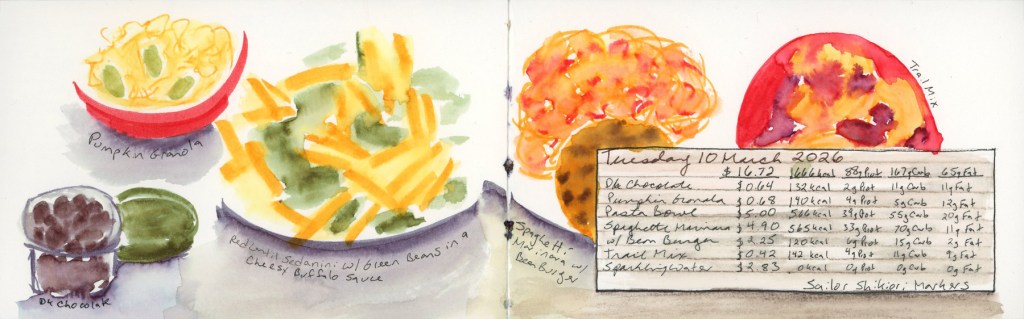
I book started on March 9th, intending to keep going through the month. But then those allergens hit, and I only got two days done. Both are done in Shikiori markers, because I was thinking markers would be fast and I was worried about not keeping up.
Monday 9 March 2026 — Food Diary in Sailor Shikiori markersTuesday 10 March 2026 Food diary in Sailor Shikiori markers
These are Sailor Shikiori markers. Japanese brush markers that take water beautifully. I do love that watery look. I had used Faber-Castell watercolor markers for food a few years ago and loved how they looked. I had these close by, so they were the obvious choice when I started this new book, hoping using marker would be a fast and easy method.
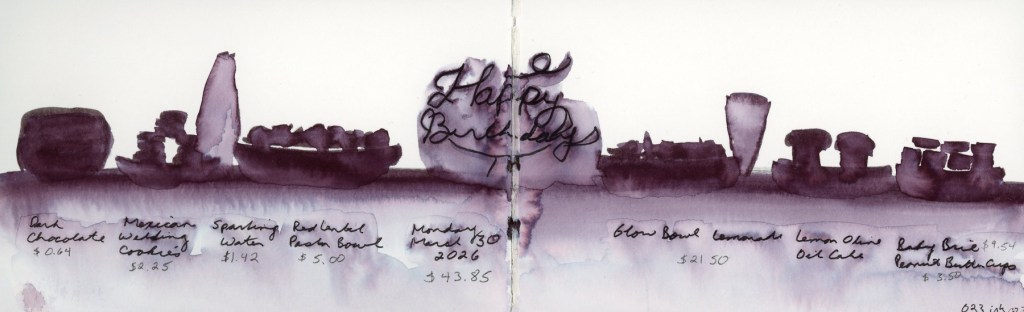
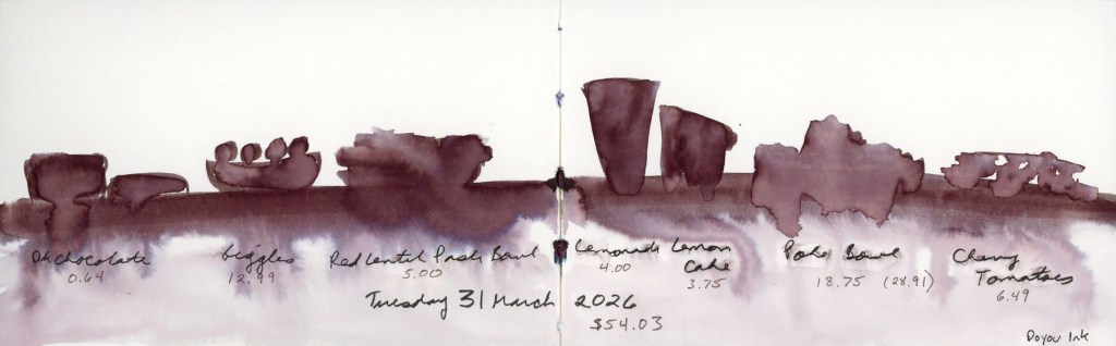
I got two days in. Once almost three weeks has passed, I knew I wouldn’t be able to catch-up, so I decided to jump in with my birthday. But I also knew I needed a fast method this busy week. One of my favorite sketches previously was a monochrome silhouette style, but I couldn’t remember if I’d done it in the 023 ink, or the Doyou ink. Obviously this means I had to both this week!
A fast way to record, and then the fun comes in the lovely ink washes as the dark lines are diluted.
Monday 30 March 2026 Food Diary in Shikiori marker 023.Tuesday 31 March 2026 Food Diary in Shikiori marker Doyou.
The 023 has the deeper purple undertones, while the Doyou leans toward the browns. Both work beautifully in the silhouette format, and the way the marker ink blooms into the wet wash below is very much what I was going for here.
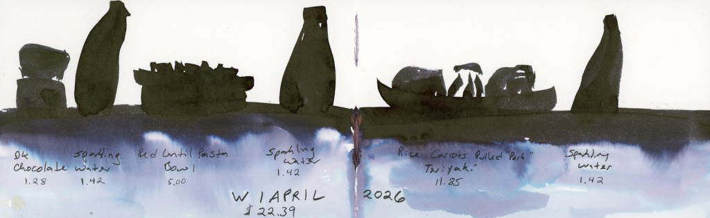
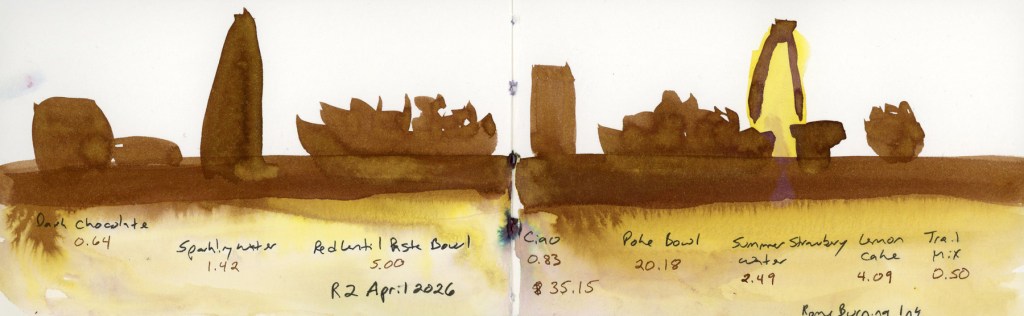
Wednesday 1 April 2026 Food Diary in Diamine Good Tidings Ink wash.
I wanted to keep going with the black inks, and I had the Diamine Good Tidings nearby. I really need to write the inks higher on the page, because doing it near the margin, they get cut off when I scan! I loved the color bleed on this ink so much!
I remembered the Udemy course on fountain pen ink art by Nick Stewart that I’d dabbled with back in January — specifically his chromatography exercises, which are all about how inks separate and bloom when water is introduced. That’s exactly what was happening in these food spreads. One of the inks he uses in that course is Noodler’s Rome Burning, so I knew what ink I was going to do next!
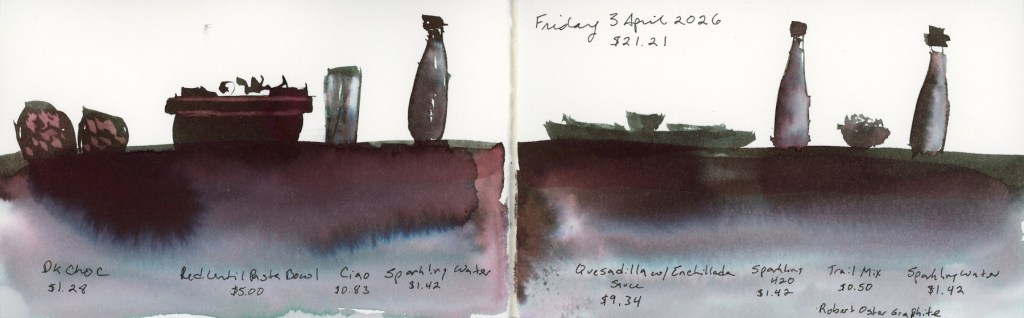
Thursday 2 April 2026 Food Diary in Noodler’s Rome Burning Ink washFriday 3 April 2026 Food Diary in Robert Oster Graphite Ink wash
The Robert Oster Graphite is also used in Nick Stewart’s course, and I can see why! Look at those colors! Deep plum-to-grey shift with the blue bloom and pink undertones in the wash is doing a lot of atmospheric work for what is essentially a record of sparkling water and a quesadilla.
From Shikiori markers to fountain pen inks. Now I’m energized to get back to the exercises in that Udemy course, and see what these inks can do!
If you’ve been following the Illustrated Food Diary for a while, you know the premise is pretty simple: I sketch what I eat, sometimes with calories, carbs, and cost noted alongside. Same subject, every single day. Plates, bowls, bottles of sparkling water, the occasional bag of chips.
It could get very repetitive very fast. And honestly, without some intentional page design, it does.
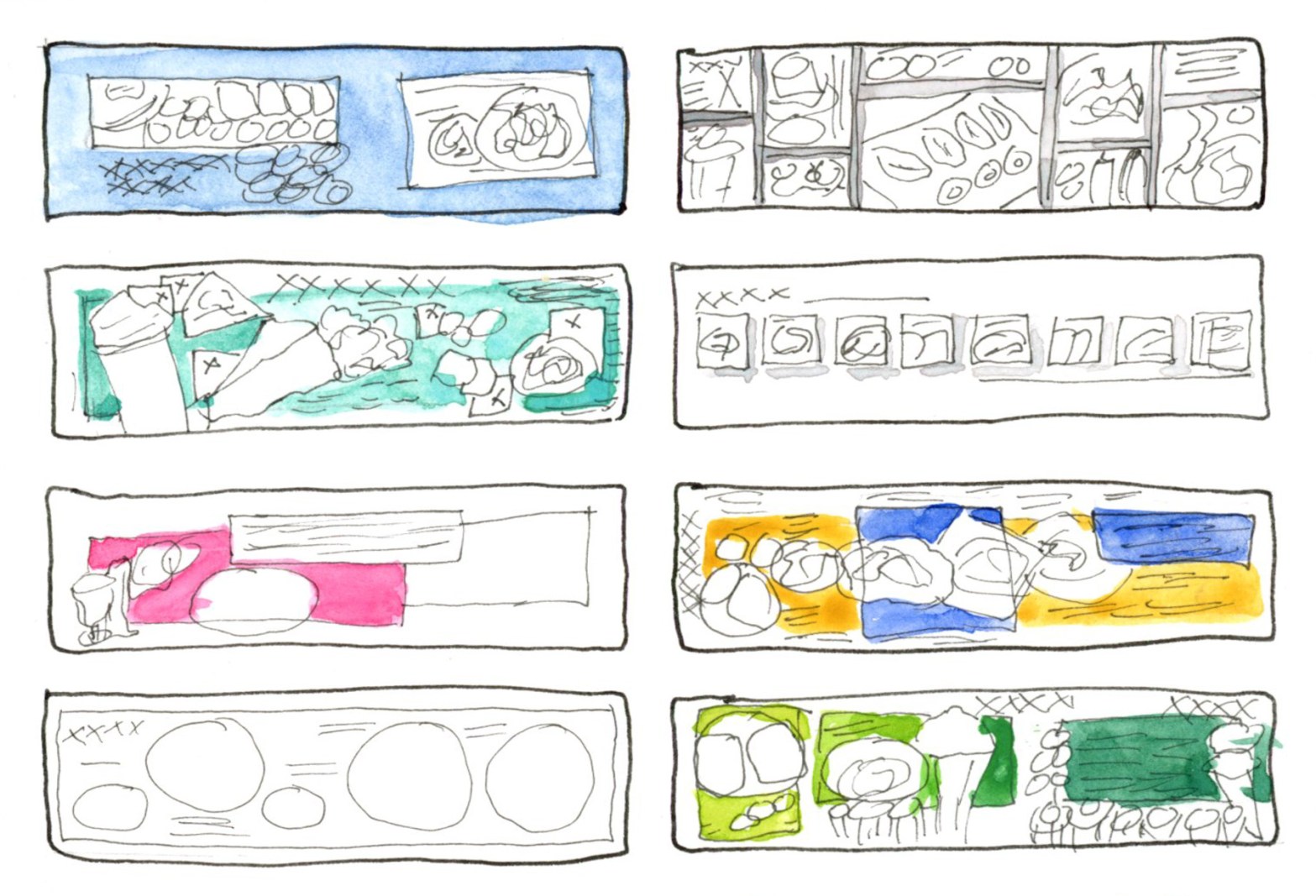
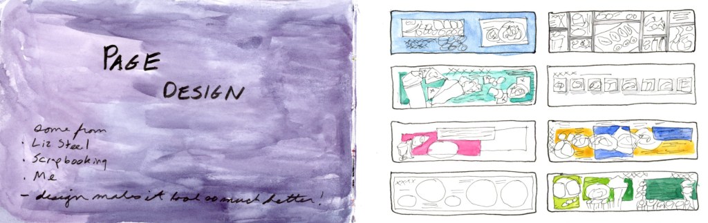
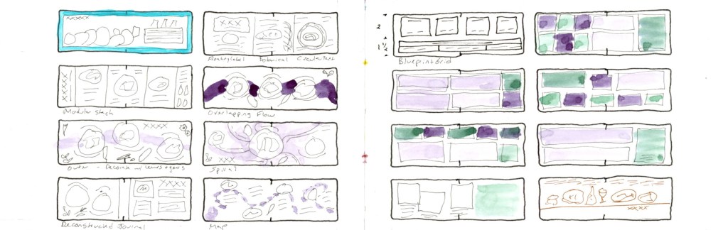
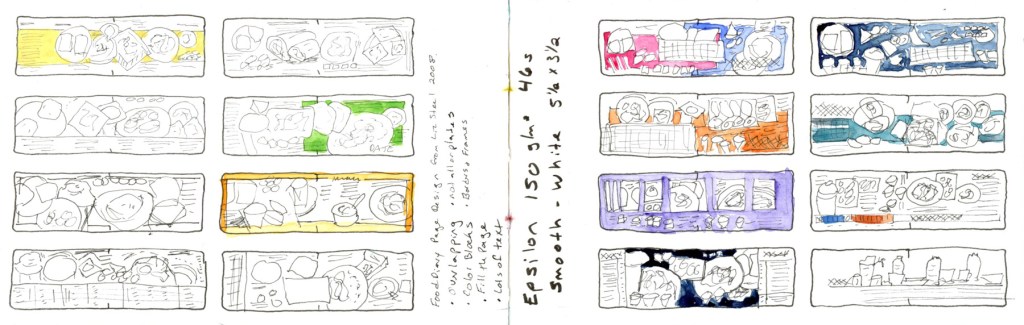
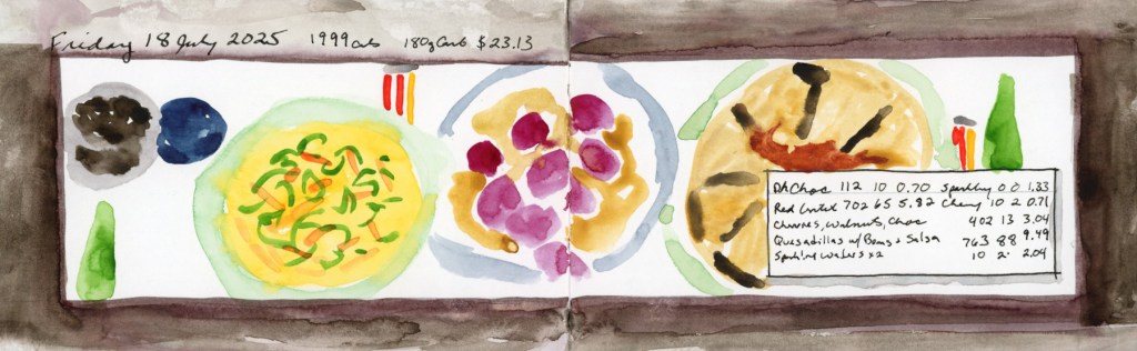
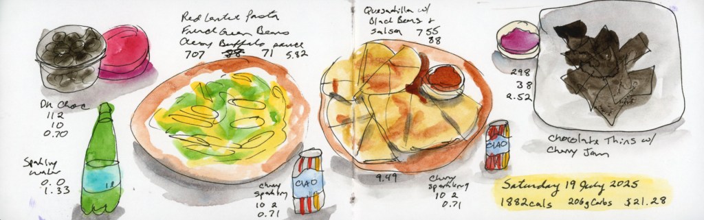
I’ve been thinking about page design since taking Liz Steel’s Sketching Now course — Sketchbook Design — and with Sketchbook Volume 24 (my 5th food sketchbook,) I got serious about actually applying it to the food diary. Near the back of the book I filled a few pages with wireframe sketches: little thumbnail layouts exploring different ways to organise a page. What Liz called recipe book in the Sketchbook Design class. Some ideas came from Liz, some from scrapbooking, and some I just made up. The note I wrote on the title spread still holds: design makes it look so much better.
Page Design — sources and first thumbnails, Vol. 024Wireframe page design layout concepts.Wireframe page design layouts for S&B Epsilon 5.5 x 3.5-inch Landscape sketchbook.
Here’s what I landed on as my toolkit.
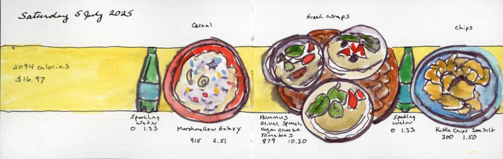
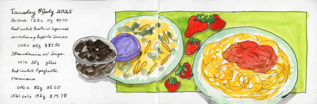
Colour blocking is my favourite for making plates really pop. A solid band of colour behind the food — yellow, teal, pink — does something almost magical: suddenly the sketches read as a designed page rather than a collection of doodles.
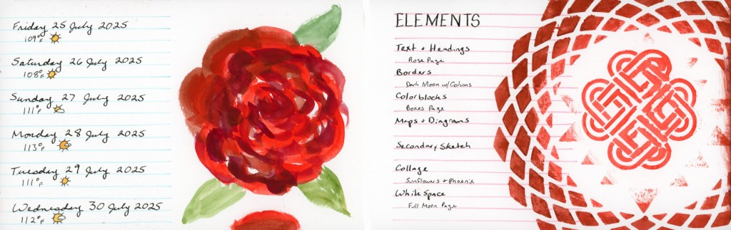
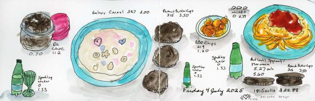
Saturday 5 July — Food Sketch page with yellow colour block
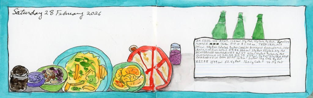
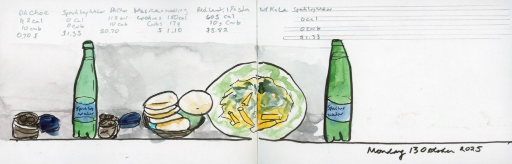
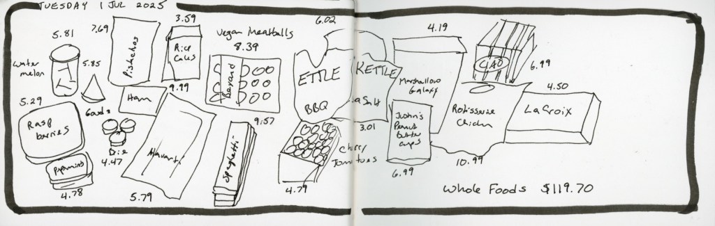
The baseline layout — everything lined up along a common ground line — gives a page a clean, almost theatrical feel, like the food is on a little stage. The variety of shapes along that line (round bowls, wedges of quesadilla, tall bottles) creates a natural rhythm without any extra effort.
Monday 7 July — Food Sketch page with baseline layout.
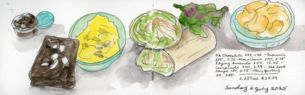
Column dividers are great when you have a lot of items and want to create clear sections without things feeling cluttered. Vertical bands separate the day into distinct moments, and it ends up reading almost like a magazine layout.
Saturday 12 July — Food Sketch page with column dividers.
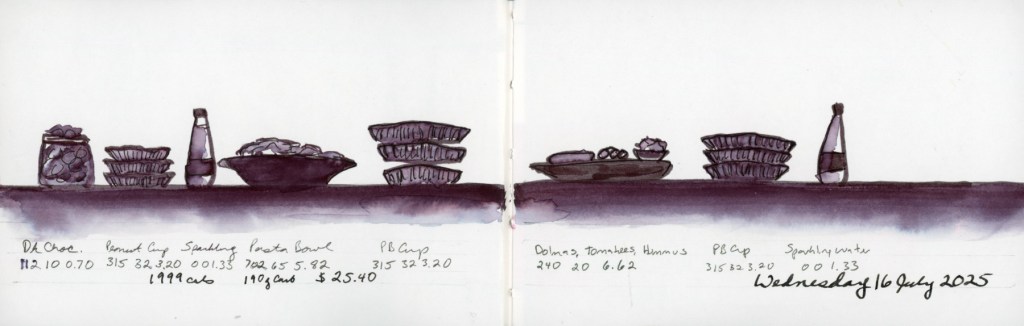
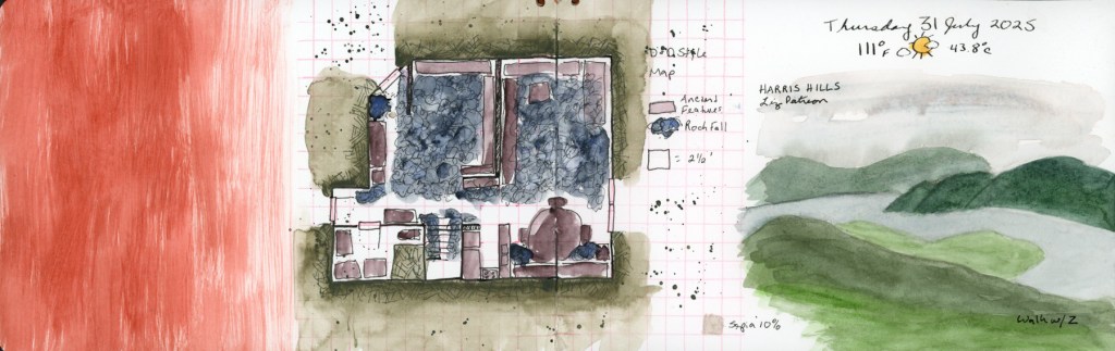
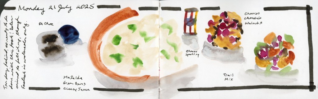
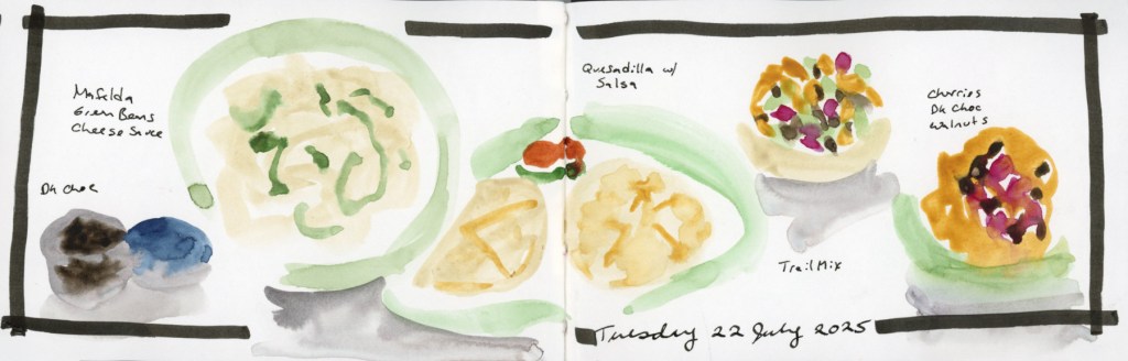
And then there’s direct watercolour with a simple frame — no planning, just paint. This is what I reach for on a busy day, or when I’m catching up after falling behind. It’s the fastest approach, and even a simple frame lifts a page considerably. That Wednesday the 16th spread — done entirely in one deep plum — is a good reminder that design doesn’t have to mean colour variety. Monochrome with a strong layout is its own kind of striking.
Wednesday 16 July — Food Sketch Page in Watercolor Marker, monochrome.
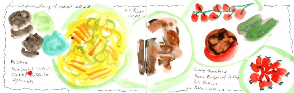
Here are a couple of recent examples from the current volume. Wednesday 4 March is a good fast-day page — loose, direct, just a simple wavy frame holding everything together.
Wednesday 4 March 2026 — Food sketch page in direct watercolour, simple frame
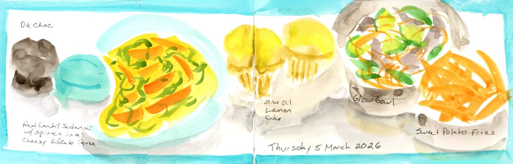
Thursday 5 March captures a dining out day — the teal colour block gives it just enough structure to feel intentional, and it nicely documents that mix of restaurant and home food in one spread.
Thursday 5 March 2026 — Food Sketch page with teal frame including a dining out dinner.
The wireframe sketches aren’t precious — they’re just a menu I made for myself, so that when I sit down with the book I’m not starting from zero. I can glance at them and think colour block day or baseline day and just get on with it. Variety of layouts keeps it interesting for me, and on days when I just can’t, a simple frame and loose direct watercolour is still a page worth keeping.
If you want the full backstory on how I first approached page design recipes for this sketchbook size, I wrote about it back in Food Sketches Week 27.
You can see all posts of this food sketchbook volume 24 here.
The End of a Series (and a Lot of Red Lentil Pasta)
It’s March, and I’m sketching food again. If you’ve been following along, you might notice that February and March seem to have a strange gravitational pull for sketching food! My first food sketchbook started 1 February 2020, my second picked up again 1 February 2021, and here I am in 2026, wrapping up my fifth. I genuinely did not plan that.
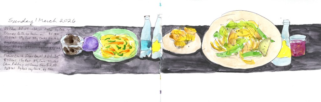
This post covers March 1–8, the final eight days in this little sketchbook — Volume 24 overall, Food Sketchbook No. 5. It’s a 3.5×5.5 inch Stillman & Birn Epsilon, softcover, 150gsm smooth white paper. I’ve used a few different Stillman & Birn papers across the five food sketchbooks, and this one has been a pleasant surprise — it handles ink beautifully, and the watercolor behaves better than you’d expect from a smooth paper. It allows for harder, crisper marks, which suits food sketching well.
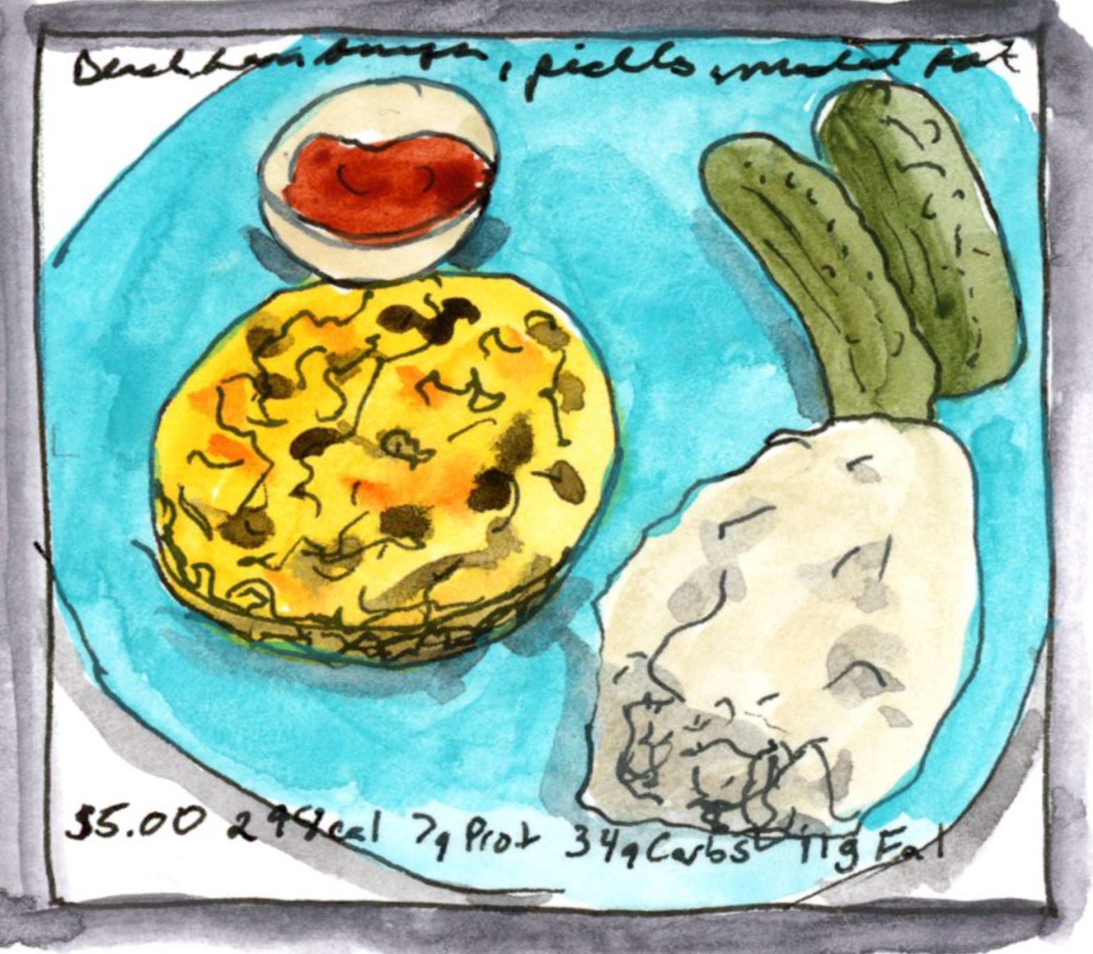
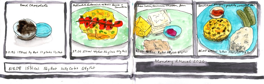
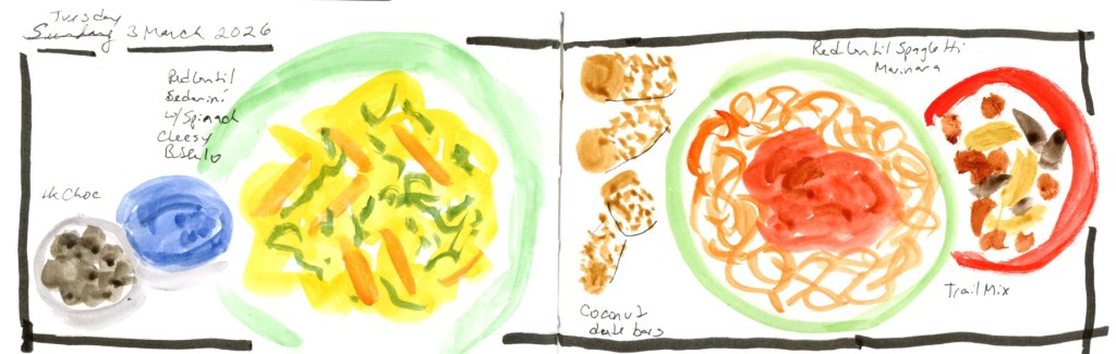
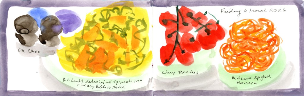
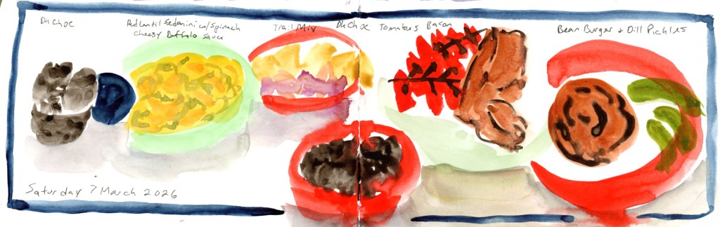
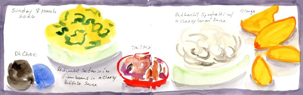
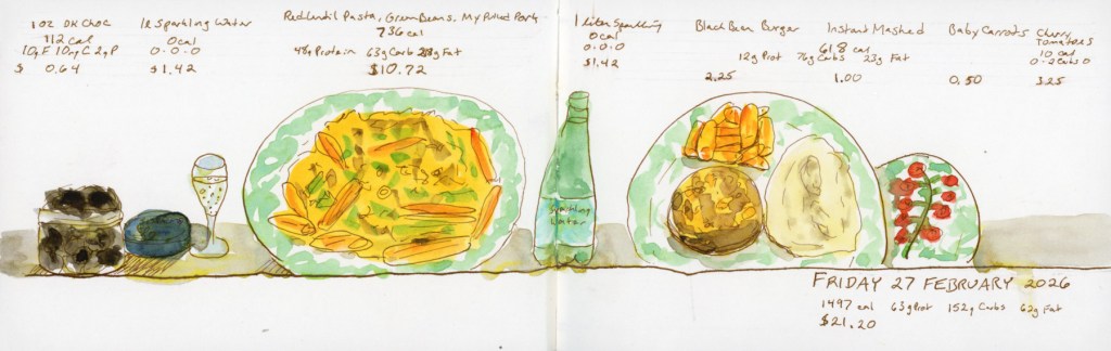
These eight pages are a bit of a mixed bag stylistically, and I’ll be honest about why: I got behind and had to catch up. Six of the eight are loose, direct watercolor without nutritional data, because that’s simply much faster to do. The two more structured pages — the panoramic spread on Sunday March 1st, and the grid of four individual food portraits on Monday the 2nd — are closer to what I’d do if I had unlimited time. The Monday page even has the full daily cost and nutrition totals at the bottom, which is the whole point of the exercise, really.
One ounce of dark chocolate chips is a must to start the day, of course. I do have a shocking amount of the red lentil sedanini every week, month, year. What can I say, it’s easier on the glucose hits, and carries a nut cheese sauce well. Food allergies, so I’m gluten free and vegan as much as possible. And let’s face it, scanning through sketches is far easier when finding a culprit!
The highlight of the week was Thursday, when I ate out at Flower Child with a friend who was heading off on vacation. The olive oil lemon cake on that page was hers — I did not eat two desserts, though I won’t say the thought didn’t cross my mind. The glow bowl and sweet potato fries were very good.
Saturday brought a treat of a different kind: I’ve recently discovered My Bacon, a vegan bacon made from mycelium (soy-free, wheat-free, and genuinely delicious), and it shows up twice this week. Highly recommend if you’re navigating similar dietary constraints.
And then Sunday the 8th, and that’s it. The book is full.
This is the fifth time I’ve filled one of these little landscape books with food, and I have no plans to stop — I’ll just be doing it within my regular daily sketchbook from here on, rather than in a dedicated volume. There will be one more post from this sketchbook: the wireframe page design diagrams I used to plan these layouts, which feels like a fitting way to close it out properly.
If you want to browse the whole food sketching journey, here are the starting points:
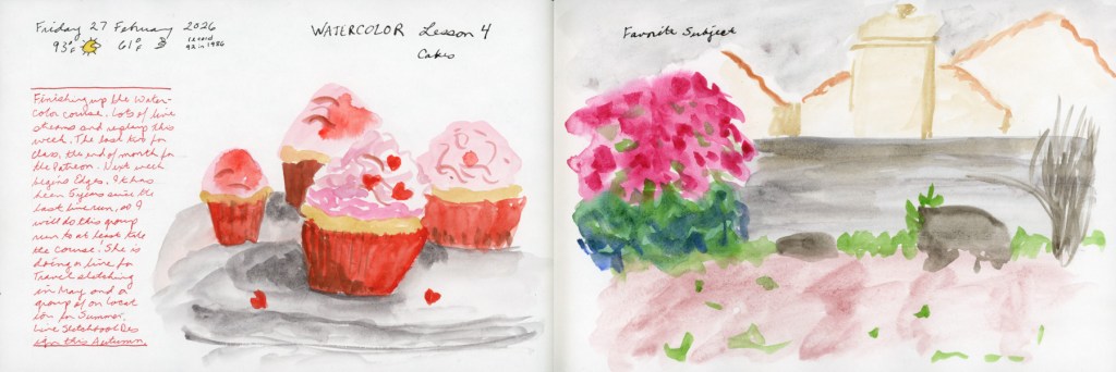
Spring is bringing better energy! Despite a challenging start to the year, I’m thrilled to announce I’ve officially wrapped up my Watercolor course. This month was all about marking moments—from Valentine’s cupcakes to the early blooms in my weed-filled (but vibrant!) backyard.
Watercolor Course Completed!
I’ve continued working through my Watercolor course, and I finally crossed the finish line! Honestly, completing this despite such a difficult couple of months feels like a huge win.
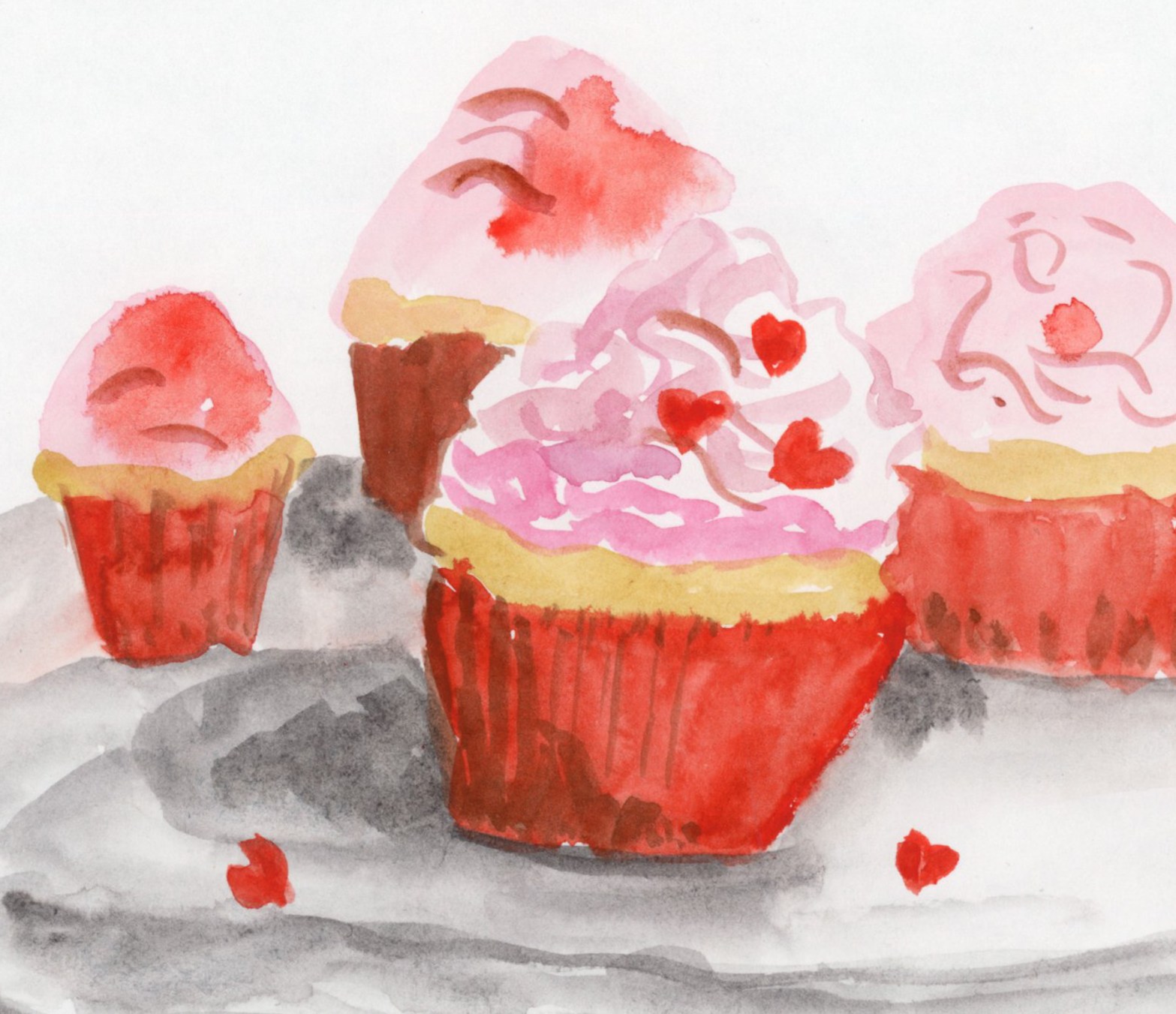
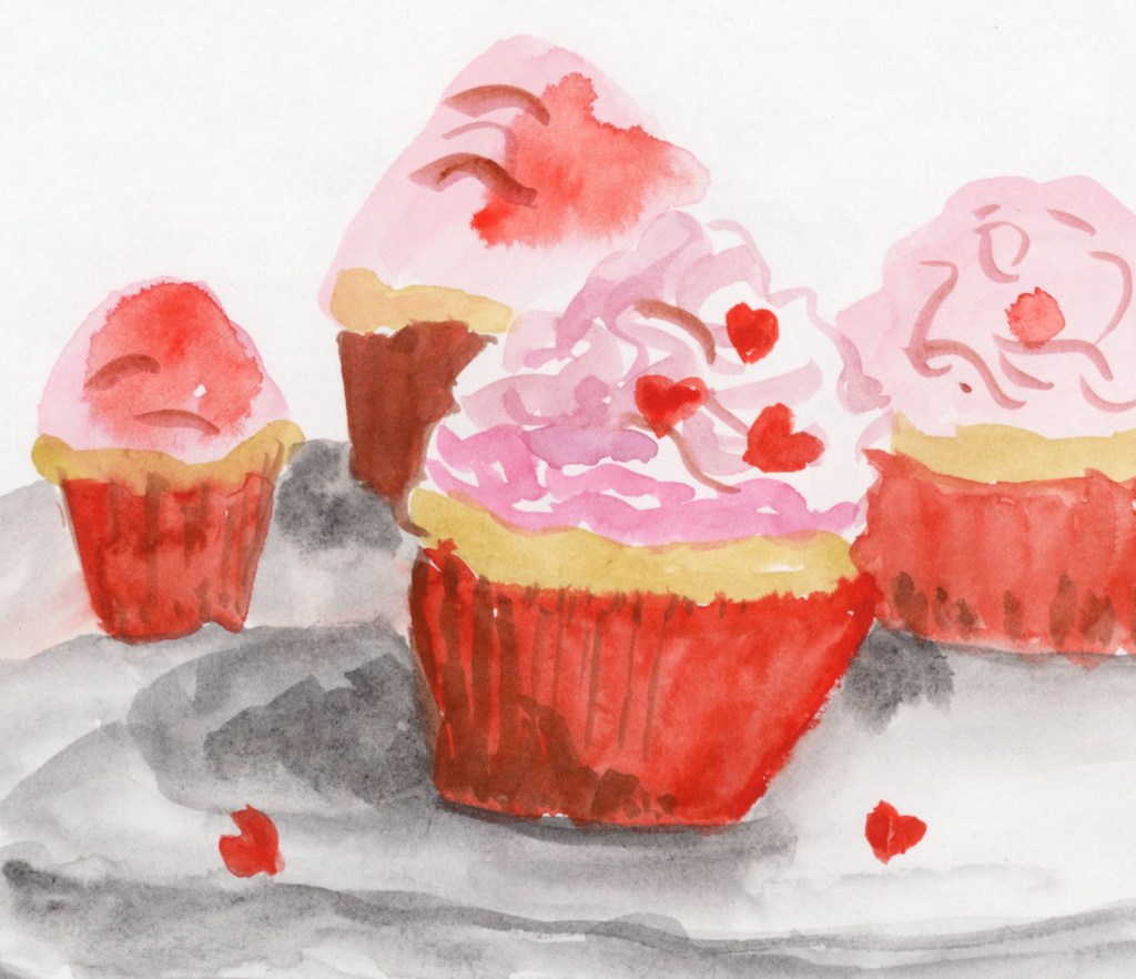
To celebrate, I painted these Valentine cupcakes from a photo I found online. It was a fun way to mark the holiday and just play with color (Quin Rose and Pyroll Scarlet.)
Record-Breaking Heat & Overgrown Weeds
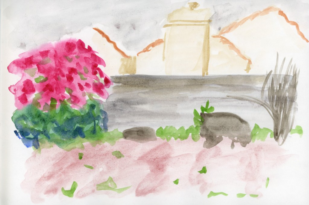
My yard has officially been taken over by weeds this year! We are experiencing record-breaking temperatures, so everything bloomed a full month earlier than usual. It’s a bit chaotic out there, but it makes for interesting sketching.
Paint Experiments and Palettes
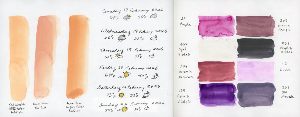
I spent some time diving into the technical side of things this month. I wanted to see the true differences between Naples Yellow Reddish from Schmincke and Roman Szmal, as well as The Tint (Roman Szmal). They look so similar at first glance!
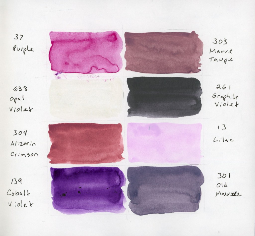
I also swatched a cute little 8-color palette of Gansai Tambi paints that I’d intended to use for February. Even though I only managed this one swatch page, these muted, dusty shades are so inspiring. The palette includes: Purple (37), Mauve Taupe (303), Opal Violet (638), Graphite Violet (261), Alizarin Crimson (304), Lilac (13), Cobalt Violet (139), and Old Mauve (301). That Opal Violet adds just the right hint of shine!
For the color blocks over my notes, I also played with a gorgeous gradient between the two Naples Yellows Reddish. But the real star? Roman Szmal Lava. That shading and granulation are just incredible—what a fun, moody color to work with!
The Return of Food Sketches
With my health still being a bit troublesome, I’ve decided to restart my food sketching habit. I’ve picked up my 3.5×5.5 Epsilon landscape book from last summer. I’m diving back in and focusing on making the page designs more visually interesting this time around.
Looking Ahead
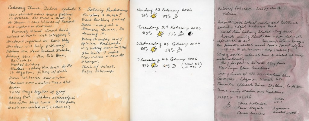
What’s next? The “Edges” course from Sketching Now starts next week! I’ve never made it past lesson one before, but I’m joining the group run this time to stay motivated. My skills feel a little rusty after the last few months, but I’m ready to get back into the flow.
I tried to start sketching food again, thinking that I would sketch the details of my trip. But the accident that happened then derailed everything. However, here is my single sketch, half a day of food.
The ink and watercolor drawing style definitely takes more time that looser and sketchier styles. However, I am enjoying focusing on the principles of design for these. Applying page design, and the various elements, to the same daily subject definitely helps see what these elements can do for design purposes.
I am continuing my way through the various options on the design page sampler I posted last week. The variety is very interesting, and I really like these pages. Each of these took between 30 to 60 minutes each.