Once again the autoimmune adventures hit hard, and life piled on. I ended up just not doing any of the Travel Sketching class work except the intro kit building, and the current sketch. Now for the hard work of forgiving all the things I cannot control and just accepting the losses. I have, however, decided that I’m going to rest this summer, and not try for the Watercolor on Location group run. I’m obviously needing the recovery time.
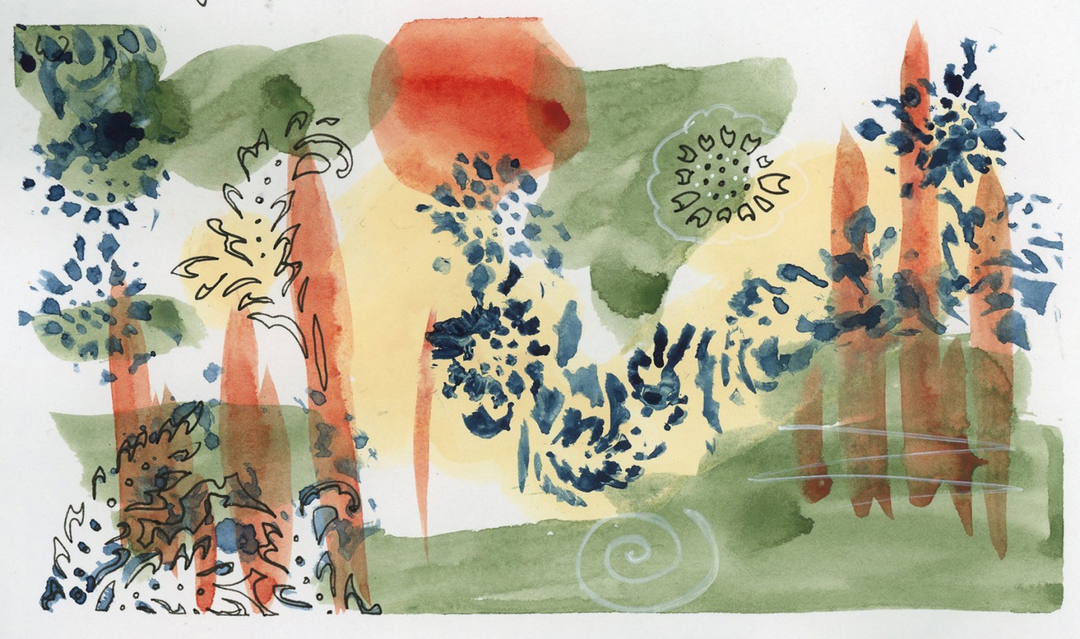
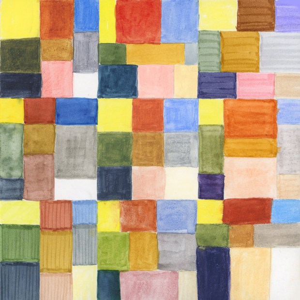
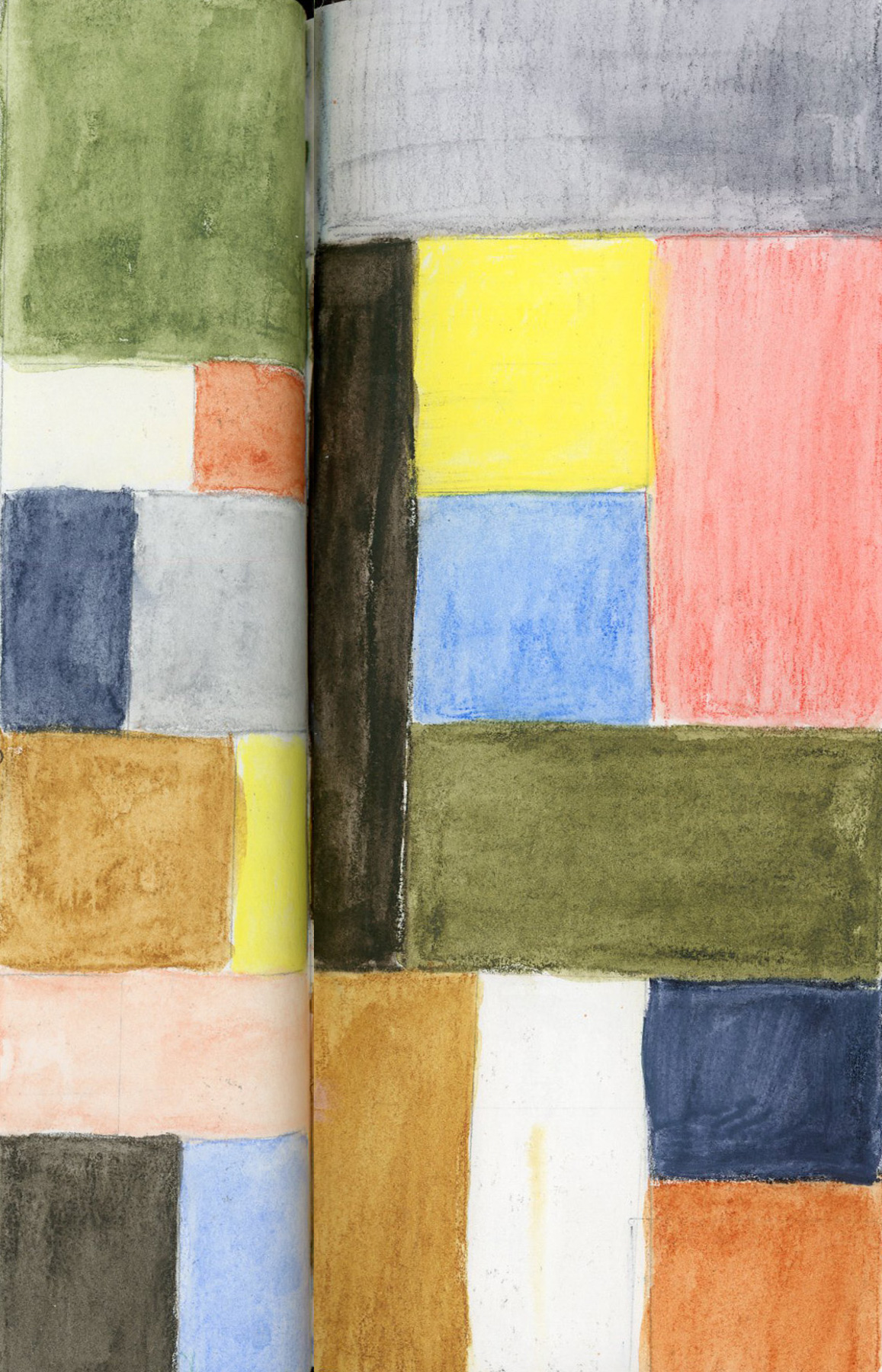
It was hard to let go this time. But so be it. Back to the days and days of just listing the dates and the weather to mark the passage of time. I left some white space. In one of those half pages, I did a watercolor abstract like I used to do, and that turned out really well! (See below.)
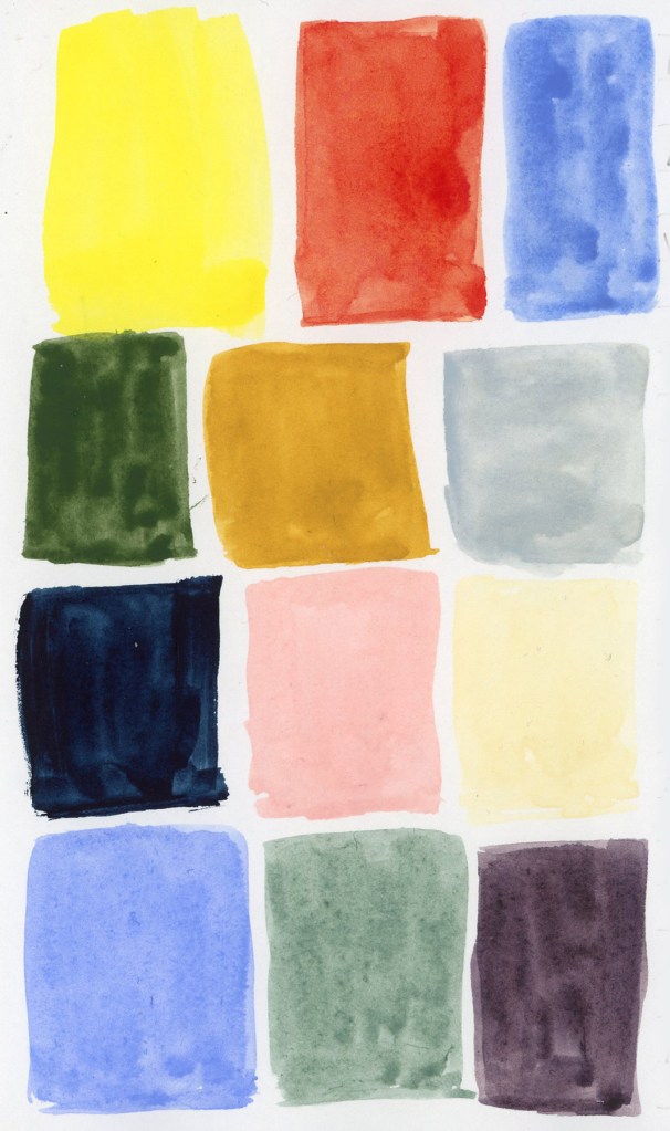
Before I lost all oomph, I did get the color charts done for the Tombow Dual Brush Markers:
Tombow Dual Brush Markers in Travel Sketching Palette
The Tombows do not seem very reactive to water. The second half of each circle was activated with water, and it shows in a couple colors, but not in most of them.
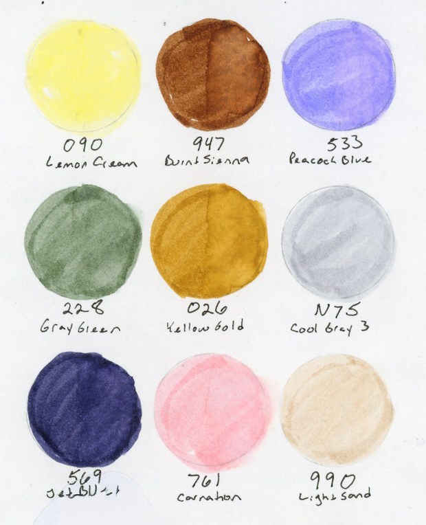
Holbein Watercolors in Travel Sketching Palette
Still in the grip of my obsession with recreating this Travel Sketching Palette (I blame the brain chemistry from the allergen hits!) I bought these Holbein Watercolors. Aren’t these lovely?
Holbein Watercolors in Travel Sketching Palette: Permanent Lemon Yellow W235, Lunar Eclipse Red WG605, Verditer Blue W295, Green Grey W352, Yellow Ochre W234, Grey of Grey W353, Indigo W298, Shell Pink W226, Jaune Brilliant No 1 W231, Lavender W316, Davy’s Grey W355, Eurasian Jay Rose Grey WG661.
Abstract Watercolor
Last year I was doing some of these watercolor abstracts. They are such a lovely way to play with color. I had to test this palette with one. I rather like this one. It ended up looking like an abstract landscape. (Also note: I cannot for the life of me get Posca pens to work! Is my climate just too dry? But there is a hint of white showing my attempt!) These abstracts are so good for capturing mood, or a moment that I find they fit documenting life surprising well. They hold memories and feelings quite well.
The complete spread in my sketchbook. A bit more thought on page design than I’ve used in a while, which feels good.
As for this summer, I have a few half pages with white space along with my dates and weather. Perhaps I will be able to sketch items or scenes. I will definitely make more abstracts.
I want to return to illustrated journaling, and documenting life as it happens. That has always been my primary goal, and what drew me to keeping a sketchbook in the first place. I am missing that in my influences and in my own work, so when I regain some oomph, I shall revisit my old inspirations.
I’m looking forward to the run this upcoming autumn of the Sketchbook Design course. Every time I’ve done it, I end up capturing more life and making pages I love. My sketchbook ends up feeling like me.
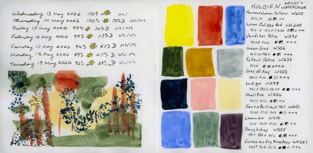
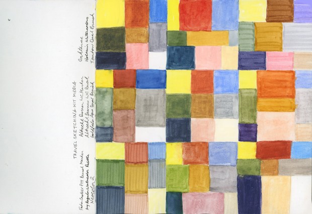
13-19 May 2026 with Abstract Watercolor, and Holbein Travel Sketching Palette swatches.
I had to add Tombow Dual Brush Pens and the Holbein Watercolors to the palette family! And I had to open Volume 30 with all of them as my frontispiece.
The Travel Sketching palette in nine media — Inktense, Holbein Watercolors, Tombow Dual Brush, Albrecht Dürer Watercolor Markers, Albrecht Dürer Watercolor Pencils, Goldfaber Aqua Dual Brush, Faber-Castell Pitt Artist Brush Pens, standard watercolor palette, and Neocolor 2. Volume 30 frontispiece, May 2026.
The concept is simple: same limited Travel Sketching palette, nine different media, arranged sudoku-style. Little nine patches of each medium. The first three nine patches are Inktense, Holbein Watercolors, and Tombow Dual Brush. The second three nine patches are Albrecht Dürer Watercolor Markers, Albrecht Dürer Watercolor Pencils (the original palette, in the center, and Goldfaber Aqua Dual Brush. The bottom three nine-patches are Faber-Castell Pitt Artist Brush Pens, my standard watercolor palette, and Neocolor 2.
The big surprise? How close in hue I was able to get each medium. The Neocolor 2 are nicely rich and creamy. Without labels you’d have a hard time telling most of them apart in a sketch.
This is the perfect way to really see how the different media work, and feel.
I have thusly begun Sketchbook Volume 30! I have been in a landscape format sketchbook for over a year, testing various Stillman and Birn papers in the 5.5 x 8.5 and 6 x 9 inch books. I am SO glad to be in a bigger book. This is the 7.5 x 7.5 inch Stillman & Birn Alpha and I can already feel the difference. With a little more space, I’m thinking about sketchbook design more and hoping to keep that in mind for this book.
The Travel Sketching palette in nine media — Inktense, Holbein Watercolors, Tombow Dual Brush, Albrecht Dürer Watercolor Markers, Albrecht Dürer Watercolor Pencils, Goldfaber Aqua Dual Brush, Faber-Castell Pitt Artist Brush Pens, standard watercolor palette, and Neocolor 2. Volume 30 frontispiece, May 2026.
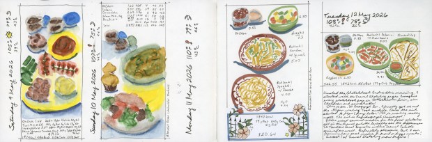
What do you do with a bag of many different types of markers, all in the same palette? Draw food, of course.
Well, I draw the food anyway. I’d been loving the Sailor Shikiori markers for food sketching — those gorgeous watery effects! But I’d also just finished building the same Travel Sketching palette six ways. Or eight. (What? I got obsessed.)
I knew the palette worked for landscapes and cityscapes. But food? I had to find out.
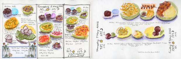
Food sketches in Shikiori and Goldfaber Aqua Dual Brush Markers, 5–8 May 2026
Shikiori markers for the first few days as I had been doing previously, then the Goldfaber Aqua Dual Brush Markers, then the Albrecht Dürer Watercolor Markers, and finally the Faber-Castell Pitt Artist Brush Pens — my first time ever using those in color.
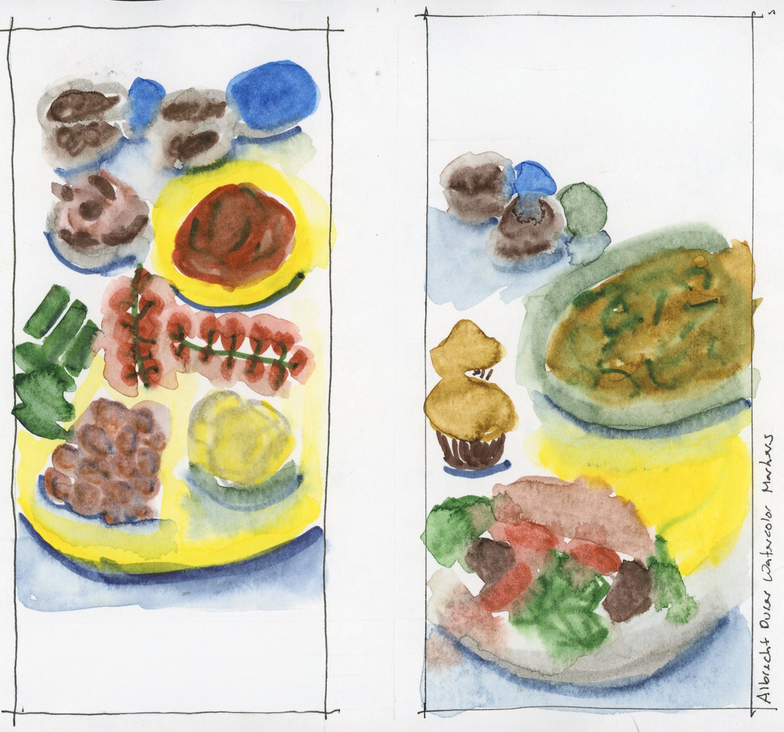
Ink on Paper — Albrecht Dürer Watercolor Markers, food diary, 9–10 May 2026
Not too bad, actually! The water-based markers end up more similar than different — the palette mostly wins. Except those tomatoes. You have to think about it to realize they’re tomatoes, because the sanguine is just not red enough. Every single person who looked at my sketchbook squinted at them. Sorry, tomatoes. You deserved better.
Food Sketches in Albrect Dürer Watercolor Markers, and Pitt Artist Brush Pens, 9–12 May 2026
In other news — I started indexing all my sketchbook pages. Can you imagine? A searchable index so I can find when I last sketched a particular subject, or when I sampled a paint color and then never used it again. Oh yes.
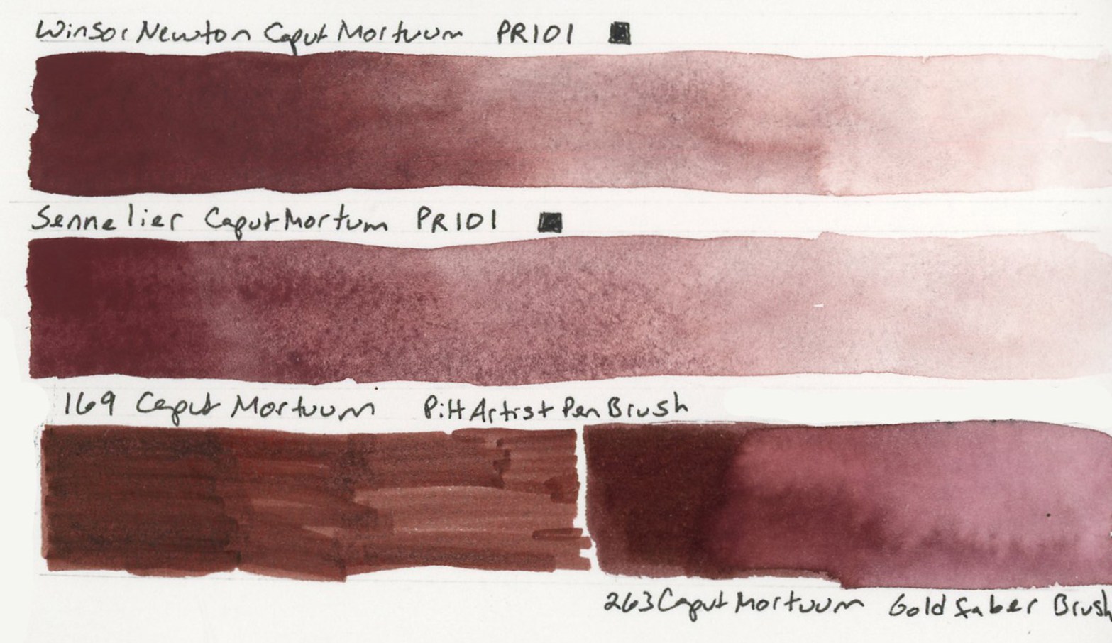
The Caput Mortuum watercolors arrived! My infatuation began when I put together the Travel Sketching palette, when the Goldfaber Aqua version caught my attention. Then in the notes page I thought of it immediately for the theme of darks. I knew I’d already ordered Winsor & Newton and Sennelier watercolors. Once they arrived I swiftly color swatched them.
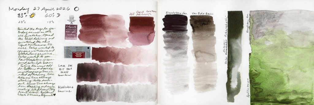
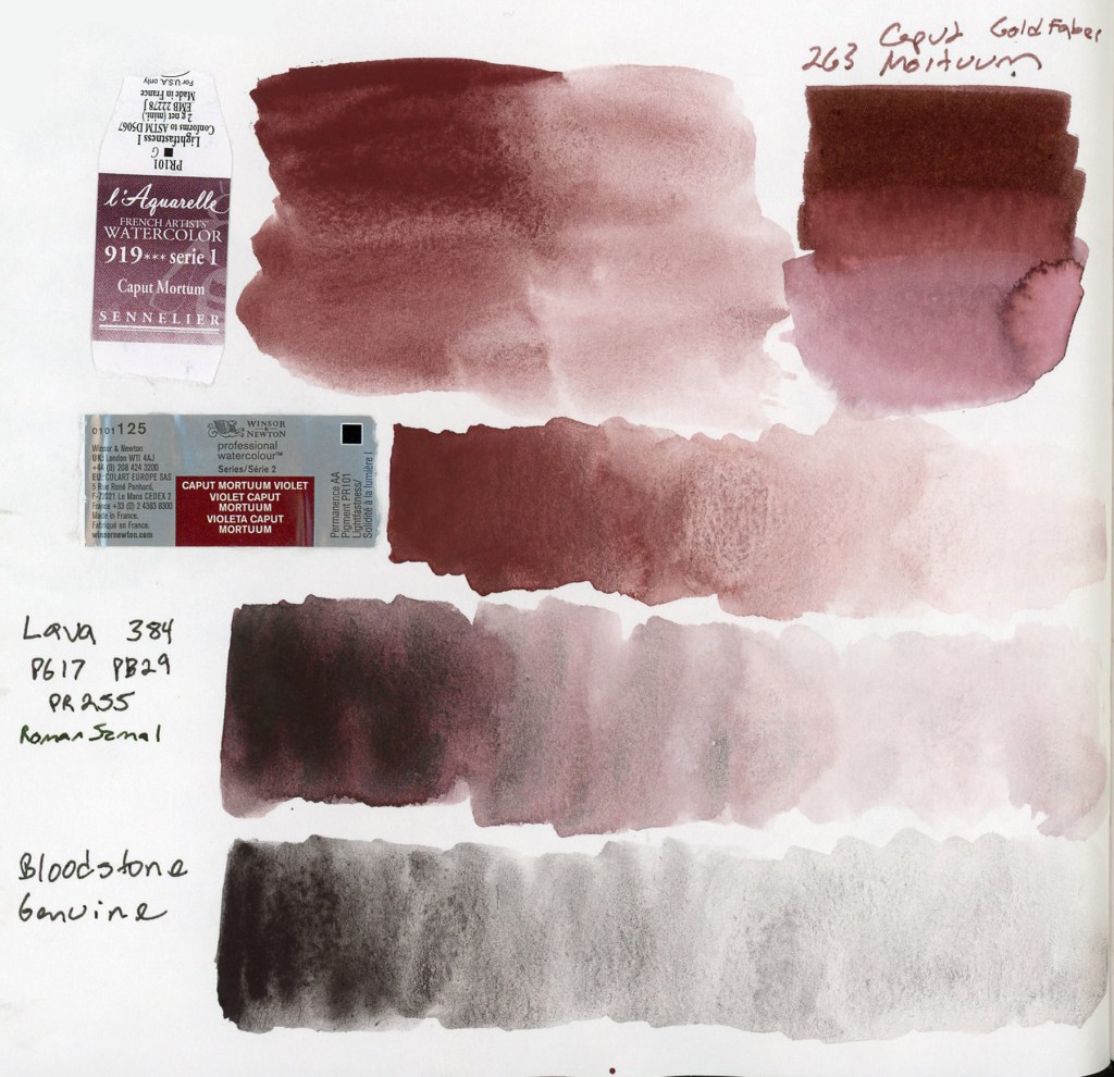
Caput Mortuum, Lava, Bloodstone Genuine, Apatite Genuine, and Sailor Shikiori Subarakishi — Monday 27 April 2026 — Stillman & Birn Alpha
That deep, complex brownish-reddish-purple. Somewhere between burgundy and iron oxide. Caput Mortuum is Latin for “dead head,” an old alchemical term for the residue left after distillation. Macabre and poetic. I love it! Winsor & Newton and Sennelier are single pigment PR101, which is fairly opaque and highly granulating.
Caput Mortuum watercolor swatches in Sennelier and Winsor Newton. Roman Szmal Lava 384 and Bloodstone Genuine — Stillman & Birn Alpha, 27 April 2026Winsor & Newton Caput Mortuum Violet, Sennelier Caput Mortuum, 169 Caput Mortuum Pitt Artist Brush Pen, 263 Caput Mortuum Goldfaber Aqua Dual Brush Pen — Stillman & Birn Delta, 27 April 2026
The two watercolors are very similar in hue. The Sennelier is a little smoother, the Winsor & Newton has more granulation. Both are quite opaque. Opacity affects layering and mixing, and these will behave differently from transparent darks. Worth paying attention to, to avoid flat or muddy works.
I also pulled out the Roman Szmal Lava 384, which I’d first swatched back in early March. I still love it so much, and it definitely feels like it belongs in this color club. That PG17 PB29 PR255 triple pigment giving it a depth and richness that the single pigment paints don’t quite replicate. Roman Szmal paints are harder to source here in the States, though.
Naturally I had to include the markers! The Goldfaber Aqua 263 Caput Mortuum and the PITT Artist Pen Brush 169 Caput Mortuum, side by side with the watercolors. The hue match is surprisingly close. Markers are their own medium with their own behavior, but it’s satisfying to know that the color I fell for in the palette swatches is holding its own. My infatuation with this color continues. How will it look if I use it for my darks, for shadows, etc?
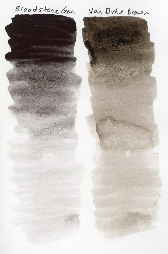
Bloodstone Genuine and Van Dyke Brown value gradients — Stillman & Birn Alpha, 27 April 2026
Since I was swatching anyway! I finally did the comparison of Van Dyke Brown versus Bloodstone Genuine. I’ve been curious about this since Liz swapped her Van Dyke Brown out last summer. Side by side in gradient swatches, the difference is clear. Bloodstone is greyer and cooler, less brown than Van Dyke Brown, and with potentially less of a color shift as it dries. Van Dyke Brown leans warmer and earthier. I can see why Liz made the swap, though I’m pretty sure my chocolate sketches need to keep the Van Dyke Brown! Bloodstone will work beautifully in landscapes and urban sketches, though!
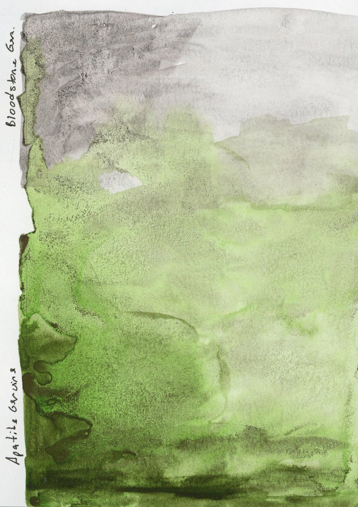
Bloodstone Genuine and Apatite Genuine — Stillman & Birn Alpha, 27 April 2026
Speaking of the landscape potential, both Bloodstone Genuine and Apatite Genuine granulate beautifully. I’m loving this texture of the genuine pigment paints, where the particles settle unevenly into the paper tooth and create something that looks almost geological. The Apatite Genuine is that luminous grey-green, softer and cooler than anything I could mix. Together on the page they look like a landscape seen from a great distance.
May has the Darks theme for the Patreon group, and the Travel Sketching course is running live. I’m excited for both, and hope to really dive in. I also want to get back to sketching the everyday things. It feels good to have more energy, and more enthusiasm again!
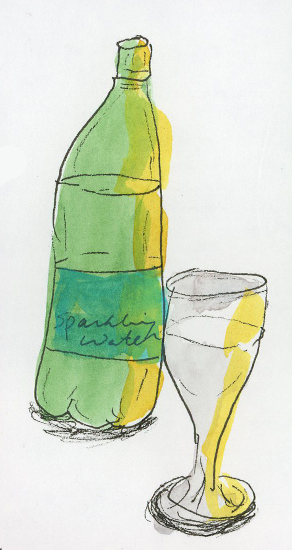
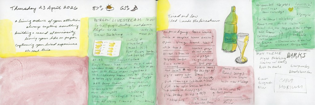
I was watching Liz Steel’s Patreon livestream and taking notes. I like kind of dense note-taking that fills a page and then adding color blocks to give it some life. While I was watching, I sketched my sparkling water that was sitting in front of me. This is my first sketch since April 7th! I’ve only done color charts since then. And I haven’t sketched anything not food since One Week 100 People! Now that seems crazy, but I look over my sketchbook pages, and there it is, in full color!
Patreon Livestream notes with sparkling water bottle sketch — Stillman & Birn Alpha, 23 April 2026
I miss the sketching, but I guess it’s been a rough season.
The livestream introduced Liz’s May theme: Darks. Oh, I like this one! She mentioned starting with darks, pushing the darks, and even night sketching! Should I try night sketching? It never occurred to me before.
Starting with darks is a very useful approach, especially with the shapes that I often start with also. Committing to your darkest values early gives a sketch structure and stops it from looking flat and cartoonish. Deepening the darks in a scene, and increasing the value range, is one of the most reliable ways to add depth and presence. It’s the kind of thing that makes a sketch look like a real object or scene. I’m thinking of darks in terms of ink lines, too, not just watercolor.
However, I did immediately think of Caput Mortuum. My new infatuation born from pulling the Travel Sketching Palette together. That deep, complex brownish, reddish, purple that sits somewhere between burgundy and iron oxide. I have the Goldfaber Aqua and PITT Artist Brush pen, and I ordered watercolors Winsor & Newton and Sennelier both. You know, I need both to compare, right? Right? They haven’t arrived yet. But I am fantasizing about the darks it might make for me. How would such a warm, deep dark work in sketches? Seems perfect for the desert, and for summer, when even the deepest shadows are still meltingingly hot.
Obviously there will be Caput Mortuum swatches when the paint arrives! Plus I might finally break open my Bloodstone Genuine and compare it to Van Dyke Brown. Last summer Liz had swapped her Van Dyke Brown for Bloodstone Genuine, and I’ve been curious about the comparison ever since.
It feels good to be getting excited about this coming theme. It feels good to sketch again, after a longer span of time when I didn’t. It feels good to be excited about the upcoming Travel Sketching course, too. May is shaping up to be quite fun in the sketching department!
I will be taking Liz Steel’s Travel Sketching course this May. I’ve taken it before, in September 2024, and I started in April 2025, but did not finish. (See all my posts for Sketching Now Travel Sketching here.)
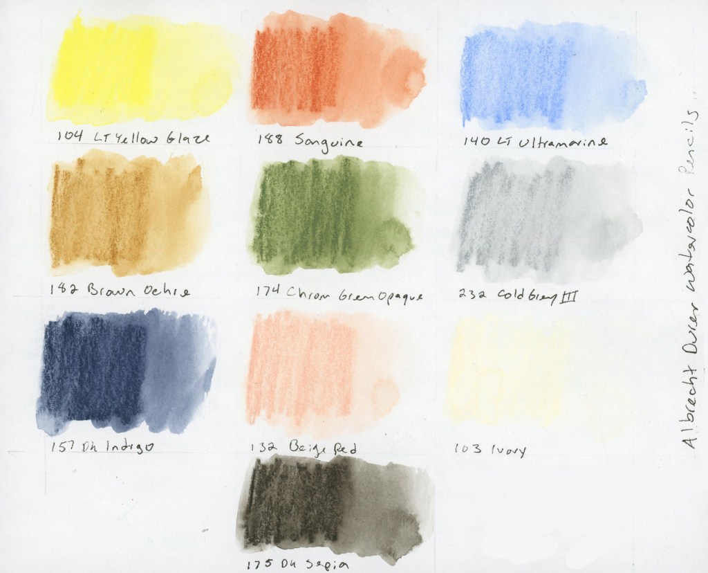
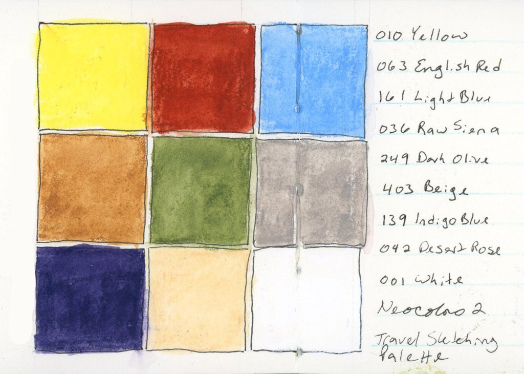
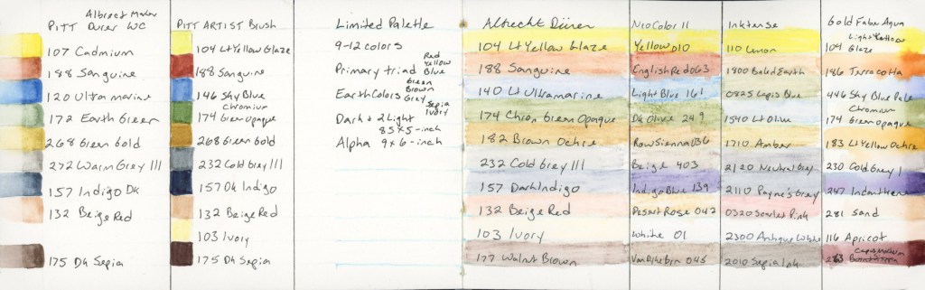
Every time I become a little obsessed with the limited palette for this class. Liz built it using threes: a primary, three earth tones, then a dark and two lights. She kept it fairly pastel, and muted. It really is great for landscapes. Especially Autumn scenes. She used Albrecht Dürer Watercolor Pencils.
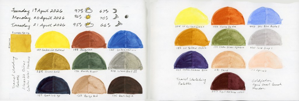
104 Lt Yellow Glaze, 188 Sanguine, 140 Lt Ultramarine, 142 Brown Ochre, 174 Chrom Green Opaque, 232 Cold Grey III, 157 Dark Indigo, 132 Beige Red, 103 Ivory, 175 Dark Sepia — Albrecht Dürer Watercolor Pencils
The first time I took this course, I discovered I really wanted a brown, so here I’ve added the dark sepia. The second time I became very curious about Inktense pencils, wondering how were they different. Since I owned a set, a pulled the same palette colors and I started using Inktense pencils shortly afterward. I also wanted to explore Neocolors II. I was unable to finish the course, so I did not explore those as much as I intended.
This time around, I decided to find out.
The Albrecht Dürer Watercolor Pencils. Activated, they produce soft, luminous washes. There’s a gentleness to them that feels very suited to location sketching, which is rather the point. Dark Sepia is my second dark, which I really craved. Plus I have a love affair with Sepia, so it’s a natural fit. I did consider a warmer brown, like Walnut, but the cooler sepia keeps the balance between warm and cool tones.
I built this Inktense palette to best match the colors of the original palette. Same colors, two media, learn how do they really behave different. The get the more pastel grey and soft pink, you really need a very light touch when applying the pencil, as the colors are darker than the matching shade. They say Inktense becomes permanent once dry, so you can layer over it without lifting. I find they give smoother washes, and they seem more vivid, but this palette is still holding that more muted vibe.
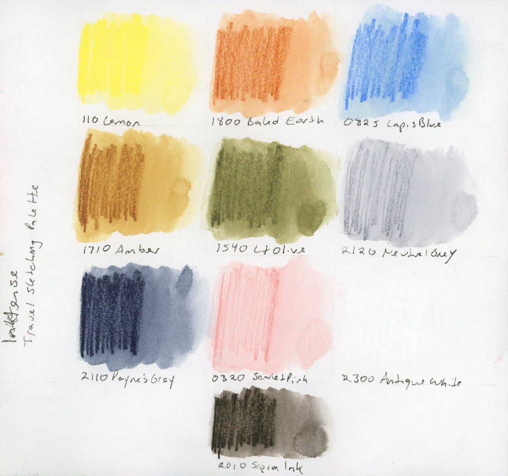
010 Yellow, 063 English Red, 161 Light Blue, 036 Raw Sienna, 249 Dark Olive, 403 Beige, 139 Indigo Blue, 042 Desert Rose, 001 White — Neocolor II — Stillman & Birn Delta, April 2026
I had selected the matching colors in a Neocolor palette for the April course, but never used them. Since I have them, I continue to be very curious to work with them. The swatches are certainly vibrant, and they felt good to lay down. These swatches were Delta book, in ivory paper, so that white shows up a bit better. I wonder how these would look on colored paper? Are they more opaque?
At this point the reasonable thing would have been to stop. I did not stop. Liz mentioned she would be adding markers to the course this time around, and well, I have markers! (Advantage of buying way too many art supplies over many years, I have a lot of stuff just lying around! Whole color sets make great gifts during the holidays!) So I pulled together the same palette in multiple marker types. (I did have to fill in a couple gaps, and order a few, but not too many.)
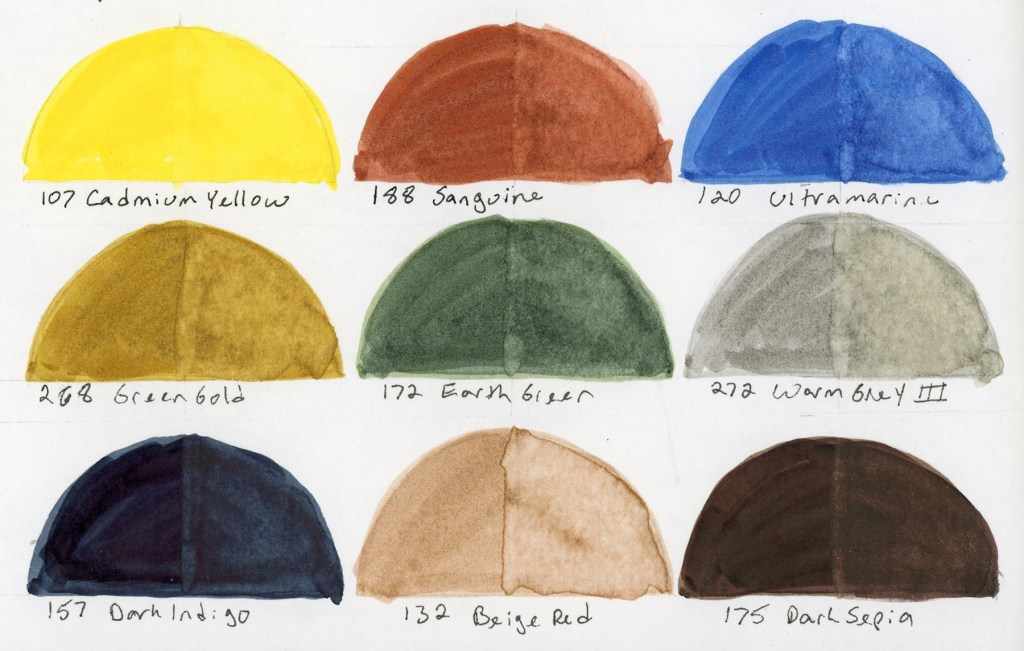
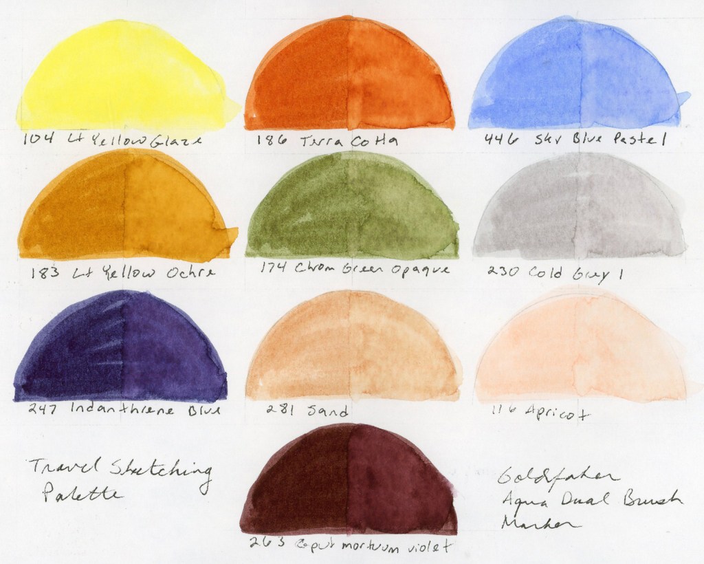
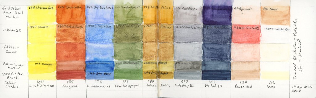
Travel Sketching palette — Albrecht Dürer Watercolor Markers and Goldfaber Aqua Dual Brush Markers — Stillman & Birn Alpha, April 2026107 Cadmium Yellow, 188 Sanguine, 120 Ultramarine, 268 Green Gold, 172 Earth Green, 272 Warm Grey III, 157 Dark Indigo, 132 Beige Red, 175 Dark Sepia — Albrecht Dürer Watercolor Markers104 Lt Yellow Glaze, 186 Terra Cotta, 446 Sky Blue Pastel, 183 Lt Yellow Ochre, 174 Chrom Green Opaque, 230 Cold Grey I, 247 Indanthrene Blue, 281 Sand, 116 Apricot, 263 Caput Mortuum Violet — Goldfaber Aqua Dual Brush Markers
I love how watercolor markers look when activated with water. They bleed and bloom in ways I love. Easy to get complete obliteration of the lines, so it’s a bit like playing a daring game! I also put together the same palette in the pigment Pitt Artist Brush pens, but never swatched those independently. They are only swatched in the big color chart below.
And of course, I had to see everything side by side, right? How well did I match these colors across the mediums?
Travel Sketching palette reference chart — Stillman & Birn Delta, April 2026Travel Sketching palette in five media — Stillman & Birn Delta, 19 April 2026
I am really looking forward to using these in actual sketches to learn how the different media behave, and discover what I do and don’t like.
I also may have begun a new obsession. I love that Goldfaber Aqua Dual Brush Caput Mortuum. They didn’t have a brown, so that was the closest. The Pitt Artist Brush pens also have a gorgeous Caput Mortuum. So I may have immediately ordered some Caput Mortuum watercolor paint.
It started with one question about two pencil ranges, how is Inktense different from the Albrect Durer watercolor pencils. It ended with six media, so many color charts and a new obsession or two.
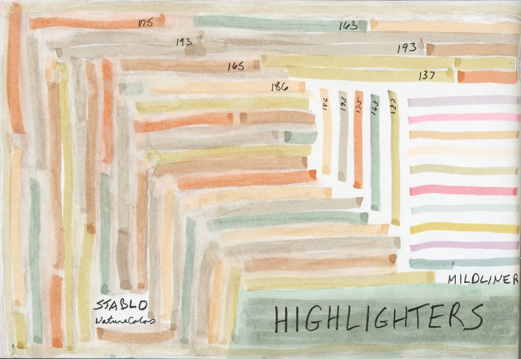
I’d ordered Stabilo NatureColors highlighters and Zebra Mildliners for my planner, but the moment they arrived I wanted to know how they’d behave on Alpha paper. Are they waterproof? Could they work as a sketching underlayer to block in a scene before adding watercolor or ink on top? Swatching each pen was essential, so of course I turned the whole test into a page.
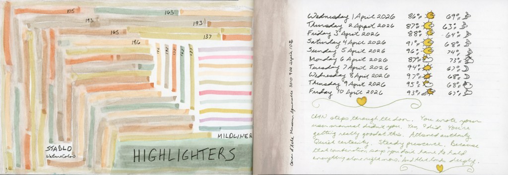
Stabilo NatureColors and Zebra Mildliner highlighter swatches — Stillman & Birn Alpha, April 2026
The NatureColors went down in somewhat random lines, that became this squarish shape. The Mildliners in simple parallel lines on the right. I did test them with water, and they are waterproof. The underlayer idea, to make a quick highlighter sketch, then build color on top, is still sitting in the “to try” pile. Documenting a delivery this way is considerably more interesting than sketching each pen! I do love making color blocks. Or in this case, color stripes.
Stabilo NatureColors and Zebra Mildliner highlighter swatches with Caran d’Ache Museum Aquarelle — Stillman & Birn Alpha, April 2026
The strip of color in the middle of the page is a Caran d’Ache Museum Aquarelle pencil, Sepia 10%. I’m a little obsessed with Sepia. It fits nicely as a soft, light neutral color. Museum Aquarelles are exceptionally soft and produce beautiful washes, and this one is quietly auditioning for a place in my standard travel kit. I may have to experiment with them more.
The right page of this spread has a little journaling alongside the first ten days of April weather. I’m working on adding a bit more journaling to my sketchbook pages, to hold memories, and capture moments.
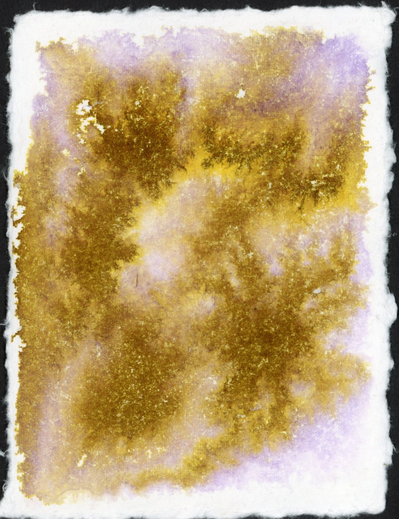
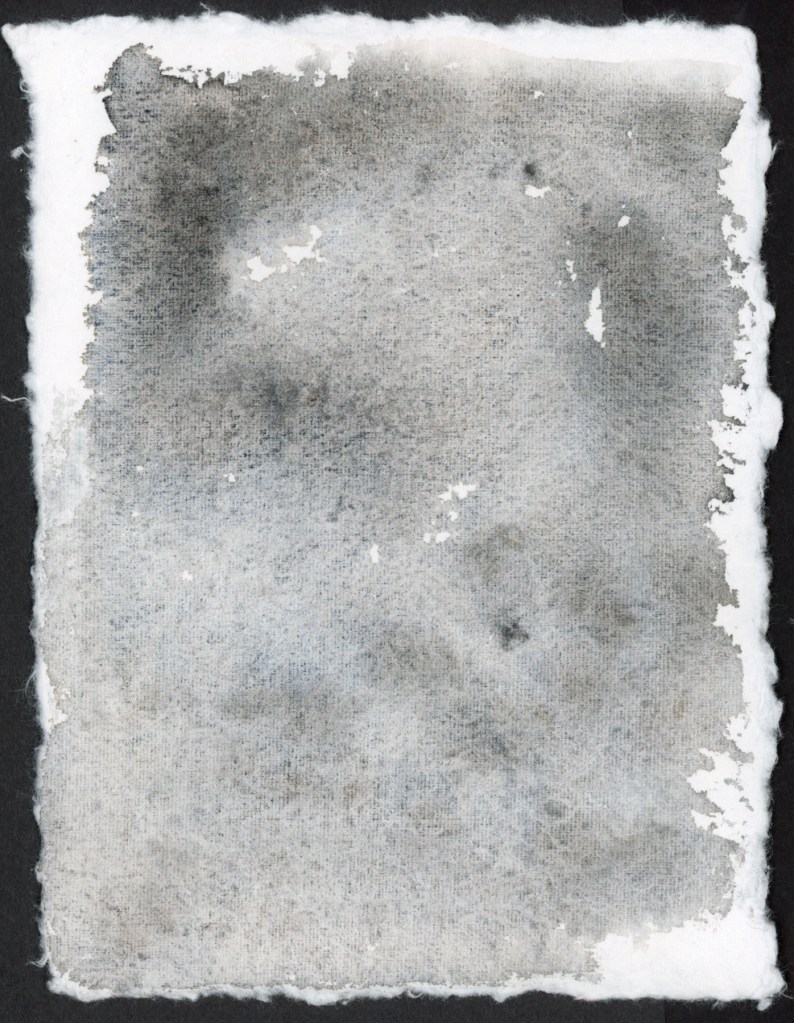
Before I put my handmade paper ink swooshes into the portfolio book, I wanted to use the backs of the cards. Can’t have blank paper! What’s the fun in that? Plus the chromatography aspect is so much fun, and what would happen if I had more paper to work with for a larger separation potential?
So I did what had to be done. I made a mess. A beautiful, atmospheric, very satisfying mess. I even had water and ink dripping off the page!
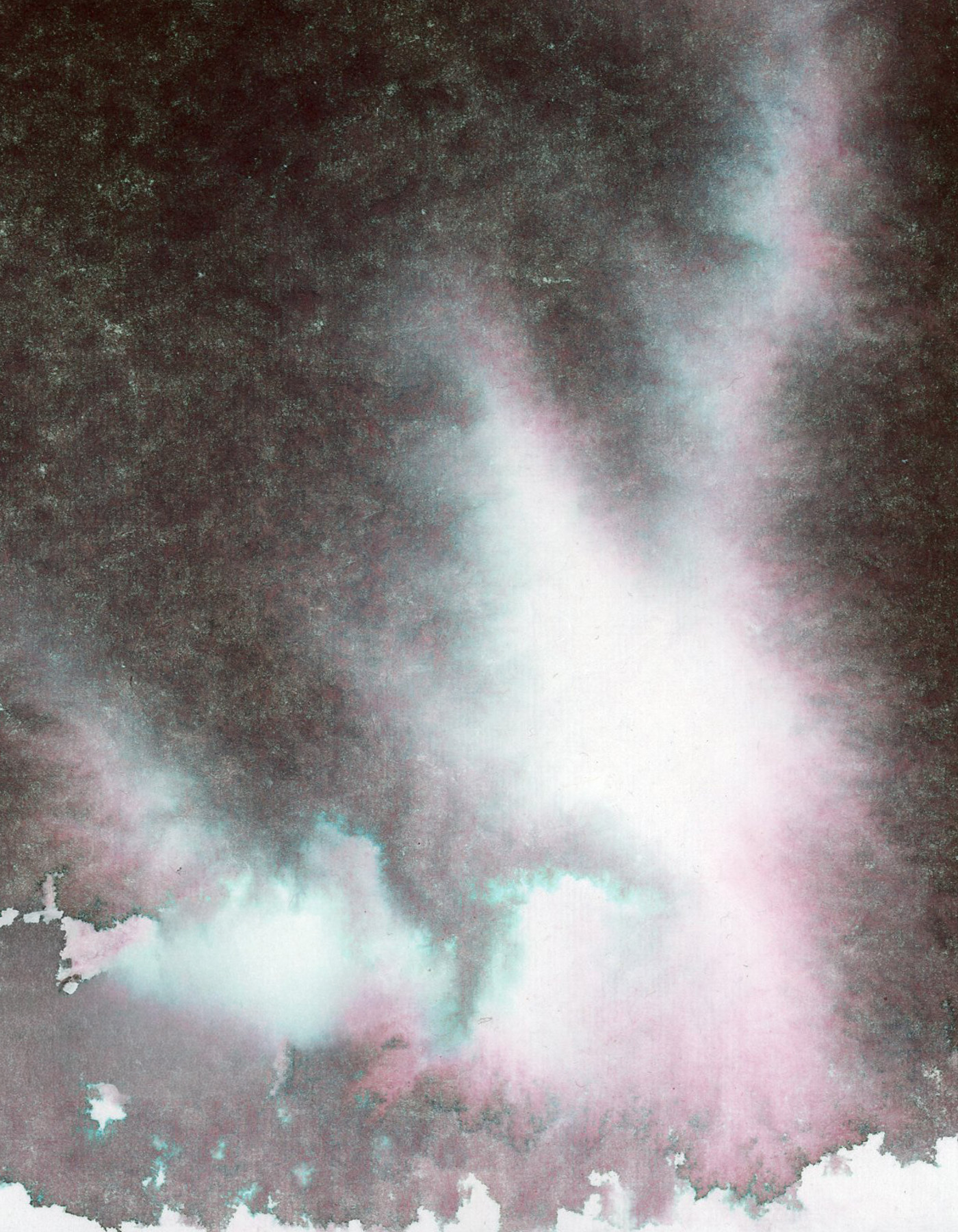
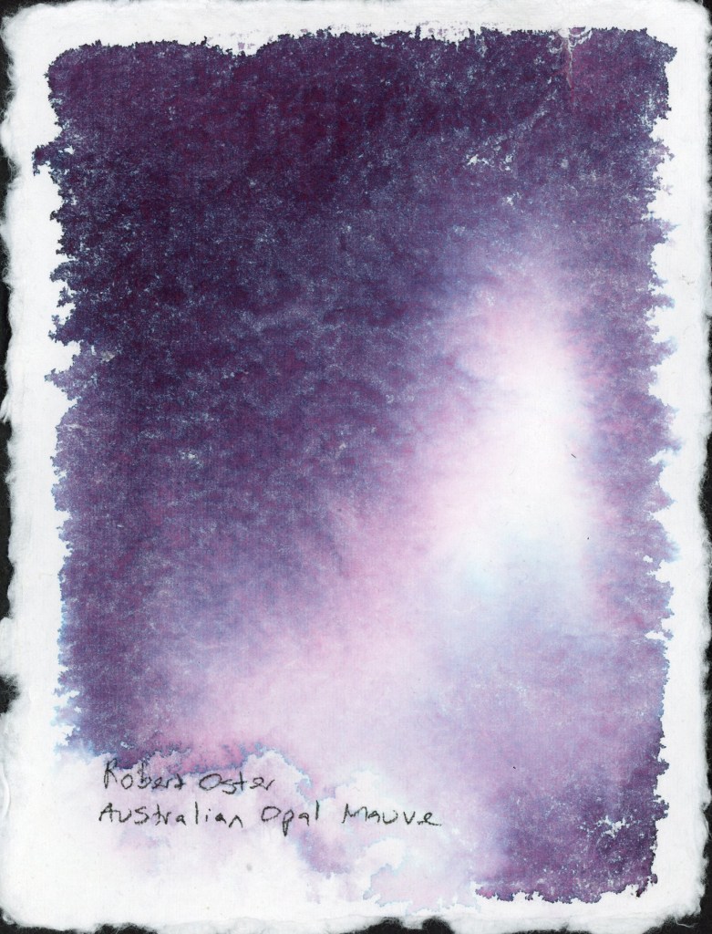
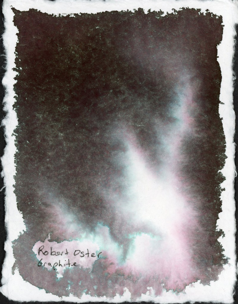
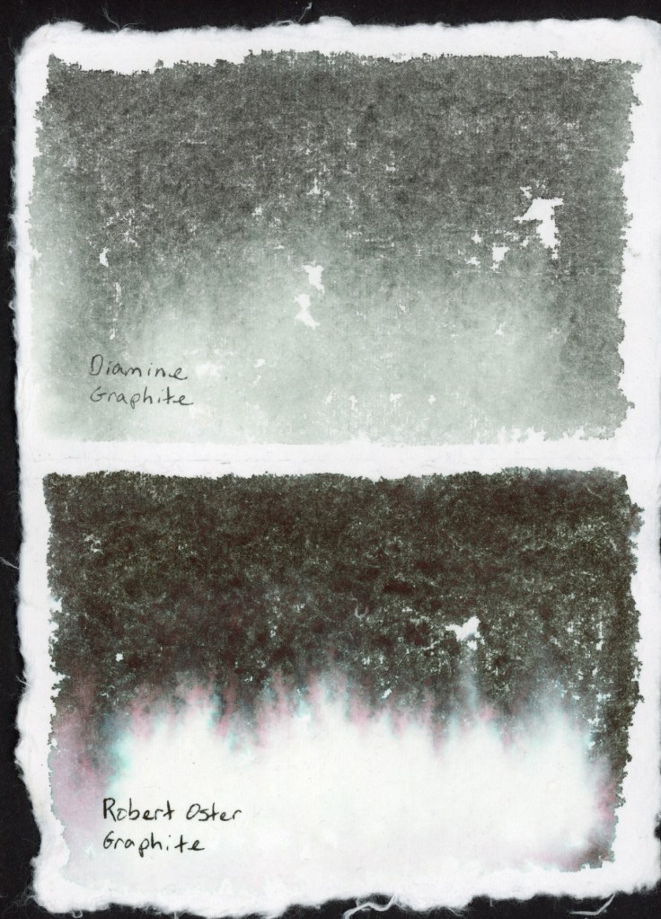
Robert Oster Australian Opal Mauve on Leather Village Handmade Cotton Watercolor PaperRobert Oster Graphite on Leather Village Handmade Cotton Watercolor Paper.
Robert Oster Graphite was one of my favorites from the chromatography lesson I posted about recently. That deep complex near-black opens up into the most beautiful teal and rose separation in the lighter areas. It looks like a nebula. I’m a little bit in love with it.
Then I wanted to see what this particular handmade paper does with some of my granulating watercolors. Granulating watercolors behave very differently depending on the paper. how much separation the pigments have causing that elusive “watercolor magic.” This handmade paper is cotton, and it does a very good job of having very even washes once it is dry. So watercolor magic? Not so much.
The granulation is visible, but the paper holds the pigments fairly close together rather than letting them really spread and separate. It’s a quieter, more even look. Perfect when you want smooth washes.
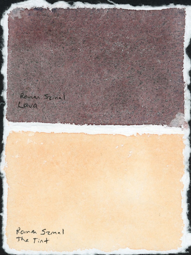
Roman Szmal Lava and The Tint — handmade paper test
I’m loving that Roman Szmal Lava in particular. I’m looking forward to using it a lot more. That dark reddish color, and it has lovely granulation on different paper.
I tested The Tint alongside it, to sample how pink versus yellow is it on this paper. A nice striking pair on the page.
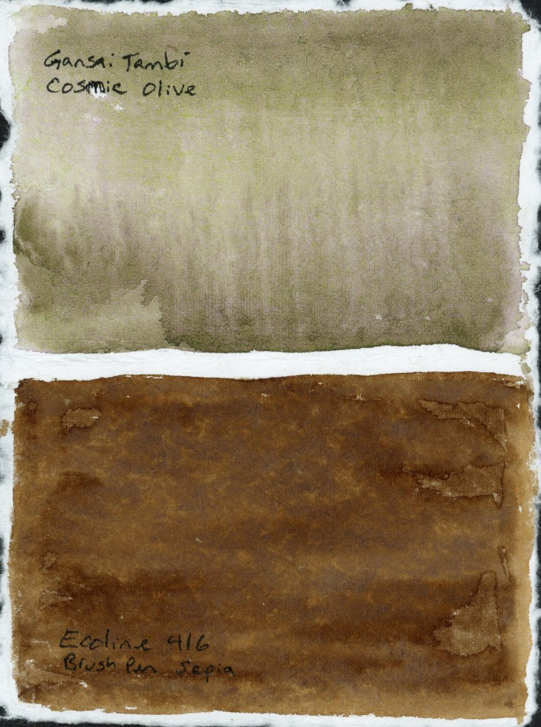
Gansai Tambi Cosmic Olive and Ecoline 416 Brush Pen Sepia — handmade paper test
The Cosmic Olive did not separate nearly as much as it does on other papers, and the Ecoline 416 Sepia marker turned out surprising flat. I expected more blooming when I added water.
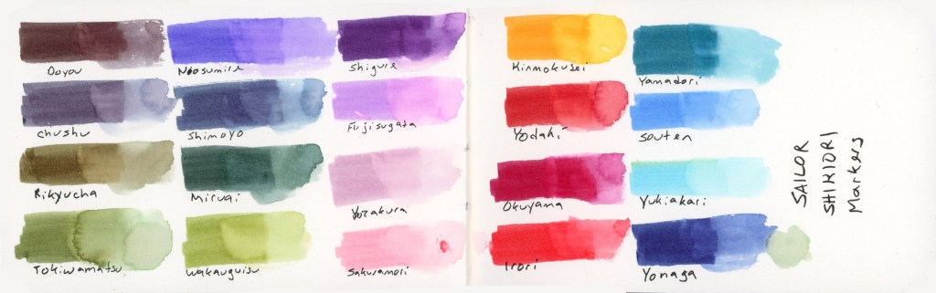
In the food sketchbook, the Delta, I’ve been using the Shikiori markers to sketch my food, so it was time to do a full color chart. Beautiful colors and they react strongly to water. I love that.
Sailor Shikiori Markers — full color swatch reference
The Shikiori markers do something I find absolutely lovely, add water and they bloom outward in that soft, spreading way that reminds me of how Faber-Castell watercolor markers behave. Very satisfying, very painterly. It’s easy to make a lovely watery mess, and I adore that. The Delta paper the results were clean and bright, and holds up well to markers and lots of water.
The Shikiori line takes its name from 四季織 — shikiori — meaning “weaving of the four seasons,” and the color names live up to that. They’re all Japanese seasonal and nature words, and I think they’re worth listing out properly because they’re just so beautiful:
Doyou — midsummer · Chushu — mid-autumn · Rikyucha — tea-brown, named for the tea master Sen no Rikyū · Tokiwamatsu — evergreen pine · Neosumire — sleeping violet · Shimoyo — frosty night · Miruai — meeting of seaweed · Wakauguisu — young bush warbler · Shigure — autumn rain shower · Fujisugata — shape of Mount Fuji · Yozakura — night cherry blossoms · Sakuramori — cherry blossom grove · Kinmokusei — osmanthus flower · Yodaki— night waterfall · Okuyama — deep mountain · Irori — hearth fire · Yamadori — copper pheasant · Souten — blue sky · Yukiakari — snow light · Yonaga — long night
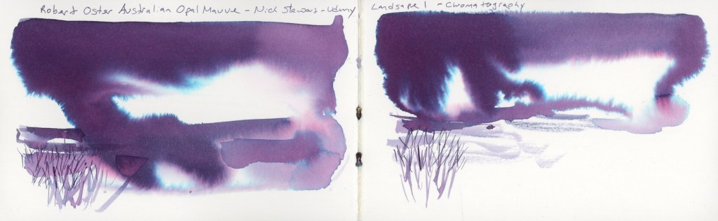
Back in December when my Invent came I had been searching online and found Nick Stewart, who has swatched every Diamine Inkvent calendar for years. I was captivated by his method. In January I dabbled in his Udemy course, Fountain Pen Ink art. I also bought some of the inks for that course that really seemed to separate chromatically in breathtaking, and beautiful ways. I’d taken a toe dip into the course, with the few inks I had, and the handmade cotton watercolor I’d gotten for Christmas. The paper is from Leather Village — 400gsm, rough textured, with those beautiful deckle edges. A simple test, with just a couple inks, to see what the paper and the ink would do together. The method to get the most chromatography from the ink is to lay down a lot of water, then drop in the ink.
Noodler’s Rome Burning on Leather Village Handmade Cotton Watercolor PaperDiamine Graphite on Leather Village Handmade Cotton Watercolor PaperDiamine Graphite and Robert Oster Graphite on Leather Village Handmade Cotton Watercolor Paper
The two graphites looked very different! Diamine Graphite is a soft, cool grey-blue. Robert Oster Graphite is dramatically darker, and look at that pink and teal fringe bleeding out at the bottom.That chromatography is lovely, with those hidden colors separating out as the water carries them across the paper.
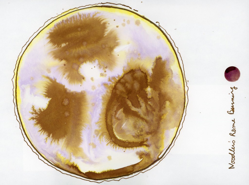
Noodler’s Rome Burning on Stillman & Birn Alpha — Chromatic World
I had also done this fun exercise, the Chromatic World in my Stillman and Birn Alpha sketchbook. You may have seen this in my “Early January 2026” post. You can really see how much Noodler’s Rome Burning in particular explodes when it hits water. That is one ink. One ink, water, and a circle. The gold, the ochre, the warm brown, the ghost of lavender — all of it was hiding inside Noodler’s Rome Burning, waiting for water to pull it apart. I find this genuinely magical every time.
When I was playing with ink in my recent food sketches, I got inspired to return to this course and do more extensive ink and paper tests. . Nick’s course uses mostly Bockingford watercolor paper, which I couldn’t source here, so I used what I have handy, and of course had to use different papers to see how they affect the results! I used the Stillman & Birn Delta, Strathmore Watercolor Paper 400 Series Cold Press 300gsm, and Arches Rough Watercolor Paper 300gsm.
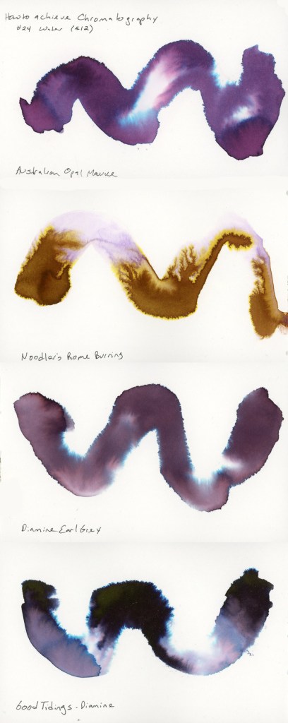
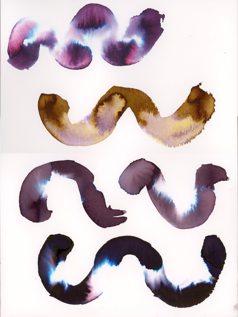
The first exercise is the Swatch Painting. You lay a wave or swoosh down with a big round brush loaded with lots of water. Then drop in the ink with a smaller round brush and watch it travel. How much it separates seems very different based on the paper. I used four inks: Robert Oster Australian Opal Mauve, Noodler’s Rome Burning, Diamine Earl Grey, and Diamine Good Tidings, though the Good Tidings only made it into the Delta book.
Robert Oster Australian Opal Mauve, Noodler’s Rome Burning, Diamine Earl Grey, and Diamine Good Tidings on Stillman & Birn Delta
The Delta paper gave me lovely fluid results. It actually holds up to these wet ink washes even better than with watercolor! Australian Opal Mauve separates beautifully, pulling apart into pink, violet, and that surprising electric blue is deeply satisfying. Rome Burning, which is brown as a writing ink, separates to this warm and golden ochre and lavender. Earl Grey is quieter, more restrained, a muted purple that bleeds to soft blue at the edges. The Good Tidings is the dramatic one of the bunch, near-black with that explosive teal bloom.
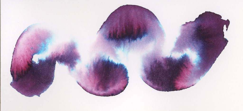
Look at the Australian Opal Mauve on the Strathmore paper!
Robert Oster Australian Opal Mauve on Strathmore Watercolor Paper
The four inks are sampled on both Strathmore Watercolor paper, and Arches Rough Watercolor paper.
Robert Oster Australian Opal Mauve
Noodler’s Rome Burning
Diamine Earl Grey
Robert Oster Graphite
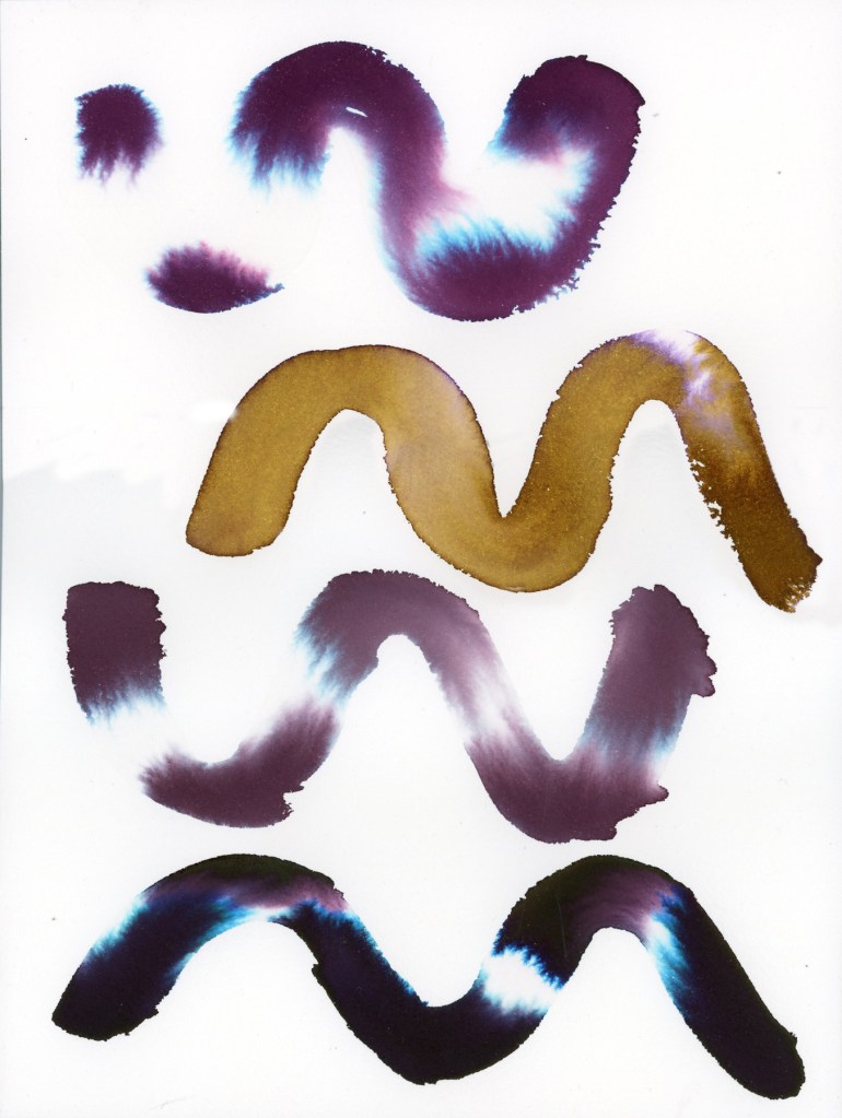
Robert Oster Australian Opal Mauve, Noodler’s Rome Burning, Diamine Earl Grey, and Robert Oster Graphite on Strathmore Watercolor PaperRobert Oster Australian Opal Mauve, Noodler’s Rome Burning, Diamine Earl Grey, and Robert Oster Graphite on Arches Rough Watercolor Paper
The Arches Rough gives a noticeably different quality — the texture of the paper surface shows through the ink in a way that the smoother Strathmore doesn’t.
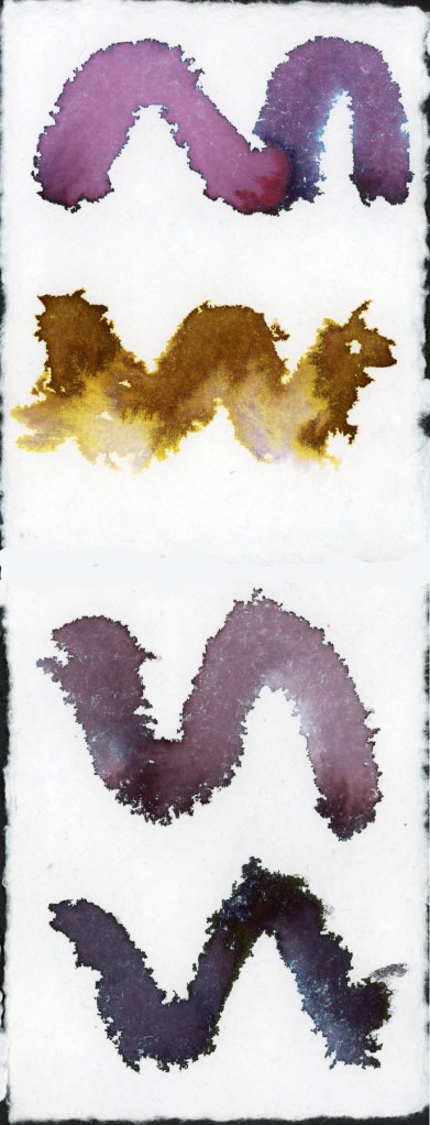
Robert Oster Australian Opal Mauve, Noodler’s Rome Burning, Diamine Earl Grey, and Robert Oster Graphite on Leather Village Handmade Cotton Watercolor Paper
The handmade Leather Village paper is a completely different experience. The rough fibrous surface grabs the ink differently, and the results are wilder and less predictable. Rome Burning in particular practically explodes on this surface. That ink has the best diffusion by far.
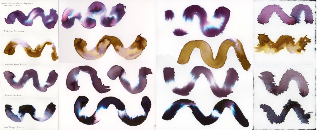
I tested the same four inks across all four papers, so you can really see how much the surface affects the results. Here they are side by side.
hromatography swatch comparison — Robert Oster Australian Opal Mauve, Noodler’s Rome Burning, Diamine Earl Grey, and Diamine Good Tidings / Robert Oster Graphite on Stillman & Birn Delta, Strathmore Watercolor Paper, Arches Rough Watercolor Paper, and Leather Village Handmade Cotton Watercolor Paper
The final two exercises move into landscape territory, applying the chromatography technique to create actual pictures. Landscape One uses a large wet mass of ink for sky and atmosphere, with simple marks below suggesting ground and grasses. I used Australian Opal Mauve for both versions on the double spread. Nick Stewart Uses Robert Oster Barossa Grape, but I couldn’t find that ink.
Robert Oster Australian Opal Mauve on Stillman & Birn Delta — Landscape 1
There’s something about that ink in landscape form that feels almost otherworldly — those blue and pink separations read as light breaking through storm clouds. The little reed marks scratched into the wet wash at the bottom anchor it just enough to feel like a place. I had more dripping than I expected, but that is just practice. Wouldn’t this be great for snowy landscapes?
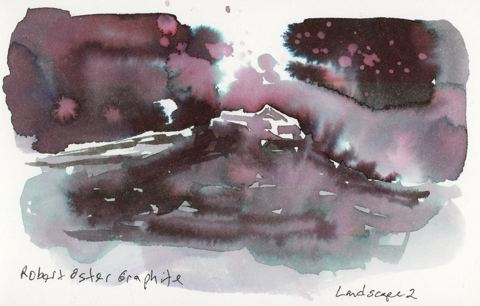
Landscape Two pushes further, adding more structure and a sense of depth. I used Robert Oster Graphite for this one, and it might be my favorite thing I made in this whole session.
Robert Oster Graphite on Stillman & Birn Delta — Landscape 2
The way Robert Oster Graphite separates in a wet wash — those deep plums, the pink spatter, the teal at the edges — makes a landscape that feels moody and atmospheric without any real effort to make it so. The ink does the work. That little glimpse of a structure in the negative space at the center, the misty ground below. If you blot the ink while it’s still wet, you get even more of that pink underlayer.
This Robert Oster Graphite is certainly the star player in this chromatography method! Honorable mention goes to Rome Burning, for it definitely separates well.
I started recording the weather alongside the daily dates in my sketchbook back in January 2023, Volume 12. Over three years now. It’s become one of those quiet anchors of my sketchbook. Even in the months where I sketched almost nothing else, the dates and weather hold the line. After an inflammation hit, or a hard week, or even death in the family, I come back and I catch up the weather. I fill in the gap from whenever I fell off to when I’m picking the sketchbook back up. There’s something grounding about that return.
It makes the sketchbook practice a living, breathing reflection of life itself and that is worth capturing. Here is the flow of the full sketchbook pages for the month.
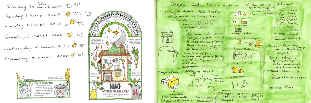
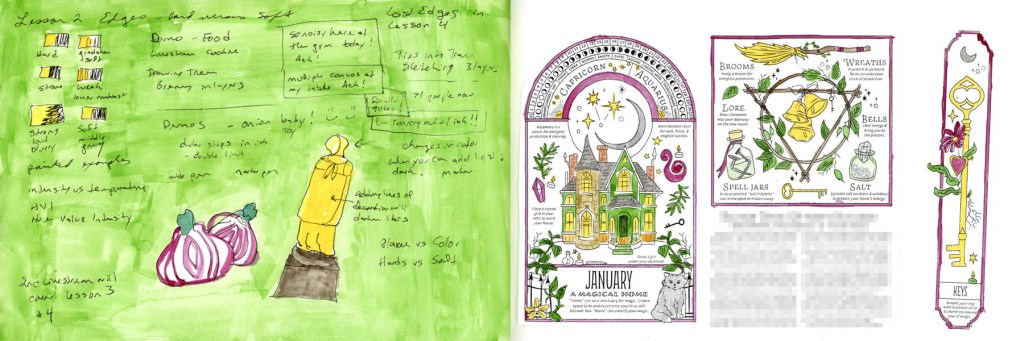
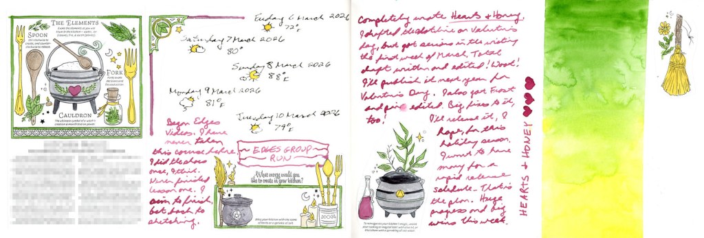
I had such great energy and joy at the start of the month! I was feeling the spring bloom, and painting my pages with the Winsor Newton Sap Green. Edges class was starting and I was super excited about that.
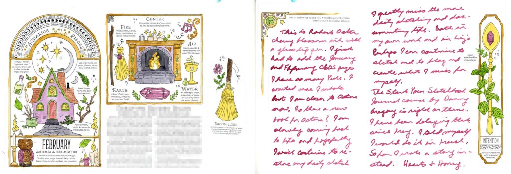
February tail end and March — A Witch’s Kitchen, CBOS 2026Edges Lesson notes and January CBOS — A Magical Home
Since I really want to include the Coloring Book of Shadows monthly designs in my sketchbook this year, myy completist brain couldn’t leave January and February’s pages missing from the record. So in they went. They really are so pretty when colored.
February CBOS — Altar and Hearth, with Cherry Blossom ink journaling
I’ve been making a deliberate effort to do more journaling in the sketchbook this year. Apparently I was doing journal notes back in January 2023 as well, and I just forgot! I like it, as it captures actual life, not just sketches. It is also a great excuse to use the large collection of fountain pen inks I have!
March CBOS — The Elements, and a Hearts & Honey gradient closing page
Hearts and Honey is the book I’m currently writing, and it’s very hard to document a writing project! They aren’t very sketchable unless I start doing storyboards (those are Hard!) but it’s a big part of my life and it deserves to be documented.
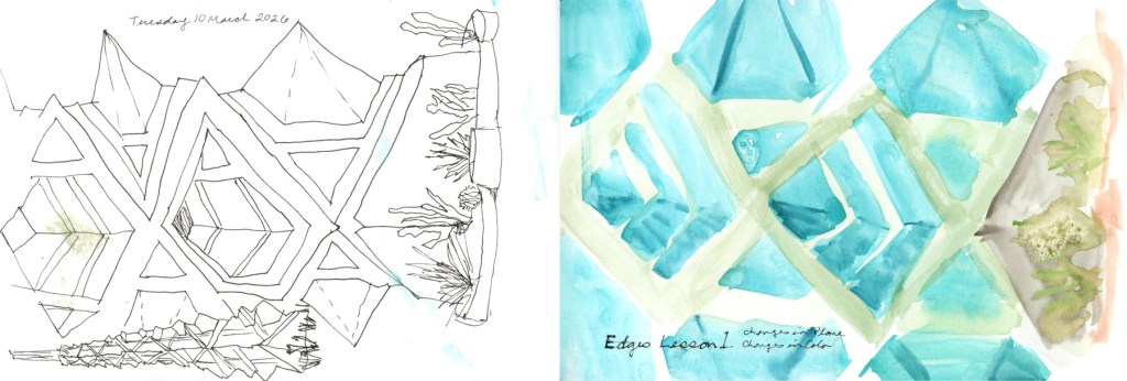
Frank Lloyd Wright Spire, three sketches
This is where the spire series lives in the sketchbook. Three attempts, ink through to direct watercolor. You can read more about that in the March Theme: Three post!
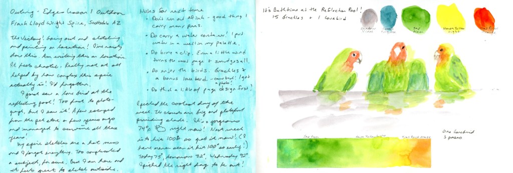
Bathtime at the Reflection Pool — Lovebird in 3 Poses, with Gradient Bar
Sketch outing notes on a color block, and the lovebird page that ended up anchoring the Three post. One bird, three poses, with a watercolor gradient bar.
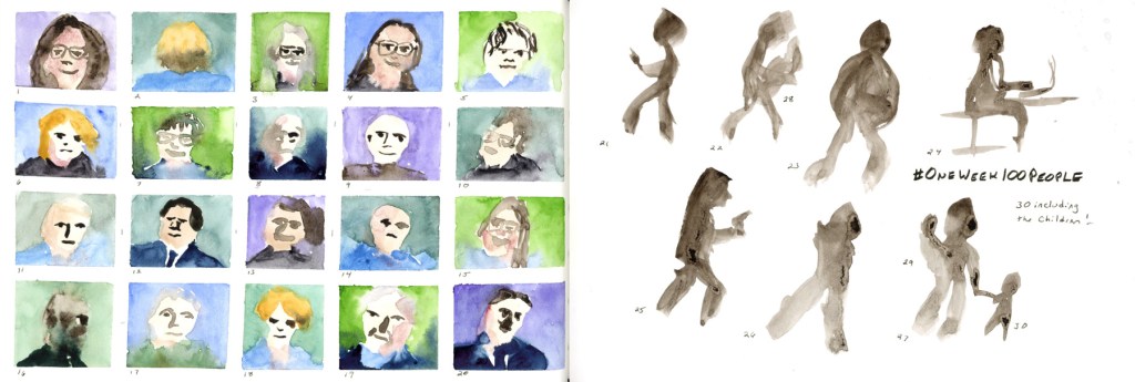
One Week 100 People — 30 done, faces and figures
I did not do as much as I wanted for One Week 100 People, but I’m happy I got one day of sketching in!
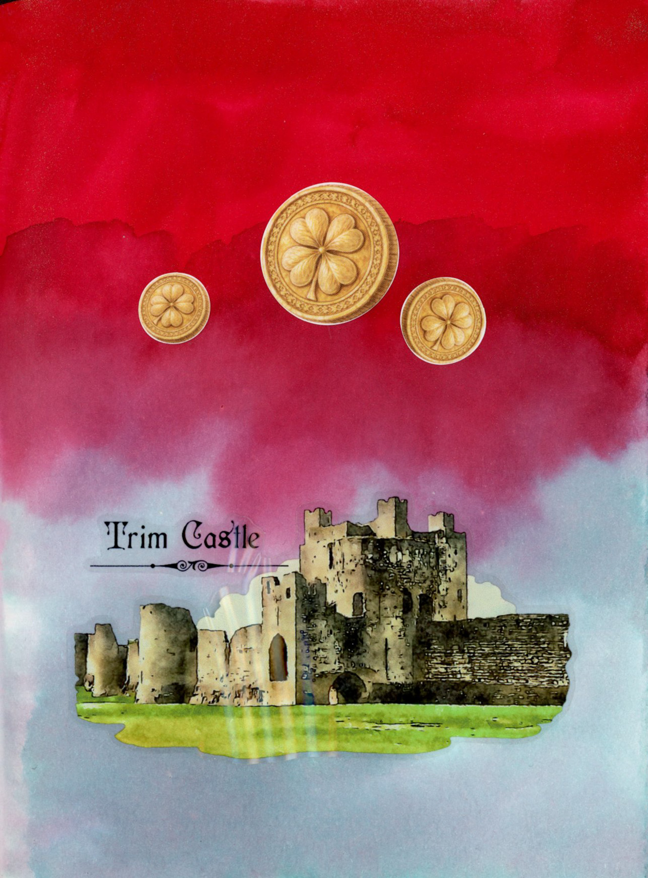
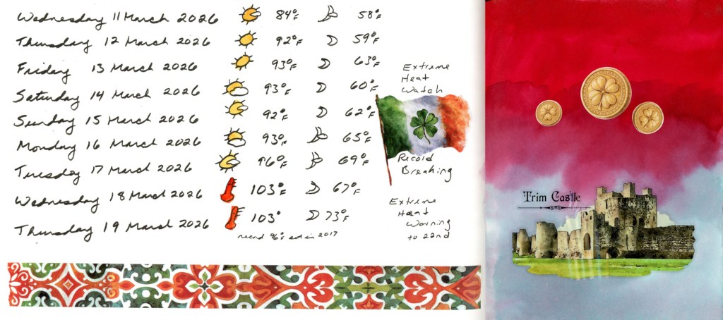
Dates and weather 11–19 March, with a St. Patrick’s Day page in Diamine Ruby Taffeta and Overcast ink.
March broke heat records, by a lot! Over ten degrees above the previous records, some days. The washi border and Irish flag sticker are for St. Patrick’s Day — a little celebration tucked into the data. A dramatic sketchbook page with a deep red and soft teal ink background made with Diamine Ruby Taffeta and Diamine Overcast inks, with three gold shamrock coin stickers and a detailed Trim Castle sticker showing stone ruins against a green lawn. The stickers and washi tapes are from this month’s Cora Crea box.
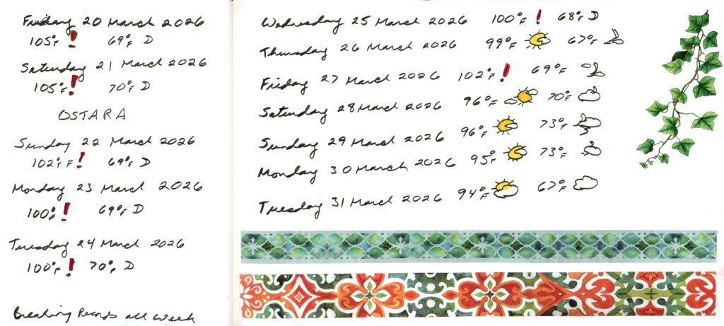
Dates and weather 20–31 March — breaking records all week. Ostara at 105°F.
I wanted to sketch, but inflammation hit badly, so a string of dates and weather is all I managed. At least the weather is cooling off! Still unseasonably warm, and matching the record high temperatures.
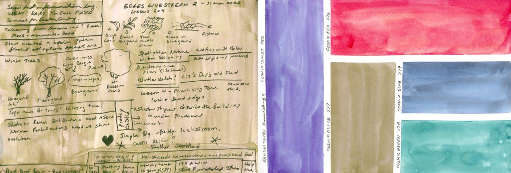
Edges Livestream 2 notes on a Cosmic Olive wash, alongside the Gansai Tambi Granulating 2 Cosmic palette swatches.
Ending the month with some notes from the second and final Edges livestream, then a little color exploration. I had to swatch out this Gansai Tambi Granulating 2 colors.
Like most of my sketchbook pages for the last several months, I have more notes than sketches, but it does capture life as it’s happening. Honestly, I’m surprised I have as many pages done as I do! That’s not nothing. Here is March, on the page.