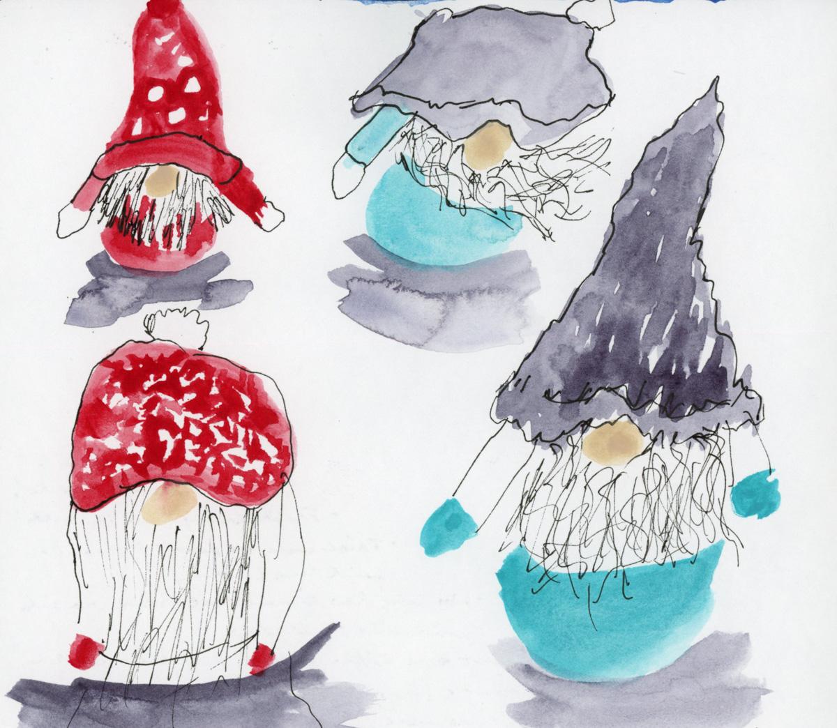
Happy New Year!
I am so very excited about Foundations this year. As I was doing Buildings a lot of the basics really clicked for me in new ways, and thusly I’m quite excited to do Foundations, and focus on those basics, and allow my new depth of understanding to really be explored and practiced!
This is my fourth run through of Foundations! Hard to believe, isn’t it? I’ve never finished, (I say that a lot, don’t I?) but I always learn a lot. Obviously, I’m absolutely planning to complete everything! Naturally, I’m “behind” already. However, I love it no less!
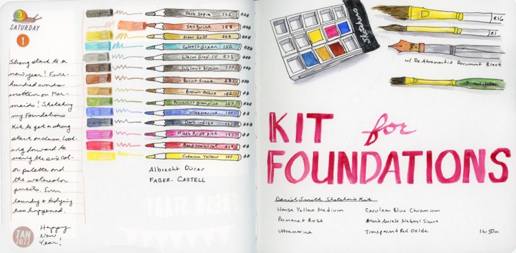
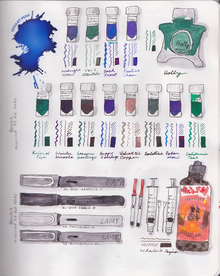
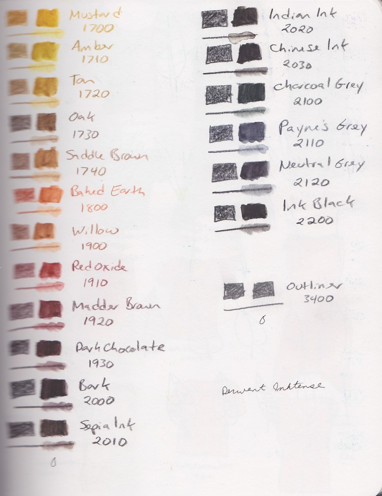
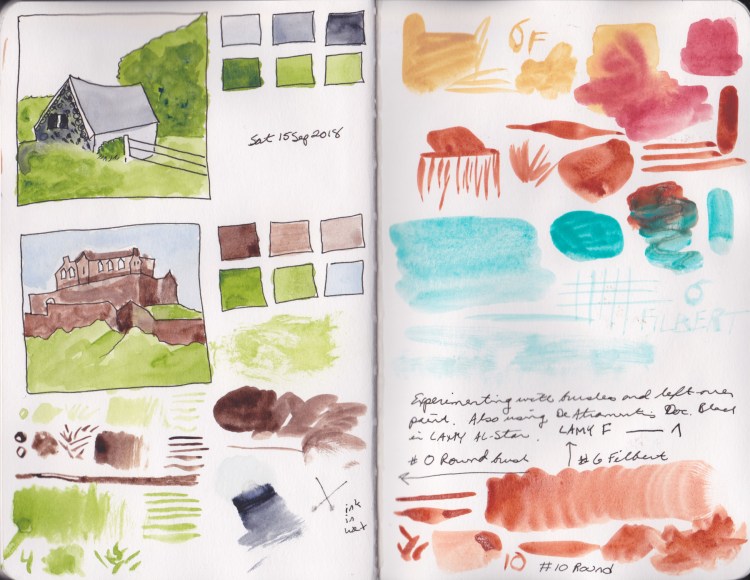
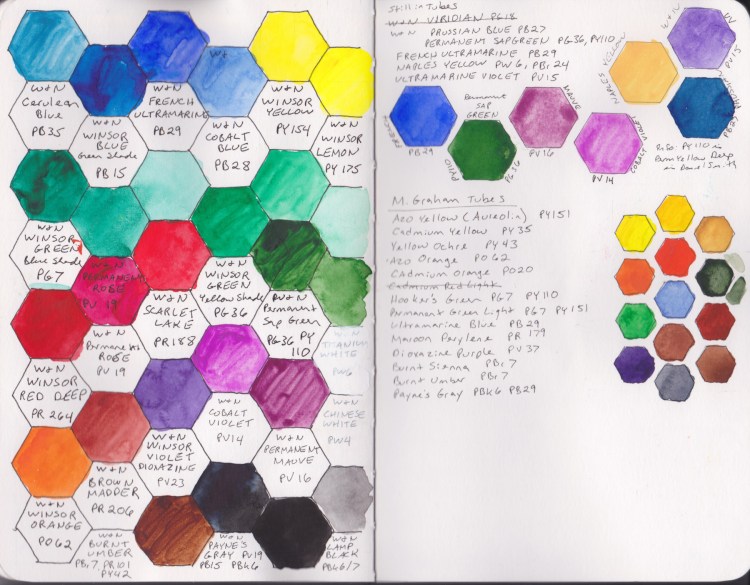
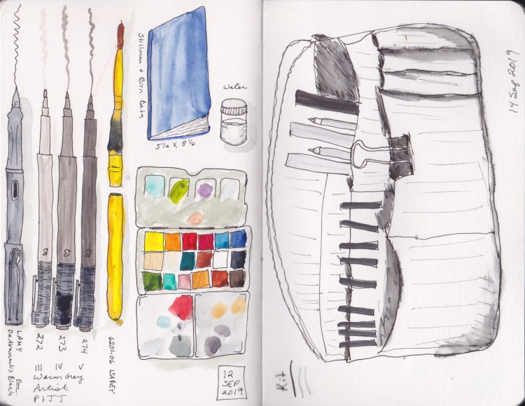
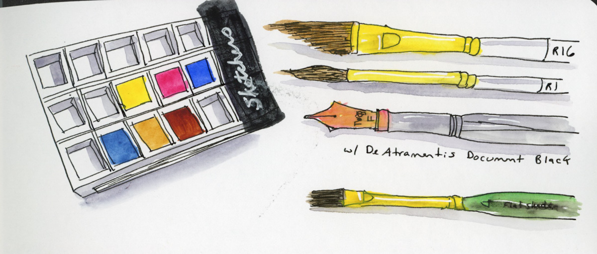
For the first time, I’m using the same kit as Liz Steel for her class. I am particularly excited to stick with the six color palette and practice my color mixing! I’m pretty good with my color mixing, so this will be fun. I also got a set of Faber Castell Albrecht Durer watercolor pencils for Yule. Thusly, for the first time, I have the full set of colors Liz uses in her kit! Woot!
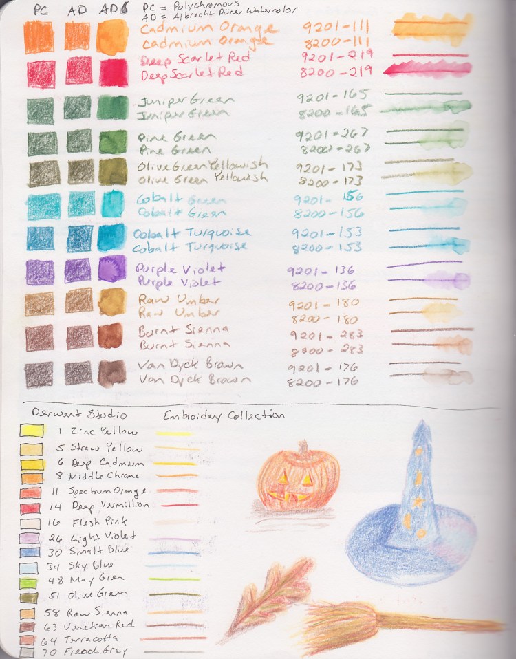
I’ve experimented with the watercolor brands I had previously, and so far the Albrecht Durer are my favorites for color intensity and ease of use. I’m looking forward to getting a feel for how they work and what I can do with them.
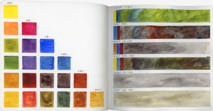

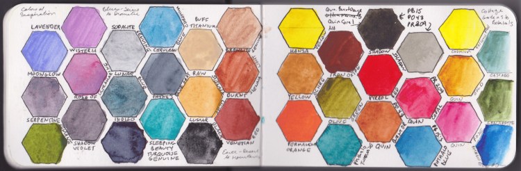
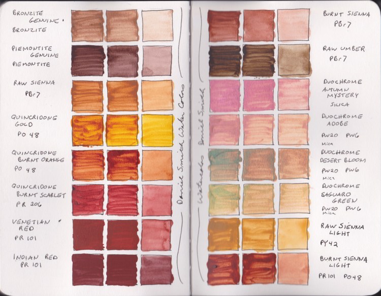
My six colors are all Daniel Smith.
- Hansa Yellow Medium (HY)
- Quincridone Rose (QR)
- Ultramarine Blue (UB)
- Cerulean Blue Chromium (CBC)
- Transparent Red Oxide (TRO)
- Monte Amiate Natural Sienna (MANS)

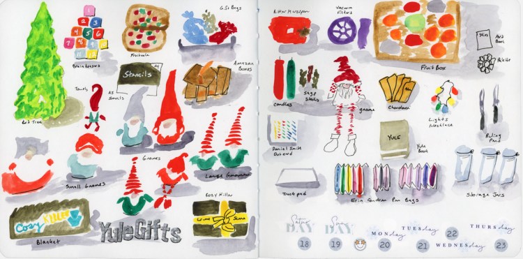
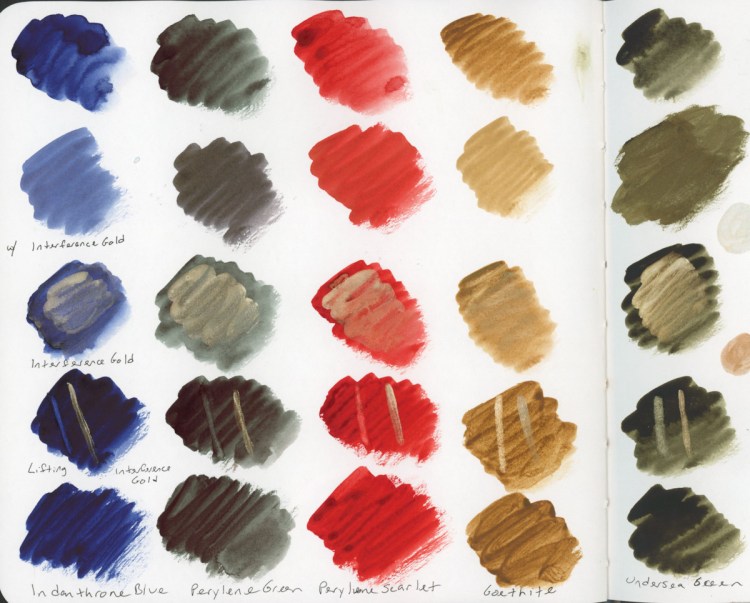
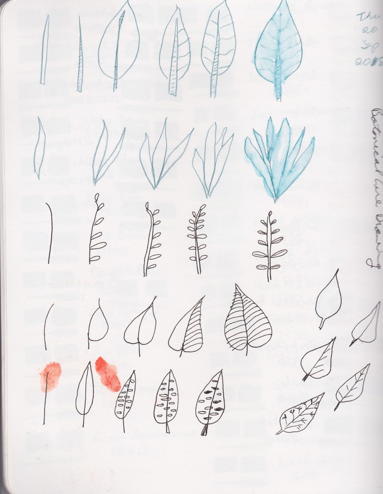
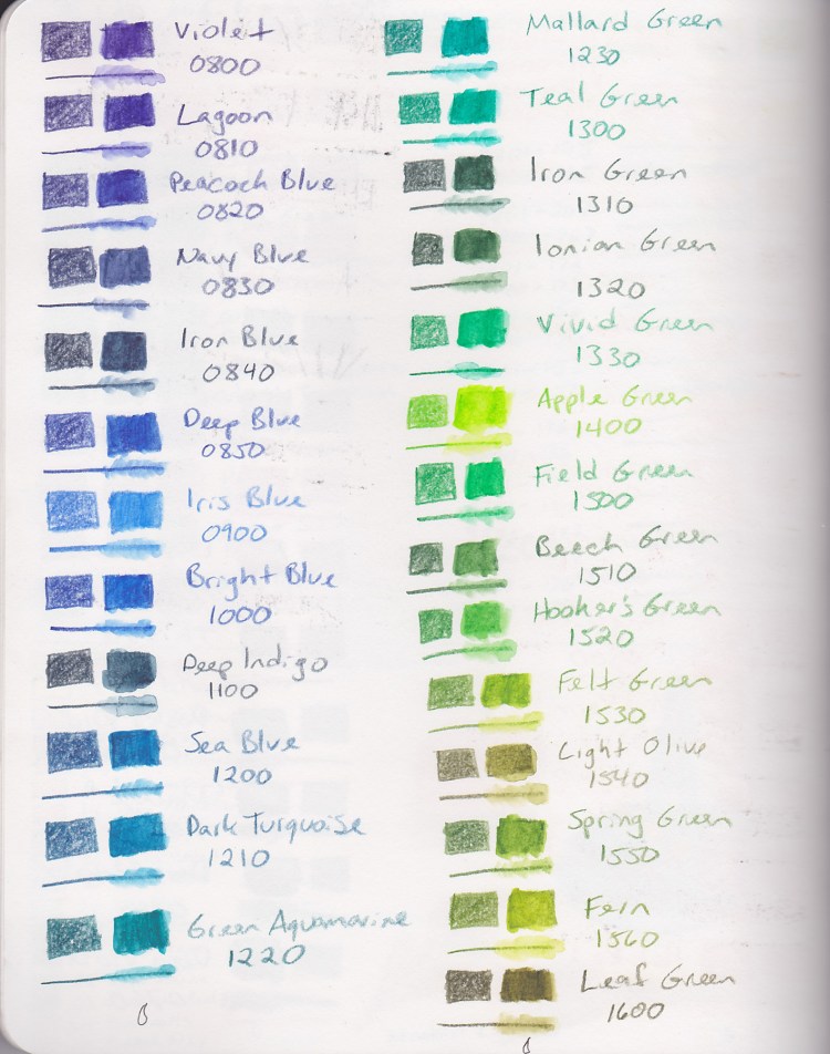
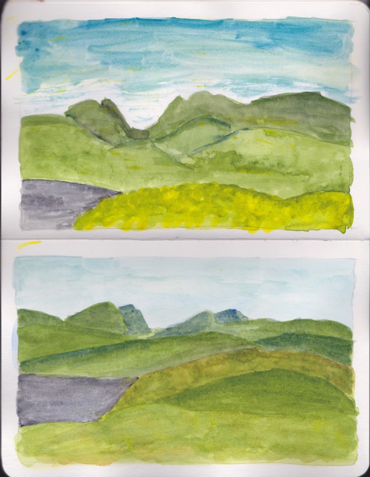
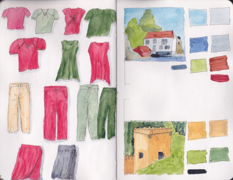
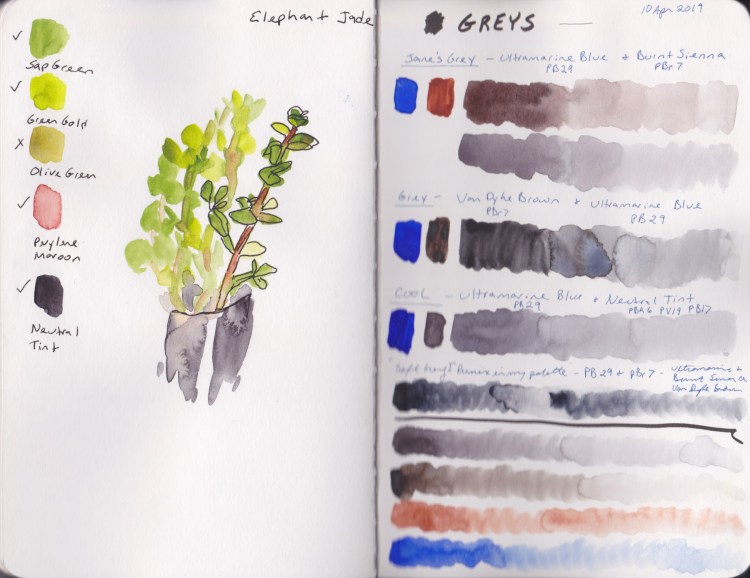
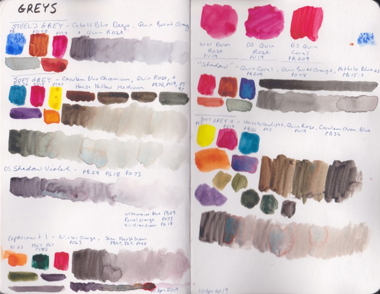
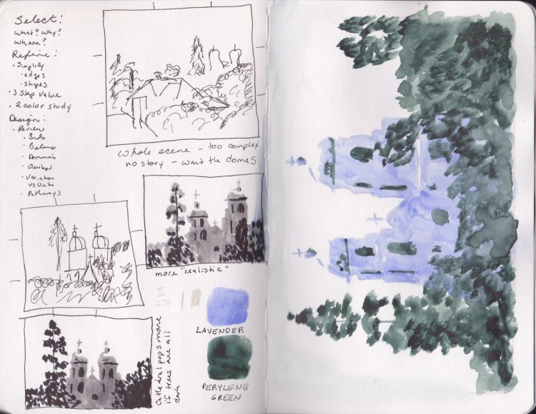
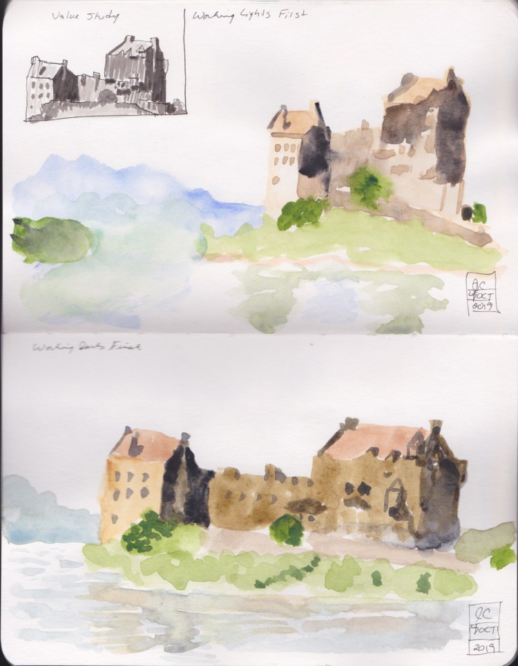
I did a few color bars, aiming for some shades and watercolor magic, as well as capturing which colors were used in the blend. Greens, browns, and grays are all colors that one benefits from knowing how to mix quickly! These are my Lesson 1 Indoor assignments. I always love sketching art materials, and doing color charts! I think we all do!