Continuous Lines

I do so love drawing with a continuous line. It is so freeing! It reduces a complex subject into something utterly doable, and low pressure! I must remember to use this technique far, far more often!

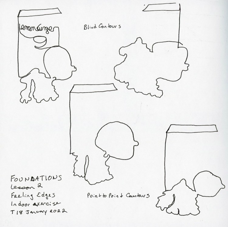
First was a few kitchen items. I grabbed a box of lemon ginger tea, a lemon, and fresh ginger root. Cute! The exercise was to do the outlines, and here they are. I had so much fun I had to do it a few times!

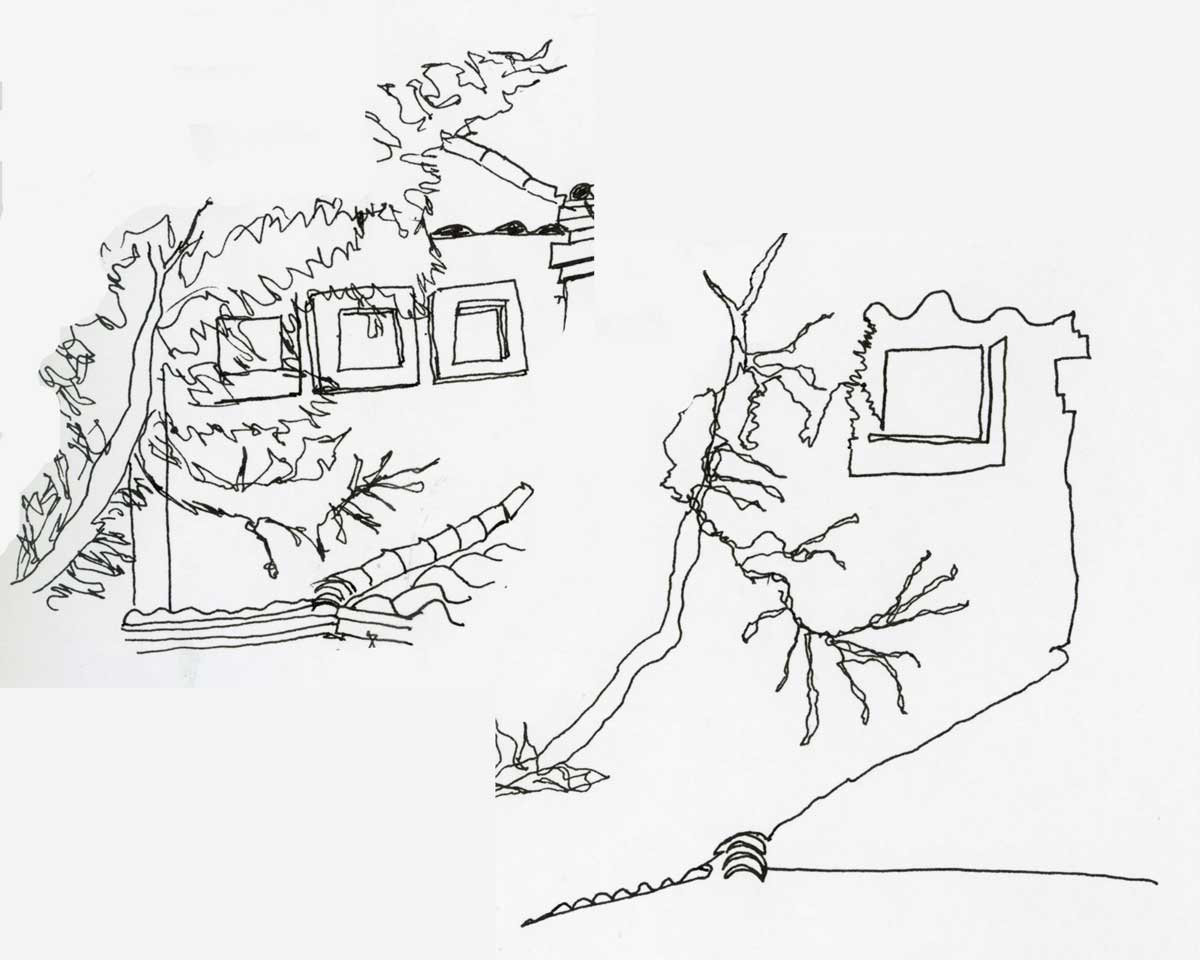
Next assignment was to sketch part of a house that had some foliage in front of it. At least that’s how I interpreted it. This was even more fun! I really love how easy these were, and the energy in the sketches. It capture something special my more careful sketches don’t.

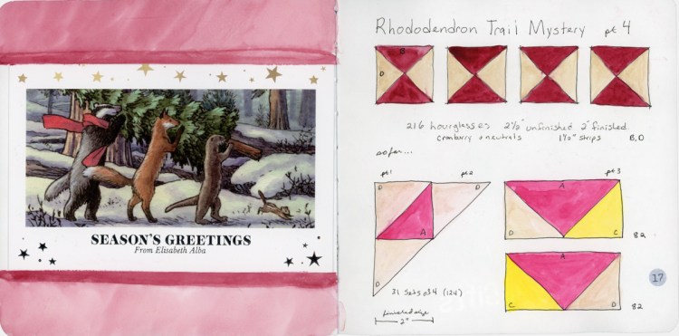
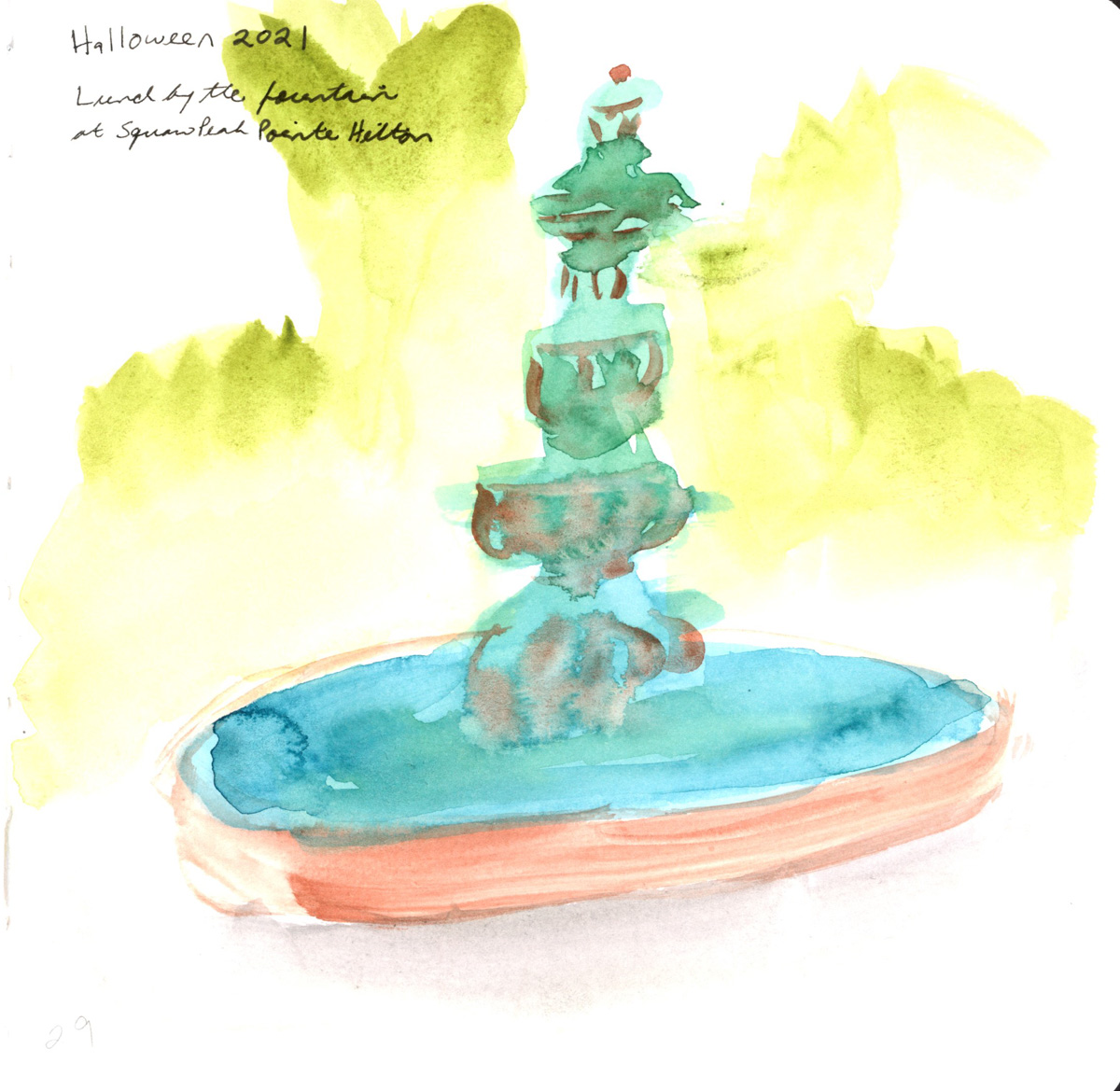
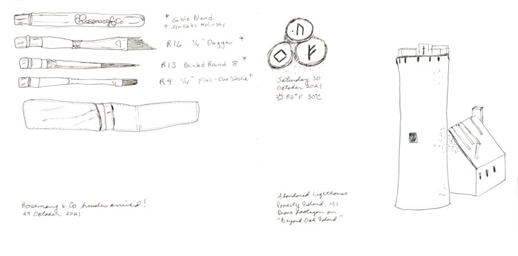
Next time I look forward to trying an even more detailed version. Maybe add the roof tiles for some texture, over and above the tree limbs. My sketchbook page got a bit crowded, but that’s the fun of being “on location” and working with what you have! I am nearing the end of this 7.5 x 7.5 inch Stillman and Birn Alpha. I’ll have to decide what size I’ll be going with next!

I decided to dust off my food sketchbook. Since this is the week of continuous line, I had to apply it to the food sketches! Not all of these little sketches are in continuous line, but I found it super helpful to sketch the pasta and the chocolate chips. Subjects where the detail typically overwhelms me.

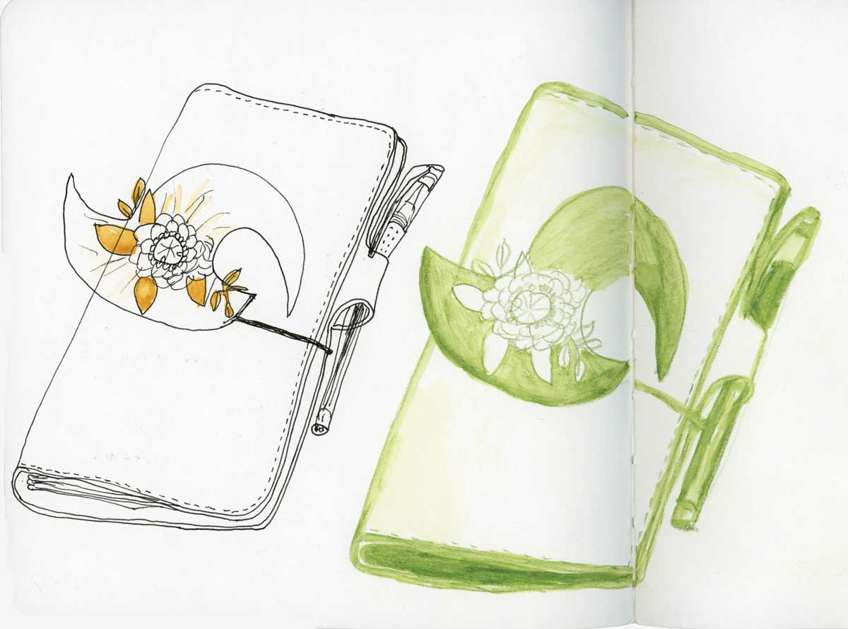
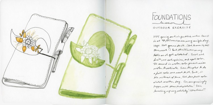
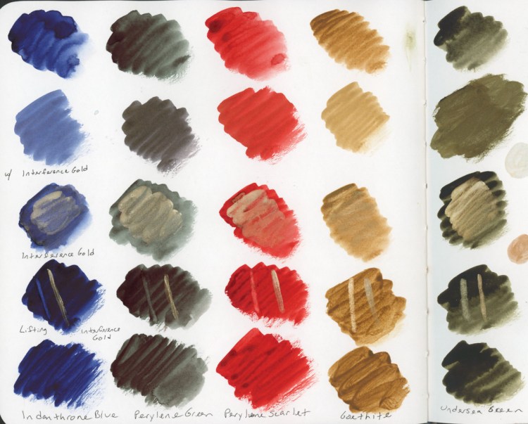
I am also working on my sketchbook design skills in the food sketchbook. It is a good subject to practice spanning the gutter, and varying layout options. I’m obviously heavily influenced by Liz Steel and her magnificent classes, especially Sketching Now Sketchbook Design.

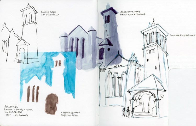
Speaking of challenging subjects, I attempted drawing something I would never have tried before, and I sketched this view of the Natchez steamboat by using continuous line. I rather love it! The cathedral I sketched using what I learned in Sketching Now Buildings, and much to my surprise, it turned out so well. This might be my favorite sketchbook page of all time, and certainly my favorite in this sketchbook!

Thanks Liz! I couldn’t be doing this without you!

TN Two Ways

My assignment was to draw something on a table in public, using two different types of materials. One in pen only, with spot color, and the other in watercolor pencil. Well, due to the current massive surge in COVID cases in my city, I’m not doing anything in public! However, this TN was on my table and it is one of those objects I never think about sketching, because it’s always around. Perfect!

I do love sketching in pen (with no pencil set up lines) and the wonky pen in the sketch doesn’t even bother me. The spot color was a fun addition. I need to remember that more often! The watercolor pencil is easier to adjust and make corrections, especially when adding water to activate it and make it a bit more painterly. I was incredibly tempted to sketch and paint a full color version, but I was short on time. Some other day!

This was a really fun exercise, and I very much enjoyed how different each version is and how it adds interest to the page.

January Miscellany

Watercolor Markers! Okay, I admit, I saw these and they were a total impulse purchase last month. I will also admit, I gleefully squeed when they finally arrived! I have not worked too much with markers, though I have some Copic markers. I’m excited to play with markers that won’t bleed through the paper! The colors are nice and vibrant.

Here brings me through the first half of January. I’m starting to pick up some momentum now, and excited about what it is to come!

Foundations (4th Run)

Happy New Year!

I am so very excited about Foundations this year. As I was doing Buildings a lot of the basics really clicked for me in new ways, and thusly I’m quite excited to do Foundations, and focus on those basics, and allow my new depth of understanding to really be explored and practiced!

This is my fourth run through of Foundations! Hard to believe, isn’t it? I’ve never finished, (I say that a lot, don’t I?) but I always learn a lot. Obviously, I’m absolutely planning to complete everything! Naturally, I’m “behind” already. However, I love it no less!

For the first time, I’m using the same kit as Liz Steel for her class. I am particularly excited to stick with the six color palette and practice my color mixing! I’m pretty good with my color mixing, so this will be fun. I also got a set of Faber Castell Albrecht Durer watercolor pencils for Yule. Thusly, for the first time, I have the full set of colors Liz uses in her kit! Woot!

I’ve experimented with the watercolor brands I had previously, and so far the Albrecht Durer are my favorites for color intensity and ease of use. I’m looking forward to getting a feel for how they work and what I can do with them.

My six colors are all Daniel Smith.

  • Hansa Yellow Medium (HY)
  • Quincridone Rose (QR)
  • Ultramarine Blue (UB)
  • Cerulean Blue Chromium (CBC)
  • Transparent Red Oxide (TRO)
  • Monte Amiate Natural Sienna (MANS)

I did a few color bars, aiming for some shades and watercolor magic, as well as capturing which colors were used in the blend. Greens, browns, and grays are all colors that one benefits from knowing how to mix quickly! These are my Lesson 1 Indoor assignments. I always love sketching art materials, and doing color charts! I think we all do!

Yule

‘Tis the season, from holiday gnomes, to the annual quilt mystery! Capturing the bits and pieces during this cold, wintery season.

One of my gifts was 238 dot card set from Daniel Smith, so you know I had to make a color chart!

On the sketchbook design front, I noticed when I scanned these just how strongly I am still doing individual pages, and not really designing across the gutter. Only one of these four spreads utilizes both pages. I had not really noticed when I was making the pages, but I do when looking at the scans. This inspires me to think a bit more about my design, and layout in the future!

Happy Holidays everyone, and may your days be Merry and Bright! Happy New Year!

A Holiday Palette

I love the idea of seasonal palettes, and color stories. For this holiday season I am inspired by these tones and colors, and I suspect one could do quite a lot with this colored. My watercolors are all Daniel Smith. The gold gouache is Winsor Newton. After all, the holiday season needs some sparkle!

Then I had to figure out what, exactly, is “Interference Gold” by Daniel Smith, and how does it work? Am I supposed to mix it in to paint to make the paint sparkle? Nope. That gives a tiny bit of sheen, but is really not very effective. How does it work if I paint it on top? That was the sparkliest options. It is transparent enough fro the color to come through, but also clearly gold in the light. I tested how these palette colors “lift” alongside a swipe of Interference Gold, as well.

Edges, Shapes, Volumes

I seem to “getting” the lessons of this buildings course more than I ever have in the past. Learning how to sketch really is an ongoing process. You think you get it one time, but then you realize there was so much more to get. I keep getting more and more every single time!

My homework assignments, utilizing Liz’s exercises for drawing using edges, shapes and volumes.

As ever, I’m best at “shapes.” I always like my paint first, or paint only sketches. I think they are far more forgiving. I love this spread. I tried to achieve an open design, with overlap and white space. Those techniques are a challenge for me. Yes, sketchbook design in addition to technique assignments! I must keep going with it!

Other things I’m learning, or should I say having to relearn, is that I really do need to use at least a little pencil set up lines. Especially for buildings. I’m always so wonky, and off with my first lines. I think that is one reason paint only is good for me–its adjustable!

My efforts to overlap my sketches in this layout was perhaps a little less successful, and thusly I learn this, too, is an ongoing skill! One reason for the difference, is that this is in a smaller sketchbook. I had been working in the 8×10 Stillman & Birn Alpha, and this is was in a 7.5×7.5 Stillman & Birn Alpha. The smaller size is quite the adjustment.

New Brushes, a Fountain

An actual, on location sketch of the fountain that I had a take-away lunch near.

I very much want to develop a daily sketching habit and capturing the stories of the day and this is a page with that intention. The buildings were from the show I was streaming and is an abandoned lighthouse in Michigan. I was attempting to use my newly learned buildings sketching skills. No doubt the sketch would be better with some color and paint, but time moved on, and so I’m leaving it and the sketch of the new brushes that got delivered as line sketches. Not finishing being part of the story, too.

Collage Pages

My new mystery box has started and this inspired some collage pages in my sketchbook! (If you are doing Curse of Humanrah by Cosy Killer, there are spoilers in these images!)

I like the double page spreads much better than the side by side but very different pages. I’m still challenged by the mental block created by that gutter, and think of it as two pages, not one spread. However, my collage pages where I built my notes for the game are among my favorites in the entire sketchbook!