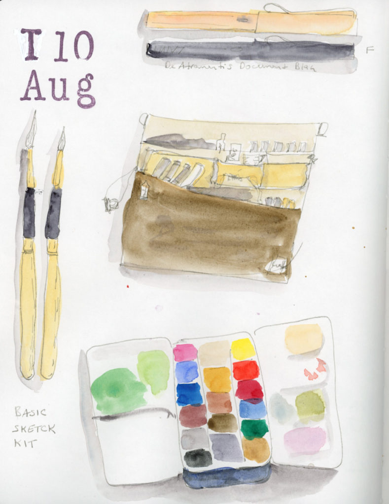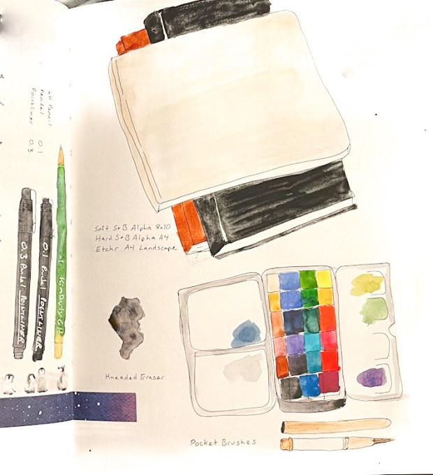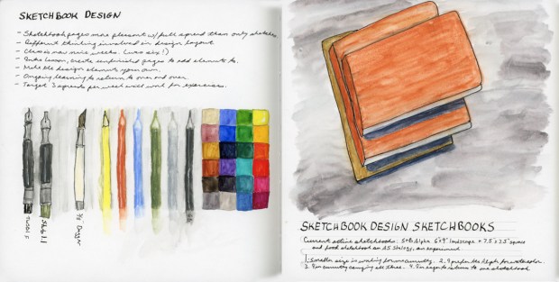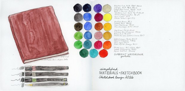
I had to add Tombow Dual Brush Pens and the Holbein Watercolors to the palette family! And I had to open Volume 30 with all of them as my frontispiece.
The Travel Sketching palette in nine media — Inktense, Holbein Watercolors, Tombow Dual Brush, Albrecht Dürer Watercolor Markers, Albrecht Dürer Watercolor Pencils, Goldfaber Aqua Dual Brush, Faber-Castell Pitt Artist Brush Pens, standard watercolor palette, and Neocolor 2. Volume 30 frontispiece, May 2026.
The concept is simple: same limited Travel Sketching palette, nine different media, arranged sudoku-style. Little nine patches of each medium. The first three nine patches are Inktense, Holbein Watercolors, and Tombow Dual Brush. The second three nine patches are Albrecht Dürer Watercolor Markers, Albrecht Dürer Watercolor Pencils (the original palette, in the center, and Goldfaber Aqua Dual Brush. The bottom three nine-patches are Faber-Castell Pitt Artist Brush Pens, my standard watercolor palette, and Neocolor 2.
The big surprise? How close in hue I was able to get each medium. The Neocolor 2 are nicely rich and creamy. Without labels you’d have a hard time telling most of them apart in a sketch.
This is the perfect way to really see how the different media work, and feel.
I have thusly begun Sketchbook Volume 30! I have been in a landscape format sketchbook for over a year, testing various Stillman and Birn papers in the 5.5 x 8.5 and 6 x 9 inch books. I am SO glad to be in a bigger book. This is the 7.5 x 7.5 inch Stillman & Birn Alpha and I can already feel the difference. With a little more space, I’m thinking about sketchbook design more and hoping to keep that in mind for this book.
What do you do with a bag of many different types of markers, all in the same palette? Draw food, of course.
Well, I draw the food anyway. I’d been loving the Sailor Shikiori markers for food sketching — those gorgeous watery effects! But I’d also just finished building the same Travel Sketching palette six ways. Or eight. (What? I got obsessed.)
I knew the palette worked for landscapes and cityscapes. But food? I had to find out.
Food sketches in Shikiori and Goldfaber Aqua Dual Brush Markers, 5–8 May 2026
Shikiori markers for the first few days as I had been doing previously, then the Goldfaber Aqua Dual Brush Markers, then the Albrecht Dürer Watercolor Markers, and finally the Faber-Castell Pitt Artist Brush Pens — my first time ever using those in color.
Ink on Paper — Albrecht Dürer Watercolor Markers, food diary, 9–10 May 2026
Not too bad, actually! The water-based markers end up more similar than different — the palette mostly wins. Except those tomatoes. You have to think about it to realize they’re tomatoes, because the sanguine is just not red enough. Every single person who looked at my sketchbook squinted at them. Sorry, tomatoes. You deserved better.
Food Sketches in Albrect Dürer Watercolor Markers, and Pitt Artist Brush Pens, 9–12 May 2026
In other news — I started indexing all my sketchbook pages. Can you imagine? A searchable index so I can find when I last sketched a particular subject, or when I sampled a paint color and then never used it again. Oh yes.
On Monday evening I walked over to Stonecreek to check on the goslings. They’re at that awkward adolescent phase where their down has turned brown instead of green, but their tail feathers are not yet coming in. I chickened out on drawing them.
The sky, however, was putting on a show. I captured the soft pastels while the geese were eating. But I could tell the color was going to be spectacular so I raced to the other side of the pond, to catch the reflections. This extraordinary fire-red-orange rewarded me. What a stunning sunset! I found out the next day there was a wildfire to the west of town. That might explain the stunning color.
Bloodstone Genuine and Transparent Pyrrol Orange direct watercolor. Sunset at Stonecreek, 4 May 2026
I used Bloodstone Genuine and Transparent Pyrrol Orange. Even the frame is all watercolor. My first “Darks” drawing for May’s Patreon theme by Liz Steel.
It wasn’t a bad month exactly, but it was a rocky one with symptoms flaring, energy unreliable, the kind of month where keeping up with a daily sketchbook practice just wasn’t in the cards. I kept eating dinner. I just wasn’t drawing it.
So yesterday I sat down with my phone, pulled up my photos, and drew twenty-six days of dinners in one go. Two and a half hours with the Shikiori markers, then another fifty minutes going back over everything with water to activate the color. I do love the blooms that activating watercolor markers can generate! Five pages. April 7th through May 3rd, all in one long, slightly meditative catch-up session.
I’ve done dinners-only before, back in 2022, but not since. The logic is the same now as it was then: breakfast and lunch don’t vary enough to sketch, and if something in my diet is causing a flare, it’s almost certainly lurking in dinner. The food diary is part creative practice, part detective work.
Drawing from photos all at once gave the pages a consistency I don’t usually get from in-the-moment sketching. Same hand, same markers, same energy — everything has a kind of visual unity that I actually like. It’s a different flow from the day-by-day record, but it’s still a record.
April 9th has a flying avocado, a fruit cup, and lemon cake, and I’m pleased with how cheerful it came out. April 12th’s glow bowl is one of the better-looking plates in the whole run. The cheesy lemon spaghetti on April 18th was delicious and the sketch knows it.
The DINNERS ONLY box that appears mid-April — I lettered it right there on the page as a label to remind myself I did still eat lunches! It has a slightly resigned, slightly determined energy that I feel captures the month accurately.
And then there’s the quesadilla. It shows up nine times. Nine. Quesadilla with enchilada sauce, quesadilla with salsa, quesadilla solo, quesadilla as a supporting player. It has practically become a character in this sketchbook. My Whoop has been giving me pointed looks about it. I asked about my poor sleep, and the theory offered is that a high fat and high carb dinner combination might be doing my sleep no favors. I did not buy tortillas on my last shopping trip. Let’s test this theory and see what happens. (But what will I eat on high brain fog, low energy days?)
This also concludes the small Delta Sketchbook that is my 29th sketchbook and my 6th food volume.
The featured image up top is from the April 21st spread — Greek bowtie pasta, and a little bowl of Giggles (allergen-friendly candy, think Skittles) with those bright confetti dot colors. It’s one of my favorites from the whole batch. Twenty-six dinners, one sitting, five pages. The record exists. On to May. Without my go to quesadillas!
Beltane comes and you can feel the season changing. I needed a week off. (Burnout persists!) I tried to clear the decks. I ordered a soft peachy floral display with sage colored leaves for the soothing soft vibes. (The order promised peach roses, white Asiatic lilies, peach miniature carnations, and white stock, accented with pitta negra, dusty miller, and a soft green echeveria succulent.)
I printed my Coloring Book of Shadows Beltane images and the start of May as well, and distributed them through the remaining 12 pages (six spreads) of sketchbook volume 28. So close to the end I can taste it! I’m eager! I’m ready to move out of this year plus long series of landscape sketchbooks, testing the various Stillman and Birns papers. It’s been great, and I learned a lot about the papers. I am ready for a bigger page! I left room for sketches and hoped the spread-out collage pieces would create harmony on the pages. (The jury is still out on that.)
Direct watercolor, Beltane bouquet, 1 May 2026
My flowers arrived, and I received vibrant orange and dark green instead. “Flowers may be substituted.” (Tropicana roses, white Asiatic lilies, orange carnations, and white stock with leatherleaf fern and salal, and a dark green echeveria succulent.)
Well, I guess we’re doing Transparent Pyrrol Orange today!
Beltane Flowers. 1 May 2026
These are the flowers I received, so I’ll paint them as they came. I tried to capture the white Asiatic lilies and the white stock flowers. White flowers are hard to paint! The Transparent Pyrrol Orange was the perfect shade for the orange flowers, with no mixing needed. I did not paint it as bright as those Tropicana roses, though. I carried that color palette over to the Beltane collage sticker, as the new color story of the day.
Ink Wash Bags for Declutter, 2 May 2026
Naturally, the weather threatened a crazy heat wave coming, and working in a hot garage is a bad idea, so I pushed to finish the garage declutter while the cooler temperature held one last weekend.
Robert Oster Graphite ink wash sketch, 2 May 2026
I love doing these Robert Oster Graphite inky chromatography garbage bags to document the decluttering. They are so expressive, and that color separation is delicious. Another big day of decluttering, and that settles the garage for the next eight months.
Book Still-life — ink and watercolor. 2 May 2026
The Start Your Sketchbook Journal course by Danny Gregory is exactly what I want to be doing with my sketchbook practice, but I keep putting off the course. Maybe because I’m terrible at taking time off, and when I need a break, I end up decluttering garages, so the self-paced courses get put off so easily? Yeah. That.
Notebooks still life, 2 May 2026
But I sketched the new delivery of composition books and Aries Journal from Coloring Book of Shadows. I even sketched one of the corner designs by hand! I really need to practice illustration-style sketching!
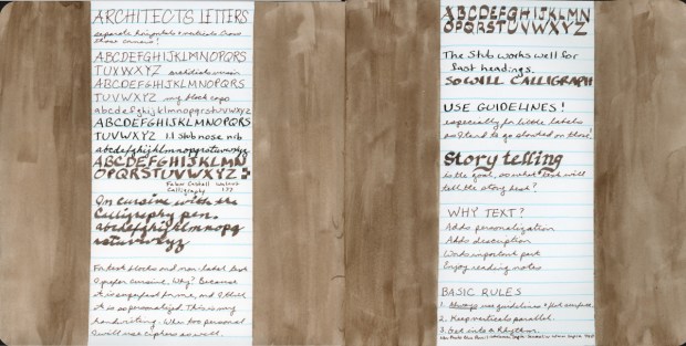
Liz Steel’s Sketching Now Travel Sketching live run, begins later this month and I am jumping back in for my third attempt. I did finish the first run. The second run, I started but let’s just say life had other plans. I have tagged the whole archive of my posts if you want to see the full saga. The official start date is May 13th, but I’m getting a head start on the Introduction lessons.
The “Before” Sketch
The Introduction includes a “current sketch” exercise. Your sketching where you are right now, before the course begins. Since I’ve done this before, I decided to sketch my back yard again. This is the same view I did as my first before sketch. Not only has the yard changed, but so has my sketching.
Naturally, I also had to document the fact that after seven months of delays in the landscaping (It’s been a whole drama!) the yard has finally been weeded. Those prickly lettuce plants had grown over six feet tall. Six feet! They were taller than me. I have photographic evidence. I think they were starting to develop permanent occupation plans. So the timing of this sketch gets to commemorate both that drama and its blissful conclusion on the day I did these. A dramatic before and after set of sketches for the yard.
The before sketch, with weeds, is in the Albrecht Dürer watercolor pencils, The after sketch is GoldFaber Aqua Markers. You can see the difference in the mediums, since I used the same color palette for both sketches. The marker version is noticeably brighter and more saturated; it’s the same scene, same composition, same palette, but a different medium. I really want to see how different mediums behave, and comparing the same color palette is a great way to do that.
Backyard, full of weeds in in Albrecht Dürer watercolor pencils.Back yard, freshly weeded, in GoldFaber Aqua Markers.
The yard features some very photogenic old barrel planters that are in the process of dramatically decomposing. They show up in both sketches as dark, slightly melancholy blobs surrounded by splaying lines. Less moody than the photographs of them!
Back yard sketches, before and after weeding. 30 April 2026.
The Kit
Part of the Introduction is also assembling materials for the travel sketching kit and doing a color/material chart. I wrote about my obsession with testing multiple media in this limited palette.
Travel Sketching Kit, April/May 2026.
Here’s what I’ll be working with for this run:
For line work, I have an Isograph 005 and 0.30, a TWSBI Urban Gray (F nib), a Copic BS, a Pentel Brush Sepia, and a Tombow WB-HB Fudenosuke Hard.
The course calls for graphite, but I’m skipping it since I find graphite too smudgy. I do have the one 3H pencil. For pencil sketches, however, I’m substituting three Derwent Inktense pencils: Charcoal (2100), Neutral (2120), and Sepia Ink (2010). I also have the class palette in Albrecht Dürer watercolor pencils, Derwent Inktense pencils, plus GoldFaber Aqua Dual Markers, Albrecht Dürer Pitt WC Markers, Faber-Castell Pitt Artist Brush pens, and Neocolor II water-soluble crayons.
For watercolor, my palette is: Hansa Yellow Light, Hansa Yellow Medium, Monte Amiata Natural Sienna, Quinacridone Gold, Transparent Pyrrol Orange, Quinacridone Rose, Potter’s Pink, Sap Green, Cobalt Turquoise Light, Cobalt Blue, French Ultramarine, Transparent Red Oxide, Van Dyke Brown, and Shadow Violet. There are also two Caput Mortuum swatches at the side, because I’m currently infatuated with that color.
The Sketchbook
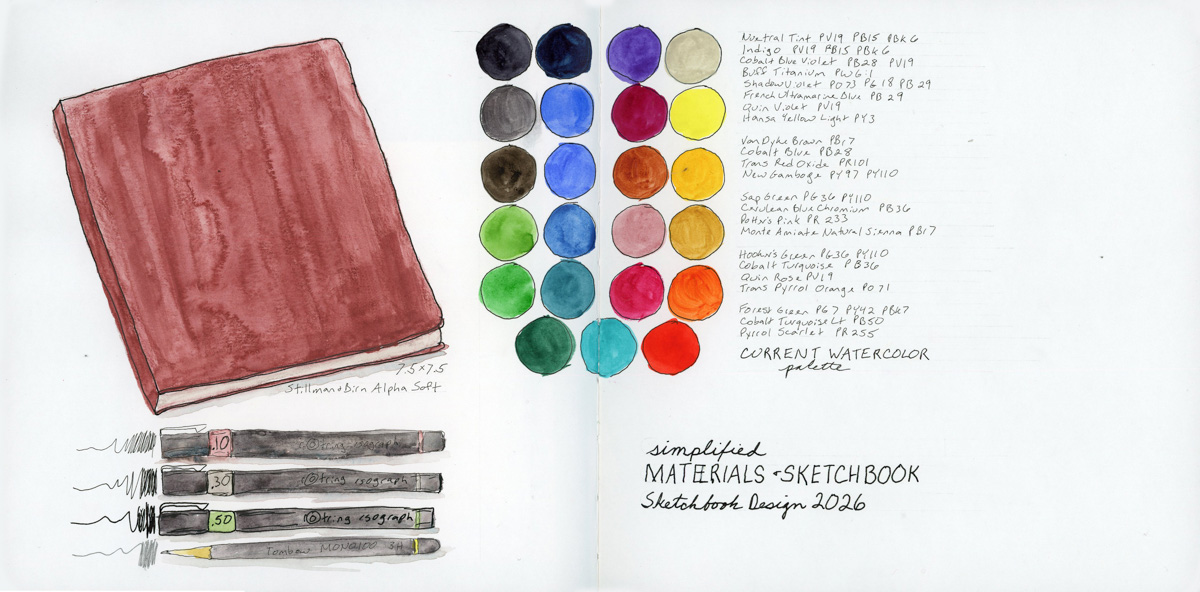
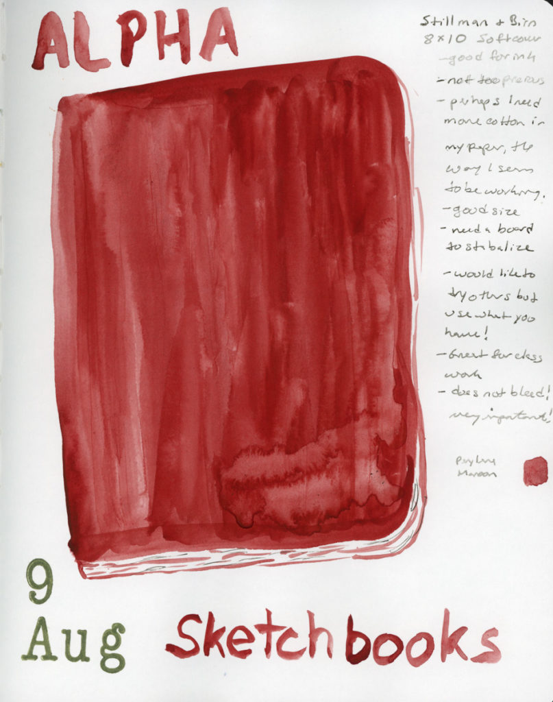
I’ll be starting in my current 6×9 inch Stillman & Birn Alpha, even though I only have a few pages left in it. Shortly I’ll be moving to a 7.5×7.5 inch softcover Alpha. Both are Stillman & Birn, both are the Alpha series, just slightly different proportions. It’ll be interesting to see how the square format feels for travel sketching.
The weeds are gone, the kit is ready, and the barrel planters have been immortalized in watercolor. What more could I need? I’m ready!
The Caput Mortuum watercolors arrived! My infatuation began when I put together the Travel Sketching palette, when the Goldfaber Aqua version caught my attention. Then in the notes page I thought of it immediately for the theme of darks. I knew I’d already ordered Winsor & Newton and Sennelier watercolors. Once they arrived I swiftly color swatched them.
Caput Mortuum, Lava, Bloodstone Genuine, Apatite Genuine, and Sailor Shikiori Subarakishi — Monday 27 April 2026 — Stillman & Birn Alpha
That deep, complex brownish-reddish-purple. Somewhere between burgundy and iron oxide. Caput Mortuum is Latin for “dead head,” an old alchemical term for the residue left after distillation. Macabre and poetic. I love it! Winsor & Newton and Sennelier are single pigment PR101, which is fairly opaque and highly granulating.
Caput Mortuum watercolor swatches in Sennelier and Winsor Newton. Roman Szmal Lava 384 and Bloodstone Genuine — Stillman & Birn Alpha, 27 April 2026Winsor & Newton Caput Mortuum Violet, Sennelier Caput Mortuum, 169 Caput Mortuum Pitt Artist Brush Pen, 263 Caput Mortuum Goldfaber Aqua Dual Brush Pen — Stillman & Birn Delta, 27 April 2026
The two watercolors are very similar in hue. The Sennelier is a little smoother, the Winsor & Newton has more granulation. Both are quite opaque. Opacity affects layering and mixing, and these will behave differently from transparent darks. Worth paying attention to, to avoid flat or muddy works.
I also pulled out the Roman Szmal Lava 384, which I’d first swatched back in early March. I still love it so much, and it definitely feels like it belongs in this color club. That PG17 PB29 PR255 triple pigment giving it a depth and richness that the single pigment paints don’t quite replicate. Roman Szmal paints are harder to source here in the States, though.
Naturally I had to include the markers! The Goldfaber Aqua 263 Caput Mortuum and the PITT Artist Pen Brush 169 Caput Mortuum, side by side with the watercolors. The hue match is surprisingly close. Markers are their own medium with their own behavior, but it’s satisfying to know that the color I fell for in the palette swatches is holding its own. My infatuation with this color continues. How will it look if I use it for my darks, for shadows, etc?
Bloodstone Genuine and Van Dyke Brown value gradients — Stillman & Birn Alpha, 27 April 2026
Since I was swatching anyway! I finally did the comparison of Van Dyke Brown versus Bloodstone Genuine. I’ve been curious about this since Liz swapped her Van Dyke Brown out last summer. Side by side in gradient swatches, the difference is clear. Bloodstone is greyer and cooler, less brown than Van Dyke Brown, and with potentially less of a color shift as it dries. Van Dyke Brown leans warmer and earthier. I can see why Liz made the swap, though I’m pretty sure my chocolate sketches need to keep the Van Dyke Brown! Bloodstone will work beautifully in landscapes and urban sketches, though!
Bloodstone Genuine and Apatite Genuine — Stillman & Birn Alpha, 27 April 2026
Speaking of the landscape potential, both Bloodstone Genuine and Apatite Genuine granulate beautifully. I’m loving this texture of the genuine pigment paints, where the particles settle unevenly into the paper tooth and create something that looks almost geological. The Apatite Genuine is that luminous grey-green, softer and cooler than anything I could mix. Together on the page they look like a landscape seen from a great distance.
May has the Darks theme for the Patreon group, and the Travel Sketching course is running live. I’m excited for both, and hope to really dive in. I also want to get back to sketching the everyday things. It feels good to have more energy, and more enthusiasm again!
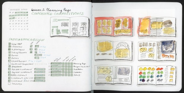
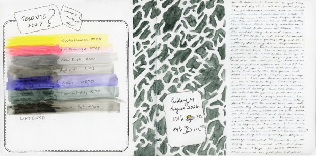
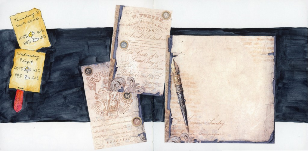
The date and the weather. Then a bit of text. Then a blank space for a sketch that never happened.
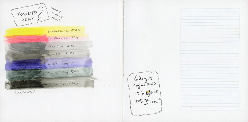
I was watching Edges lessons, scaling back after “losing” so many weeks of March and April. With class ending in a week, I was never going to catch up, so I gave myself permission to just absorb the main lesson videos only. I’ll take the course again when next it runs live. When Sunday came along, and I knew I wanted to sketch the decluttering, I decided to fill the blank spaces with ink that I haven’t swatched yet.
Have I mentioned I have a LOT of fountain pen ink?
Ink swatches and decluttering — Sailor Yurameku Seki, Ferris Wheel Press Adventurine, Robert Oster Graphite — Stillman & Birn Alpha, 24–26 April 2026Sailor Yurameku Seki — Stillman & Birn Alpha, 24 April 2026
The first swatch is Sailor Yurameku Seki. A sample I ordered, and hadn’t tested yet. It’s soft and a little ethereal, with a beautiful pink undertone that blooms in the wash. These Sailor Yurameku inks have such lovely softness and multiple colors that separate beautifully in water.
Ferris Wheel Press Adventurine, and that pink is actually a shimmering metallic! So pretty! Ferris Wheel Press Ferritales inks are genuinely special, and Adventurine is a good example of why. I will say that Alpha paper loses some of the shimmer and sheen of the inks. I need to work with Tomoe River paper to really let them perform. That’s a future experiment.
Three weekends in a row in April I’ve been doing a big push to declutter the garage before it gets too hot and I have to wait another 9 months. I hauled out trash bags, banker’s boxes, recycling, donations. It’s one of those projects that’s hard to maintain momentum on. Sketching it helps. I love my clutter sketches, but I haven’t been doing those right now. I wanted to find a way to visually document the progress of the declutter in my sketchbook, not just in before and after photographs. I wrote and sketched about decluttering back in July 2025, but stopped. Here’s to resuming, and making it a regular feature now, both for my house and my sketchbook!
Robert Oster Graphite — Stillman & Birn Alpha, 26 April 2026Robert Oster Graphite chromatography garbage bags — Stillman & Birn Alpha, 26 April 2026
Garbage bags are not pretty, but what a great subject for the inky chromatography! Black trash bags, black and dark grey inks that bleed into stunning colors! It’s a match made in heaven! Lay down heavy water, then drop in the ink, and let the ink do its magic. A lovely visual record is created.
But of course, I need to also track the metrics. A bit obsessively, perhaps. But hey, it’s very motivating to see the numbers build, for something that is often too easy to overlook and dismiss. You forget just how much you cleared out, because you get used to the look of the new space very quickly. So I also built a symbol chart to track the metrics. Trash bags by gallon size, banker’s boxes by cubic foot, trash and recycle bins, Car capacity for hauling. Everything converted into cubic feet, and also cubic meters for my international readers. (I’m thinking of you guys!) The 12th I got rid of 159 cubic feet, the 19th a more modest 15 (only my single bins were available. What an enormous difference in outflow!), and the 26th came in at 94. April’s total across three weekends: 268 cubic feet. 7.6 cubic meters. The garage is getting there! I’m racing the weather now, to finish the garage before it hits 100ºF/37ºC again!
I love how this page looks. The ink swatches filling the spaces where sketches didn’t happen, becoming a highlight feature I will absolutely use in the future. The decluttering inky garbage bags, and symbols tracking progress in the most dramatically beautiful way possible.
I was watching Liz Steel’s Patreon livestream and taking notes. I like kind of dense note-taking that fills a page and then adding color blocks to give it some life. While I was watching, I sketched my sparkling water that was sitting in front of me. This is my first sketch since April 7th! I’ve only done color charts since then. And I haven’t sketched anything not food since One Week 100 People! Now that seems crazy, but I look over my sketchbook pages, and there it is, in full color!
Patreon Livestream notes with sparkling water bottle sketch — Stillman & Birn Alpha, 23 April 2026
I miss the sketching, but I guess it’s been a rough season.
The livestream introduced Liz’s May theme: Darks. Oh, I like this one! She mentioned starting with darks, pushing the darks, and even night sketching! Should I try night sketching? It never occurred to me before.
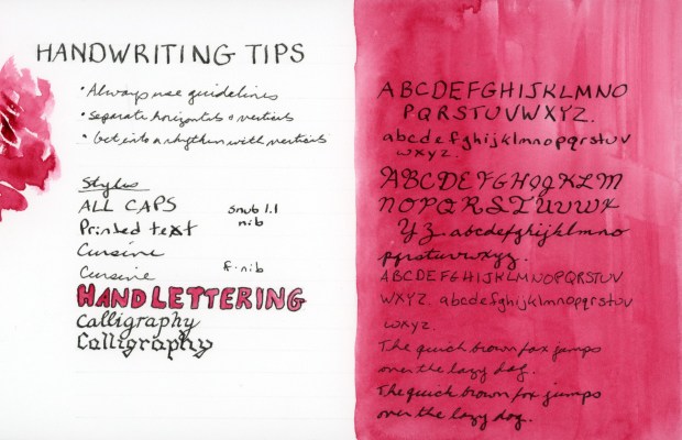
Starting with darks is a very useful approach, especially with the shapes that I often start with also. Committing to your darkest values early gives a sketch structure and stops it from looking flat and cartoonish. Deepening the darks in a scene, and increasing the value range, is one of the most reliable ways to add depth and presence. It’s the kind of thing that makes a sketch look like a real object or scene. I’m thinking of darks in terms of ink lines, too, not just watercolor.
However, I did immediately think of Caput Mortuum. My new infatuation born from pulling the Travel Sketching Palette together. That deep, complex brownish, reddish, purple that sits somewhere between burgundy and iron oxide. I have the Goldfaber Aqua and PITT Artist Brush pen, and I ordered watercolors Winsor & Newton and Sennelier both. You know, I need both to compare, right? Right? They haven’t arrived yet. But I am fantasizing about the darks it might make for me. How would such a warm, deep dark work in sketches? Seems perfect for the desert, and for summer, when even the deepest shadows are still meltingingly hot.
Obviously there will be Caput Mortuum swatches when the paint arrives! Plus I might finally break open my Bloodstone Genuine and compare it to Van Dyke Brown. Last summer Liz had swapped her Van Dyke Brown for Bloodstone Genuine, and I’ve been curious about the comparison ever since.
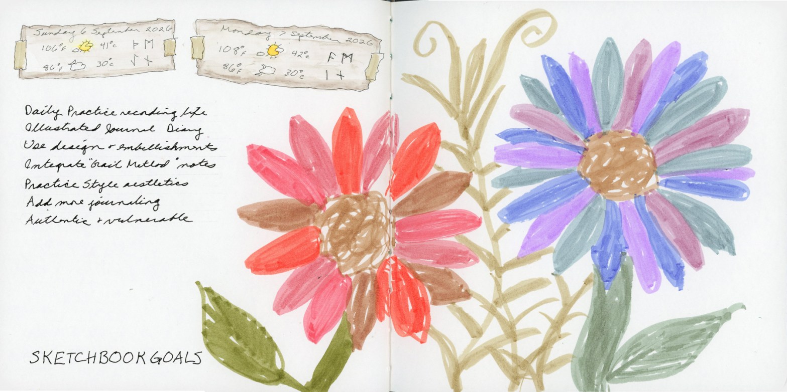
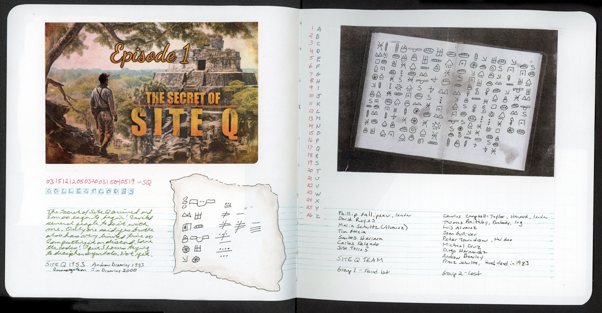
It feels good to be getting excited about this coming theme. It feels good to sketch again, after a longer span of time when I didn’t. It feels good to be excited about the upcoming Travel Sketching course, too. May is shaping up to be quite fun in the sketching department!
I will be taking Liz Steel’s Travel Sketching course this May. I’ve taken it before, in September 2024, and I started in April 2025, but did not finish. (See all my posts for Sketching Now Travel Sketching here.)
Every time I become a little obsessed with the limited palette for this class. Liz built it using threes: a primary, three earth tones, then a dark and two lights. She kept it fairly pastel, and muted. It really is great for landscapes. Especially Autumn scenes. She used Albrecht Dürer Watercolor Pencils.
104 Lt Yellow Glaze, 188 Sanguine, 140 Lt Ultramarine, 142 Brown Ochre, 174 Chrom Green Opaque, 232 Cold Grey III, 157 Dark Indigo, 132 Beige Red, 103 Ivory, 175 Dark Sepia — Albrecht Dürer Watercolor Pencils
The first time I took this course, I discovered I really wanted a brown, so here I’ve added the dark sepia. The second time I became very curious about Inktense pencils, wondering how were they different. Since I owned a set, a pulled the same palette colors and I started using Inktense pencils shortly afterward. I also wanted to explore Neocolors II. I was unable to finish the course, so I did not explore those as much as I intended.
This time around, I decided to find out.
The Albrecht Dürer Watercolor Pencils. Activated, they produce soft, luminous washes. There’s a gentleness to them that feels very suited to location sketching, which is rather the point. Dark Sepia is my second dark, which I really craved. Plus I have a love affair with Sepia, so it’s a natural fit. I did consider a warmer brown, like Walnut, but the cooler sepia keeps the balance between warm and cool tones.
I built this Inktense palette to best match the colors of the original palette. Same colors, two media, learn how do they really behave different. The get the more pastel grey and soft pink, you really need a very light touch when applying the pencil, as the colors are darker than the matching shade. They say Inktense becomes permanent once dry, so you can layer over it without lifting. I find they give smoother washes, and they seem more vivid, but this palette is still holding that more muted vibe.
010 Yellow, 063 English Red, 161 Light Blue, 036 Raw Sienna, 249 Dark Olive, 403 Beige, 139 Indigo Blue, 042 Desert Rose, 001 White — Neocolor II — Stillman & Birn Delta, April 2026
I had selected the matching colors in a Neocolor palette for the April course, but never used them. Since I have them, I continue to be very curious to work with them. The swatches are certainly vibrant, and they felt good to lay down. These swatches were Delta book, in ivory paper, so that white shows up a bit better. I wonder how these would look on colored paper? Are they more opaque?
At this point the reasonable thing would have been to stop. I did not stop. Liz mentioned she would be adding markers to the course this time around, and well, I have markers! (Advantage of buying way too many art supplies over many years, I have a lot of stuff just lying around! Whole color sets make great gifts during the holidays!) So I pulled together the same palette in multiple marker types. (I did have to fill in a couple gaps, and order a few, but not too many.)
Travel Sketching palette — Albrecht Dürer Watercolor Markers and Goldfaber Aqua Dual Brush Markers — Stillman & Birn Alpha, April 2026107 Cadmium Yellow, 188 Sanguine, 120 Ultramarine, 268 Green Gold, 172 Earth Green, 272 Warm Grey III, 157 Dark Indigo, 132 Beige Red, 175 Dark Sepia — Albrecht Dürer Watercolor Markers104 Lt Yellow Glaze, 186 Terra Cotta, 446 Sky Blue Pastel, 183 Lt Yellow Ochre, 174 Chrom Green Opaque, 230 Cold Grey I, 247 Indanthrene Blue, 281 Sand, 116 Apricot, 263 Caput Mortuum Violet — Goldfaber Aqua Dual Brush Markers
I love how watercolor markers look when activated with water. They bleed and bloom in ways I love. Easy to get complete obliteration of the lines, so it’s a bit like playing a daring game! I also put together the same palette in the pigment Pitt Artist Brush pens, but never swatched those independently. They are only swatched in the big color chart below.
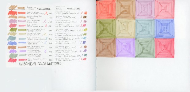
And of course, I had to see everything side by side, right? How well did I match these colors across the mediums?
Travel Sketching palette reference chart — Stillman & Birn Delta, April 2026Travel Sketching palette in five media — Stillman & Birn Delta, 19 April 2026
I am really looking forward to using these in actual sketches to learn how the different media behave, and discover what I do and don’t like.
I also may have begun a new obsession. I love that Goldfaber Aqua Dual Brush Caput Mortuum. They didn’t have a brown, so that was the closest. The Pitt Artist Brush pens also have a gorgeous Caput Mortuum. So I may have immediately ordered some Caput Mortuum watercolor paint.
It started with one question about two pencil ranges, how is Inktense different from the Albrect Durer watercolor pencils. It ended with six media, so many color charts and a new obsession or two.