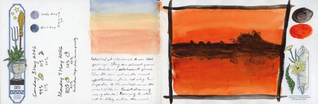
On Monday evening I walked over to Stonecreek to check on the goslings. They’re at that awkward adolescent phase where their down has turned brown instead of green, but their tail feathers are not yet coming in. I chickened out on drawing them.
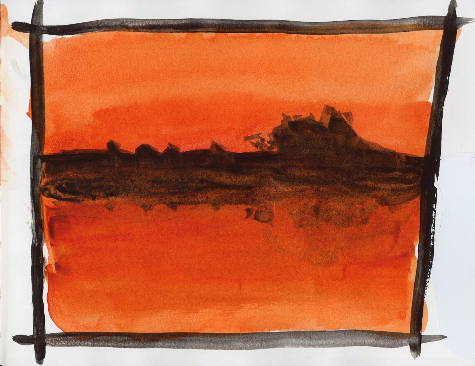
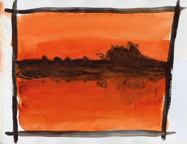
The sky, however, was putting on a show. I captured the soft pastels while the geese were eating. But I could tell the color was going to be spectacular so I raced to the other side of the pond, to catch the reflections. This extraordinary fire-red-orange rewarded me. What a stunning sunset! I found out the next day there was a wildfire to the west of town. That might explain the stunning color.
Bloodstone Genuine and Transparent Pyrrol Orange direct watercolor. Sunset at Stonecreek, 4 May 2026
I used Bloodstone Genuine and Transparent Pyrrol Orange. Even the frame is all watercolor. My first “Darks” drawing for May’s Patreon theme by Liz Steel.
Yesterday, I went out and sketched on location, which I rarely do
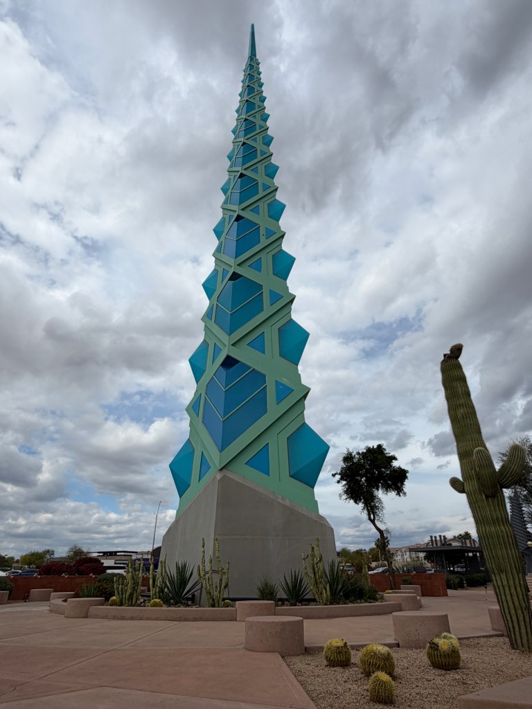
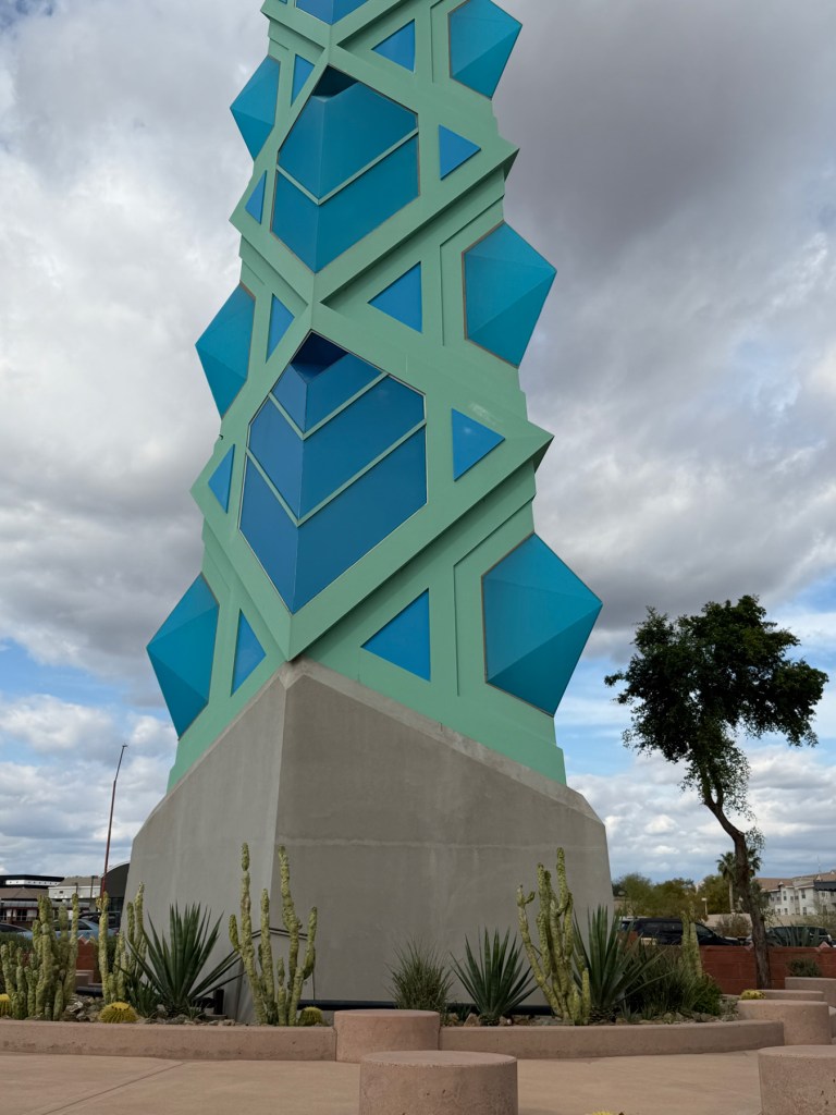
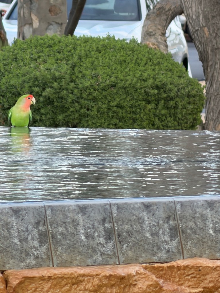
This was Lesson One of my Edges sketching course — the outdoor assignment. I picked the Frank Lloyd Wright spire in Scottsdale. I’ve photographed it many times, but never tried to sketch it. The assignment was to sketch a monument, and this spire came to mind. I had no idea how complicated that thing actually is.
I picked the best possible day for it, keeping a sharp eye on the swings in temperature lately. Clouds were big and plentiful, temperatures a gorgeous 74°F, with plenty of shade. I knew I had to grab it — next week is forecast to hit 100°F, which would be the earliest I’ve ever seen it that high. So Tuesday it was.
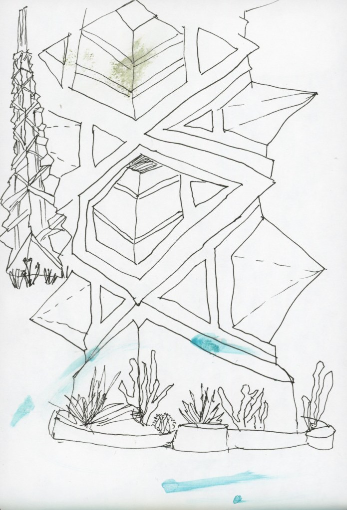
I did two ink sketches first — the assignment was to sketch edges where planes change, so I did one thumbnail of the whole spire and one attempting a closer view. I liked how the plants came out. The angles on the spire itself? Not so much. It is genuinely, mercilessly complex and I had completely missed that fact until I was sitting in front of it with a pen in my hand.
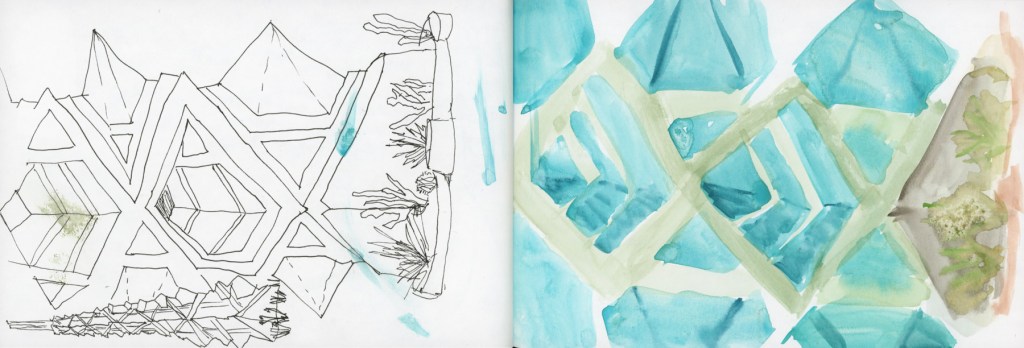
Then I moved on to a direct watercolor sketch to do the changes is color assignment. This became a wet, blobby situation. And then the wind caught the wet page, flipped it over, and smeared wet paint all over the ink sketches on the other side. Ack!
Of course it did.
The wind had danced with my page, and I had a puddle of water in my palette because I forgot a water container, but I had water. Oh yeah, I also forgot to refill my fountain pen, so I ran out of ink and had to use a fineliner. I was lucky I had my paint! I wrote my notes for next time right there on the page, on location, because some lessons need to be recorded immediately:
Don’t run out of ink — good thing I carry many pens
Do carry a water container — I was using a well in my palette
Do bring a clip — even a little wind will flip a wet page and ruin everything
Do think about page design a little first
Do enjoy the birds
That last one is important.
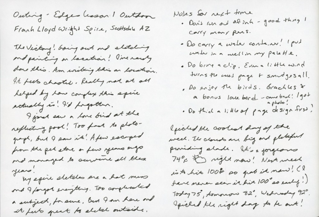
There were fifteen grackles at the reflecting pool while I was sketching. And then — a lovebird. A few escaped from a local pet store years ago and a small flock has somehow survived in Scottsdale ever since. It came and went so fast I barely registered it. I thought I’d missed my chance.
It came back. I got a photo.
I have a spot waiting on the page next to my journal notes for a proper lovebird sketch. That’s a whole other post.
My sketches are a mess. The watercolor is blobby, the angles on the spire are wrong, the wind made a disaster of my pages. And I sat there on location and wrote in my sketchbook that it felt chaotic, and also that it felt great.
Both are true. That’s the joy of sketching on location, isn’t it?
I will have many chances to improve my rate of on location sketching this year. Not only do I have the four outdoor assignments for the Edges course. but this year is rich with Sketching Now courses that are outdoor. The Travel Sketching course is running in May, and the Watercolor On Location will run this summer. In the heat. Oh dear. I’ll need some strategies for that!
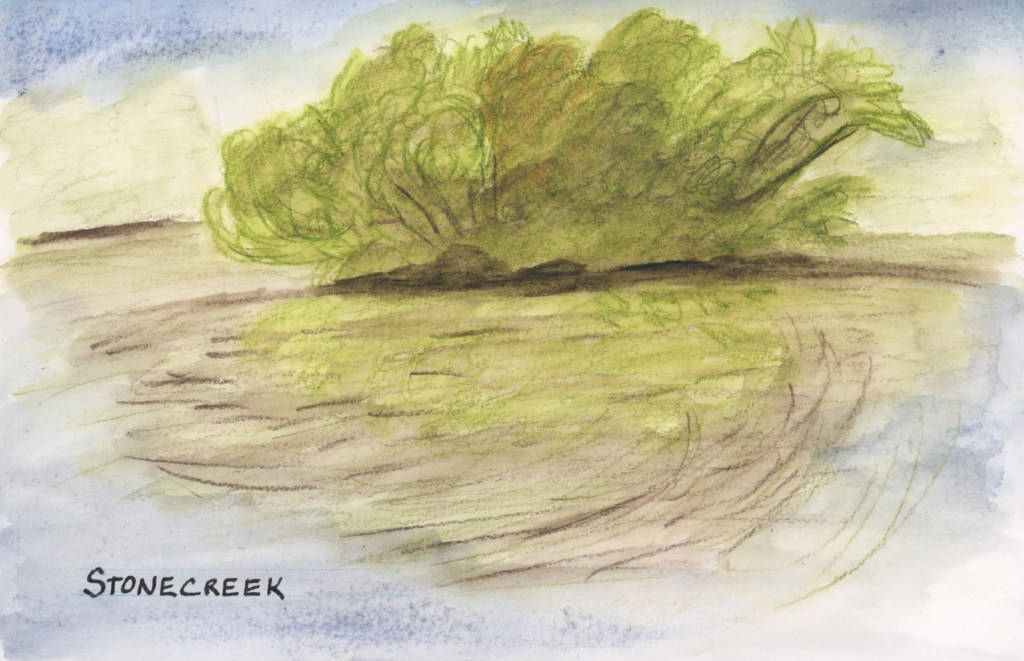
The Spring Greens have erupted on the trees and the entire island has lost all yellows and browns from the winter.
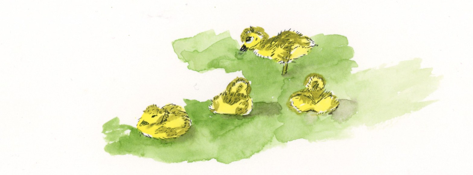
I sketched the island at the pond at Stonecreek with Inktense and I painted the goslings at home from a photo as my eyeballs do not zoom as much as a camera lens.(This is likely why the nature journalists like John Muir Laws carry binoculars!)
This sketch let me down. First my Inktense pencil was too bright, so I tried to tone it all down, but then ended up making it muddy. Not the spring green vibe I’m going for! While the photo was taken in a calm moment, most of the time the wind was rippling the pond water, which is what I captured in my sketch.
The Delta Series paper also let me down. To get a lighter shade of blue for the sky and reflection, I used a lot of water and the paper did this weird spotting thing. I had seen it do that in the previous pages, but since I was using supergranulating paint, I thought that was the granulation effect. Inktense does not granulate, so this is definitely the paper. Worse, those spots are showing through to the other side! Ack! I use this much water all the time with the Alpha Series, and Gamma Series papers, and that near bleeding, and changing of texture does not happen. Interesting difference!
I’m going to try watercolor over the top of this sketch to see if I can fix that muddy feeling to restore it back to that Spring Green vibe which is what I wanted to capture.
Well, I added watercolor over the top, and it is a better shade of green for the spring greens, but I can’t say I’d call this a very successful sketch. I do like it better now, at least.
What I love on this page are the goslings I sketched! Cuteness!
I painted the goslings from a photo a couple days later, in ink and watercolor, and I’m super happy with these adorable little guys. They were young and still tiny little fluff balls who had to rest after every few steps. There were actually two families of goslings! One family had five who were slightly bigger than these four. What a treat of a day to see the goslings!
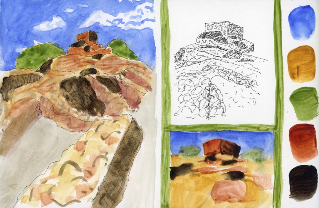
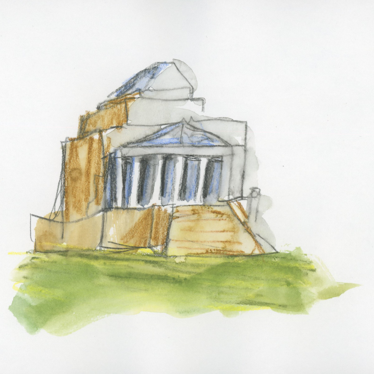
For the final livestream of class we were asked to submit a scene we thought was very challenging to sketch and she would select a couple to discuss for our final review. I was lucky enough that she chose my photo of Tuzigoot National Monument.
I took notes, and then attempted to sketch this view following her advice, and the techniques learned in class.
Not bad for my first attempts. I actually learned a lot by doing three versions in a row. One thing I certainly learned is I need more practice drawing these kinds of ruins, if I want them to make any sort of sense to understand what is going on. All that stone on stone on stone, yet to create the depth and shading to visually represent the many rooms, and layers. Plenty to practice!
Last week’s sketchbook pages had a lot more focus on sketchbook design since I am taking the class as an independent study program.
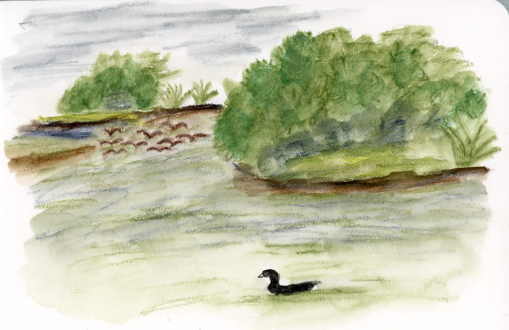
Having recently finished the Travel Sketching class, when I had the opportunity to walk Stonecreek, I brought my sketchbook with me, and tackled a scene that has long seemed very intimidating. This landscape view from the bottom of the pond. So I began with 5 shapes, and then added texture and details. Many of the details arrived while sketching. When the flock of Canadian geese flew in and landed on the water, so I had to add them in. When the American Coot swam up and gave me extended side-eye, perfectly posing for my sketch. He swam off just as I finished his addition! A cardinal in a tree branch, with the grey pond behind him, highlighting his colors. (He was so quick to fly off, I could only catch him via photo, and painted him later when I finished the page.)
I added the map, the titles, and the text block to finish off this page.
This also happens to be the first full spread page in my new sketchbook! I’m sticking with the 7.5×7.5-inch Stillman & Birn Softcover Alpha for now. The smaller pages are satisfying right now, and feel good. Keeping it simpler to encourage building a daily practice of sketchbook pages.
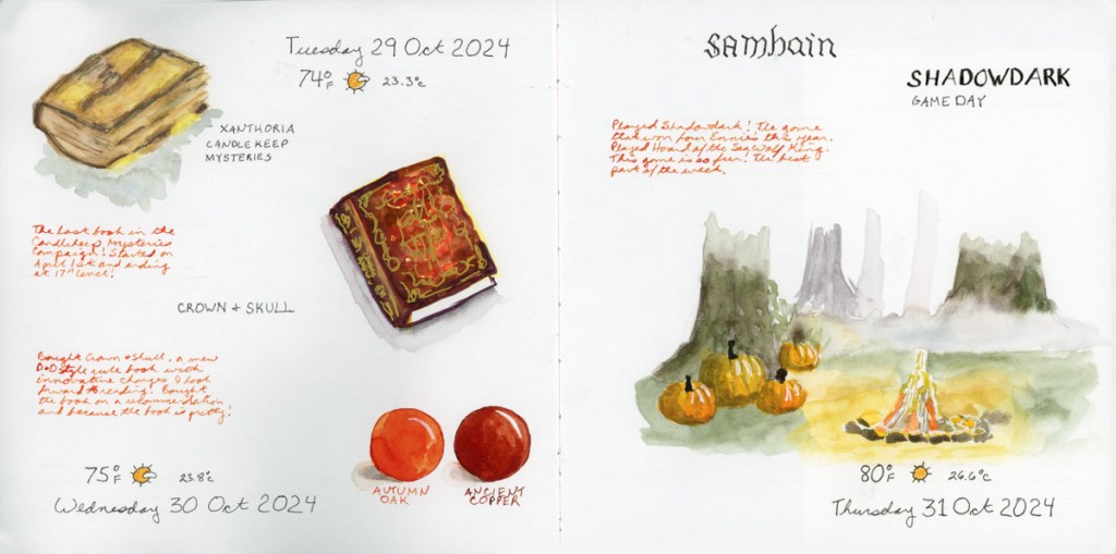
For this spread I used colored ink for extra notes, and the two ink color swatches to fill in a space. The ink is Diamine, and those are two of my favorite autumn colors.
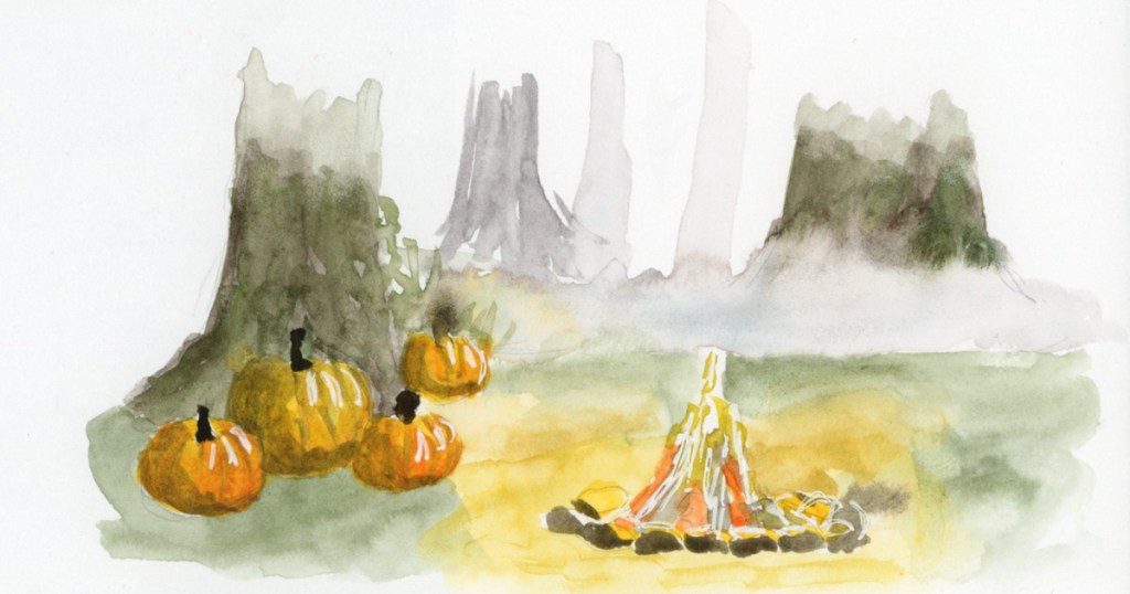
This is a part of an Alley of Ambience image. Drawing campfires is hard, but I may be in love with those pumpkins!
This page is a little more abstract. I love Elisabeth Alba’s art and I had these various stickers of hers. I’d also put the 5×7 prints I have of her work into a newly purchased portfolio album. This simple spread marks that for this week. The raven is also on a half sheet, which flips over for a second color block of transparent red oxide, which is fun and interactive in my sketchbook.
I will cut half pages sometimes when I have a lot of collage, to reduce the overall bulk in the finished sketchbook. It’s a fun way to do interesting pages.
As usual, my participation in the Sketchbook Design class has me sketching more pages, and putting a lot more thought into their layouts and designs. I love them even more when I’m putting in the extra effort and time! I also seem to have leveled up in my drawing ability! Don’t ask me how THAT happened! It seems to happen at random intervals and I’m sure it’s a product of practice. And the many lessons, of course. That Travel Sketching class really did seem to help me level up, didn’t it?
Onto the next week! The holiday season begins in earnest and I wonder what my sketchbook will capture next?
What a great class this has been, and I’ve learned so much!
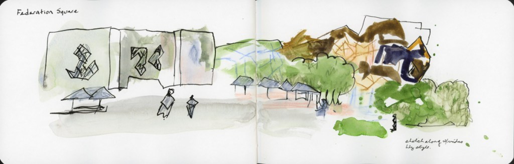
The final demos I did a crazed, loose sketch-along for these locations in Melbourne.
My takeaways from the class are many. I vastly enjoyed this class and learned so much. I feel I significantly leveled up in my understanding of practical applications, as well as in how to manage my overwhelm in the moment. So helpful! Here are my takeaways:
The fastest, loosest sketch will still capture the memory and scene.
Start with 7 lines, 5 shapes, or 3 layers when overwhelmed by a scene. It will still be clear enough to know.
I really like shapes and do better with them—that’s my personal go to beginning a sketch.
Onward! Though the group run through of Sketchbook Design is no longer happening, I intend to do the class myself. It aligns nicely with my desire to get back to a daily sketchbook habit.
A simple approach of thinking of foreground, middle ground, and background while using watercolor pencils to color shapes, ink to add lines for definition, and a final layer of water or watercolor paint to finish the sketch. I’m quite happy with my results.
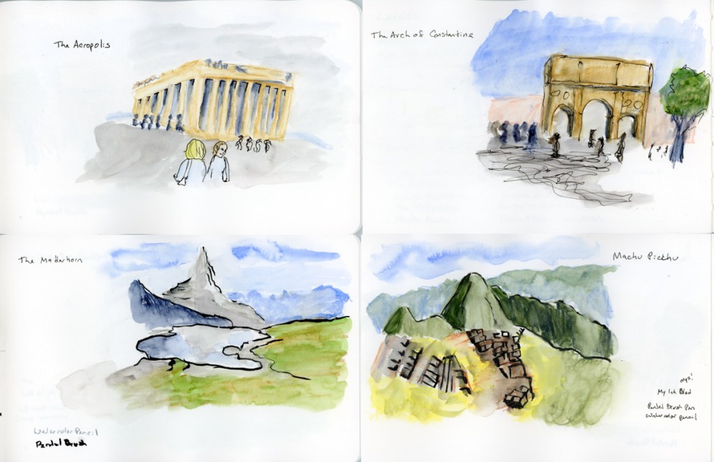
These are the sketches I’ve done for my assignments, famous locations. The first layer is indeed done with watercolor pencil, then some ink lines for definition. Then watercolor paint and water to add the finishing touches. I’d be very happy if my sketches when traveling looked so good. Most of these took me about 15 minutes to quick sketch, from photos. I was trying to work super fast, working along with the instruction video.
My three scenes, same ones I’ve done for the lines, and shapes exercises. Really happy with these. The ink lines are done with my Pentel Brush pen, and I really like it.
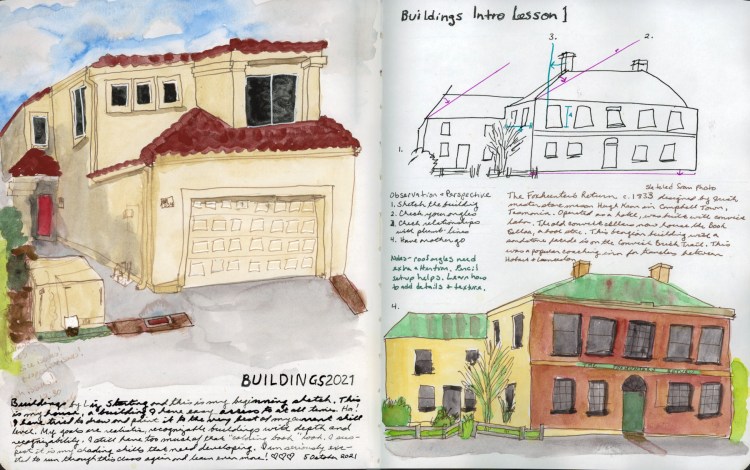
Sketching Now Buildings begins and I couldn’t be more excited!
I sketched my home and the first of the intro assignments, which I’ve done before. I’ve never finished the course, so I’m determined to do so this time! It is really interesting to see my own growth in these exercises. If you’d asked me, I wouldn’t have thought I’d improved much, but there it is, in ink and watercolor, all I’ve learned in the past months! This, of course, confirms what I’m learning every day. It’s practice that matters most!
Still working on my landscape skills. I took some notes on various paint brushes that Terry Harrison used/designed for landscapes. He works a lot larger than I typically do!
I was hoping to get a bit more blending in my sky, but I’m really beginning to think that it’s not me, it’s my paper that isn’t quite up for the blending I’m thinking of. I’ll have to try both cotton paper, and a different style to experiment!
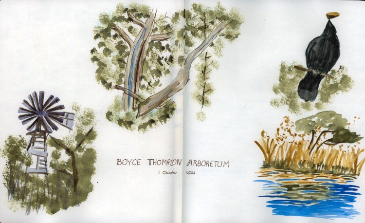
I took a short trip to Boyce Thompson Arboretum. My intention was to paint on location, but I’ll admit I chickened out. Again! So these are done from photographs I took. I was experimenting with different techniques with my brush to get different effects.
You can sure tell I struggle with open layouts in sketchbook design. I’m not sure if the amount of white space here is perfect, or dreadful! LOL! I’ll keep practicing, though, because clearly that’s the only way to go! Plus, it’s super fun.
I had no intention of making this map and entire double page spread, but it really got away from me! I love it, however. I do love maps, and one of the things I’m eager to add more of into my sketchbook is maps!
Since I did not sketch on location at the Boyce Thompson Arboretum, I was determined to do so somewhere, so I went to the Japanese Friendship Gardens and painted this on location. While not my first on location effort, it is the first since Pandemic started. It is also the first time anyone spoke to me about it! He was so complimentary and impressed! So that’s a new first for me, and what a pleasure it was!
More lost days, then a little Bob Ross inspiration. Since I’m really keen to learn how to paint landscapes, I decided to try Bob Ross in watercolor. I learned a lot about how different oil paints are from watercolor! Ha!
Then a second attempt. Yep, I need a whole different set of techniques than Bob used!
These four were also my first “sequence of pages’ designed as a set for my Sketchbook design class.
I had a variety of subjects I knew I wanted in this sequence, including large landscapes, clothing sketches, and open line drawings. Originally I was going to group the clothes on one page, and the line drawings on another, since they were the same, but after this lesson I realized that it would flow so much better as a sequence of spreads if I broke the subjects up. So I therefore definitely needed a second large, contained landscape to complete the sequence.
I love it now! These pages seem to now tell a story in a much better way than they would have had I gone with my first method!
Additionally, I used the same date stamp and weather temperature as a unifying marker through the pages. I probably could have done more with headings or text, maybe even a color block with the clothes, though I do like the airy open white space I have. It is a nice contrast to the fully painted landscape pages.
I certainly learned a whole lot doing this! Now I just need to practice a lot more so it gets faster! Though all told, I think all four spreads took me about three or four hours in total, so really that’s not too bad at all.
Wrapping up September with a landscape of Piestewa Peak that I’m very, very pleased with. I even love the outrageous amount of white space!
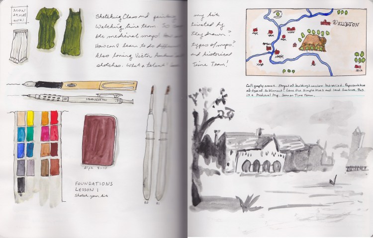
Foundations lessons, and inspiration from Time Team!
I fell in love with those medieval maps! Need to find a way to learn how to do that! I copied this one from the screen!
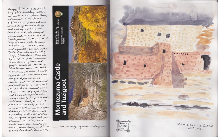
I was too overwhelmed to sketch Montezuma’s Castle while on location, so sketched this from a photograph. Clearly I need more practice, as I did not get the results I was looking for from this sketch. Worse, I don’t know why or how. At least I’ve grown enough to realize now that this means I am lacking some sort of knowledge that can be learned, and practiced.
More sketching from television here. I have discovered with this sketch that my paper really does not do the wet in wet techniques I was attempting. Did not work! Do I need to change my paper? That said, I heart this sketch because I love the subject so much, and I do love learning, even when the results don’t work out, they teach me.