Bathtime at the Reflection Pool

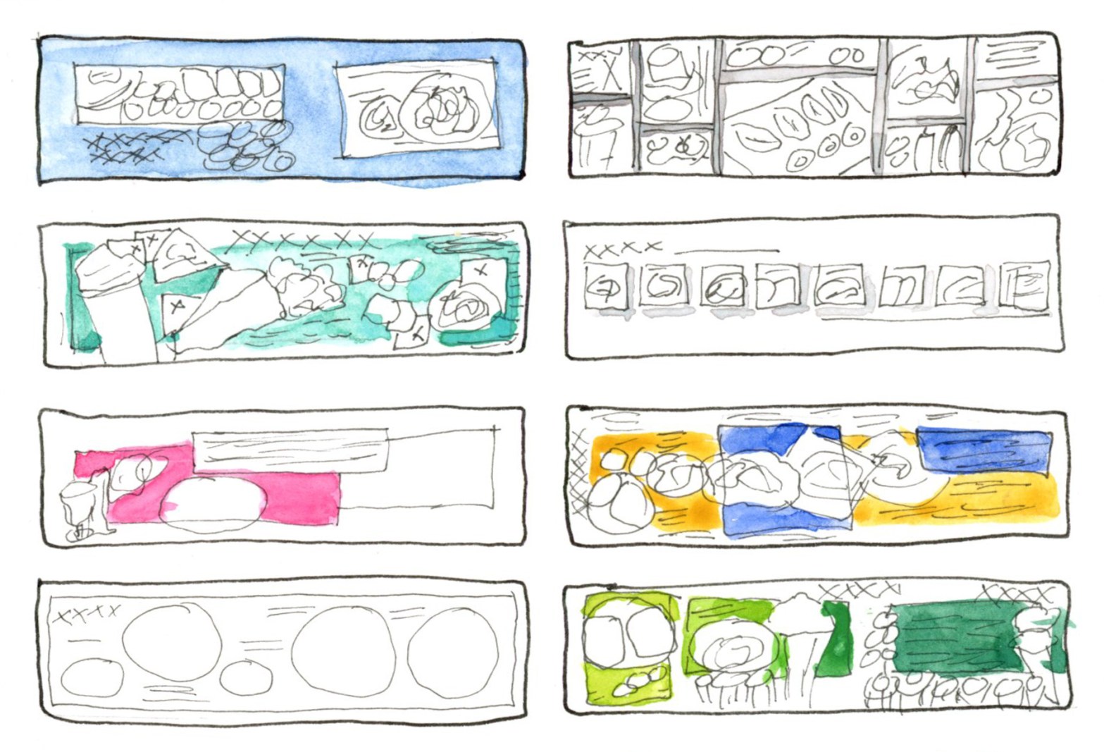
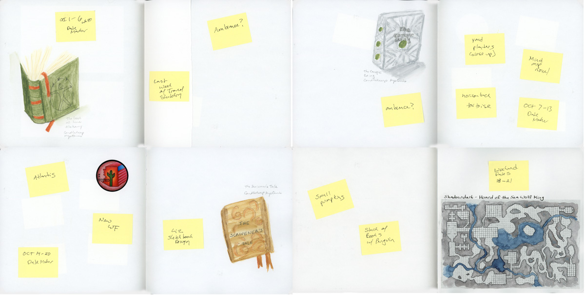
Concluding The Messy Middle from last week, you saw a sketchbook in progress — pages waiting, spaces held open, intentions taped into place. This is the update. The pages are filled. Titles are added.

A dual page sketchbook spread — three sketches of the Frank Lloyd Wright Spire at Scottsdale Road and Frank Lloyd Wright Blvd on the left with handwritten location notes and journaling on a teal colour block wash, and a painted watercolour study of the spire with Edges course notes on the right
Frank Lloyd Wright Spire, three sketches

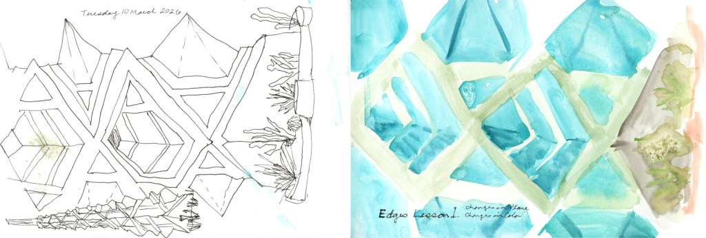
This is my Edges Lesson One outdoor outing — the Frank Lloyd Wright Spire at the little commemorative park at Scottsdale Road and Frank Lloyd Wright Blvd, sketched on location. I knew it was going to be the last good weather day for a while, so there was no hesitation — I had to get out there while I could.

The sketches are chaotic in the best way — three poses of the spire, which also happens to tie in perfectly with Liz Steel’s Patreon March Challenge of three things. The outing felt messy and alive, and I wrote all of it down right there on the page while I was still sitting in the shade. I finished this page by adding the date and the Title to it. I also tried to lift the wet paint transfer that the wind had put on the ink sketches.

A dual page sketchbook spread — handwritten journaling in black ink on a teal colour block wash on the left describing the Edges outdoor outing and the surprise lovebird sighting at the reflection pool, and three watercolour lovebirds painted in greens, oranges and yellows with the header Bathtime at the Reflection Pool on the right
Bathtime at the Reflection Pool — 15 grackles and 1 lovebird

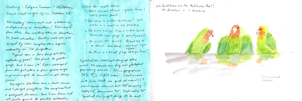
But this is the page that made the whole outing. I’d gone to sketch the spire, and I found a lovebird.

Fifteen grackles and one lovebird, bathing at the reflection pool. A few escaped from a pet store years ago, apparently, and they’ve been surviving in the wild ever since. I spotted it, grabbed some photos, and left the blank page so I could paint these birds at home.

Three watercolour lovebirds painted in bright greens, orange and yellow, sitting along a grey perch with soft reflected colour below, on white paper
One lovebird, three poses — green, orange, and full of personality

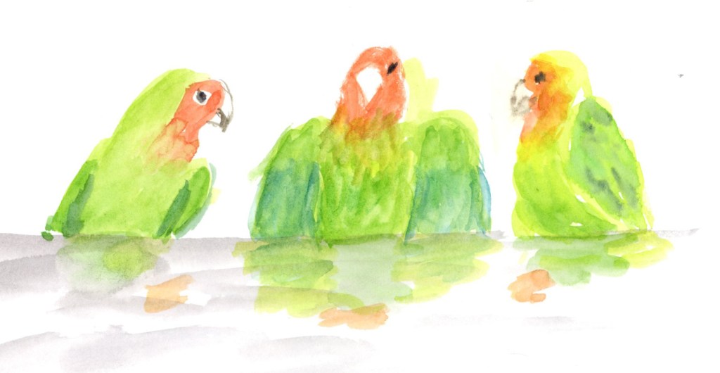
Three lovebirds — one lovebird in three poses, because it was there taking a bath. They’re green and orange and yellow and absolutely full of personality. The journaling on the left is written in that teal colour block wash, and it holds the whole story of the outing: the victory of getting outside, the chaos of the spire, the unexpected gift of the birds.

A dual page sketchbook spread — twenty watercolour portrait studies in small numbered grid squares on green and blue washes on the left, and ten loose ink figure studies in sepia on the right, labelled One Week 100 People, 30 including the children
One Week 100 People — 30 done, faces and figures

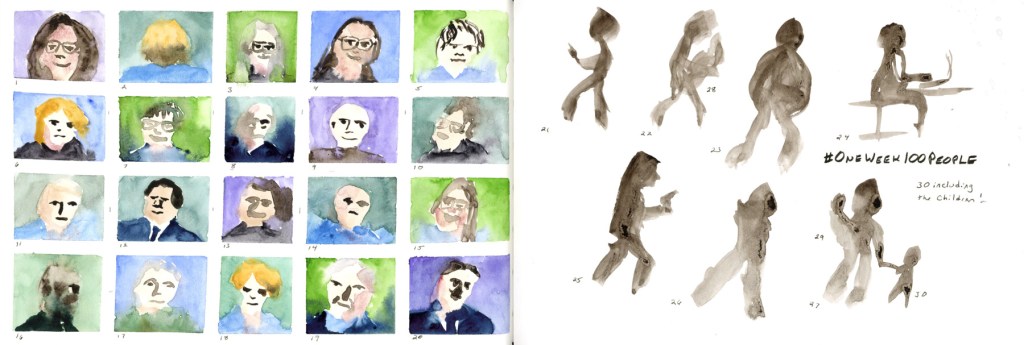
The One Week 100 People page got its finishing touches too — thirty people including the children, faces in watercolour on the left, ink figures on the right. I added the numbers and the titles to finish off this page.

A handwritten weather log for Wednesday 11 March through Thursday 19 March 2026, with hand drawn weather symbols in yellow and red, noting temperatures rising from 84 degrees Fahrenheit to 103 degrees, with annotations reading Extreme Heat Watch, Record Breaking, and Extreme Heat Warning to 22nd
Weather log 11–19 March 2026 — record breaking heat in March

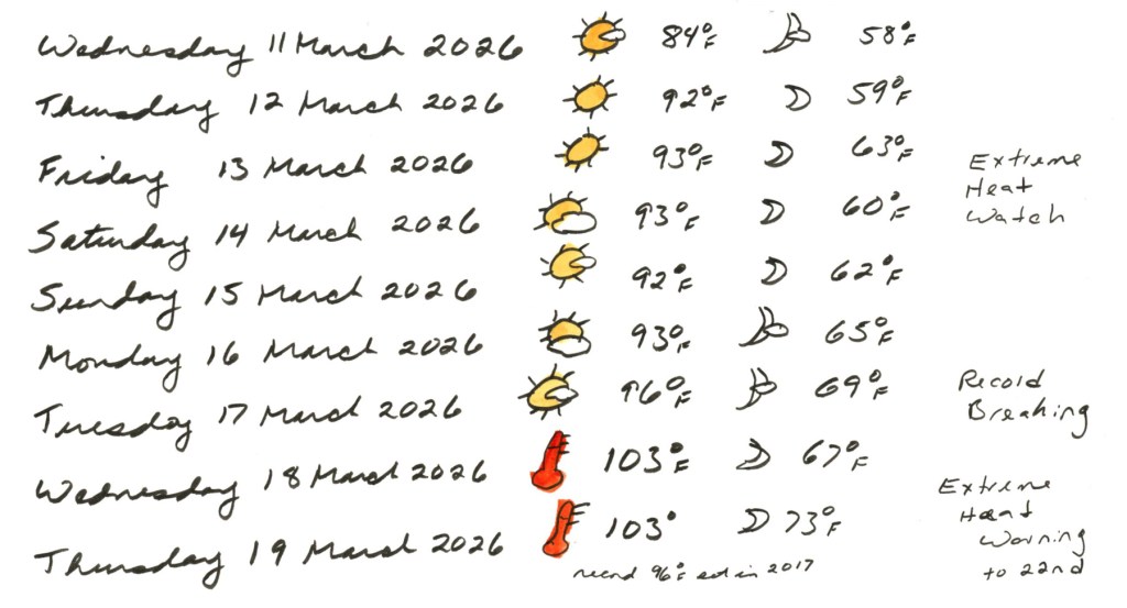
I knew my outing day was the last cooler day for awhile, but wow has the heat spiked! Breaking records by a mile! And it’s just going to get hotter, if you can believe that. I don’t usually see these kind of temperatures until May. We went from a warm pleasant 84°F on Wednesday the 11th to 103°F — record breaking — by Wednesday the 18th, with an Extreme Heat Warning extending through the 22nd. In March. The thermometer icon I drew in red says everything. And it’s only getting hotter!

Titles and notes help complete pages, and aid in telling the story of the everyday life I’m documenting with my sketchbook. This mini series of posts has shown a bit of the process for what is usually only shown completed. It’s easy to think I should complete pages in just one sitting, all perfect, but the truth is that isn’t how it’s done, really, if you are going to add a little sketchbook design to your pages.

Why Page Design Makes All the Difference (Even for a Food Diary)

If you’ve been following the Illustrated Food Diary for a while, you know the premise is pretty simple: I sketch what I eat, sometimes with calories, carbs, and cost noted alongside. Same subject, every single day. Plates, bowls, bottles of sparkling water, the occasional bag of chips.

It could get very repetitive very fast. And honestly, without some intentional page design, it does.

I’ve been thinking about page design since taking Liz Steel’s Sketching Now course — Sketchbook Design — and with Sketchbook Volume 24 (my 5th food sketchbook,) I got serious about actually applying it to the food diary. Near the back of the book I filled a few pages with wireframe sketches: little thumbnail layouts exploring different ways to organise a page. What Liz called recipe book in the Sketchbook Design class. Some ideas came from Liz, some from scrapbooking, and some I just made up. The note I wrote on the title spread still holds: design makes it look so much better.

Watercolour title page in purple reading "Page Design" with handwritten notes citing Liz Steel, scrapbooking, and personal ideas as sources, beside a page of small coloured thumbnail layout sketches for food diary pages
Page Design — sources and first thumbnails, Vol. 024
Two pages of hand-drawn wireframe thumbnail sketches showing named food diary page layout concepts including Modular Stack, Overlapping Flow, Spiral, Deconstructed Journal, Blueprint Grid, and Map, with watercolour colour studies
Wireframe page design layout concepts.
Two pages of food diary layout wireframe thumbnails in various colour combinations including pink, blue, orange, purple, teal and green, with handwritten notes reading "Food Diary Page Design from Liz Steel 2008" and Epsilon sketchbook specifications.
Wireframe page design layouts for S&B Epsilon 5.5 x 3.5-inch Landscape sketchbook.

Here’s what I landed on as my toolkit.

Colour blocking is my favourite for making plates really pop. A solid band of colour behind the food — yellow, teal, pink — does something almost magical: suddenly the sketches read as a designed page rather than a collection of doodles.

Illustrated food diary page for Saturday 5 July 2025 using a yellow colour block band, with watercolour sketches of cereal, Greek wraps, and kettle chips, annotated with calories and costs
Saturday 5 July — Food Sketch page with yellow colour block

The baseline layout — everything lined up along a common ground line — gives a page a clean, almost theatrical feel, like the food is on a little stage. The variety of shapes along that line (round bowls, wedges of quesadilla, tall bottles) creates a natural rhythm without any extra effort.

Illustrated food diary page for Monday 7 July 2025 with all food items lined up along a common baseline, including dark chocolate, red lentil pasta, watermelon, quesadillas, and sparkling water, annotated with calories and costs.
Monday 7 July — Food Sketch page with baseline layout.

Column dividers are great when you have a lot of items and want to create clear sections without things feeling cluttered. Vertical bands separate the day into distinct moments, and it ends up reading almost like a magazine layout.

Illustrated food diary page for Saturday 12 July 2025 using green vertical column dividers to separate meals, with watercolour sketches of dark chocolate, red lentil pasta pizza, cherries, and a Greek-style mezze plate
Saturday 12 July — Food Sketch page with column dividers.

And then there’s direct watercolour with a simple frame — no planning, just paint. This is what I reach for on a busy day, or when I’m catching up after falling behind. It’s the fastest approach, and even a simple frame lifts a page considerably. That Wednesday the 16th spread — done entirely in one deep plum — is a good reminder that design doesn’t have to mean colour variety. Monochrome with a strong layout is its own kind of striking.

Illustrated food diary page for Wednesday 16 July 2025 entirely in deep plum monochrome watercolor marker, showing a full day of meals arranged along a baseline across a two-page spread.
Wednesday 16 July — Food Sketch Page in Watercolor Marker, monochrome.

Here are a couple of recent examples from the current volume. Wednesday 4 March is a good fast-day page — loose, direct, just a simple wavy frame holding everything together.

Loose watercolor food sketch on a double page spread, Wednesday 4 March 2026. On the left page, dark mushroom shapes and a teal oval sit beside a large yellow pasta bowl rendered in fluid, gestural brushwork. On the right, a loosely painted brown shape sits centrally, with scattered sketches of cherry tomatoes on the vine, green cucumbers, a bean burger with ketchup, a bowl of strawberries, and more strawberries rendered in bright red. Handwritten food labels throughout.
Wednesday 4 March 2026 — Food sketch page in direct watercolour, simple frame

Thursday 5 March captures a dining out day — the teal colour block gives it just enough structure to feel intentional, and it nicely documents that mix of restaurant and home food in one spread.

Watercolor food sketch on a double page spread, Thursday 5 March 2026, with a bright turquoise border wash across both pages. On the left, a dark chocolate piece and a blue oval sit beside a yellow pasta bowl on a turquoise plate. On the right, two golden olive oil lemon cakes sit beside a grey bowl with a colorful glow bowl of vegetables and a plate of bright orange sweet potato fries. Food names are handwritten on both pages.
Thursday 5 March 2026 — Food Sketch page with teal frame including a dining out dinner.

The wireframe sketches aren’t precious — they’re just a menu I made for myself, so that when I sit down with the book I’m not starting from zero. I can glance at them and think colour block day or baseline day and just get on with it. Variety of layouts keeps it interesting for me, and on days when I just can’t, a simple frame and loose direct watercolour is still a page worth keeping.

If you want the full backstory on how I first approached page design recipes for this sketchbook size, I wrote about it back in Food Sketches Week 27.

You can see all posts of this food sketchbook volume 24 here

Sketchbook Design 2025

My very favorite of all of the Sketching Now classes! I’m so excited to be starting this group run, and return to these lessons. Every time I go through this class, my sketchbook and sketching level up significantly. Every time!

This is the spread I used as my “Current Sketch” starting point for Intro Week.

Sketchbook Goals is exercise one, and since I seem to have a floral theme for this page most of the years I’ve taken this course, I painted the peonies I bought this week.

Handwriting Tips is the next lesson, and I’m not feeling like doing too much differently with my text these days, so I just kept my page simple, but focused on the overall design to match the other half of the page.

I had left over paint in my palette so I painted a simple color block later in the sketchbook, thinking that having this beautiful color show up again would create a flow within the sketchbook. It sure does!

Sketchbook Design October 2024

I did this class as an independent study. I’d really looked forward to it when it was scheduled, but then the schedule changed, and I wanted to do the class anyway so I stuck with it. Here is the wrap-up:

Hmm, apparently I haven’t uploaded many of the remaining pages for these either. Interesting. So here is some of it. I may have to edit this page at some point in the future.

Adding Elements pt 2

Adding elements really does round out a sketchbook page. One of my favorite elements to add are maps!

There is a public walkway next to a golf course that I like to walk at when the weather is cool enough. They have a manmade pond that attracts birds and other wildlife. Since the temperature dropped down to 93F/33C (finally!) I took a walk. The one-mile round trip walk from the parking lot to the end of the pond is a perfect map to draw for the sketchbook, and for this sketchbook design element.

Color Blocks are another one of the Sketchbook Design elements we are working with in Sketching Now Sketchbook Design class. Here I’ve used a simple color block to balance and add interest to this minimal page of the stickers I’d placed in my book.

I’m working my way through the seven elements. So far I’ve done one for text, white space, color blocks, and maps. Three more to go!

Adding Elements pt 1

I’m really happy with how the text blocks makes this page look so complete! Without the text these disparate sketches looked adrift in the odd sea of the page. The headings and text blocks really make it look like there was a plan, when there wasn’t!

I realized that the white space on this spread really highlighted the sketch of the pumpkins and that I should definitely leave it alone and let it shine! I tend to struggle with white space, so being able to see this as I finished off the page is something I’ve learned!

Materials Sketch

My sketchbook and materials for this class. I am currently preferring the smaller size and the alpha paper. I have two going at the moment, a 6×9-inch landscape that I started for the Travel Sketching Class, and a 7.5-inch square that is my everyday. It’s almost finished! I am also carrying around an A5 Stalogy that I was using as my food diary sketchbook since it’s pages are super thin and it does take watercolor without bleeding, so I can have a longer period of time in one book. I haven’t kept it up, so I may abandon it soon? This trio of sketchbooks I’ve been carrying around for a couple months now, so it feels very familiar. (Note to self, I’m looking forward to taking Foundations again in January, because I’m still not getting the angles on stacks of books right! Hardest thing to draw! Ever!) These two sketches are actually on two different pages of my sketchbook, but they would have looked quite good together in one spread!

Should I continue my memory lane search for the materials sketches I did in previous iterations of this class?

My materials and palette sketch from the January 2021 class. The palette in particular brings me back, because I’ve used a variety of palettes since then.

My materials sketch (and a food sketch!) from the August 2021 class.

Sketch of Materials I did for the January 2023 class. I see I used a similar stack of sketchbooks for my composition! I never did use that Etchr sketchbook, though. Interesting. Both those Alpha books got filled up since then, however.

Sketchbooks hold such wonderful memories, don’t they?

Handwriting Tips

Always a fun page to do for Sketchbook Design Class. This year I’m keeping things simple and using only different widths of pen for headings. I have been opting for fast over style lately. As ever, I always use my own cursive for the majority of my text, as it is very easy and very fast for me.

I got curious when I did this page to see what I had done in previous runs for this class.

This one is from January 2021, when the sketchbook design class premiered. It was a revelation the first time I took it, and it improved the overall look of my sketchbooks a hundredfold!

August 2021 was my second run of the class, and I consider the pages I was making then the best of my work. I aim to get back to the skills I had then! I have always loved this page spread so very much. Especially those sunflowers! August is sunflower month, and I enjoyed capturing that, and the fresh cut flowers I had when I did this spread.

Then in January 2023, for class I did this spread. I like it, too.

Now I’m taking my fourth run through this course to reinvigorate my sketchbook design skills and practice. Looking back through these older versions of the same assignment certainly does inspire me.

Sketchbook Design Goals

The first of the Intro Assignments is to draw a page, and list our goals for the class. Apparently I forgot to share this one when I did it. So how about I continue on the memory lane with this same assignment from previous years?

From January 2021.

Same spread I showed for the Handwriting tips, because I put both on one spread. What a huge difference in my Sketchbook Design is plainly visible in this spread, done just a few months after the first run of the class! This blows my mind!

Here is the Goals page I did in January 2023. My goals themselves don’t change much, but there is such an evolution on my style I’m not sure I ever would have realized if I hadn’t been showing these back to back!