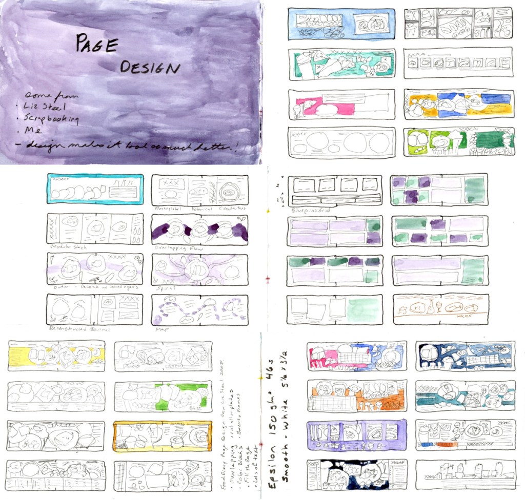
Last year I was filling a 3.5×5.5 inch landscape sketchbook with food photos. The very receptive nature of the subject, meant I got bored quickly and reached for page design to keep it interesting. I began to collect ideas on the pages in the back of that book, as I used them. The small size of the paper, and the long landscape shape offered challenges to design, so I am very happy to have this reference!
3.5 x 5.5 inch Landscape Format Layouts (Food Sketches)
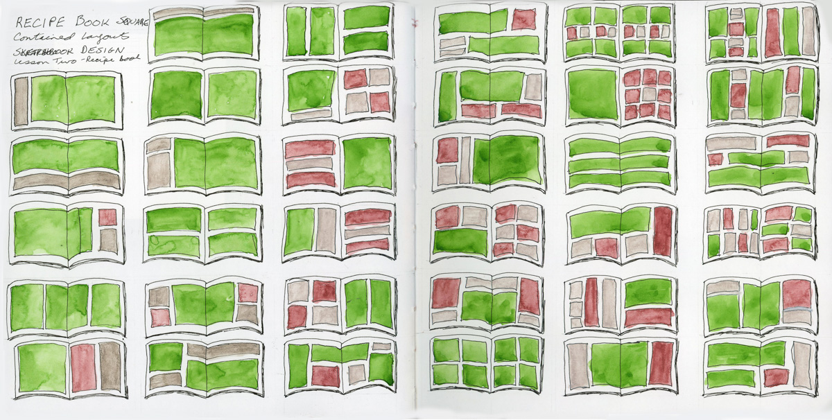
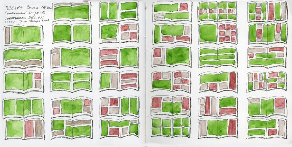
For this exercise in class this year, I did a bunch of layouts for the square format sketchbook.
Continuing my elements that can be part of page design.
Heading
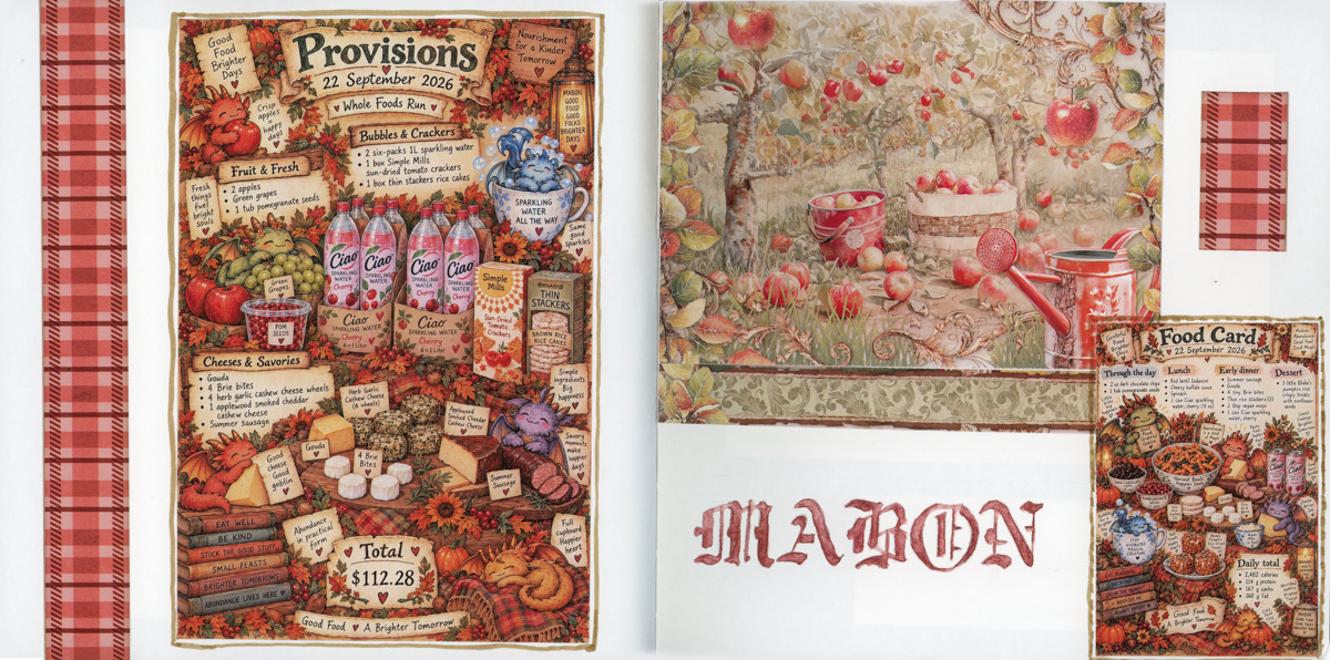
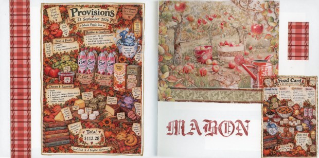
I think the heading here just made this page come together for me. I was very focused on page layout and design. I chose the size to fill the space just so, and I hunted among my stencils for that lettering/font choice. I colored it with that color to match the collage (especially that fun plaid!) and make the page harmonious. something about this particular page is a soothing little rest for the eye among the more complicated pages before and after it, in the sketchbook.
Maps
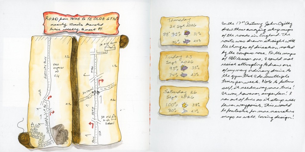
For this exercise I just had to try a John Ogilby style strip map for a very ordinary city trip. I love maps so much, but they are a challenge!
Secondary Sketch
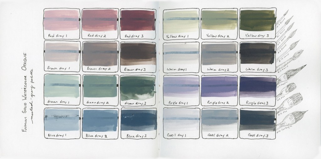
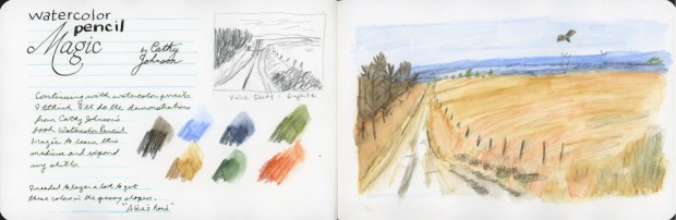
I decided to add the brushes behind this sketch/color chart to make it a more accurate capture of the actual delivery. And to fit in a secondary sketch, because I am not very good at thinking of secondary sketches! I rather love how this page turned out!
Collage
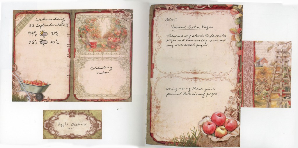
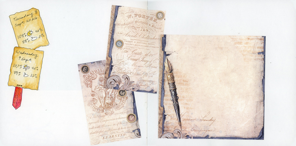
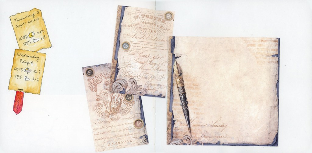
Though it’s nothing like how collage is used in the lesson, this is how I’ve been using collage a lot these days. Using junk journal ephemera and note cards to add some seasonal flavor and notecards when I’m not sketching other things. It keeps my sketchbook alive, even if I’m blocked in the sketching department.
Diagrams
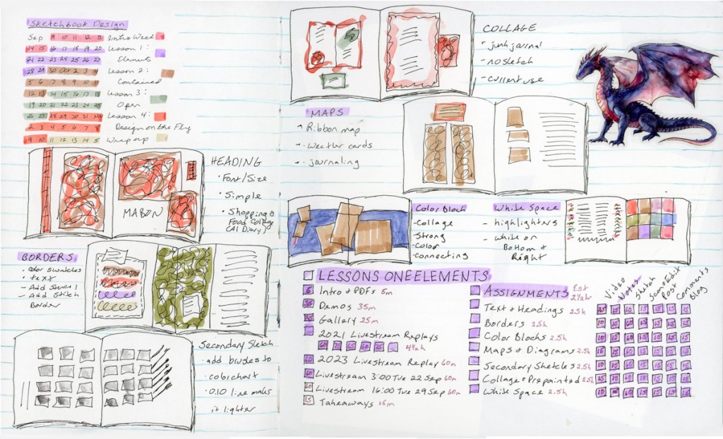
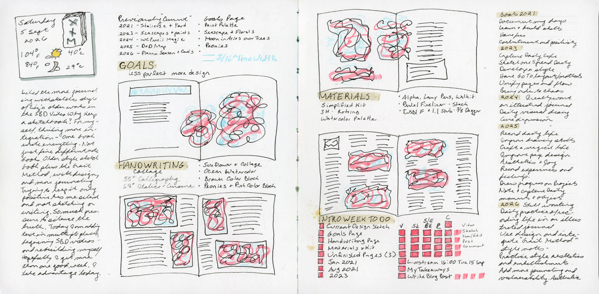
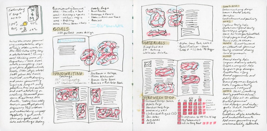
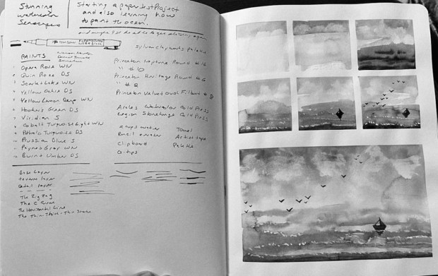
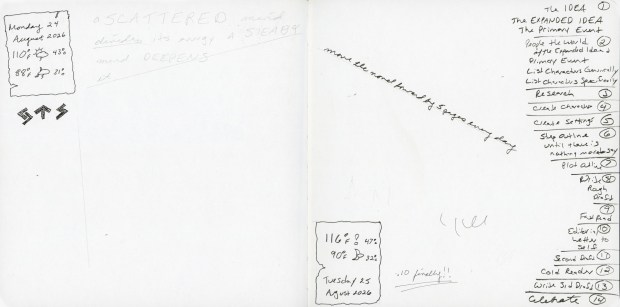
I made this planning page for Lesson One to help me track everything, and I found I absolutely fell in love with having my planning and design thoughts happening in the thumbnails on the same page as the checklists! This kind of page is now a new must have for me. Thinking on the page, and having such thinking out loud, thinking on the page itself. I really thought about how to place all the various bits of information as well, and I loved adding the drawn lines to really pull it all together!. This might be my favorite page, so far, and it certainly is the one where I learned the most about myself!
I’m working my way through the elements for the first lesson of Sketchbook Design. I started by finishing the previously unfinished pages and adding elements to make said pages look better. Lesson one has seven different elements one can use, and here are three of them.
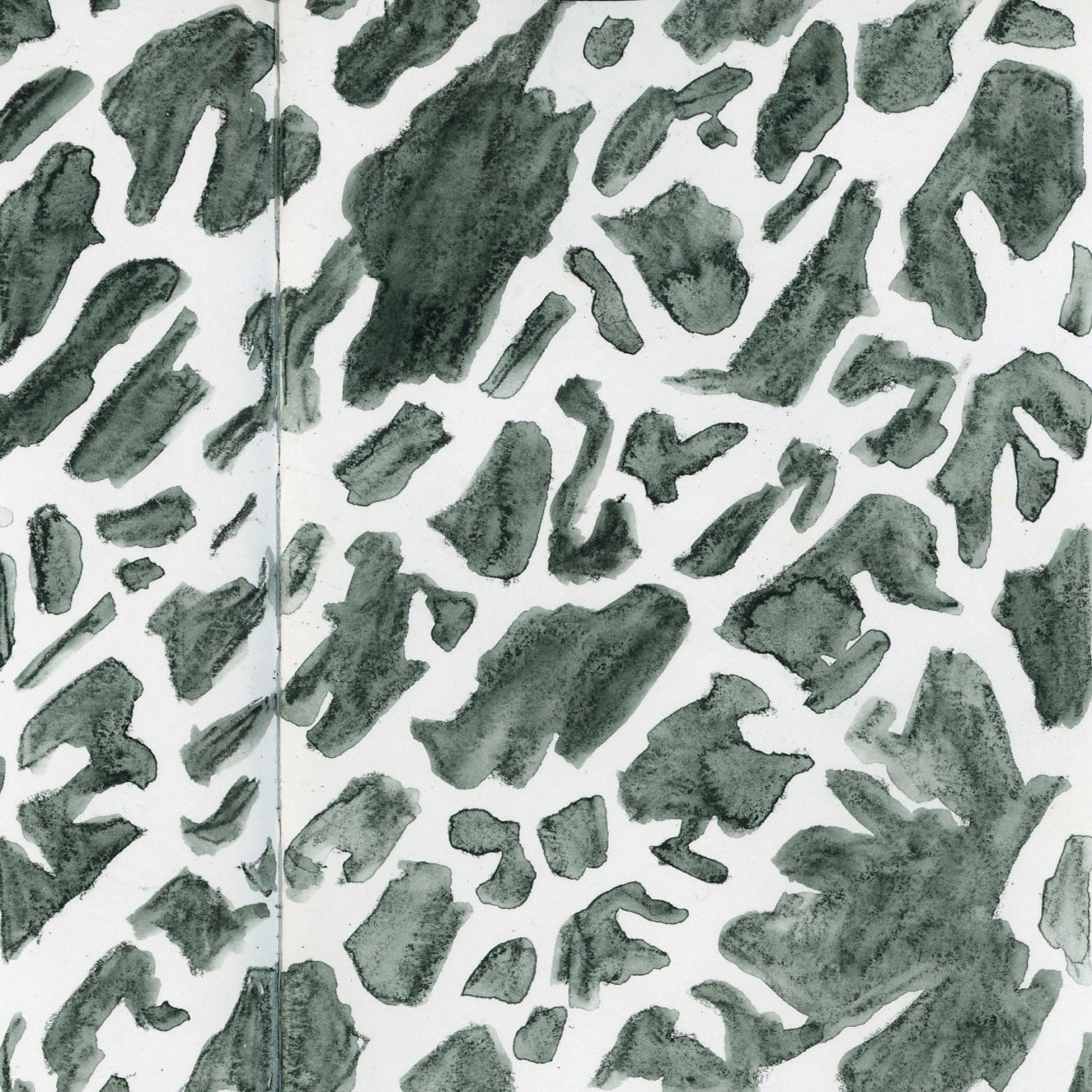
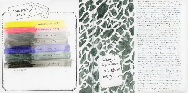
Adding the border around this color swatching chart really helped this page come together in a way I like a lot now. This page was one of those that sat for a long time in the “I don’t like it but what do I do with it?” arena. It is amazing how much the border helped. So did adding the stenciled column, but in many ways that feels like it reinforces that border even more. That’s where the eyes goes, right to those colors and it’s little border. This page also has that strong text block, which I like for the journaling, but it’s the border I felt did the best work for this page.
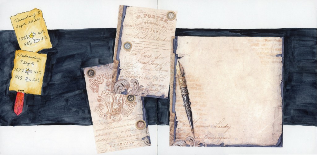
For this one I had those weather cards just hanging out there, and the collage ephemera just floating. I wondered how to create a cohesive page. I tried this strong color block, and suddenly this page really came together and looks like one page, rather than random elements. A few pages early I have a solid color background with weather cards on it, but the color block somehow makes it look even more intentional than the solid background. The horizontal aspect gives it shape and movement. I also notice the choice of color strongly impacts the feeling and the color story, perhaps coordinating with other pages in the sketchbook as a whole.
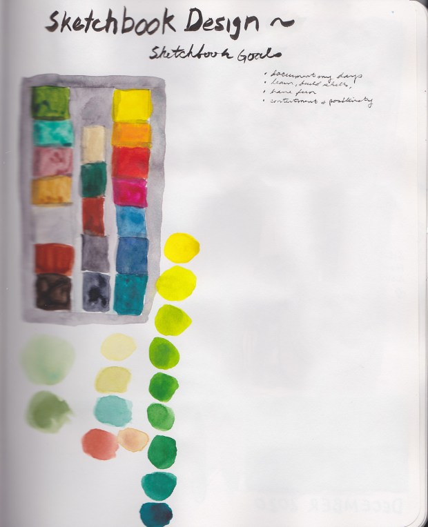
I held the white at the bottom and the right side of the color chart to really help the colors here shine. This page is to document this purchase, and keeping the design asymmetrical with that nice white edge makes this one feel almost soothing to me.
This page has been a breakthrough for me because I combined Page Design with making Design Notes and Thumbnails to actually think on the page, plan my coursework, and I even included a little chart to help me keep track of all the tasks! This page kept me inspired, because I was working out my layouts visually, and kept me from getting lost in where I was with the assignments! Planning plus design thumbnails, all on a designed page! Yes, I will be doing this again!
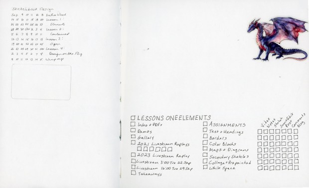
I have begun the page for the First Lesson as well. I haven’t decided if I’ll put class notes on the elements on this page, or the design ideas for some of the pages, yet. That will develop as I go, since this is a working, thinking-on-the-page page.
The assignment is to have a collection of unfinished pages so we can add elements to them to finish them off in the future. We are encouraged to go back and use older sketch pages, but I have a tendency to prefer very full pages without a lot of white space. Plus, once I’m done and moved on I don’t generally like to go back. Let the page sit as it was, that better captures what the moment was. However, knowing this assignment was coming up I did make sure to leave white spaces, or not otherwise finish off some pages for this exercise.
Additionally, I’m not actually sketching things or objects that much right now, which makes it even harder to select good examples for class. The class seems to assume you have a sketch first, and need to finish the page. Lately I’m more, I have my weather cards, and some notes, but no sketch, how can I finish this page. Slightly different angle. I tend to add color blocks a lot. I love to fill in with abstracts, and color charts. The color charts are usually documenting whatever new art supply I have either ordered, or found again in the dusty bins.
I collected a number of unfinished pages, wondering what I can do with them. And I definitely am adding more text this year, aiming for more documentation, and memories.
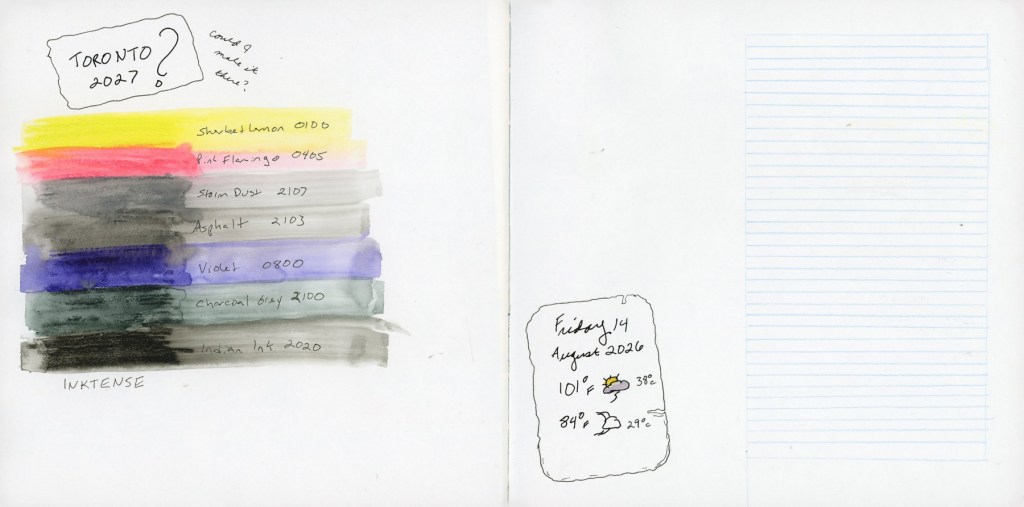
Unfinished page dated 14 August 2026Unfinished sketchbook spread with weather and notes on Write Away methodUnfnished sketchbook page with weather notes for 26-29 August 2026.Unfinished page with sketched UFO and Derwent Drawing PencilsUnfinished sketchbook spread, The Grail Method and various notes.
One of these I finished and it became my “Current Sketch”
The rest are still waiting.
I will confess it brings me a surprising amount of stress to have these unfinished pages waiting for so long! I am a completist at heart, and I’ve been itching to get them done, and move on to the fun new things I want to do!
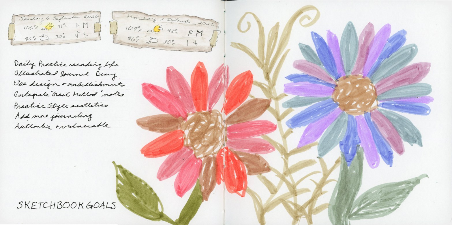
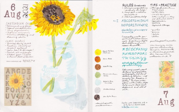
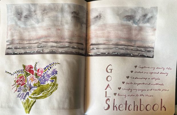
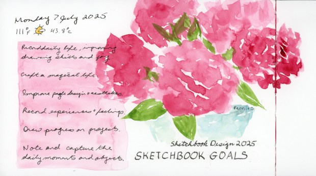
My goals for Sketchbook Design have not changed much over the years. I always want to establish that daily sketching practice, capturing life in the sketching of objects and moments. I always want to improve my drawing skills. I always want to improve my page design.
As I’ve mentioned I have taken this course multiple times. I do not always finish, but I have done several of these Sketchbook Goals pages.
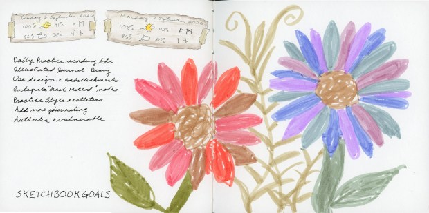
This year I am adding in the focus of style elements and the “Grail Method” style of notes. I watched a trio of You Tube videos on The Grail Method by Perry Daniels which inspired me to begin to include thinking on the page and more notes and feelings and comments. An all-in-one approach. Perfect timing for class, and working with these ideas for how to make it all flow and look cohesive, as as sketch more and capture more of real life, even when it’s subtle.
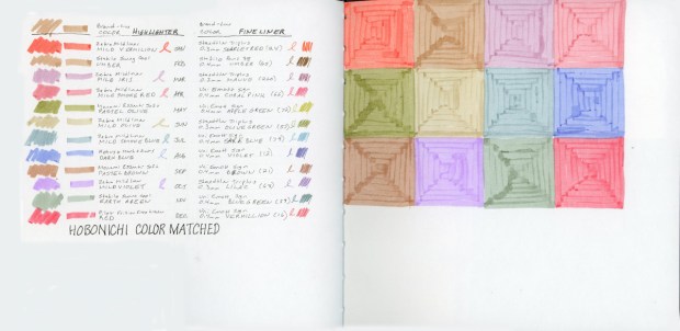
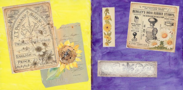
For example, those flowers are made with highlighters which are color matched to the Hobonichi. The page after this one, in the sketchbook, is the color chart for those pens. I’ll share that in a future post.
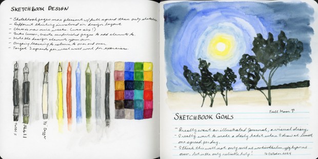
I went through and looked up all the times I’ve taken, or partially taken, Sketchbook Design. Every class with Liz Steel begins with posting one’s current sketch. A sample of where their style and skills are before beginning the course. I was curious what had I posted before each run, and it always is so interesting to look back and review.
These are from the years 2021, 2023, 2024, and 2025.
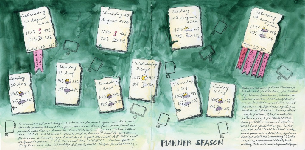
This year, it seems I’ve mostly just made pages with weather cards on them, so that is most definitely my “current” style of page!
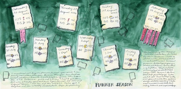
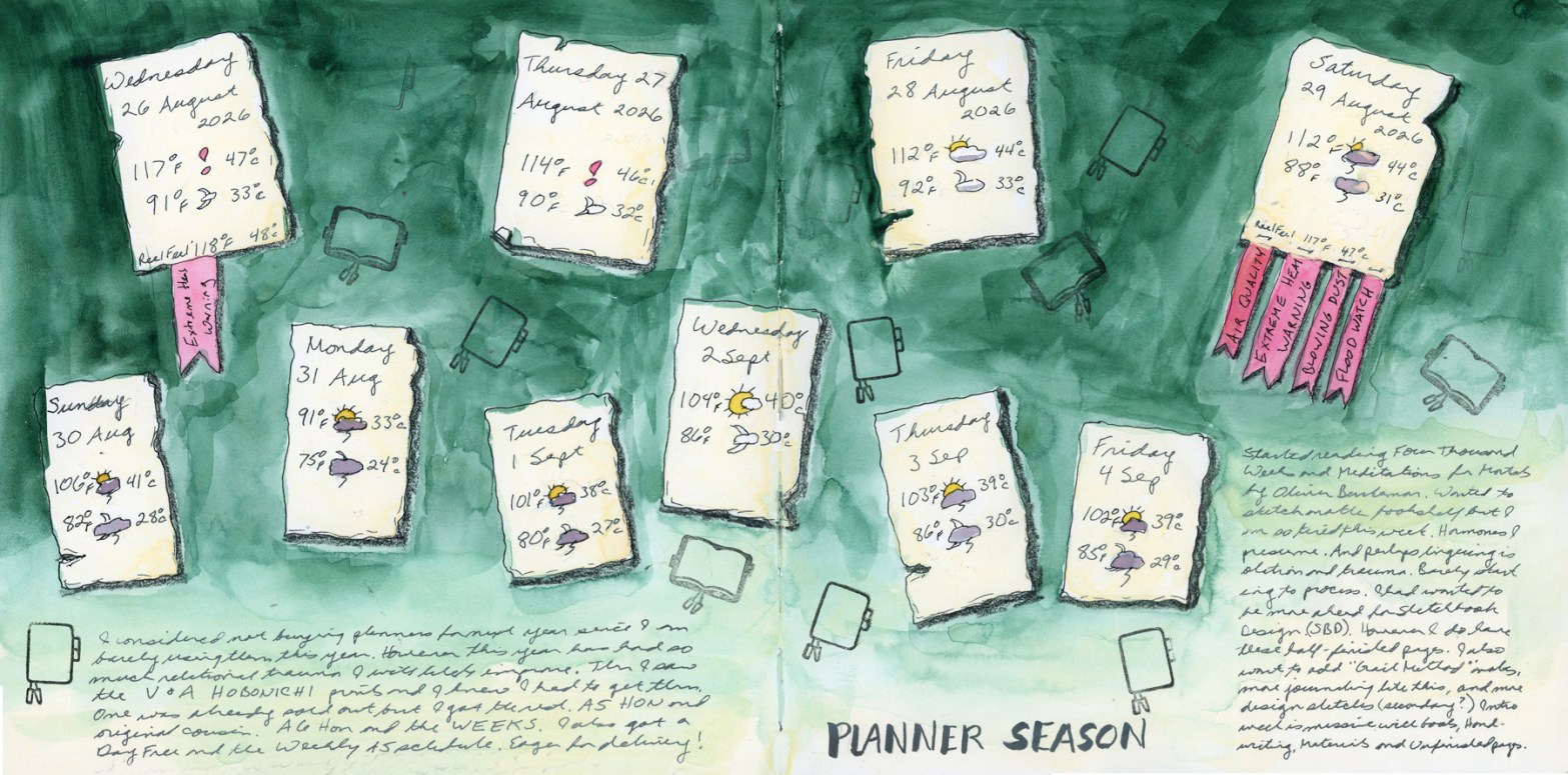
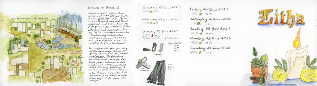
This is also one of those unfinished pages from my previous entry. Obviously another week passed, so I added yet more date and weather cards. Then I decided it was a good page to finish off by documenting this year’s planner season, and Hobonichi purchasing. Just like that, it’s a page about current life!
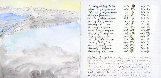
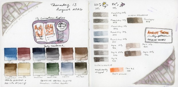
I finally scanned my sketchbook again. I hadn’t scanned pages since 27 June! I begin again. I did just post an entry for July, that I’d written the first paragraph in the beginning of July, then never finished. Now I fill in with August. These pages mostly just capture the weather information. Very, very little sketching. But even when there is very little, that says something when you go back and look.
Soft summer skies and a lot of hot days.Sunflower CollageSennelier Neutral Palette, and a selection of Luminance pencils.
I am rather loving that Neutrals palette by Sennelier and I hope to do more with it. Plus, I finally ordered some Luminance pencils. I’ve long resisted because I don’t generally love dry media, and the line is fairly costly. However, I just could not resist these percent tones in the neutrals. So I will now find out if these pencils are worth their hype. So far, they felt lovely to swatch them. And the ink wash over them worked out very nicely.
Sketchbook Design begins in September. That is by far my favorite course with Liz Steel at Sketching Now. I had hoped to get a strong head start and begin in August. I know the course load is hefty, and I’m a completist, so only doing some of it feels so wrong! However, the month has just flown by.
I do have a number of unfinished pages for the second half of August, which conveniently is something the intro week recommends we have, so I’ve scanned those. They are pretty barren, but that’s the intention isn’t it?
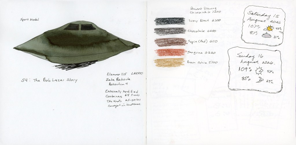
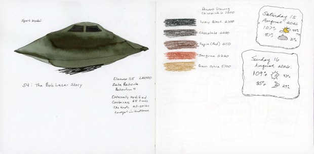
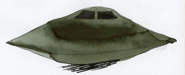
Unfinished page dated 14 August 2026Unfinished page with sketched UFO and Derwent Drawing PencilsUFO “sport model” sketch with Sailor Shikiori Suberakashi ink wash
Anyone else following the monthly PURSUE releases on the UAP files? Fascinating stuff! I have watched a few other documentaries on the subject. I used an ink wash for this flying saucer. I am pretty sure this is the Sailor Shikiori Suberakashi ink. It’s a black ink with a greenish undertone, which seemed perfect.
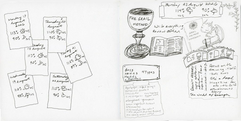
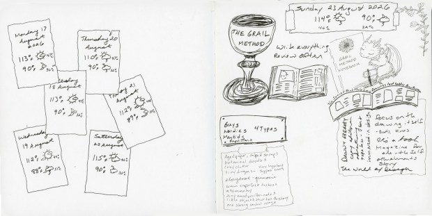
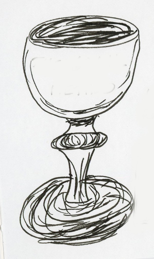
Unfinished sketchbook spread, The Grail Method and various notes. Ink sketch of goblet
I watched a video on You Tube called the Grail Method by Perry Daniels and I was quite inspired by it. It gives me the idea of perhaps a less perfect sketchbook, and including more life things, more notes in the same book, rather than keeping so many subject specific notebooks might be a great idea. This is the page I sketched after watching his trio of videos on the subject.
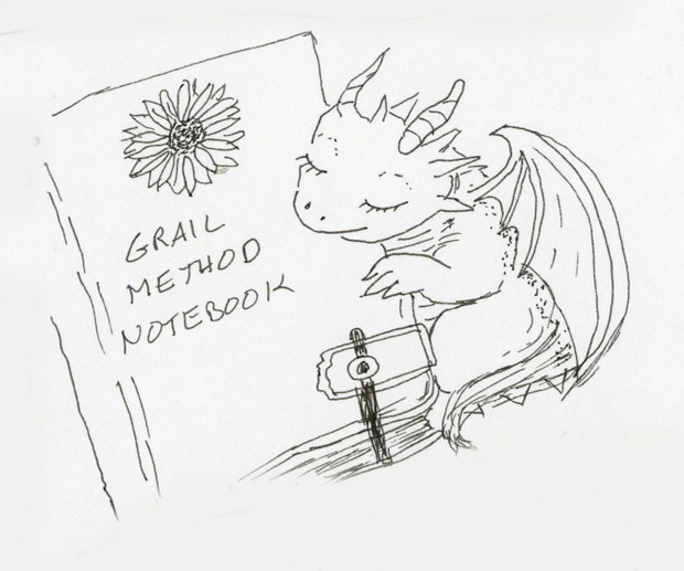
Ink sketch of notebook with baby dragon
I just have to mention these adorable little baby dragons. I’m trying to learn how to draw these. I had them on my bookshelf in June, and here is another one. I am currently copying these from AI generated art, as I know nothing about illustration techniques. But they add a light-hearted whimsy that seriously brightens my days. I hope to keep drawing many more of these little guys until I can actually draw them myself, instead of copy them. Can’t wait to get this guy painted!
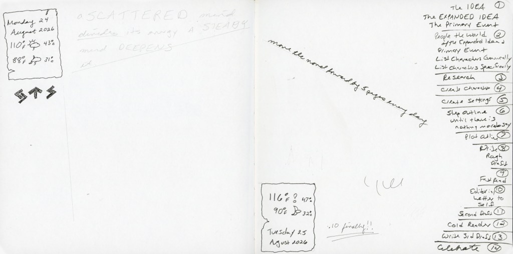
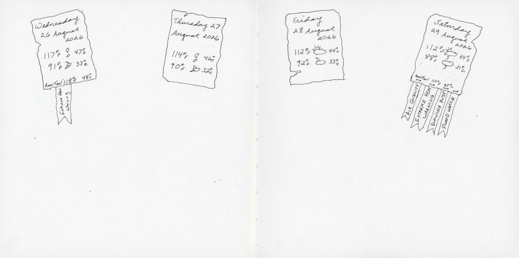
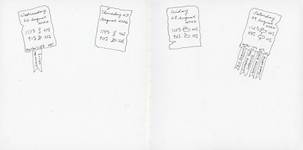
Unfinished sketchbook spread with weather and notes on Write Away methodUnfnished sketchbook page with weather notes for 26-29 August 2026.
And here we are, back to scorching heat and breaking records. These temperatures are usually in early July, not the end of August! I’m hiding in the A/C while I prepare for the Sketchbook Design course. I’m ramping up some spreads, if not too many sketches yet. I am thinking of some abstracts for these empty spreads? More ink washes?
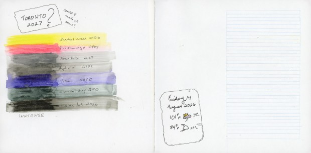
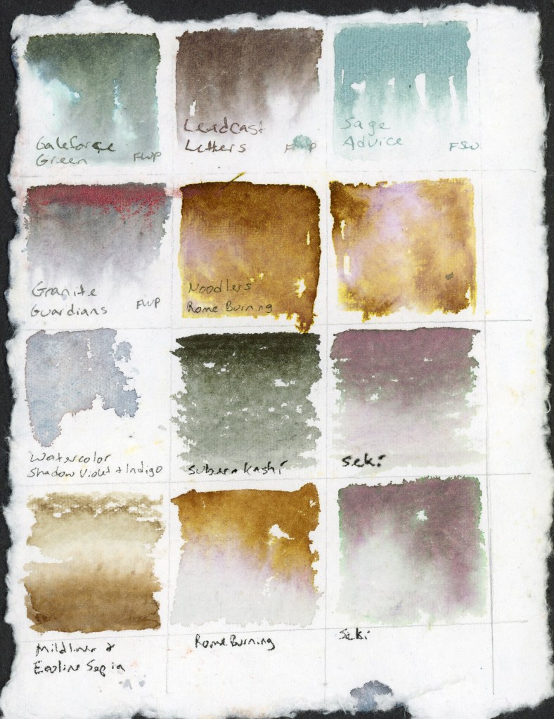
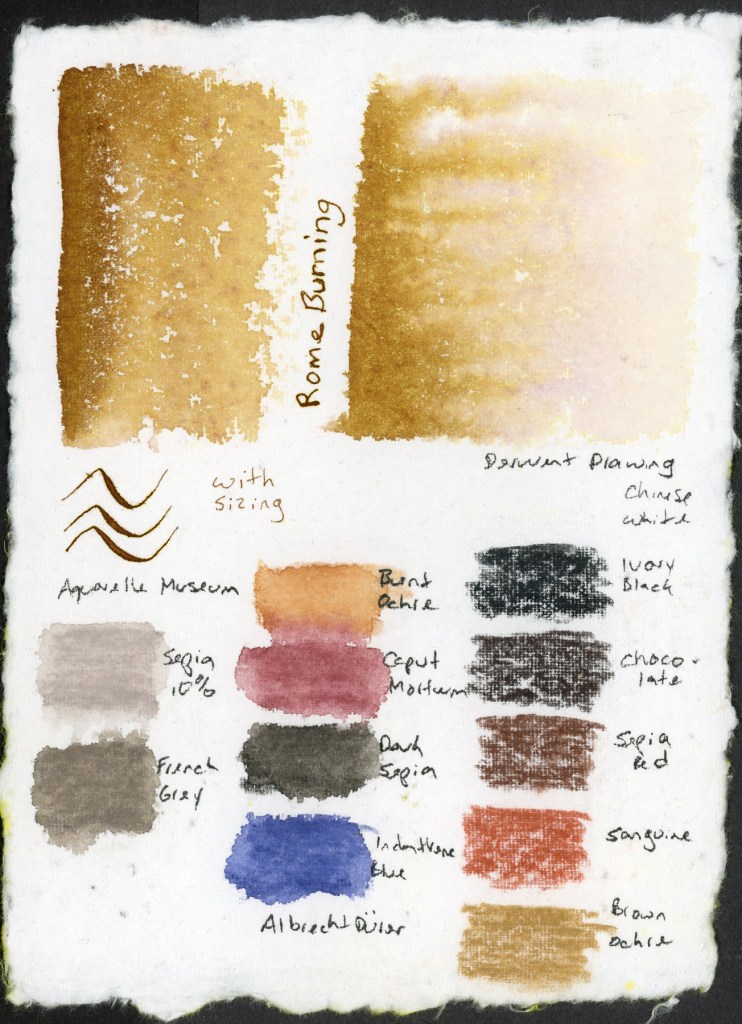
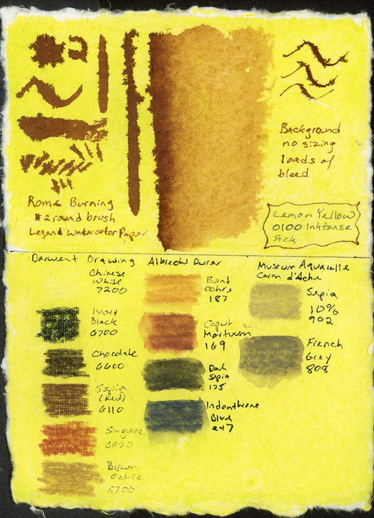
Speaking of ink washes, how about I just share the accumulation of swatches I’ve been testing as well. I don’t have much to say about these.
Ink swatches on handmade watercolor paperInk and colored pencil swatches on handmade watercolor paperInk swatches on handmade watercolor paper tinted Lemon Yellow, with colored pencil swatches
This catches me up and now I get to swing into Sketchbook Design again. I have a tag for previous courses at sketchingnowsketchbookdesign.
Time is moving swiftly this summer, isn’t it? We are in the Dog Days of Summer now. I love that phrase. The Romans and Greeks considered a time of madness and insanity. Here in Phoenix, when the temps are over 110F, people do indeed go a little crazy. Me? I’m just hiding the in the A/C. And buying way, way too many books!
I had written the above paragraph ages ago, and then… the summer happened. So here are the July Pages:
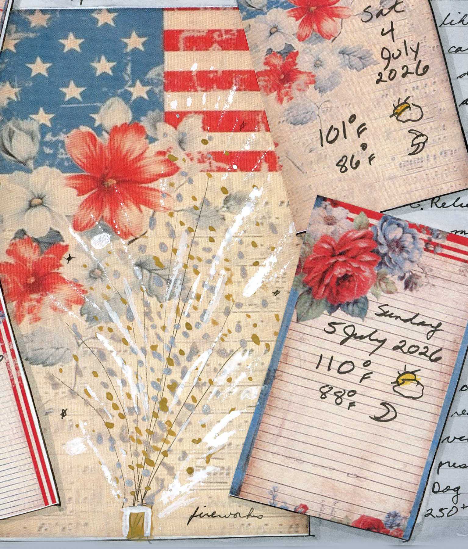
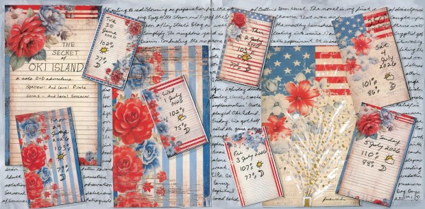
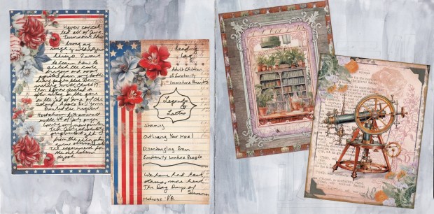
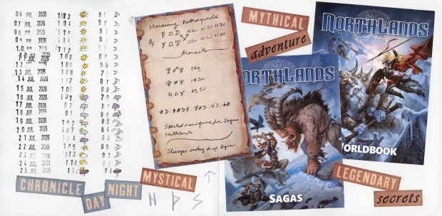
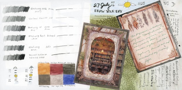
Americana collage for the 250th 4th of July celebration.Collage with Americana and Magical Herbalism images. Weather and Collage for July.Pencils, and Draw Your Day style page.
(Posted on 30 August 2026. Backdated to 28 July 2026.)
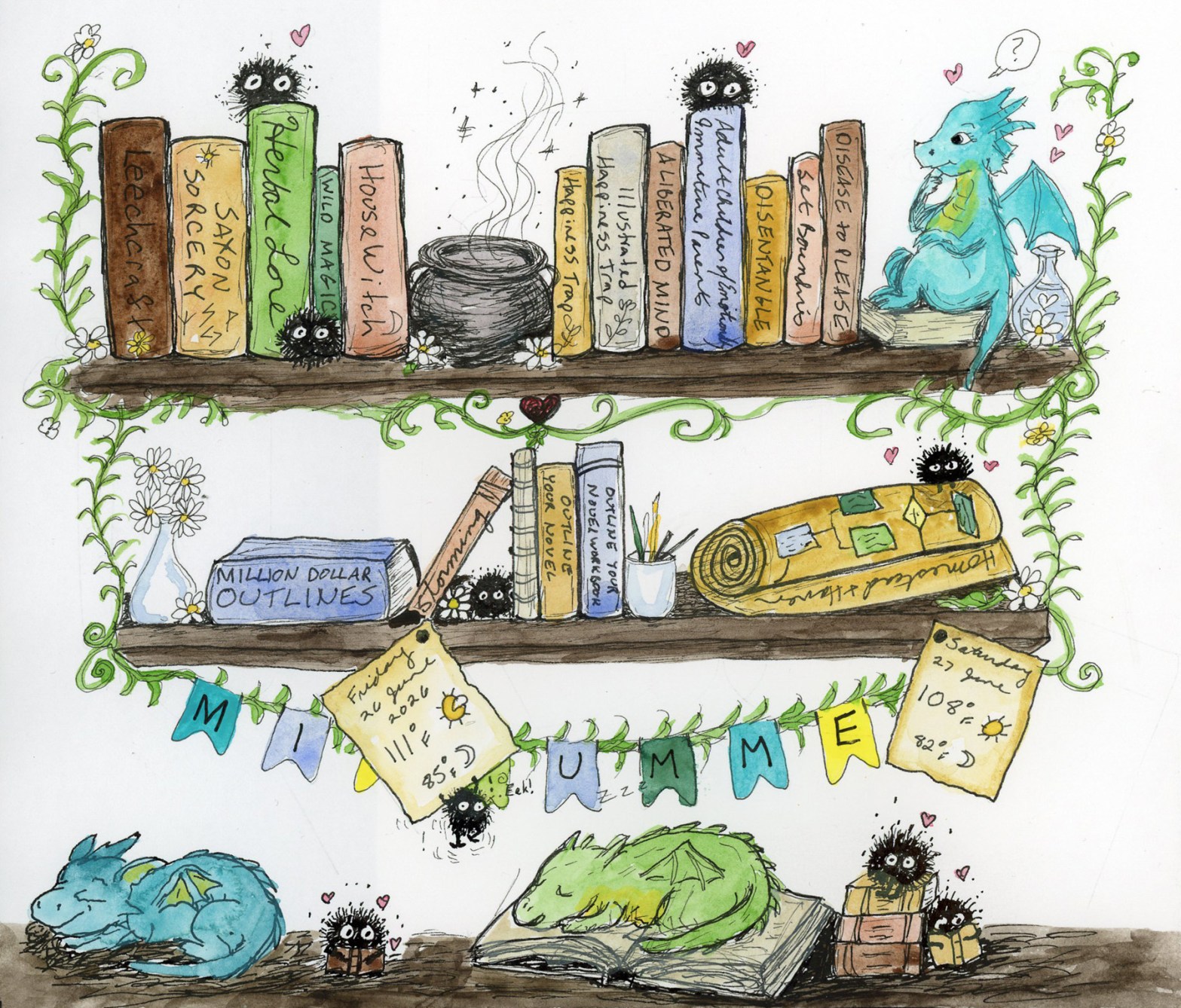
So the question comes up, how do I document that I’m buying books, when I buy ebooks, and don’t really have anything to actually sketch? I could sketch the covers. I could sketch the kindle or the kobo. Or I could venture out of the world of observational sketching only, and venture into illustration. Gasp!
Well, if I’m going to venture into illustration, might as well add soot sprites and dragons then! Ha! So here is my illustrated bookshelf. the books are real and purchased, and I really am working on Homestead and Haven. The shelves, the vines, the flowers, the soot sprites, and the baby dragons are just for delight.
Midsummer Bookshelf with baby dragons, June 2026
Done with ink and watercolor wash, using my standard watercolor palette.
I think my favorite is that poor soot sprite trying so hard not to fall off that weather card! He is having a struggle moment, for sure!