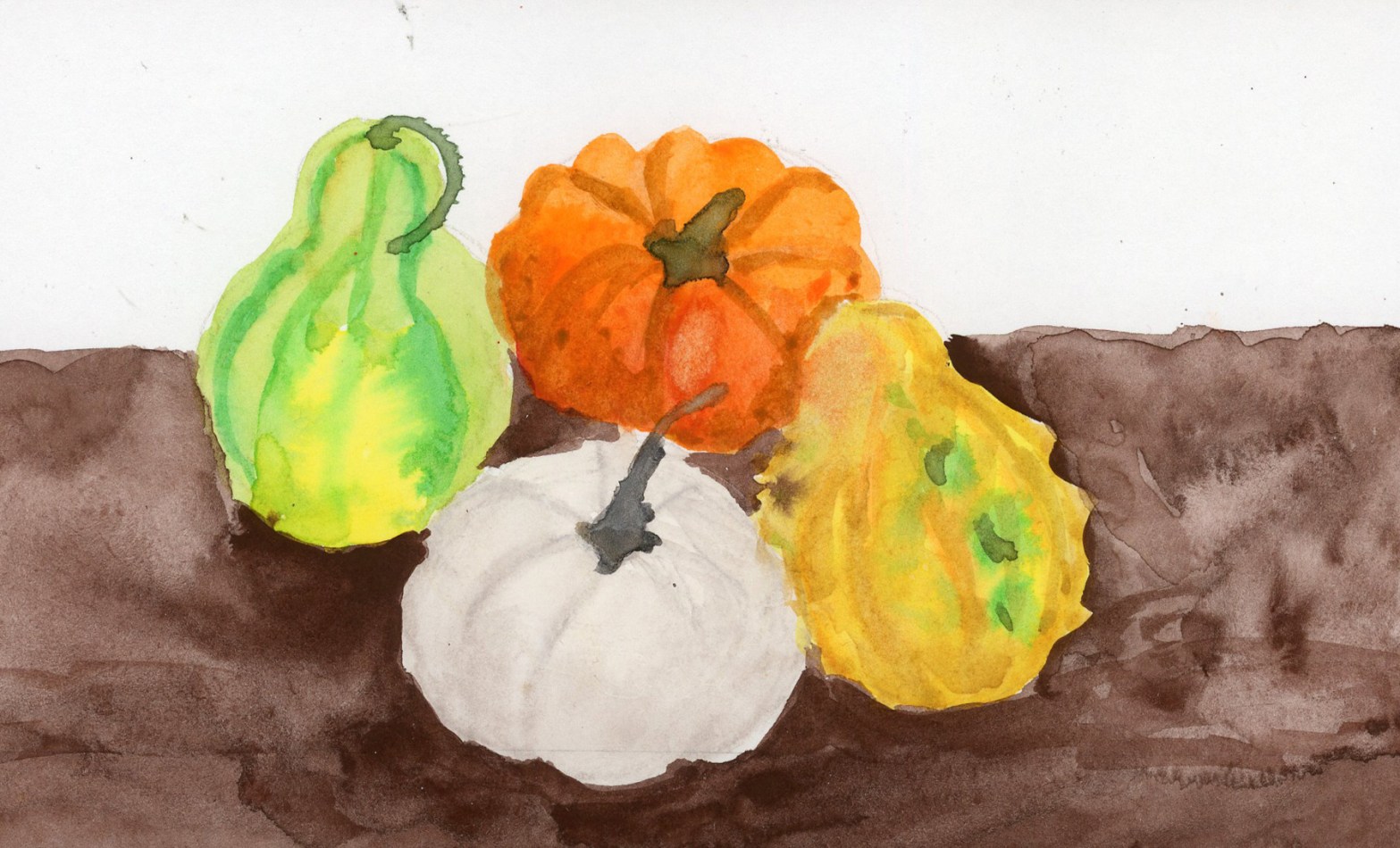
Designing on the Fly

Designing on the Fly is the Sketchbook Design lesson that trips me up every year. I finally realized why: It wants many different objectives. First, sketch a whole series. The suggestion is to go out for a day, and I struggle with that. Second, design on the fly, as you go, with little planning. What happens if you need a little planning to even know where to go, or what to draw while there? Third, utilize some of the design elements like balance, and repetition. Now go fill a whole series of pages, and make them look like part of a whole book with flow and variety! That’s all!

Then I got sick for a week and a half, and the time I had for the lesson vanished. So I had to rescale my plan to what I could do with my virus, and my at-home sketching. (I’m still fending off this virus, as I write this. I tested for Covid, and Flu A & B, and it’s neither, fortunately. Shall I add that note as a little orange flag to the sketchbook page?)

My through-line was paper notes. I’ve been doing these hand-drawn weather cards for a while now. Little sketched pages, slightly curled and shadowed, turning up on every spread. I can’t resist tracking the absurdity of “autumn” in Scottsdale. It was 93° on October 20th. With thunderstorms! Very spooky season.
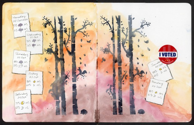
Two-page watercolor sketchbook spread with a soft wash of yellow, orange, pink and dusty brown. Across the middle, dark blue-grey tree trunks with bare branches, falling leaves, small squirrel silhouettes and a little hedgehog at the base of each group. Down the left edge is a cascade of hand-drawn paper notes, each with a daily forecast from Tuesday 20 October 2026 to Saturday 24 October. The highs and lows are in Fahrenheit and Celsius, with tiny storm-cloud, sun and moon icons. Two more notes on the right page cover Sunday 25 and Monday 26 October, and above them is a round red, white and blue “I Voted – Maricopa County” sticker.
Designing on the Fly

Orange. The first spread is my fall forest. I wanted to use the Warm/Cool theme, so my background is warm autumn colors, then I stenciled the cool dark trunks over the wash, plus squirrels, falling leaves and a hedgehog who wandered in. The weather notes tumble down the left side and pick up again on the right, and yes, there’s a sticker. I voted!
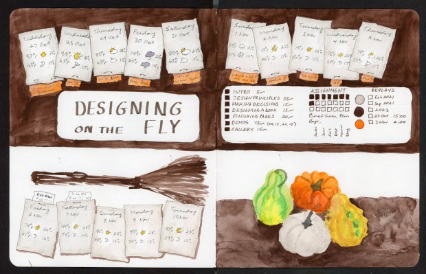
Two-page sketchbook spread in deep Van Dyke brown and white. A row of drawn paper weather notes runs across the top, one for each day from 27 October to 5 November. Under each one is a small orange tab with that day’s plan or status: “Write Witch’s Apothecary,” “Site Q,” “Blog Post,” “Finish Witch’s Apoth,” “toolkit!!,” “toe injury,” “ugh,” “Sick!” In the center is a white panel lettered “Designing on the Fly.” Beside it is a lesson checklist with session lengths, assignment progress squares, replay dates and three color swatches (grey, dark brown, orange). The lower left has a loose brown sketch of a broom above five more weather notes for 6–10 November, two of them with tags reading “Blah page, sick!!!” and “Site Q2, sick!!!” The lower right is a watercolor still life of green, orange, white and yellow gourds on a brown surface.
Designing on the Fly Planning Page

Brown. I had to include my planning page. It’s been the defining theme of my run of Sketchbook Design this year. I’ve loved these planning pages so much. This page is dark and cozy, partly because I’d made an inking error on the borders and so the dark background became how to hide that error! Weather notes march across the top, instead of the small calendar insert I used on the previous planning pages. I gave each one an orange tab with that day’s plan. It started out ambitious: Write Witch’s Apothecary. Site Q. Blog post. Finish Witch’s Apothecary (I did!). Then it turns into something more like a medical chart: toe injury. ugh. Sick! The lesson checklist went in the middle, and the empty space underneath got a witchy broom and a pile of gourds, since the gourds were very patiently sitting there. At least I got some of the seasonal flavor in my spread!
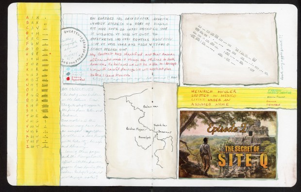
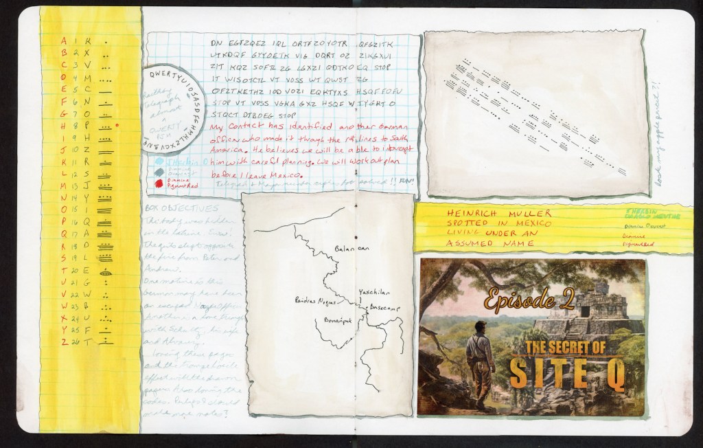
Two-page troupe l'oeil spread of notes from the Site Q mystery game, Episode 2 (includes spoilers) A bright yellow lined-paper strip down the left edge holds a cipher key matching A–Z with numbers, substitute letters and Maya numerals. Next to it is a drawn sheet of graph paper with a coded telegram, a circular “railway telegraph” keyboard key, and the decoded message in red ink about intercepting a German officer who fled to South America. Below that are handwritten case notes in pale blue ink and a hand-drawn map of a river with Balancán, Yaxchilán, Piedras Negras, Bonampak and a basecamp marked. On the right are an aged paper scrap covered in diagonal Maya-numeral code, a yellow strip lettered in red “Heinrich Muller spotted in Mexico living under an assumed name,” and the printed Episode 2 card showing an explorer facing a Maya pyramid in the jungle.
Site Q Box 2 (Spoilers!!)

Yellow. The last spread is Site Q, Episode 2. I kept up the yellow lined-paper trompe l’oeil from my Box 1 pages, so the whole thing connects back to earlier in the book. I solved both the telegraph cipher and the Maya number cipher, which was so much fun, and I found an escaped officer, a body in a latrine (eww) and a possible love triangle. Also, I lost my Apple Pencil. But I found it a couple days later. I do love documenting life as it happens!

For this series, I was thinking that the notes repeat, the color drifts from orange to brown to yellow, and each spread has one dark, heavy element anchoring it: the tree trunks, the brown band, the cipher strip. None of that was planned, I drew one thing, and then the next. I adjusted my error with a heavy color, and so on. Very On the Fly!

Though the real series that seems to be emerging are these Site Q pages. There is a distinct through-line for these, that I’m absolutely loving. I have twelve boxes, so what a series this will be when it’s all done!
Open Compositions

The Open Compositions assignment has always challenged me and I haven’t managed it most of the years I’ve taken this Sketchbook Design course. I understand open corners, overlapping sketches, extending sketches, or “just put things on the page in a random way and have fun.” I just get overwhelmed.

I did two pages and ran out of time. In fairness, these were very time consuming pages. I leaned into the concept of overlapping. I leaned in hard. I ended up with a scattered desk look that I rather like.

Planning Page

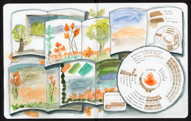
A landscape sketchbook spread showing a loose, overlapping pile of open sketchbooks drawn in black ink, each with a dark gray shadow underneath. Each little book holds its own watercolor sketch. There’s a yellow-green tree with a brown trunk, a blue-gray and green landscape, tall orange flowers with teal leaves, another tree above a row of orange shrubs, orange flowers over a peach and tan wash, swatches of orange, green and teal framed by a dark green beaded vine, and stripes of olive, green and blue. At top right, an open book holds a blue, peach and gray sunset wash on one page. The facing page has brown swatches labeled “Stabilo 70/165” and “Ecoline 416 Sepia” above a circle of dashed brown arcs. A large circular planning wheel fills the lower right. It reads “Assignments Open Compositions — Page One: Site Q Page, Page Two: Planning Page, Page Three,” and the third line is left blank. Around it are checklists for the lesson sections (Intro, Overview, Strategies, Using Elements, Demo, Gallery), a workflow list (Sketch, Scan, Edit, Post, Comment, Blog), and a list of livestream dates. In the center is “OCTOBER” with an orange flame-shaped tree, ringed by tan tracker boxes. A small 2026 October calendar sits below, with the last two weeks shaded tan, and loose orange leaves are scattered across the page.
Open Compositions – Planning Page

I am loving making these planning pages to keep me organized for each lesson. I drew the sample sketchbooks tumbling over each other, each holding its own small watercolor: trees, orange autumn flowers, a sunset, and a few swatch tests. The dark shadows under each book did a lot of the work. They push things forward and back, so the pile reads as a stack instead of a puzzle. The planning wheel sits on top of everything in the corner. It holds the lesson checklist, my workflow list, the livestream dates, and a little October calendar tucked underneath.

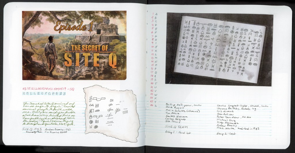
Site Q and Trompe-l’œil. (Contains Spoilers for the mystery!)

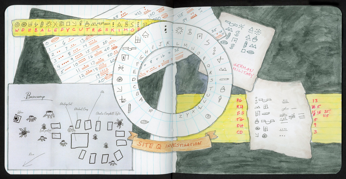
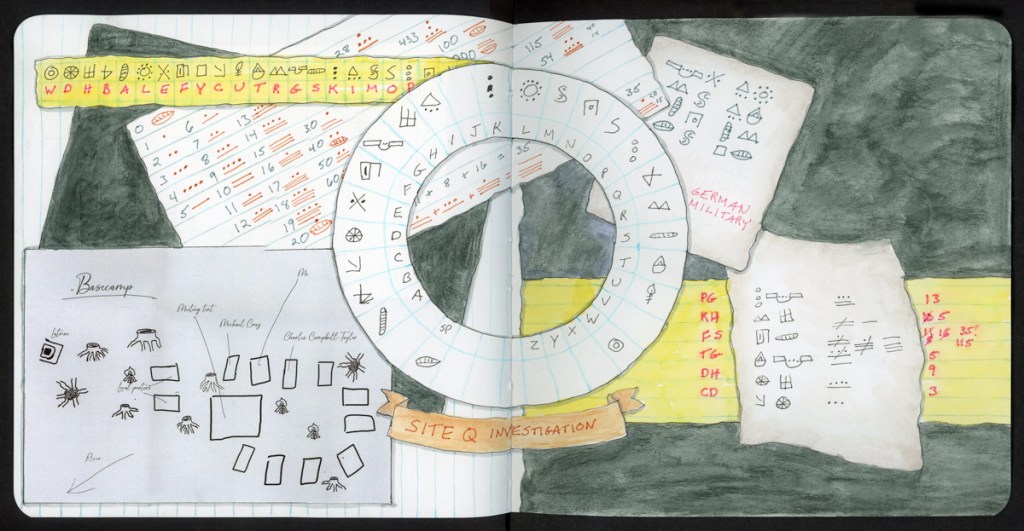
A landscape sketchbook spread of puzzle notes and a cipher key from Box 1 of the Site Q mystery box, built from overlapping papers, drawn to look like ruled notebook pages and yellow legal pad strips, all laid over a dark green-black painted background. A yellow strip across the top left is a cipher key: a row of hand-drawn symbols above the red letters “W D H B A L E F Y C U T R G S K I M O P.” Below it, a tilted ruled sheet lists the numbers 1 to 20 alongside red dot-and-bar numerals. At the center is a two-ring cipher wheel, with symbols on the outer ring and the alphabet A to Z on the inner ring. Through its center window you can see a strip with the dot-and-bar sum “+ 8 + 16 = 35.” A tan ribbon banner beneath the wheel reads “SITE Q INVESTIGATION” in red. At top right, a parchment scrap of symbols is labeled “German Military” in pink. At bottom left, a pale blue-gray sheet titled “Basecamp” maps a campsite: rectangles for tents, palm-like tree symbols, and handwritten labels for the latrine, meeting tent, local porters, “Michael Craig,” “Charles Campbell-Taylor,” “Me,” and an arrow pointing to the river. At bottom right, a yellow legal strip lists red letter pairs (PG, KH, FS, TG, DH, CD) next to a parchment scrap of symbol-and-numeral clues and a column of red answers, with one number crossed out and corrected.
Open Composition – Site Q (includes spoilers)

Site Q is a mystery box from Cosy Killer, and this spread is my notes and cipher key from Box 1. There’s a basecamp map collaged in, a symbol alphabet to crack, and some suspicious numbers that needed a lot of red ink before they gave up their secrets. Sketching my notes instead of just scribbling them on scrap paper made the whole thing feel like I was keeping a real field journal.

This is the spread I’m happiest with. I drew most of the elements to look like paper: ruled notebook sheets, yellow legal pad strips, and torn parchment scraps. It was so much fun! What a great trompe-l’œil effect! Once everything is “paper,” overlapping makes sense, because papers pile up on a desk. The cipher key slides under the number chart, the cipher wheel sits on top of both, and the basecamp map gets shoved into the corner the way real notes do mid-investigation.

The dark green background holds it all together and makes the pale papers pop. And yes, there’s a crossed-out wrong answer in the bottom corner. It stays. That’s what an investigation looks like.

This Site Q mystery has twelve episodes, and the first episode was two full pages in my sketchbook. I’m going to be having a lot of fun! This is my holiday season recreation project this year. I’ll be sharing as I go. (Along with the ink advent calendars again! They have been ordered! Stay tuned. December will be fun!)

What I’m taking away

Overlapping was much less scary once I gave myself a reason for things to overlap. Books in a pile, papers on a desk. If the objects themselves would naturally stack, the page stops fighting me. It’s still time-consuming, but I love the look of it.

Next lesson is the one I consistently struggle with. Designing on the Fly. It isn’t the designing part that gets me. It’s getting out to sketch multiple pages. However, the timing for this is right on Halloween week. I can’t resist leaning into that theme!