Once again the autoimmune adventures hit hard, and life piled on. I ended up just not doing any of the Travel Sketching class work except the intro kit building, and the current sketch. Now for the hard work of forgiving all the things I cannot control and just accepting the losses. I have, however, decided that I’m going to rest this summer, and not try for the Watercolor on Location group run. I’m obviously needing the recovery time.
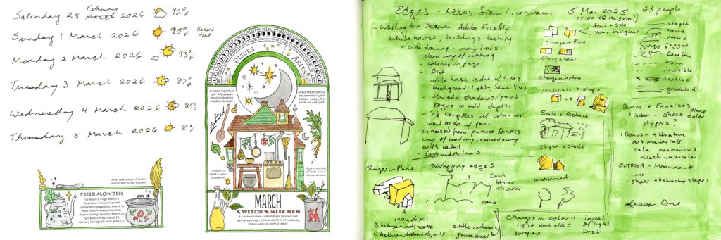
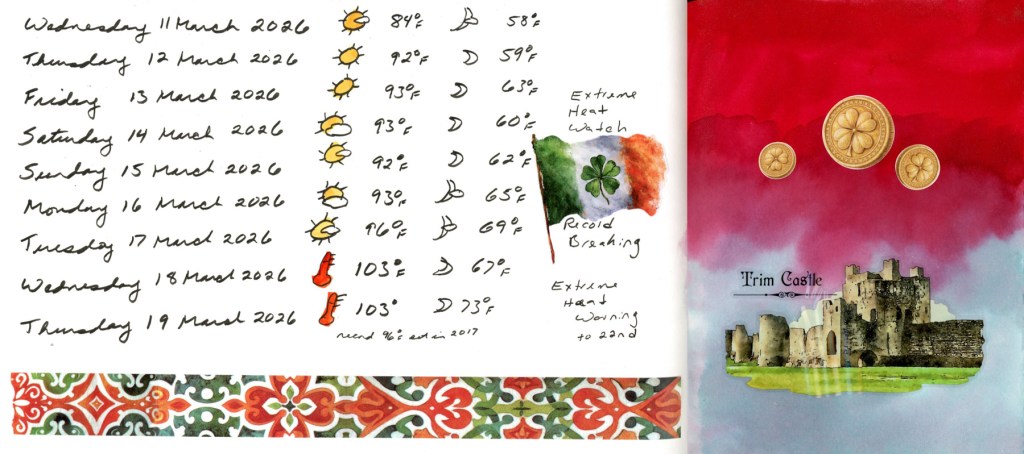
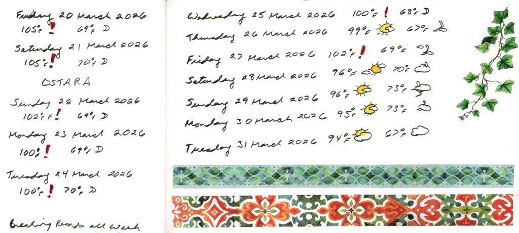
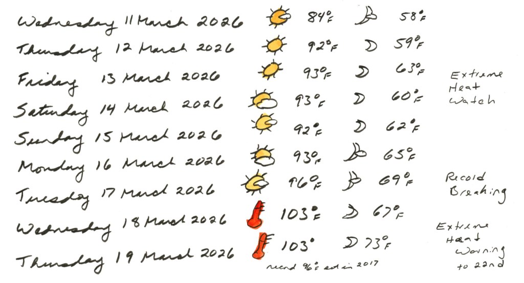
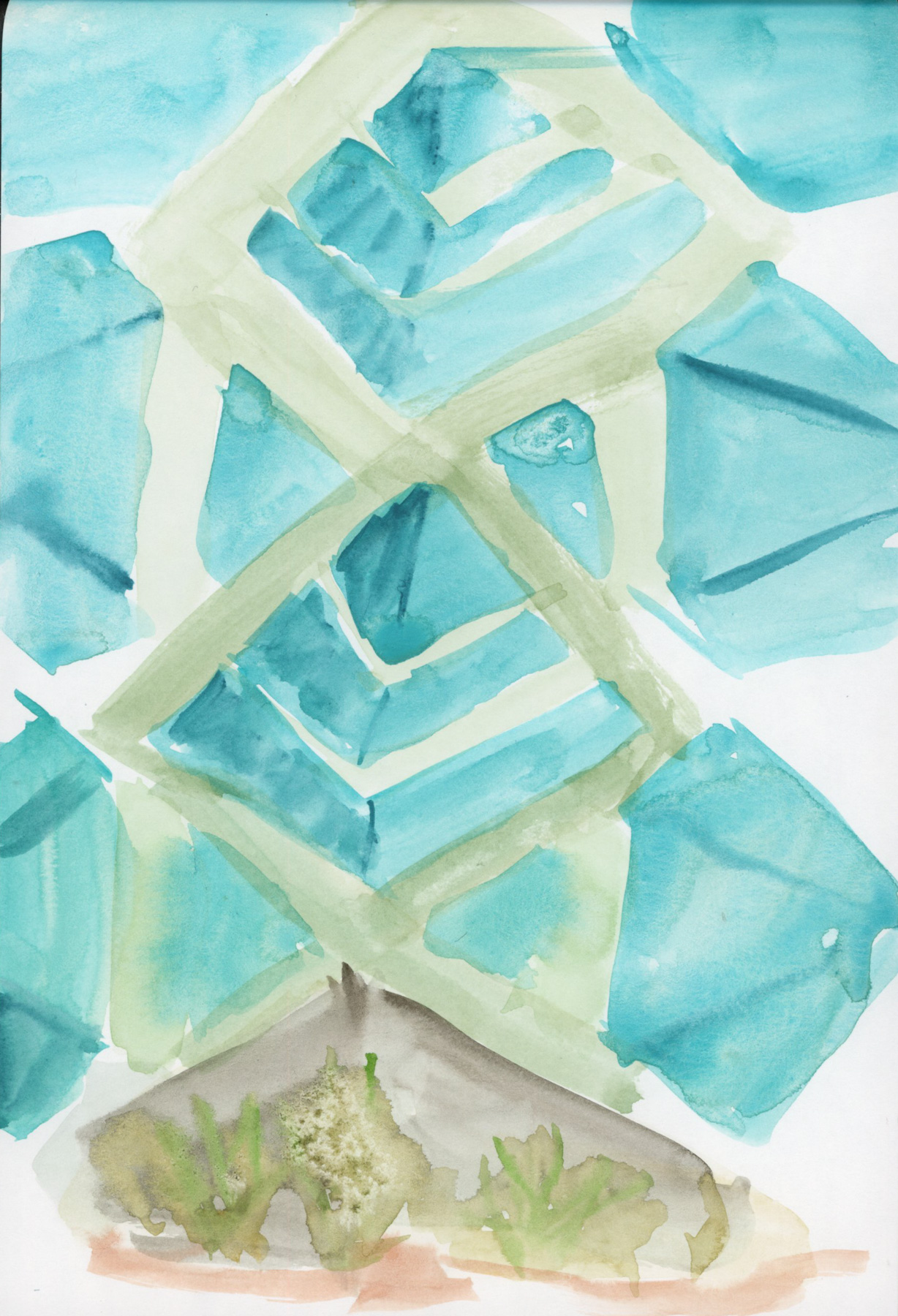
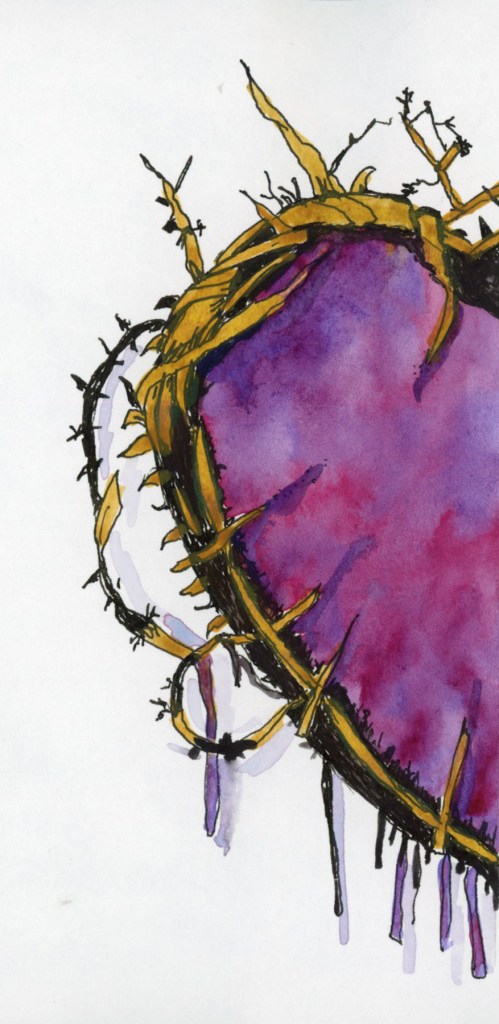
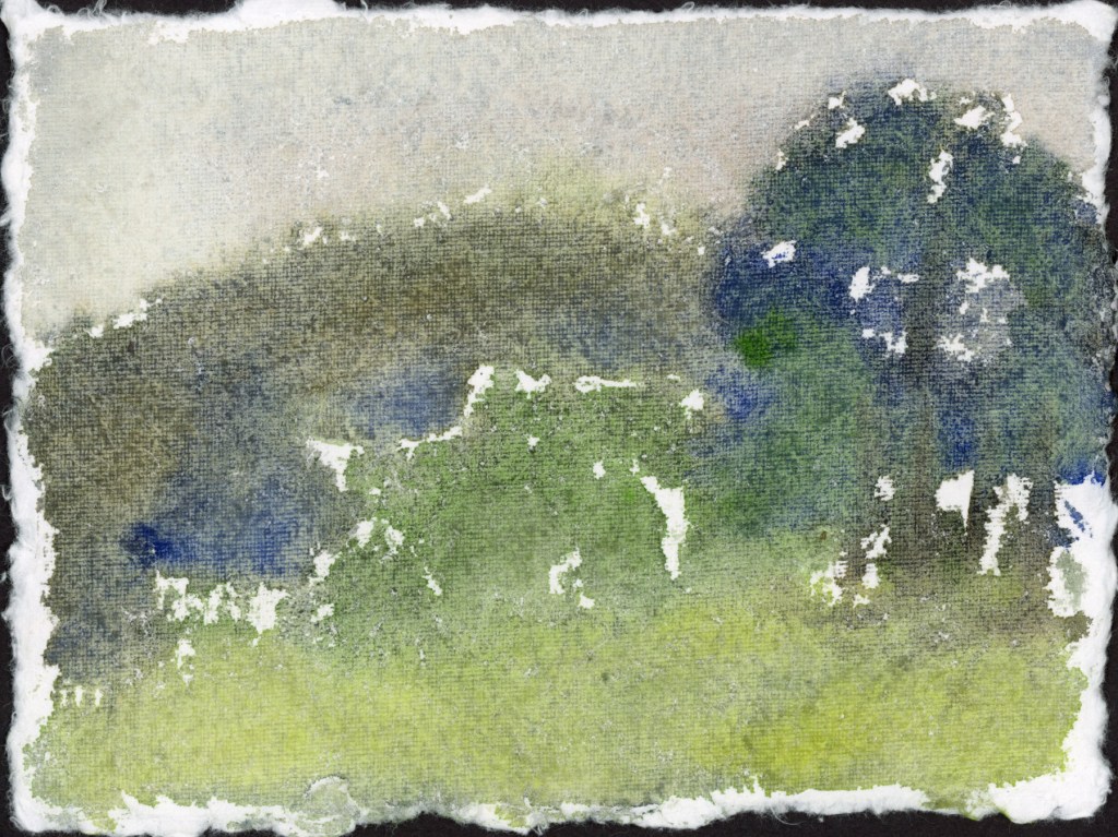
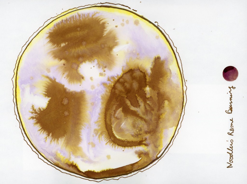
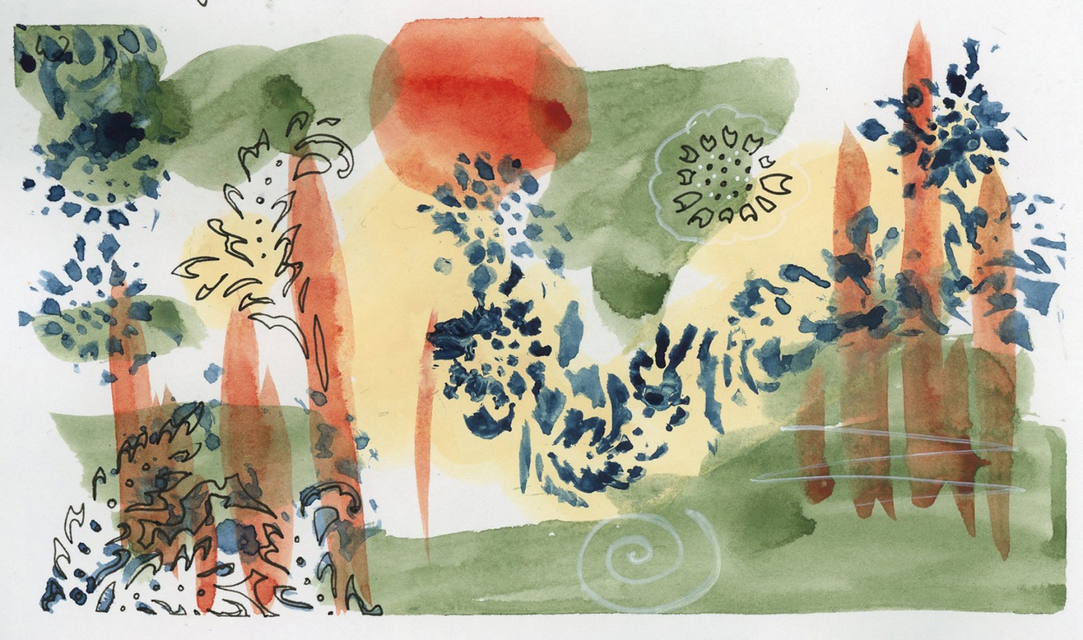
It was hard to let go this time. But so be it. Back to the days and days of just listing the dates and the weather to mark the passage of time. I left some white space. In one of those half pages, I did a watercolor abstract like I used to do, and that turned out really well! (See below.)
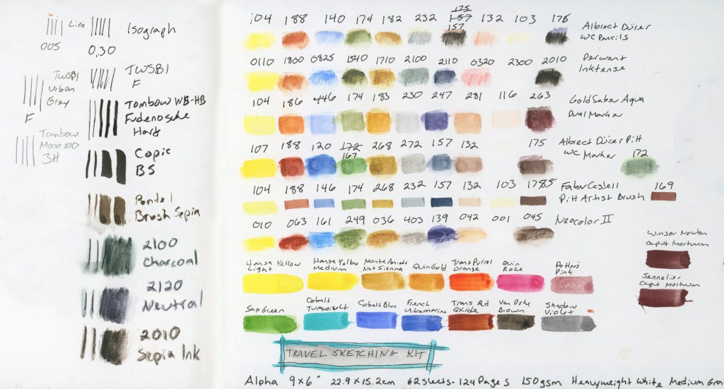
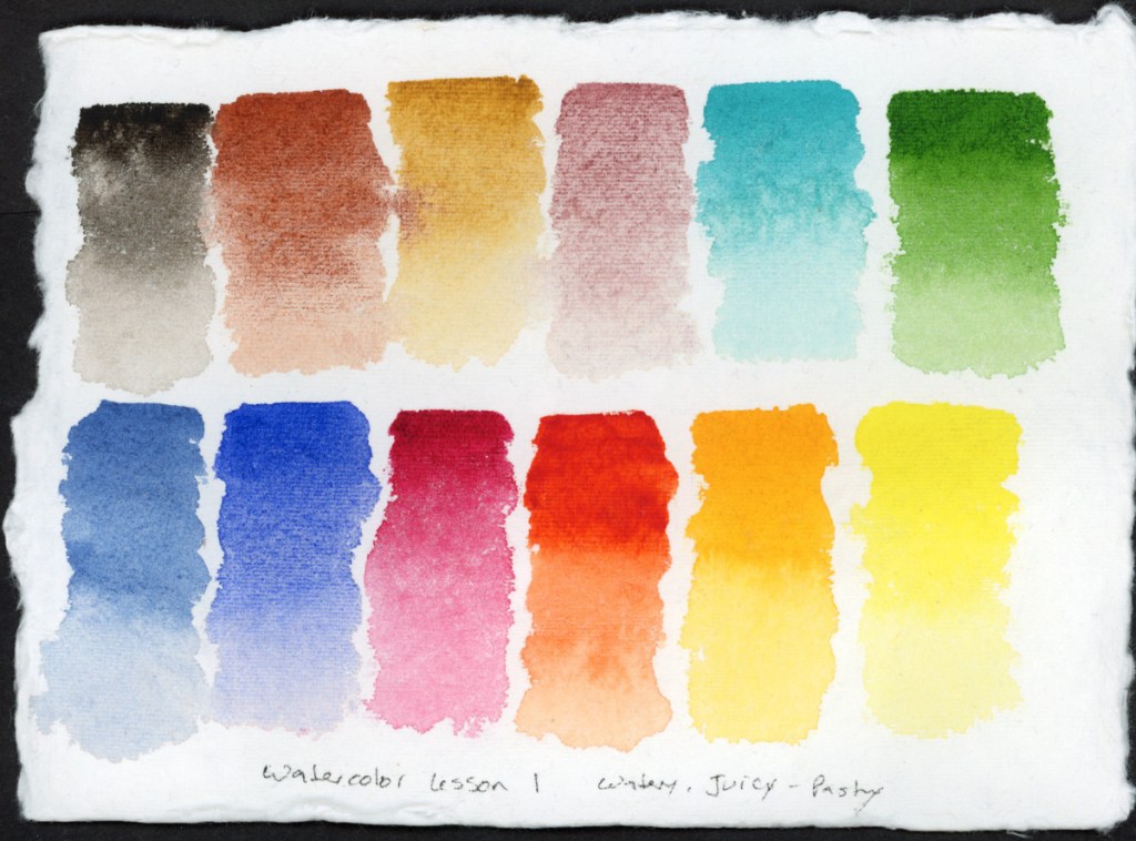
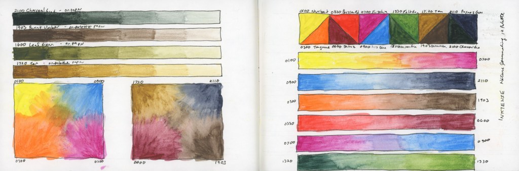
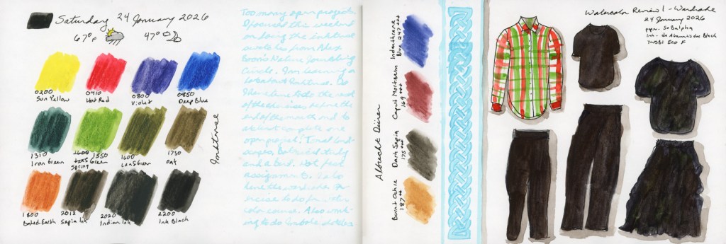
Before I lost all oomph, I did get the color charts done for the Tombow Dual Brush Markers:
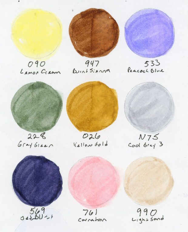
Those colors are Tombow Dual Brush Markers: 090 Lemon Cream, 947 Burnt sienna, 533 Peacock Blue, 228 Gray Green, 026 Yellow Gold, N75 Cool Gray 3, 569 Jet Blue, 761 Carnation, 990 Light Sand.
The Tombows do not seem very reactive to water. The second half of each circle was activated with water, and it shows in a couple colors, but not in most of them.
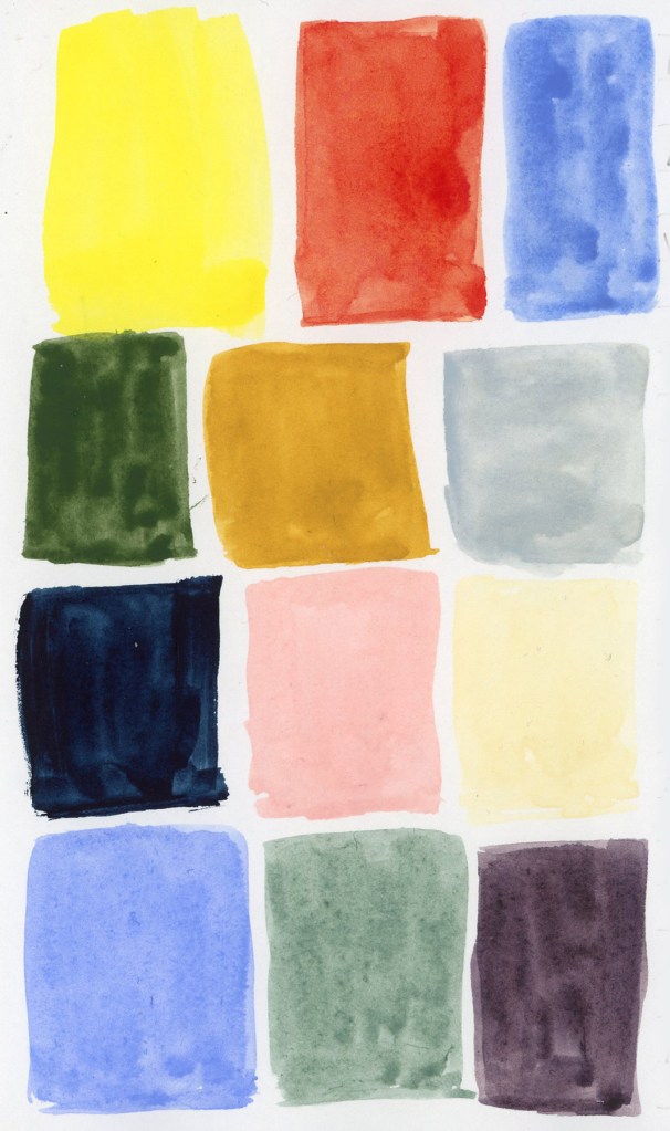
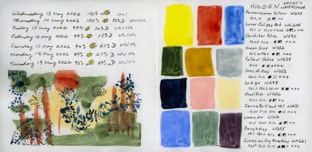
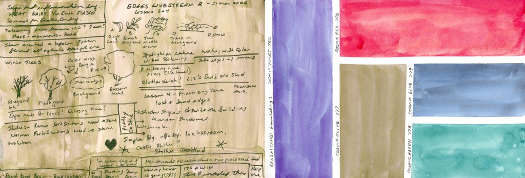
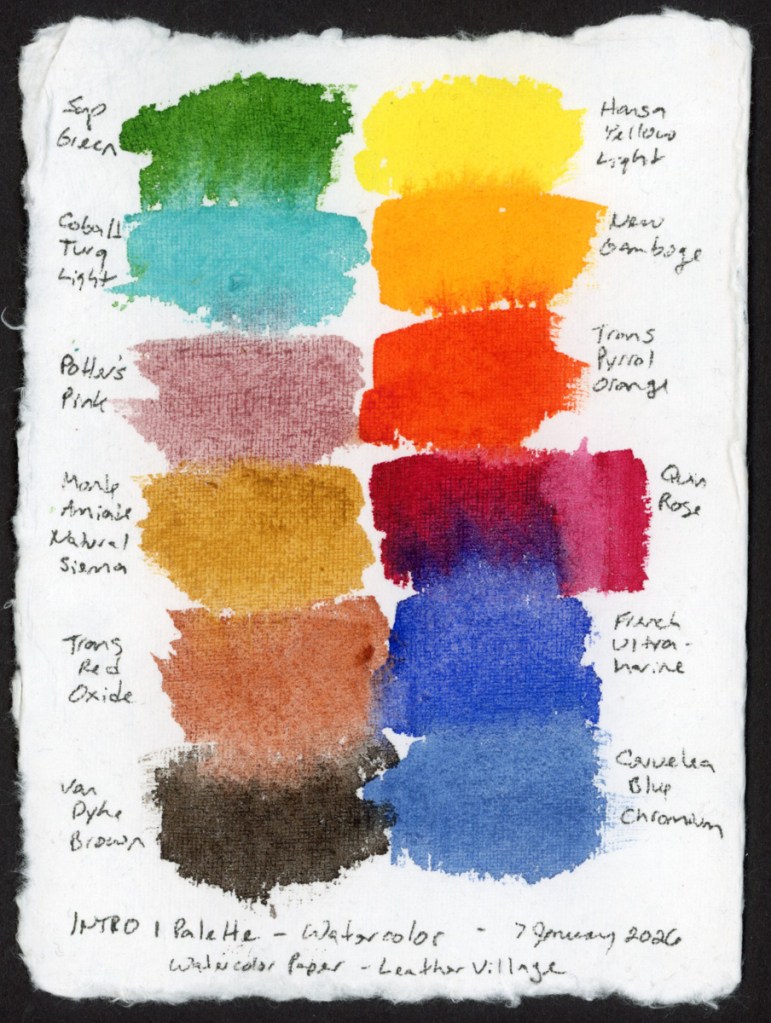
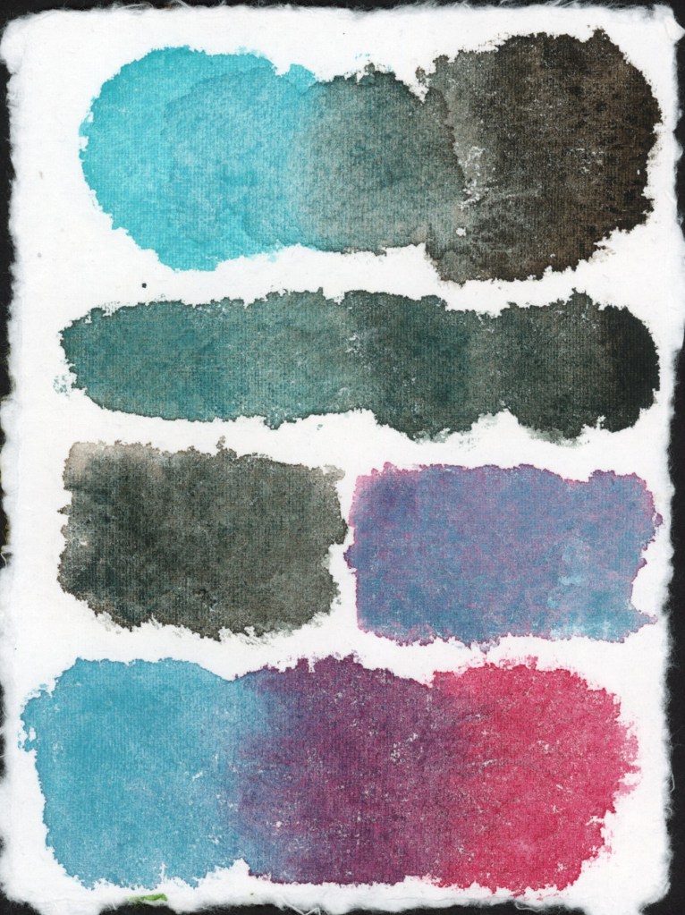
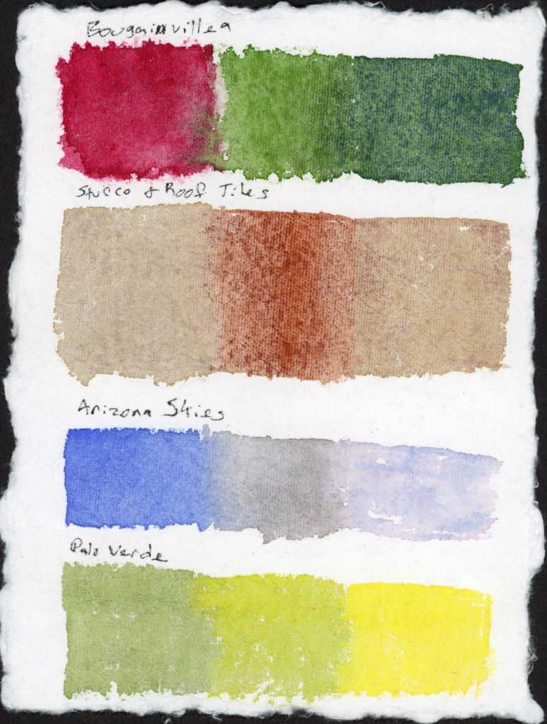
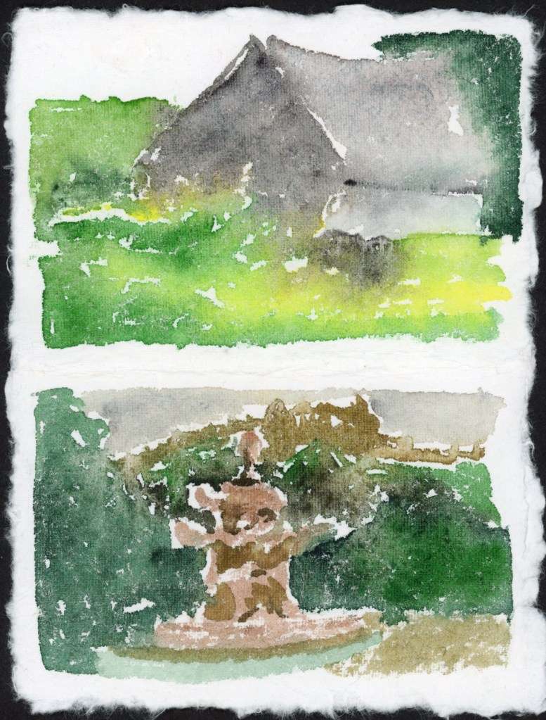
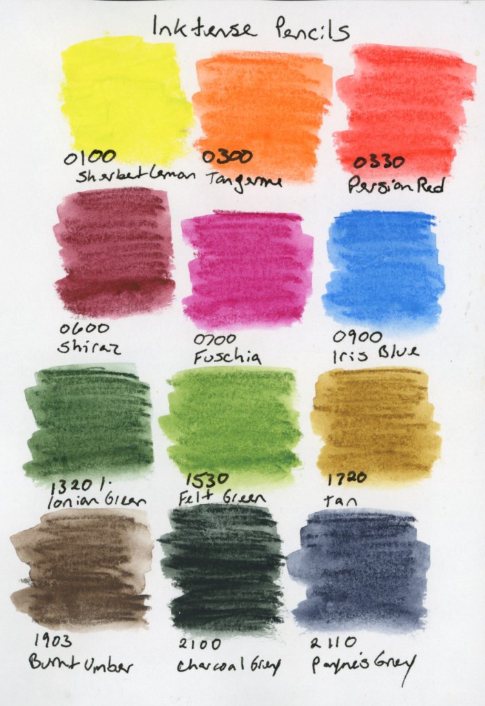
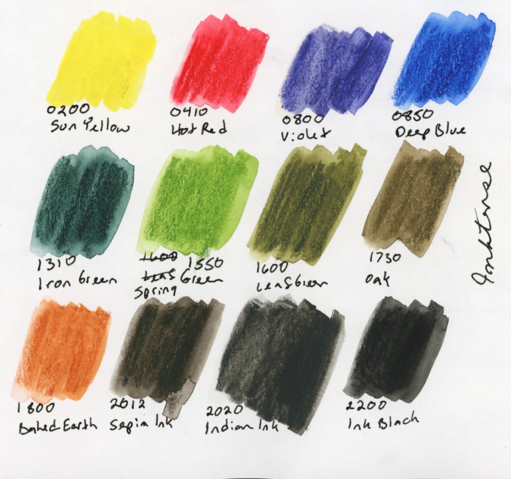
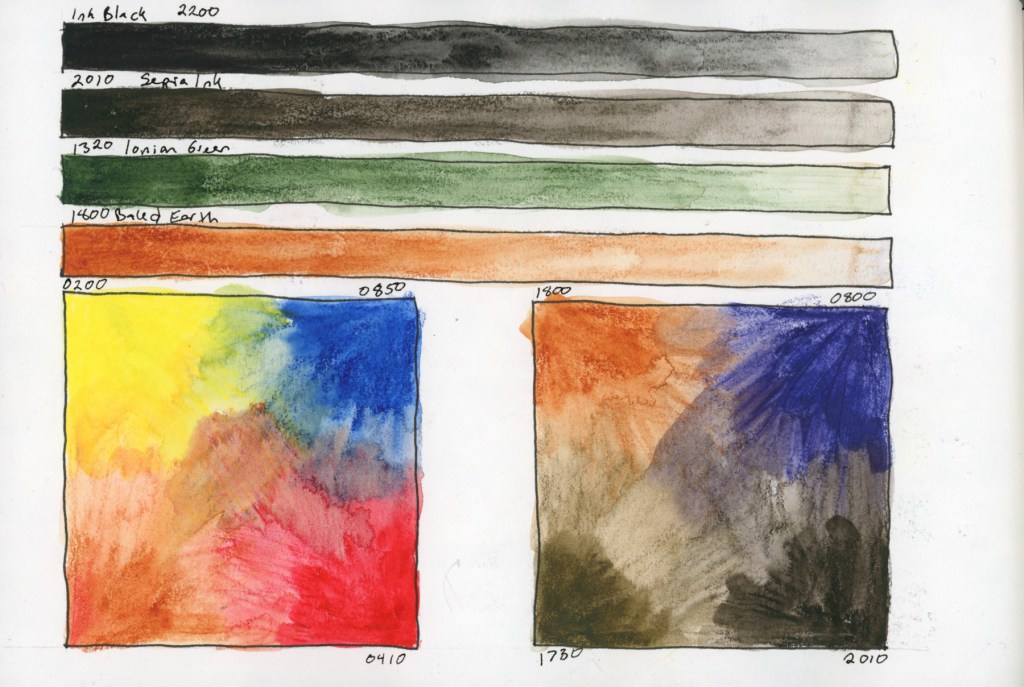
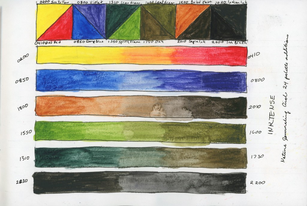
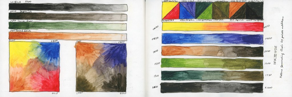
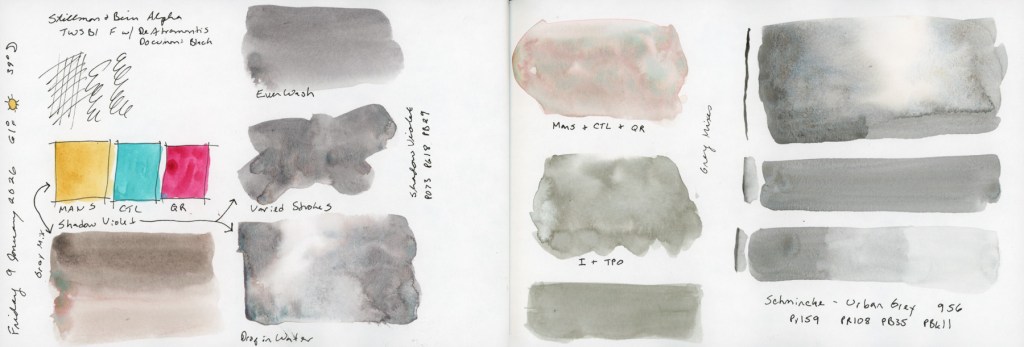
Still in the grip of my obsession with recreating this Travel Sketching Palette (I blame the brain chemistry from the allergen hits!) I bought these Holbein Watercolors. Aren’t these lovely?
Holbein Watercolors in Travel Sketching Palette: Permanent Lemon Yellow W235, Lunar Eclipse Red WG605, Verditer Blue W295, Green Grey W352, Yellow Ochre W234, Grey of Grey W353, Indigo W298, Shell Pink W226, Jaune Brilliant No 1 W231, Lavender W316, Davy’s Grey W355, Eurasian Jay Rose Grey WG661.

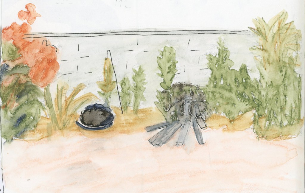
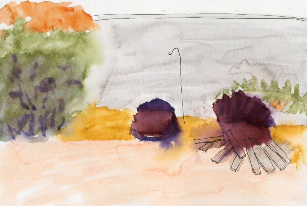
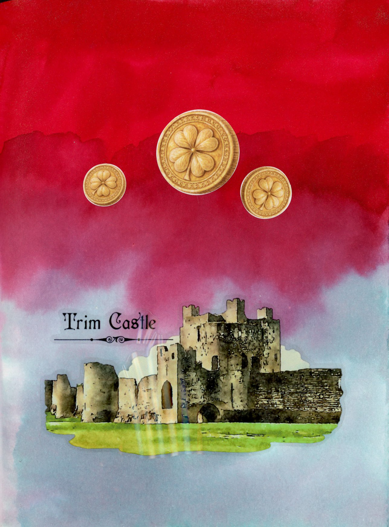
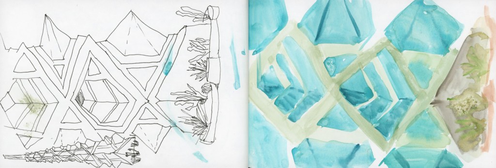
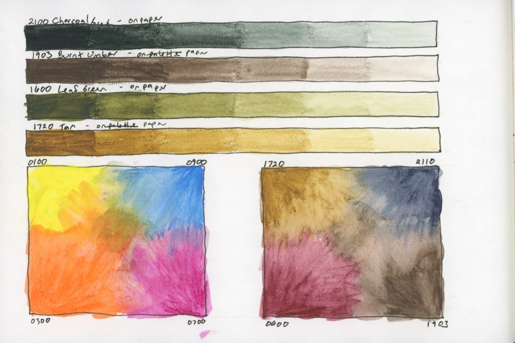
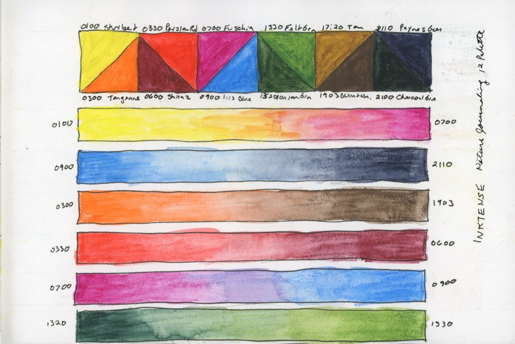
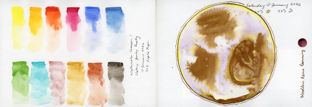
Last year I was doing some of these watercolor abstracts. They are such a lovely way to play with color. I had to test this palette with one. I rather like this one. It ended up looking like an abstract landscape. (Also note: I cannot for the life of me get Posca pens to work! Is my climate just too dry? But there is a hint of white showing my attempt!) These abstracts are so good for capturing mood, or a moment that I find they fit documenting life surprising well. They hold memories and feelings quite well.
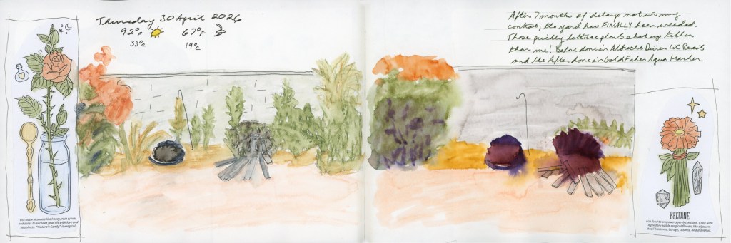
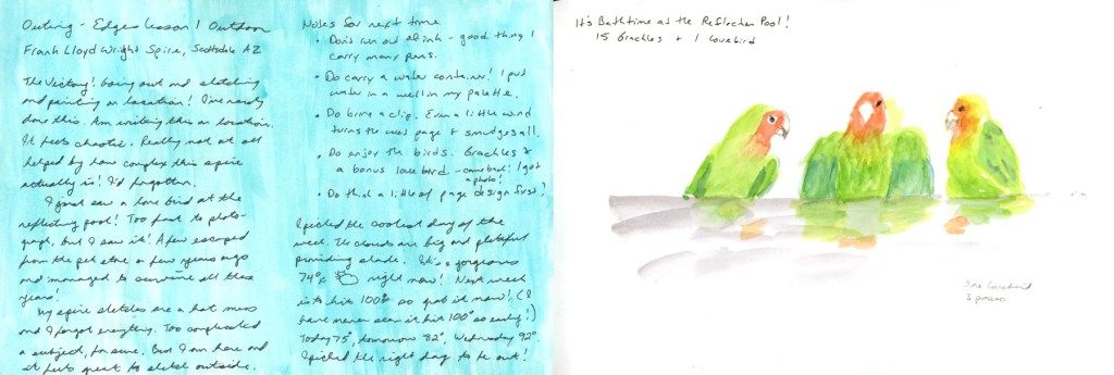
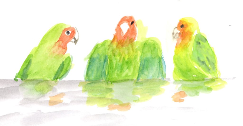
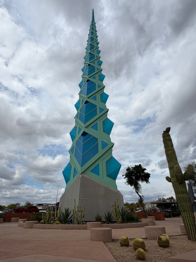
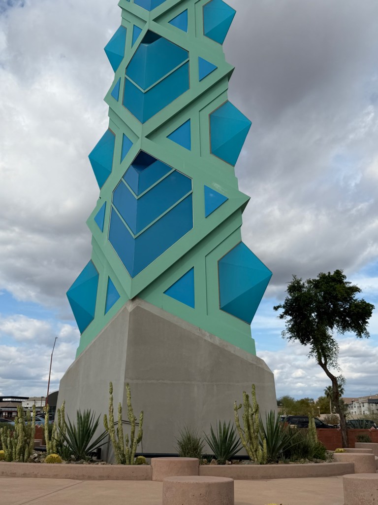
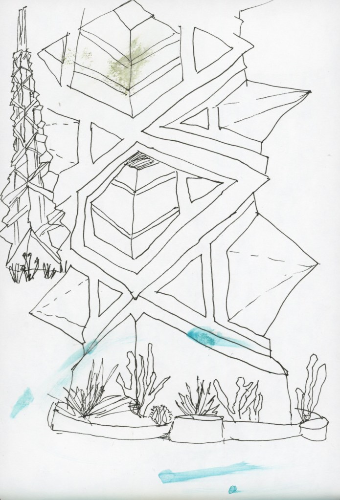
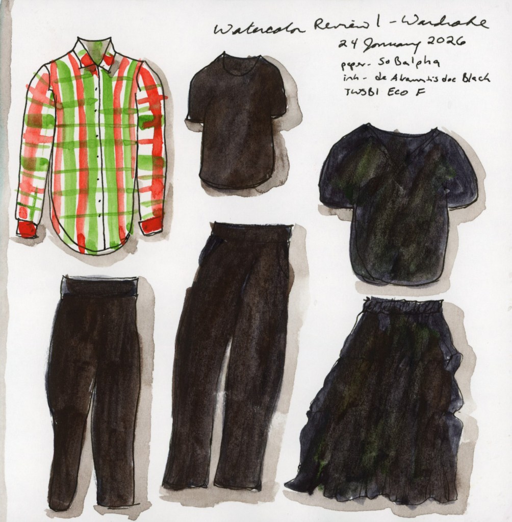
The complete spread in my sketchbook. A bit more thought on page design than I’ve used in a while, which feels good.
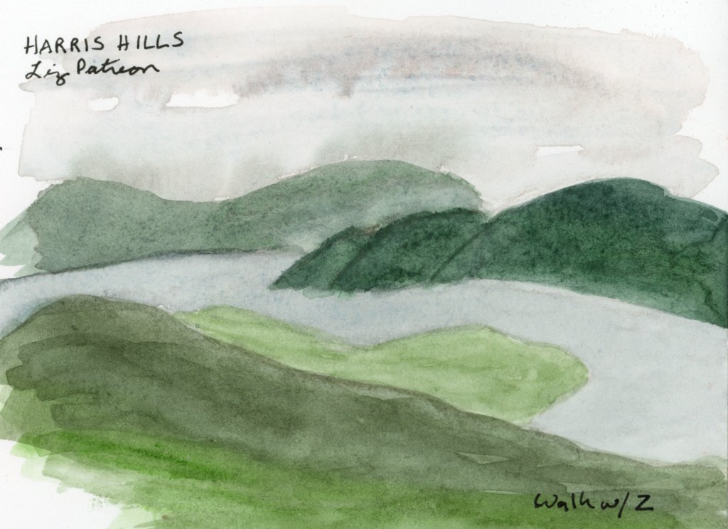
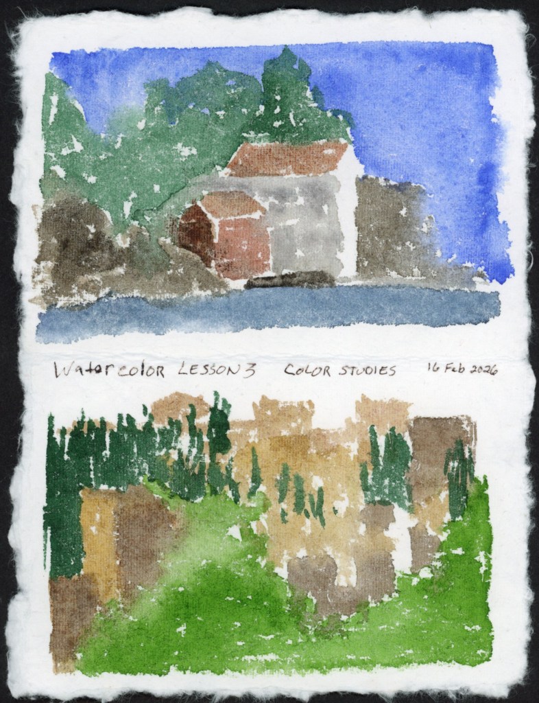
As for this summer, I have a few half pages with white space along with my dates and weather. Perhaps I will be able to sketch items or scenes. I will definitely make more abstracts.
I want to return to illustrated journaling, and documenting life as it happens. That has always been my primary goal, and what drew me to keeping a sketchbook in the first place. I am missing that in my influences and in my own work, so when I regain some oomph, I shall revisit my old inspirations.
I’m looking forward to the run this upcoming autumn of the Sketchbook Design course. Every time I’ve done it, I end up capturing more life and making pages I love. My sketchbook ends up feeling like me.