Third Time’s the Charm: Travel Sketching is Back

Liz Steel’s Sketching Now Travel Sketching live run, begins later this month and I am jumping back in for my third attempt. I did finish the first run. The second run, I started but let’s just say life had other plans. I have tagged the whole archive of my posts if you want to see the full saga. The official start date is May 13th, but I’m getting a head start on the Introduction lessons.

The “Before” Sketch

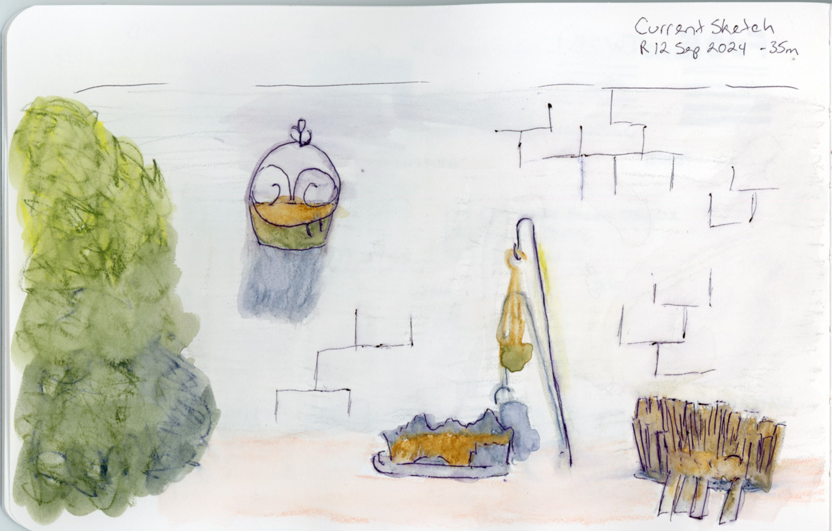
The Introduction includes a “current sketch” exercise. Your sketching where you are right now, before the course begins. Since I’ve done this before, I decided to sketch my back yard again. This is the same view I did as my first before sketch. Not only has the yard changed, but so has my sketching.

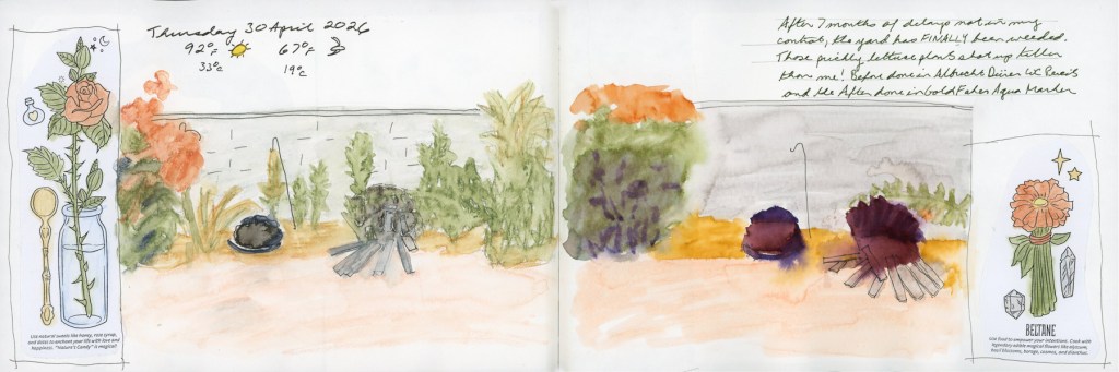
Naturally, I also had to document the fact that after seven months of delays in the landscaping (It’s been a whole drama!) the yard has finally been weeded. Those prickly lettuce plants had grown over six feet tall. Six feet! They were taller than me. I have photographic evidence. I think they were starting to develop permanent occupation plans. So the timing of this sketch gets to commemorate both that drama and its blissful conclusion on the day I did these. A dramatic before and after set of sketches for the yard.

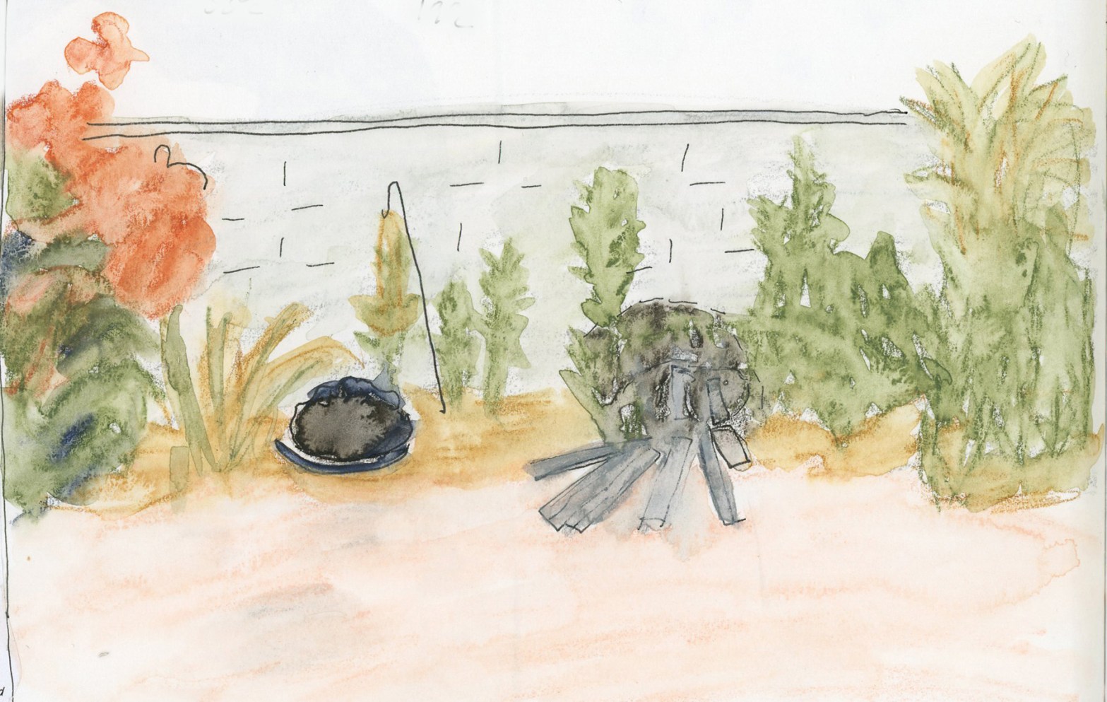
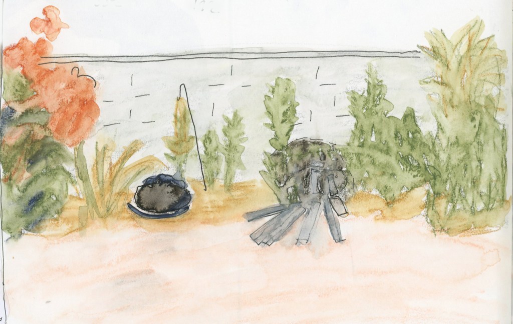
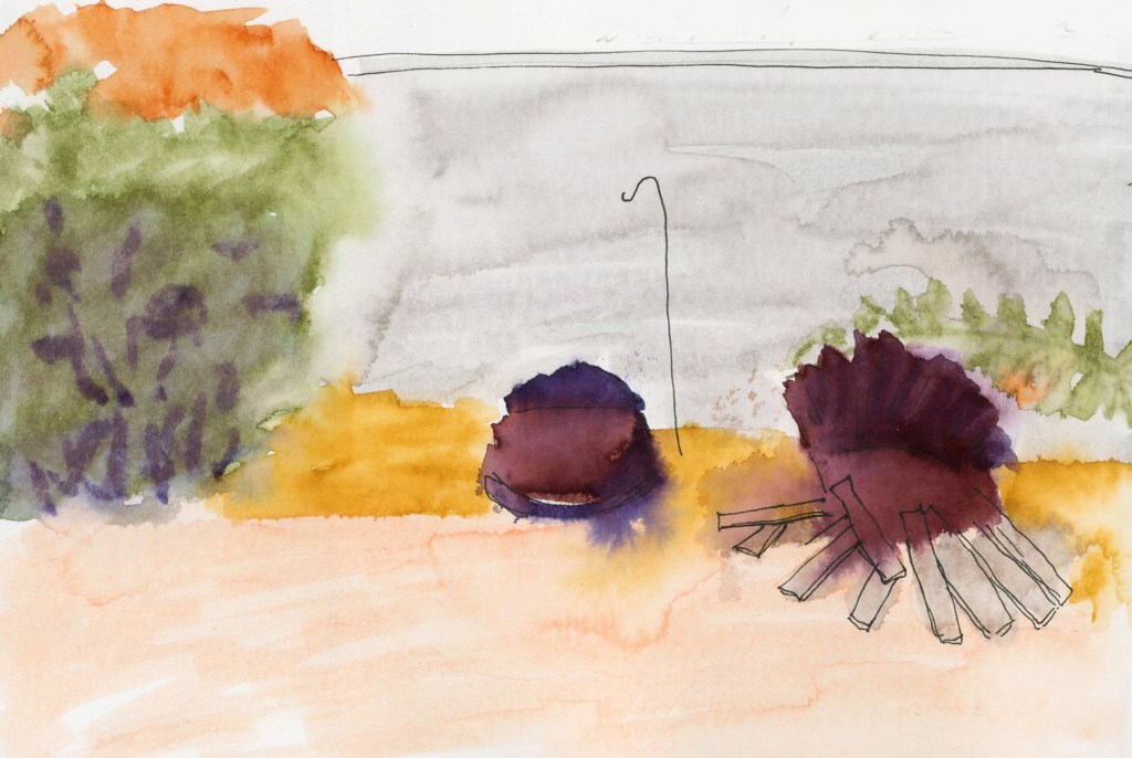
The before sketch, with weeds, is in the Albrecht Dürer watercolor pencils, The after sketch is GoldFaber Aqua Markers. You can see the difference in the mediums, since I used the same color palette for both sketches. The marker version is noticeably brighter and more saturated; it’s the same scene, same composition, same palette, but a different medium. I really want to see how different mediums behave, and comparing the same color palette is a great way to do that.

A watercolor pencil sketch of a back yard garden bed, showing a row of tall weeds and trees against a grey wall, with orange-red flowering plants at the left, golden weeds in the centre, and two decomposing barrel planters rendered as dark rounded shapes on the rocky ground. A shepherd's hook curves up between the plantings.
Backyard, full of weeds in in Albrecht Dürer watercolor pencils.
A watercolor marker sketch of the back yard, with a large orange-topped shrub at the left rendered in bright saturated colour, a grey wall wash behind, and two decomposing barrel planters in deep burgundy and purple tones at centre and right. I bold and saturated color.
Back yard, freshly weeded, in GoldFaber Aqua Markers.

The yard features some very photogenic old barrel planters that are in the process of dramatically decomposing. They show up in both sketches as dark, slightly melancholy blobs surrounded by splaying lines. Less moody than the photographs of them!

full sketchbook spread dated Thursday 30 April 2026, showing two watercolour sketches of the same back yard garden bed side by side — the left in softer watercolour pencil tones, the right in brighter, more saturated marker colours. Handwritten weather notes show 92°F and 67°F. A note in the upper right reads that the yard has finally been weeded after seven months, and that the before sketch was done in Albrecht Dürer watercolour pencils and the after in GoldFaber Aqua Markers. Decorative illustrated borders from a Coloring Book of Shadows frame both sides of the spread with Beltane-themed botanical imagery.
Back yard sketches, before and after weeding. 30 April 2026.

The Kit

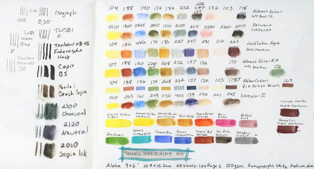
Part of the Introduction is also assembling materials for the travel sketching kit and doing a color/material chart. I wrote about my obsession with testing multiple media in this limited palette.

A two-page spread showing a travel sketching kit chart. The left page tests various pens and pencils with line and swatch samples, labelled with tool names including Isograph, TWSBI Urban Gray, Tombow Fudenosuke Hard, Copic BS, Pentel Brush Sepia, and Derwent Inktense pencils in Charcoal, Neutral, and Sepia Ink. The right page shows rows of colour swatches for multiple media including Albrecht Dürer watercolour pencils, Derwent Inktense, GoldFaber Aqua Dual Markers, Albrecht Dürer Pitt WC Markers, Faber-Castell Pitt Artist Brush, and Neocolor II, with a bottom row of watercolour paint swatches. A teal banner at the bottom reads "Travel Sketching Kit."
Travel Sketching Kit, April/May 2026.

Here’s what I’ll be working with for this run:

For line work, I have an Isograph 005 and 0.30, a TWSBI Urban Gray (F nib), a Copic BS, a Pentel Brush Sepia, and a Tombow WB-HB Fudenosuke Hard.

The course calls for graphite, but I’m skipping it since I find graphite too smudgy. I do have the one 3H pencil. For pencil sketches, however, I’m substituting three Derwent Inktense pencils: Charcoal (2100), Neutral (2120), and Sepia Ink (2010). I also have the class palette in Albrecht Dürer watercolor pencils, Derwent Inktense pencils, plus GoldFaber Aqua Dual Markers, Albrecht Dürer Pitt WC Markers, Faber-Castell Pitt Artist Brush pens, and Neocolor II water-soluble crayons.

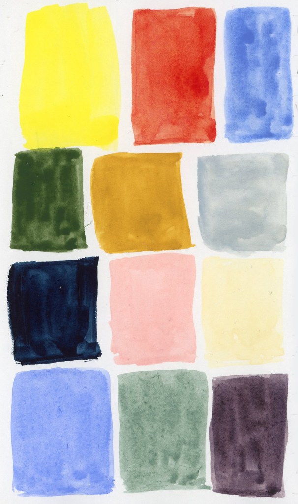
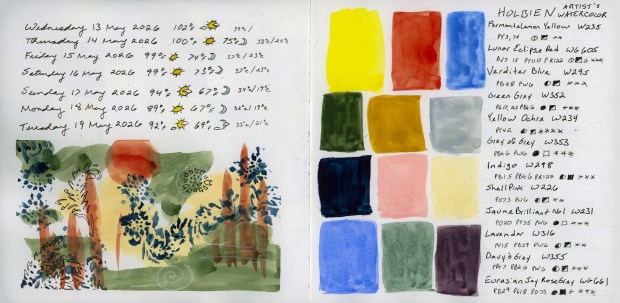
For watercolor, my palette is: Hansa Yellow Light, Hansa Yellow Medium, Monte Amiata Natural Sienna, Quinacridone Gold, Transparent Pyrrol Orange, Quinacridone Rose, Potter’s Pink, Sap Green, Cobalt Turquoise Light, Cobalt Blue, French Ultramarine, Transparent Red Oxide, Van Dyke Brown, and Shadow Violet. There are also two Caput Mortuum swatches at the side, because I’m currently infatuated with that color.

The Sketchbook

I’ll be starting in my current 6×9 inch Stillman & Birn Alpha, even though I only have a few pages left in it. Shortly I’ll be moving to a 7.5×7.5 inch softcover Alpha. Both are Stillman & Birn, both are the Alpha series, just slightly different proportions. It’ll be interesting to see how the square format feels for travel sketching.

The weeds are gone, the kit is ready, and the barrel planters have been immortalized in watercolor. What more could I need? I’m ready!

One Palette, Six Ways. An Obsession.

One Palette, Six Ways. An Obsession.

I will be taking Liz Steel’s Travel Sketching course this May. I’ve taken it before, in September 2024, and I started in April 2025, but did not finish. (See all my posts for Sketching Now Travel Sketching here.)

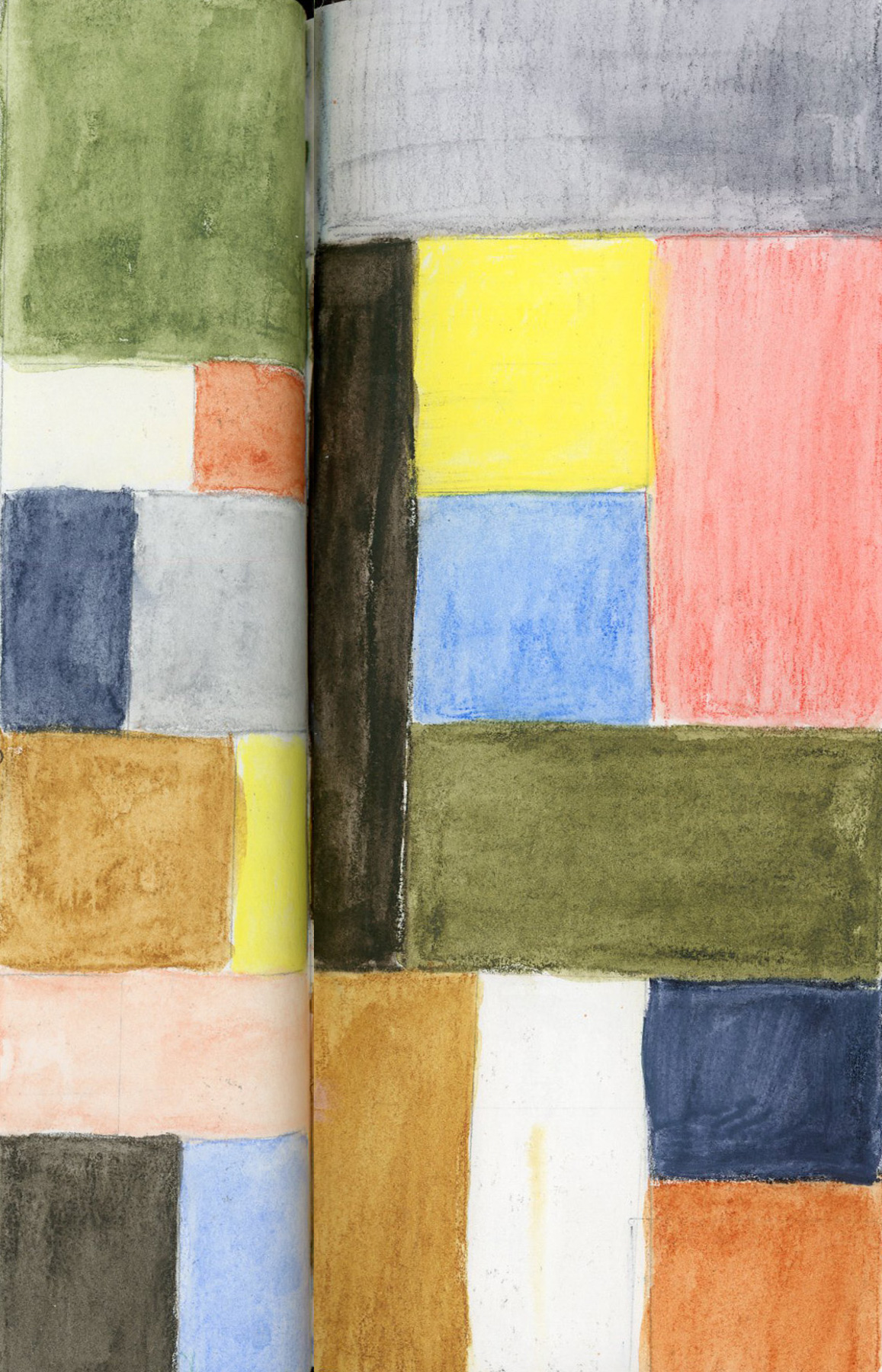
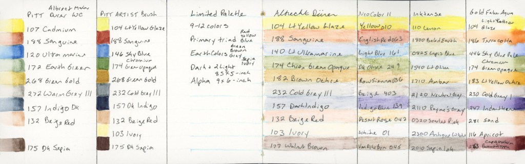
Every time I become a little obsessed with the limited palette for this class. Liz built it using threes: a primary, three earth tones, then a dark and two lights. She kept it fairly pastel, and muted. It really is great for landscapes. Especially Autumn scenes. She used Albrecht Dürer Watercolor Pencils.

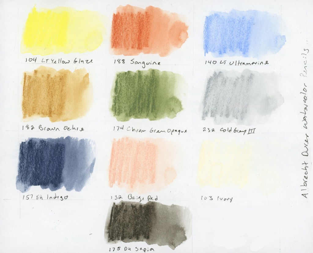
Nine watercolor pencil swatches in rectangular wash format on white paper, labeled with color numbers and names. Colors include Lt Yellow Glaze, Sanguine, Lt Ultramarine, Brown Ochre, Chrom Green Opaque, Cold Grey III, Dark Indigo, Beige Red, Ivory, and Dark Sepia. Albrecht Dürer Watercolor Pencils, Travel Sketching palette.
104 Lt Yellow Glaze, 188 Sanguine, 140 Lt Ultramarine, 142 Brown Ochre, 174 Chrom Green Opaque, 232 Cold Grey III, 157 Dark Indigo, 132 Beige Red, 103 Ivory, 175 Dark Sepia — Albrecht Dürer Watercolor Pencils

The first time I took this course, I discovered I really wanted a brown, so here I’ve added the dark sepia. The second time I became very curious about Inktense pencils, wondering how were they different. Since I owned a set, a pulled the same palette colors and I started using Inktense pencils shortly afterward. I also wanted to explore Neocolors II. I was unable to finish the course, so I did not explore those as much as I intended.

This time around, I decided to find out.

The Albrecht Dürer Watercolor Pencils. Activated, they produce soft, luminous washes. There’s a gentleness to them that feels very suited to location sketching, which is rather the point. Dark Sepia is my second dark, which I really craved. Plus I have a love affair with Sepia, so it’s a natural fit. I did consider a warmer brown, like Walnut, but the cooler sepia keeps the balance between warm and cool tones.

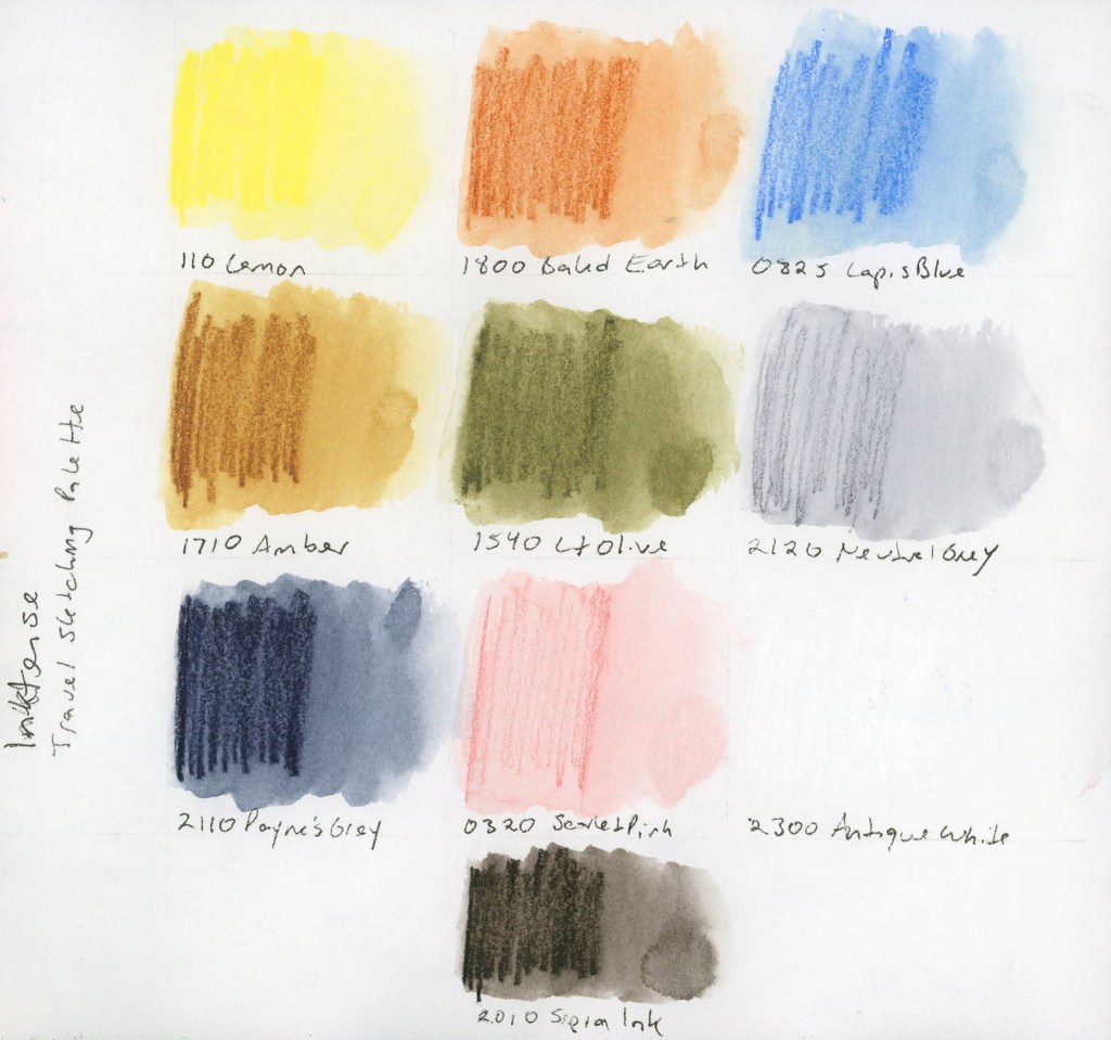
en Inktense pencil swatches in rectangular wash format on white paper, labeled with color numbers and names. Colors include Lemon, Baked Earth, Lapis Blue, Amber, Lt Olive, Neutral Grey, Paynes Grey, Scarlet Pink, Antique White, and Sepia Ink. Inktense Travel Sketching palette.
110 Lemon, 1800 Baked Earth, 0825 Lapis Blue, 1710 Amber, 1540 Lt Olive, 2120 Neutral Grey, 2110 Paynes Grey, 0320 Scarlet Pink, 2300 Antique White, 2010 Sepia Ink — Inktense

I built this Inktense palette to best match the colors of the original palette. Same colors, two media, learn how do they really behave different. The get the more pastel grey and soft pink, you really need a very light touch when applying the pencil, as the colors are darker than the matching shade. They say Inktense becomes permanent once dry, so you can layer over it without lifting. I find they give smoother washes, and they seem more vivid, but this palette is still holding that more muted vibe.

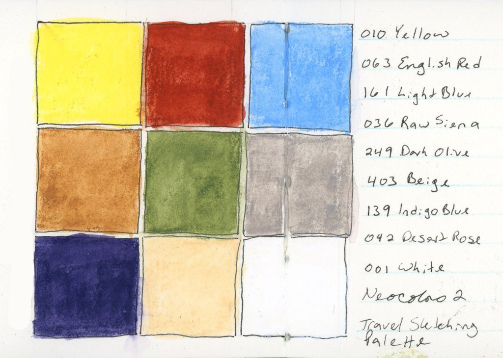
Nine Neocolor II wax pastel swatches in bold saturated squares arranged in a three by three grid on white lined paper. Colors include Yellow, English Red, Light Blue, Raw Sienna, Dark Olive, Beige, Indigo Blue, Desert Rose, and White. Labeled Neocolor II Travel Sketching Palette.
010 Yellow, 063 English Red, 161 Light Blue, 036 Raw Sienna, 249 Dark Olive, 403 Beige, 139 Indigo Blue, 042 Desert Rose, 001 White — Neocolor II — Stillman & Birn Delta, April 2026

I had selected the matching colors in a Neocolor palette for the April course, but never used them. Since I have them, I continue to be very curious to work with them. The swatches are certainly vibrant, and they felt good to lay down. These swatches were Delta book, in ivory paper, so that white shows up a bit better. I wonder how these would look on colored paper? Are they more opaque?

At this point the reasonable thing would have been to stop. I did not stop. Liz mentioned she would be adding markers to the course this time around, and well, I have markers! (Advantage of buying way too many art supplies over many years, I have a lot of stuff just lying around! Whole color sets make great gifts during the holidays!) So I pulled together the same palette in multiple marker types. (I did have to fill in a couple gaps, and order a few, but not too many.)

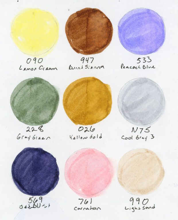
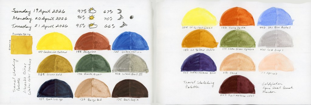
A double page spread in a Stillman and Birn Alpha sketchbook showing Travel Sketching palette swatches in half-dome format. The left page shows Albrecht Dürer Watercolor Markers with weather entries for Sunday through Tuesday April 19–21 2026, and a small Diamine ink square. The right page shows Goldfaber Aqua Dual Brush Markers. Both pages are labeled Travel Sketching Palette.
Travel Sketching palette — Albrecht Dürer Watercolor Markers and Goldfaber Aqua Dual Brush Markers — Stillman & Birn Alpha, April 2026
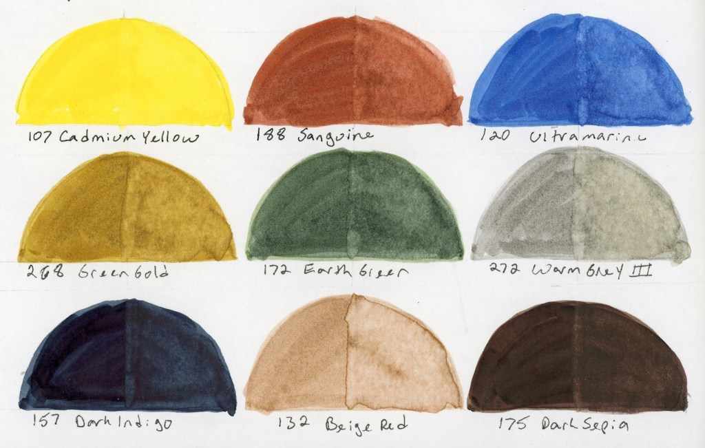
Nine watercolor marker swatches in half-dome format on white paper, labeled with color numbers and names. Colors are Cadmium Yellow, Sanguine, Ultramarine, Green Gold, Earth Green, Warm Grey III, Dark Indigo, Beige Red, and Dark Sepia. Albrecht Dürer Watercolor Markers, Travel Sketching palette.
107 Cadmium Yellow, 188 Sanguine, 120 Ultramarine, 268 Green Gold, 172 Earth Green, 272 Warm Grey III, 157 Dark Indigo, 132 Beige Red, 175 Dark Sepia — Albrecht Dürer Watercolor Markers
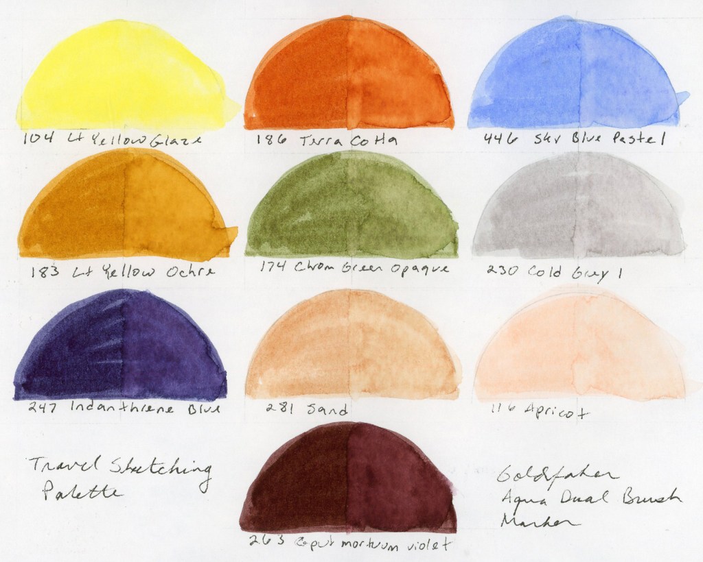
Ten watercolor marker swatches in half-dome format on white paper, labeled with color numbers and names. Colors include Lt Yellow Glaze, Terra Cotta, Sky Blue Pastel, Lt Yellow Ochre, Chrom Green Opaque, Cold Grey I, Indanthrene Blue, Sand, Apricot, and Corpus Mortuum Violet. Goldfaber Aqua Dual Brush Markers, Travel Sketching palette.
104 Lt Yellow Glaze, 186 Terra Cotta, 446 Sky Blue Pastel, 183 Lt Yellow Ochre, 174 Chrom Green Opaque, 230 Cold Grey I, 247 Indanthrene Blue, 281 Sand, 116 Apricot, 263 Caput Mortuum Violet — Goldfaber Aqua Dual Brush Markers

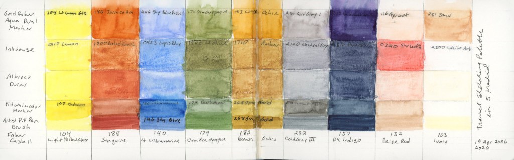
I love how watercolor markers look when activated with water. They bleed and bloom in ways I love. Easy to get complete obliteration of the lines, so it’s a bit like playing a daring game! I also put together the same palette in the pigment Pitt Artist Brush pens, but never swatched those independently. They are only swatched in the big color chart below.

And of course, I had to see everything side by side, right? How well did I match these colors across the mediums?

A handwritten reference chart in a Stillman and Birn Delta sketchbook mapping the Travel Sketching palette across six media: Albrecht Dürer Watercolor Pencils, Albrecht Dürer Watercolor Markers, Goldfaber Aqua Dual Brush Markers, Neocolor II, Inktense, and PITT Artist Brush markers. Color names and numbers are listed in columns with small painted swatches alongside each entry. Dated April 2026.
Travel Sketching palette reference chart — Stillman & Birn Delta, April 2026
A horizontal color comparison chart in a Stillman and Birn Delta sketchbook showing the Travel Sketching palette across six media in stacked rows. Each column represents a color family and each row a different medium, including Goldfaber Aqua Dual Brush Markers, Inktense, Albrecht Dürer Watercolor Pencils, PITT Watercolor Markers, PITT Artist Brush markers, and Faber-Castell. Dated 19 April 2026.
Travel Sketching palette in five media — Stillman & Birn Delta, 19 April 2026

I am really looking forward to using these in actual sketches to learn how the different media behave, and discover what I do and don’t like.

I also may have begun a new obsession. I love that Goldfaber Aqua Dual Brush Caput Mortuum. They didn’t have a brown, so that was the closest. The Pitt Artist Brush pens also have a gorgeous Caput Mortuum. So I may have immediately ordered some Caput Mortuum watercolor paint.

It started with one question about two pencil ranges, how is Inktense different from the Albrect Durer watercolor pencils. It ended with six media, so many color charts and a new obsession or two.

Seven Lines Again

Travel Sketching has begun, and I’m definitely needing the practice! I recently traveled and did not sketch on location. Still working on that! It was so crowded I feared I’d be in the way too much, hogging a bench, etc. Therefore practicing very fast techniques should help in the future.

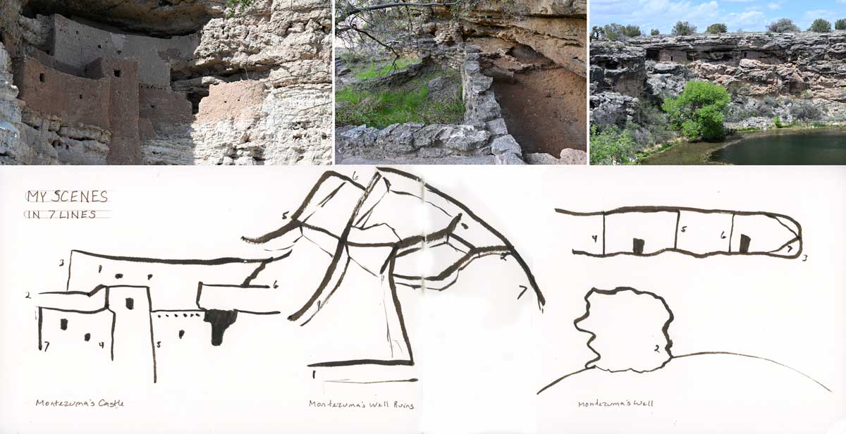
The assignment is to take some of our own scenes and use only seven lines to draw them. Here is my previous post with this exercise, when I took the course last year.

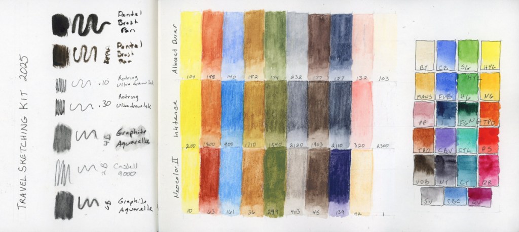
Travel Sketching Materials

My second run through Liz Steel’s Travel Sketching course and I’m excited about it. I learned so much the first time! This year I’ll be traveling one of the weeks of the course, so I hope to use the skills I learned last time, refresh the skills this time, and hopefully get some real travel sketching done on location!

Here are my materials for the class. I’m using the same palette of watercolor pencils as she recommends. I’ve been using this palette since the first run of the class, and they are excellent. I am adding the same palette in Inktense pencils, and in Neocolor II so I can learn the differences in the media, while keeping my familiarity with the colors.

I’m using my standard watercolor palette that I’ve been using for a few years now. While I want to make a few changes to this, I won’t before my trip, or before class, so I can use what I know. I’ll be using the recommended A5 book size, with a Stillman and Birn 8.5 x 5.5 inch softcover Delta Series. The paper is ivory colored, cold press surface, and 270 gsm.

Another color chart with the Travel Sketching Palette, this time on the Delta Series paper. Very interesting, and different results over the Alpha or Gamma Series papers. I’m surprised. The page did not curl when wet with paint. It developed this very interesting granulating effect. I thought the paper was disintigrating, at first, but then I realized it’s just taking on that texture when painted. It seemed my paints appeared less pigments, but the colored pencils appeared more pigmented. All three types of dry media look more vivid on this paper, it seems.

I continue to be surprised by the Neocolor II. They are so smooth and easy to work with. I have only done one sketch with them, so I look forward to learning more. They activate with water beautifully, too, as seen above.

I’m tempted to pull out this same palette of colors in the Gansai Tambi, too. That could be good fun. The same palette, many media.

Travel Sketching Class Takeaways

What a great class this has been, and I’ve learned so much!

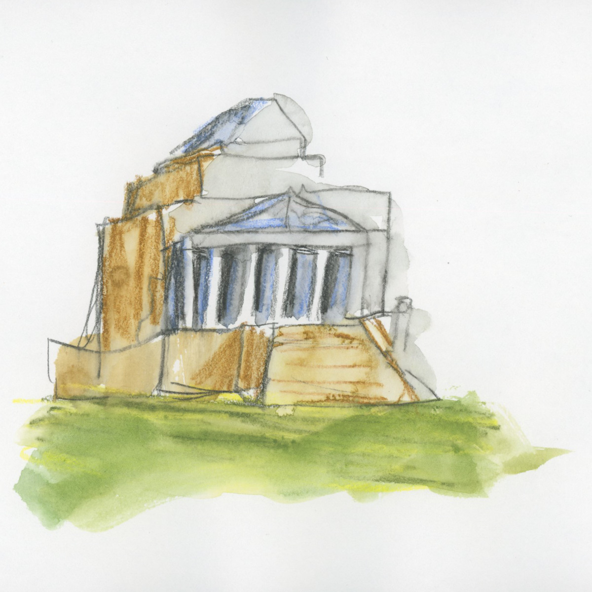
Shrine of Remembrance

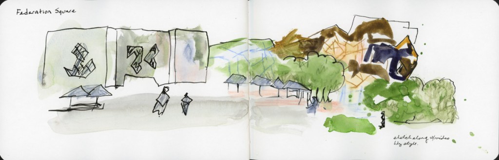
The final demos I did a crazed, loose sketch-along for these locations in Melbourne.

Federation Square
Shrine of Remembrance

My takeaways from the class are many. I vastly enjoyed this class and learned so much. I feel I significantly leveled up in my understanding of practical applications, as well as in how to manage my overwhelm in the moment. So helpful! Here are my takeaways:

The fastest, loosest sketch will still capture the memory and scene.

Start with 7 lines, 5 shapes, or 3 layers when overwhelmed by a scene. It will still be clear enough to know.

I really like shapes and do better with them—that’s my personal go to beginning a sketch.

Onward! Though the group run through of Sketchbook Design is no longer happening, I intend to do the class myself. It aligns nicely with my desire to get back to a daily sketchbook habit.

Three Layers

A simple approach of thinking of foreground, middle ground, and background while using watercolor pencils to color shapes, ink to add lines for definition, and a final layer of water or watercolor paint to finish the sketch. I’m quite happy with my results.

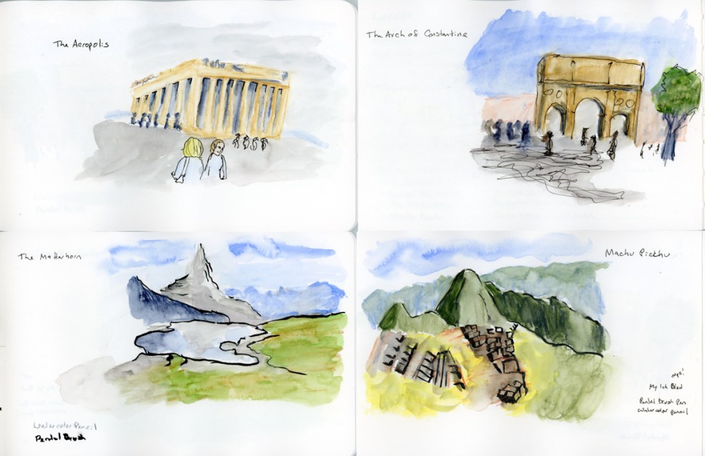
These are the sketches I’ve done for my assignments, famous locations. The first layer is indeed done with watercolor pencil, then some ink lines for definition. Then watercolor paint and water to add the finishing touches. I’d be very happy if my sketches when traveling looked so good. Most of these took me about 15 minutes to quick sketch, from photos. I was trying to work super fast, working along with the instruction video.

My three scenes, same ones I’ve done for the lines, and shapes exercises. Really happy with these. The ink lines are done with my Pentel Brush pen, and I really like it.

5 Shapes

Sketching with just five shapes, using dry color media like watercolor pencils.

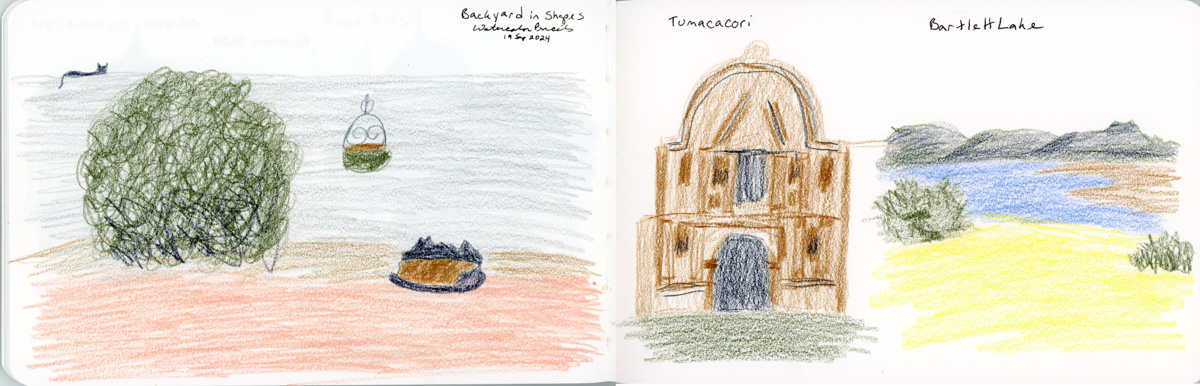
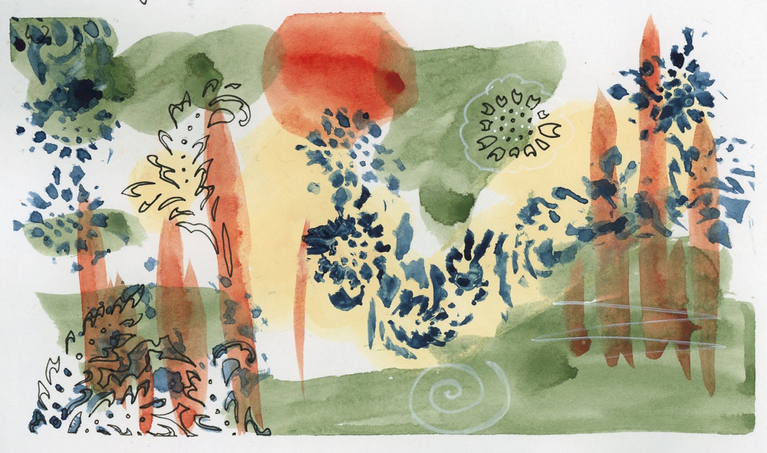
I always like starting with shapes in a drawing. I find it easier, and more forgiving. I chose the same three scenes for my assignment: my backyard, Tumacacori, and Bartlett Lake. I like all three better in shapes than I do in lines. I will confess I had a powerful desire to add water to these color blocks. I generally prefer water, but this class is to test out different methods and media that can make travel sketching faster and easier. I left them alone to get the full effect.

My Takeaways from the Shapes exercise: I really do have a much easier time using shapes than I do with line drawings. Just ten minutes with a very limited set of watercolor pencils really did a good job capturing these scenes, which surprised me.

Seven Lines

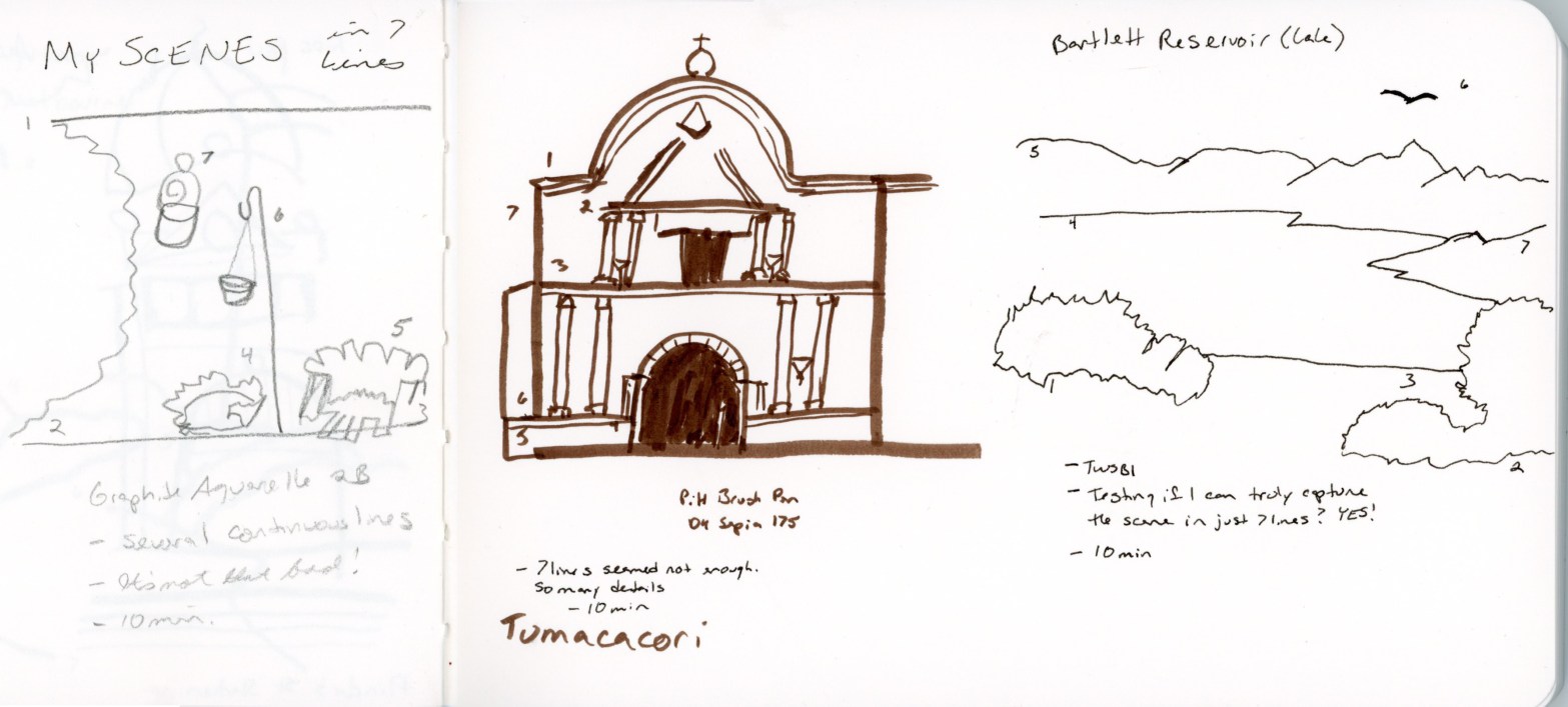
My Three Scenes:

Backyard, Tumacasori, Bartlett Lake

First, my backyard. Using a continuous line for each of the objects worked well for this scene. In just ten minutes, I think it is a decent depiction.

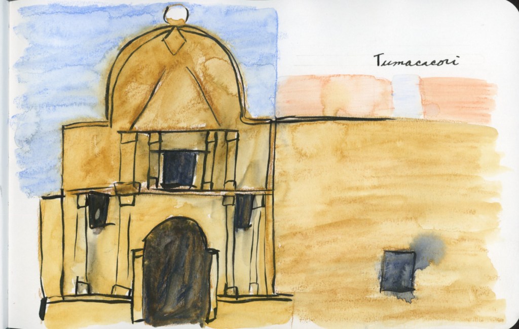
Second: Tumacacori, in southern Arizona. This building, when I traveled there and tried to sketch it, felt like a huge struggle, and a failure, so it now represents my target. To be able to confidently sketch a building like this, when under the time pressure I was under that day. I did not feel seven lines captured it, so I added more detail in this sketch. Perhaps I chose the wrong lines? Still, this sketch took ten minutes, and it does look like the scene!

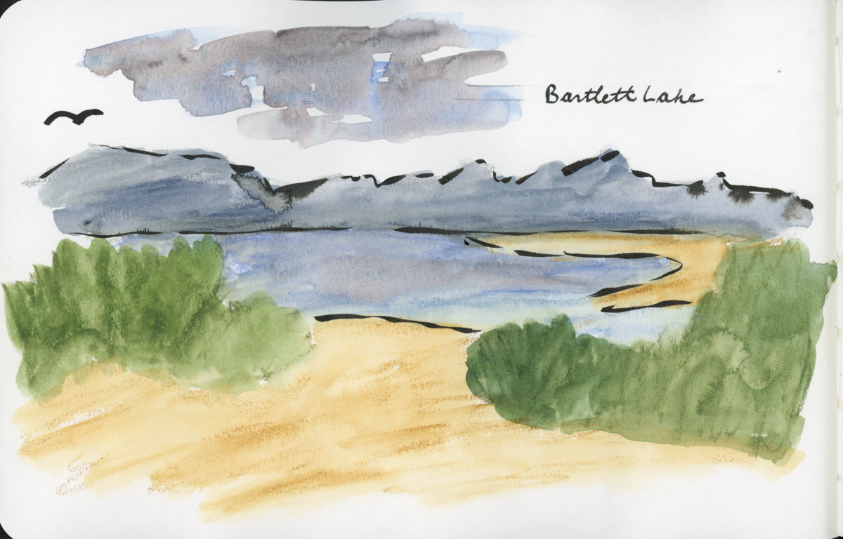
Third: Bartlett Lake. Just seven lines and this is a wonderful capture of the lake. I’m quite surprised how effective just seven lines are here. I did use continuous lines for the mountain line and the bushes. I absolutely had to use a line for the buzzard. There were many buzzards that day, and it was a highlight of the trip!

Takeaways:

Seven lines approach feels like a game changer! It dramatically helps calm the overwhelm and targets HOW to begin to simplify. My big takeaways have been:

  1. Even the simplest, seven lines only sketch can capture the scene and the memories.
  2. Different tools do create a different feeling in the sketch, and in the lines.
  3. Thicker lines look more intentional and complete when there are only 7 of them, reducing the urge to fill in.
  4. It is perfectly acceptable to have a simple sketch. Variety in the sketchbook looks good

Travel Sketching

Starting a new Sketching Now class on Travel Sketching. Since I’m not even leaving the house with the weather breaking yet more heat records, I decided that for my “current sketch” I’d sketch a view that is always available. My backyard. I can stay in the air conditioning and sketch whenever I want.

I used watercolor pencils because they are going to be used in class, and I wanted to see how I do with them, before we’ve had any instructions. The idea is to do another sketch of this view after class for a good before and after, and to cement what I do learn. This sketch took me 35 minutes. I did add water to the watercolor pencils after drawing.

Travel Sketching Class Palette

I haven’t used watercolor pencils for travel sketching, so I’m going with the class palette in order to learn the techniques. Using the same watercolor palette I used for the Teacups class. I tend to avoid graphite pencils, so it will be interesting to see how these work out for me. I’m rather intrigued by the graphite aquarelle variety. I do have Neocolor II in a similar palette to the watercolor pencils that I may try out (but are not in this image) because I’m very curious about them.