It wasn’t a bad month exactly, but it was a rocky one with symptoms flaring, energy unreliable, the kind of month where keeping up with a daily sketchbook practice just wasn’t in the cards. I kept eating dinner. I just wasn’t drawing it.
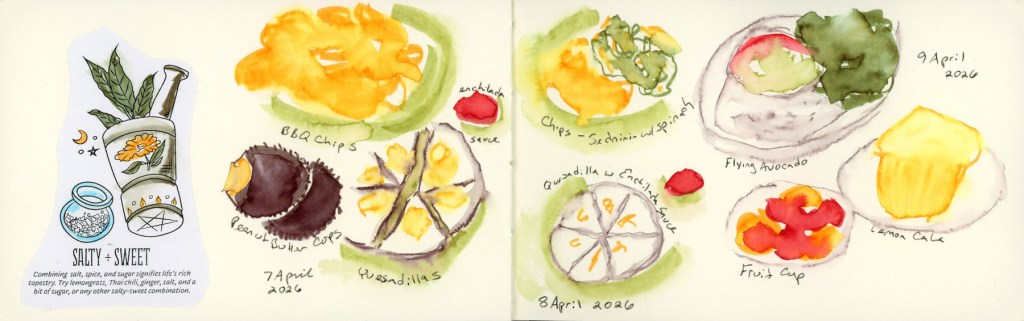
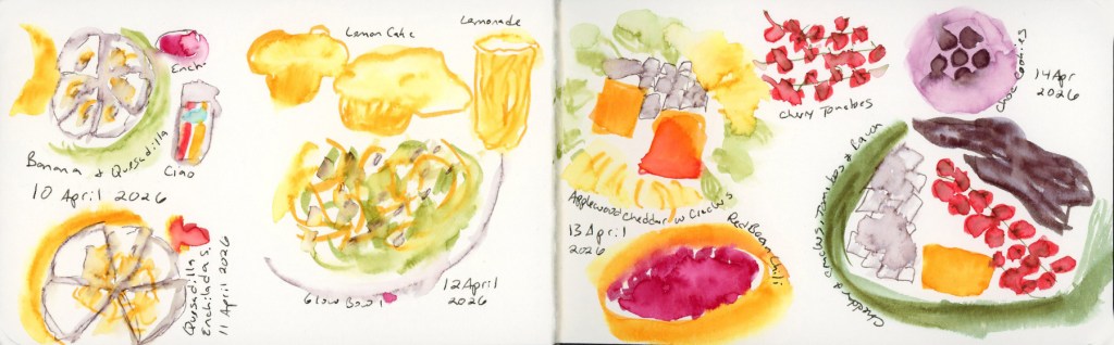
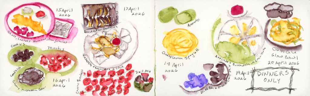
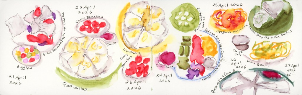
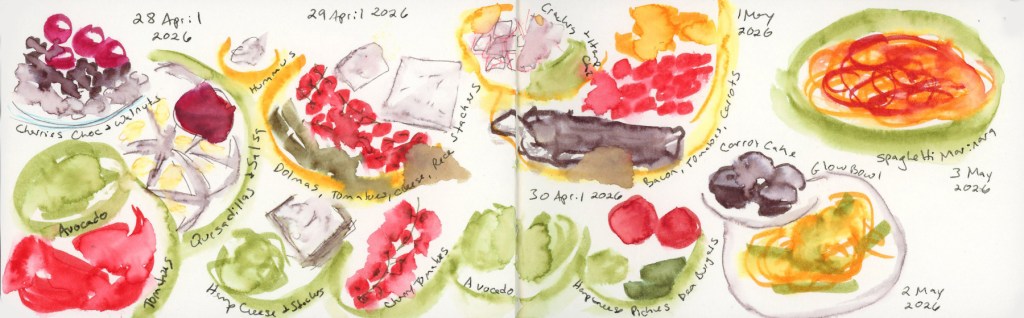
So yesterday I sat down with my phone, pulled up my photos, and drew twenty-six days of dinners in one go. Two and a half hours with the Shikiori markers, then another fifty minutes going back over everything with water to activate the color. I do love the blooms that activating watercolor markers can generate! Five pages. April 7th through May 3rd, all in one long, slightly meditative catch-up session.
I’ve done dinners-only before, back in 2022, but not since. The logic is the same now as it was then: breakfast and lunch don’t vary enough to sketch, and if something in my diet is causing a flare, it’s almost certainly lurking in dinner. The food diary is part creative practice, part detective work.
Drawing from photos all at once gave the pages a consistency I don’t usually get from in-the-moment sketching. Same hand, same markers, same energy — everything has a kind of visual unity that I actually like. It’s a different flow from the day-by-day record, but it’s still a record.
April 9th has a flying avocado, a fruit cup, and lemon cake, and I’m pleased with how cheerful it came out. April 12th’s glow bowl is one of the better-looking plates in the whole run. The cheesy lemon spaghetti on April 18th was delicious and the sketch knows it.
The DINNERS ONLY box that appears mid-April — I lettered it right there on the page as a label to remind myself I did still eat lunches! It has a slightly resigned, slightly determined energy that I feel captures the month accurately.
And then there’s the quesadilla. It shows up nine times. Nine. Quesadilla with enchilada sauce, quesadilla with salsa, quesadilla solo, quesadilla as a supporting player. It has practically become a character in this sketchbook. My Whoop has been giving me pointed looks about it. I asked about my poor sleep, and the theory offered is that a high fat and high carb dinner combination might be doing my sleep no favors. I did not buy tortillas on my last shopping trip. Let’s test this theory and see what happens. (But what will I eat on high brain fog, low energy days?)
This also concludes the small Delta Sketchbook that is my 29th sketchbook and my 6th food volume.
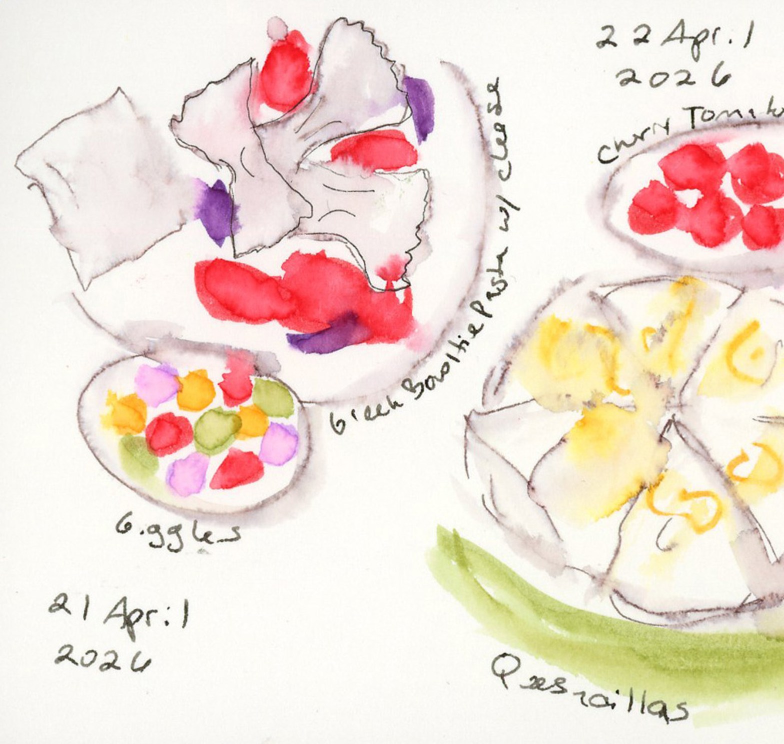
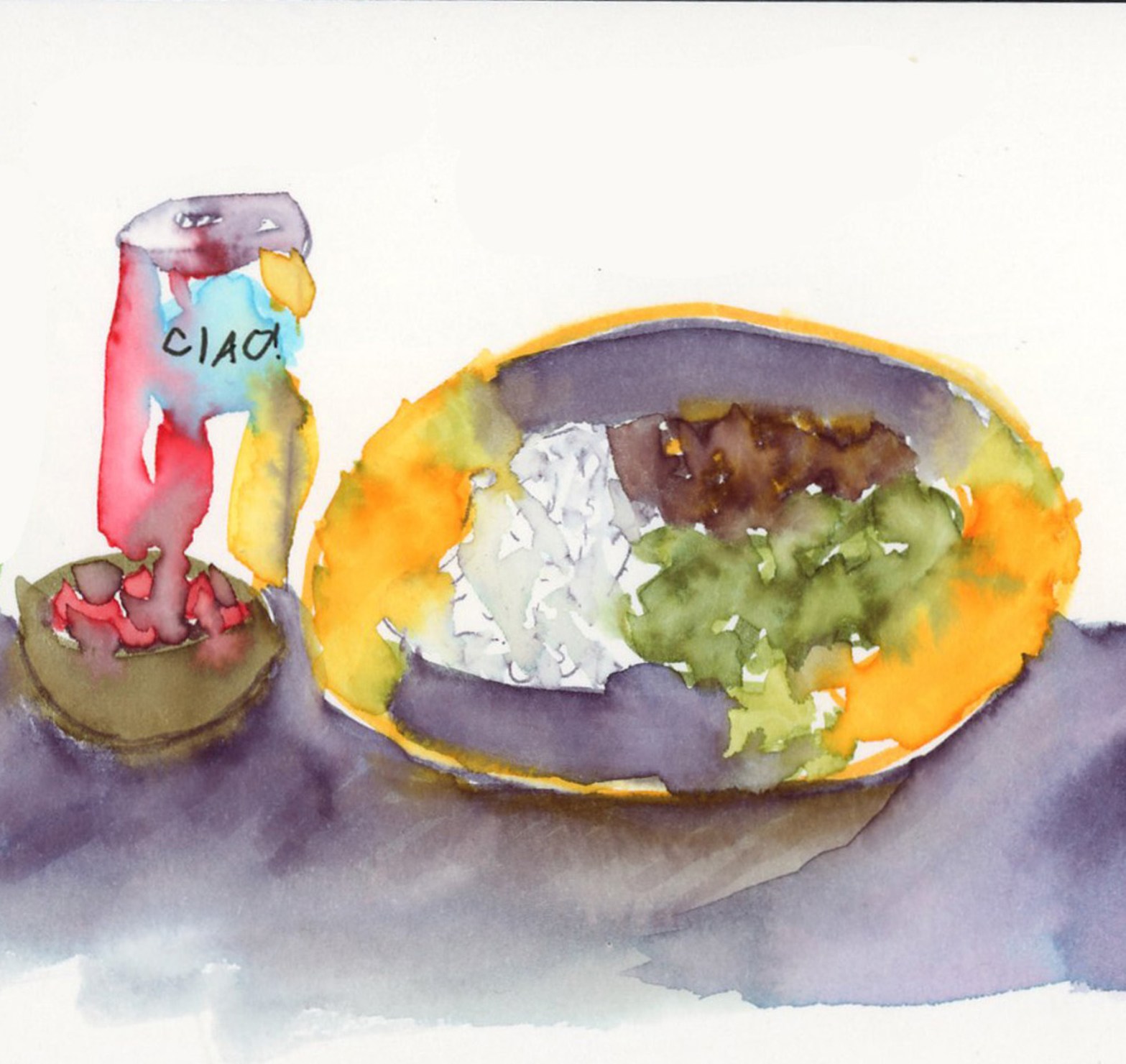
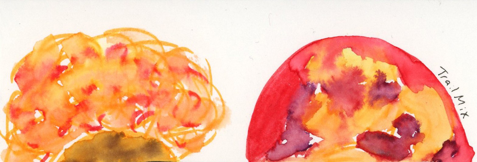
The featured image up top is from the April 21st spread — Greek bowtie pasta, and a little bowl of Giggles (allergen-friendly candy, think Skittles) with those bright confetti dot colors. It’s one of my favorites from the whole batch. Twenty-six dinners, one sitting, five pages. The record exists. On to May. Without my go to quesadillas!
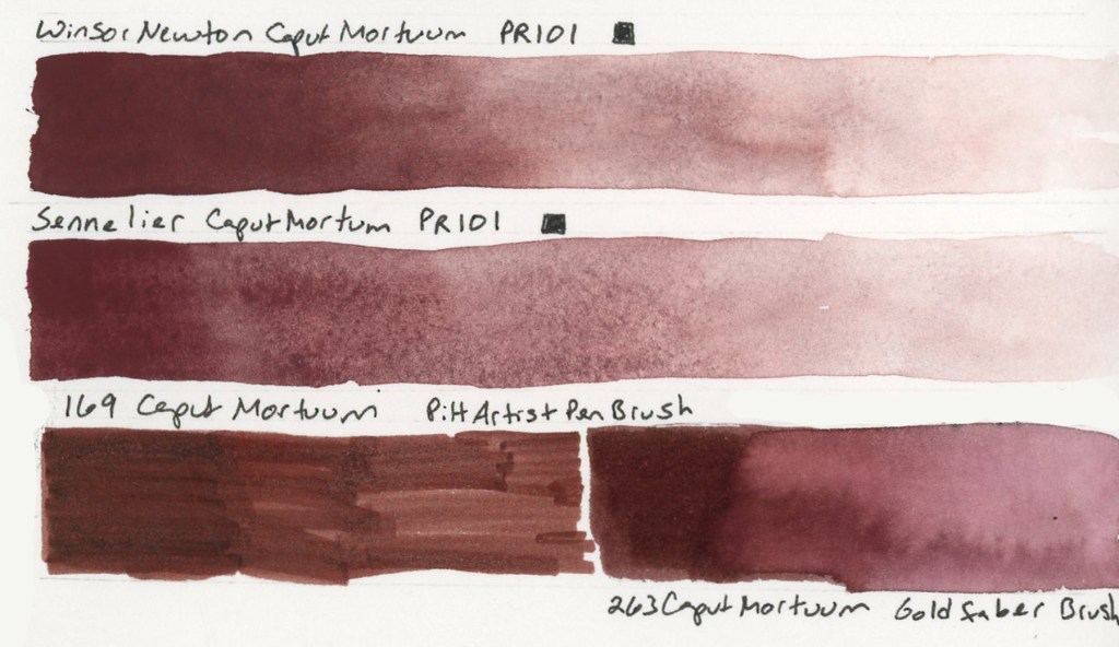
The Caput Mortuum watercolors arrived! My infatuation began when I put together the Travel Sketching palette, when the Goldfaber Aqua version caught my attention. Then in the notes page I thought of it immediately for the theme of darks. I knew I’d already ordered Winsor & Newton and Sennelier watercolors. Once they arrived I swiftly color swatched them.
Caput Mortuum, Lava, Bloodstone Genuine, Apatite Genuine, and Sailor Shikiori Subarakishi — Monday 27 April 2026 — Stillman & Birn Alpha
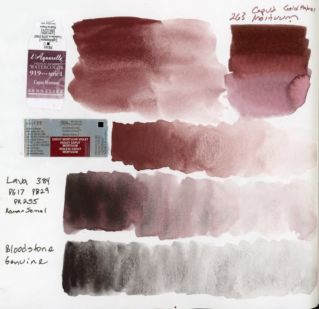
That deep, complex brownish-reddish-purple. Somewhere between burgundy and iron oxide. Caput Mortuum is Latin for “dead head,” an old alchemical term for the residue left after distillation. Macabre and poetic. I love it! Winsor & Newton and Sennelier are single pigment PR101, which is fairly opaque and highly granulating.
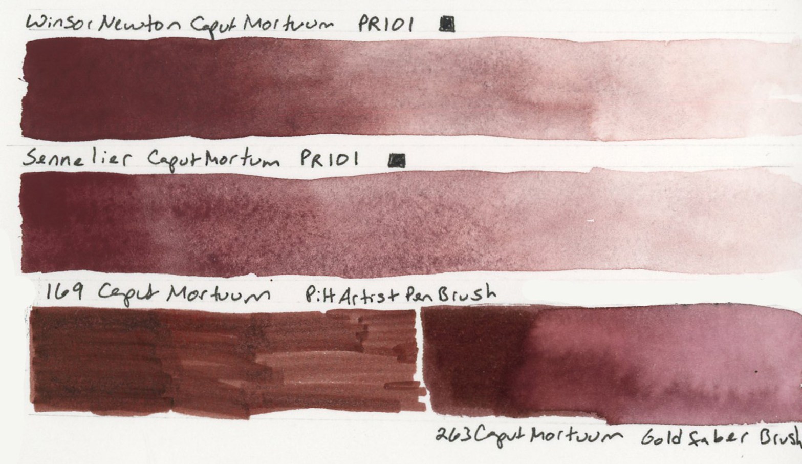
Caput Mortuum watercolor swatches in Sennelier and Winsor Newton. Roman Szmal Lava 384 and Bloodstone Genuine — Stillman & Birn Alpha, 27 April 2026Winsor & Newton Caput Mortuum Violet, Sennelier Caput Mortuum, 169 Caput Mortuum Pitt Artist Brush Pen, 263 Caput Mortuum Goldfaber Aqua Dual Brush Pen — Stillman & Birn Delta, 27 April 2026
The two watercolors are very similar in hue. The Sennelier is a little smoother, the Winsor & Newton has more granulation. Both are quite opaque. Opacity affects layering and mixing, and these will behave differently from transparent darks. Worth paying attention to, to avoid flat or muddy works.
I also pulled out the Roman Szmal Lava 384, which I’d first swatched back in early March. I still love it so much, and it definitely feels like it belongs in this color club. That PG17 PB29 PR255 triple pigment giving it a depth and richness that the single pigment paints don’t quite replicate. Roman Szmal paints are harder to source here in the States, though.
Naturally I had to include the markers! The Goldfaber Aqua 263 Caput Mortuum and the PITT Artist Pen Brush 169 Caput Mortuum, side by side with the watercolors. The hue match is surprisingly close. Markers are their own medium with their own behavior, but it’s satisfying to know that the color I fell for in the palette swatches is holding its own. My infatuation with this color continues. How will it look if I use it for my darks, for shadows, etc?
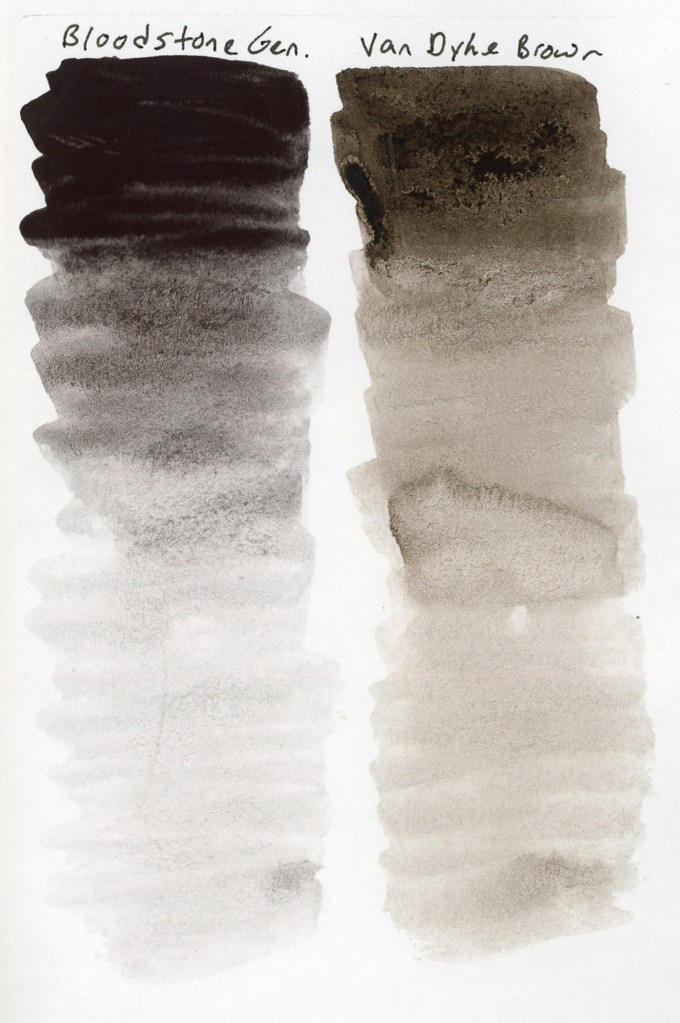
Bloodstone Genuine and Van Dyke Brown value gradients — Stillman & Birn Alpha, 27 April 2026
Since I was swatching anyway! I finally did the comparison of Van Dyke Brown versus Bloodstone Genuine. I’ve been curious about this since Liz swapped her Van Dyke Brown out last summer. Side by side in gradient swatches, the difference is clear. Bloodstone is greyer and cooler, less brown than Van Dyke Brown, and with potentially less of a color shift as it dries. Van Dyke Brown leans warmer and earthier. I can see why Liz made the swap, though I’m pretty sure my chocolate sketches need to keep the Van Dyke Brown! Bloodstone will work beautifully in landscapes and urban sketches, though!
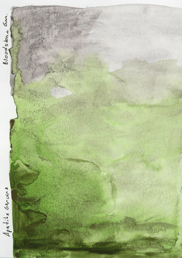
Bloodstone Genuine and Apatite Genuine — Stillman & Birn Alpha, 27 April 2026
Speaking of the landscape potential, both Bloodstone Genuine and Apatite Genuine granulate beautifully. I’m loving this texture of the genuine pigment paints, where the particles settle unevenly into the paper tooth and create something that looks almost geological. The Apatite Genuine is that luminous grey-green, softer and cooler than anything I could mix. Together on the page they look like a landscape seen from a great distance.
May has the Darks theme for the Patreon group, and the Travel Sketching course is running live. I’m excited for both, and hope to really dive in. I also want to get back to sketching the everyday things. It feels good to have more energy, and more enthusiasm again!
I will be taking Liz Steel’s Travel Sketching course this May. I’ve taken it before, in September 2024, and I started in April 2025, but did not finish. (See all my posts for Sketching Now Travel Sketching here.)
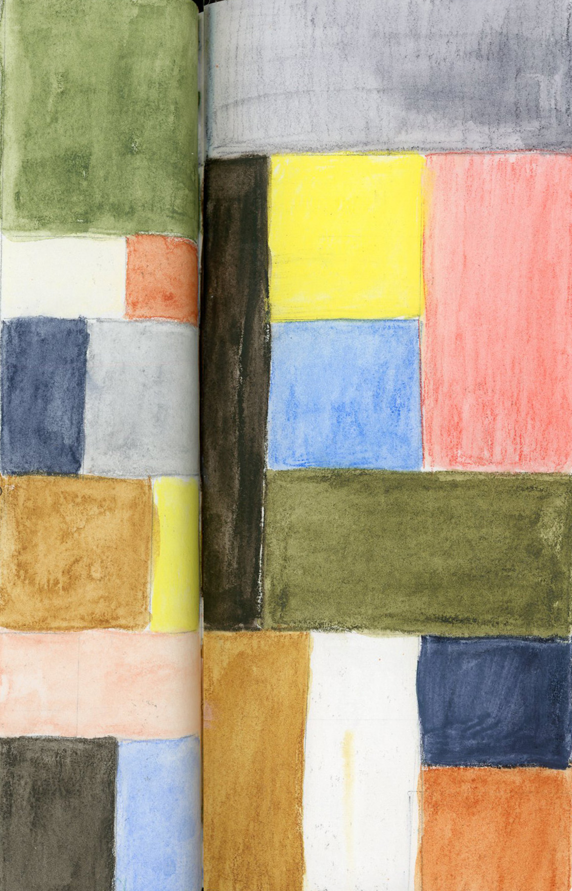
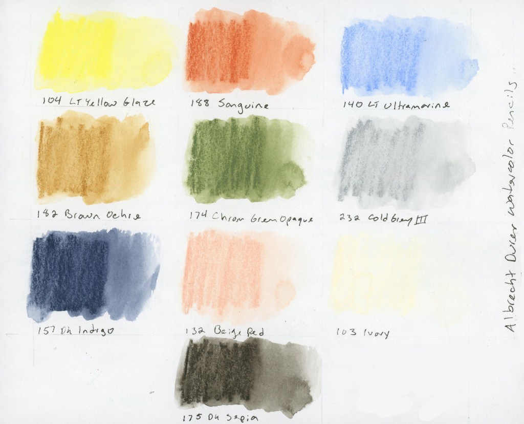
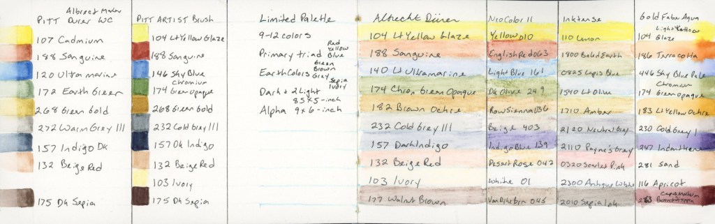
Every time I become a little obsessed with the limited palette for this class. Liz built it using threes: a primary, three earth tones, then a dark and two lights. She kept it fairly pastel, and muted. It really is great for landscapes. Especially Autumn scenes. She used Albrecht Dürer Watercolor Pencils.
104 Lt Yellow Glaze, 188 Sanguine, 140 Lt Ultramarine, 142 Brown Ochre, 174 Chrom Green Opaque, 232 Cold Grey III, 157 Dark Indigo, 132 Beige Red, 103 Ivory, 175 Dark Sepia — Albrecht Dürer Watercolor Pencils
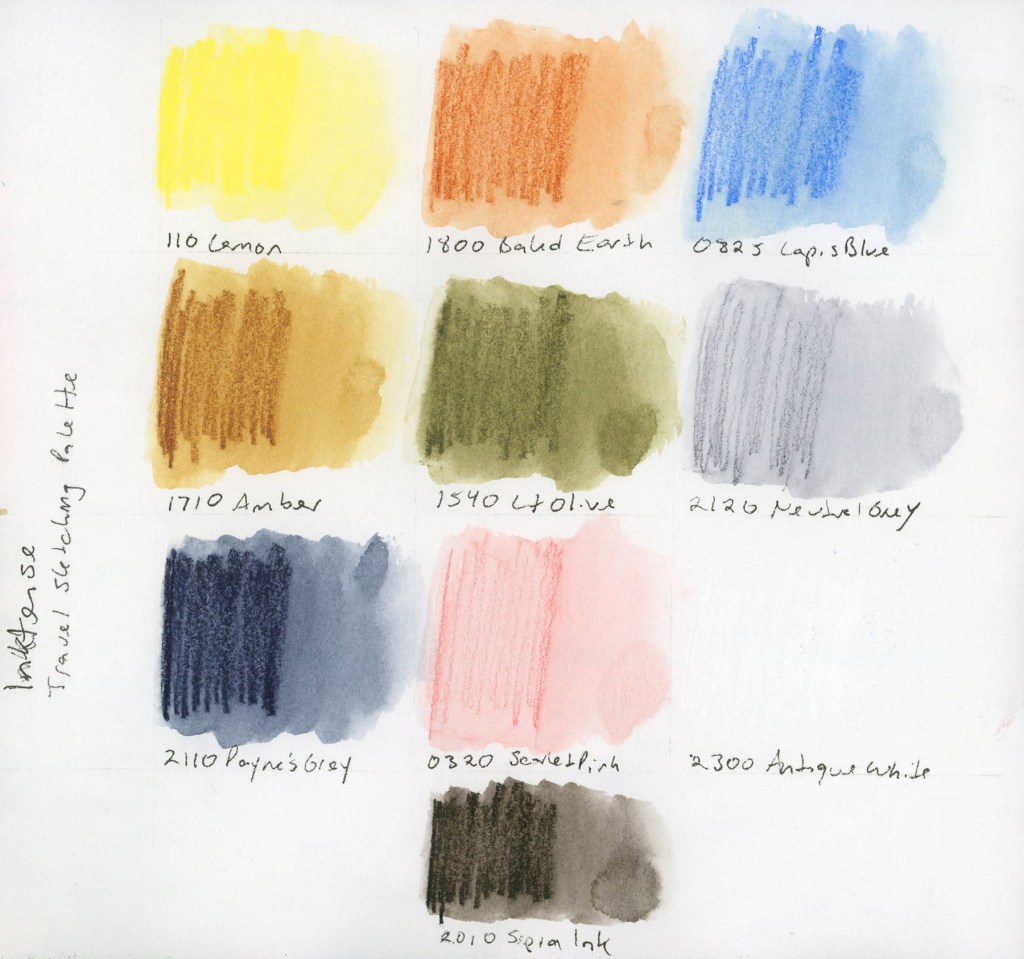
The first time I took this course, I discovered I really wanted a brown, so here I’ve added the dark sepia. The second time I became very curious about Inktense pencils, wondering how were they different. Since I owned a set, a pulled the same palette colors and I started using Inktense pencils shortly afterward. I also wanted to explore Neocolors II. I was unable to finish the course, so I did not explore those as much as I intended.
This time around, I decided to find out.
The Albrecht Dürer Watercolor Pencils. Activated, they produce soft, luminous washes. There’s a gentleness to them that feels very suited to location sketching, which is rather the point. Dark Sepia is my second dark, which I really craved. Plus I have a love affair with Sepia, so it’s a natural fit. I did consider a warmer brown, like Walnut, but the cooler sepia keeps the balance between warm and cool tones.
I built this Inktense palette to best match the colors of the original palette. Same colors, two media, learn how do they really behave different. The get the more pastel grey and soft pink, you really need a very light touch when applying the pencil, as the colors are darker than the matching shade. They say Inktense becomes permanent once dry, so you can layer over it without lifting. I find they give smoother washes, and they seem more vivid, but this palette is still holding that more muted vibe.
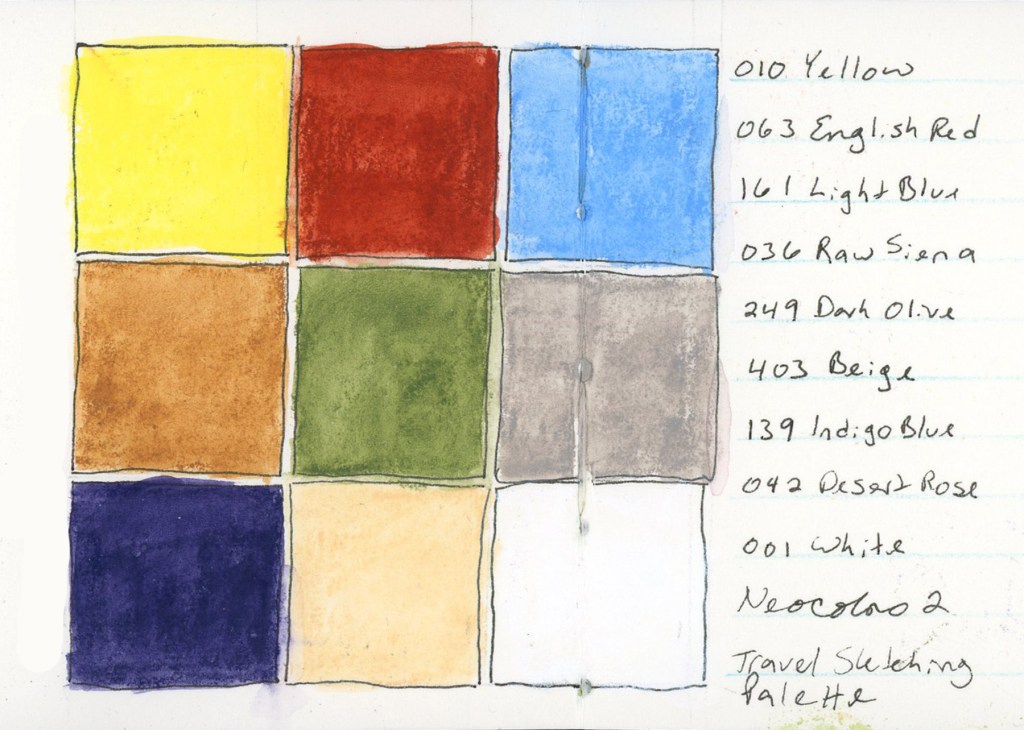
010 Yellow, 063 English Red, 161 Light Blue, 036 Raw Sienna, 249 Dark Olive, 403 Beige, 139 Indigo Blue, 042 Desert Rose, 001 White — Neocolor II — Stillman & Birn Delta, April 2026
I had selected the matching colors in a Neocolor palette for the April course, but never used them. Since I have them, I continue to be very curious to work with them. The swatches are certainly vibrant, and they felt good to lay down. These swatches were Delta book, in ivory paper, so that white shows up a bit better. I wonder how these would look on colored paper? Are they more opaque?
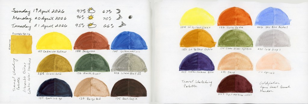
At this point the reasonable thing would have been to stop. I did not stop. Liz mentioned she would be adding markers to the course this time around, and well, I have markers! (Advantage of buying way too many art supplies over many years, I have a lot of stuff just lying around! Whole color sets make great gifts during the holidays!) So I pulled together the same palette in multiple marker types. (I did have to fill in a couple gaps, and order a few, but not too many.)
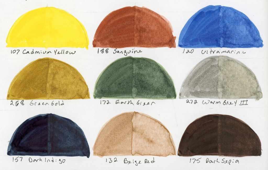
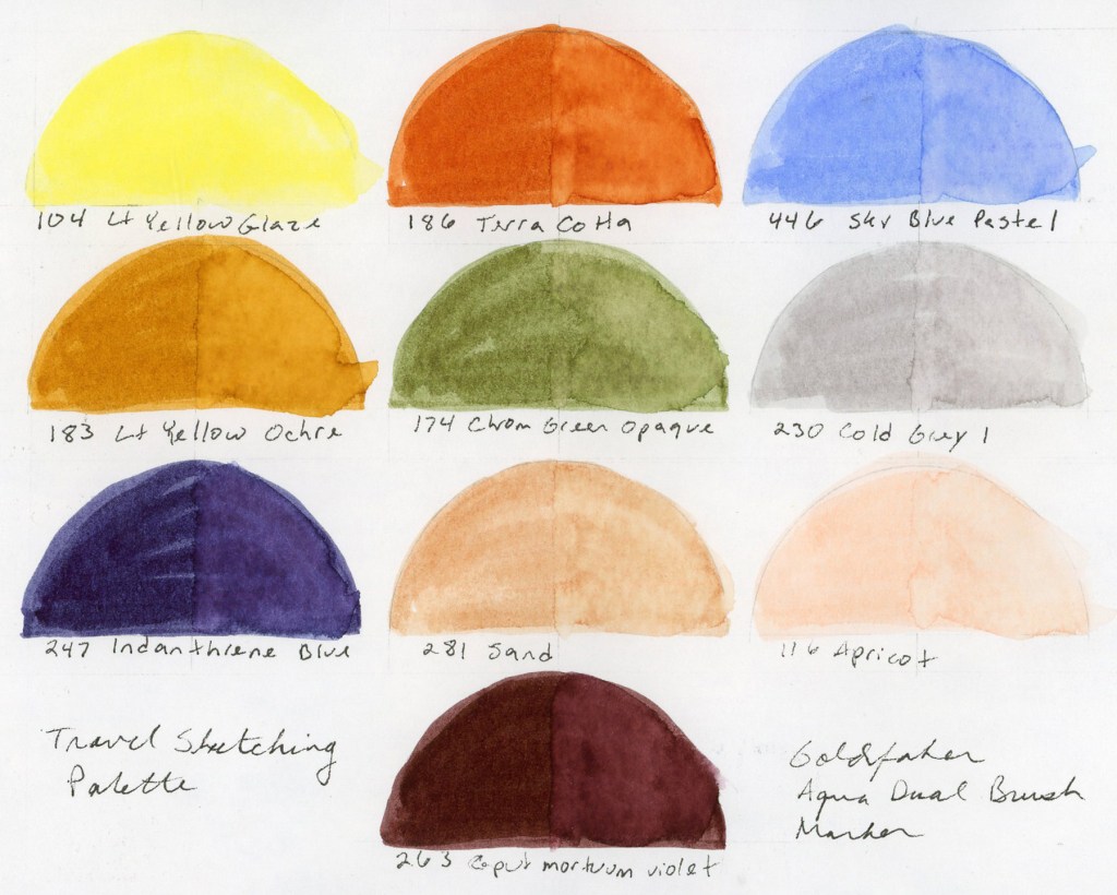
Travel Sketching palette — Albrecht Dürer Watercolor Markers and Goldfaber Aqua Dual Brush Markers — Stillman & Birn Alpha, April 2026107 Cadmium Yellow, 188 Sanguine, 120 Ultramarine, 268 Green Gold, 172 Earth Green, 272 Warm Grey III, 157 Dark Indigo, 132 Beige Red, 175 Dark Sepia — Albrecht Dürer Watercolor Markers104 Lt Yellow Glaze, 186 Terra Cotta, 446 Sky Blue Pastel, 183 Lt Yellow Ochre, 174 Chrom Green Opaque, 230 Cold Grey I, 247 Indanthrene Blue, 281 Sand, 116 Apricot, 263 Caput Mortuum Violet — Goldfaber Aqua Dual Brush Markers
I love how watercolor markers look when activated with water. They bleed and bloom in ways I love. Easy to get complete obliteration of the lines, so it’s a bit like playing a daring game! I also put together the same palette in the pigment Pitt Artist Brush pens, but never swatched those independently. They are only swatched in the big color chart below.
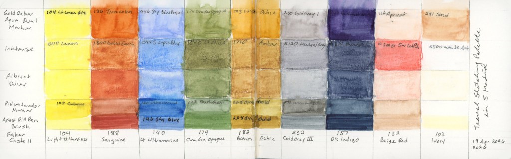
And of course, I had to see everything side by side, right? How well did I match these colors across the mediums?
Travel Sketching palette reference chart — Stillman & Birn Delta, April 2026Travel Sketching palette in five media — Stillman & Birn Delta, 19 April 2026
I am really looking forward to using these in actual sketches to learn how the different media behave, and discover what I do and don’t like.
I also may have begun a new obsession. I love that Goldfaber Aqua Dual Brush Caput Mortuum. They didn’t have a brown, so that was the closest. The Pitt Artist Brush pens also have a gorgeous Caput Mortuum. So I may have immediately ordered some Caput Mortuum watercolor paint.
It started with one question about two pencil ranges, how is Inktense different from the Albrect Durer watercolor pencils. It ended with six media, so many color charts and a new obsession or two.
Time for a catch-up post on the food diary. I’m still using the Shikiori markers. Four days, four very different spreads, and a peek into what happens when I sketch under varying degrees of brain function.
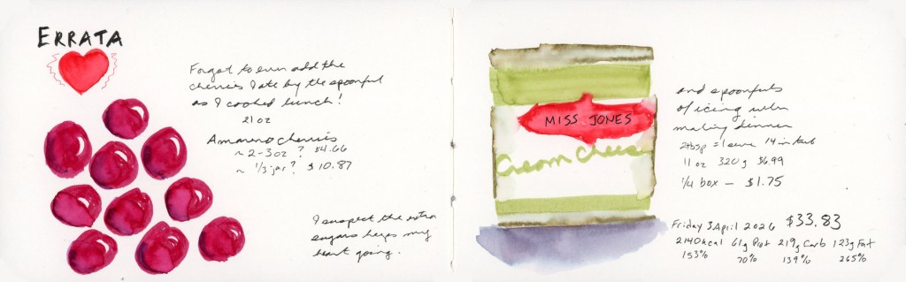
I forgot to log the Amareno cherries I ate by the spoonful while cooking lunch. Those deep jewel reds were so fun to paint, and drawing bigger than usual suited them. The Miss Jones cream cheese icing on the right got its own sketch too, because apparently I also ate several spoonfuls of that while making dinner. I have regrets. I suspect the extra sugar gets my heart going. And yes, for mysterious reasons I have been bingeing more sugar lately. Trying to rein that in.
Saturday 4 April 2026 — Food Sketch in Stillman & Birn Delta
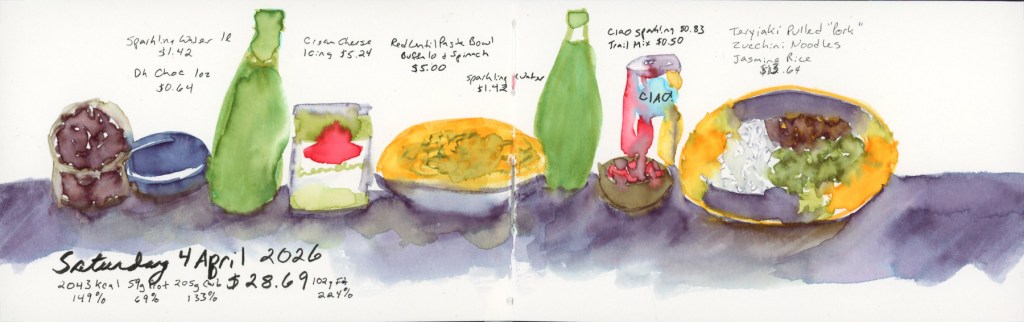
Saturday was a proper cooking day with teriyaki vegan pulled pork, jasmine rice, and zucchini noodles. It was very good and I was pleased with the sketch. I did this day’s sketches in the moment! My sunflower plate with the purple shadow wash underneath is one of my favorite things I’ve painted in this book so far. (And I didn’t forget to include the rest of the icing I finished off on the second day of it being open!)
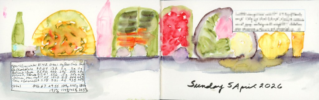
Sunday was a big food day. Bento box with dolmas, baby carrots, hummus and herb garlic cheese (vegan) in one half, cherry tomatoes and kalamata olives in the other, then salmon with roasted vegetables and mac and cheese for dinner, finished off with lemon olive oil cake muffins and a lemonade. It looks like a cheerful parade of colorful shapes across the page, which is exactly what it was.
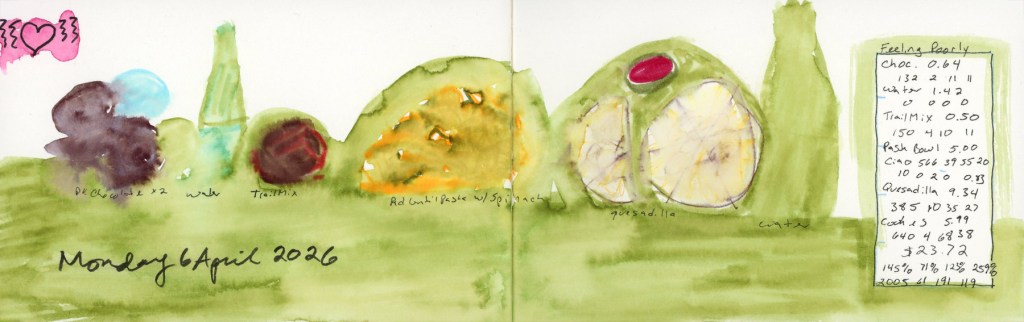
And then Monday. I was not feeling well, and it shows. The whole spread went down in a loose green wash and I forgot to sketch the cookies entirely. The little pink heart in the corner was doing its best. Some days the diary is a beautiful detailed record, and some days it’s an honest green blob. That I’m keeping up is a miracle, when the bad brain hits. I blame the sugar and the allergens I had eating out on Sunday. Which is the whole reason I like to sketch my food, so it’s easier to find the culprits, when the body crashes or outbreaks or flares up days later.
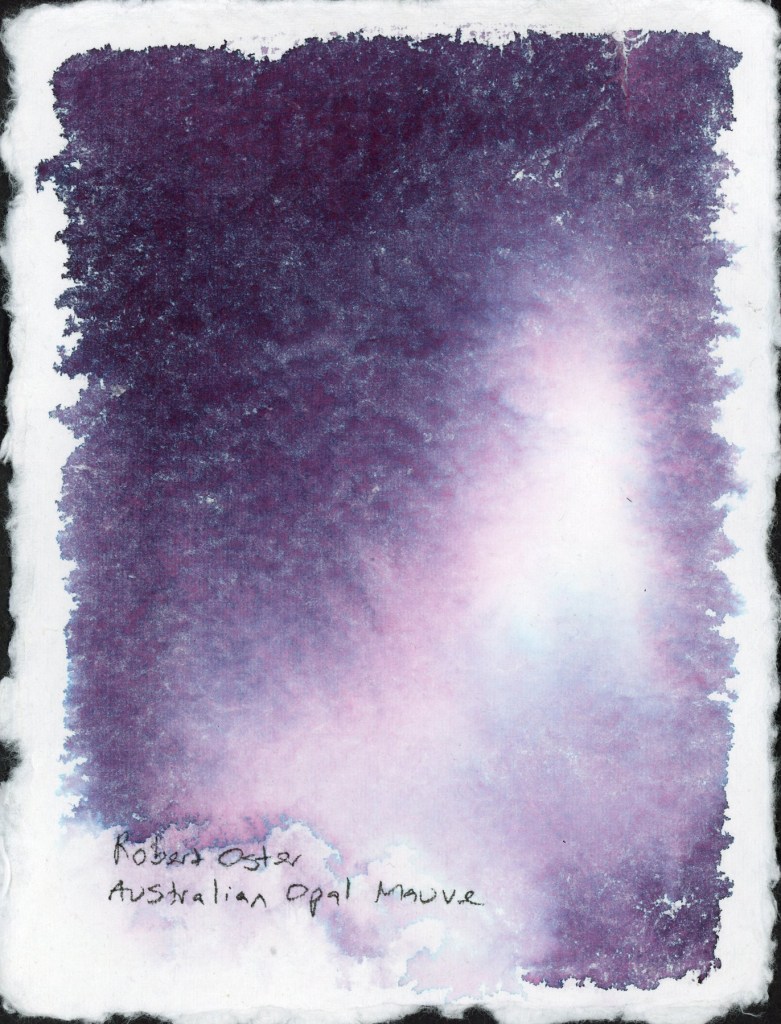
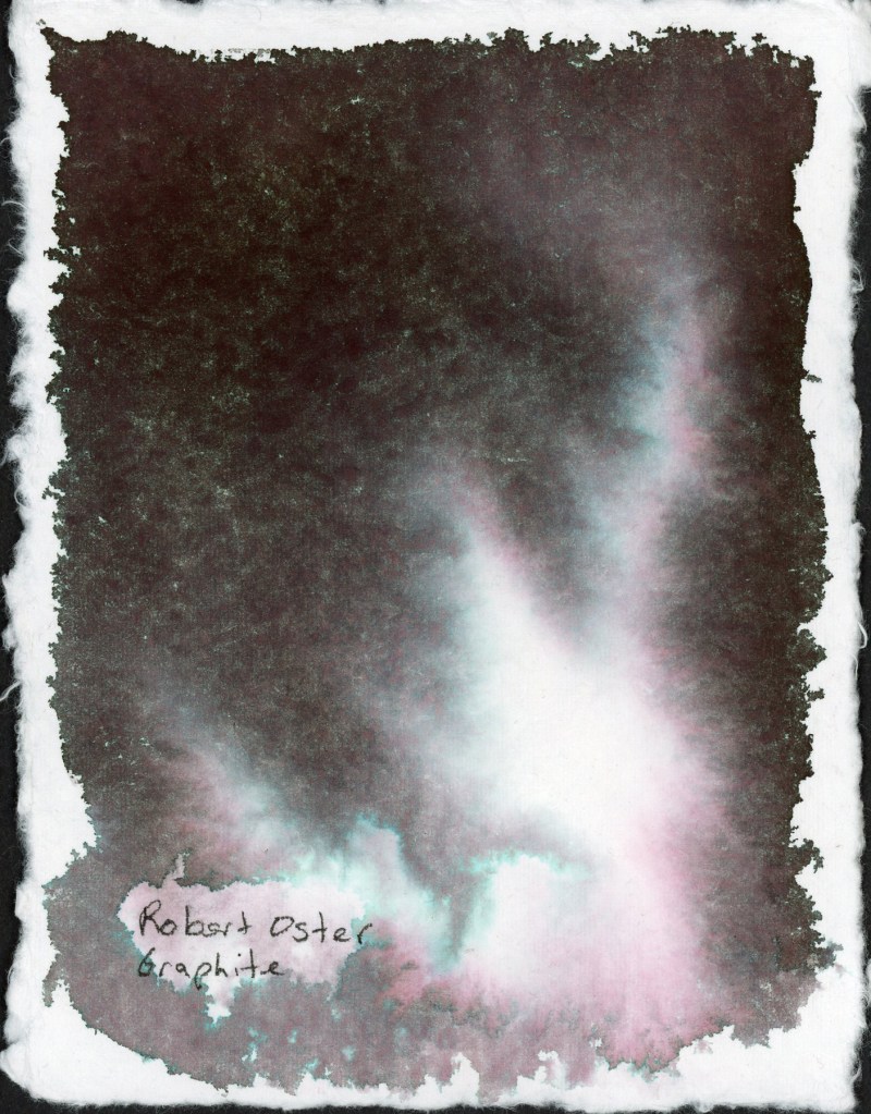
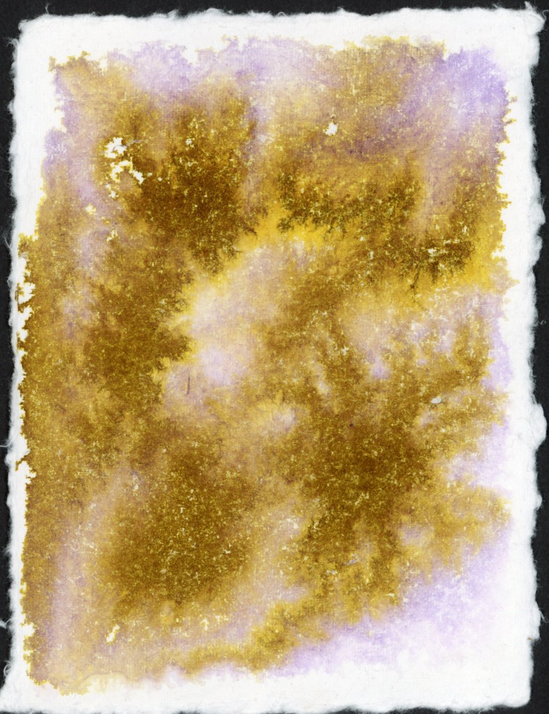
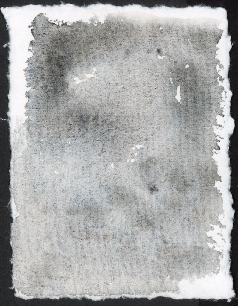
Before I put my handmade paper ink swooshes into the portfolio book, I wanted to use the backs of the cards. Can’t have blank paper! What’s the fun in that? Plus the chromatography aspect is so much fun, and what would happen if I had more paper to work with for a larger separation potential?
So I did what had to be done. I made a mess. A beautiful, atmospheric, very satisfying mess. I even had water and ink dripping off the page!
Robert Oster Australian Opal Mauve on Leather Village Handmade Cotton Watercolor PaperRobert Oster Graphite on Leather Village Handmade Cotton Watercolor Paper.
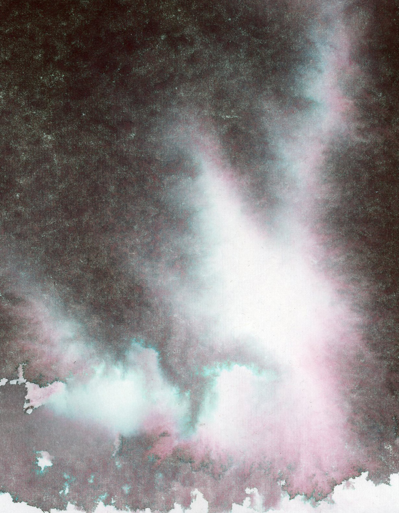
Robert Oster Graphite was one of my favorites from the chromatography lesson I posted about recently. That deep complex near-black opens up into the most beautiful teal and rose separation in the lighter areas. It looks like a nebula. I’m a little bit in love with it.
Then I wanted to see what this particular handmade paper does with some of my granulating watercolors. Granulating watercolors behave very differently depending on the paper. how much separation the pigments have causing that elusive “watercolor magic.” This handmade paper is cotton, and it does a very good job of having very even washes once it is dry. So watercolor magic? Not so much.
The granulation is visible, but the paper holds the pigments fairly close together rather than letting them really spread and separate. It’s a quieter, more even look. Perfect when you want smooth washes.
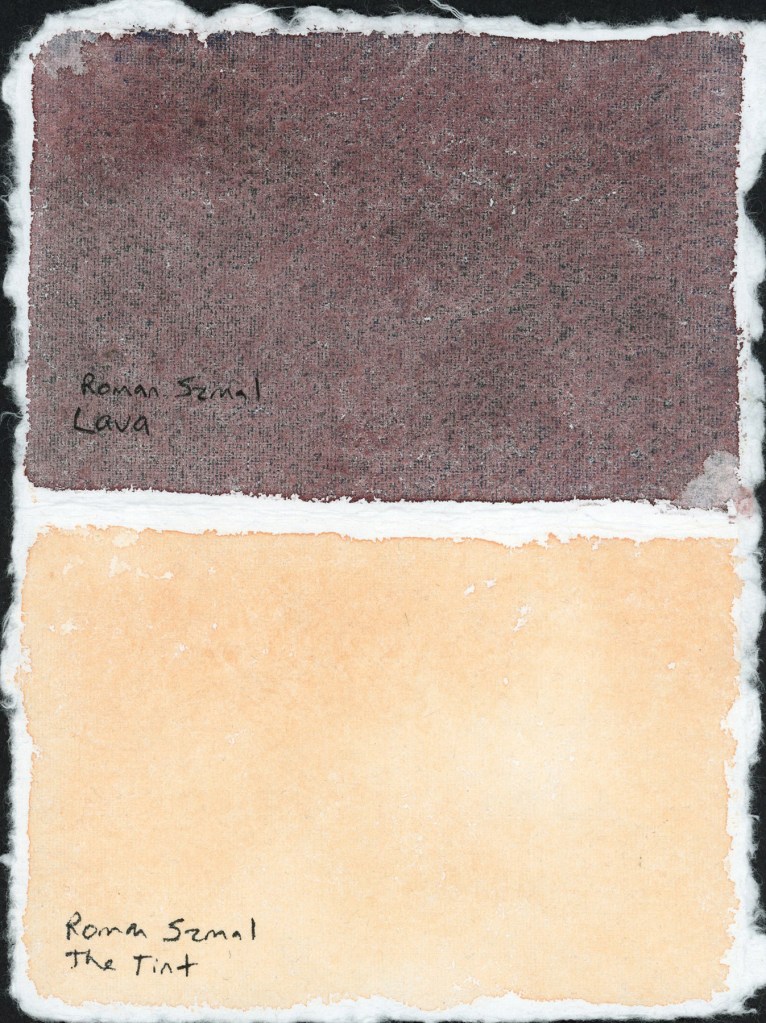
Roman Szmal Lava and The Tint — handmade paper test
I’m loving that Roman Szmal Lava in particular. I’m looking forward to using it a lot more. That dark reddish color, and it has lovely granulation on different paper.
I tested The Tint alongside it, to sample how pink versus yellow is it on this paper. A nice striking pair on the page.
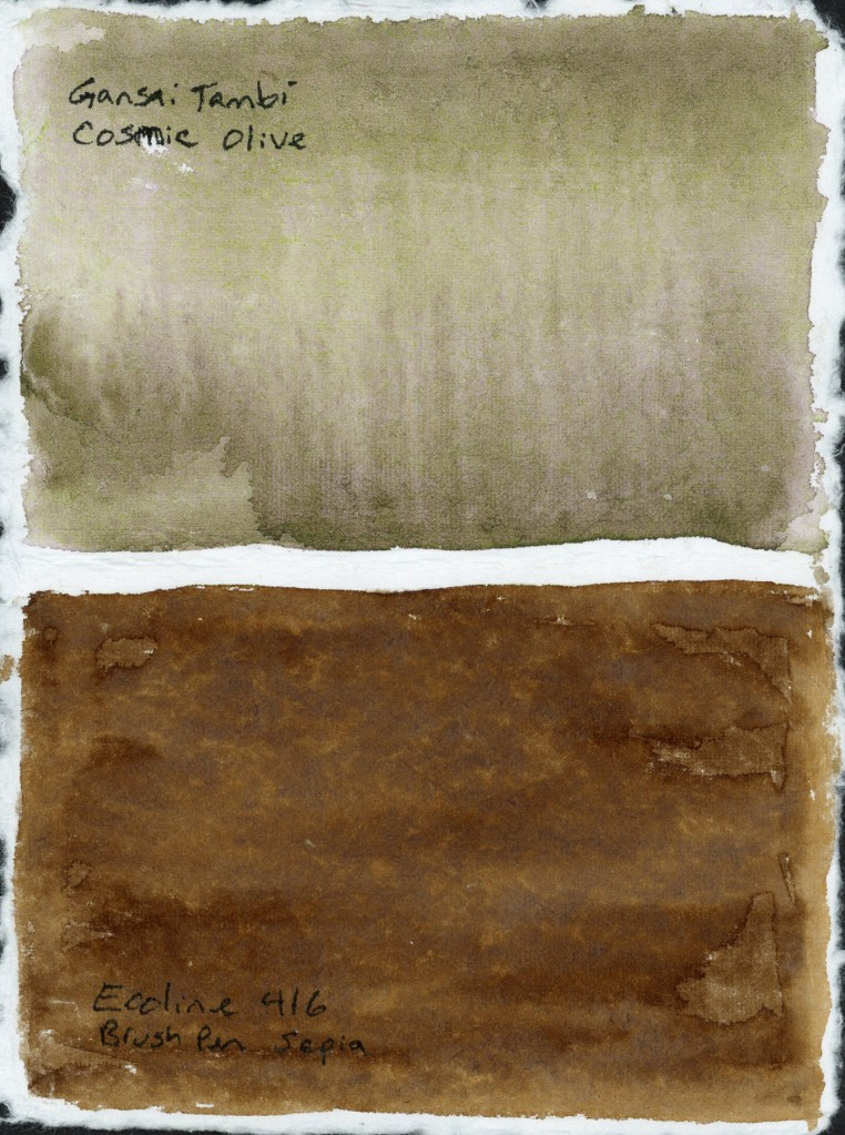
Gansai Tambi Cosmic Olive and Ecoline 416 Brush Pen Sepia — handmade paper test
The Cosmic Olive did not separate nearly as much as it does on other papers, and the Ecoline 416 Sepia marker turned out surprising flat. I expected more blooming when I added water.
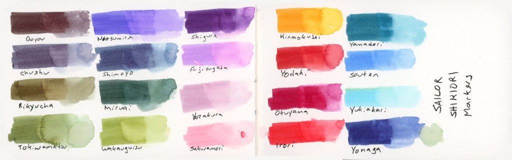
In the food sketchbook, the Delta, I’ve been using the Shikiori markers to sketch my food, so it was time to do a full color chart. Beautiful colors and they react strongly to water. I love that.
Sailor Shikiori Markers — full color swatch reference
The Shikiori markers do something I find absolutely lovely, add water and they bloom outward in that soft, spreading way that reminds me of how Faber-Castell watercolor markers behave. Very satisfying, very painterly. It’s easy to make a lovely watery mess, and I adore that. The Delta paper the results were clean and bright, and holds up well to markers and lots of water.
The Shikiori line takes its name from 四季織 — shikiori — meaning “weaving of the four seasons,” and the color names live up to that. They’re all Japanese seasonal and nature words, and I think they’re worth listing out properly because they’re just so beautiful:
Doyou — midsummer · Chushu — mid-autumn · Rikyucha — tea-brown, named for the tea master Sen no Rikyū · Tokiwamatsu — evergreen pine · Neosumire — sleeping violet · Shimoyo — frosty night · Miruai — meeting of seaweed · Wakauguisu — young bush warbler · Shigure — autumn rain shower · Fujisugata — shape of Mount Fuji · Yozakura — night cherry blossoms · Sakuramori — cherry blossom grove · Kinmokusei — osmanthus flower · Yodaki— night waterfall · Okuyama — deep mountain · Irori — hearth fire · Yamadori — copper pheasant · Souten — blue sky · Yukiakari — snow light · Yonaga — long night
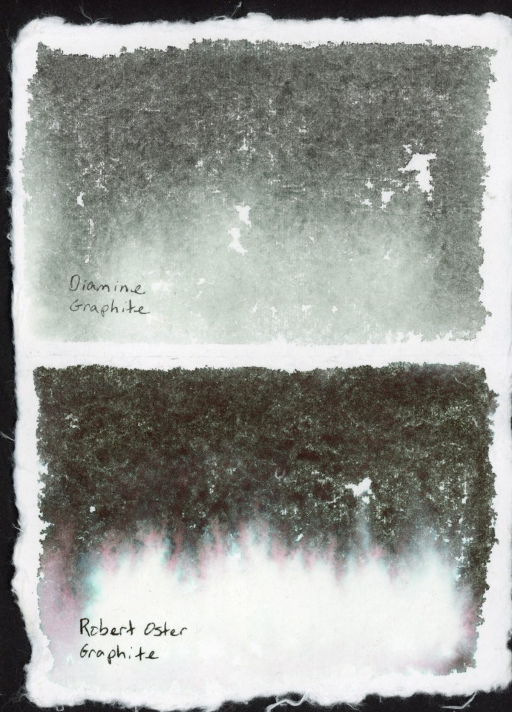
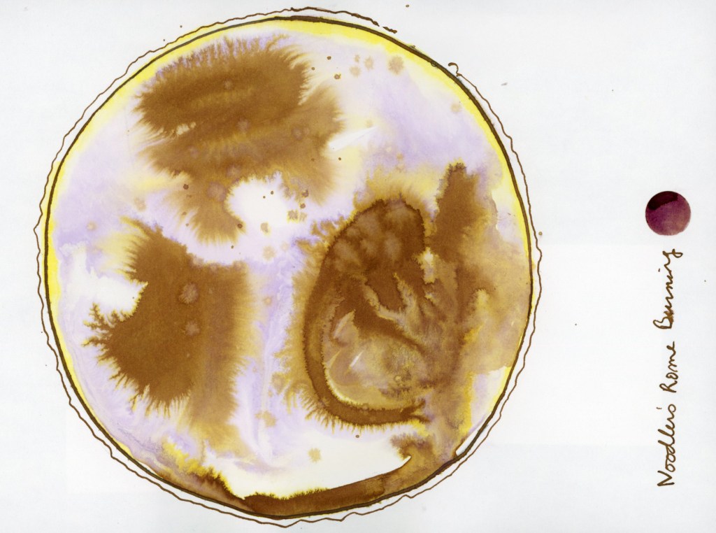
Back in December when my Invent came I had been searching online and found Nick Stewart, who has swatched every Diamine Inkvent calendar for years. I was captivated by his method. In January I dabbled in his Udemy course, Fountain Pen Ink art. I also bought some of the inks for that course that really seemed to separate chromatically in breathtaking, and beautiful ways. I’d taken a toe dip into the course, with the few inks I had, and the handmade cotton watercolor I’d gotten for Christmas. The paper is from Leather Village — 400gsm, rough textured, with those beautiful deckle edges. A simple test, with just a couple inks, to see what the paper and the ink would do together. The method to get the most chromatography from the ink is to lay down a lot of water, then drop in the ink.
Noodler’s Rome Burning on Leather Village Handmade Cotton Watercolor PaperDiamine Graphite on Leather Village Handmade Cotton Watercolor PaperDiamine Graphite and Robert Oster Graphite on Leather Village Handmade Cotton Watercolor Paper
The two graphites looked very different! Diamine Graphite is a soft, cool grey-blue. Robert Oster Graphite is dramatically darker, and look at that pink and teal fringe bleeding out at the bottom.That chromatography is lovely, with those hidden colors separating out as the water carries them across the paper.
Noodler’s Rome Burning on Stillman & Birn Alpha — Chromatic World
I had also done this fun exercise, the Chromatic World in my Stillman and Birn Alpha sketchbook. You may have seen this in my “Early January 2026” post. You can really see how much Noodler’s Rome Burning in particular explodes when it hits water. That is one ink. One ink, water, and a circle. The gold, the ochre, the warm brown, the ghost of lavender — all of it was hiding inside Noodler’s Rome Burning, waiting for water to pull it apart. I find this genuinely magical every time.
When I was playing with ink in my recent food sketches, I got inspired to return to this course and do more extensive ink and paper tests. . Nick’s course uses mostly Bockingford watercolor paper, which I couldn’t source here, so I used what I have handy, and of course had to use different papers to see how they affect the results! I used the Stillman & Birn Delta, Strathmore Watercolor Paper 400 Series Cold Press 300gsm, and Arches Rough Watercolor Paper 300gsm.
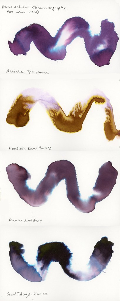
The first exercise is the Swatch Painting. You lay a wave or swoosh down with a big round brush loaded with lots of water. Then drop in the ink with a smaller round brush and watch it travel. How much it separates seems very different based on the paper. I used four inks: Robert Oster Australian Opal Mauve, Noodler’s Rome Burning, Diamine Earl Grey, and Diamine Good Tidings, though the Good Tidings only made it into the Delta book.
Robert Oster Australian Opal Mauve, Noodler’s Rome Burning, Diamine Earl Grey, and Diamine Good Tidings on Stillman & Birn Delta
The Delta paper gave me lovely fluid results. It actually holds up to these wet ink washes even better than with watercolor! Australian Opal Mauve separates beautifully, pulling apart into pink, violet, and that surprising electric blue is deeply satisfying. Rome Burning, which is brown as a writing ink, separates to this warm and golden ochre and lavender. Earl Grey is quieter, more restrained, a muted purple that bleeds to soft blue at the edges. The Good Tidings is the dramatic one of the bunch, near-black with that explosive teal bloom.
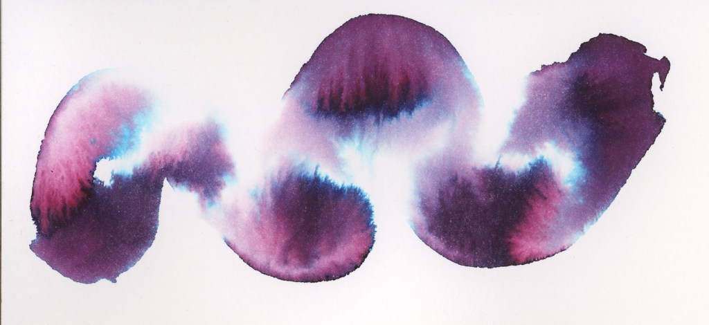
Look at the Australian Opal Mauve on the Strathmore paper!
Robert Oster Australian Opal Mauve on Strathmore Watercolor Paper
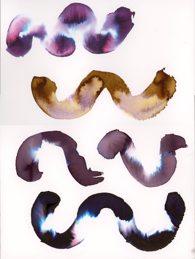
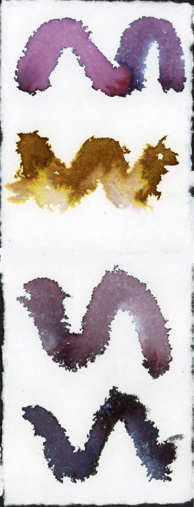
The four inks are sampled on both Strathmore Watercolor paper, and Arches Rough Watercolor paper.
Robert Oster Australian Opal Mauve
Noodler’s Rome Burning
Diamine Earl Grey
Robert Oster Graphite
Robert Oster Australian Opal Mauve, Noodler’s Rome Burning, Diamine Earl Grey, and Robert Oster Graphite on Strathmore Watercolor PaperRobert Oster Australian Opal Mauve, Noodler’s Rome Burning, Diamine Earl Grey, and Robert Oster Graphite on Arches Rough Watercolor Paper
The Arches Rough gives a noticeably different quality — the texture of the paper surface shows through the ink in a way that the smoother Strathmore doesn’t.
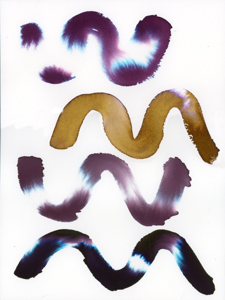
Robert Oster Australian Opal Mauve, Noodler’s Rome Burning, Diamine Earl Grey, and Robert Oster Graphite on Leather Village Handmade Cotton Watercolor Paper
The handmade Leather Village paper is a completely different experience. The rough fibrous surface grabs the ink differently, and the results are wilder and less predictable. Rome Burning in particular practically explodes on this surface. That ink has the best diffusion by far.
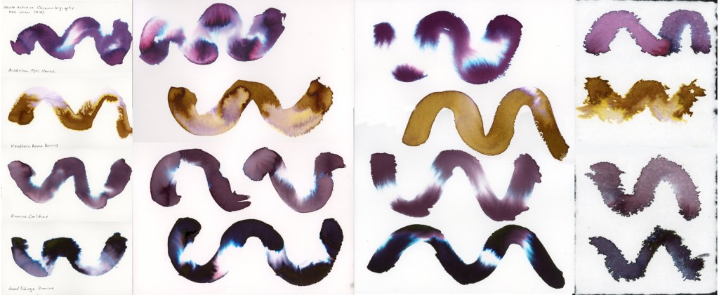
I tested the same four inks across all four papers, so you can really see how much the surface affects the results. Here they are side by side.
hromatography swatch comparison — Robert Oster Australian Opal Mauve, Noodler’s Rome Burning, Diamine Earl Grey, and Diamine Good Tidings / Robert Oster Graphite on Stillman & Birn Delta, Strathmore Watercolor Paper, Arches Rough Watercolor Paper, and Leather Village Handmade Cotton Watercolor Paper
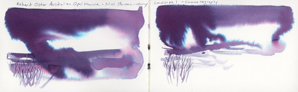
The final two exercises move into landscape territory, applying the chromatography technique to create actual pictures. Landscape One uses a large wet mass of ink for sky and atmosphere, with simple marks below suggesting ground and grasses. I used Australian Opal Mauve for both versions on the double spread. Nick Stewart Uses Robert Oster Barossa Grape, but I couldn’t find that ink.
Robert Oster Australian Opal Mauve on Stillman & Birn Delta — Landscape 1
There’s something about that ink in landscape form that feels almost otherworldly — those blue and pink separations read as light breaking through storm clouds. The little reed marks scratched into the wet wash at the bottom anchor it just enough to feel like a place. I had more dripping than I expected, but that is just practice. Wouldn’t this be great for snowy landscapes?
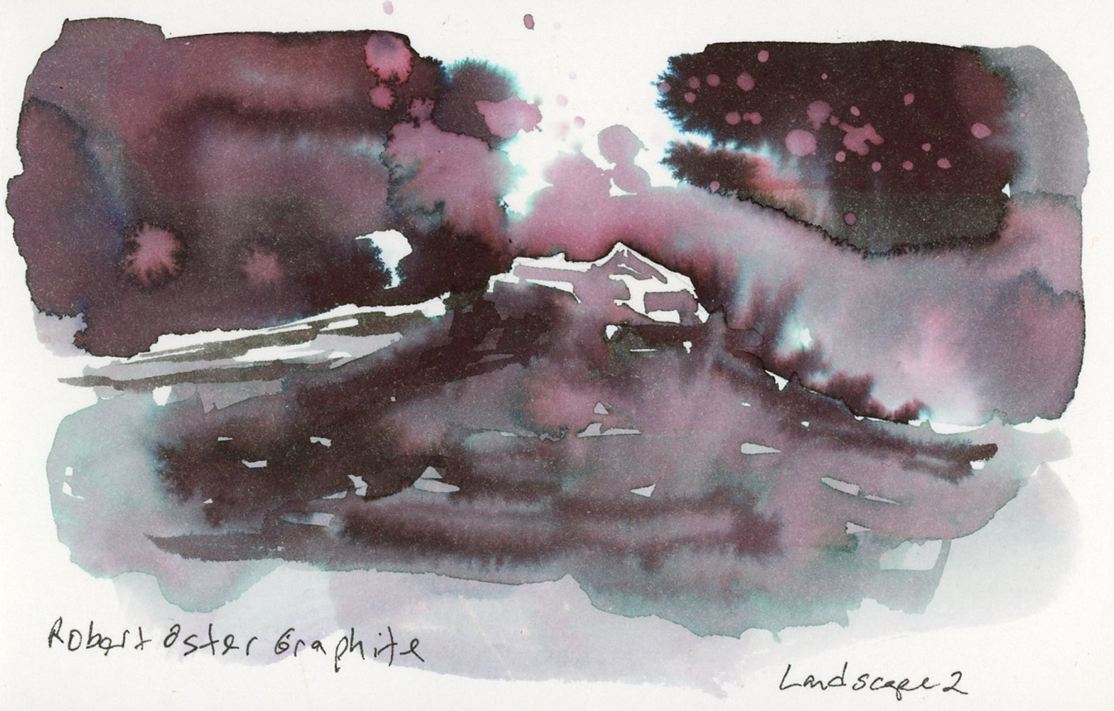
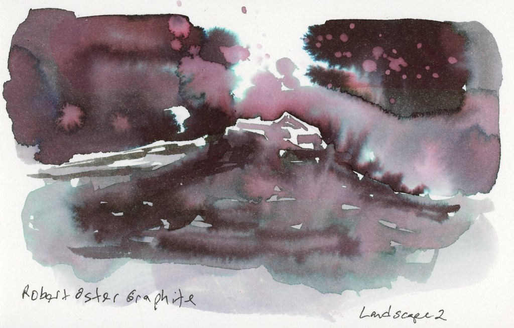
Landscape Two pushes further, adding more structure and a sense of depth. I used Robert Oster Graphite for this one, and it might be my favorite thing I made in this whole session.
Robert Oster Graphite on Stillman & Birn Delta — Landscape 2
The way Robert Oster Graphite separates in a wet wash — those deep plums, the pink spatter, the teal at the edges — makes a landscape that feels moody and atmospheric without any real effort to make it so. The ink does the work. That little glimpse of a structure in the negative space at the center, the misty ground below. If you blot the ink while it’s still wet, you get even more of that pink underlayer.
This Robert Oster Graphite is certainly the star player in this chromatography method! Honorable mention goes to Rome Burning, for it definitely separates well.
I did not plan to start another food sketchbook so soon. I said at the end of the last one that I’d be folding food sketching into my regular daily sketchbook going forward. But then I didn’t. Ha! I grabbed this Delta thinking it has fewer pages, and would be great for March. Also, tracking my allergens is genuinely easier in a dedicated book, and here we are. Food Sketchbook No. 6.
This one is a Stillman & Birn Delta, softcover, 5.5 × 3.5 inches, 270gsm cold press in ivory. I’ve tried the Delta paper before, one year ago exactly! I did not love it for watercolor. However, for ink it’s been great. Very wet ink washes with loads of water, it doesn’t even buckle!
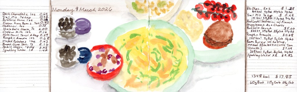
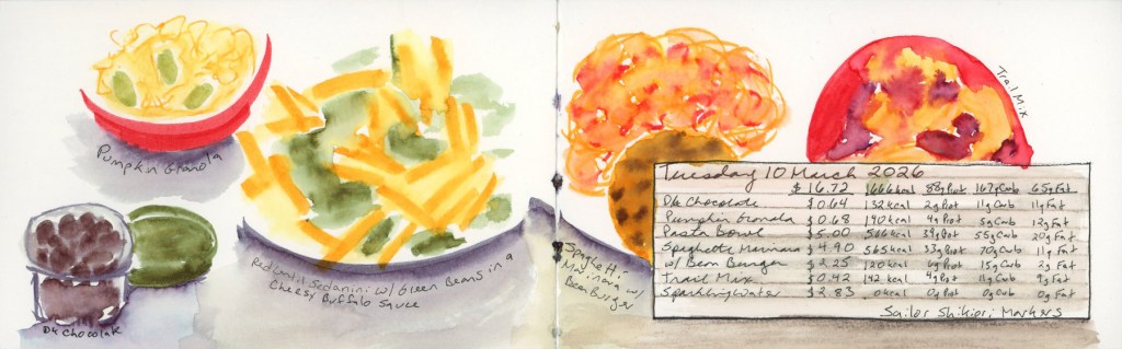
I book started on March 9th, intending to keep going through the month. But then those allergens hit, and I only got two days done. Both are done in Shikiori markers, because I was thinking markers would be fast and I was worried about not keeping up.
Monday 9 March 2026 — Food Diary in Sailor Shikiori markersTuesday 10 March 2026 Food diary in Sailor Shikiori markers
These are Sailor Shikiori markers. Japanese brush markers that take water beautifully. I do love that watery look. I had used Faber-Castell watercolor markers for food a few years ago and loved how they looked. I had these close by, so they were the obvious choice when I started this new book, hoping using marker would be a fast and easy method.
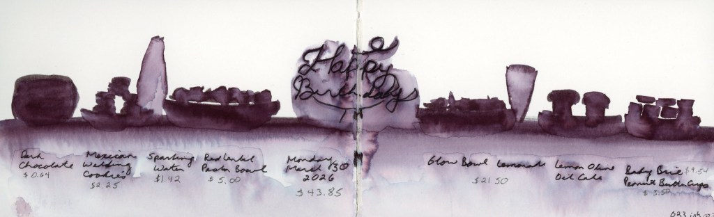
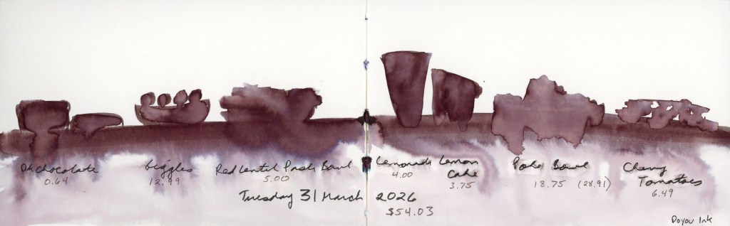
I got two days in. Once almost three weeks has passed, I knew I wouldn’t be able to catch-up, so I decided to jump in with my birthday. But I also knew I needed a fast method this busy week. One of my favorite sketches previously was a monochrome silhouette style, but I couldn’t remember if I’d done it in the 023 ink, or the Doyou ink. Obviously this means I had to both this week!
A fast way to record, and then the fun comes in the lovely ink washes as the dark lines are diluted.
Monday 30 March 2026 Food Diary in Shikiori marker 023.Tuesday 31 March 2026 Food Diary in Shikiori marker Doyou.
The 023 has the deeper purple undertones, while the Doyou leans toward the browns. Both work beautifully in the silhouette format, and the way the marker ink blooms into the wet wash below is very much what I was going for here.
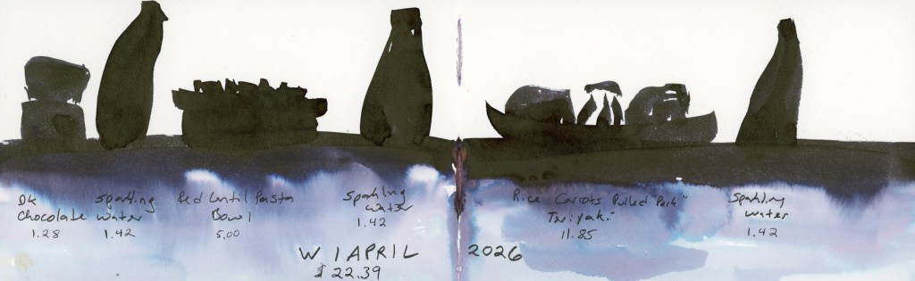
Wednesday 1 April 2026 Food Diary in Diamine Good Tidings Ink wash.
I wanted to keep going with the black inks, and I had the Diamine Good Tidings nearby. I really need to write the inks higher on the page, because doing it near the margin, they get cut off when I scan! I loved the color bleed on this ink so much!
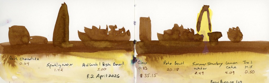
I remembered the Udemy course on fountain pen ink art by Nick Stewart that I’d dabbled with back in January — specifically his chromatography exercises, which are all about how inks separate and bloom when water is introduced. That’s exactly what was happening in these food spreads. One of the inks he uses in that course is Noodler’s Rome Burning, so I knew what ink I was going to do next!
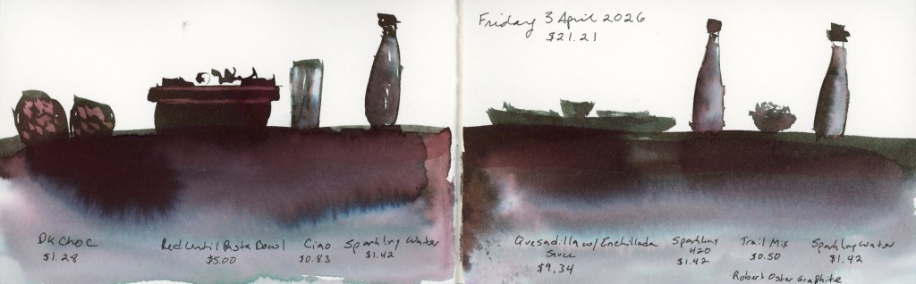
Thursday 2 April 2026 Food Diary in Noodler’s Rome Burning Ink washFriday 3 April 2026 Food Diary in Robert Oster Graphite Ink wash
The Robert Oster Graphite is also used in Nick Stewart’s course, and I can see why! Look at those colors! Deep plum-to-grey shift with the blue bloom and pink undertones in the wash is doing a lot of atmospheric work for what is essentially a record of sparkling water and a quesadilla.
From Shikiori markers to fountain pen inks. Now I’m energized to get back to the exercises in that Udemy course, and see what these inks can do!