Some Caput Mortuum, please?

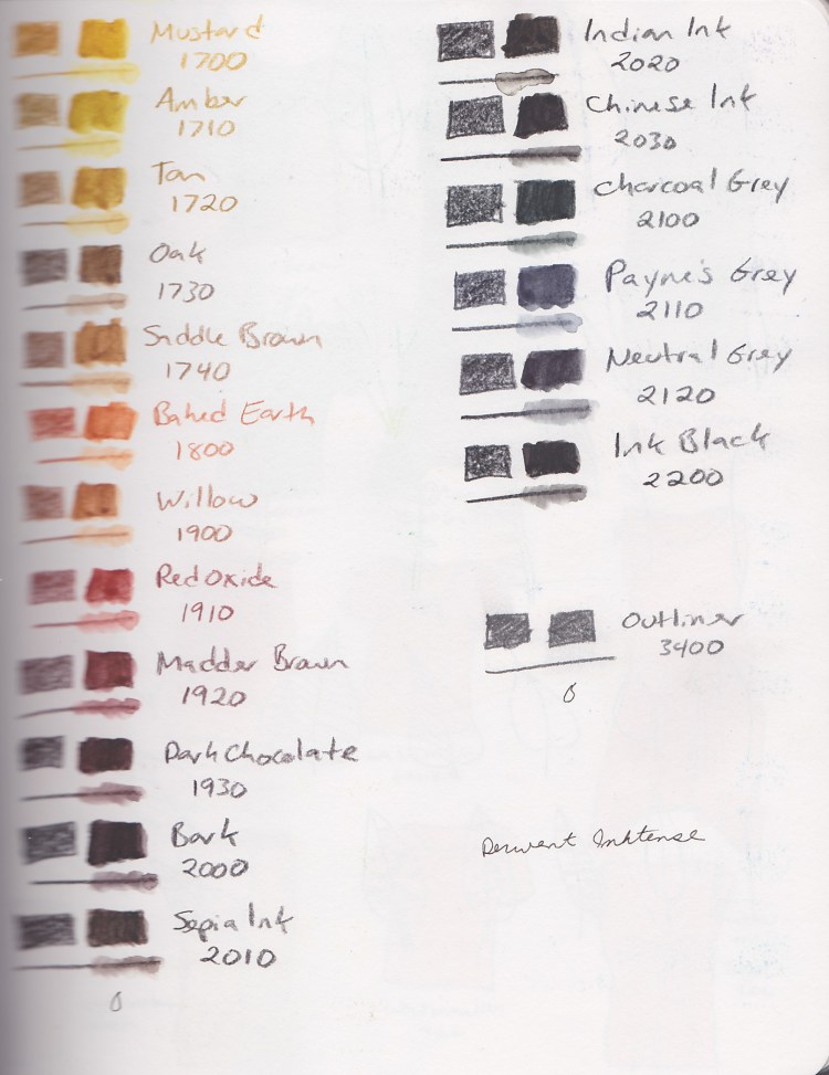
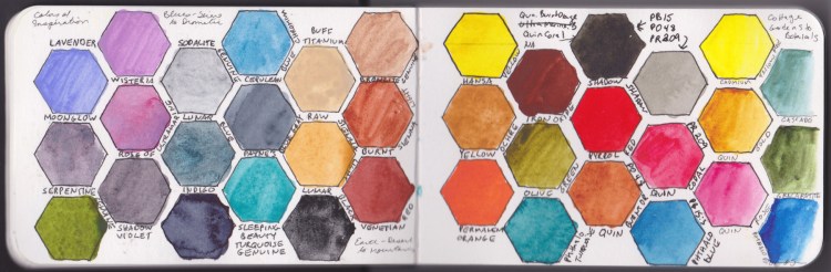
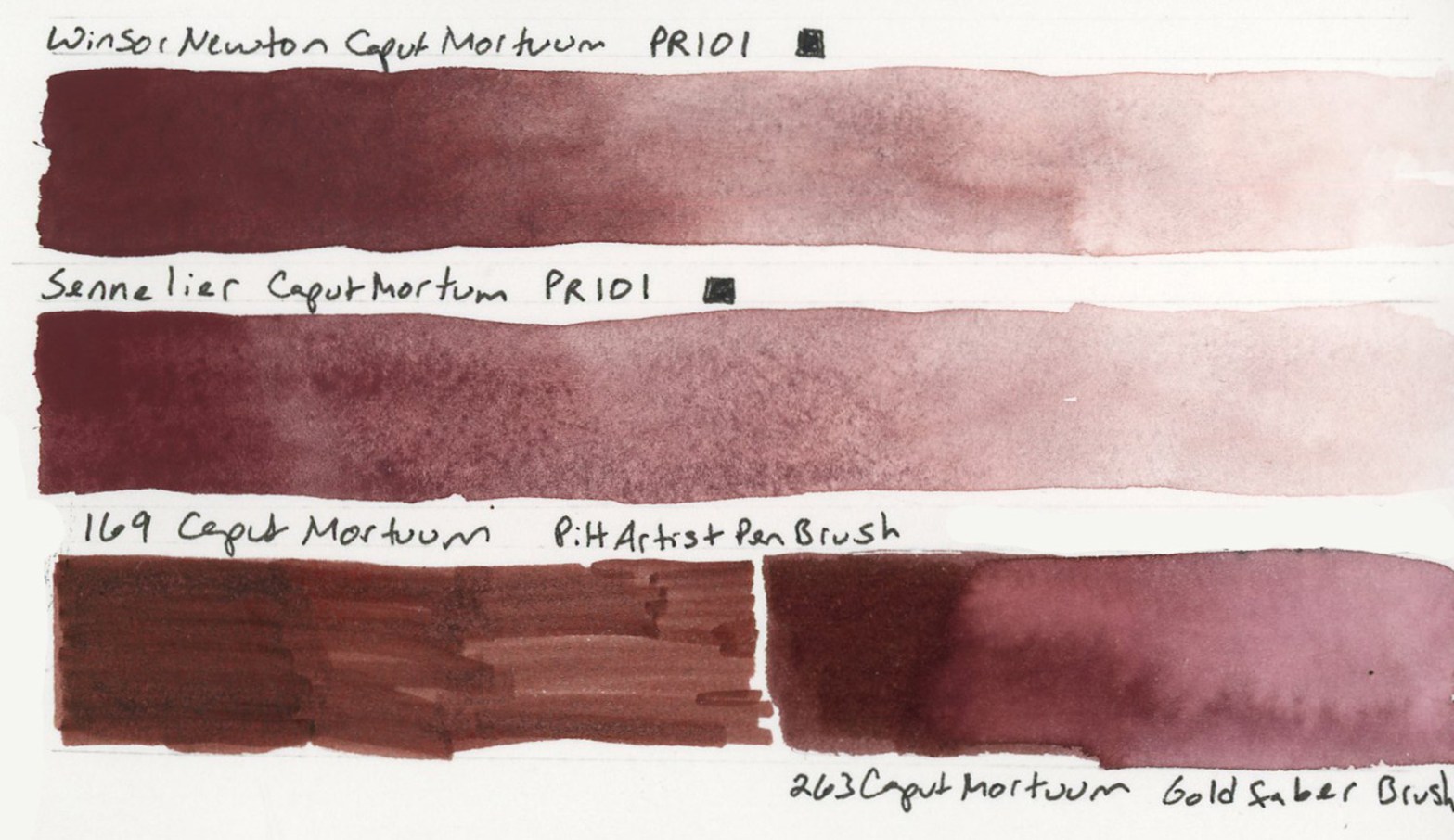
The Caput Mortuum watercolors arrived! My infatuation began when I put together the Travel Sketching palette, when the Goldfaber Aqua version caught my attention. Then in the notes page I thought of it immediately for the theme of darks. I knew I’d already ordered Winsor & Newton and Sennelier watercolors. Once they arrived I swiftly color swatched them.

A double page spread in a Stillman and Birn Alpha sketchbook dated Monday 27 April 2026 with weather noted as 83 degrees Fahrenheit and 60 degrees at night. The left page shows a handwritten journal entry alongside Caput Mortuum watercolor comparison swatches with two paint tube labels affixed to the page. The right page shows Bloodstone Genuine and Van Dyke Brown gradient swatches, Sailor Shikiori Subarakishi and Apatite Genuine ink and paint swatches, and the Bloodstone Genuine and Apatite Genuine combined swatch. All pages are dense with color and handwritten labels.
Caput Mortuum, Lava, Bloodstone Genuine, Apatite Genuine, and Sailor Shikiori Subarakishi — Monday 27 April 2026 — Stillman & Birn Alpha

That deep, complex brownish-reddish-purple. Somewhere between burgundy and iron oxide. Caput Mortuum is Latin for “dead head,” an old alchemical term for the residue left after distillation. Macabre and poetic. I love it! Winsor & Newton and Sennelier are single pigment PR101, which is fairly opaque and highly granulating.

A sketchbook page showing Caput Mortuum comparison swatches across multiple media. Four horizontal watercolor wash bands fill the center and left, ranging from deep brownish-purple at full saturation to pale pink at dilution. Two paint tube labels are affixed to the page — Sennelier l'Aquarelle Caput Mortuum and Winsor and Newton Caput Mortuum Violet, both PR101. Handwritten labels identify Roman Szmal Lava 384 and Bloodstone Genuine. In the upper right corner a small swatch labeled 263 Caput Mortuum Goldfaber shows the marker equivalent. Stillman and Birn Alpha sketchbook.
Caput Mortuum watercolor swatches in Sennelier and Winsor Newton. Roman Szmal Lava 384 and Bloodstone Genuine — Stillman & Birn Alpha, 27 April 2026
A watercolor swatch comparison page showing four horizontal wash bands on ivory sketchbook paper. From top to bottom: Winsor and Newton Caput Mortuum Violet, Sennelier Caput Mortuum, Pitt Artist Brush Pen Caput Mortuum, and Goldfaber Aqua Dual Brush Caput Mortuum. All are deep brownish-reddish-purple tones with subtle variations in warmth, granulation, and opacity. Stillman and Birn Delta sketchbook.
Winsor & Newton Caput Mortuum Violet, Sennelier Caput Mortuum, 169 Caput Mortuum Pitt Artist Brush Pen, 263 Caput Mortuum Goldfaber Aqua Dual Brush Pen — Stillman & Birn Delta, 27 April 2026

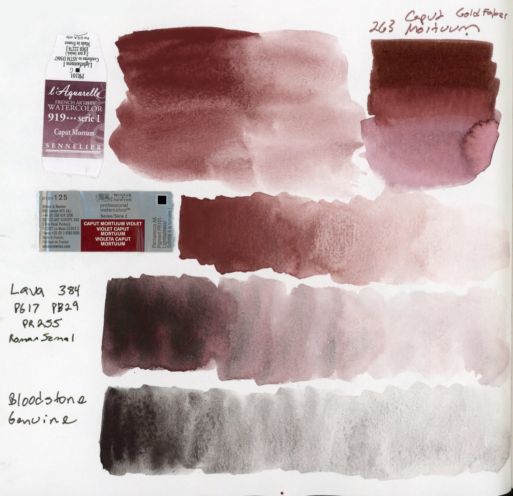
The two watercolors are very similar in hue. The Sennelier is a little smoother, the Winsor & Newton has more granulation. Both are quite opaque. Opacity affects layering and mixing, and these will behave differently from transparent darks. Worth paying attention to, to avoid flat or muddy works.

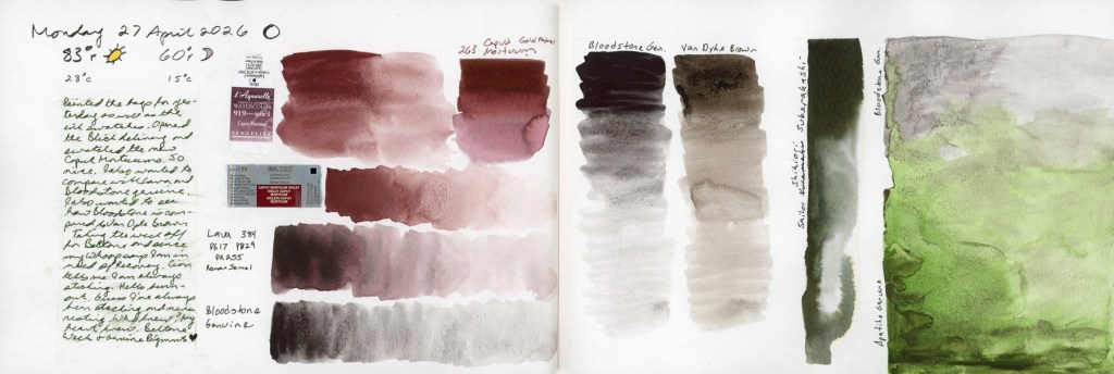
I also pulled out the Roman Szmal Lava 384, which I’d first swatched back in early March. I still love it so much, and it definitely feels like it belongs in this color club. That PG17 PB29 PR255 triple pigment giving it a depth and richness that the single pigment paints don’t quite replicate. Roman Szmal paints are harder to source here in the States, though.

Naturally I had to include the markers! The Goldfaber Aqua 263 Caput Mortuum and the PITT Artist Pen Brush 169 Caput Mortuum, side by side with the watercolors. The hue match is surprisingly close. Markers are their own medium with their own behavior, but it’s satisfying to know that the color I fell for in the palette swatches is holding its own. My infatuation with this color continues. How will it look if I use it for my darks, for shadows, etc?

Two tall vertical watercolor gradient swatches side by side on white sketchbook paper, each fading from deep saturation at the top to a near-white wash at the bottom. The left swatch labeled Bloodstone Genuine is a cool dark grey-brown with visible granulation. The right swatch labeled Van Dyke Brown is warmer and earthier with a slightly different granulation texture. The comparison shows Bloodstone as cooler and greyer while Van Dyke Brown reads as warmer and more overtly brown. Stillman and Birn Alpha sketchbook.
Bloodstone Genuine and Van Dyke Brown value gradients — Stillman & Birn Alpha, 27 April 2026

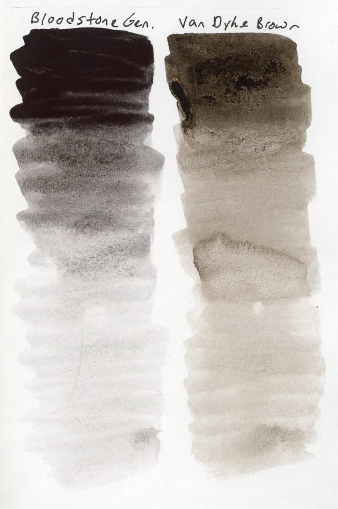
Since I was swatching anyway! I finally did the comparison of Van Dyke Brown versus Bloodstone Genuine. I’ve been curious about this since Liz swapped her Van Dyke Brown out last summer. Side by side in gradient swatches, the difference is clear. Bloodstone is greyer and cooler, less brown than Van Dyke Brown, and with potentially less of a color shift as it dries. Van Dyke Brown leans warmer and earthier. I can see why Liz made the swap, though I’m pretty sure my chocolate sketches need to keep the Van Dyke Brown! Bloodstone will work beautifully in landscapes and urban sketches, though!

A large vertical watercolor swatch on white sketchbook paper showing two pigments applied together. The upper portion is Bloodstone Genuine in a cool dark granulating grey, labeled at the top left. The lower portion transitions into Apatite Genuine, a luminous granulating grey-green, labeled at the lower left. The granulation of both genuine pigments is visible as the particles settle unevenly into the paper tooth, creating a rich textured surface. Stillman and Birn Alpha sketchbook.
Bloodstone Genuine and Apatite Genuine — Stillman & Birn Alpha, 27 April 2026

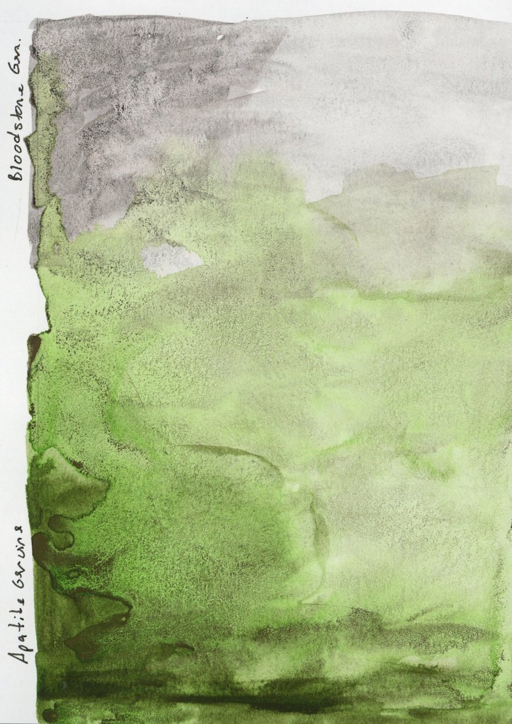
Speaking of the landscape potential, both Bloodstone Genuine and Apatite Genuine granulate beautifully. I’m loving this texture of the genuine pigment paints, where the particles settle unevenly into the paper tooth and create something that looks almost geological. The Apatite Genuine is that luminous grey-green, softer and cooler than anything I could mix. Together on the page they look like a landscape seen from a great distance.

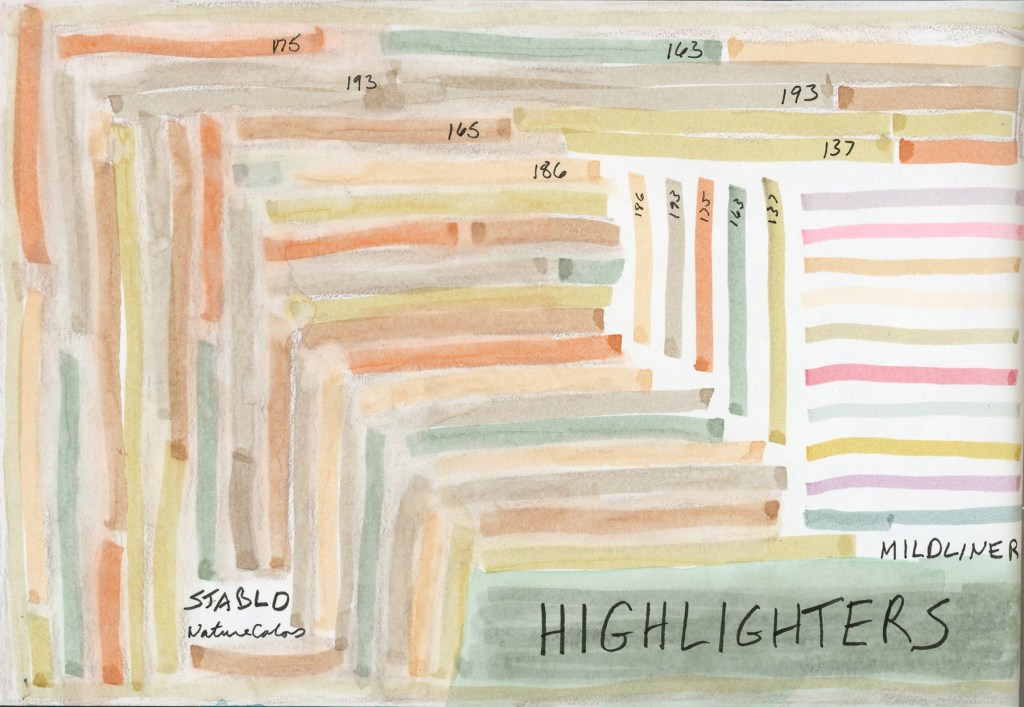
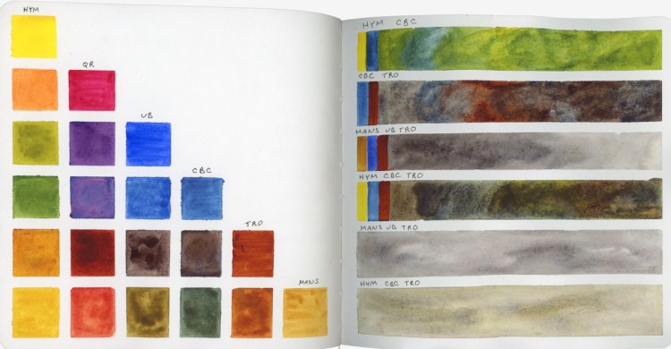
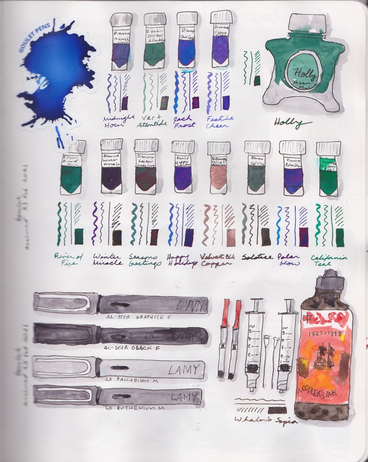
May has the Darks theme for the Patreon group, and the Travel Sketching course is running live. I’m excited for both, and hope to really dive in. I also want to get back to sketching the everyday things. It feels good to have more energy, and more enthusiasm again!

NatureColors Highlighters

April arrived with a delivery from JetPens.

I’d ordered Stabilo NatureColors highlighters and Zebra Mildliners for my planner, but the moment they arrived I wanted to know how they’d behave on Alpha paper. Are they waterproof? Could they work as a sketching underlayer to block in a scene before adding watercolor or ink on top? Swatching each pen was essential, so of course I turned the whole test into a page.

A page of highlighter swatches in a Stillman and Birn Alpha sketchbook. Stabilo NatureColors highlighters form overlapping diagonal stripes spiraling inward on the left in soft earthy tones of Beige, Earth Green, Mud Green, Sienna, Umber, and Warm Grey.. Zebra Mildliner highlighters appear as clean parallel horizontal stripes on the right in Mild Beige, Mild Cool Gray, Mild Cream, Mild Dusty Pink, and Mild Olive. The word HIGHLIGHTERS is lettered in bold across a sage green block at the bottom right.
Stabilo NatureColors and Zebra Mildliner highlighter swatches — Stillman & Birn Alpha, April 2026

NatureColors: Beige, Earth Green, Mud Green, Sienna, Umber, and Warm Grey.
Mildliners Calm Set: Mild Iris, Mild Mimosa Yellow, Mild Mint, Mild Moss Green, and Mild Smoke Red.
Mildliners Natural Set: Mild Beige, Mild Cool Gray, Mild Cream, Mild Dusty Pink, and Mild Olive.

The NatureColors went down in somewhat random lines, that became this squarish shape. The Mildliners in simple parallel lines on the right. I did test them with water, and they are waterproof. The underlayer idea, to make a quick highlighter sketch, then build color on top, is still sitting in the “to try” pile. Documenting a delivery this way is considerably more interesting than sketching each pen! I do love making color blocks. Or in this case, color stripes.

A double page spread in a Stillman and Birn Alpha sketchbook. The left page shows overlapping diagonal highlighter stripes in Stabilo NatureColors forming a spiral composition in soft earthy tones, with a narrow Caran d'Ache Museum Aquarelle pencil swatch strip along the left edge. The right page shows Zebra Mildliner stripes in clean parallels alongside the word HIGHLIGHTERS in bold lettering, with handwritten journaling and weather entries for April 1 through 10, 2026 on the facing page.
Stabilo NatureColors and Zebra Mildliner highlighter swatches with Caran d’Ache Museum Aquarelle — Stillman & Birn Alpha, April 2026

The strip of color in the middle of the page is a Caran d’Ache Museum Aquarelle pencil, Sepia 10%. I’m a little obsessed with Sepia. It fits nicely as a soft, light neutral color. Museum Aquarelles are exceptionally soft and produce beautiful washes, and this one is quietly auditioning for a place in my standard travel kit. I may have to experiment with them more.

The right page of this spread has a little journaling alongside the first ten days of April weather. I’m working on adding a bit more journaling to my sketchbook pages, to hold memories, and capture moments.

Foundations (4th Run)

Happy New Year!

I am so very excited about Foundations this year. As I was doing Buildings a lot of the basics really clicked for me in new ways, and thusly I’m quite excited to do Foundations, and focus on those basics, and allow my new depth of understanding to really be explored and practiced!

This is my fourth run through of Foundations! Hard to believe, isn’t it? I’ve never finished, (I say that a lot, don’t I?) but I always learn a lot. Obviously, I’m absolutely planning to complete everything! Naturally, I’m “behind” already. However, I love it no less!

For the first time, I’m using the same kit as Liz Steel for her class. I am particularly excited to stick with the six color palette and practice my color mixing! I’m pretty good with my color mixing, so this will be fun. I also got a set of Faber Castell Albrecht Durer watercolor pencils for Yule. Thusly, for the first time, I have the full set of colors Liz uses in her kit! Woot!

I’ve experimented with the watercolor brands I had previously, and so far the Albrecht Durer are my favorites for color intensity and ease of use. I’m looking forward to getting a feel for how they work and what I can do with them.

My six colors are all Daniel Smith.

  • Hansa Yellow Medium (HY)
  • Quincridone Rose (QR)
  • Ultramarine Blue (UB)
  • Cerulean Blue Chromium (CBC)
  • Transparent Red Oxide (TRO)
  • Monte Amiate Natural Sienna (MANS)

I did a few color bars, aiming for some shades and watercolor magic, as well as capturing which colors were used in the blend. Greens, browns, and grays are all colors that one benefits from knowing how to mix quickly! These are my Lesson 1 Indoor assignments. I always love sketching art materials, and doing color charts! I think we all do!

A Holiday Palette

I love the idea of seasonal palettes, and color stories. For this holiday season I am inspired by these tones and colors, and I suspect one could do quite a lot with this colored. My watercolors are all Daniel Smith. The gold gouache is Winsor Newton. After all, the holiday season needs some sparkle!

Then I had to figure out what, exactly, is “Interference Gold” by Daniel Smith, and how does it work? Am I supposed to mix it in to paint to make the paint sparkle? Nope. That gives a tiny bit of sheen, but is really not very effective. How does it work if I paint it on top? That was the sparkliest options. It is transparent enough fro the color to come through, but also clearly gold in the light. I tested how these palette colors “lift” alongside a swipe of Interference Gold, as well.

February Pages

New supplies, and mysteries, a lot of color testing Potter’s Pink, and seeking out those lavenders, February brought a mix of sketches.

This is the page that launched the lavender search. I was trying to color match the post card, and didn’t quite get the results I wanted.

I do love to sketch art supplies!

Here is the great search for how to make that lavender I was going for earlier in the month. Then I had to dive into Potter’s Pink and really get a true feel for what it does!

Testing Products

Time for some product tests!

Comparing Pencils

Comparing the colors of Polychromos, Albrecht Durer, and Derwent Inktense to see how they compare and to find matches.

Sketchbox tests

I had a variety of pens and items I’d received via my Sketchbox subscription, so I tested those out.

I was gifted an old set of Arteza brush pens, so here was my color chart and testing of those.

Shades of Grey

Testing various shades of grey, grey brush pens and pencils. I do love the warm greys!

Leaves, Clothes, and a Palette

Continuing on with my older sketchbooks, where I was still experimenting a lot in my pages.

Botanical Line Drawing
Wardrobe Sketches

Since I sew and dye many of my own clothes, sketching my wardrobe is always a favorite for me! That green is not at all accurate for the clothes, so thus begins my eternal quest to match the perfect mixes for greens!

Autumn Palette

I was attempting to create a nice Autumn color palette and was testing some choices. Most of these colors were very new to me when I made this color test page!

Derwent Inktense Pencils

How do Derwent Inktense pencils perform? How do Albrecht Durer Watercolor Pencils compare? Which do I want to use? Nothing like a good color test to find out!

Derwent Watercolor vs Polychromos

Here I am learning the difference between water soluble and not with a small set of Faber-Castell Polychromos Pencils compared with Derwent Watercolor Pencils. I also wanted to see what happens with the watercolor pencils when activated with water.

Comparing Various Pencils

Then I wanted to find out of Polychromos pencils actually are the same shade as their Albrecht Durer Watercolor brethren. Sure enough, they really are! How great is that?! While I was at it, I had some Derwent Studio pencils, so I decided to check those out.

Derwent Inktense Pencils – Warm Colors
Derwent Inktense Pencils – Blues & Greens
Derwent Inktense – Neutrals

Since I had a big set of Inktense, next it was time to make a color chart. I sure do love to make color charts!

So Many Colors!

I am obsessed with color! Now I was bitten with the color bug, and just had to try out all sorts of different pigments and find out what I had in stash, as well as the new ones I bought just for fun. I filled pages with these color tests in my Stillman & Birn Beta.

I learned a lot about these paints during this phase. Then I had to learn how to mix greys. I tried a few recipes I’d read from others, and tested them out myself.