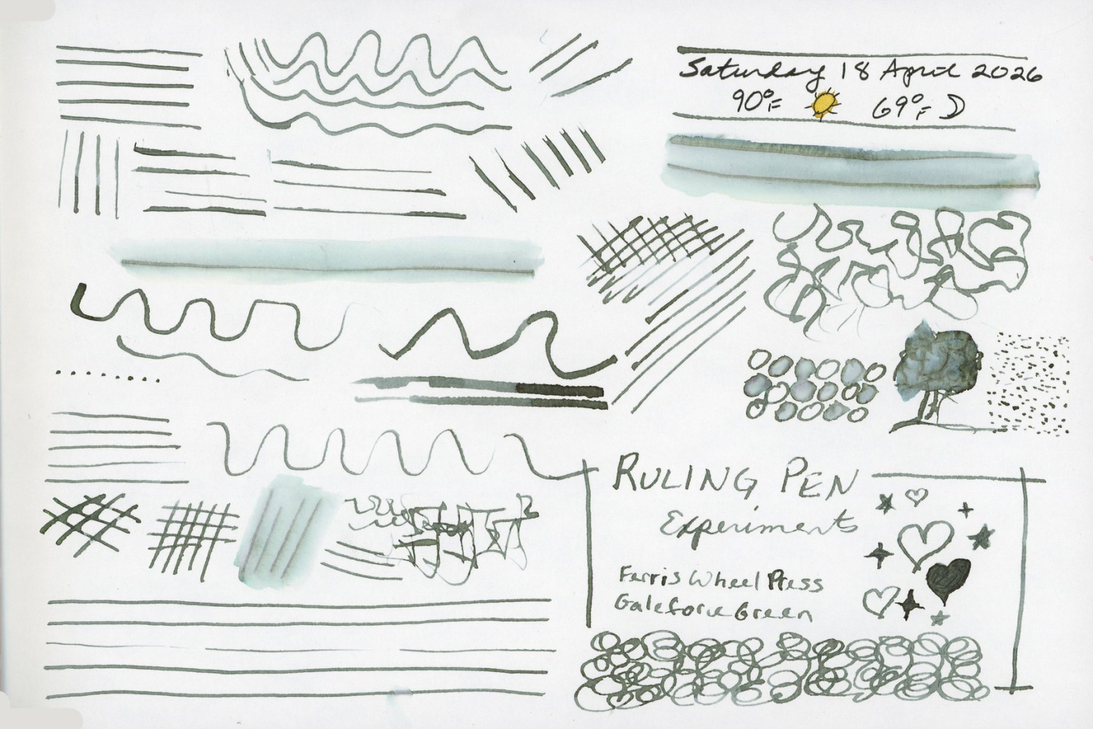
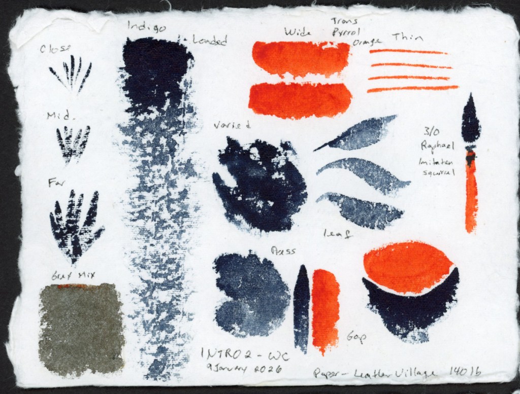
I’ve been thinking about dip pens for travel sketching. But I’d prefer not to get stabbed by my nib when I reach into my bag! So I began to wonder why I haven’t seen artists using a ruling pen. Technically a drafting tool, it holds ink between two adjustable tines and produces a line that can be adjusted for thickness. No stabbing. So I grabbed some from Amazon and decided to experiment. I used three different sizes, though I couldn’t really tell the difference. I’m not sure if these would be better than the Kakimori nib. They seemed very similar in a way. Though the Kakimori nib can get much wider results of you put it sideways. It’s also a lot more expensive than a ruling pen!
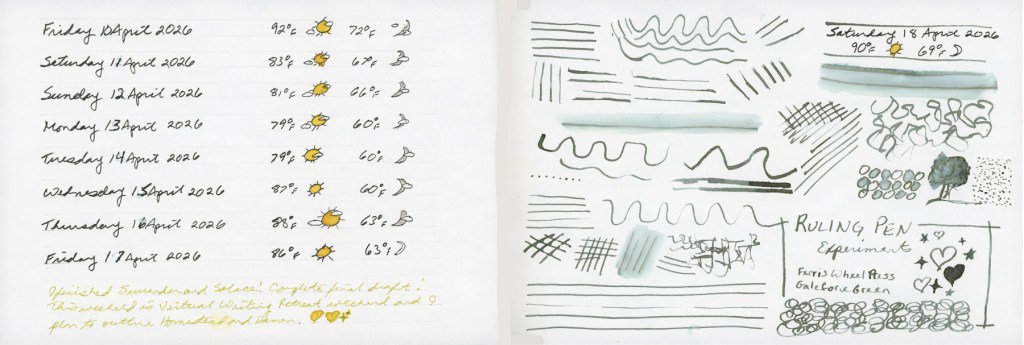
Weather entries April 10–17 and Ruling Pen experiments in Ferris Wheel Press Galeforce Green — Stillman & Birn Alpha, 18 April 2026
The ink is Ferris Wheel Press Galeforce Green, which is one of my favorites. That greyish-green is so lovely and unique. The mark-making page turned into waves, crosshatching, loops, hatching studies, and eventually a tiny tree, to see what actually drawing instead of pen testing might be like. The verdict is still open, but the ruling pen is worth exploring further. Especially with ink this good. And I have so, so, so many inks!
Before I put my handmade paper ink swooshes into the portfolio book, I wanted to use the backs of the cards. Can’t have blank paper! What’s the fun in that? Plus the chromatography aspect is so much fun, and what would happen if I had more paper to work with for a larger separation potential?
So I did what had to be done. I made a mess. A beautiful, atmospheric, very satisfying mess. I even had water and ink dripping off the page!
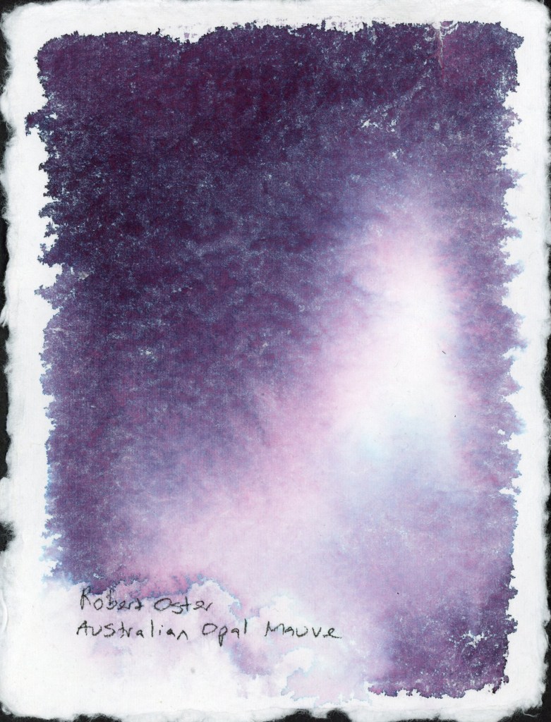
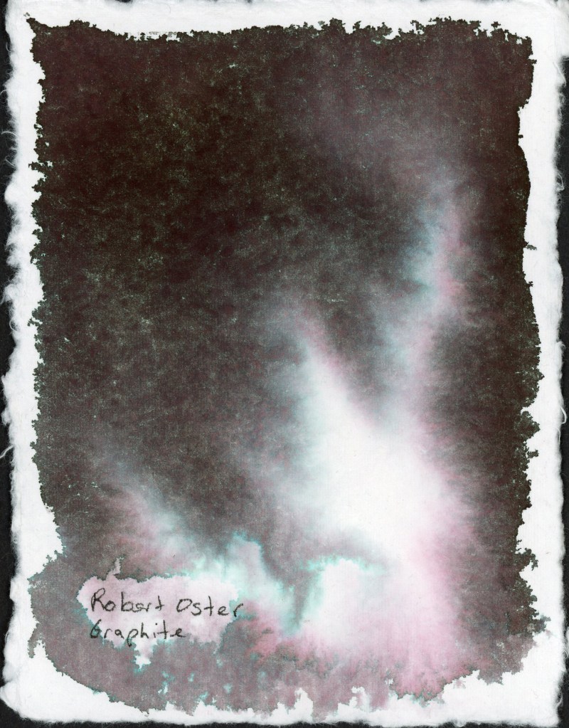
Robert Oster Australian Opal Mauve on Leather Village Handmade Cotton Watercolor PaperRobert Oster Graphite on Leather Village Handmade Cotton Watercolor Paper.
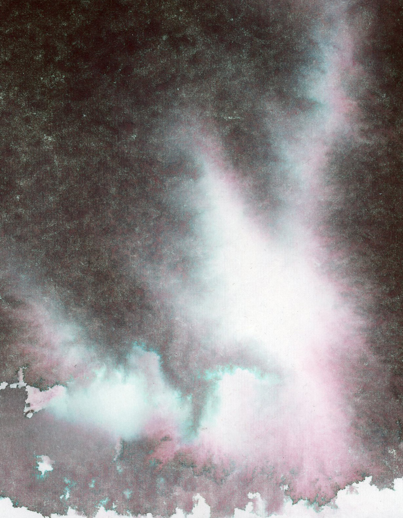
Robert Oster Graphite was one of my favorites from the chromatography lesson I posted about recently. That deep complex near-black opens up into the most beautiful teal and rose separation in the lighter areas. It looks like a nebula. I’m a little bit in love with it.
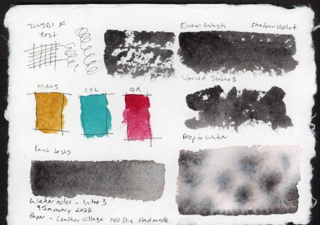
Then I wanted to see what this particular handmade paper does with some of my granulating watercolors. Granulating watercolors behave very differently depending on the paper. how much separation the pigments have causing that elusive “watercolor magic.” This handmade paper is cotton, and it does a very good job of having very even washes once it is dry. So watercolor magic? Not so much.
The granulation is visible, but the paper holds the pigments fairly close together rather than letting them really spread and separate. It’s a quieter, more even look. Perfect when you want smooth washes.
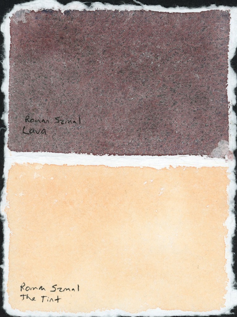
Roman Szmal Lava and The Tint — handmade paper test
I’m loving that Roman Szmal Lava in particular. I’m looking forward to using it a lot more. That dark reddish color, and it has lovely granulation on different paper.
I tested The Tint alongside it, to sample how pink versus yellow is it on this paper. A nice striking pair on the page.
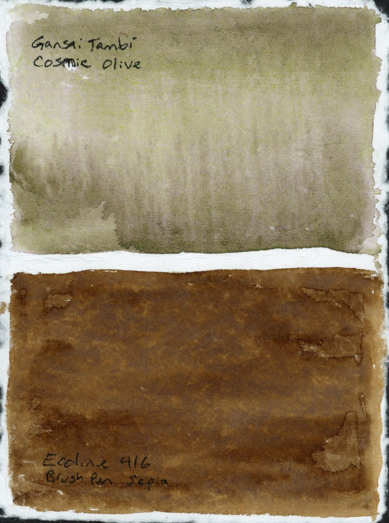
Gansai Tambi Cosmic Olive and Ecoline 416 Brush Pen Sepia — handmade paper test
The Cosmic Olive did not separate nearly as much as it does on other papers, and the Ecoline 416 Sepia marker turned out surprising flat. I expected more blooming when I added water.
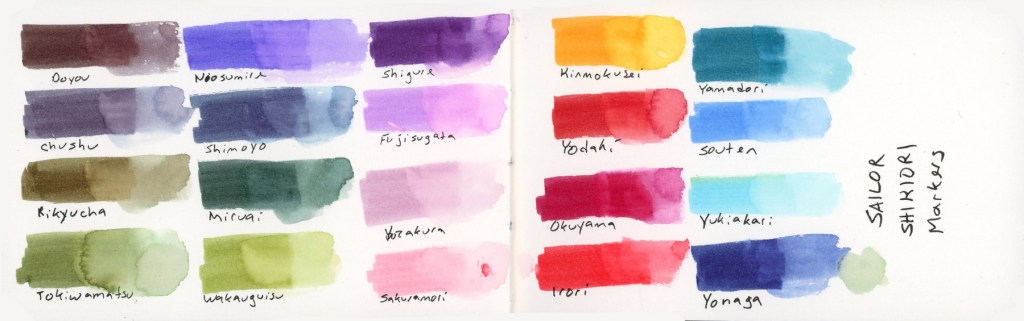
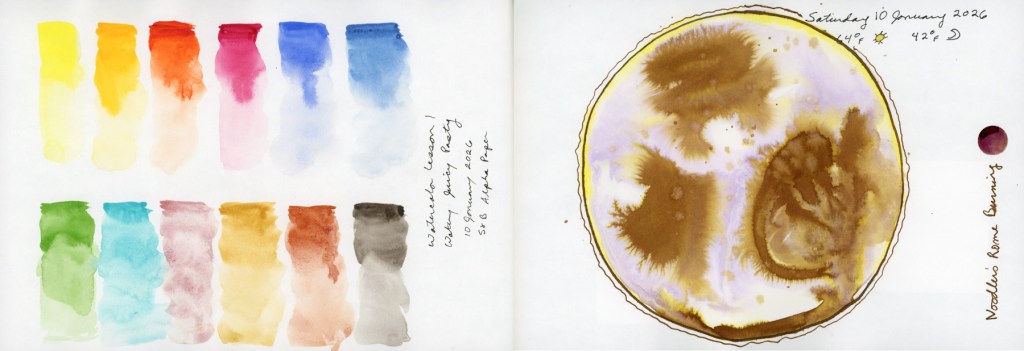
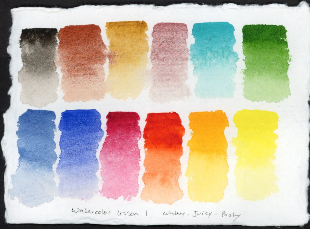
In the food sketchbook, the Delta, I’ve been using the Shikiori markers to sketch my food, so it was time to do a full color chart. Beautiful colors and they react strongly to water. I love that.
Sailor Shikiori Markers — full color swatch reference
The Shikiori markers do something I find absolutely lovely, add water and they bloom outward in that soft, spreading way that reminds me of how Faber-Castell watercolor markers behave. Very satisfying, very painterly. It’s easy to make a lovely watery mess, and I adore that. The Delta paper the results were clean and bright, and holds up well to markers and lots of water.
The Shikiori line takes its name from 四季織 — shikiori — meaning “weaving of the four seasons,” and the color names live up to that. They’re all Japanese seasonal and nature words, and I think they’re worth listing out properly because they’re just so beautiful:
Doyou — midsummer · Chushu — mid-autumn · Rikyucha — tea-brown, named for the tea master Sen no Rikyū · Tokiwamatsu — evergreen pine · Neosumire — sleeping violet · Shimoyo — frosty night · Miruai — meeting of seaweed · Wakauguisu — young bush warbler · Shigure — autumn rain shower · Fujisugata — shape of Mount Fuji · Yozakura — night cherry blossoms · Sakuramori — cherry blossom grove · Kinmokusei — osmanthus flower · Yodaki— night waterfall · Okuyama — deep mountain · Irori — hearth fire · Yamadori — copper pheasant · Souten — blue sky · Yukiakari — snow light · Yonaga — long night
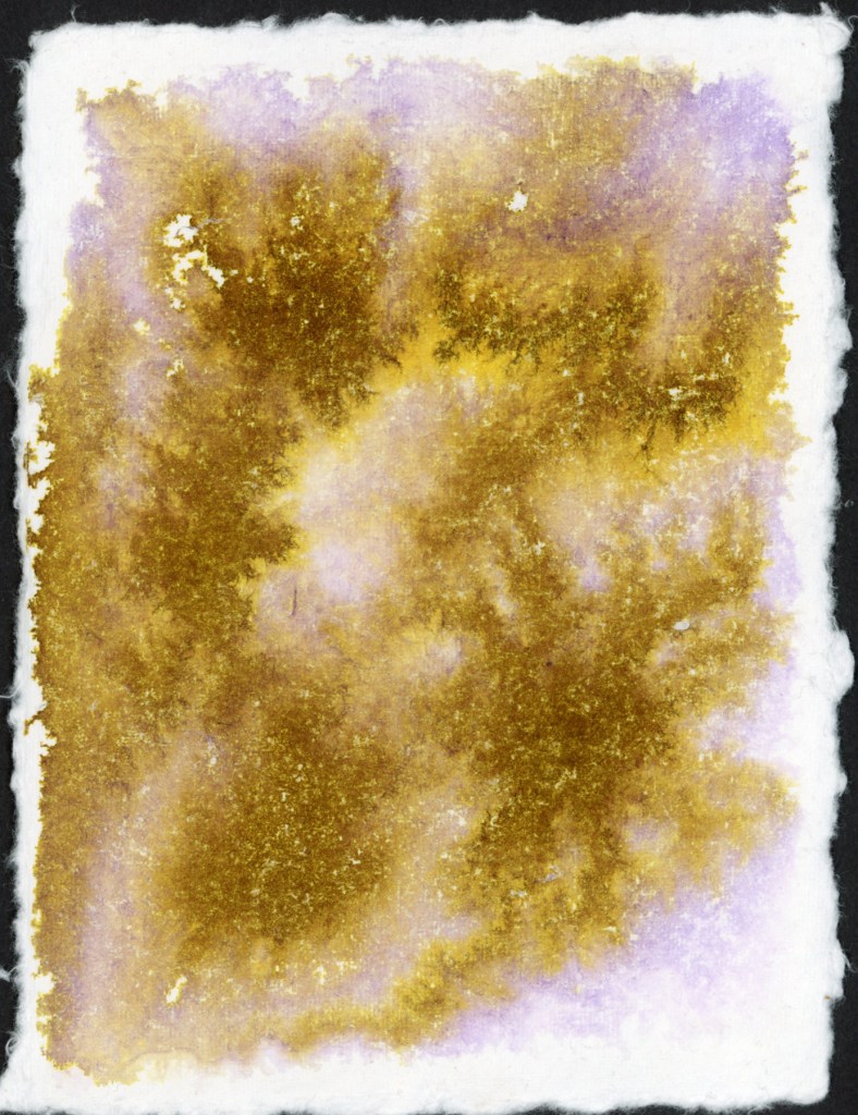
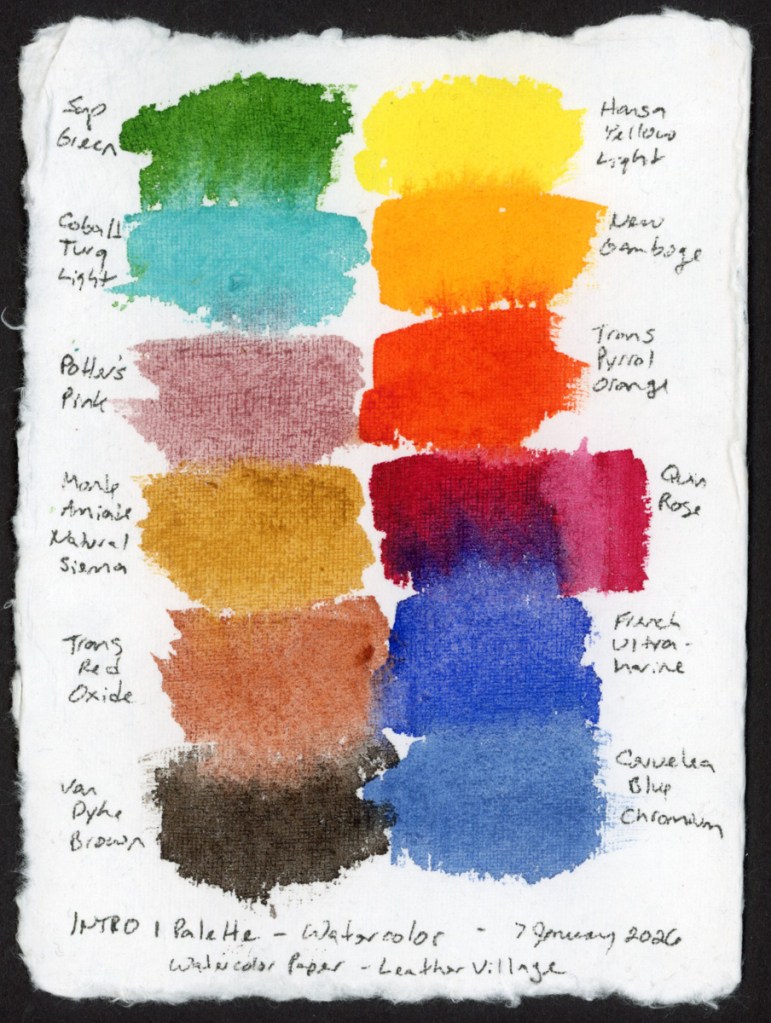
Back in December when my Invent came I had been searching online and found Nick Stewart, who has swatched every Diamine Inkvent calendar for years. I was captivated by his method. In January I dabbled in his Udemy course, Fountain Pen Ink art. I also bought some of the inks for that course that really seemed to separate chromatically in breathtaking, and beautiful ways. I’d taken a toe dip into the course, with the few inks I had, and the handmade cotton watercolor I’d gotten for Christmas. The paper is from Leather Village — 400gsm, rough textured, with those beautiful deckle edges. A simple test, with just a couple inks, to see what the paper and the ink would do together. The method to get the most chromatography from the ink is to lay down a lot of water, then drop in the ink.
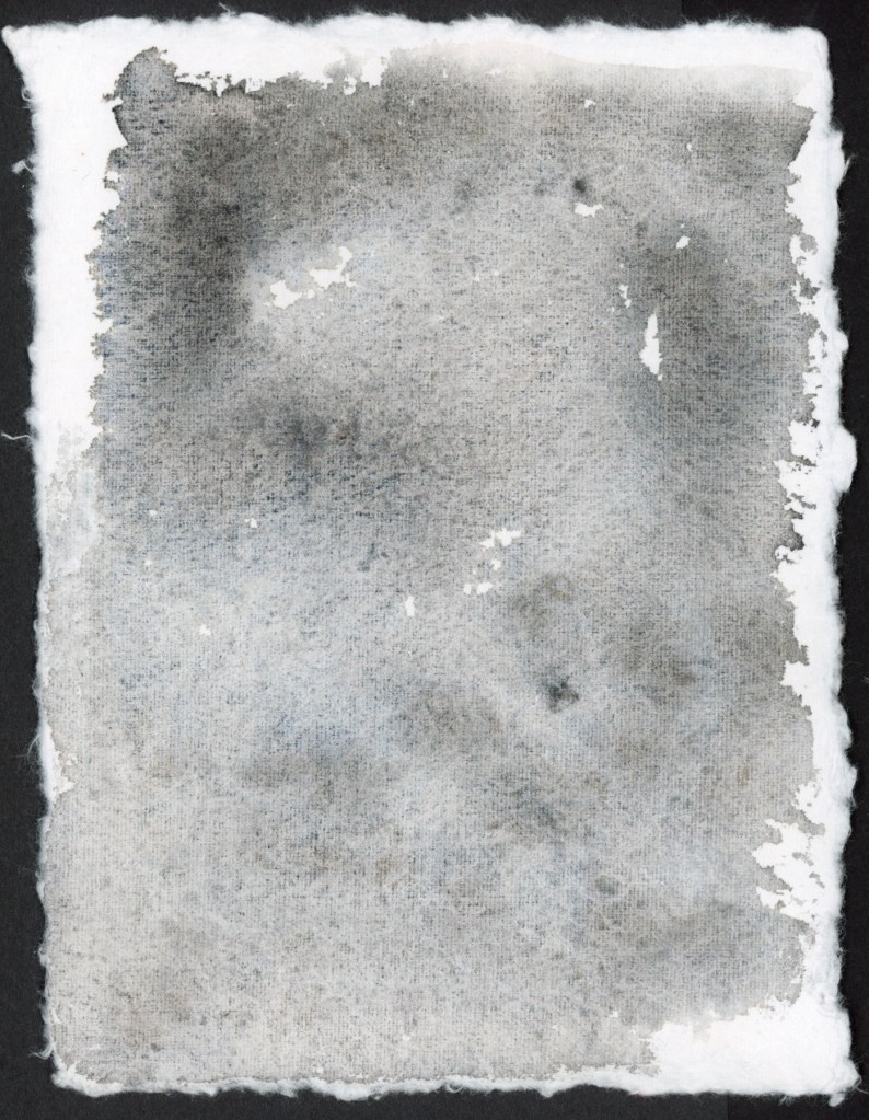
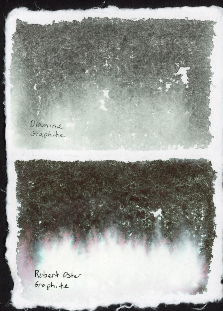
Noodler’s Rome Burning on Leather Village Handmade Cotton Watercolor PaperDiamine Graphite on Leather Village Handmade Cotton Watercolor PaperDiamine Graphite and Robert Oster Graphite on Leather Village Handmade Cotton Watercolor Paper
The two graphites looked very different! Diamine Graphite is a soft, cool grey-blue. Robert Oster Graphite is dramatically darker, and look at that pink and teal fringe bleeding out at the bottom.That chromatography is lovely, with those hidden colors separating out as the water carries them across the paper.
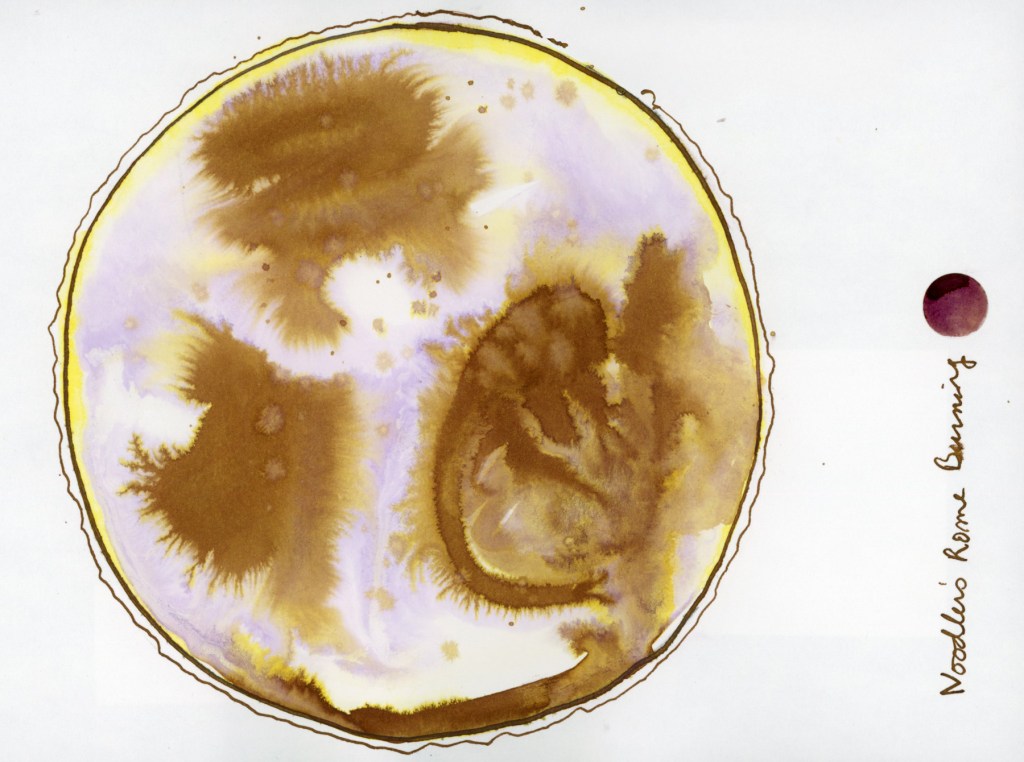
Noodler’s Rome Burning on Stillman & Birn Alpha — Chromatic World
I had also done this fun exercise, the Chromatic World in my Stillman and Birn Alpha sketchbook. You may have seen this in my “Early January 2026” post. You can really see how much Noodler’s Rome Burning in particular explodes when it hits water. That is one ink. One ink, water, and a circle. The gold, the ochre, the warm brown, the ghost of lavender — all of it was hiding inside Noodler’s Rome Burning, waiting for water to pull it apart. I find this genuinely magical every time.
When I was playing with ink in my recent food sketches, I got inspired to return to this course and do more extensive ink and paper tests. . Nick’s course uses mostly Bockingford watercolor paper, which I couldn’t source here, so I used what I have handy, and of course had to use different papers to see how they affect the results! I used the Stillman & Birn Delta, Strathmore Watercolor Paper 400 Series Cold Press 300gsm, and Arches Rough Watercolor Paper 300gsm.
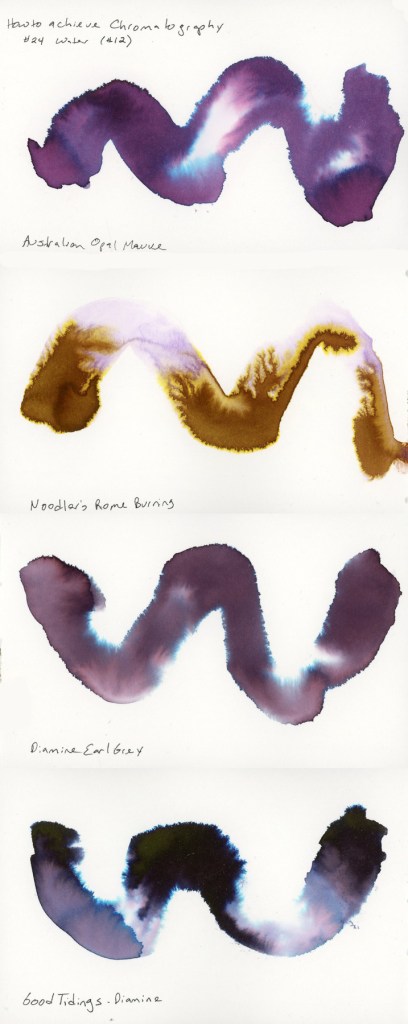
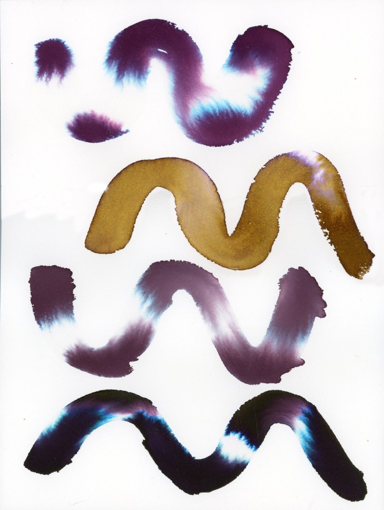
The first exercise is the Swatch Painting. You lay a wave or swoosh down with a big round brush loaded with lots of water. Then drop in the ink with a smaller round brush and watch it travel. How much it separates seems very different based on the paper. I used four inks: Robert Oster Australian Opal Mauve, Noodler’s Rome Burning, Diamine Earl Grey, and Diamine Good Tidings, though the Good Tidings only made it into the Delta book.
Robert Oster Australian Opal Mauve, Noodler’s Rome Burning, Diamine Earl Grey, and Diamine Good Tidings on Stillman & Birn Delta
The Delta paper gave me lovely fluid results. It actually holds up to these wet ink washes even better than with watercolor! Australian Opal Mauve separates beautifully, pulling apart into pink, violet, and that surprising electric blue is deeply satisfying. Rome Burning, which is brown as a writing ink, separates to this warm and golden ochre and lavender. Earl Grey is quieter, more restrained, a muted purple that bleeds to soft blue at the edges. The Good Tidings is the dramatic one of the bunch, near-black with that explosive teal bloom.
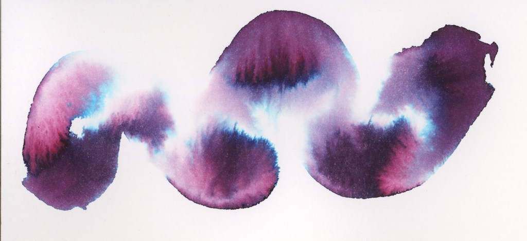
Look at the Australian Opal Mauve on the Strathmore paper!
Robert Oster Australian Opal Mauve on Strathmore Watercolor Paper
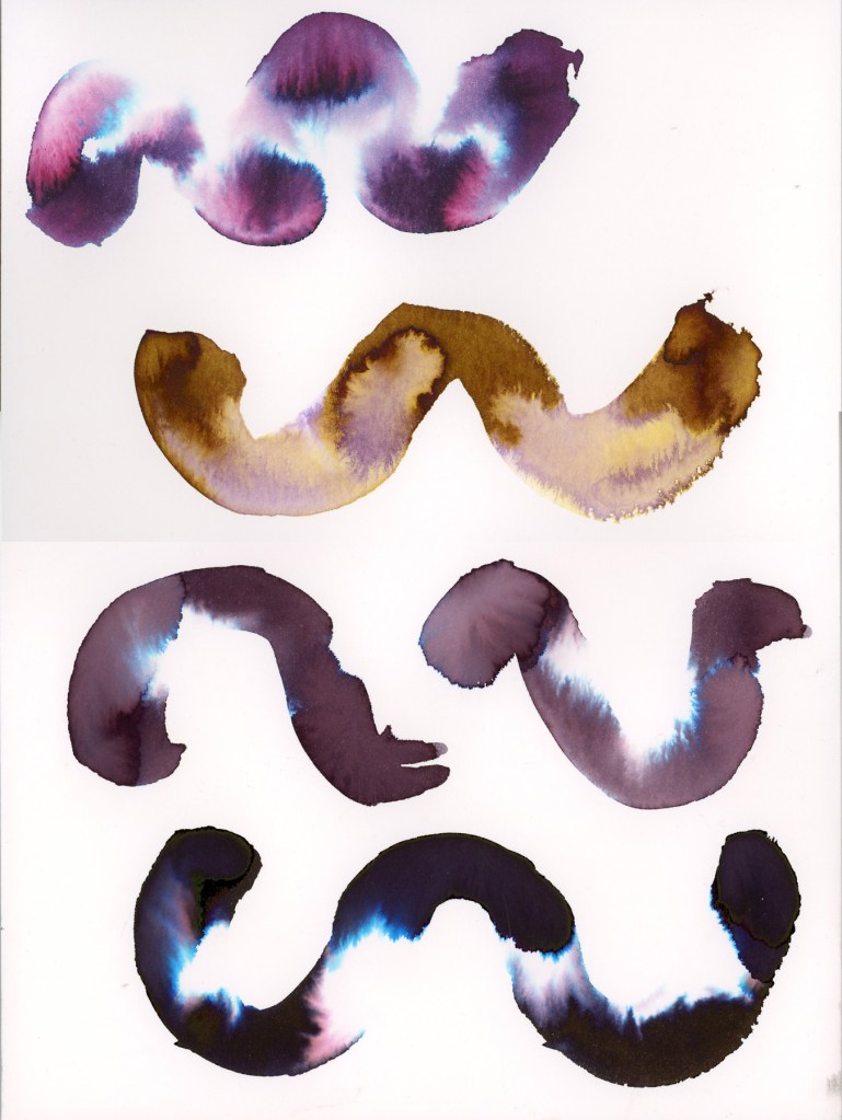
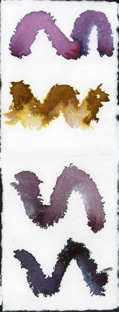
The four inks are sampled on both Strathmore Watercolor paper, and Arches Rough Watercolor paper.
Robert Oster Australian Opal Mauve
Noodler’s Rome Burning
Diamine Earl Grey
Robert Oster Graphite
Robert Oster Australian Opal Mauve, Noodler’s Rome Burning, Diamine Earl Grey, and Robert Oster Graphite on Strathmore Watercolor PaperRobert Oster Australian Opal Mauve, Noodler’s Rome Burning, Diamine Earl Grey, and Robert Oster Graphite on Arches Rough Watercolor Paper
The Arches Rough gives a noticeably different quality — the texture of the paper surface shows through the ink in a way that the smoother Strathmore doesn’t.
Robert Oster Australian Opal Mauve, Noodler’s Rome Burning, Diamine Earl Grey, and Robert Oster Graphite on Leather Village Handmade Cotton Watercolor Paper
The handmade Leather Village paper is a completely different experience. The rough fibrous surface grabs the ink differently, and the results are wilder and less predictable. Rome Burning in particular practically explodes on this surface. That ink has the best diffusion by far.
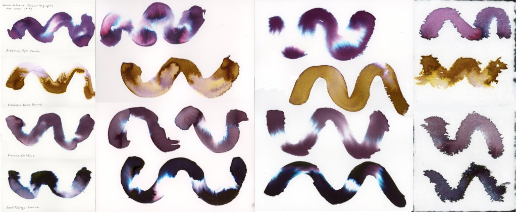
I tested the same four inks across all four papers, so you can really see how much the surface affects the results. Here they are side by side.
hromatography swatch comparison — Robert Oster Australian Opal Mauve, Noodler’s Rome Burning, Diamine Earl Grey, and Diamine Good Tidings / Robert Oster Graphite on Stillman & Birn Delta, Strathmore Watercolor Paper, Arches Rough Watercolor Paper, and Leather Village Handmade Cotton Watercolor Paper
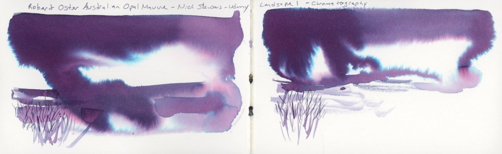
The final two exercises move into landscape territory, applying the chromatography technique to create actual pictures. Landscape One uses a large wet mass of ink for sky and atmosphere, with simple marks below suggesting ground and grasses. I used Australian Opal Mauve for both versions on the double spread. Nick Stewart Uses Robert Oster Barossa Grape, but I couldn’t find that ink.
Robert Oster Australian Opal Mauve on Stillman & Birn Delta — Landscape 1
There’s something about that ink in landscape form that feels almost otherworldly — those blue and pink separations read as light breaking through storm clouds. The little reed marks scratched into the wet wash at the bottom anchor it just enough to feel like a place. I had more dripping than I expected, but that is just practice. Wouldn’t this be great for snowy landscapes?
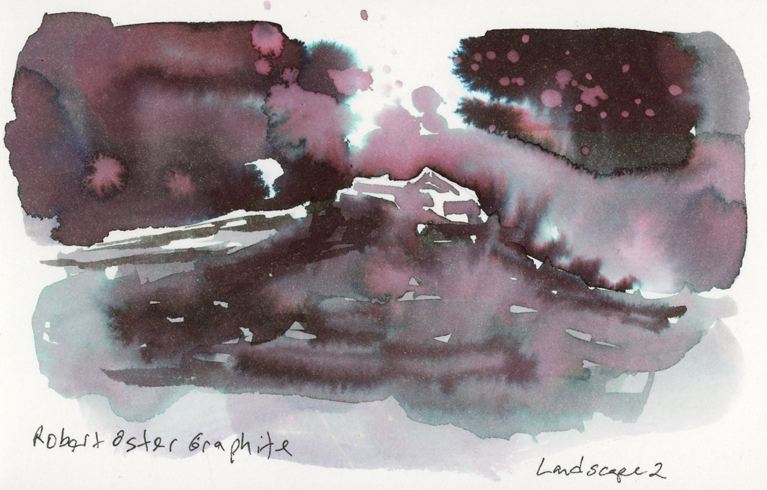
Landscape Two pushes further, adding more structure and a sense of depth. I used Robert Oster Graphite for this one, and it might be my favorite thing I made in this whole session.
Robert Oster Graphite on Stillman & Birn Delta — Landscape 2
The way Robert Oster Graphite separates in a wet wash — those deep plums, the pink spatter, the teal at the edges — makes a landscape that feels moody and atmospheric without any real effort to make it so. The ink does the work. That little glimpse of a structure in the negative space at the center, the misty ground below. If you blot the ink while it’s still wet, you get even more of that pink underlayer.
This Robert Oster Graphite is certainly the star player in this chromatography method! Honorable mention goes to Rome Burning, for it definitely separates well.
The first days of January. Still working with inks, especially those that explode so beautifully when dropped into water, like Noodler’s Rome Burning. This is an exercise from Nick Stewart’s Udemy course on Fountain Pen Ink.
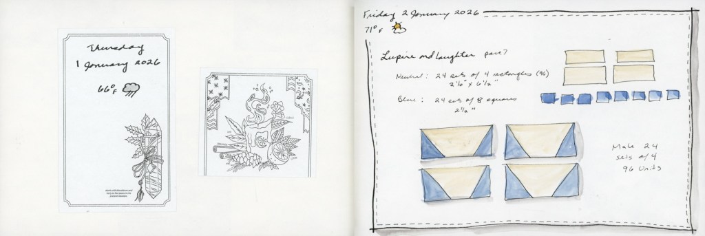
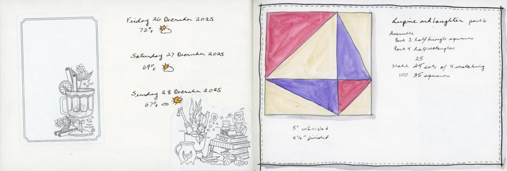
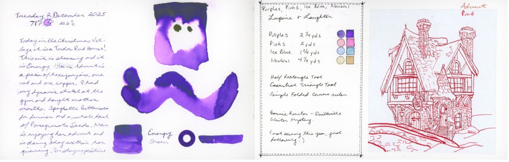
Lupine and Laughter continues each Friday and I had more inks to test.
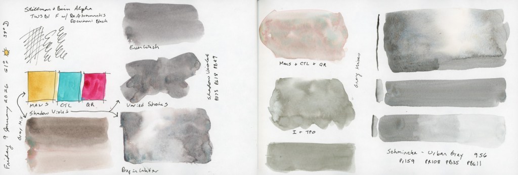
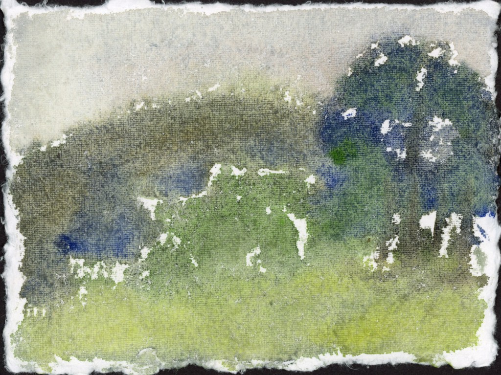
The new live round of the watercolor course started, and I did some of exercises in my S&B Alpha sketchbook. I also did the exercises on a handmade watercolor paper that is turning out very interesting to work with.
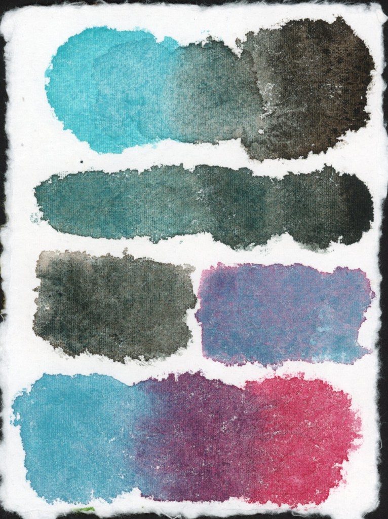
I am always fascinated by mixing greys and how varied they can be with different colors.
A collage page, with printed stickers, for the end of the Lupine and Laughter series.
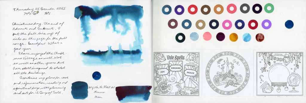
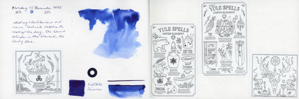
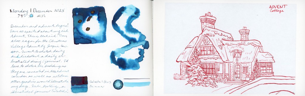
I have big hopes for the month. I’ve been deep in grief and hopefully returning to the page with sketching my advent will be just the thing. (Or, at least that was the plan. Execution was far less than perfect.)
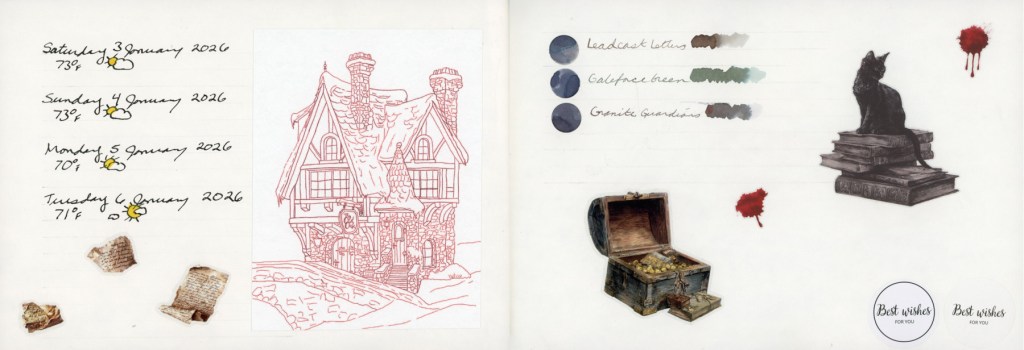
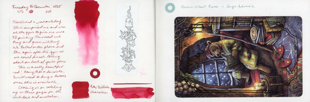
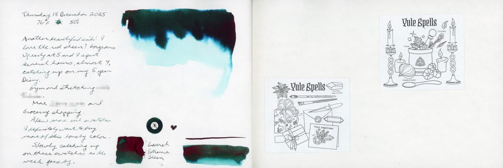
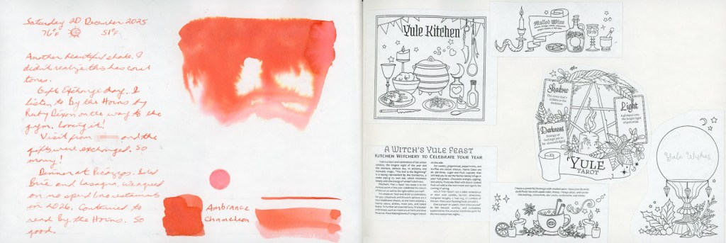
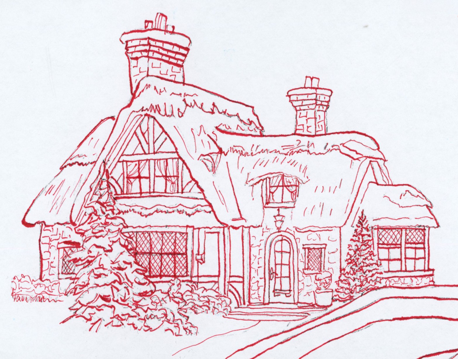
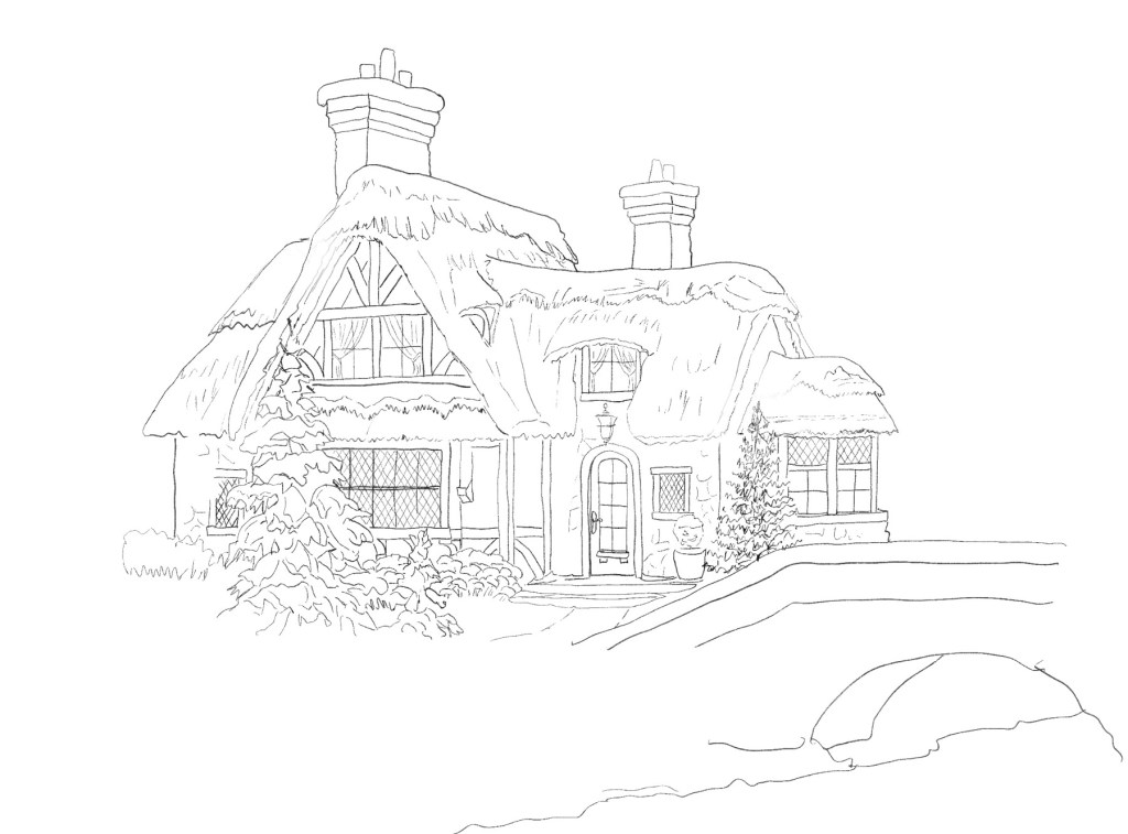
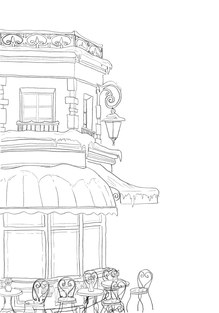
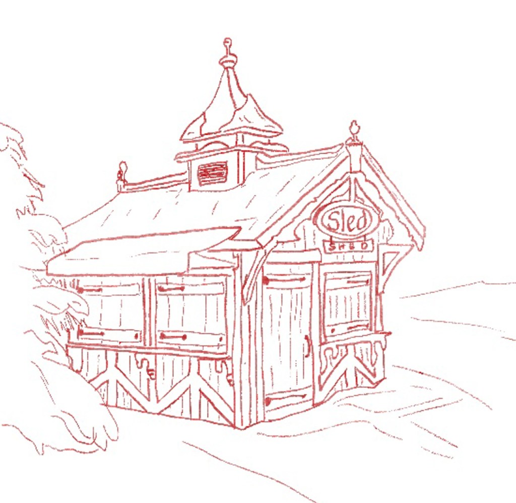
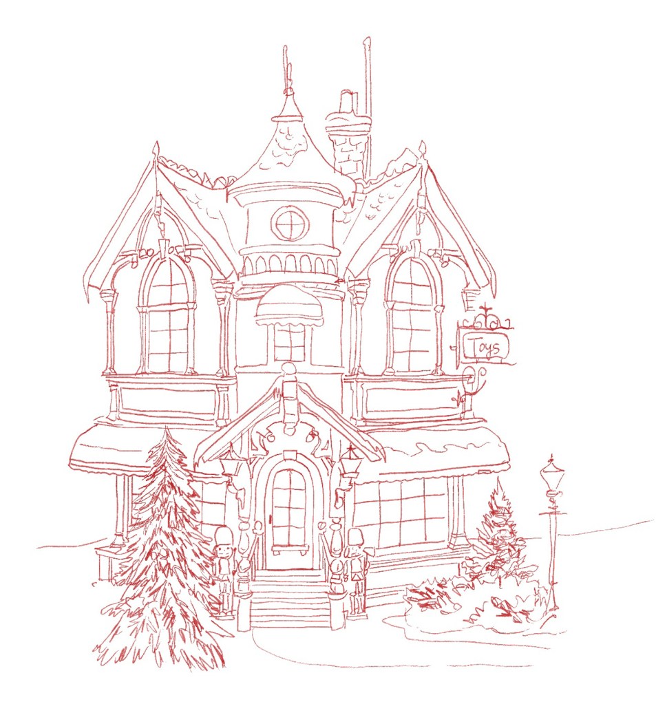
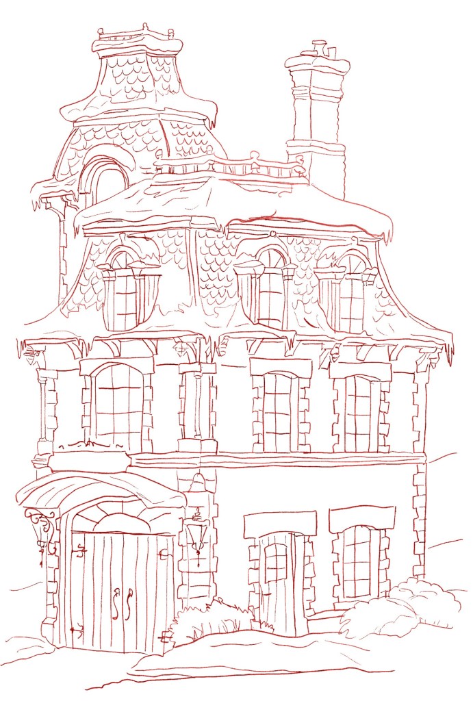
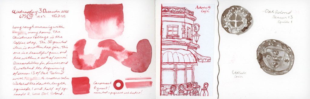
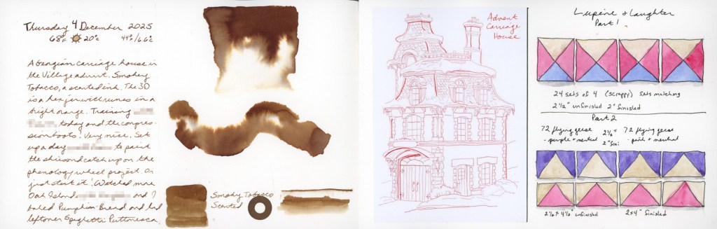
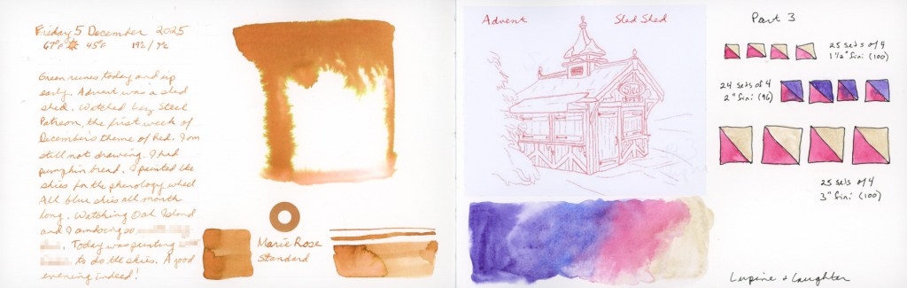
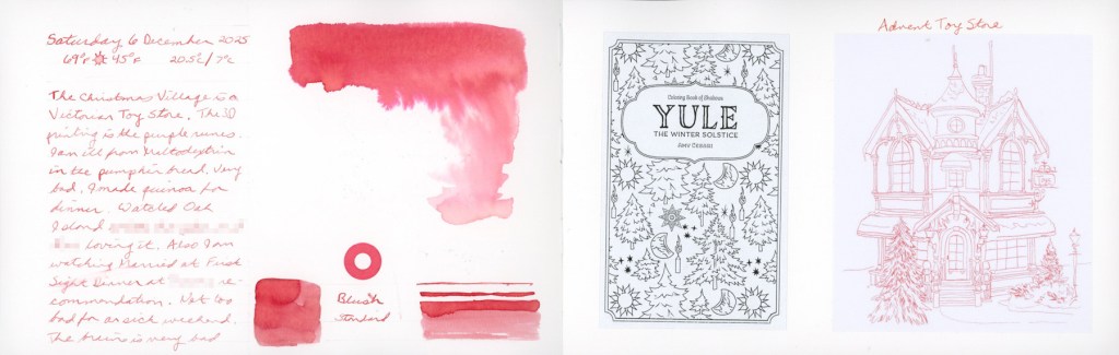
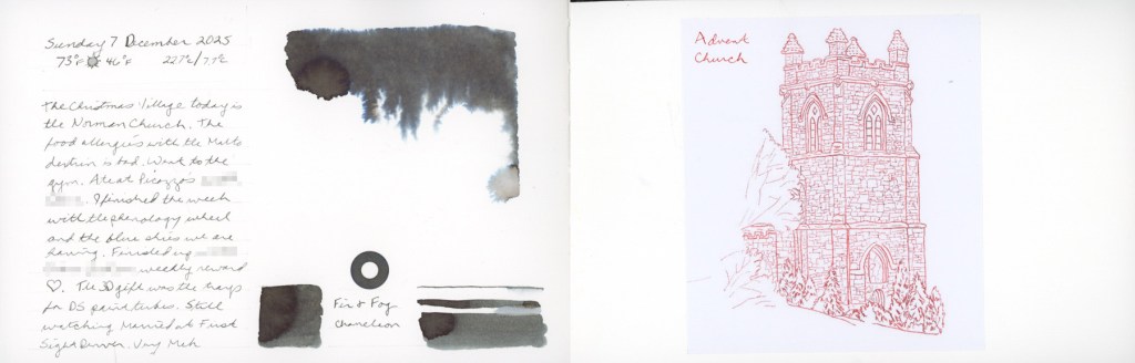
Every year I love Diamine Inkvent and this year is no different. Each day gets the ink swatch. I wanted to sketch each building in the Jacquie Lawson Christmas Village this year, but insecurity got the better of me. I did trace the first week of buildings, however. In red, as the Liz Steel Patreon theme this month is Red.
This was traced in Procreate, then printed. I inked it over with J Herbin 1670 Hematite Rouge and a dip pen with a crow quill.
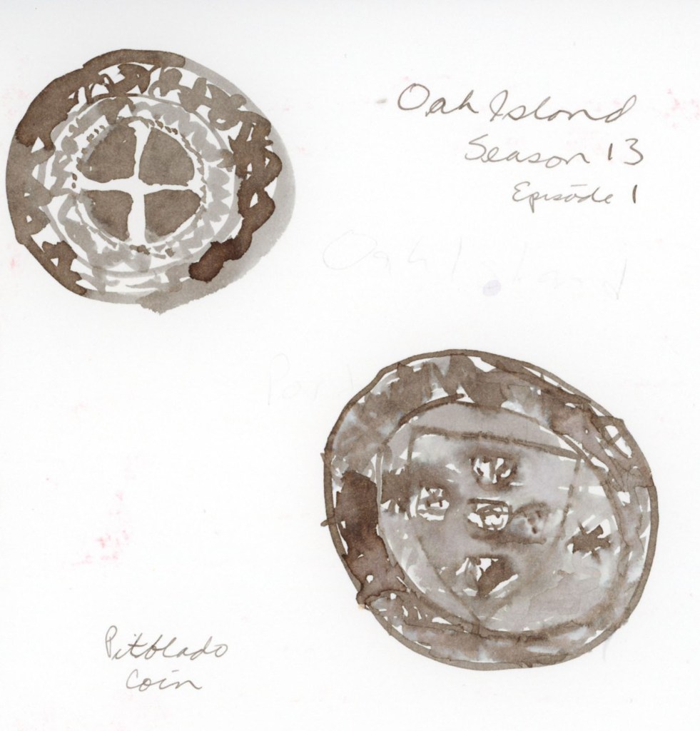
The other procreate traced Christmas village buildings, and the Portuguese coin I sketched in ink, using Ferris Wheel Press ink Leadcast Letters.
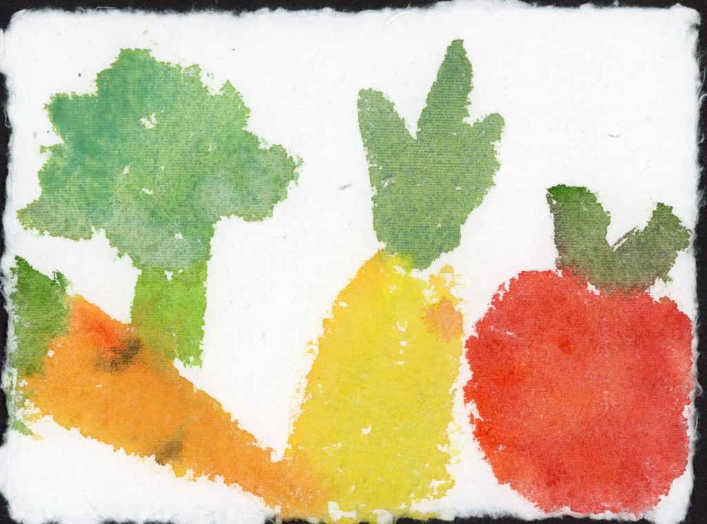
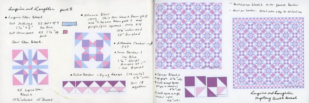
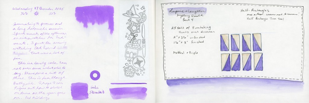
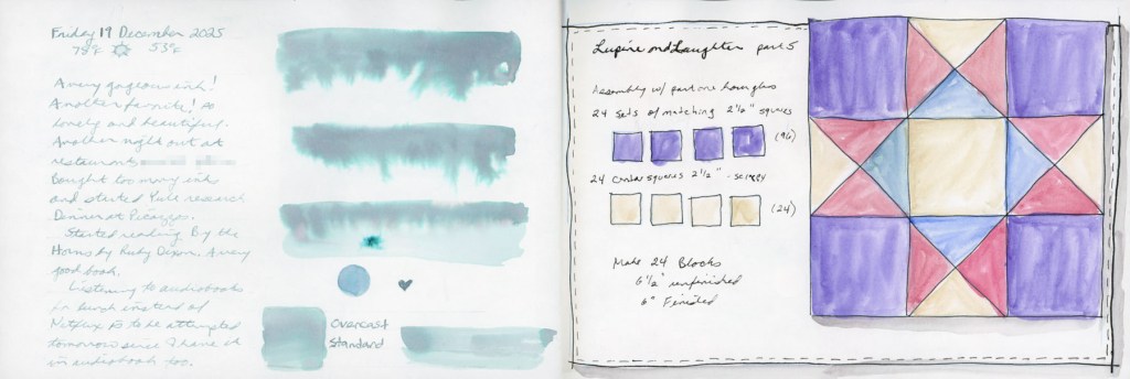
I am not quilting this year, as I do not have access to my sewing area, but each year I still like to follow the Bonnie Hunter Winter Mystery Quilt, even if I’m not sewing it. This is my second of what I’m calling my December Daily captures. These quilting clues release weekly, but they are a significant part of my December traditions each year for many years now.
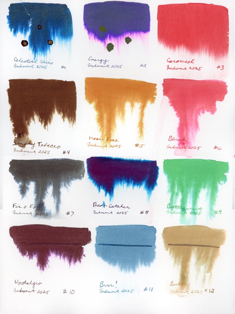
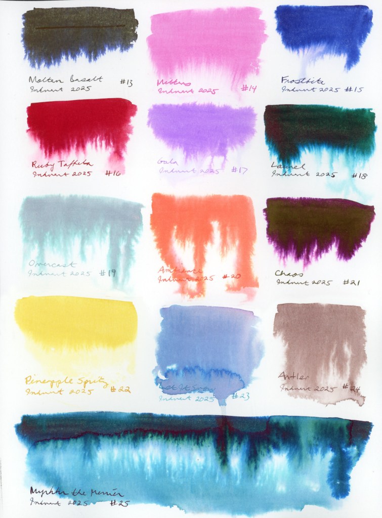
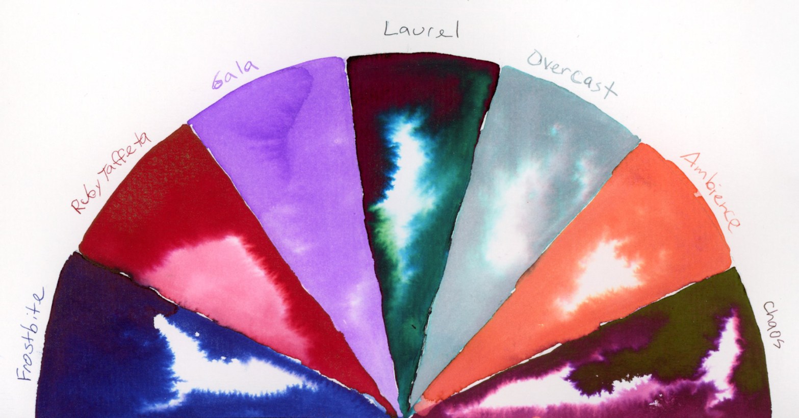
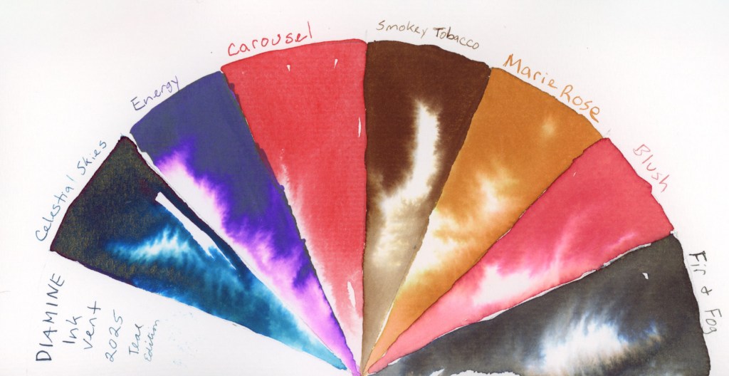
The December tradition I’m loving the most this is The Diamine Inkvent for 2025. This year is the Teal Edition and the inks so far are:
Celestial Skies – Shimmer – A teal with a gold and red shimmer.
Energy – A purple with a green sheen.
Carousel – Waterproof pigment red!
Smoky Tobacco – Walnut brown, scented.
Marie Rose – An amber with a green chroma.
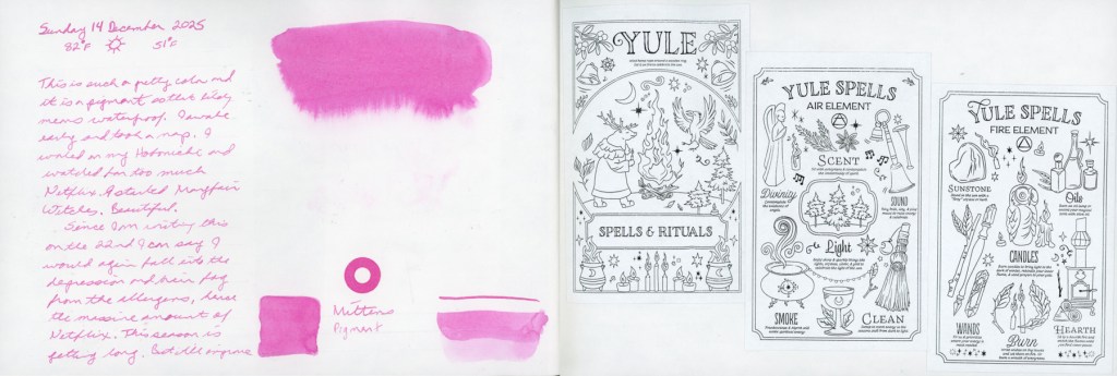
Blush – A lovely warm pink.
Fir and Fog – Greyish Green. Love this ink! It looks more green in person than it scanned.