Everyday Sketching 2025 Week 18

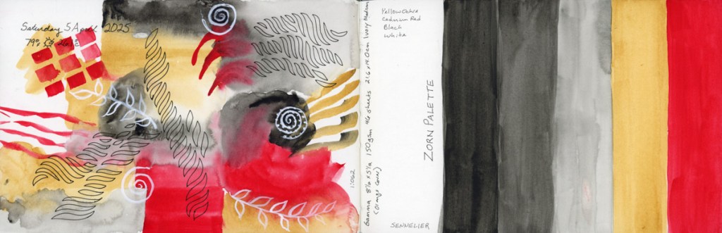
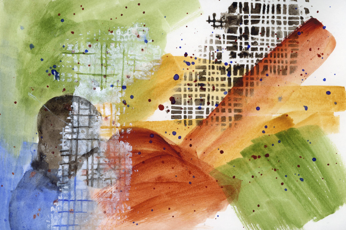
Trying to catch-up on blank pages in the sketchbook, while still struggling to sketch. So I’ve used some stencils and abstracts to get going again.

Simple color blocks representing the environment and colors around me for those days.

Here I used a stencil with watercolor paint. This works surprisingly well. I would have expected more bleeding and runs under the stencil since I’m using a wet media, but I really like the results. A flower pattern stencil to represent Easter. I faded into a gentler background wash with the idea of writing a text block there, but I didn’t get to it. I used Hansa Yellow Light, Hansa Yellow Medium, Quin Gold, Quin Rose, and Shadow Violet.

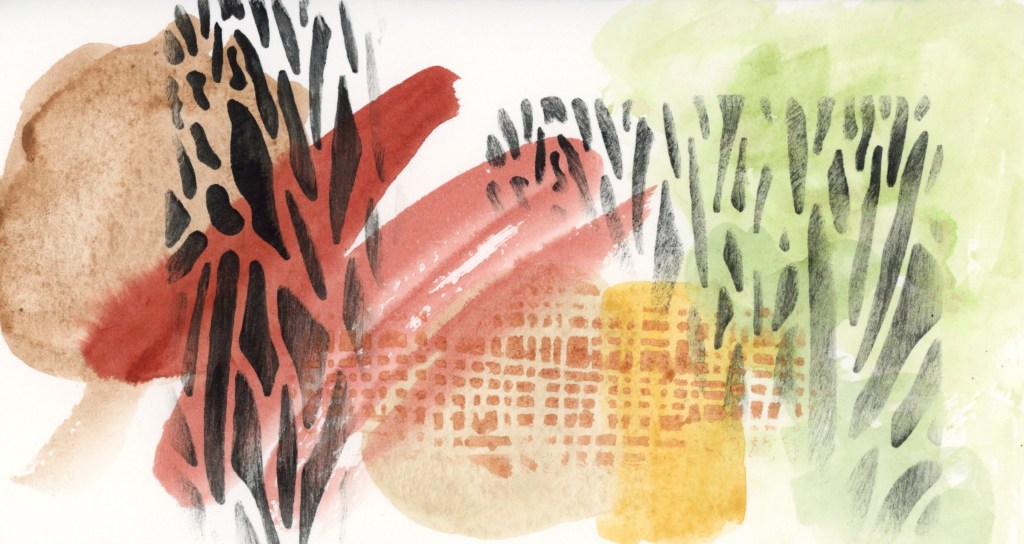
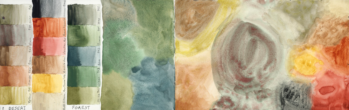
A pure abstract using the desert color palette. Daniel Smith’s Earth: Desert to Mountains. With the addition of Serpentine Green, because I live for greens. Add a blue, and I think this palette would be a perfect limited color palette for painting the desert.

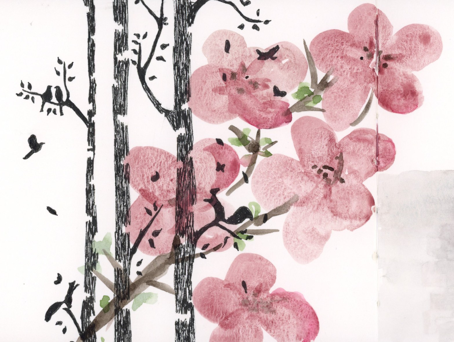
Feeling the spring vibes for May, so I took a stencil and inked it black, then painted these loose, free-hand blossoms over it. I used Potter’s Pink, Van Dyke Brown, and Serpentine Green.

The sun was glowing on these bushes, so I had to try to capture that spring green light. Serpentine Green, and Apatite Genuine. I painted the foliage and bushes with a rigger 4 brush. I haven’t used riggers like this before, and I enjoyed it. The cinderblock wall was done with 1/2″ flat brush, trying to get the texture without overwhelming this paint only, direct watercolor sketch.

I still have the blank spaces for the Montezuma’s Well and Montezuma’s Castle to fill, but this week I filled all other blank areas. Here are the full pages:

Everyday Sketching 2025 Week 14

This week I finished Volume 19 of my sketchbook, and started Volume 20. I wrote a bit on these pages in the past few entries.

A lot of color explorations in these pages this week. I did not have much time to sketch, what with the leaking pipes in the kitchen (now repaired!) I find that color charts are great for soothing a stressed out brain!

Sketching ruins, and foreshortening, and an exploration into creating abstracts, which I’ve already written about, was very fun.

I am going to be traveling with family later in April, so I wanted to test the two desert paint palettes I have to see if I should bring them with me. One is the Schmincke Supergranulating Desert set. The other is Daniel Smith’s Earth Desert to Mountain. Then I decided to test the Schmincke Supergranulating Forest set, as I’ll also be among the pine trees. I haven’t decided what I’ll bring, but I certainly am beginning to feel the vibes here!

Since I had out the Supergranulating box, I noticed I hadn’t filled in the swatch card they provided with it, so naturally I had to begin swatching the rest of the colors! So I did another Haze page, and then Shire.

I had some paint left over from the shire tests, so I filled a page with that. I also wanted to put the Alex Boon recommended set of 24 as a reference in this Delta book. I could also test the different paper, which does seem to be surprisingly different for the pencils over the Alpha/Gamma paper.

I may add text to these pages, or line sketches. Though I may not have the time, in which case, I’ll just opt to move on and leave the pages as is, capturing the busy-ness in slightly unfinished pages.

Abstracts

I’ve been working toward increasingly abstract options for my color chart examples. I have read a couple books, and been inspired by a couple artists. So I dove in to attempting a fully abstract, color exploration abstracts. The first was done because I really liked the colors I used for the Tuzigoot sketches, so I wanted to explore the same color combination in an abstract. I really love this one.

I also tried a plastic stencil with watercolor. The first effort, which is the Van Dyke Brown, worked great. I used a dry brush. The second effort was the white Acryla Gouache, which bled more because my brush wasn’t dry enough. I think I can get these stencils to work pretty well, though. I like how they look.

My second abstract attempt was using the Zorn color palette. Anders Zorn, a Swedish painter born in 1860, is attributed with this very limited color palette because he excelled at it. He worked with oil paints, using Yellow, Red, Black, and White.

I used a set of Sennelier paints: Bright Red (NR), Yellow Ochre (PY43), and Ivory Black (PBk9). The white doodles painted on top are done with Acryla Gouache.

Though I did not attempt any color mixing for these abstracts, from my research the Zorn palette is amazing at skin tones, and I’m definitely curious to try that. I do wonder what red pigment he actually used, however. One source said he used yellow ochre, ivory black, vermilion and lead white. Modern substitutions recommended are Cadmium Red Light, and Titanium White. I may have to explore the Zorn palette more fully.

Here are the full page spreads with these abstracts. I painted three values of the Ivory Black, plus the Yellow Ochre, and Bright Red.

I will definitely be doing more of these abstracts.