Reviewing 2025

They say a year in review should be a highlight reel—a collection of my best sketches, crispest lines, and most vibrant colors. But when I look back at my stacks of sketchbooks from the last twelve months, I don’t see a gallery of masterpieces.

I see a graveyard of the unfinished.

I see where life went sideways and I simply stopped. I see half-finished classes left and never touched again. I see “failed” sketches where my lines just wouldn’t click. For a while, this felt like a lack of discipline. I felt like I was falling behind.

But as I sit down to write this, I realize something important: You can’t have a “failed” sketch unless you actually sat down to draw. Every incomplete page is proof that I showed up. Every “bad” drawing was a risk I was brave enough to take. This year wasn’t about the finish line; it was about the messy, frustrating, and ultimately beautiful process of staying in the game. Even when there were long gaps where all I did was write down the date and the weather.

Today, I’m celebrating the journey. Let’s look back at my year of incompletes—and why they might be the most important things I’ve ever drawn. I showed up anyway, in a year where life rather kicked my ass with illness, accidents, and a major death in the family. So many losses, so maybe not finishing most of the classes I started, isn’t such a bad thing. Maybe it isn’t failure at all.

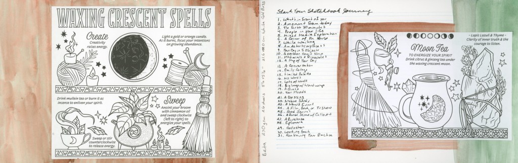
The year started strong for me, I was feeling good and actually accomplishing the lessons in Sketching Now Foundations

I had a lot of fun with 100 People One Week and successfully achieved that. 

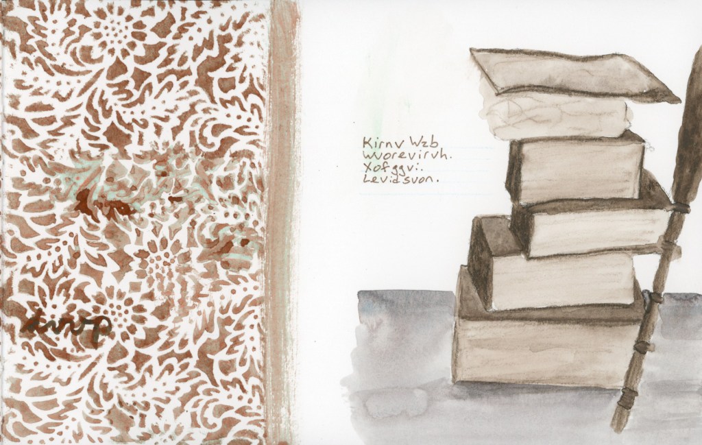
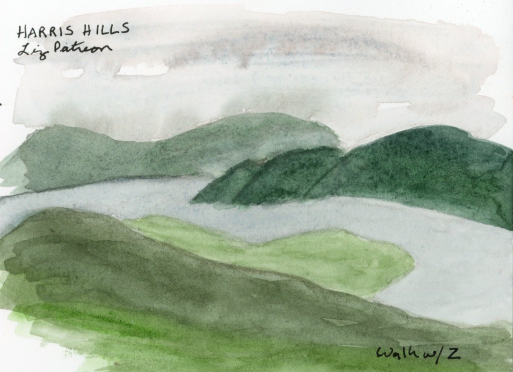
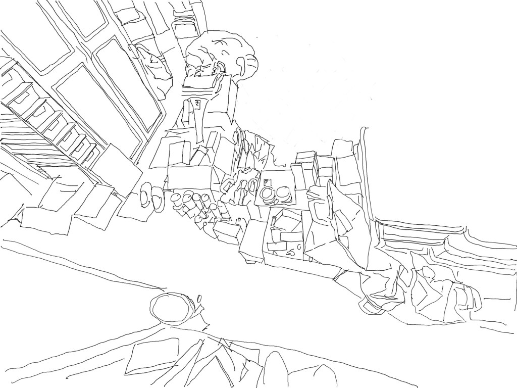
I was ready to go strong and do Sketching Now Travel Sketching during my family trip to Mund’s Park, but this is when things began to go awry. I did however, do some travel sketches even if I didn’t manage to participate in the class itself. Admittedly most of these sketches I did once I got home. 

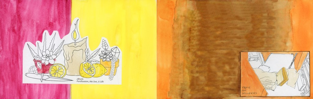
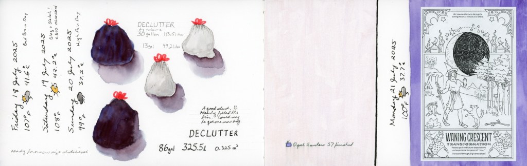
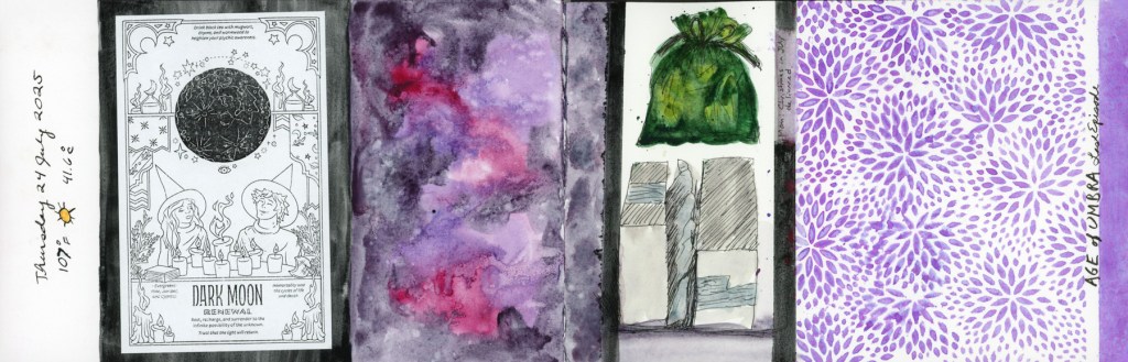
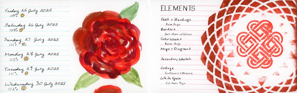
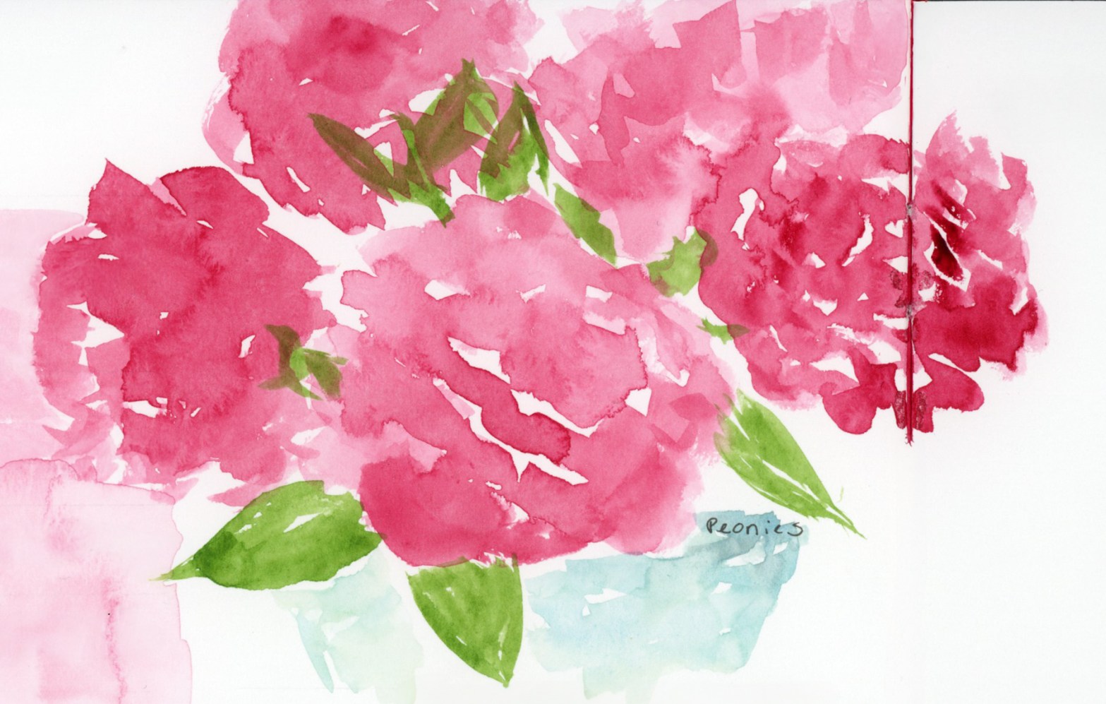
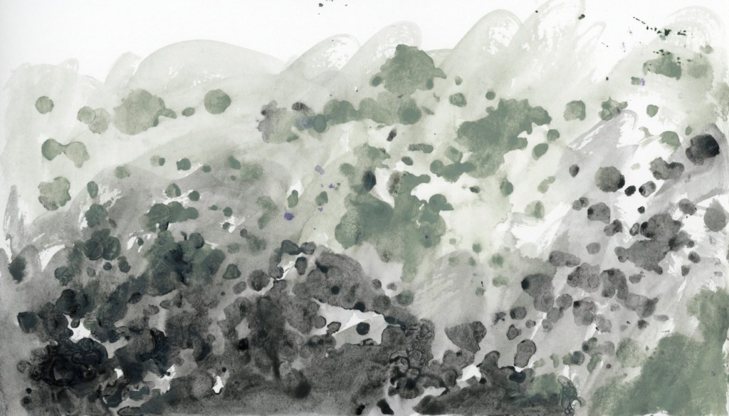
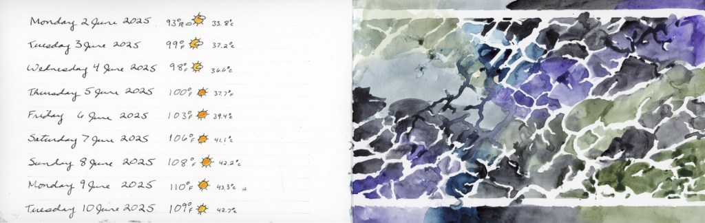
The summer was a mix of color palettes, a few attempts at sketches, amid the missed days. 

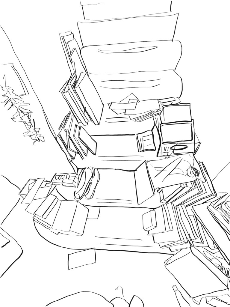
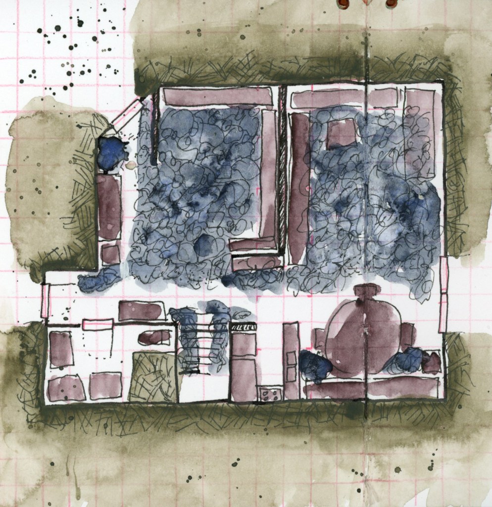
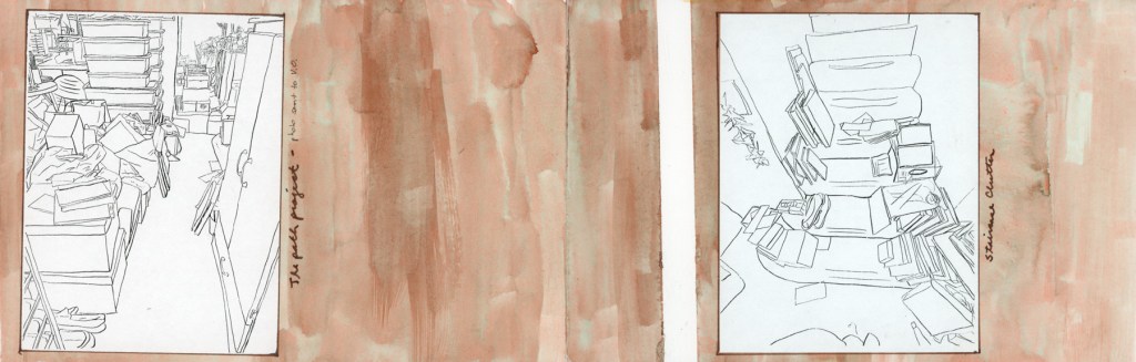
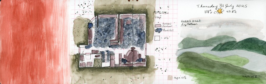
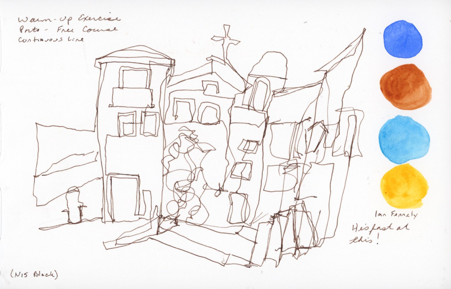
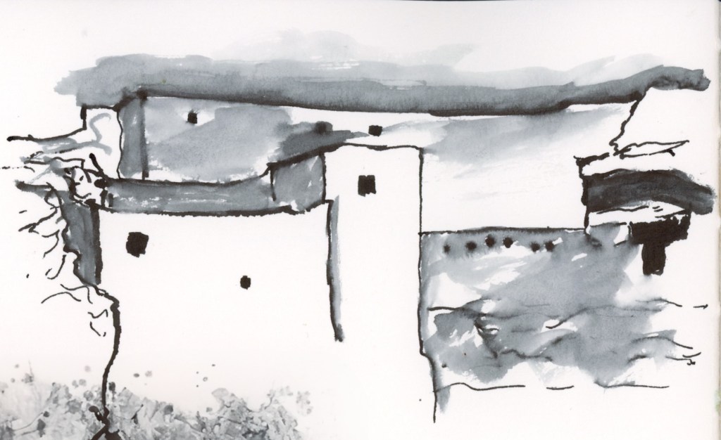
Autumn fell completely apart. I had hoped to sketch buildings during my family vacation, and thusly sketch during my trip and do the Sketching Now Buildings course, but devastating disaster struck.

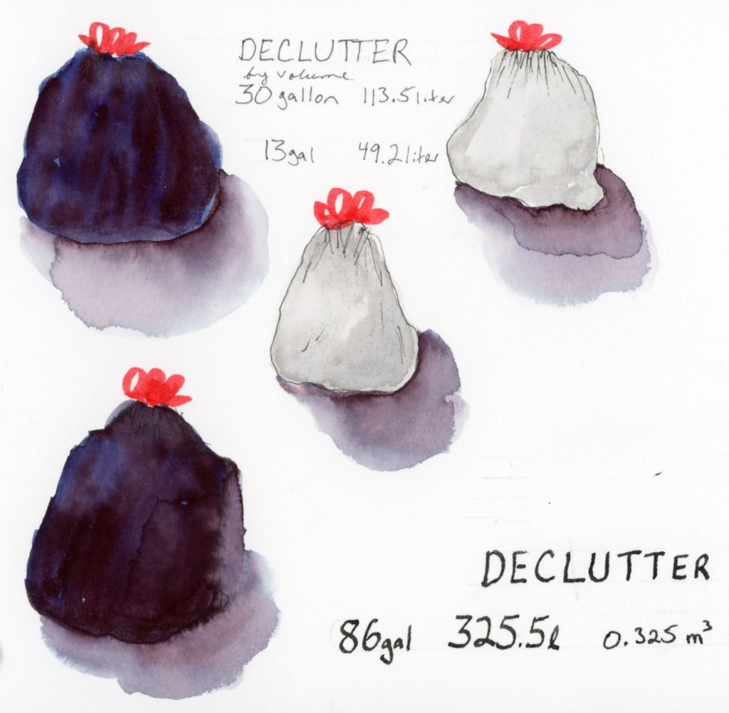
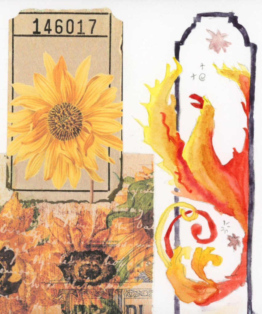
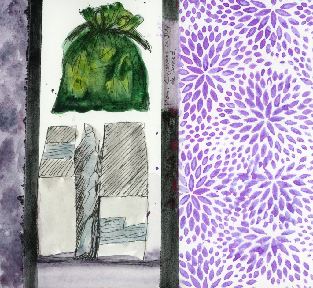
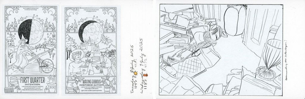
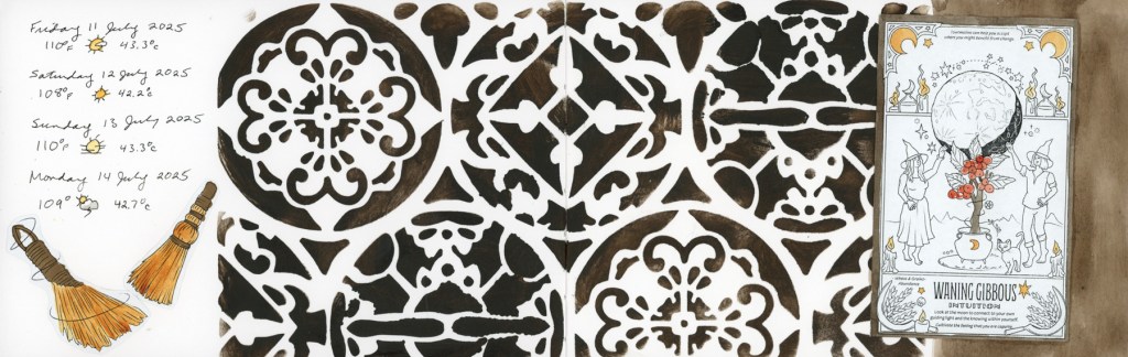
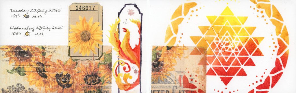
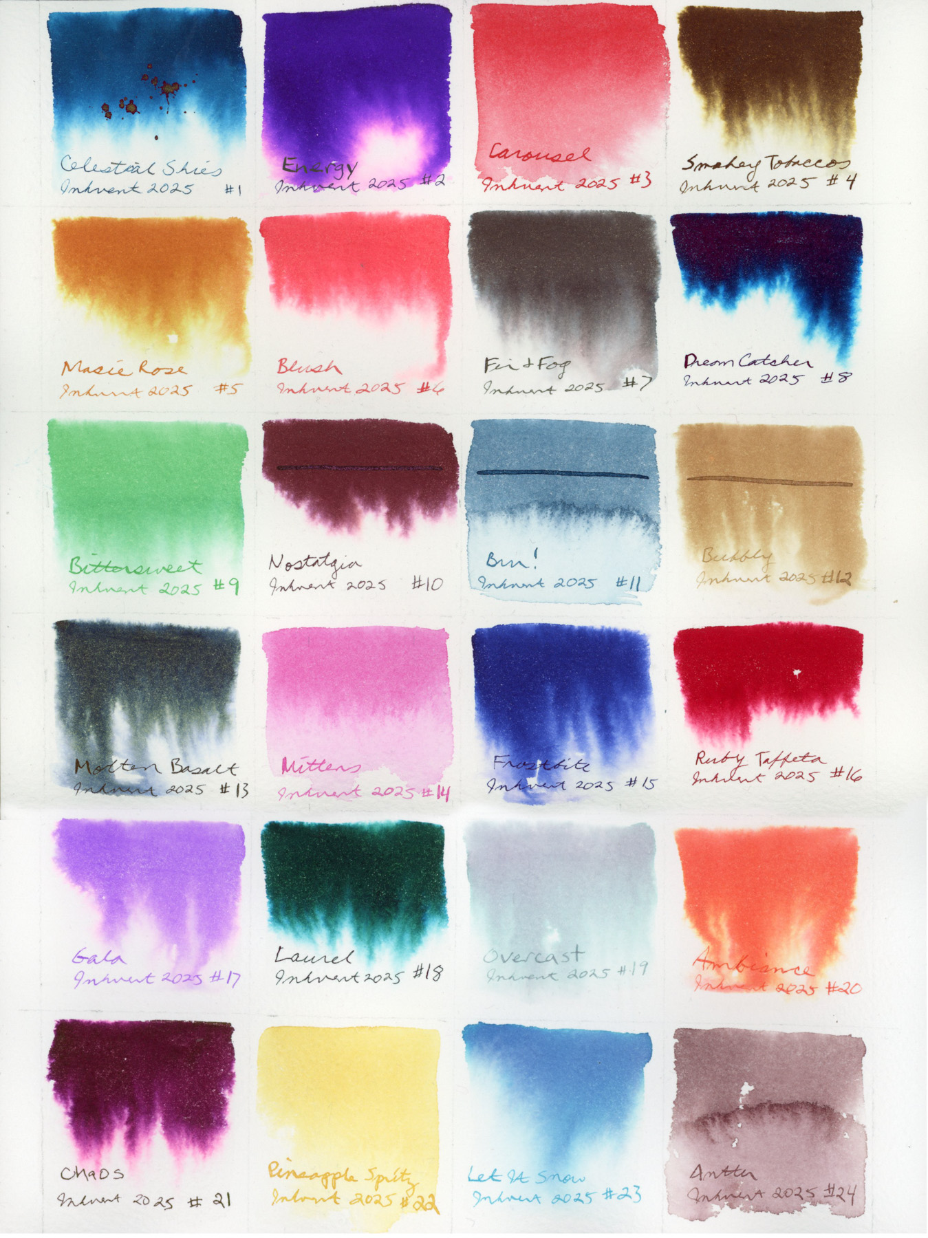
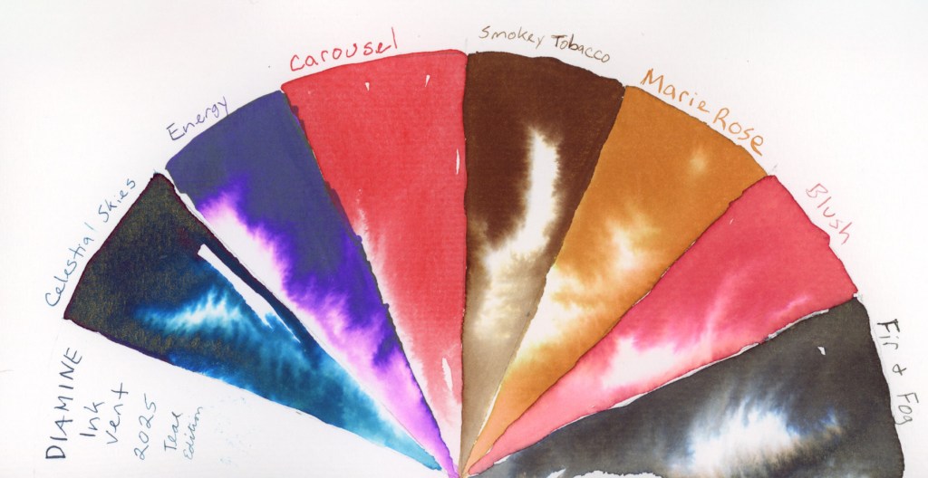
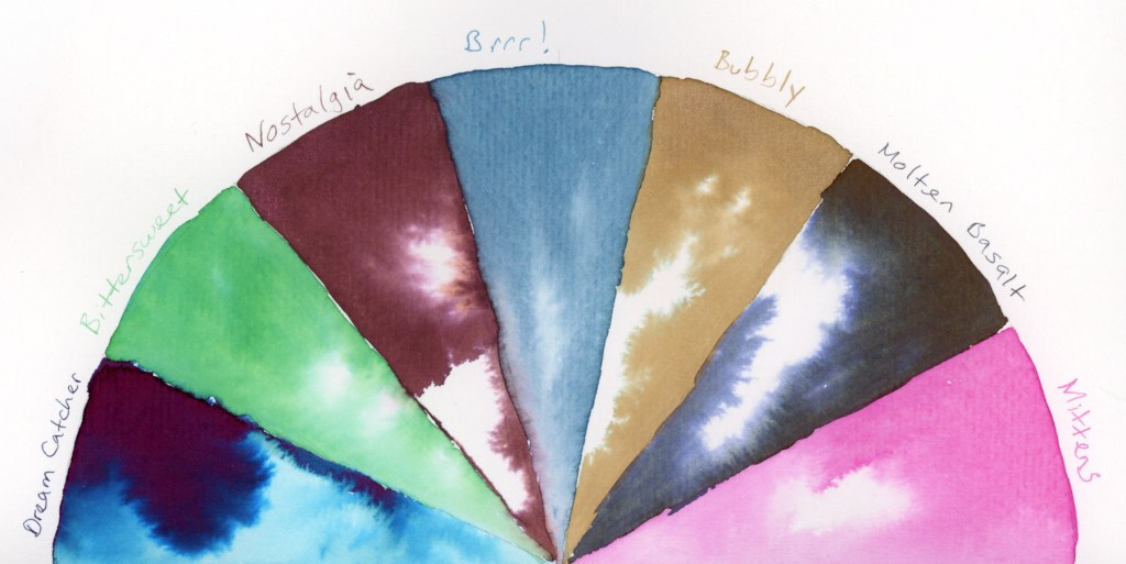
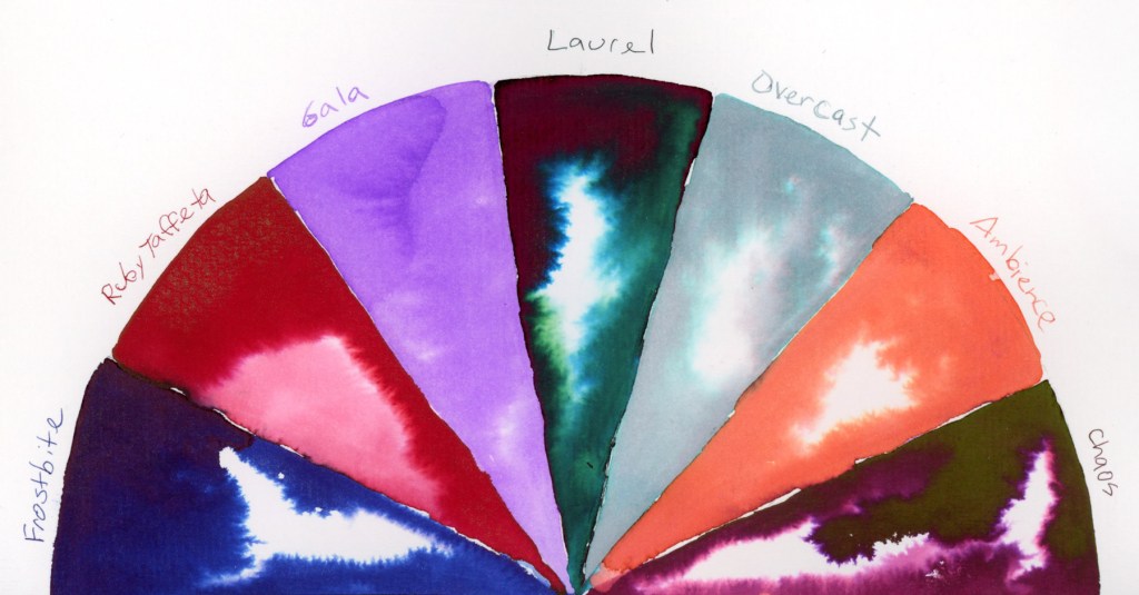
Coping with grief as well as recovering my own health issues, brought me to December with grand ideas for a December Daily. I did sample my Diamine Inkvent, and I did do a lot of collage in my sketchbook.

Stillman and Birn Sketchbooks

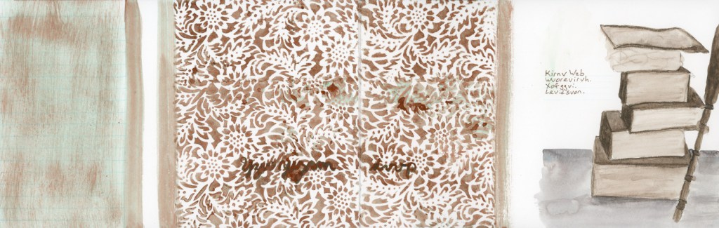
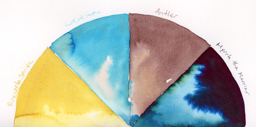
I set out this year to test each type of paper in the Stillman and Birn sketchbook line, and I did accomplish all but the Nova. Final verdict, Alpha remains my favorite. I did like the ivory colored papers more than I expected to, however. I liked the Delta paper the least, as I found it seemed to pill under water, which was not desirable for me. The smoother papers, Epsilon and Zeta were also nice. Better for ink work, than watercolor. Beta was fine, but with heavy paper, I expected smoother washes, so Alpha remains top for me with my preferred ink and watercolor. I still have to test the Nova range, with the tinted papers, and I’m looking forward to that in the future. I stuck with the 5.5×8.5 inch landscape, and as the year closes, I’ll admit, I’m really jonesing for a bigger page and for a portrait layout!

Improvements

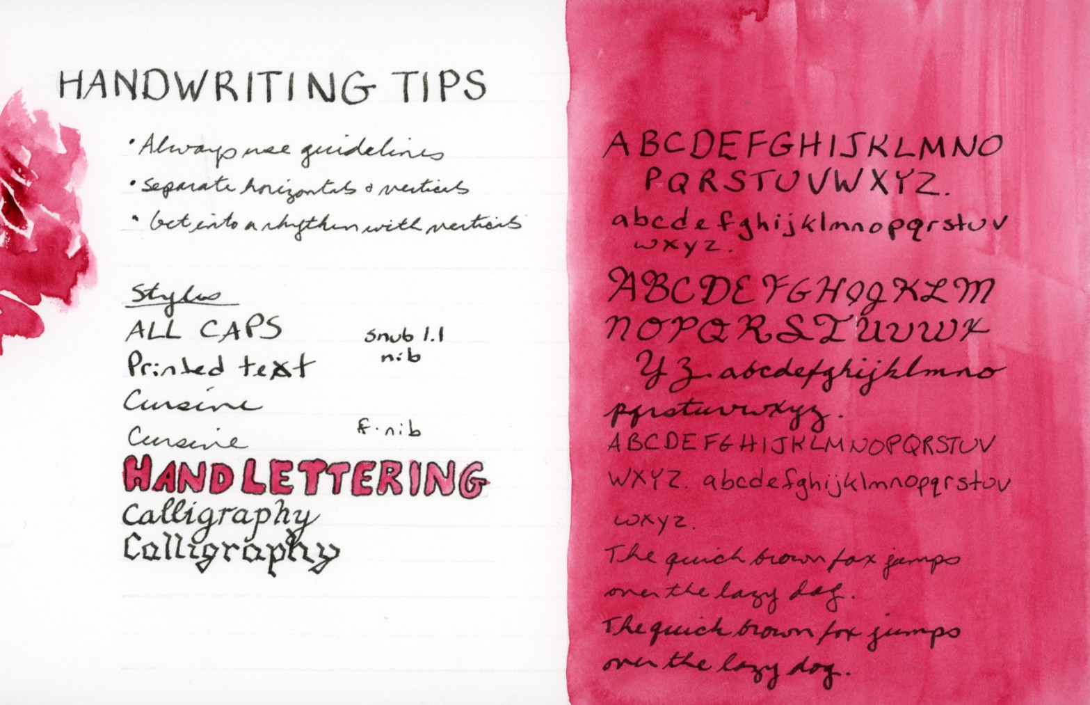
I admit, I’m hard on myself, and I never see my own improvements until years later when I look back. I do feel I learned a lot this year about how paper affects results, and about the various materials and palettes and did color swatches with. I worked with Inktense a bit, and I sampled a lot of different paints. I would have liked to see more improvement with my drawing skills, but I also did not draw that much, when it comes down to it.

I did complete eight sketchbooks this year! Two of them were begun in 2024, and several of them were thicker paper, so only a few pages at 26 sheets.

  • Vol 17 – Travel Sketching for 2024, then Watercolor Pencil Magic, then in January 2025 I picked it up for my daily sketchbook and  Foundations. 
  • Vol 18 – Everyday sketchbook for Autumn 2024 – Mid-January 2025. Sketchbook Design. Inks. 
  • Vol 19 – Gamma. Mid-February 2025 to early April 2025. Foundations. Color studies.
  • Vol 20 – Delta. April to June 2025. 
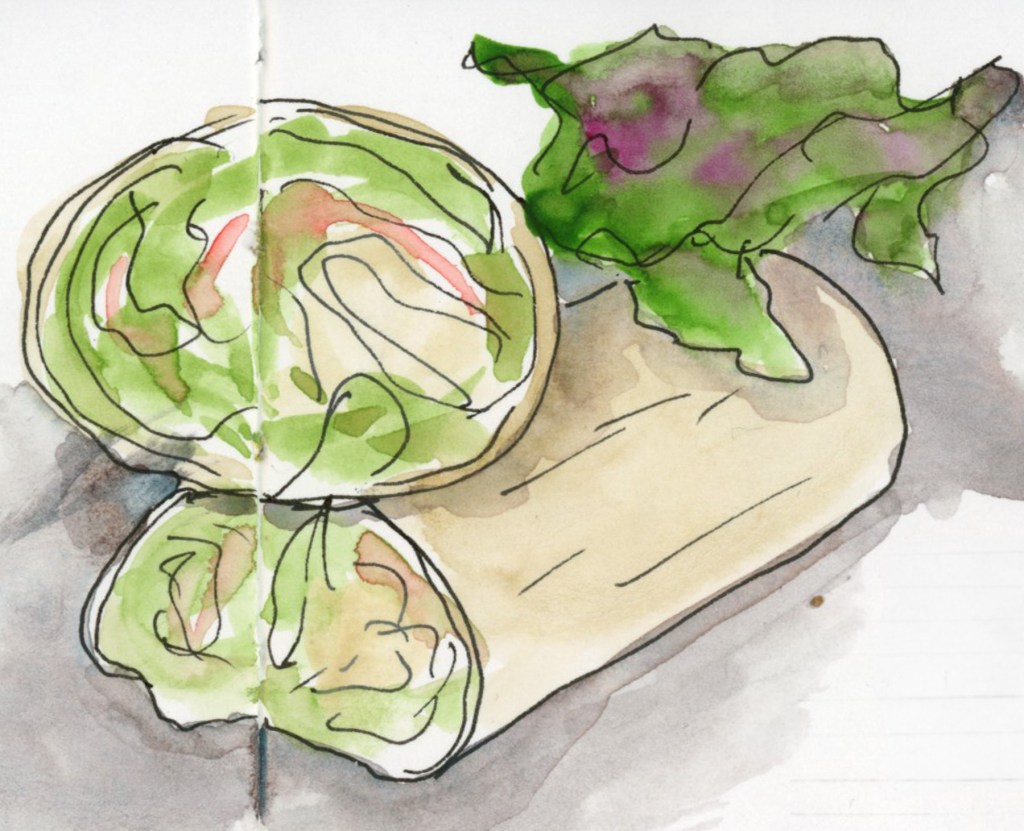
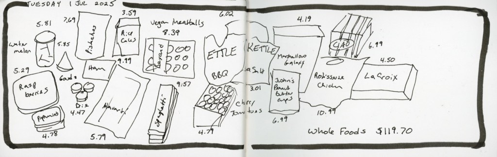
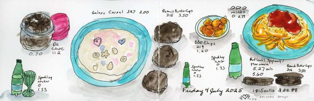
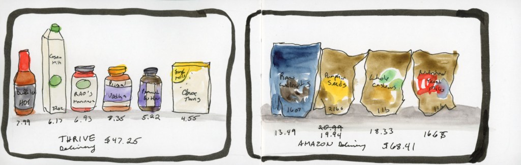
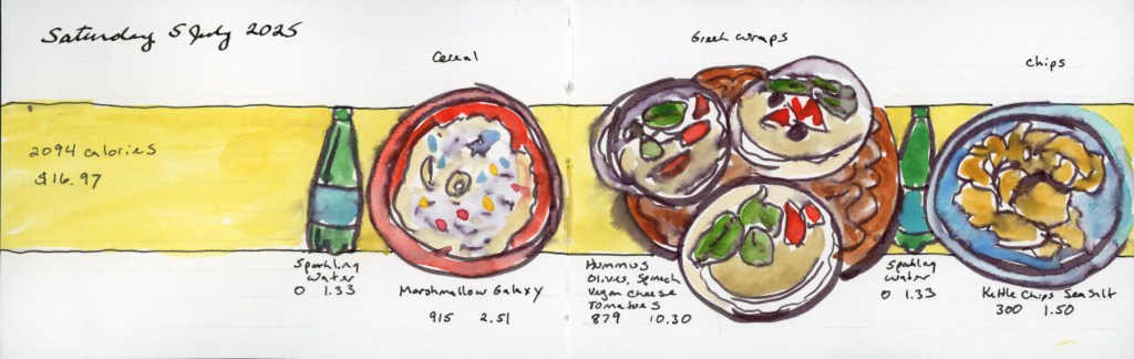
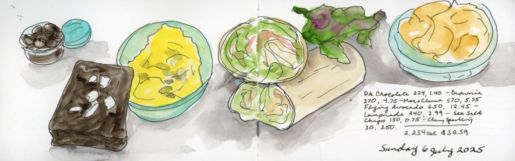
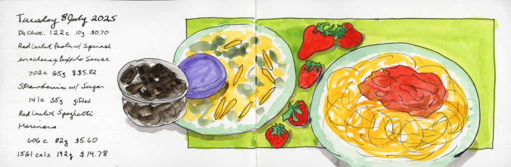
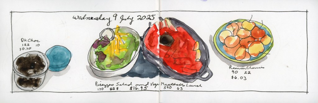
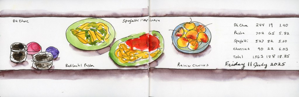
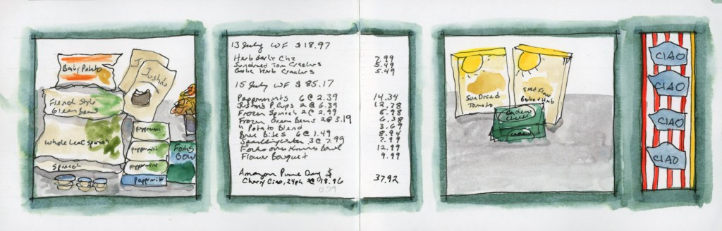
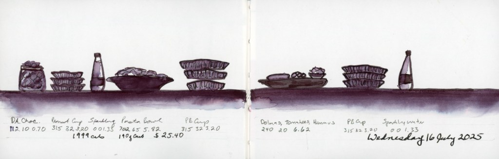
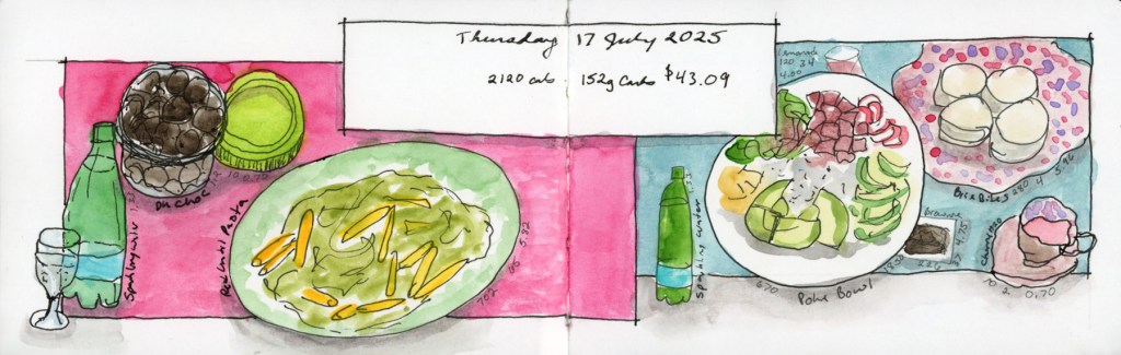
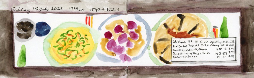
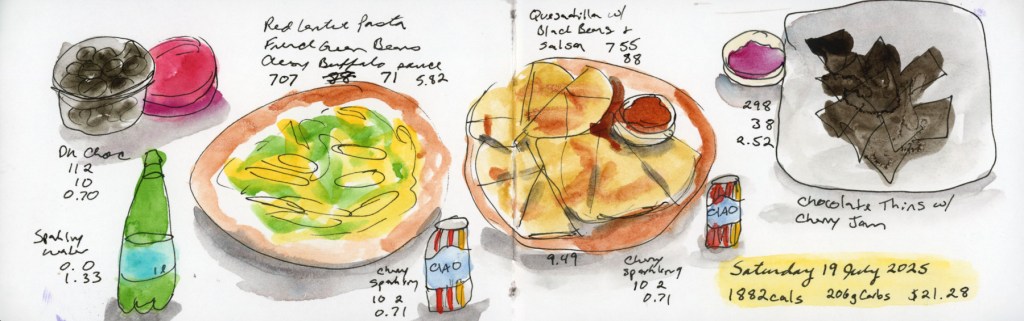
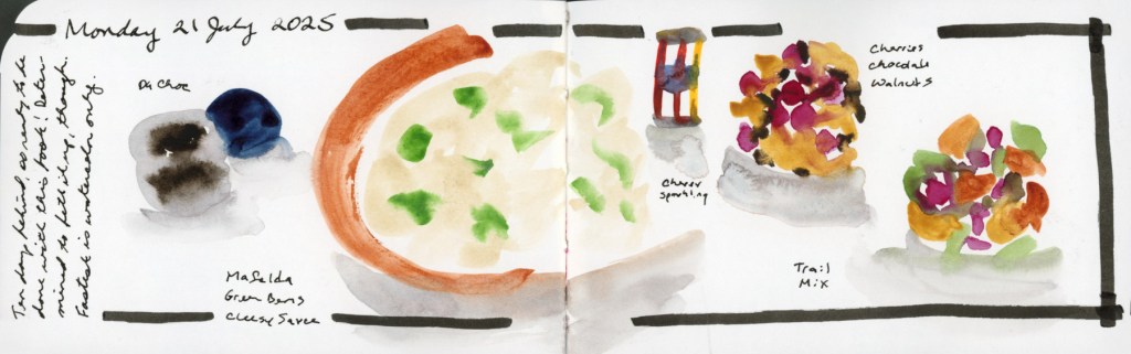
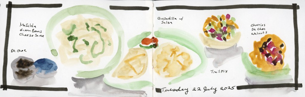
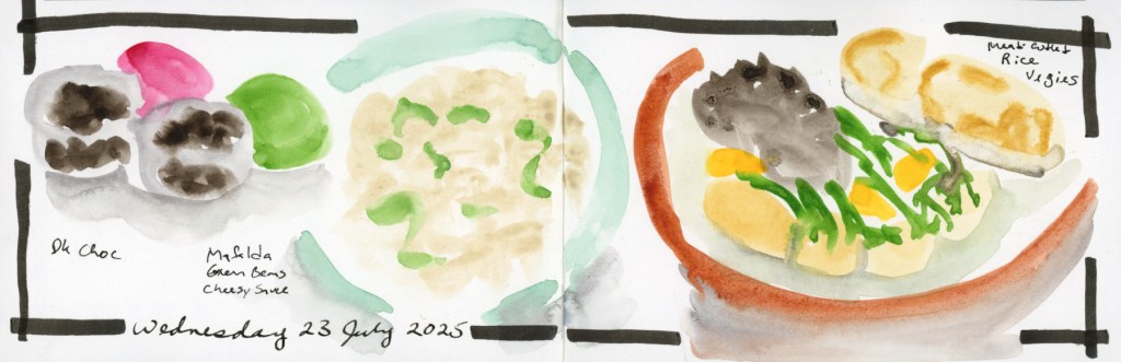
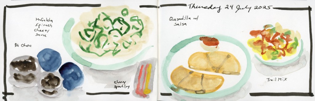
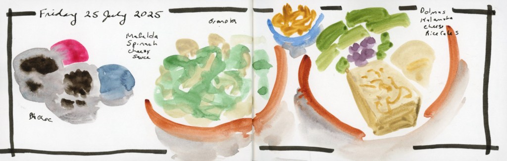
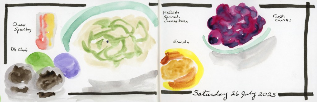
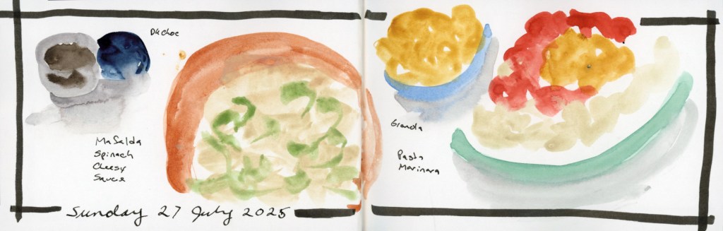
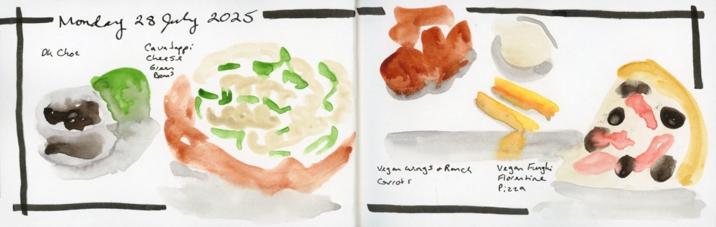
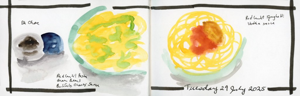
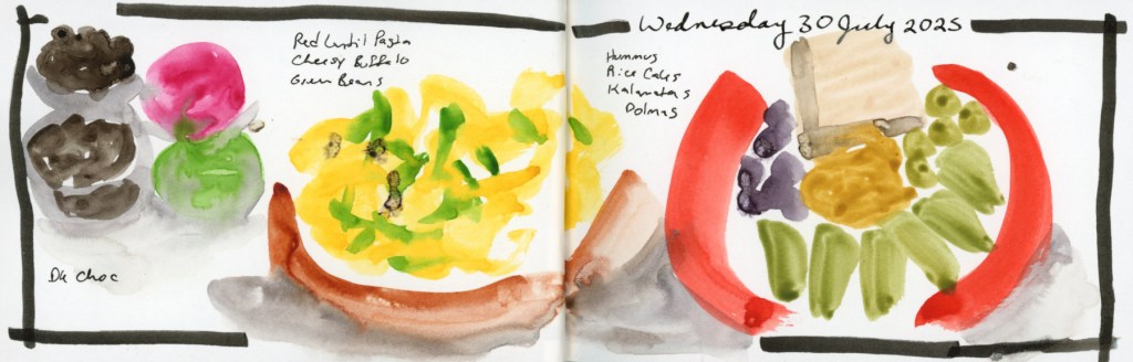
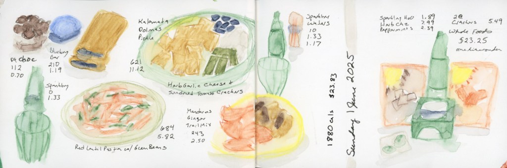
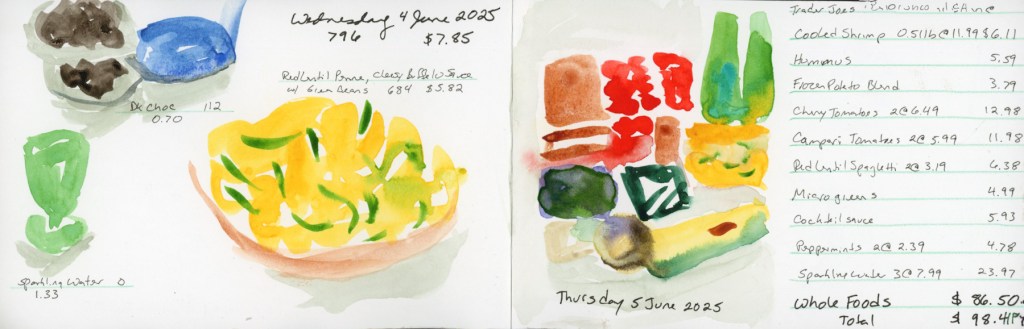
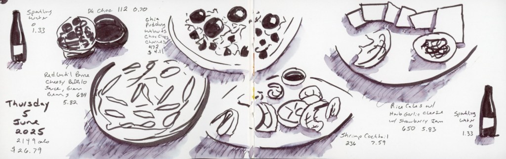
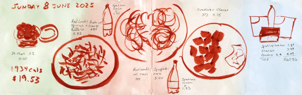
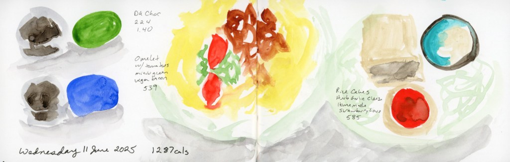
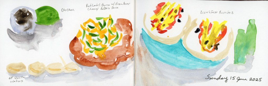
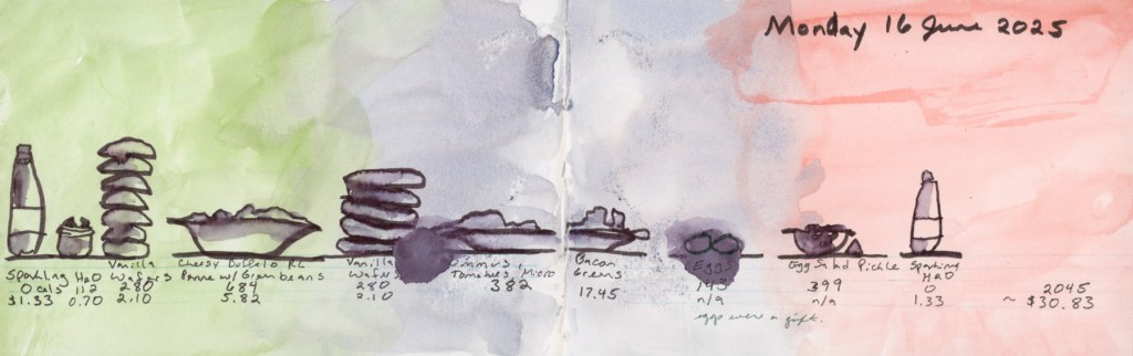
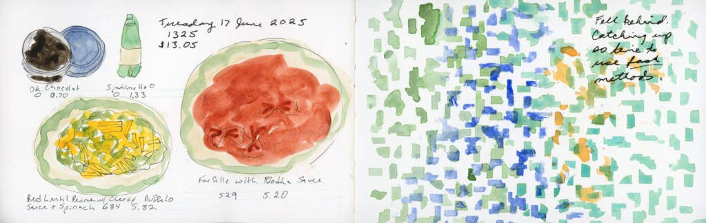
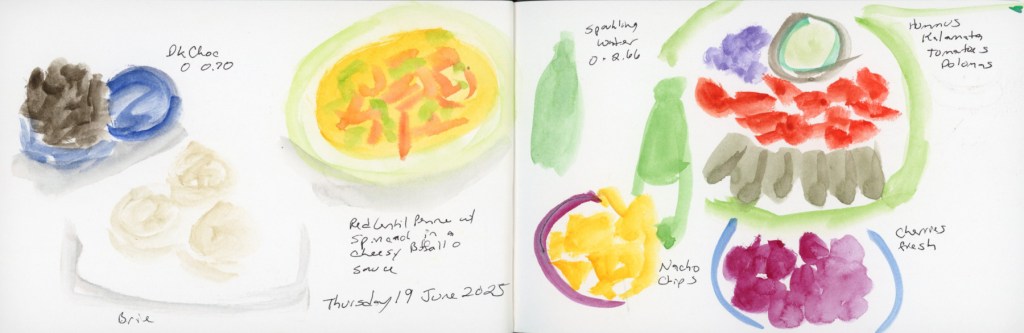
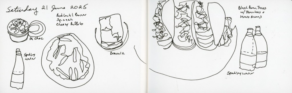
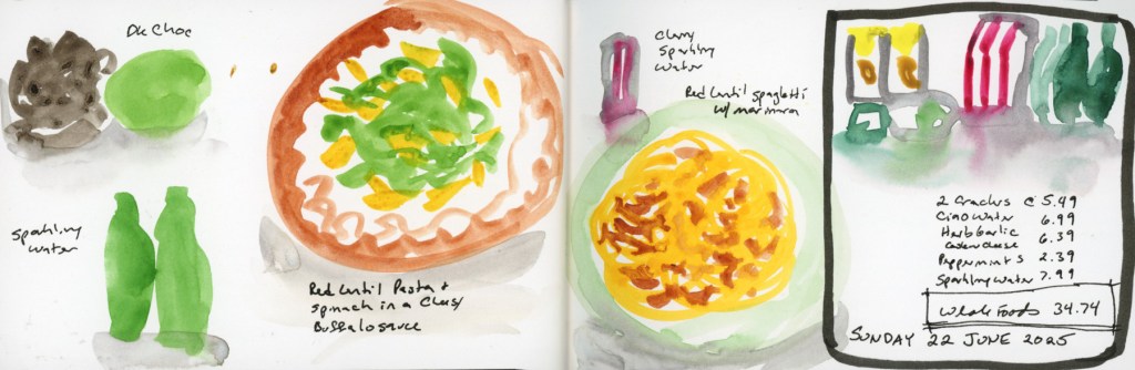
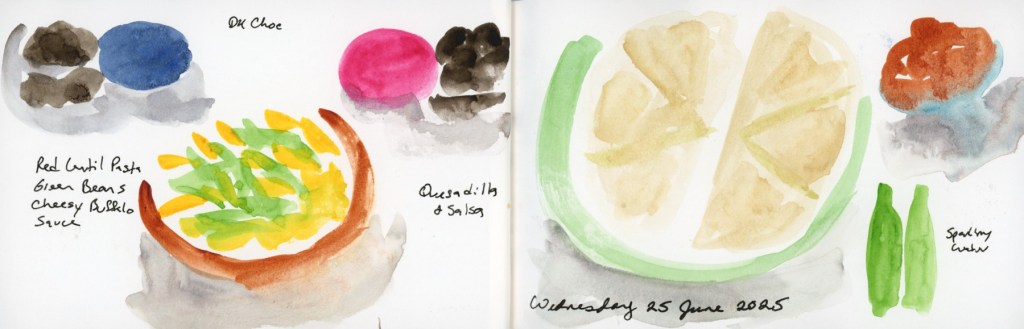
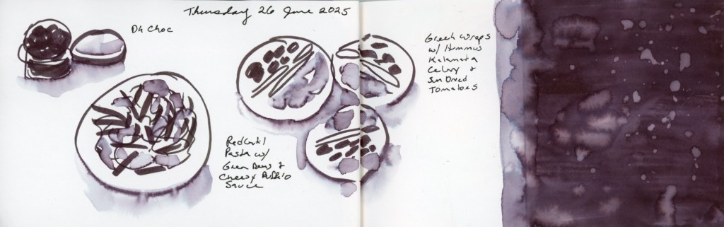
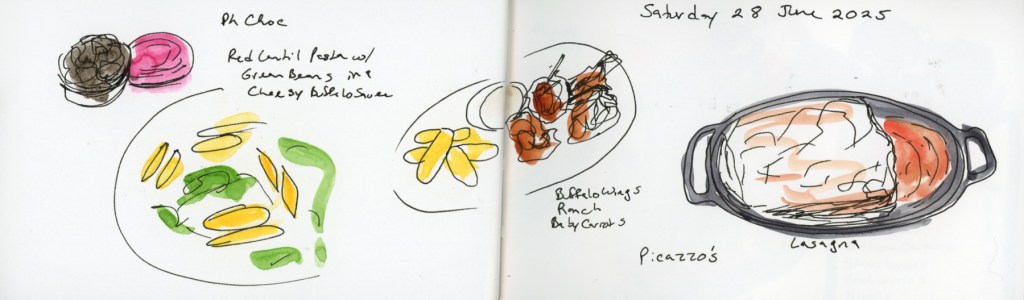
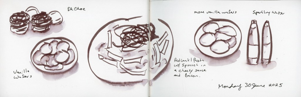
  • Vol 21 – Food
  • Vol 22 – Beta. June to July 2026
  • Vol 23 – Food (Page Design)
  • Vol 24 – Zeta. August to December 2025. 

TAKEAWAY

My chief takeaway might be to simply return to the page. Regardless of how it feels, or however long it has been with nothing, just return to the page. Do some color tests, or play with ink. I found peace in those moments, when it seemed there was little peace to be had personally, or in the world. You can learn a lot about art and your tools and your mediums just from color swatches. Return to the page and you’ve showed up, you are continuing the journey. This is about progress not perfection. A few years from now, I will see the progress, and the memory of the pain and the struggle will have faded. But I will be very glad I showed up to the page, even just to mark the date.

GOALS FOR 2026

  1. I’d like a bit more consistency. I always aim to finish the classes I start, but maybe I can also find ways to give myself permission to sketch small things, just to keep the practice in. 
  2. Document the everyday. This is always my chief objective. Document life as it really happens. Sketch the everyday moments, or objects, or even abstractly capture the feelings in color. 
  3. Share and participate a bit more in the online communities and classes I’m part of. Share more here in my blog as well as touch base with what I am learning as I go along. 

CONCLUSION

In a nutshell, I did more than I think I did this year! I struggled to keep sketching when life hit hard, but I am glad I sketched, and painted, and experimented.

Same View, Similar Sketch, Four Years Apart

In hunting down the older clutter sketches I came across this one.

Likely sketched Autumn 2021.

I realized this is the same view I sketched this week, so I had to put them side by side and compare!

I definitely like the variable brush tip better than the single width. I like that I went ahead and did sketch in all the background. Might use a smaller brush for the background next time. (Which I did in one of the other clutter sketches I did this week.)

Another thing I find very interesting, is that my technique is the same for these. I traced over a photo in Procreate to create these line art sketches. You’d think there would be no difference in the drawing skill. But I see differences and improvements between these two, and frankly, that surprises me. The biggest differences I see are drawing the lines that denote thicknesses. Those alone create much more three-dimensionality. That which seems to be the difference between what I used to feel looked like “coloring book” sketches, versus more realistic sketches. It’s taken me years to learn how to make things that look less like “coloring books.” Ha! Ironic that it is a traced sketch that reveals more of that learning.

Everyday Sketching 2025 Week 29

The weather is shifting, and we are getting some storm clouds, and a little temperature drop. I’m feeling the “dog days of summer.” I love that phrase, especially as it marks not only this hot, difficult stretch of summer, but the astronomical fact that this period of time has the star Sirius (in the constellation Canus Major, hence the dog star) rising at dawn. The Farmer’s Almanac calls July 3 to August 11 the Dog Days of Summer.

I’m once again using watercolor and stencils to art journal. This stencil came in my Cora Crea box of Dark Academia and I love it. The paint is Schmincke Dark Sepia Reddish. These little moon collages are from Coloring Book of Shadows.

I did a number of clutter sketches this week.

I’m liking the variability in line using the Gelsinki pen in Procreate. I like the effect better than the technical pen brush I used in previous sketches.

Two Weeks of Everyday Sketching

Not much sketching in week 27, but then I began Sketchbook Design, making pages for the Intro Week exercises.

I really love this sketch! I used the Schminke Retro Cochineal Red to paint the peonies I’d purchased at the grocery store. I used a petal brush for the first time, and through some mystery of brush design, it really did make those amazing flowers so easy to paint! I painted this for the exercises for the Sketchbook Design course. Had left-over paint, so painted a color block a few pages later in the book, knowing that color blocks are an element we will do next week.

The record breaking heat (118F/48C!) brought some household drama, which I decided to document indirectly with a clutter sketch.

I rather like the wireframe look of these clutter sketches, so I generally leave them this way rather than adding wash or shading.

I turned to this pre-painted color block and the day happened to be the Full Moon. I’ve been including these collage items for the lunar phases this month, and it seemed the perfect fit! I added the date and weather and loved the open look of the page, the white space, and the color block so much I left this page as is. My usual style is fairly crowded, packing a lot onto each page, so this is definitely the kind of design style taking this class teaches me to embrace. I love this page!

Thursday was a big day between Prime Day and Age of Umbra. Lots of little sketches that are chaotic and/or not very good. I enjoy doing the portraits for Age of Umbra, but I do them on the fly while the livestream is playing so accuracy is not what happens! The goal is to document daily life.

Here is the gallery of the full pages for the last couple weeks.

Sketchbook Design 2025

My very favorite of all of the Sketching Now classes! I’m so excited to be starting this group run, and return to these lessons. Every time I go through this class, my sketchbook and sketching level up significantly. Every time!

This is the spread I used as my “Current Sketch” starting point for Intro Week.

Sketchbook Goals is exercise one, and since I seem to have a floral theme for this page most of the years I’ve taken this course, I painted the peonies I bought this week.

Handwriting Tips is the next lesson, and I’m not feeling like doing too much differently with my text these days, so I just kept my page simple, but focused on the overall design to match the other half of the page.

I had left over paint in my palette so I painted a simple color block later in the sketchbook, thinking that having this beautiful color show up again would create a flow within the sketchbook. It sure does!

Everyday Sketching Week 26

These hot summer days are slowing me down significantly! I’m continuing with the food sketches, but not much else. Likely because I’m not really leaving the house for anything but grocery shopping, and I keep forgetting to bring my sketchbook for that. But watching shows gives a good opportunity to try some quick portraits.

This week’s food sketches:

Everyday Sketching 2025 Week 25

The temperatures heat up, and we are under Extreme Heat Advisories, and Air Quality Alerts, so I’m staying inside. Consequently not sketching nearly as much as I’d like. Happy Summer Solstice! Here is a little map I drew from a game I’m playing.

Food sketches for the week. Since the subject matter is so repetitive, I’m working on varying the methods.

Everyday Sketching 2025 Week 24

Doom scrolling this week, so not much sketching. Trying ways to capture events. I used abstracts and attempted some portraits. I like the abstracts I made with stencils and watercolor.

I color tested some new paints. I had to find out what the Warm Yellow Light and Naples Yellow Reddish looked like when I saw them online. Then I had to find out how they compare to Jaune Brilliant, which they resembled strongly. My obsession with sepia continues so I color tested these three tubes.