Ink Swatches and Garbage Bags

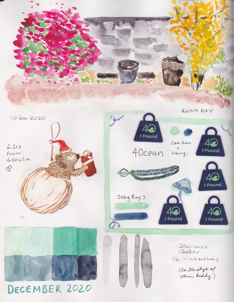
The date and the weather. Then a bit of text. Then a blank space for a sketch that never happened.

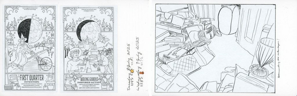
I was watching Edges lessons, scaling back after “losing” so many weeks of March and April. With class ending in a week, I was never going to catch up, so I gave myself permission to just absorb the main lesson videos only. I’ll take the course again when next it runs live. When Sunday came along, and I knew I wanted to sketch the decluttering, I decided to fill the blank spaces with ink that I haven’t swatched yet.

Have I mentioned I have a LOT of fountain pen ink?

A double page spread in a Stillman and Birn Alpha sketchbook covering Friday 24 through Sunday 26 April 2026. The left section shows handwritten journal entries for Friday with the heading Edges and a Sailor Yurameku Seki ink wash swatch in a soft ethereal grey-purple. The center section shows a Ferris Wheel Press Adventurine wash swatch in dusty rosy grey with journal notes. The right section shows handwritten decluttering metrics and a symbol tracking chart alongside two large Robert Oster Graphite chromatography garbage bags, labeled 268 cu ft Declutter.
Ink swatches and decluttering — Sailor Yurameku Seki, Ferris Wheel Press Adventurine, Robert Oster Graphite — Stillman & Birn Alpha, 24–26 April 2026
A large soft ink wash swatch on white sketchbook paper, labeled Sailor Yurameku Seki in the artist's handwriting below. The wash is a delicate ethereal grey-purple with soft pink undertones, blooming and pooling gently across the page in an irregular rectangular shape with slightly ragged edges. Stillman and Birn Alpha sketchbook.
Sailor Yurameku Seki — Stillman & Birn Alpha, 24 April 2026

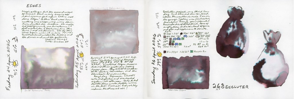
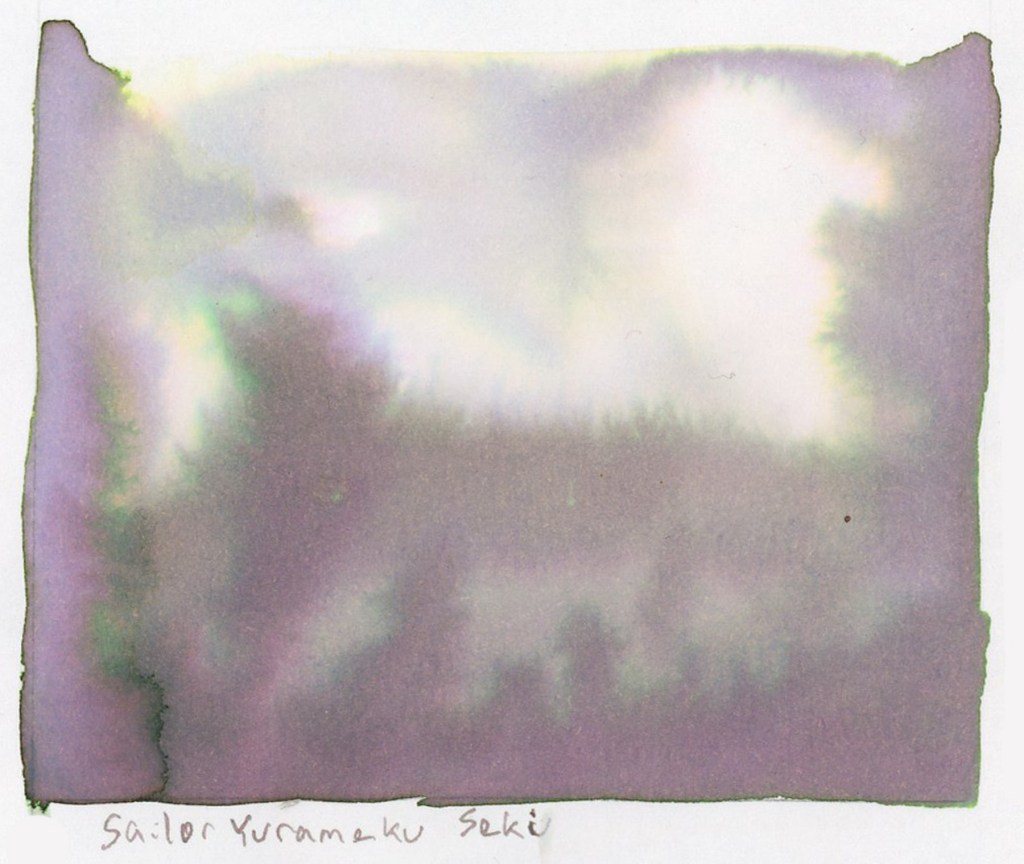
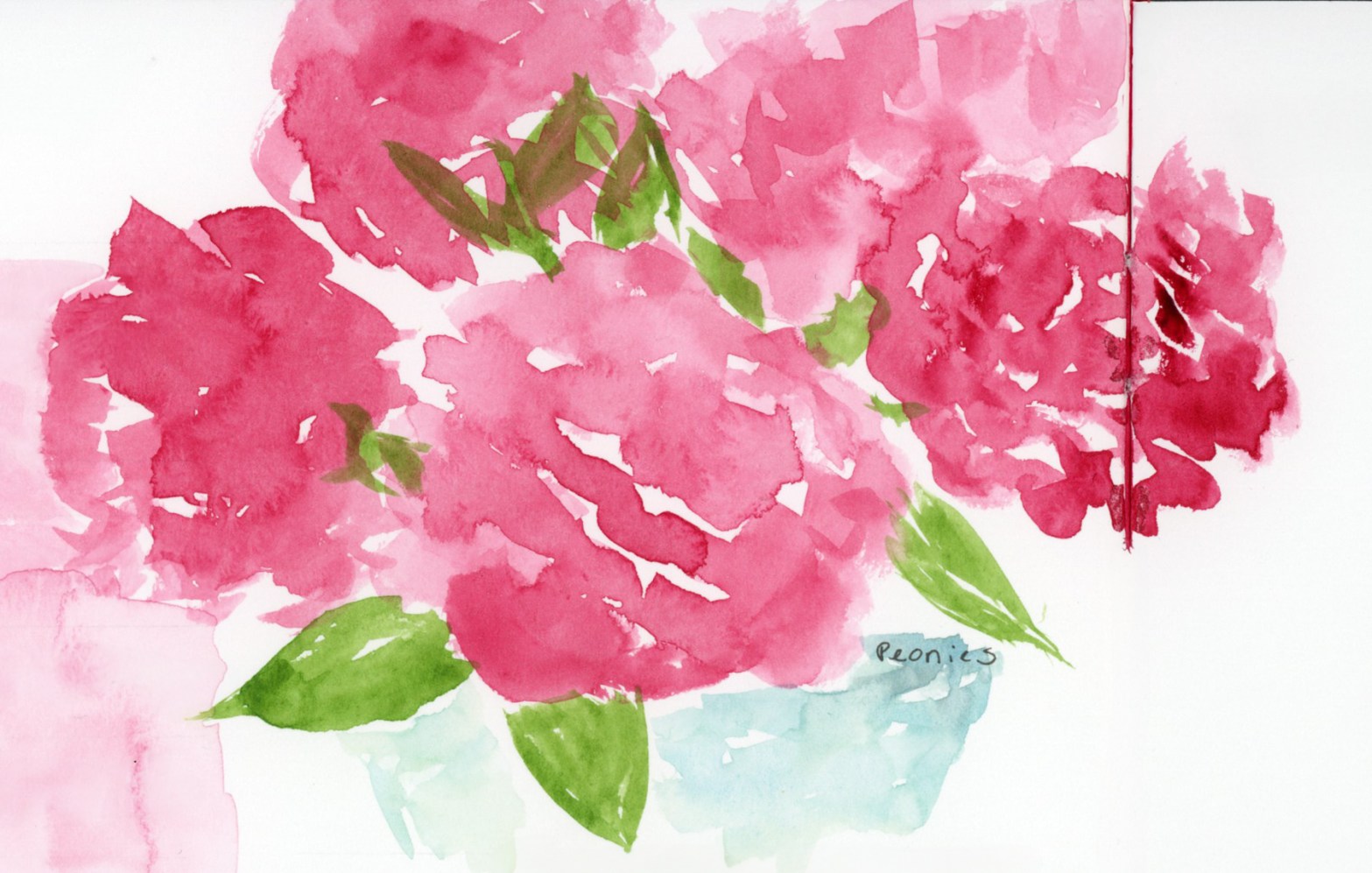
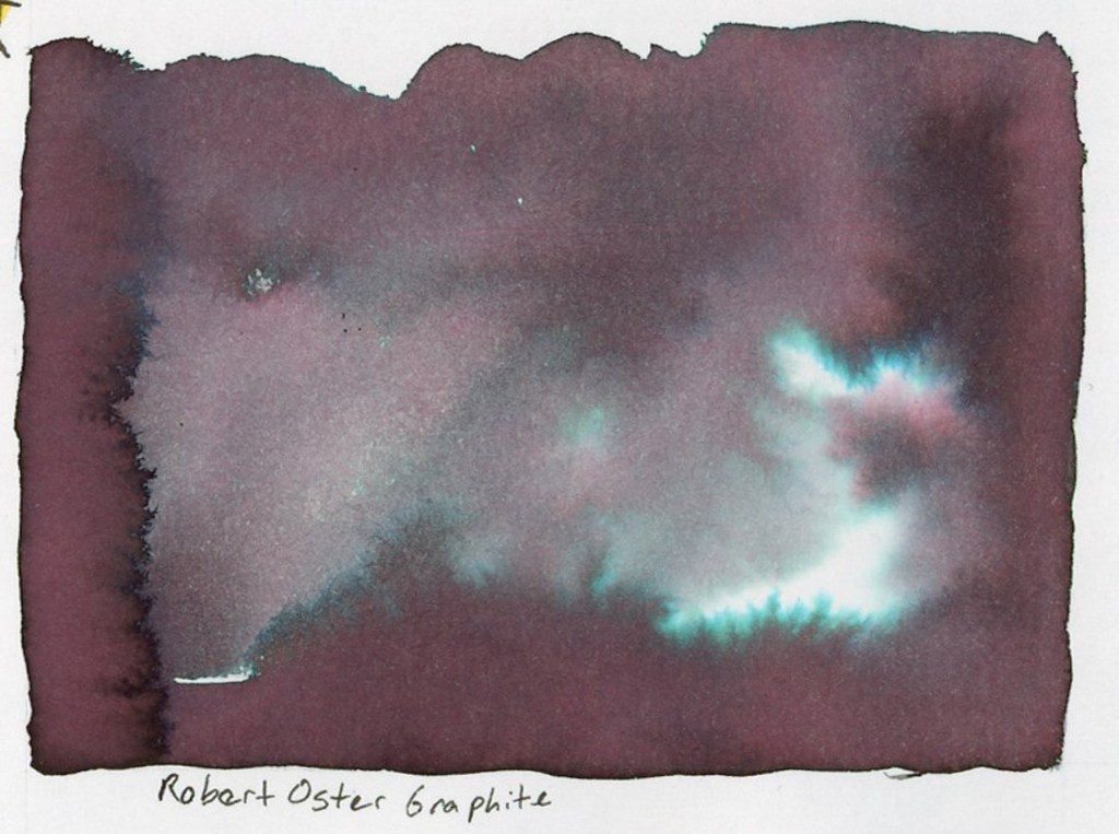
The first swatch is Sailor Yurameku Seki. A sample I ordered, and hadn’t tested yet. It’s soft and a little ethereal, with a beautiful pink undertone that blooms in the wash. These Sailor Yurameku inks have such lovely softness and multiple colors that separate beautifully in water.

A large soft ink wash swatch on white sketchbook paper, labeled Ferris Wheel Press Adventurine in the artist's handwriting above. The wash is a dusty rosy grey with subtle shimmer and soft pink undertones, spreading in a slightly uneven rectangular shape with organic edges. Stillman and Birn Alpha sketchbook.
Ferris Wheel Press Adventurine — Stillman & Birn Alpha, 25 April 2026

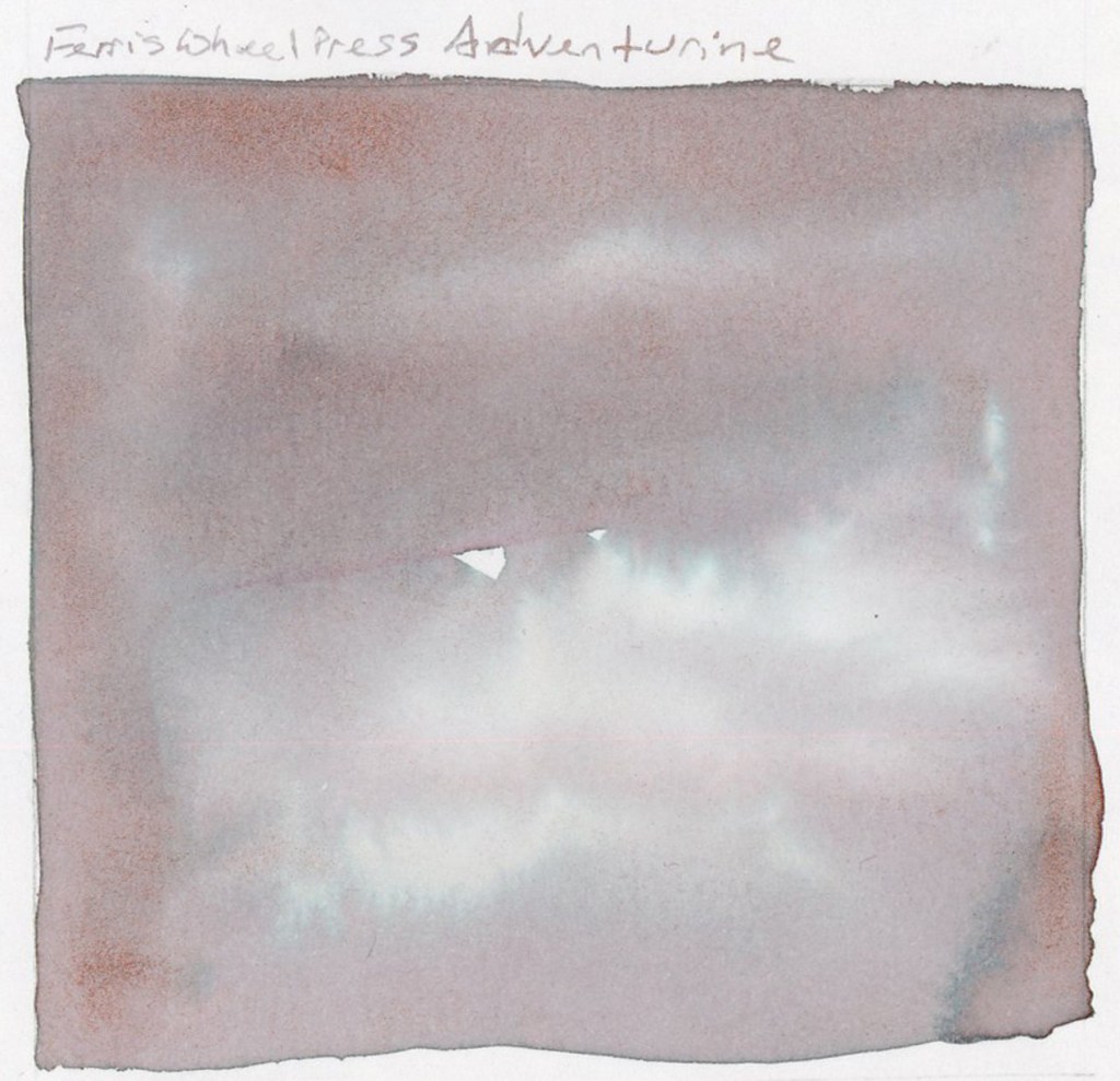
Ferris Wheel Press Adventurine, and that pink is actually a shimmering metallic! So pretty! Ferris Wheel Press Ferritales inks are genuinely special, and Adventurine is a good example of why. I will say that Alpha paper loses some of the shimmer and sheen of the inks. I need to work with Tomoe River paper to really let them perform. That’s a future experiment.

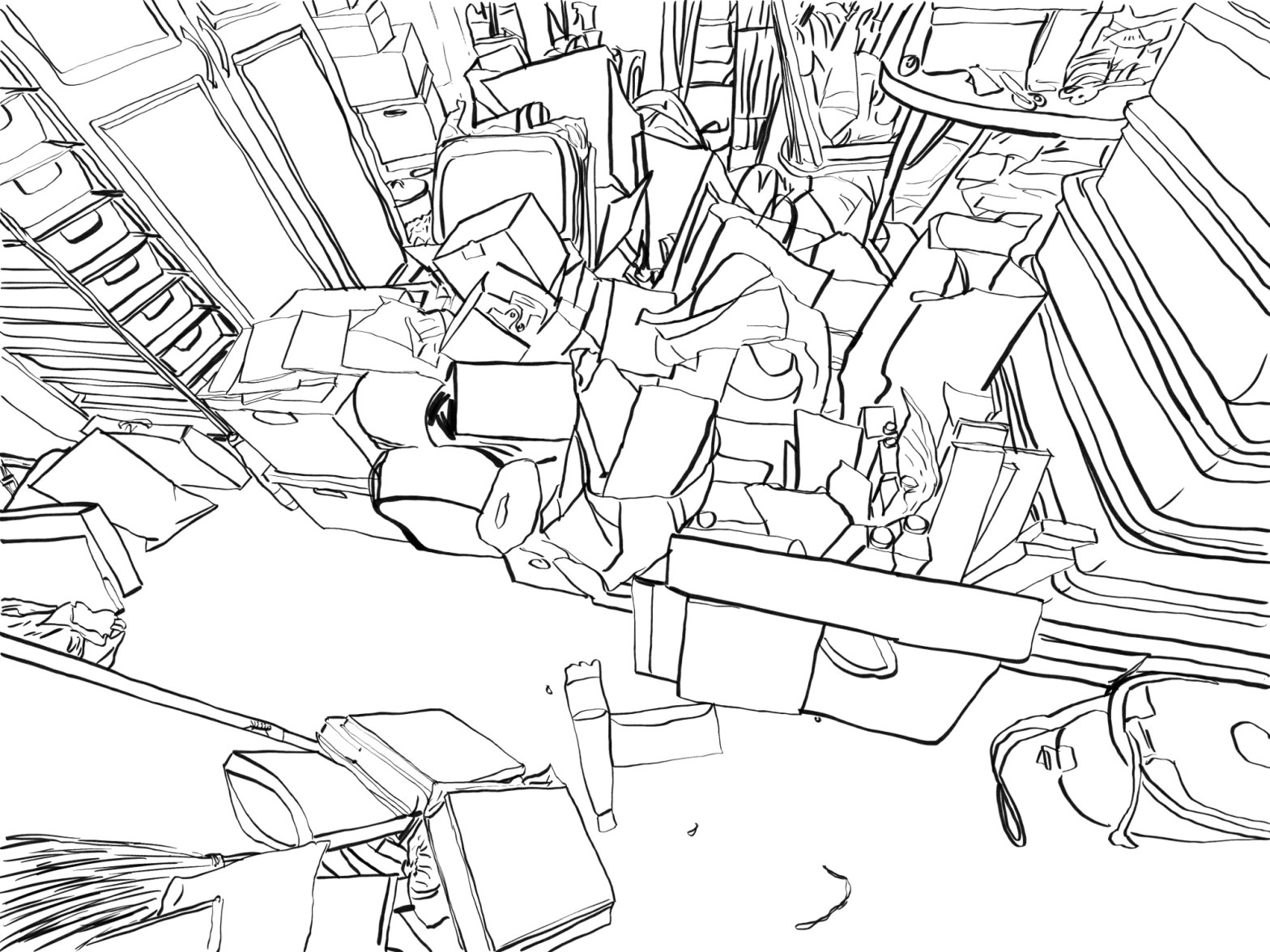
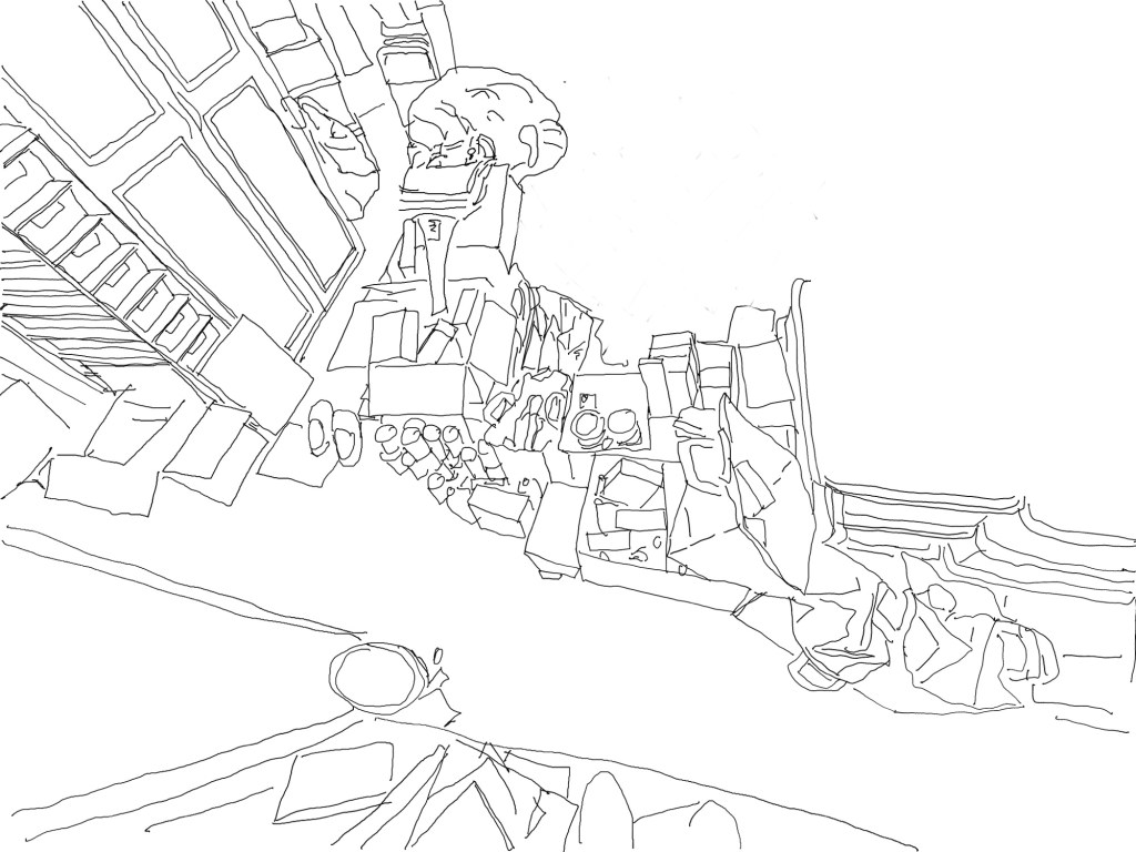
Three weekends in a row in April I’ve been doing a big push to declutter the garage before it gets too hot and I have to wait another 9 months. I hauled out trash bags, banker’s boxes, recycling, donations. It’s one of those projects that’s hard to maintain momentum on. Sketching it helps. I love my clutter sketches, but I haven’t been doing those right now. I wanted to find a way to visually document the progress of the declutter in my sketchbook, not just in before and after photographs. I wrote and sketched about decluttering back in July 2025, but stopped. Here’s to resuming, and making it a regular feature now, both for my house and my sketchbook!

A large dramatic ink wash swatch on white sketchbook paper labeled Robert Oster Graphite below. The wash is a deep dark purple-brown with vivid teal and turquoise chromatography blooms spreading through the pigment as the ink dried, creating an atmospheric landscape-like effect with bright teal highlights against the dark base. Stillman and Birn Alpha sketchbook.
Robert Oster Graphite — Stillman & Birn Alpha, 26 April 2026
Two large ink washed garbage bags on white sketchbook paper, rendered in Robert Oster Graphite ink. The blobs are deep dark purple-brown with dramatic teal and turquoise chromatography blooms spreading through the pigment, giving each shape a moody atmospheric quality. Stillman and Birn Alpha sketchbook.
Robert Oster Graphite chromatography garbage bags — Stillman & Birn Alpha, 26 April 2026

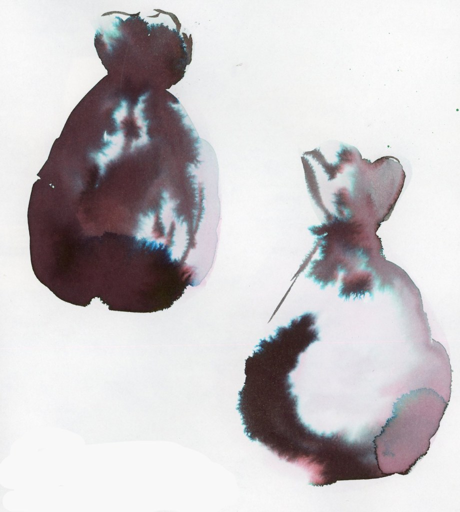
Garbage bags are not pretty, but what a great subject for the inky chromatography! Black trash bags, black and dark grey inks that bleed into stunning colors! It’s a match made in heaven! Lay down heavy water, then drop in the ink, and let the ink do its magic. A lovely visual record is created.

But of course, I need to also track the metrics. A bit obsessively, perhaps. But hey, it’s very motivating to see the numbers build, for something that is often too easy to overlook and dismiss. You forget just how much you cleared out, because you get used to the look of the new space very quickly. So I also built a symbol chart to track the metrics. Trash bags by gallon size, banker’s boxes by cubic foot, trash and recycle bins, Car capacity for hauling. Everything converted into cubic feet, and also cubic meters for my international readers. (I’m thinking of you guys!) The 12th I got rid of 159 cubic feet, the 19th a more modest 15 (only my single bins were available. What an enormous difference in outflow!), and the 26th came in at 94. April’s total across three weekends: 268 cubic feet. 7.6 cubic meters. The garage is getting there! I’m racing the weather now, to finish the garage before it hits 100ºF/37ºC again!

I love how this page looks. The ink swatches filling the spaces where sketches didn’t happen, becoming a highlight feature I will absolutely use in the future. The decluttering inky garbage bags, and symbols tracking progress in the most dramatically beautiful way possible.

Same View, Similar Sketch, Four Years Apart

In hunting down the older clutter sketches I came across this one.

Likely sketched Autumn 2021.

I realized this is the same view I sketched this week, so I had to put them side by side and compare!

I definitely like the variable brush tip better than the single width. I like that I went ahead and did sketch in all the background. Might use a smaller brush for the background next time. (Which I did in one of the other clutter sketches I did this week.)

Another thing I find very interesting, is that my technique is the same for these. I traced over a photo in Procreate to create these line art sketches. You’d think there would be no difference in the drawing skill. But I see differences and improvements between these two, and frankly, that surprises me. The biggest differences I see are drawing the lines that denote thicknesses. Those alone create much more three-dimensionality. That which seems to be the difference between what I used to feel looked like “coloring book” sketches, versus more realistic sketches. It’s taken me years to learn how to make things that look less like “coloring books.” Ha! Ironic that it is a traced sketch that reveals more of that learning.

Clutter Sketches: The Beginning

I first fell in love with clutter sketches due to Stephen Reddy’s work. He has a number of clutter sketches published in his books. It was love at first sight. Not only did I want to be able to draw like that, but I also felt such sketching would be a great way to handle my growing clutter problem in my own house.

Why might sketching the clutter help? Sketching is often like meditation, especially when the subject has so many lines. You create a new way of looking at and thusly thinking about what is in front of you. They say clutter blindness is a thing. I wouldn’t say I had blindness, as much as paralyzing overwhelm. My clutter erupted in a short period of time, born of grief, and depression. I call it pandemic clutter, because the profound losses that first year of pandemic, gave birth to it. I have yet to overcome the damages. I still believe sketching is an excellent way to cope, to change thinking, and grapple with the impossible. There are so many negative feelings trapped in each square inch of clutter.

My very first clutter sketch, which I drew right after seeing Stephen Reddy’s book and getting so inspired by his clutter sketches, was of my treacherous staircase. This sketch I did from a photo, in pen and ink, and ink wash, copying his technique for shading. Or at least trying to. Ha!

Drawn Christmas Day 2020.

I hated this sketch at the time, due my lack of skill with both lines and shading. Skills I STILL work on. At least I’ve learned now that they are skills that never finish developing.

Drawn 1 April 2021.

The next clutter sketch I attempted I also used inspiration from Paul Heston, who does these amazing room sketches, always including his own hands drawing. I used my iPad. I felt like I was cheating, but I really wanted to make clutter sketches, and felt my drawing skills were simply not up to the number of lines required, the proportions, any of it. So I put the photo into Procreate and drew the lines, basically tracing the photograph. This is what I ended up with. I loved it. Just the lines, simplifying the scene into basic black and white. I still use this approach today.

I just realized that’s a covid mask hanging on the doorknob. Woah. That stirs up some feelings!

After this I decided that before and after sketches would be a great way to document my efforts to declutter.

Drawn September 2021.

I had to scroll through nine months of photos to find when I took this photo, and did this sketch! I apparently need to add dates to the iPad sketches! I read the book Decluttering at the Speed of Life, and took her advice to start at the front door.

I have a few random clutter sketches, which have no dates. I believe they were all in that Autumn of 2021.

January 2024.

I found this third one, which I did in January of 2024.

The next big push for such clutter sketches was a year later, January 2025, when I participated in the All Day Declutter with Take Your House Back, which I wanted to document. I’ll share those in a future post, as I get them uploaded.

Two Weeks of Everyday Sketching

Not much sketching in week 27, but then I began Sketchbook Design, making pages for the Intro Week exercises.

I really love this sketch! I used the Schminke Retro Cochineal Red to paint the peonies I’d purchased at the grocery store. I used a petal brush for the first time, and through some mystery of brush design, it really did make those amazing flowers so easy to paint! I painted this for the exercises for the Sketchbook Design course. Had left-over paint, so painted a color block a few pages later in the book, knowing that color blocks are an element we will do next week.

The record breaking heat (118F/48C!) brought some household drama, which I decided to document indirectly with a clutter sketch.

I rather like the wireframe look of these clutter sketches, so I generally leave them this way rather than adding wash or shading.

I turned to this pre-painted color block and the day happened to be the Full Moon. I’ve been including these collage items for the lunar phases this month, and it seemed the perfect fit! I added the date and weather and loved the open look of the page, the white space, and the color block so much I left this page as is. My usual style is fairly crowded, packing a lot onto each page, so this is definitely the kind of design style taking this class teaches me to embrace. I love this page!

Thursday was a big day between Prime Day and Age of Umbra. Lots of little sketches that are chaotic and/or not very good. I enjoy doing the portraits for Age of Umbra, but I do them on the fly while the livestream is playing so accuracy is not what happens! The goal is to document daily life.

Here is the gallery of the full pages for the last couple weeks.