One Palette, Six Ways. An Obsession.
I will be taking Liz Steel’s Travel Sketching course this May. I’ve taken it before, in September 2024, and I started in April 2025, but did not finish. (See all my posts for Sketching Now Travel Sketching here.)
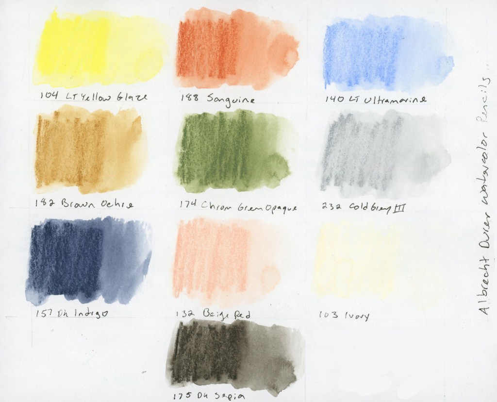
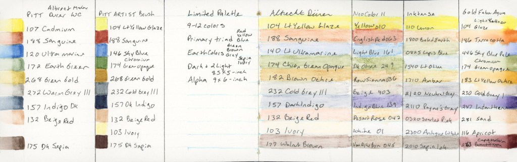
Every time I become a little obsessed with the limited palette for this class. Liz built it using threes: a primary, three earth tones, then a dark and two lights. She kept it fairly pastel, and muted. It really is great for landscapes. Especially Autumn scenes. She used Albrecht Dürer Watercolor Pencils.
The first time I took this course, I discovered I really wanted a brown, so here I’ve added the dark sepia. The second time I became very curious about Inktense pencils, wondering how were they different. Since I owned a set, a pulled the same palette colors and I started using Inktense pencils shortly afterward. I also wanted to explore Neocolors II. I was unable to finish the course, so I did not explore those as much as I intended.
This time around, I decided to find out.
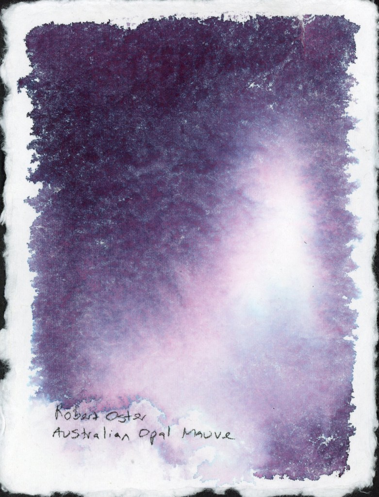
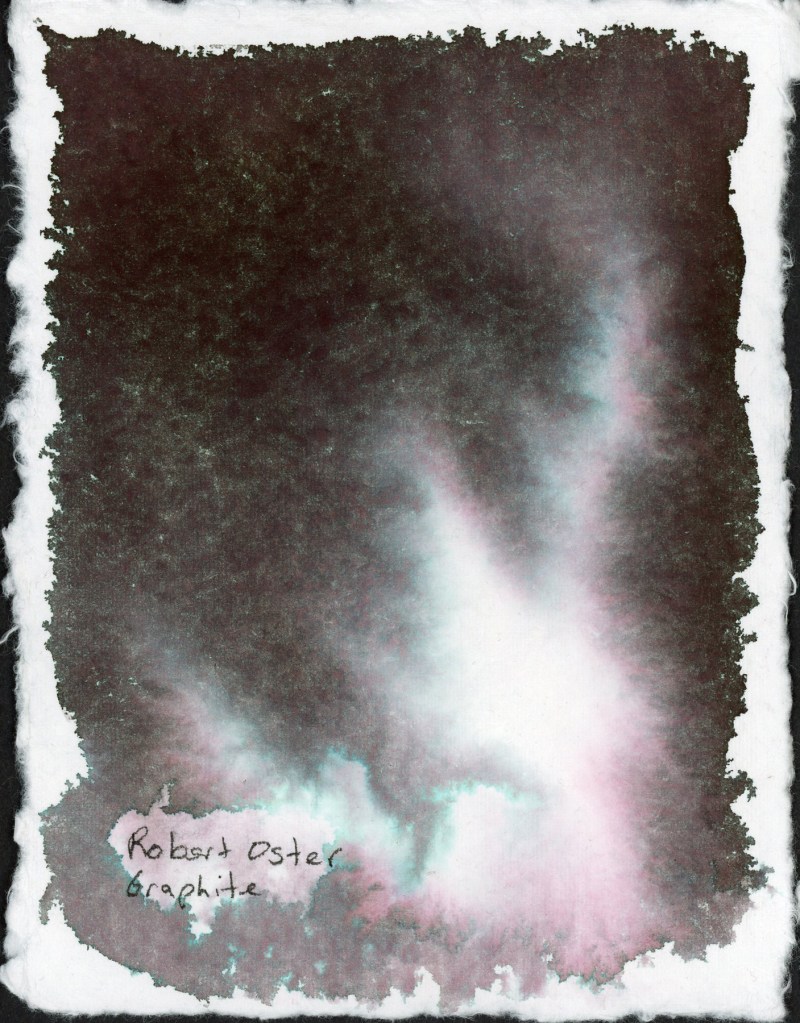
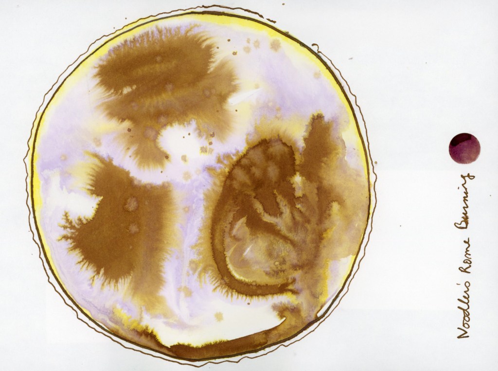
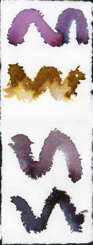
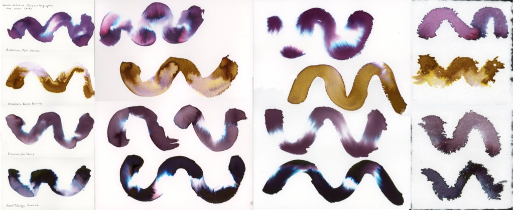
The Albrecht Dürer Watercolor Pencils. Activated, they produce soft, luminous washes. There’s a gentleness to them that feels very suited to location sketching, which is rather the point. Dark Sepia is my second dark, which I really craved. Plus I have a love affair with Sepia, so it’s a natural fit. I did consider a warmer brown, like Walnut, but the cooler sepia keeps the balance between warm and cool tones.
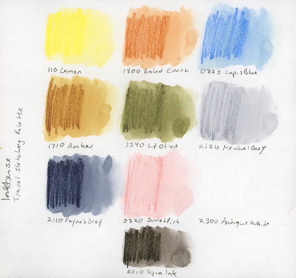
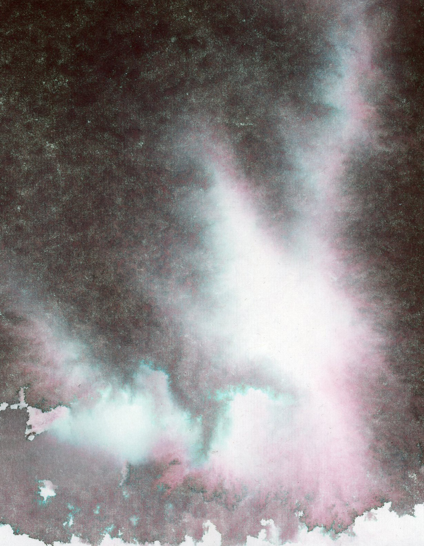
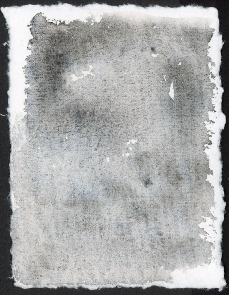
I built this Inktense palette to best match the colors of the original palette. Same colors, two media, learn how do they really behave different. The get the more pastel grey and soft pink, you really need a very light touch when applying the pencil, as the colors are darker than the matching shade. They say Inktense becomes permanent once dry, so you can layer over it without lifting. I find they give smoother washes, and they seem more vivid, but this palette is still holding that more muted vibe.
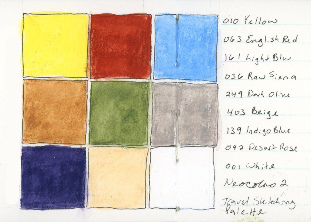
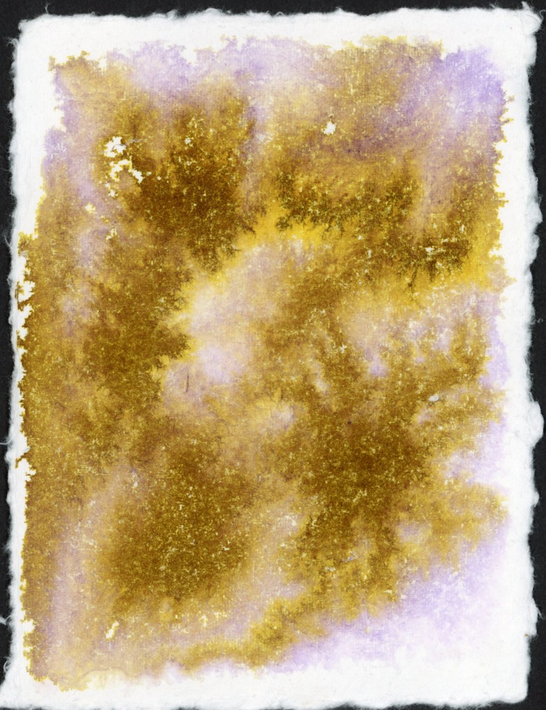
I had selected the matching colors in a Neocolor palette for the April course, but never used them. Since I have them, I continue to be very curious to work with them. The swatches are certainly vibrant, and they felt good to lay down. These swatches were Delta book, in ivory paper, so that white shows up a bit better. I wonder how these would look on colored paper? Are they more opaque?
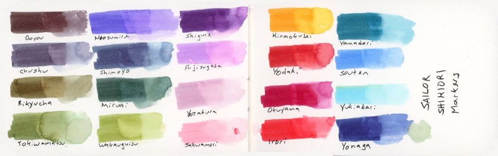
At this point the reasonable thing would have been to stop. I did not stop. Liz mentioned she would be adding markers to the course this time around, and well, I have markers! (Advantage of buying way too many art supplies over many years, I have a lot of stuff just lying around! Whole color sets make great gifts during the holidays!) So I pulled together the same palette in multiple marker types. (I did have to fill in a couple gaps, and order a few, but not too many.)
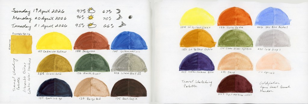
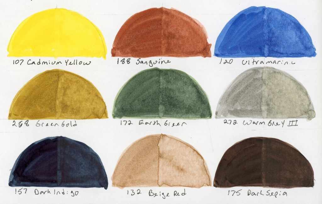
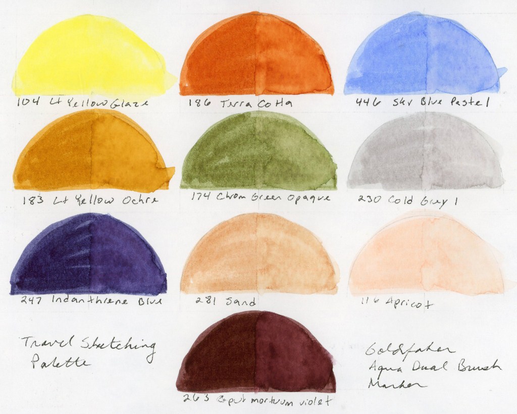
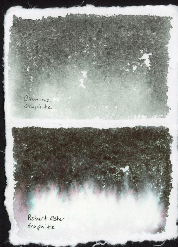
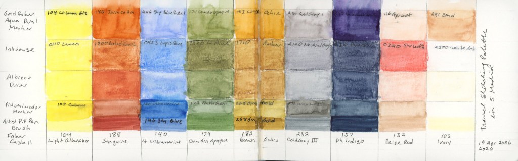
I love how watercolor markers look when activated with water. They bleed and bloom in ways I love. Easy to get complete obliteration of the lines, so it’s a bit like playing a daring game! I also put together the same palette in the pigment Pitt Artist Brush pens, but never swatched those independently. They are only swatched in the big color chart below.
And of course, I had to see everything side by side, right? How well did I match these colors across the mediums?
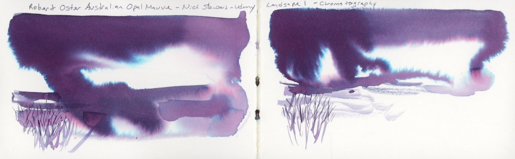
I am really looking forward to using these in actual sketches to learn how the different media behave, and discover what I do and don’t like.
I also may have begun a new obsession. I love that Goldfaber Aqua Dual Brush Caput Mortuum. They didn’t have a brown, so that was the closest. The Pitt Artist Brush pens also have a gorgeous Caput Mortuum. So I may have immediately ordered some Caput Mortuum watercolor paint.
It started with one question about two pencil ranges, how is Inktense different from the Albrect Durer watercolor pencils. It ended with six media, so many color charts and a new obsession or two.