One Week 100 People 2026: Twenty-Seven People

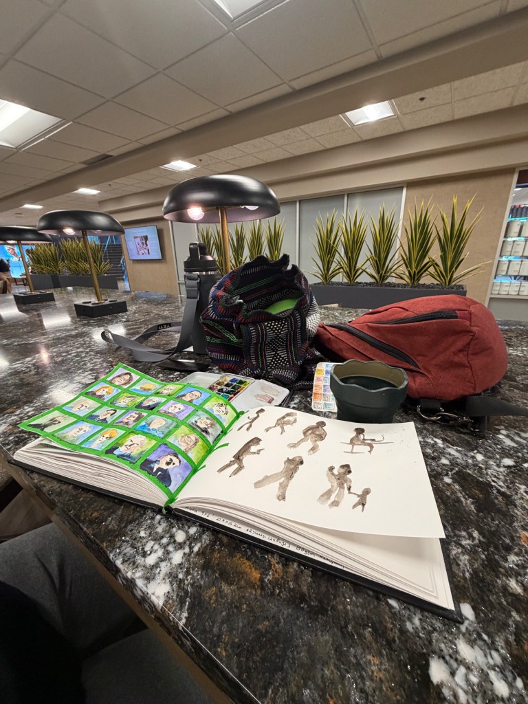
I made it to the gym.

The plan was to sketch at the gym business center, dedicated time and space, no excuses. It worked. I spent an hour there on Thursday with my sketchbook open and my palette out. Having that contained, intentional time made everything easier. Even the faces from Stargate SG1, which I was sketching from photos, came more readily than they do at home. There’s something wonderful about sitting down to sketch rather than sketching when distracted.

Photograph of an open sketchbook on a dark marble counter in a gym business center, showing a grid of small colorful watercolor portraits on the left page and loose sepia gesture figures on the right. A watercolor palette, woven bag, and red backpack sit nearby. The room behind has dome pendant lamps and tall spiky plants.

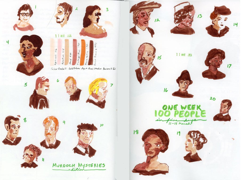
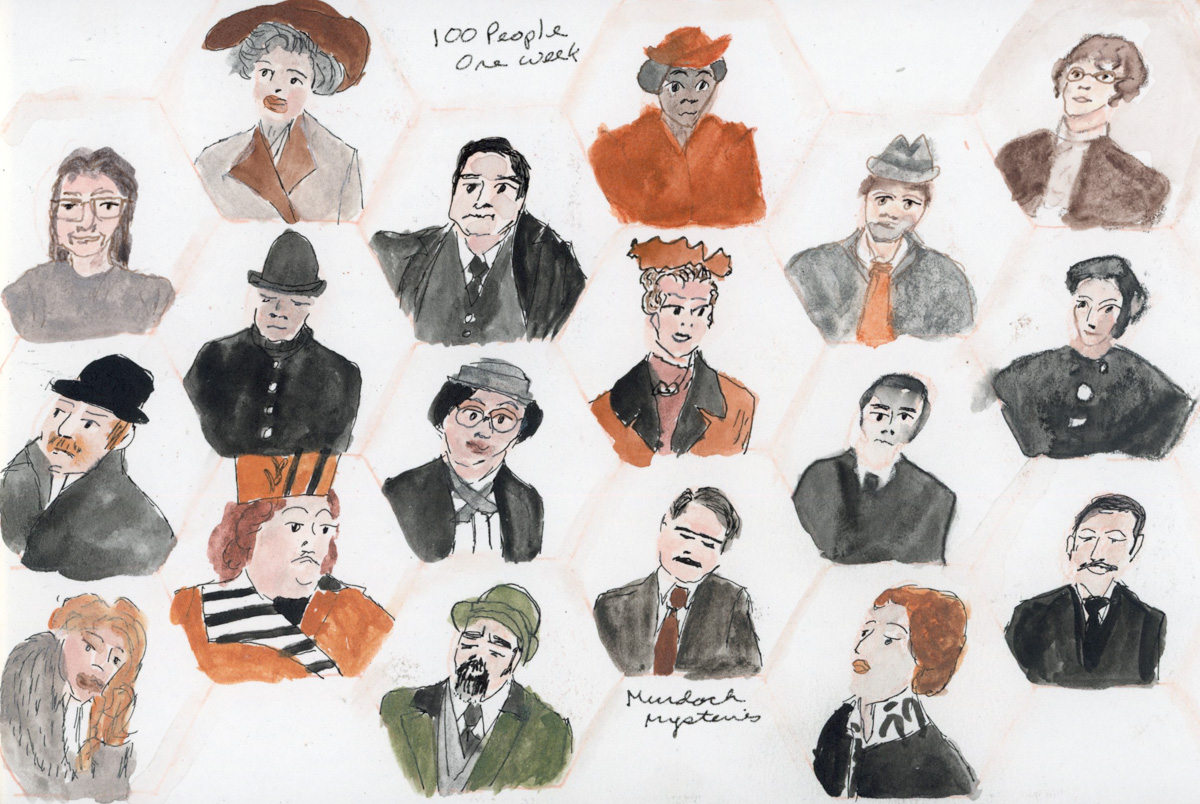
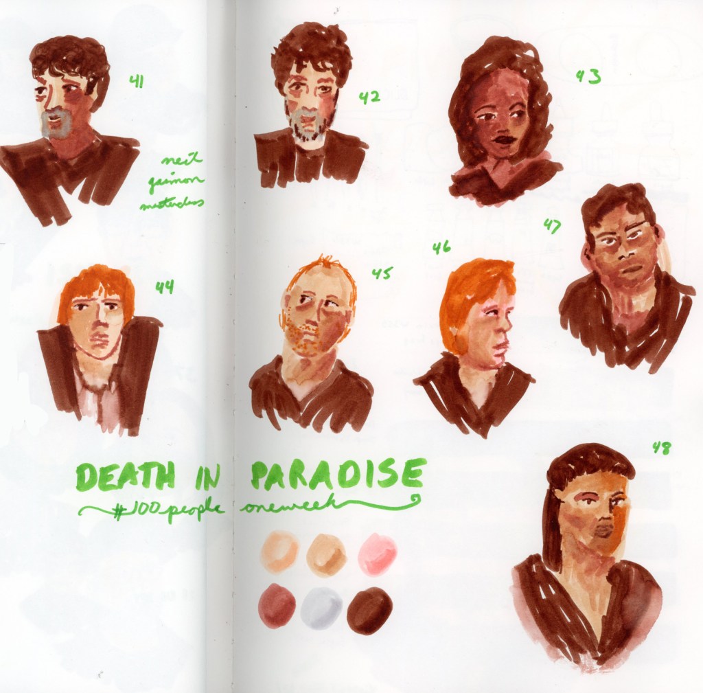
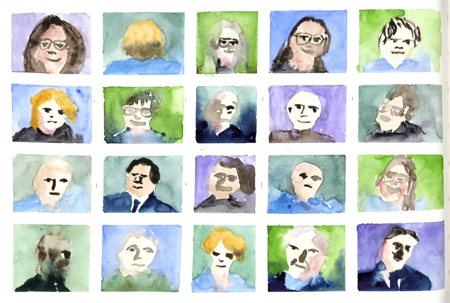
The portrait grid was directly inspired by Liz Steel’s approach this year, Mine are small watercolor faces in a taped-off grid, about 1-inch square. I used narrow green masking tape, which you can see in the photo. The portraits are mostly SG1 faces, though mixed in among them are three self-portraits I drew holding up my camera!

A grid of twenty small watercolor portrait sketches, arranged five across and four down. Faces in warm skin tones are painted against washes of green, blue, and purple. Hair ranges from bald to dark, blond to grey. Several figures wear glasses. The wet-into-wet watercolor technique gives many faces a soft, blooming quality.

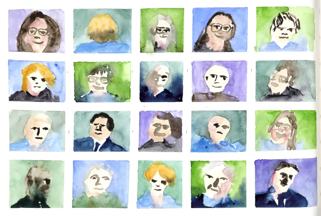
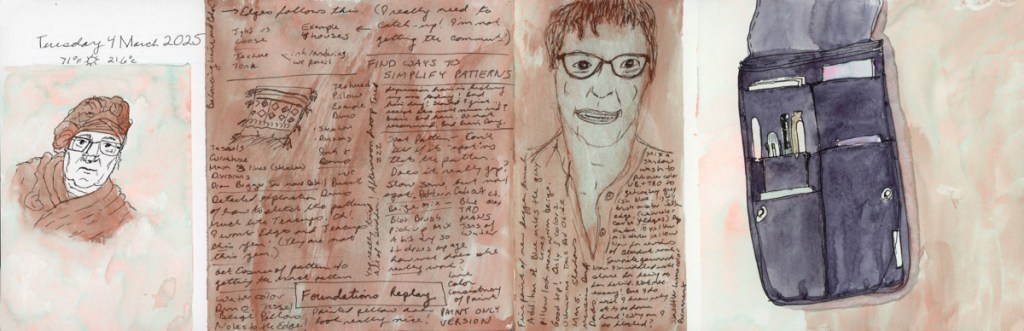
I painted directly in watercolor, no pencil underdrawing, and I did not wait for paint to dry. The color blooms that resulted are some of my favorite things on the page. I was working pretty wet, and puddles of color bleeding, especially in the backgrounds, did beautiful things! Colors drifting into each other, faces softened by wandering washes. The whole grid has a dreamy, watercolory quality I really love.

Skin tones came from Buff Titanium, Potter’s Pink, and Van Dyke Brown. Other colors included Monte Amiata Natural Sienna, Sap Green (Winsor & Newton), Forest Green (Sennelier), Cobalt Violet, and Shadow Violet. (All paints are Daniel Smith, unless otherwise called out.) One brush throughout: the Rosemary & Co. R13.

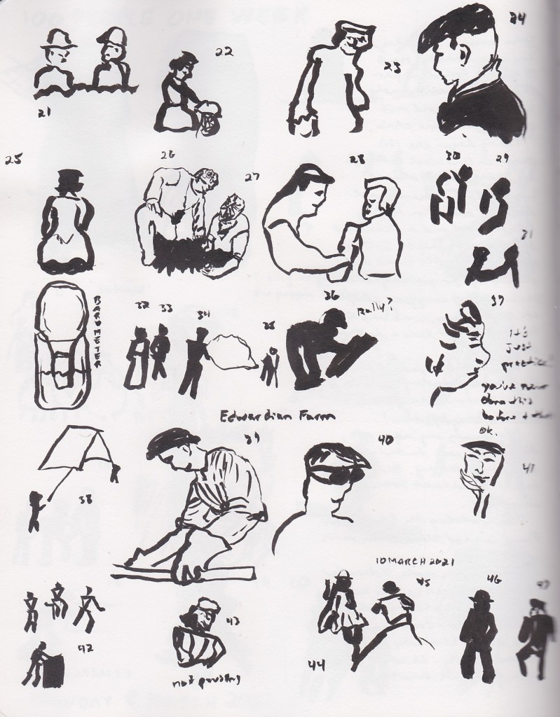
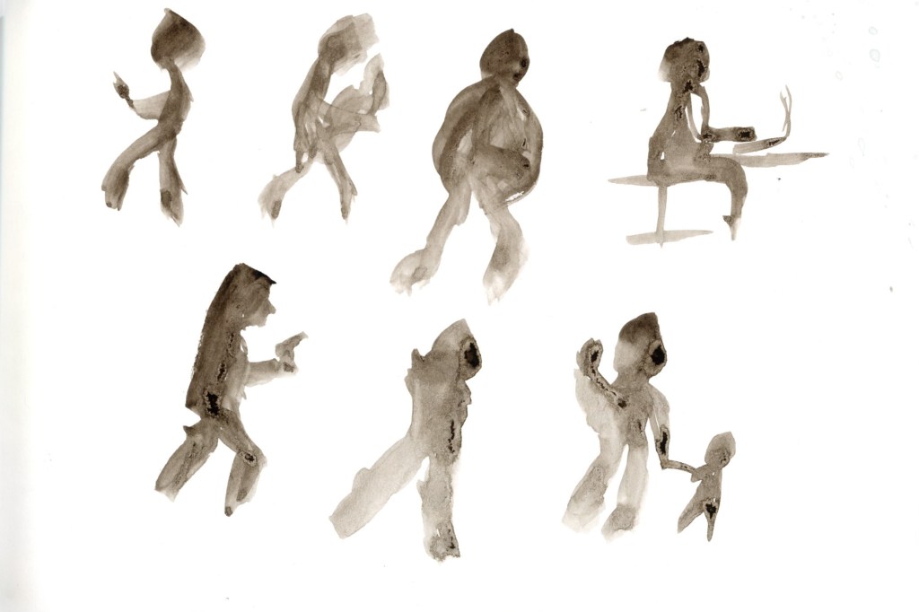
The gesture figures on the facing page are a different story. Real people, sketched live, with brush and Van Dyke Brown wash. People walking past, sitting, moving. Seven of them. I’m proud of those. I love the parent with two kids the best.

even loose gesture figures painted in Van Dyke Brown wash on a white page, arranged in two informal rows. The figures are caught in various poses — walking, sitting, looking at a phones, carrying and holding hands with small children. The brushwork is fluid and gestural, with shapes suggested rather than detailed.

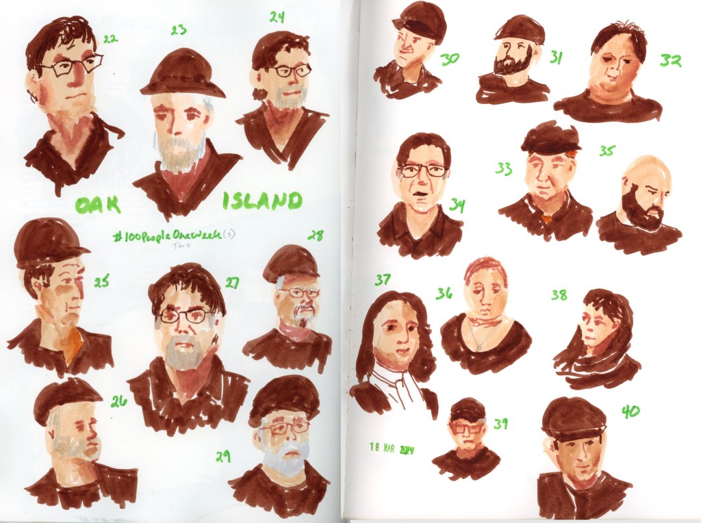
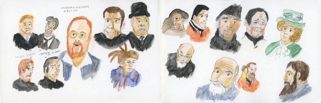
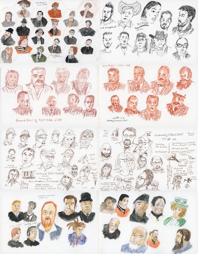
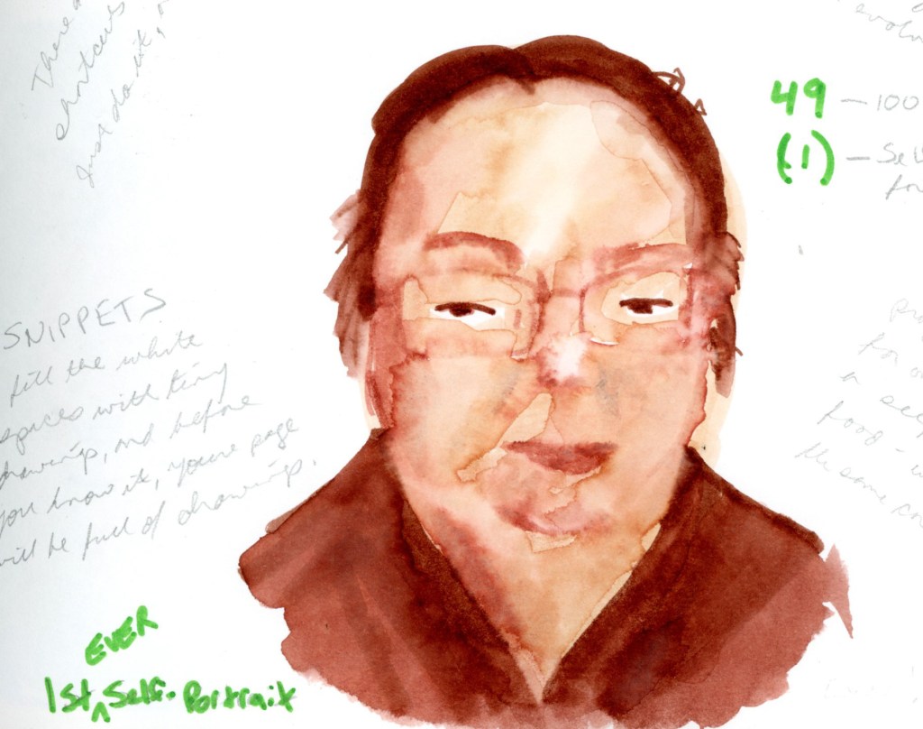
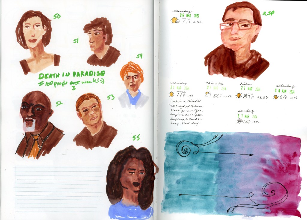
Twenty-seven people total. The challenge calls for a hundred in a week, and I started on Thursday. We will see if I am able to do more this weekend, but if this is where I land, I’m happy with it. Twenty-seven faces, one good hour, and a page I genuinely love.

One Week 100 People 2026 Starts

One Week, One Hundred People

Every year, -ish, I do this challenge. I love it. And every year, before I start, I get a bit stressed how hard people are to draw.

This is One Week 100 People — a challenge that runs annually in the Urban Sketchers community, where sketchers commit to drawing one hundred people in one week. It sounds challenging. It is, a little. But when you start, and something loosens up, and the faces start coming.

I always do better at faces than I think I will. Even the hilariously misshapen ones are somehow delightful. I don’t often get a genuine resemblance, but if it looks like a person at all, I’m happy with it. Once I get into it, I always feel that faces are fun, and why was I so resistant?

A little history

I first did this challenge in 2021. I’d never drawn people before — not once. I picked up a brush pen, found an episode of Edwardian Farm (a British documentary where living historians recreate life on an Edwardian farm, which is exactly as charming as it sounds), and started drawing. I didn’t get to 100, and that was fine. I loved these little gestures.

I skipped 2022 and 2023. Life happened. Or maybe I was too intimidated to begin.

In 2024 I came back with a Faber Castell dual markers portrait set and spent the week with Murdoch Mysteries, Oak Island, and Death in Paradise keeping me company. You can see the 2024 entry here.

2025 was my favorite year so far — I experimented with materials, mostly using the Inktense Shade and Tone Mixed Media Set, and the full color pages are ones I’m genuinely proud of. You can see all of those pages in last year’s post.

And this year?

This year’s faces will be coming from Stargate SG1, mostly. It’s what I’m streaming right now. I have my sketchbook taped up and ready — a grid of narrow green masking tape waiting to be filled with faces. This I plan to sketch in the business center of my gym and attempt to sketch people live. Quick gestures, people in motion, no time to overthink it.

Maybe that’s the best possible way to start. One hundred people. One week. Here we go.

One Week 100 People 2025

I did it! I sketched 100 people in one week! I sketched mostly from television, mostly Murdoch Mysteries (costumes are fun to draw!) I used a variety of media and enjoyed the exploration. The first page took me 3 hours to complete, the Pitt Pastel Sanguine page, took 1 hour. The rest fell somewhere in the middle.

100 People One Week — 2025

I did it! I sketched 100 people in one week!

Well — one week spread across a few sessions, with a lot of good television keeping me company. This was my most experimental year yet, and I loved every messy, discovery-filled minute of it.

I sketched mostly from television — mostly Murdoch Mysteries, because the costumes are just so fun to draw — but also The Curse of Oak Island, and a show called Unexplained and Unexplored, which turned out to be surprisingly good drawing material. Lots of interesting faces.

A composite image showing all the sketchbook pages from the 2025 One Week 100 People challenge, arranged in a grid. The pages show a variety of media and styles including watercolor, sanguine pastel, fineliner pen, and mixed media, with faces drawn from Murdoch Mysteries, The Curse of Oak Island, and Unexplained and Unexplored.

The Materials

This was a mixed media year, and I leaned into that fully. I used more different tools and materials than any previous year, and I learned things along the way.

The anchor of the year was the Derwent Shade and Tone Mixed Media Set — a gorgeous set with a full range of warm and cool tones across Inktense, Graphitint, Tinted Charcoal, and Pastel Shade media. The first page I completed used this set, with the Murdoch Mysteries faces arranged in a light hexagon grid. That page took about three hours. I also did detailed color swatches of the entire set — all twelve colors and media — which became its own little design on the left page.

A double page sketchbook spread. The left page features large painted color blocks and a detailed list of named swatches from the Derwent Shade and Tone Mixed Media Set, with the set name written vertically along the edge. The right page shows faces from Murdoch Mysteries arranged against a lightly drawn hexagon grid, with the handwritten title '100 People One Week' and the label 'Murdoch Mysteries.'

I also worked with the Derwent Drawing Terracotta 6400 — a rich sanguine drawing pencil — and the Pitt Pastel 1122-138, a sanguine pastel. Both on the same spread, one page each. That spread took one hour. The difference between the two is fascinating — the pencil gives fine detail, the pastel is looser and warmer. Both are entirely in that beautiful terracotta red.

A double page sketchbook spread worked entirely in warm sanguine tones. The left page features faces sketched from television using Derwent Drawing Terracotta 6400, with faces scattered loosely across the page. The right page uses Pitt Pastel 1122-138, with faces arranged in two rows, labeled with the date Monday 3 March 2025 and a weather stamp showing 64°F."

One of my favorite pages featured the Gansai Tambi Granulating Aurora Orange — such a gorgeous paint! I used it for the background wash and the portrait itself. The granulating effect it makes in the skin tones is just beautiful. This is my third self-portrait, and I remain unconvinced it looks much like me, but I love the page.

A self-portrait with a soft, blooming background wash in Gansai Tambi Granulating Aurora Orange watercolor. The portrait is rendered in the same paint with black ink linework, showing a figure wearing glasses and a hat. The granulating quality of the paint creates a delicate, mottled texture throughout."

For the Oak Island pages I switched to the Faber-Castell Pitt Artist Fineliner in Dark Sepia 175 — a lovely warm brown line that suits those weathered, cap-wearing Oak Island faces perfectly. This spread is packed — faces, notes, measurements, show details. It has a wonderful chaotic energy.

A double page sketchbook spread drawn entirely in Faber-Castell Pitt Artist Fineliner Dark Sepia 175. Faces from The Curse of Oak Island are scattered densely across both pages alongside handwritten notes about the show, materials, and measurements. The handwritten title 'The Curse of Oak Island' and the date Wednesday 5 March 2025 appear among the portraits."

I found a new favorite paint on the Thursday pages — Holbein Sepia watercolor, which I tested in a set of swatches alongside more Unexplained and Unexplored pen drawings on the left and Murdoch Mysteries faces in the Shade and Tone set on the right.

A double page sketchbook spread with three distinct areas. The left portion features faces drawn in sepia fineliner pen from the TV show Unexplained and Unexplored, with handwritten notes about Meriwether Lewis. The center features vertical swatch strips of Holbein Sepia watercolor in a range of tones. The right portion features faces from Murdoch Mysteries drawn with the Derwent Shade and Tone Mixed Media Set, with the date Thursday 6 March 2025 and a weather stamp showing 70°F.

The page featuring faces from Unexplained and Unexplored also has a little painted pencil case and color block done in that Aurora Orange — I was clearly smitten with that paint all week. Look at those colors, the oranges and greens, all from one paint!

A double page sketchbook spread. The left page features a painted illustration of a pencil case and a vertical color block, all in Gansai Tambi Granulating Aurora Orange watercolor. The right page shows faces drawn in black fineliner pen, sketched from the TV show Unexplained and Unexplored, with the show name handwritten below the portraits."

The final pages brought everything together — portraits 84 through 100, Murdoch Mysteries again, using the Shade and Tone set with a little blue and green watercolor for accent. I also made a useful discovery: Unipin pens bleed with watercolor, but Rapidograph ink does not. Noted for next time!

A double page sketchbook spread featuring portraits 84 through 100, sketched from Murdoch Mysteries using the Derwent Shade and Tone Mixed Media Set with blue and green watercolor accents. Faces are scattered across both pages in a mix of warm and cool tones. Handwritten notes record materials discoveries, including observations about Unipin and Rapidograph ink behavior with watercolor.

Best year yet! And the first time I did all 100 people! I did it! One hundred people. And I already can’t wait to do it again.

A Bag & More People

Using ink sketches for today’s people. It is certainly faster, but not exactly easier. When you get a line wrong, it really shows! Unless it’s in the hair. Hair gets lots of lines, so a wrong one doesn’t show as much! Ha!

I’ve done 48 sketches so far, in 3 days! I don’t think I got that far last year, but I’d have to look it up. I haven’t scanned that sketchbook yet, either, so I can’t share them now. The first year I tried it, I did gestures, and I only did 47 of them, but there were fun to do!

March Challenges

I’m participating in two challenges this month. One is the annual 100 People One Week challenge hosted by Liz Steel and Marc Taro Holmes. Last year I surprised myself by doing better people sketches than I thought I’d be able to, so I have to do it again!

The second challenge is from Liz Steel’s Patreon Community which is To the Edge. Take your sketches to the edge of the page. I’m intrigued by this one, because I do usually keep a border.

Naturally, I started by swatching paints. I decided to swatch the latest purchase of watercolors I made a couple weeks ago. I took the design element to the pages edges and really like the look of that.

Color blocks to use up left over paint. I was going to sketch a line drawing on the color block, but then I didn’t, and now I’ll just leave as it is. I did paint my cute little penguin. I painted it twice, and I laugh because the wet on wet technique (resulting bleed) to the paint on the head, gives it a more tufted look. Somehow, just that one error, and it looks like I painted an owl! This makes me smile, so I left it.

I color swatched my newest purchase, the Derwent Shades and Tones color palette (it has a combination of inktense paints, tinted charcoal, and more in it.) I wanted to sketch something else with this palette, so what better than the current week’s 100 People One Week challenge? So I set to sketching Murdoch Mysteries, which I was watching. (I also did one self-portrait. I’ll try to do at least one per day.)

Loving these people. This took more time to be so careful, but it was worth it for the first day! I’ll be using speedier techniques and different mediums each day, or each page. We’ll see.

The next day, I put an effort to not only speed up, but test the difference between the two pencils: Derwent Drawing Terracotta, and Faber Castell Pitt Pastel Sanguine. More Murdoch Mysteries portraits (and one self-portrait.) The pastel pencil is chalkier, as expected, but richer in color. To keep these from smudging too badly in the sketchbook when I close it, I use fixative when I’m done drawing.

One Week 100 People 2024

Wonderful! Here’s the cleaned-up final draft:


One Week 100 People — 2024

I came back to this challenge after two years away. Life happened, as it does. But in 2024 I finally sat back down with a sketchbook and committed to One Week 100 People again.

There was one big difference from 2021. Last time, I drew tiny gestural figures — whole bodies, loosely suggested, no faces to speak of. This year I decided to actually draw faces. Properly. Or as properly as I manage anything.

I treated myself to a new marker set to mark the occasion: the Faber-Castell Goldfaber Aqua Dual Marker Portrait set, with six warm tones — Apricot 116, Pale Pink 114, Sand 281, Vintage Pink 195, Terra Cotta 185, and Burnt Sienna 283. A small, muted palette. The warmest browns ended up doing a lot of heavy lifting, since Burnt Sienna was my only real dark — every head of hair, every jacket, every shadow ended up in that rich brown. I didn’t mind at all.

My companions for the week were Murdoch Mysteries, The Curse of Oak Island, and Death in Paradise. Good, comfortable television. The kind you can pause.

A double page sketchbook spread of faces drawn in warm tones with the Faber-Castell Goldfaber Aqua Dual Marker Portrait set, sketched from the TV show Murdoch Mysteries. Faces are scattered loosely across the pages, alongside named color swatches and the handwritten title 'One Week 100 People, in five days, 11–15 March.'

Somewhere around portrait 21, I drew someone live for the first time — a friend, sitting for me properly. It was more careful than the TV portraits, and it actually looks like him. Not a perfect likeness, but close enough that someone who knows him would recognize him. That felt like a milestone.

A single sketchbook page featuring portrait number 21, drawn from life with the Faber-Castell Goldfaber Aqua Dual Marker Portrait set. A bald man with glasses wears an orange shirt under a dark brown jacket. A handwritten date stamp at the top reads Tuesday, March 12, 2024.
A double page sketchbook spread of faces drawn in warm tones with the Faber-Castell Goldfaber Aqua Dual Marker Portrait set, sketched from the TV show The Curse of Oak Island. Portraits numbered 22 through 40 are scattered across the pages, with the handwritten label 'Oak Island' and a date stamp reading 19 March 2024."
A double page sketchbook spread of faces drawn in warm tones with the Faber-Castell Goldfaber Aqua Dual Marker Portrait set, sketched from the TV show Death in Paradise. Portraits numbered 41 through 48 are scattered across the pages, alongside six unnamed color swatches and the handwritten title 'Death in Paradise, #100 People One Week.'

Portrait 49 is one of my favorite pages from the whole challenge. I added water to the markers and got the most beautiful blooming effects in the skin tone — soft and loose and a little unpredictable. Exactly the kind of happy accident that makes me love this medium. My first ever self-portrait, which looks nothing like me. But I do love the effects of the water on the marker and the blooms created.

I stopped at 56, which is my second ever self-portrait. Also looks nothing like me. My people sketches were spread across three weeks, and I am completely fine with that.

A double page sketchbook spread. The left page features six faces from Death in Paradise, numbered 50 through 55, drawn with the Faber-Castell Goldfaber Aqua Dual Marker Portrait set, with the crossed-out heading '#100 People One Week' corrected to 'three weeks.' The right page features a self-portrait labeled 2SP, date stamps and weather notes spanning Tuesday March 26 through Sunday March 31 2024, a handwritten journal note, and a painted gradient in teal and magenta with pen flourishes."

What surprised me most was how easily the faces came. I’d been nervous — faces are intimidating. But once I started, something loosened up. I was better at it than I thought I would be. Though I was happy if it just looked like a person, and not too distorted. I didn’t mind if it didn’t actually look like the person!

I’m glad I did this challenge this year. I’ll definitely do it again next years!