One Week 100 People 2026 Starts

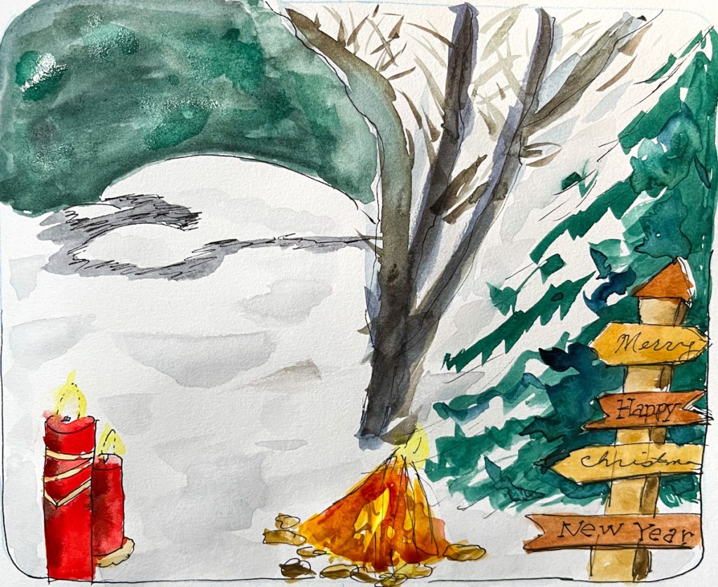
One Week, One Hundred People

Every year, -ish, I do this challenge. I love it. And every year, before I start, I get a bit stressed how hard people are to draw.

This is One Week 100 People — a challenge that runs annually in the Urban Sketchers community, where sketchers commit to drawing one hundred people in one week. It sounds challenging. It is, a little. But when you start, and something loosens up, and the faces start coming.

I always do better at faces than I think I will. Even the hilariously misshapen ones are somehow delightful. I don’t often get a genuine resemblance, but if it looks like a person at all, I’m happy with it. Once I get into it, I always feel that faces are fun, and why was I so resistant?

A little history

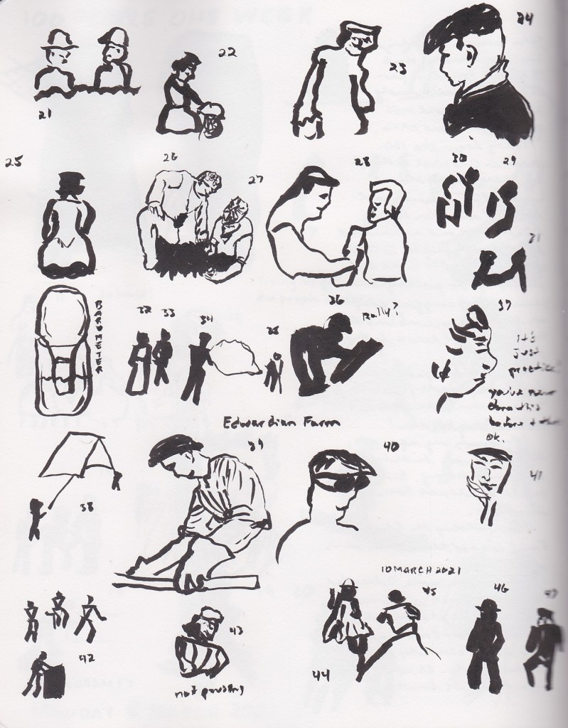
I first did this challenge in 2021. I’d never drawn people before — not once. I picked up a brush pen, found an episode of Edwardian Farm (a British documentary where living historians recreate life on an Edwardian farm, which is exactly as charming as it sounds), and started drawing. I didn’t get to 100, and that was fine. I loved these little gestures.

I skipped 2022 and 2023. Life happened. Or maybe I was too intimidated to begin.

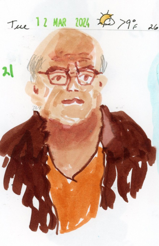
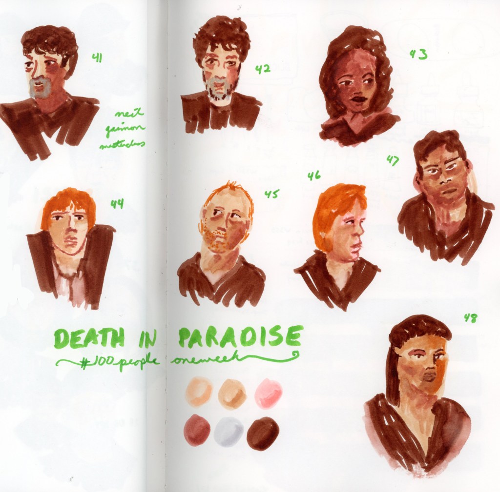
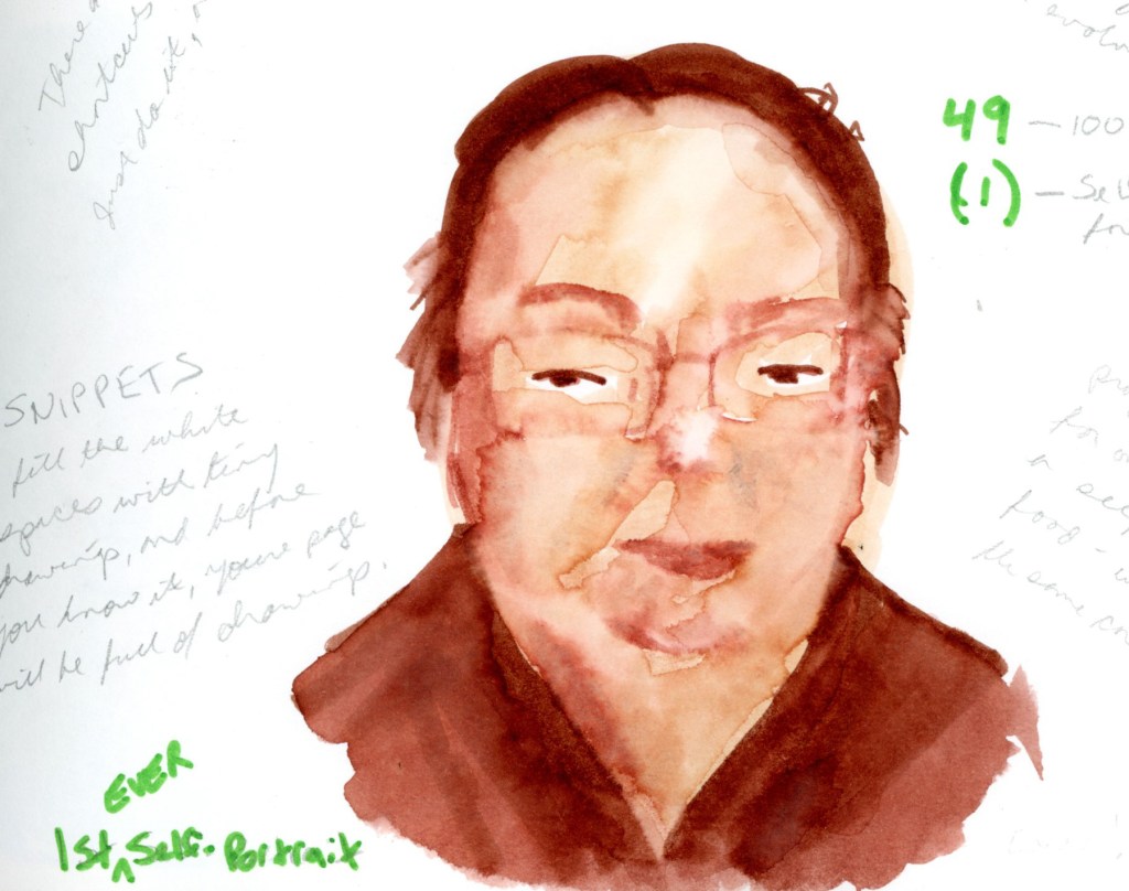
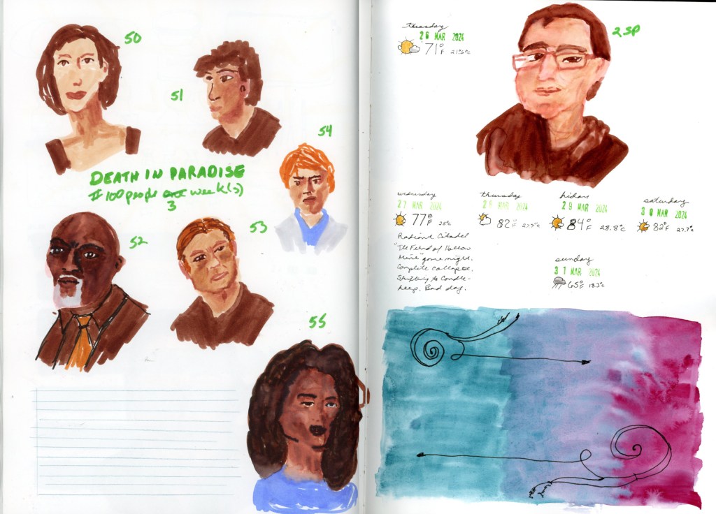
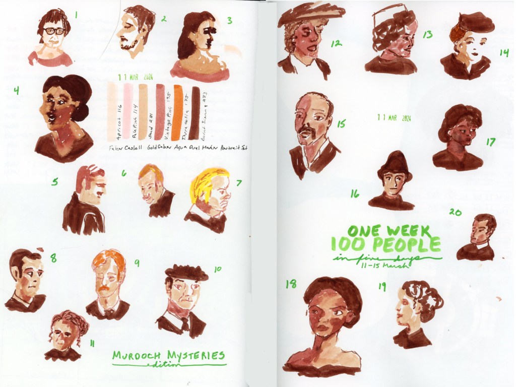
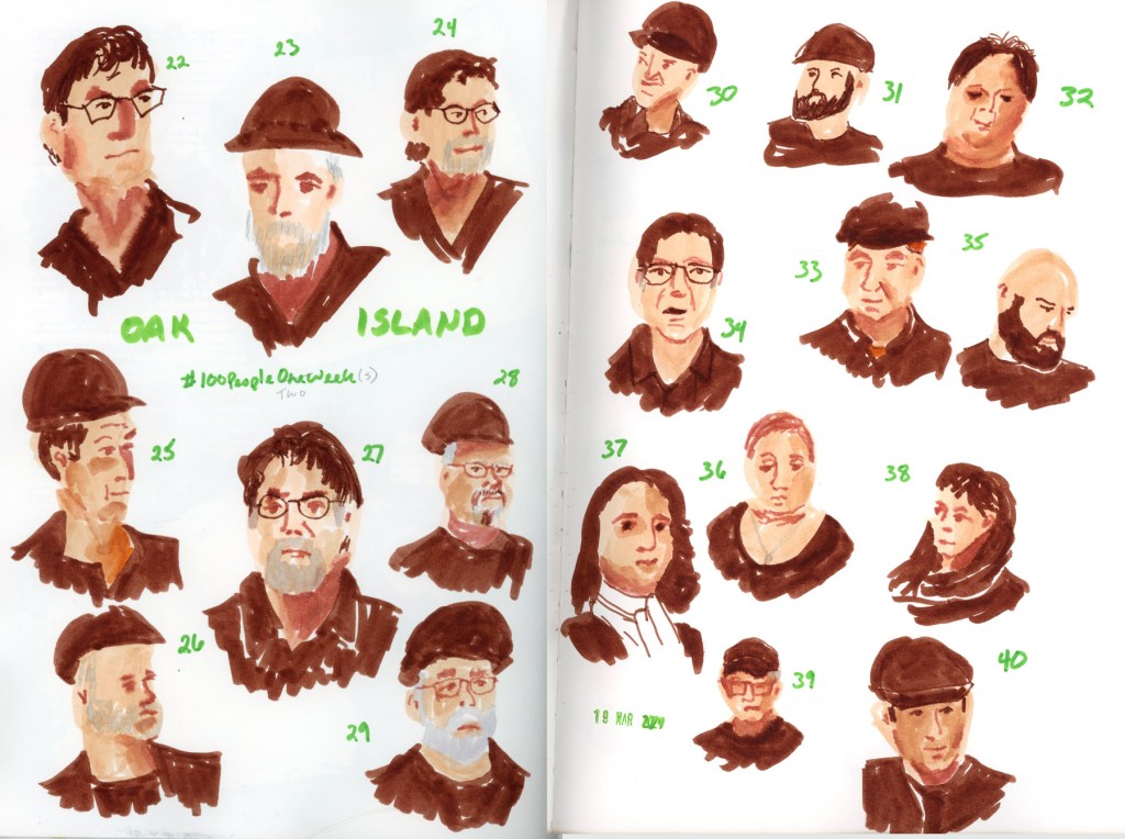
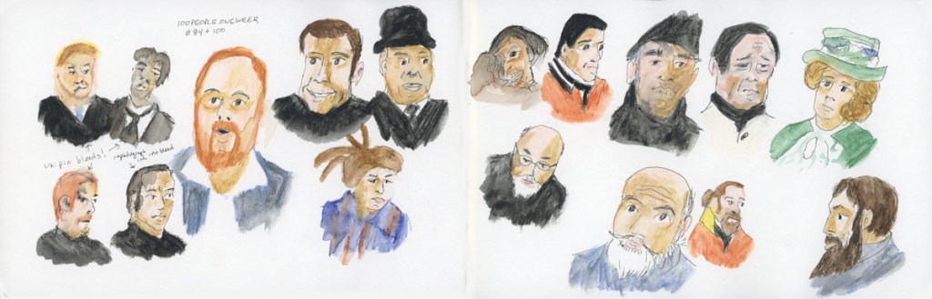
In 2024 I came back with a Faber Castell dual markers portrait set and spent the week with Murdoch Mysteries, Oak Island, and Death in Paradise keeping me company. You can see the 2024 entry here.

2025 was my favorite year so far — I experimented with materials, mostly using the Inktense Shade and Tone Mixed Media Set, and the full color pages are ones I’m genuinely proud of. You can see all of those pages in last year’s post.

And this year?

This year’s faces will be coming from Stargate SG1, mostly. It’s what I’m streaming right now. I have my sketchbook taped up and ready — a grid of narrow green masking tape waiting to be filled with faces. This I plan to sketch in the business center of my gym and attempt to sketch people live. Quick gestures, people in motion, no time to overthink it.

Maybe that’s the best possible way to start. One hundred people. One week. Here we go.

Sketchbook Design October 2024

I did this class as an independent study. I’d really looked forward to it when it was scheduled, but then the schedule changed, and I wanted to do the class anyway so I stuck with it. Here is the wrap-up:

Hmm, apparently I haven’t uploaded many of the remaining pages for these either. Interesting. So here is some of it. I may have to edit this page at some point in the future.

Ponds and Pumpkins

Last week’s sketchbook pages had a lot more focus on sketchbook design since I am taking the class as an independent study program.

Having recently finished the Travel Sketching class, when I had the opportunity to walk Stonecreek, I brought my sketchbook with me, and tackled a scene that has long seemed very intimidating. This landscape view from the bottom of the pond. So I began with 5 shapes, and then added texture and details. Many of the details arrived while sketching. When the flock of Canadian geese flew in and landed on the water, so I had to add them in. When the American Coot swam up and gave me extended side-eye, perfectly posing for my sketch. He swam off just as I finished his addition! A cardinal in a tree branch, with the grey pond behind him, highlighting his colors. (He was so quick to fly off, I could only catch him via photo, and painted him later when I finished the page.)

I added the map, the titles, and the text block to finish off this page.

This also happens to be the first full spread page in my new sketchbook! I’m sticking with the 7.5×7.5-inch Stillman & Birn Softcover Alpha for now. The smaller pages are satisfying right now, and feel good. Keeping it simpler to encourage building a daily practice of sketchbook pages.

For this spread I used colored ink for extra notes, and the two ink color swatches to fill in a space. The ink is Diamine, and those are two of my favorite autumn colors.

This is a part of an Alley of Ambience image. Drawing campfires is hard, but I may be in love with those pumpkins!

This page is a little more abstract. I love Elisabeth Alba’s art and I had these various stickers of hers. I’d also put the 5×7 prints I have of her work into a newly purchased portfolio album. This simple spread marks that for this week. The raven is also on a half sheet, which flips over for a second color block of transparent red oxide, which is fun and interactive in my sketchbook.

I will cut half pages sometimes when I have a lot of collage, to reduce the overall bulk in the finished sketchbook. It’s a fun way to do interesting pages.

As usual, my participation in the Sketchbook Design class has me sketching more pages, and putting a lot more thought into their layouts and designs. I love them even more when I’m putting in the extra effort and time! I also seem to have leveled up in my drawing ability! Don’t ask me how THAT happened! It seems to happen at random intervals and I’m sure it’s a product of practice. And the many lessons, of course. That Travel Sketching class really did seem to help me level up, didn’t it?

Onto the next week! The holiday season begins in earnest and I wonder what my sketchbook will capture next?

One Week 100 People 2024

Wonderful! Here’s the cleaned-up final draft:


One Week 100 People — 2024

I came back to this challenge after two years away. Life happened, as it does. But in 2024 I finally sat back down with a sketchbook and committed to One Week 100 People again.

There was one big difference from 2021. Last time, I drew tiny gestural figures — whole bodies, loosely suggested, no faces to speak of. This year I decided to actually draw faces. Properly. Or as properly as I manage anything.

I treated myself to a new marker set to mark the occasion: the Faber-Castell Goldfaber Aqua Dual Marker Portrait set, with six warm tones — Apricot 116, Pale Pink 114, Sand 281, Vintage Pink 195, Terra Cotta 185, and Burnt Sienna 283. A small, muted palette. The warmest browns ended up doing a lot of heavy lifting, since Burnt Sienna was my only real dark — every head of hair, every jacket, every shadow ended up in that rich brown. I didn’t mind at all.

My companions for the week were Murdoch Mysteries, The Curse of Oak Island, and Death in Paradise. Good, comfortable television. The kind you can pause.

A double page sketchbook spread of faces drawn in warm tones with the Faber-Castell Goldfaber Aqua Dual Marker Portrait set, sketched from the TV show Murdoch Mysteries. Faces are scattered loosely across the pages, alongside named color swatches and the handwritten title 'One Week 100 People, in five days, 11–15 March.'

Somewhere around portrait 21, I drew someone live for the first time — a friend, sitting for me properly. It was more careful than the TV portraits, and it actually looks like him. Not a perfect likeness, but close enough that someone who knows him would recognize him. That felt like a milestone.

A single sketchbook page featuring portrait number 21, drawn from life with the Faber-Castell Goldfaber Aqua Dual Marker Portrait set. A bald man with glasses wears an orange shirt under a dark brown jacket. A handwritten date stamp at the top reads Tuesday, March 12, 2024.
A double page sketchbook spread of faces drawn in warm tones with the Faber-Castell Goldfaber Aqua Dual Marker Portrait set, sketched from the TV show The Curse of Oak Island. Portraits numbered 22 through 40 are scattered across the pages, with the handwritten label 'Oak Island' and a date stamp reading 19 March 2024."
A double page sketchbook spread of faces drawn in warm tones with the Faber-Castell Goldfaber Aqua Dual Marker Portrait set, sketched from the TV show Death in Paradise. Portraits numbered 41 through 48 are scattered across the pages, alongside six unnamed color swatches and the handwritten title 'Death in Paradise, #100 People One Week.'

Portrait 49 is one of my favorite pages from the whole challenge. I added water to the markers and got the most beautiful blooming effects in the skin tone — soft and loose and a little unpredictable. Exactly the kind of happy accident that makes me love this medium. My first ever self-portrait, which looks nothing like me. But I do love the effects of the water on the marker and the blooms created.

I stopped at 56, which is my second ever self-portrait. Also looks nothing like me. My people sketches were spread across three weeks, and I am completely fine with that.

A double page sketchbook spread. The left page features six faces from Death in Paradise, numbered 50 through 55, drawn with the Faber-Castell Goldfaber Aqua Dual Marker Portrait set, with the crossed-out heading '#100 People One Week' corrected to 'three weeks.' The right page features a self-portrait labeled 2SP, date stamps and weather notes spanning Tuesday March 26 through Sunday March 31 2024, a handwritten journal note, and a painted gradient in teal and magenta with pen flourishes."

What surprised me most was how easily the faces came. I’d been nervous — faces are intimidating. But once I started, something loosened up. I was better at it than I thought I would be. Though I was happy if it just looked like a person, and not too distorted. I didn’t mind if it didn’t actually look like the person!

I’m glad I did this challenge this year. I’ll definitely do it again next years!