
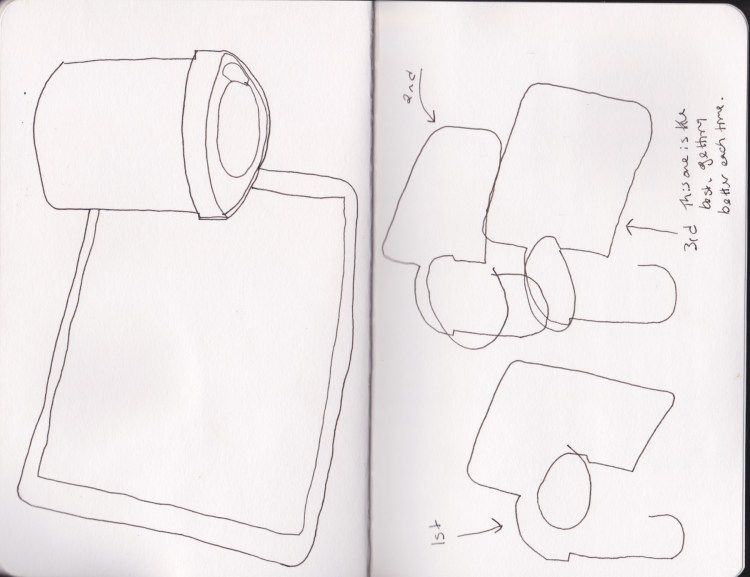
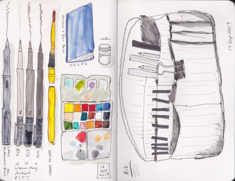
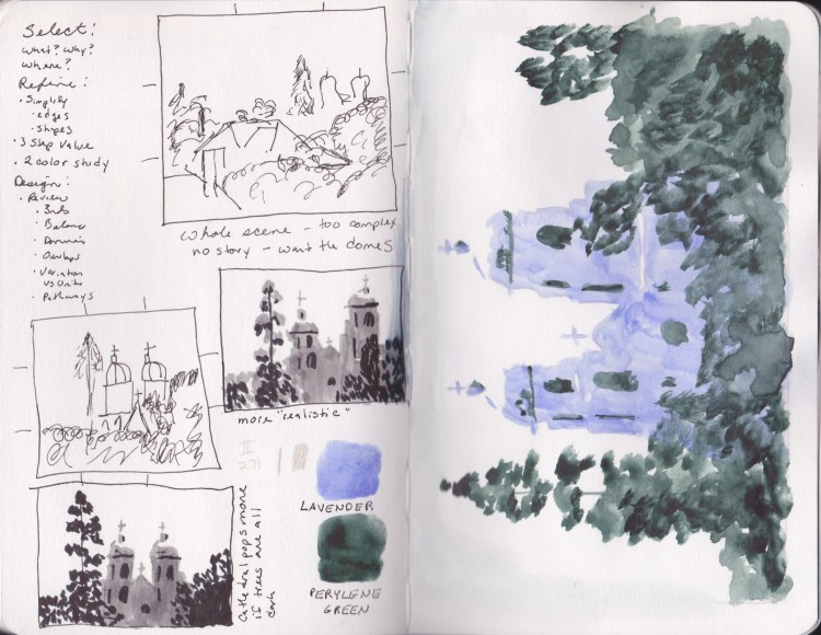


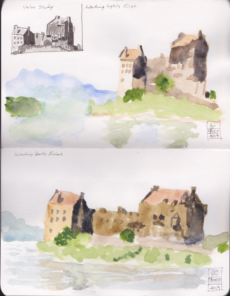


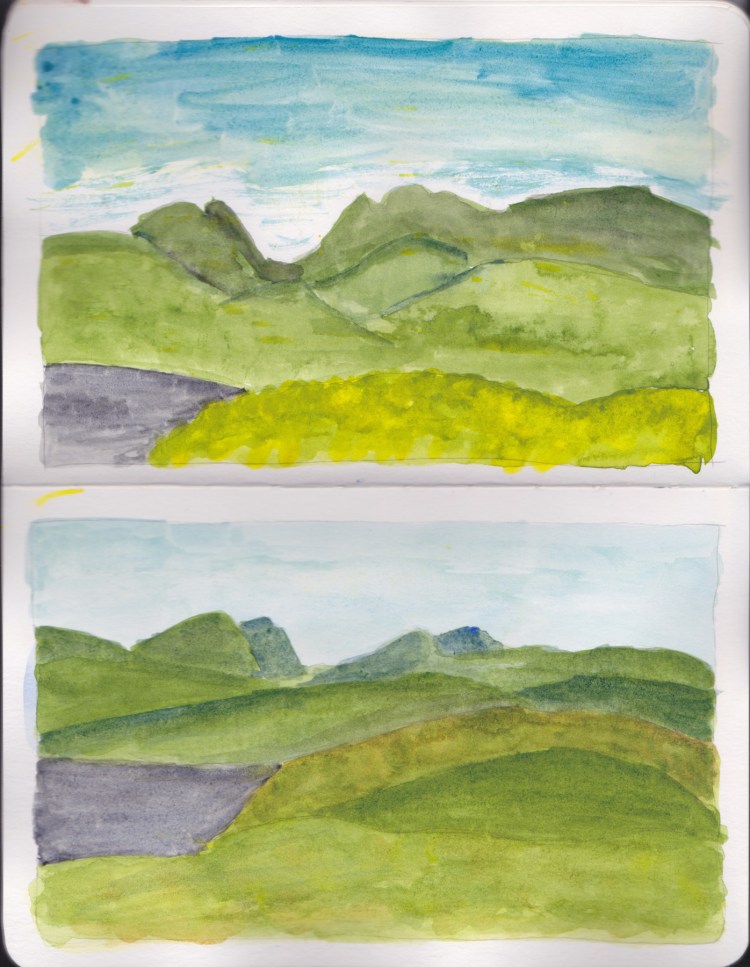
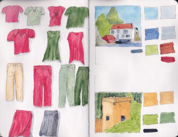
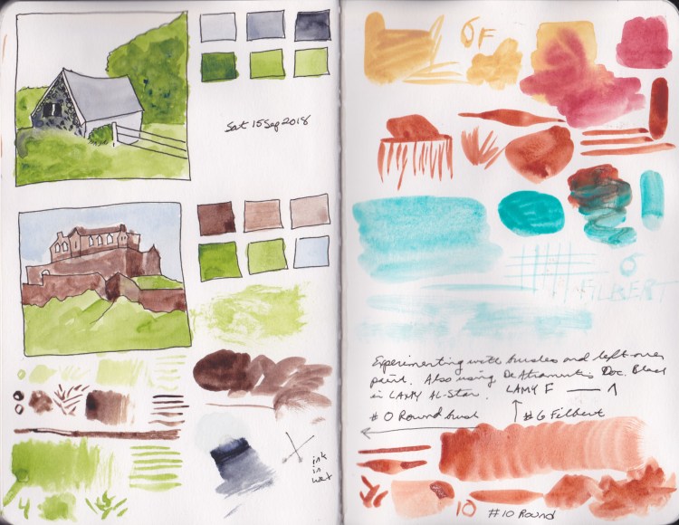
This is the first sketchbook I finished, the second sketchbook I started. I had accidentally labeled it volume 1, then found the earlier sketchbook, so I changed it to volume 1b. This is a 5.5 x 8.5 inch Stillman & Birn Beta, softcover. I used it mostly for classwork, and color tests. Very much a working sketchbook.
Category Archives: Color
So Many Colors!
I am obsessed with color! Now I was bitten with the color bug, and just had to try out all sorts of different pigments and find out what I had in stash, as well as the new ones I bought just for fun. I filled pages with these color tests in my Stillman & Birn Beta.


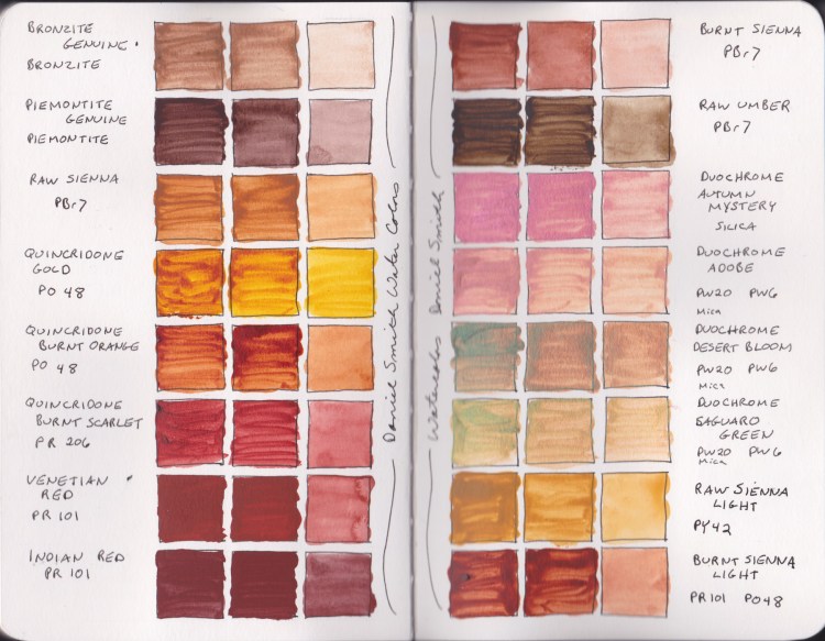


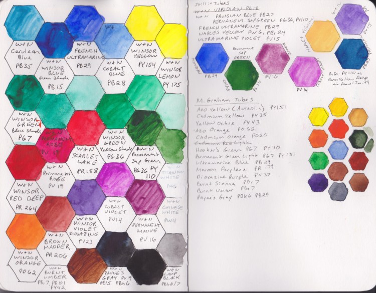
I learned a lot about these paints during this phase. Then I had to learn how to mix greys. I tried a few recipes I’d read from others, and tested them out myself.
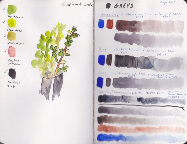
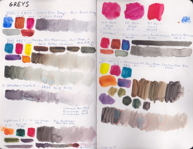

Watercolor Course 2020
When I started Liz Steel’s Watercolor class in August 2018 I chose the Stillman & Birn Beta, size 5.5 x 8.5 inches (14.0 x 21.6 cm) Softcover. I bought her palette colors, and loved the idea of painting the palette to start the sketchbook.
Why is this Sketchbook 1B, instead of 2? Well, when I was trying to round up my sketchbooks by the time I had several of them going, I numbered this one 1, but ended up finding the earlier sketchbook, so it became 1A, and this one became 1B.

The very first palette I set up myself! I was so proud of my filled half-pans, and of my color labels right here on page one! Great way to start a sketchbook!

The first lessons of the course were to experiment with the marks ones brush can make, and how to test the properties of the paint, and the paper. What a revelation this was to me! Not all paper is the same? Not all pigments behave the same? Not all brushes brush the same?! Mind blown!
I loved every lesson I did, and learned so much.




Experiments with Food and Color Tests
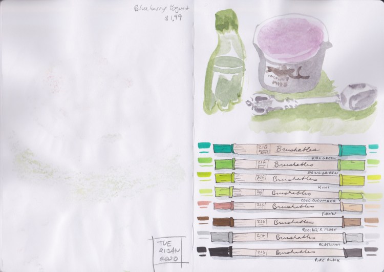
Food sketches and color tests were a big focus for much of the rest of my very first sketchbook. This is an A5 Leuchtturm Sketchbook, which I was beginning to realize was not very good paper for the wet techniques I prefer. That did not stop me from playing with and finishing the book. Here continues my tour through Sketchbook 1A.


Love this Lasagna sketch!
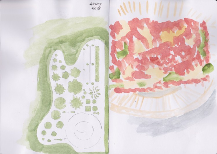
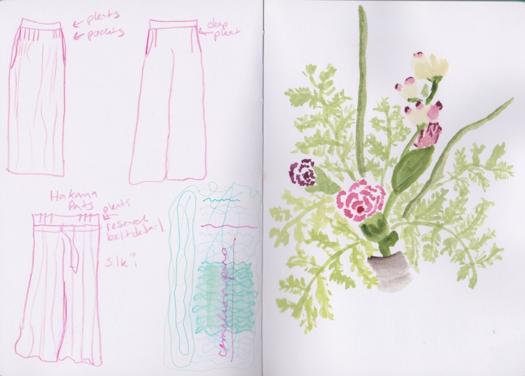

Here I am testing Monte Amiate Natural Sienna, Geothite, Naples Yellow, and Quincridone Gold.
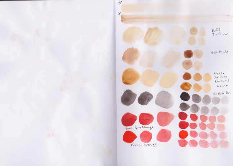
More tests of Monte Amiate Natural Sienna and Goethite, this time with Buff Titanium, and Van Dyke Brown. I also Tested Transparent Pyrrol Orange versus Pyrrol Orange.
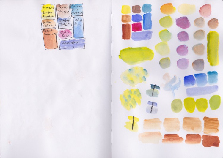
This is the Big Impact palette produced by Expeditionary Art and Uma Kelkar. I was testing out what kind of mixes I could achieve with it, in order to get a feel for it.
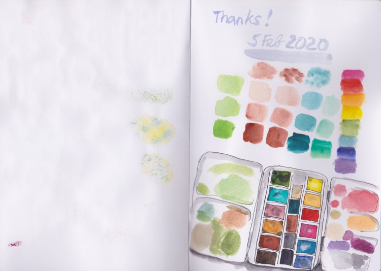
My primary palette, as it was when I finished this sketchbook in February.

