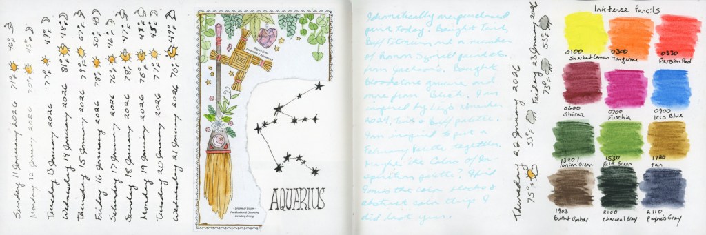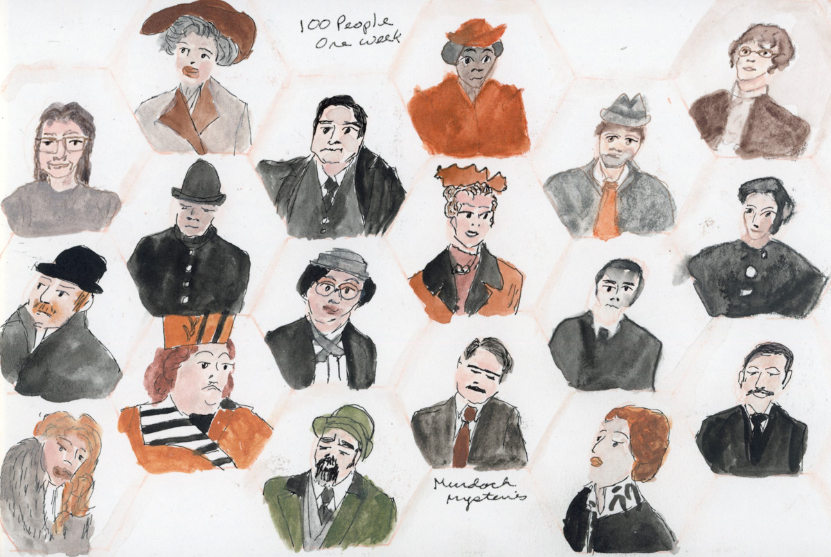
March Theme: Three
Liz Steel’s Patreon community theme for March was Three. Three sketches, three objects, three colors, a triad palette all counted, and it is a very versatile theme. I didn’t sketch as much this month as I wanted (hello inflammation hit!), but when I looked back through my sketchbook, three had been quietly showing up all along.
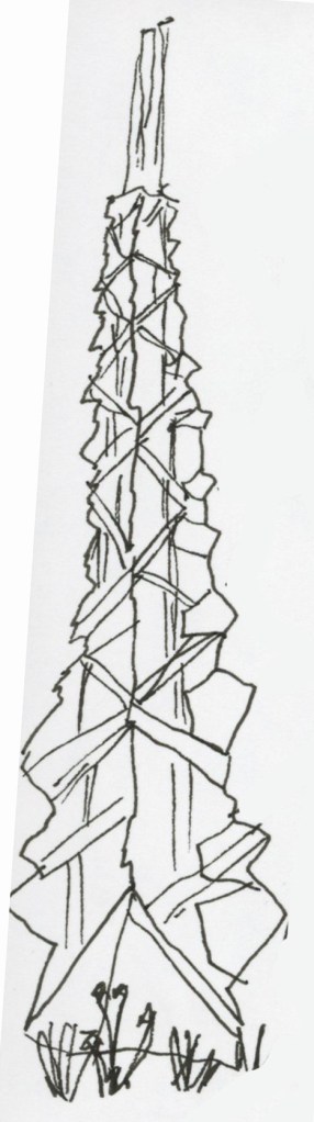
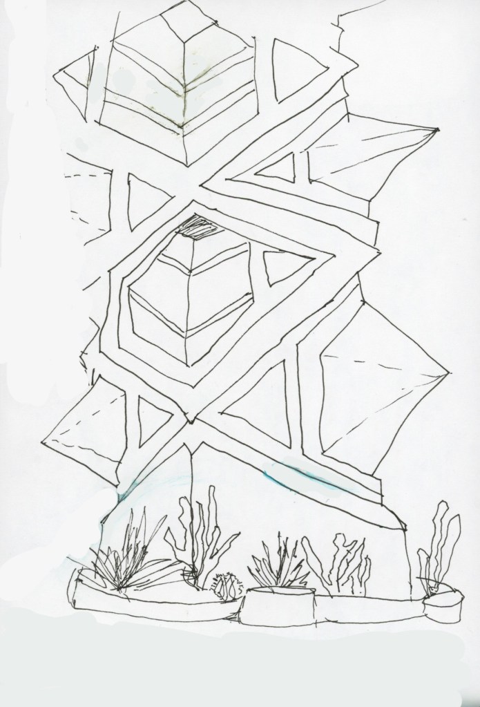
The most obvious was the Frank Lloyd Wright spire. I drew it three times. First just ink, getting acquainted with the energy of it. The second ink sketch was working on getting those complex angles and changes in plane. The spire has this wonderful jagged, faceted quality and it took real concentration to follow all those shifting surfaces. Much more challenging subject than I anticipated!
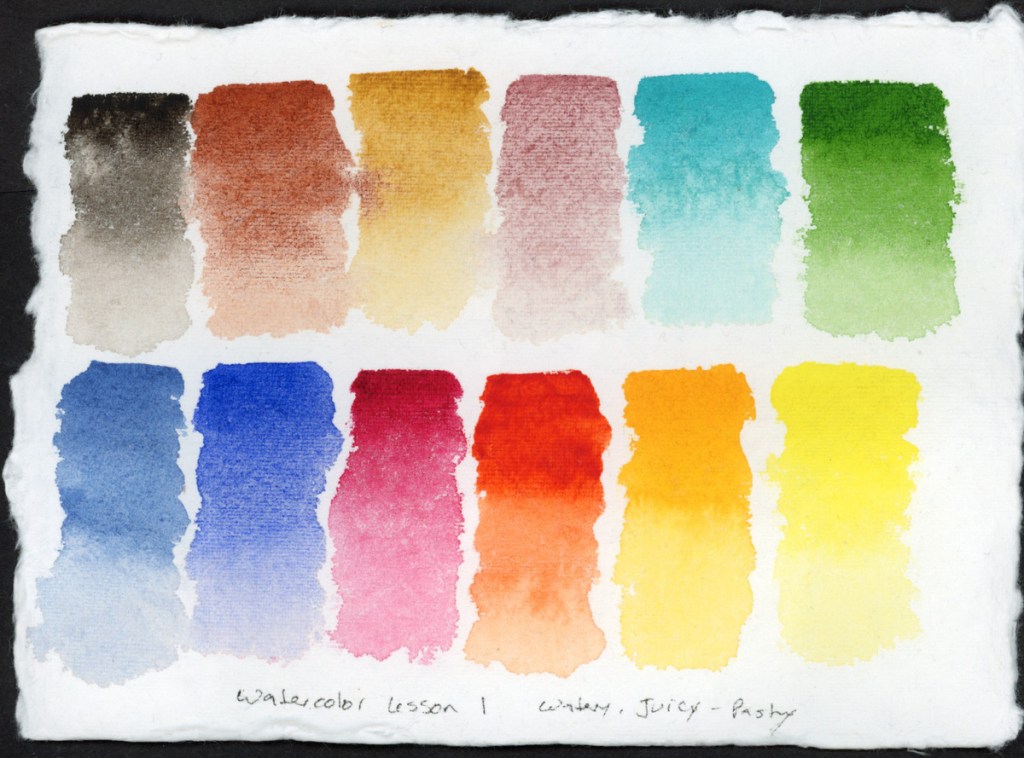
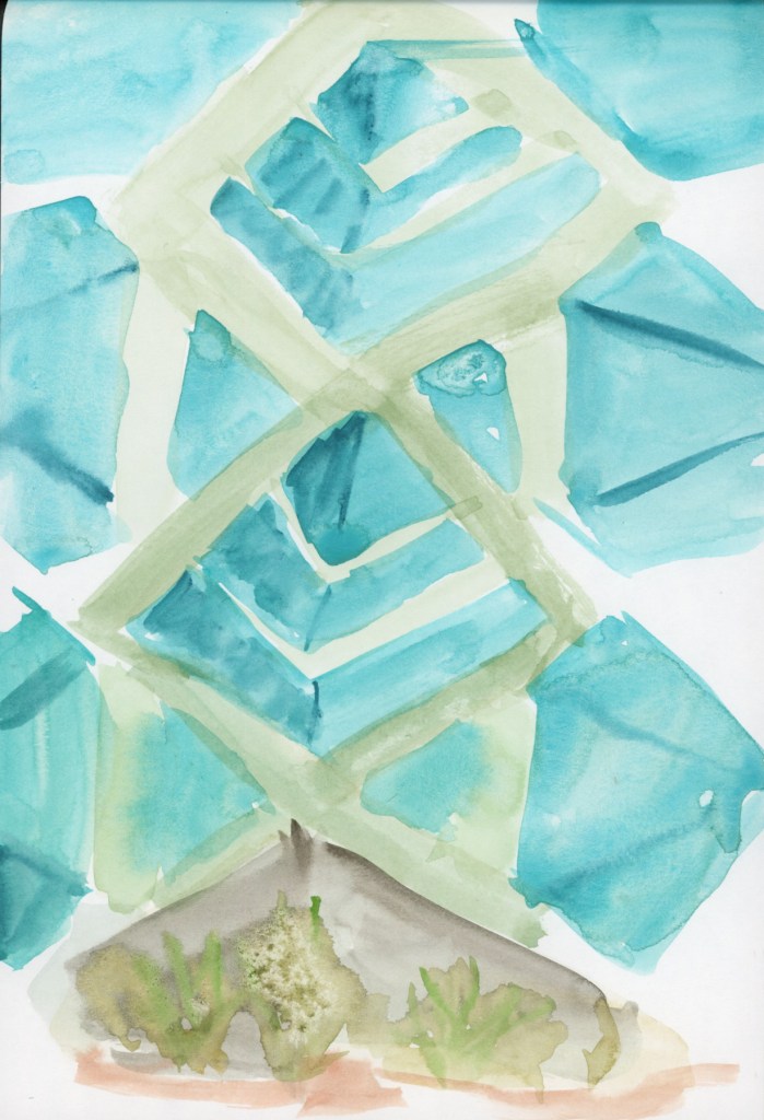
By the third, I went straight to direct watercolor. I always seem to love direct watercolour. It’s so much more forgiving! . There’s a looseness and confidence that comes from having already worked through the subject twice. Another aspect of three, was using just three colors: Winsor Newton Cobalt Turquoise Light, Winsor Newton Sap Green, and Daniel Smith Transparent Pyrrol Orange.
Something lovely happens when you sketch a single subject three times. I should do this more often. It looses you up, and you get more familiar with it.
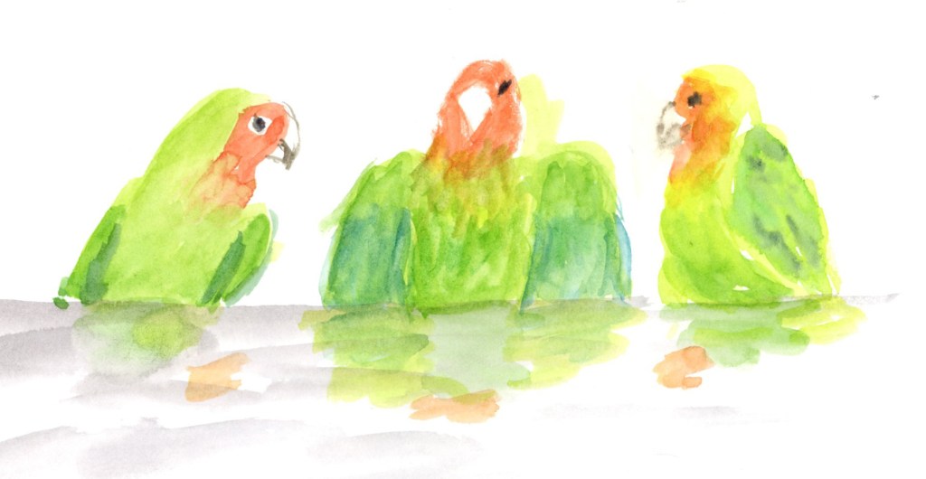
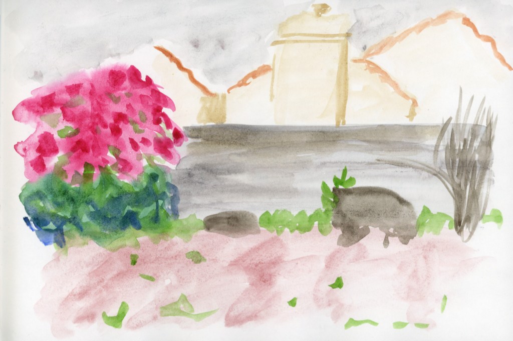
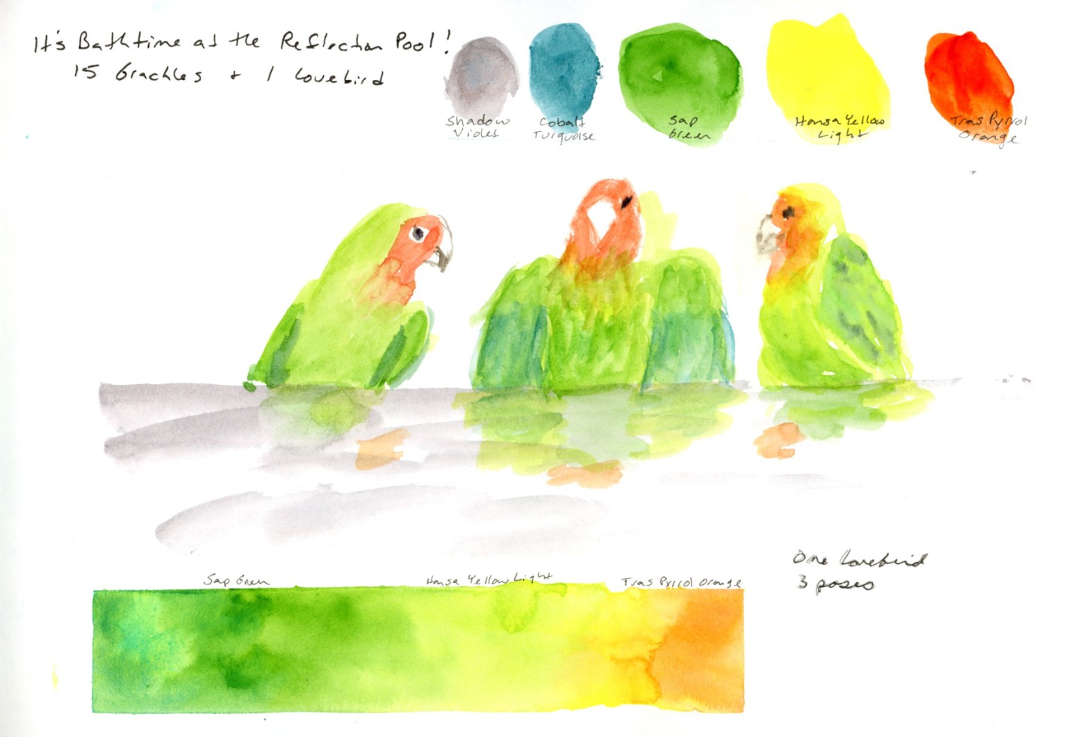
I loved this bird! One lovebird, in three poses, taking a bath. I drew these from photographs I took at the time. One sketch wasn’t enough to capture his fluttering energy during his bath at the reflection pool outside. Fifteen grackles were also present, focused on their own baths. Having those three poses meant I could tell the whole little story of this bath on a single page: the cautious approach, the full splashy middle, the ruffled aftermath.
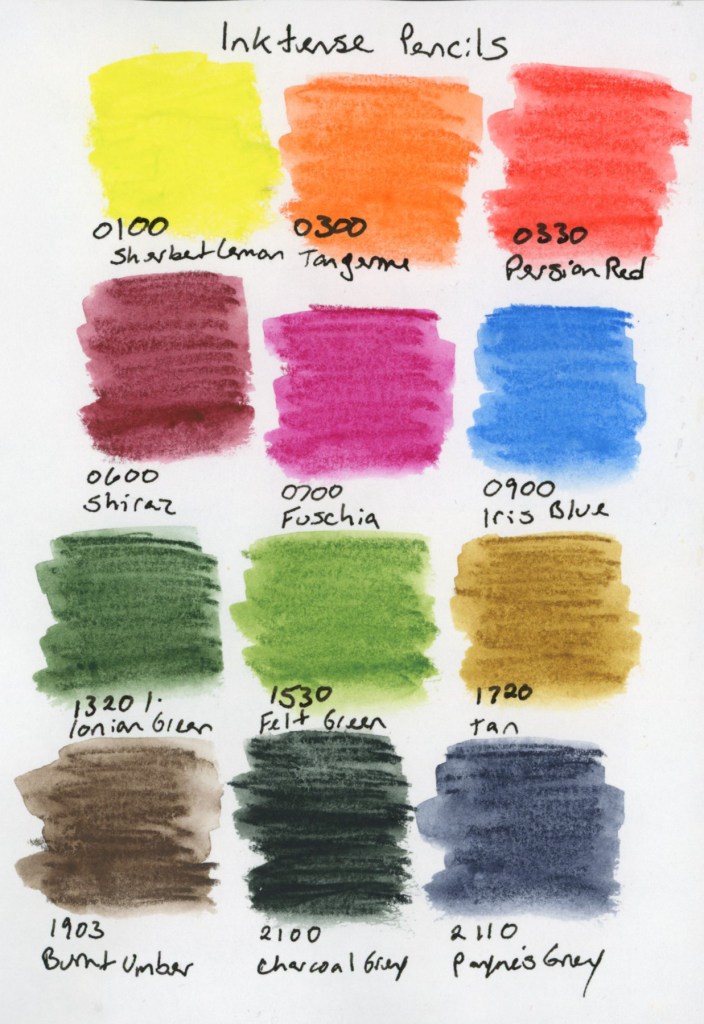
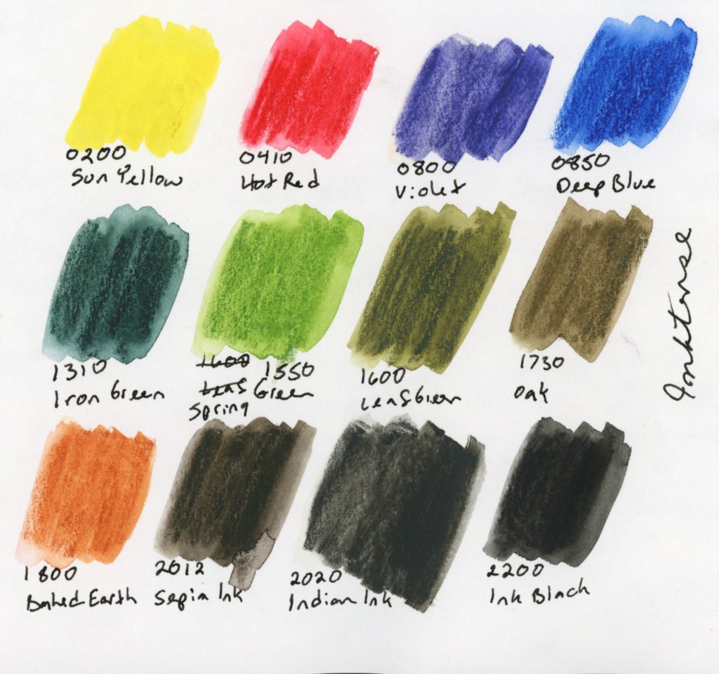
I worked with a very limited set of colors across both subjects. The spire was a three color palette of Cobalt Turquoise Light, Sap Green, and Transparent Pyrrol Orange. For the birds it was a three color palette of Hansa Yellow Light, Sap Green and Trans Pyrrol Orange. I did add a hint of Cobalt Turquoise for the dark shadows on those wing feathers, and of course, Shadow Violet quietly sneaking in for the water. Technically five colors. Spiritually still three. Ha!
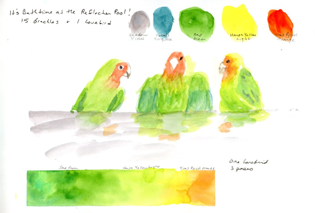
Then I had to add three design elements to this page! So we have the color gradient. (I do love painting a nice color gradient! Been practicing those for years!), the color swatches, and, of course, the main subject of the sketch. My swatches might be over-large for the best page design, but I still like how it tells the story of the colors as well as the love bird. After all, his colors are what makes him so special!
So that’s my exploration of the theme of three for March. One spire, drawn three times. One bird, three poses. A page with three design elements. Lastly, a palette that tried very hard to stay at three colors and almost made it.