What a Difference Color Makes

Last week I wrote The Messy Middle, with these pages in their unfinished state — collage laid down, journaling written, color promised but not yet delivered. Well. The color has arrived.

A dual page sketchbook spread — dates and weather log for Saturday 28 February through Thursday 5 March 2026 with moon phases and astronomical events on the left, and the March 2026 Coloring Book of Shadows page painted in greens, yellows, and warm browns depicting a witch's kitchen cottage, on the right, with Edges course notes on a bright green wash in the background
February tail end and March — A Witch’s Kitchen, CBOS 2026

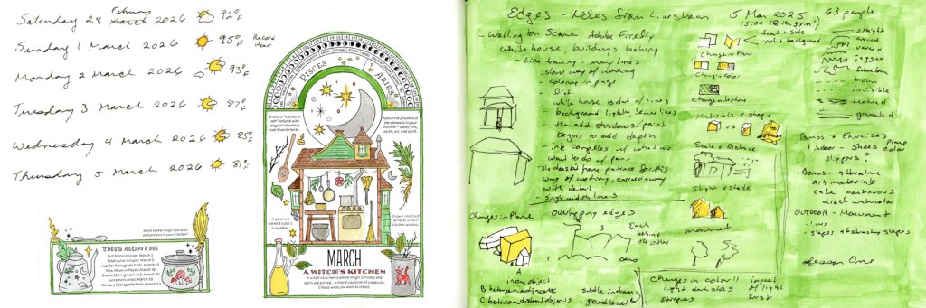
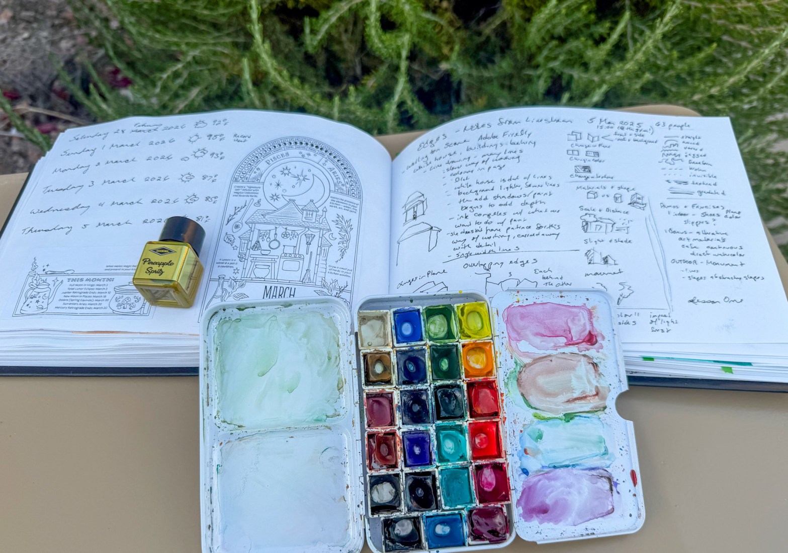
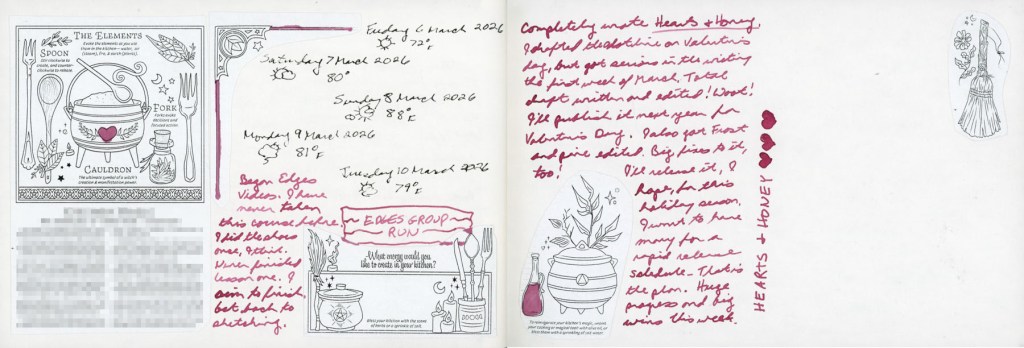
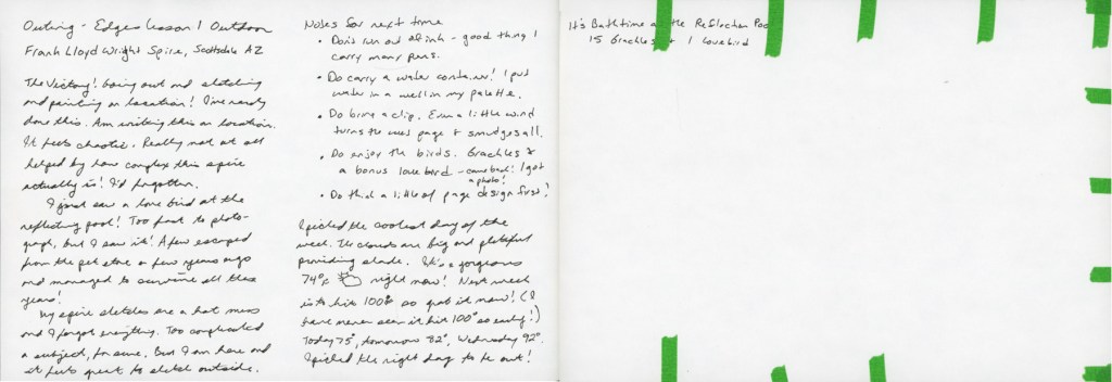
This first spread is the one that started the catching up. Dates and weather for the last days of February and the first days of March, alongside the March Coloring Book of Shadows page — A Witch’s Kitchen. The facing page is still doing its job as an Edges course notes page, now with that bright green wash making all those handwritten diagrams and observations feel like a proper sketchbook page rather than a notepad.

A dual page sketchbook spread — Edges Lesson course notes with painted examples including a red onion and a figure in yellow on a bright green wash on the left, and the January 2026 Coloring Book of Shadows page painted in purples, greens, and golds depicting a magical home with a cat, on the right
Edges Lesson notes and January CBOS — A Magical Home

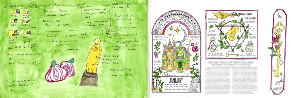
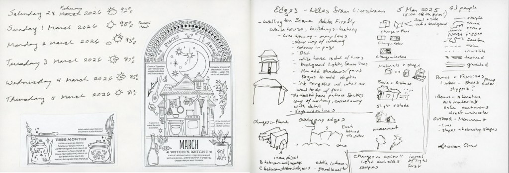
The January CBOS page finally got its color too — yes, in March, and I stand by it. The Edges Lesson Two notes on the left with the red onion and the figure in yellow are a good reminder that messy working pages can be beautiful ones.

A dual page sketchbook spread — the February 2026 Coloring Book of Shadows page painted in purples and greens depicting an altar and hearth cottage on the left, and a handwritten journal entry in Robert Oster Cherry Blossom ink with small decorated collage images on the right
February CBOS — Altar and Hearth, with Cherry Blossom ink journaling

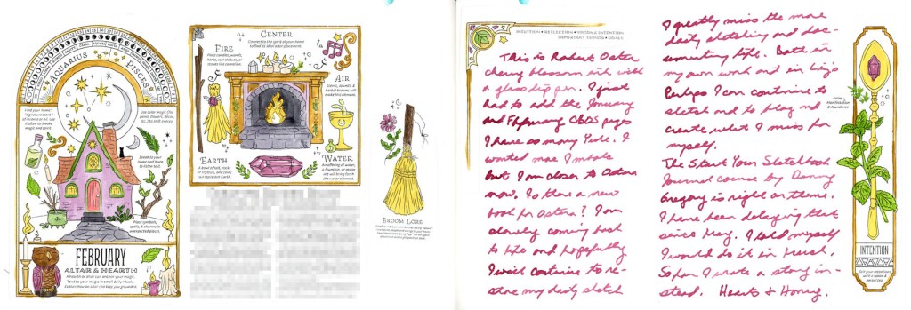
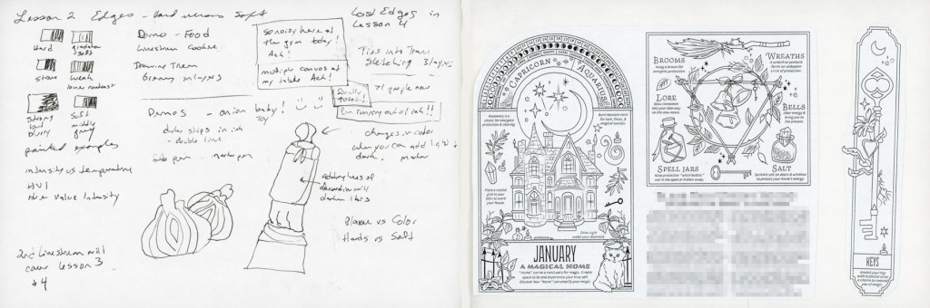
This is the spread I’m most pleased with. The February CBOS page painted up beautifully, and the Cherry Blossom ink journaling on the right ties it all together. Reading back through what I wrote there — missing daily sketching, thinking about Ostara, the mention of Danny Gregory’s Start Your Sketchbook Journal course that I’ve been putting off since May — it’s a good reminder of why I keep this kind of sketchbook. It holds things.

A dual page sketchbook spread — the March 2026 Coloring Book of Shadows elements page painted in greens and pinks with dates and weather log and journaling in Cherry Blossom ink on the left, and a bold watercolour gradient wash from Sap Green to Hansa Yellow Light with Hearts and Honey written vertically in Cherry Blossom ink and small painted collage images on the right
March CBOS — The Elements, and a Hearts & Honey gradient closing page

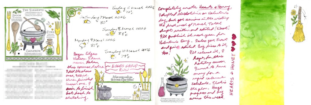
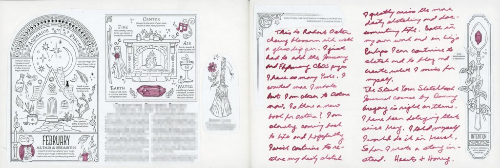
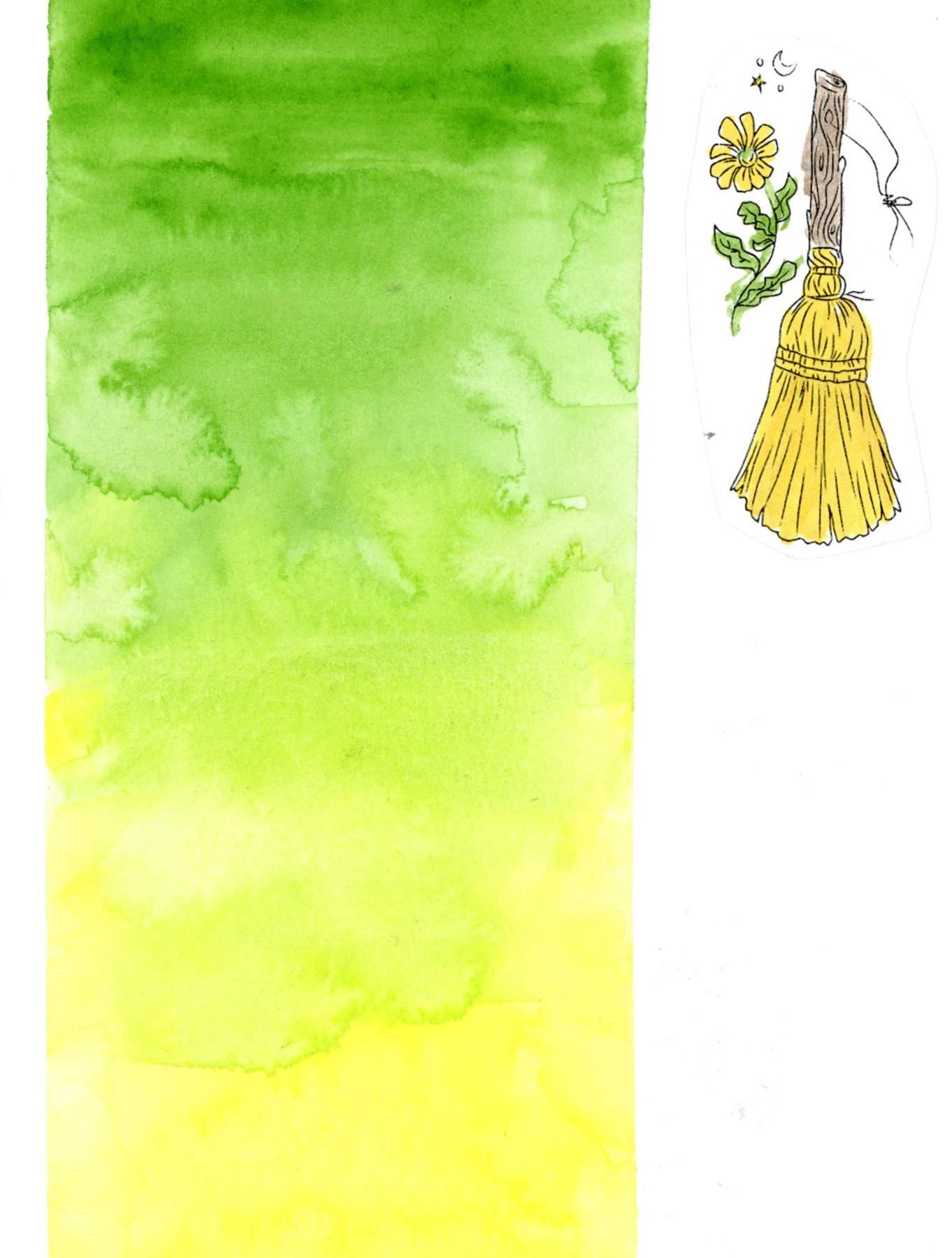
And this is the one that closed the loop. More dates and weather, more journaling about Hearts & Honey and the Edges group run, and that final wash of green fading to yellow with Hearts & Honey written vertically down the side. It’s the most designed page of the section and it feels like a proper ending. The pinks of February moving into the spring colors of March!

A note on materials: the bright yellow you see in the CBOS images is ink — Diamine Pineapple Spritz from the 2025 Inkvent calendar, and it is exactly as cheerful as it sounds. The rest is watercolor from my usual palette. The greens throughout — the frames, the notes pages, and that final gradient block — are Winsor & Newton Sap Green, with Daniel Smith Hansa Yellow Light pulling the gradient toward that warm yellow finish.

The pages aren’t perfectly painted. Some of the CBOS collage images have text I’ve blurred for copyright reasons, and there are spots where I rushed. But color does something that no amount of careful collage and journaling can do on its own.

The Messy Middle

Not every sketchbook page is ready for its close-up.

Right now my sketchbook is deep in what I’m calling the messy middle — pages that are made, but not finished. Collage laid down, journaling written, tape applied in anticipation. Color promised but not yet delivered. And I’ve decided that’s worth a post, because this is what a sketchbook actually looks like when it’s being lived in.

A dual page sketchbook spread in black ink — dates, weather, and temperature log for February 28 through March 5 with collage images from the 2026 Coloring Book of Shadows by Amy Cesari on the left, and handwritten notes and sketches from an Edges course livestream on the right.

I’m a little behind on my seasonal pages — this first spread catches up on the tail end of February and the first days of March. Dates, weather, temperatures. The facing page is covered in handwritten notes and sketches from the Edges course livestream. Messy and functional and very much in progress.

A dual page sketchbook spread in black ink — continued handwritten notes and sketches from an Edges course livestream on the left, and collage images from the January 2026 Coloring Book of Shadows by Amy Cesari on the right.

And speaking of catching up — that’s the January collage on the right. Yes, in March. I forgot it at the time, I like the images, so in it went. No apologies.

The collage images throughout these pages are from the 2026 Coloring Book of Shadows by Amy Cesari. They’re pasted in and waiting to be painted. That painted version is coming. Eventually is the operative word.

A dual page sketchbook spread — February collage images from the 2026 Coloring Book of Shadows by Amy Cesari with touches of spot color in Robert Oster's Cherry Blossom ink on the left, and a handwritten journal entry in the same pink ink with smaller collage images on the right.

This is where a little color starts sneaking in. I’ve been reaching for Robert Oster’s Cherry Blossom ink — a soft rosy pink — for both spot color on the collage images and for journaling. It wasn’t an accident. I’ve been thinking about sketchbook design, using a single ink color across multiple spreads to create a visual thread through this section of the book. Even in the messy middle, there are intentional choices happening.

A dual page sketchbook spread — March collage images from the 2026 Coloring Book of Shadows by Amy Cesari with spot color, dates and weather log for March 6 through 10, and a handwritten note in Robert Oster's Cherry Blossom ink on the left, and a handwritten journal entry in Cherry Blossom ink with small decorated collage images on the right, with  half of the page left blank.

The Cherry Blossom ink continues here — more dates and weather, a note marking the start of the Edges course, and a half page of journaling with small collaged images tucked into the corners. The pages are full. They’re just not painted yet.

There’s also a half page left blank — and I’m genuinely undecided whether that’s a space waiting for a sketch, or whether it should stay as white space. Sketchbook design is something I’m always thinking about and not always getting right. White space does not come naturally to me!

A dual page sketchbook spread — handwritten journal notes from an on location sketching outing to Frank Lloyd Wright Commemorative Park on the left, and a page header reading 'Bathtime at the Reflection Pool' with the remainder left blank and edges dotted with narrow green masking tape on the right.

You might recognize the right hand page from my last post — the header for the lovebird sketch that’s still waiting to be drawn. The green masking tape dotting the edges is there because the other side of the page is already taped up for something else. The blank space is intentional. It’s waiting.

A single sketchbook page prepared with a 4 by 5 grid of narrow green masking tape, ready for the One Week 100 People sketching challenge.

And this is my favorite kind of messy middle image — a page that’s completely empty but completely ready. Narrow green masking tape laid out in a grid, waiting for this week’s One Week 100 People challenge. No sketches yet. Just intention and tape and anticipation.

This is what a sketchbook in motion looks like. Not every page is finished. Not every page is painted. Some pages are still becoming what they’re going to be.

And that’s fine. That’s actually the whole point.