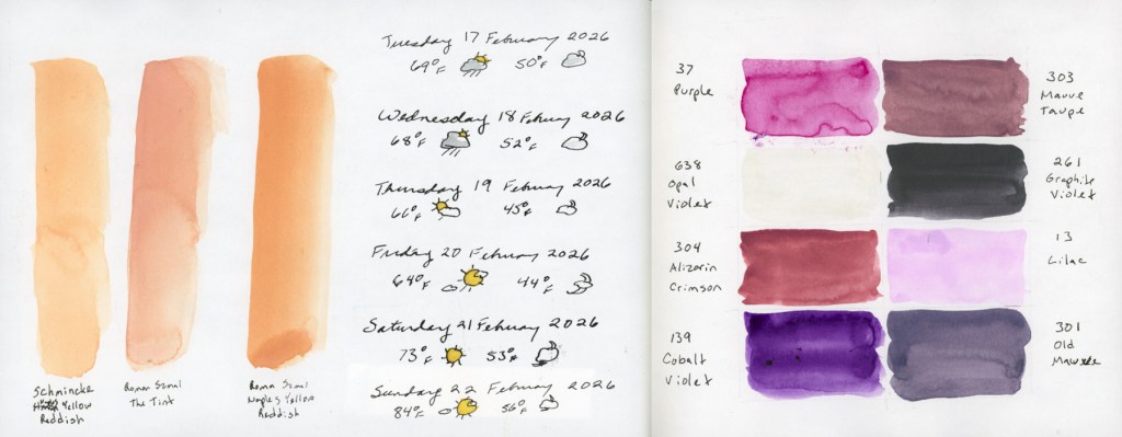
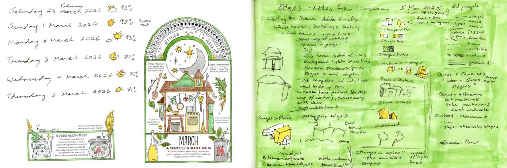
I started recording the weather alongside the daily dates in my sketchbook back in January 2023, Volume 12. Over three years now. It’s become one of those quiet anchors of my sketchbook. Even in the months where I sketched almost nothing else, the dates and weather hold the line. After an inflammation hit, or a hard week, or even death in the family, I come back and I catch up the weather. I fill in the gap from whenever I fell off to when I’m picking the sketchbook back up. There’s something grounding about that return.
It makes the sketchbook practice a living, breathing reflection of life itself and that is worth capturing. Here is the flow of the full sketchbook pages for the month.
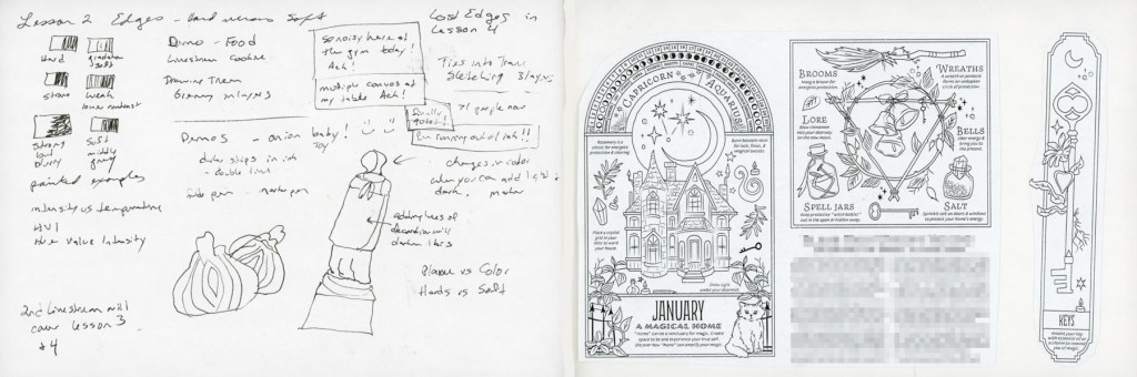
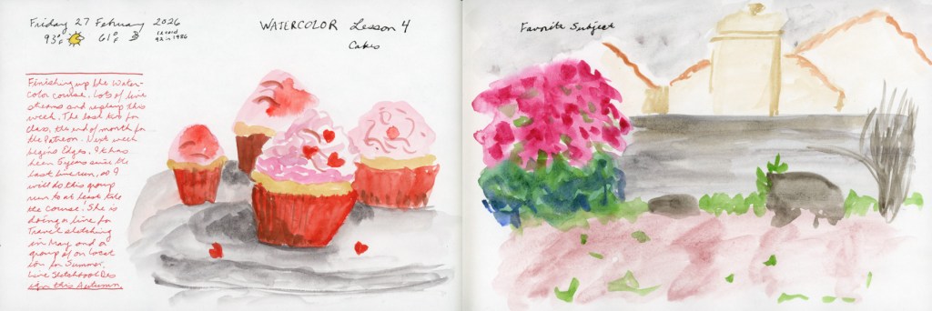
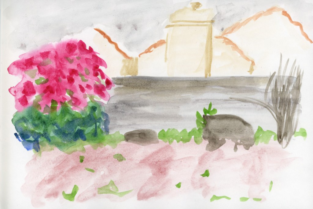
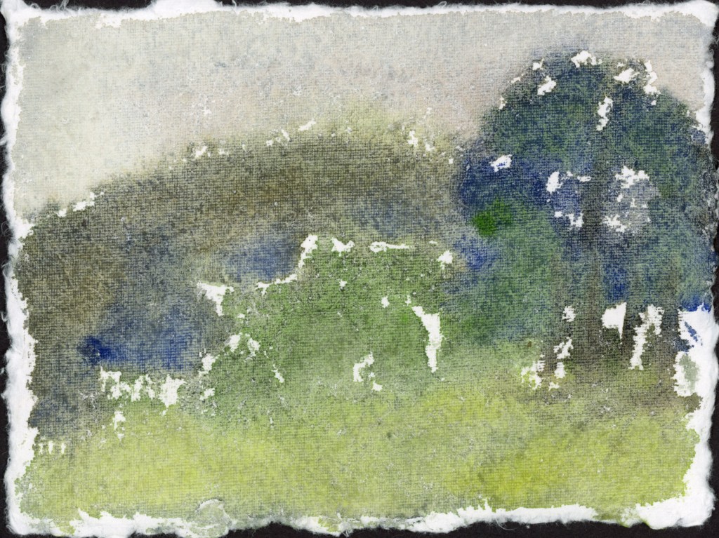
I had such great energy and joy at the start of the month! I was feeling the spring bloom, and painting my pages with the Winsor Newton Sap Green. Edges class was starting and I was super excited about that.
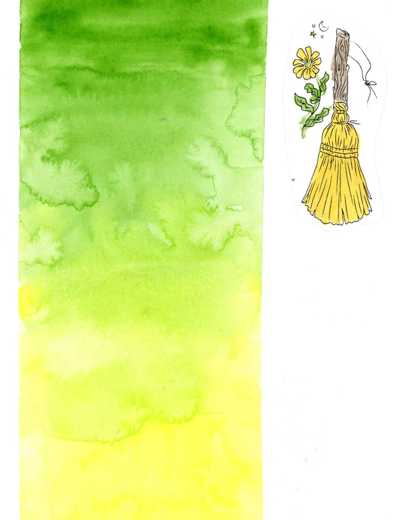
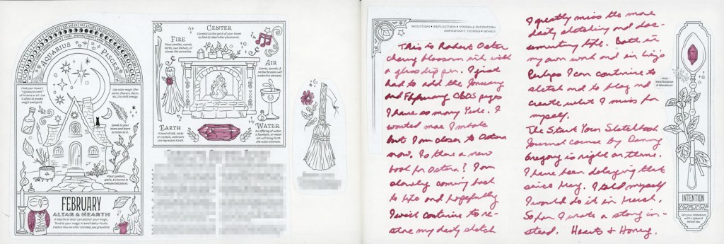
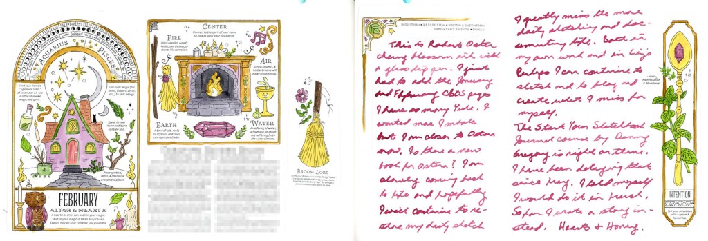
Since I really want to include the Coloring Book of Shadows monthly designs in my sketchbook this year, myy completist brain couldn’t leave January and February’s pages missing from the record. So in they went. They really are so pretty when colored.
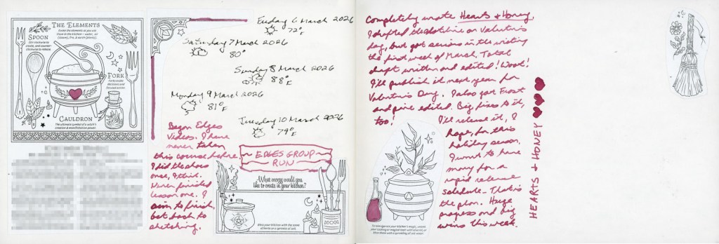
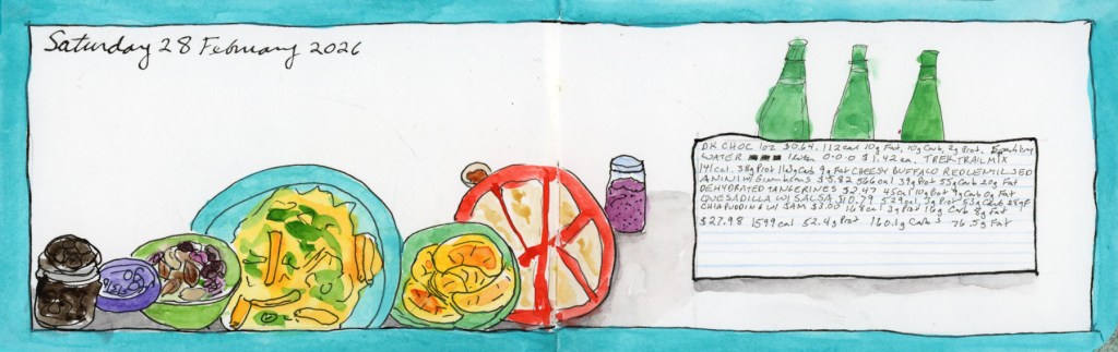
I’ve been making a deliberate effort to do more journaling in the sketchbook this year. Apparently I was doing journal notes back in January 2023 as well, and I just forgot! I like it, as it captures actual life, not just sketches. It is also a great excuse to use the large collection of fountain pen inks I have!
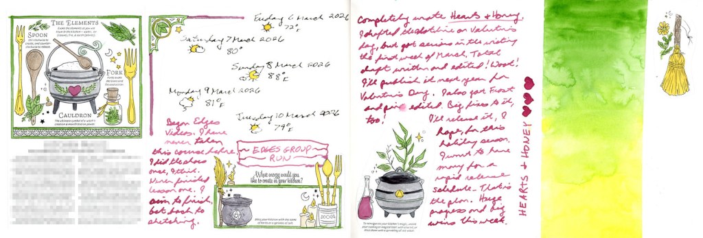
Hearts and Honey is the book I’m currently writing, and it’s very hard to document a writing project! They aren’t very sketchable unless I start doing storyboards (those are Hard!) but it’s a big part of my life and it deserves to be documented.
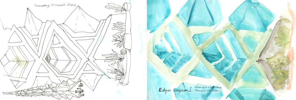
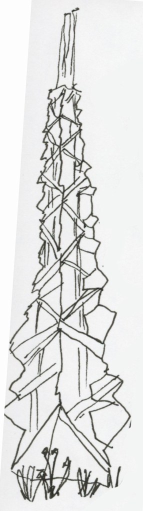
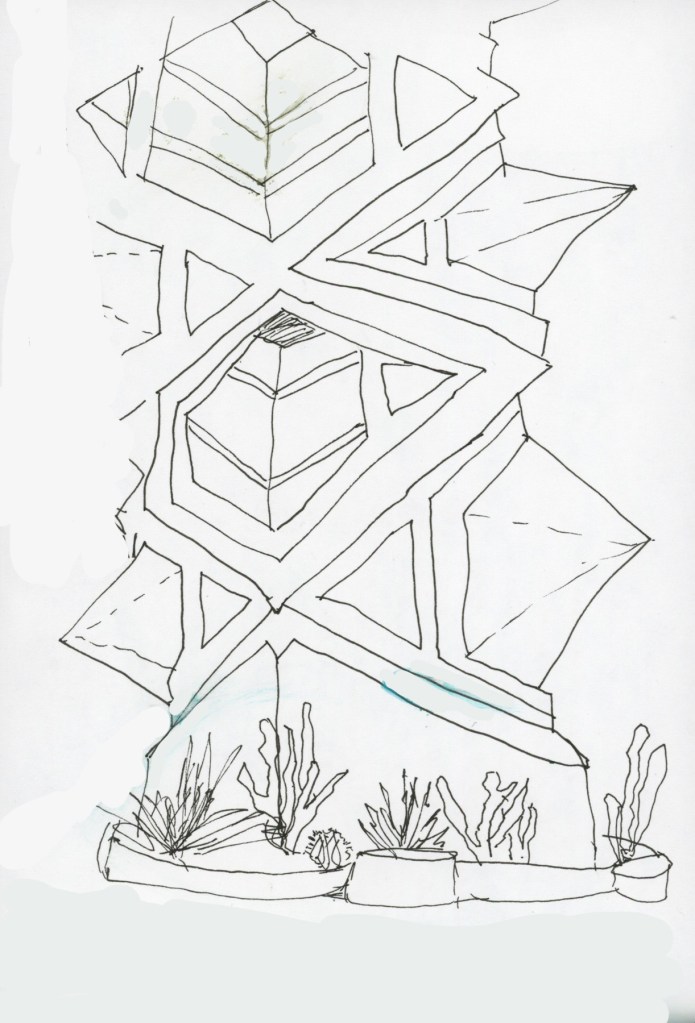
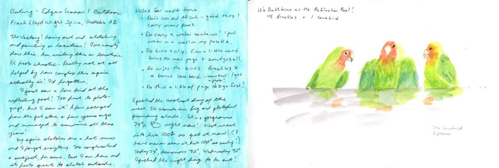
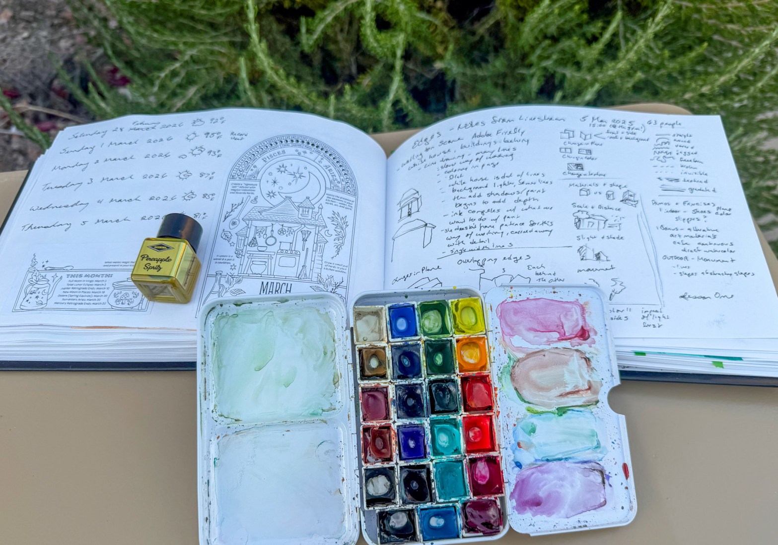
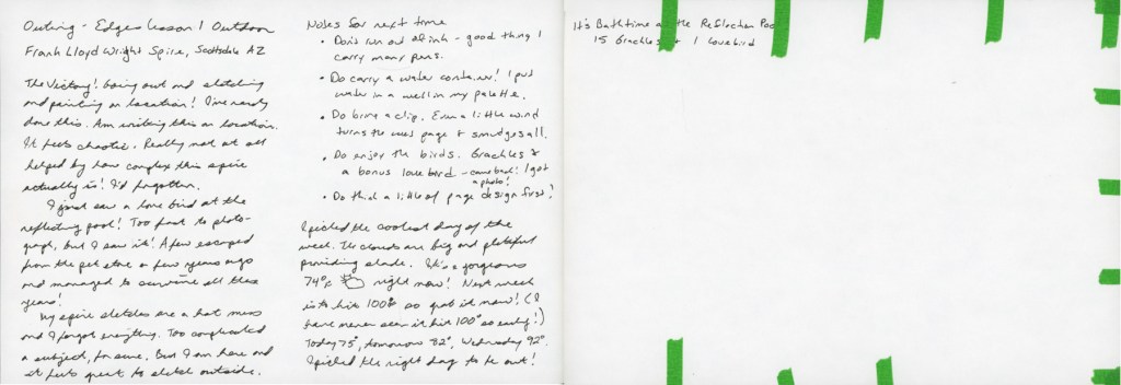
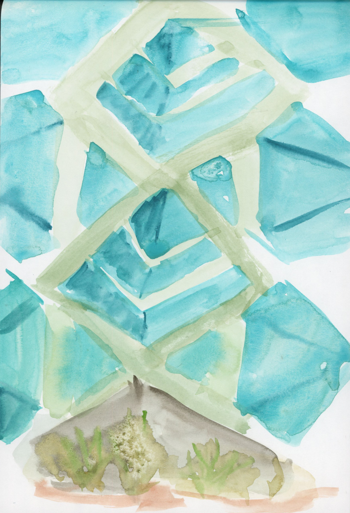
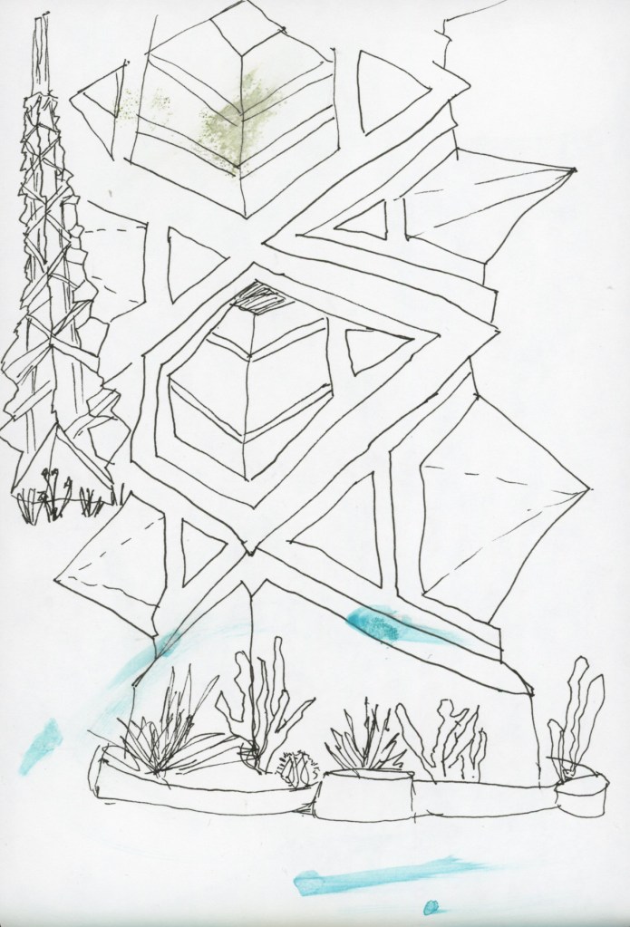
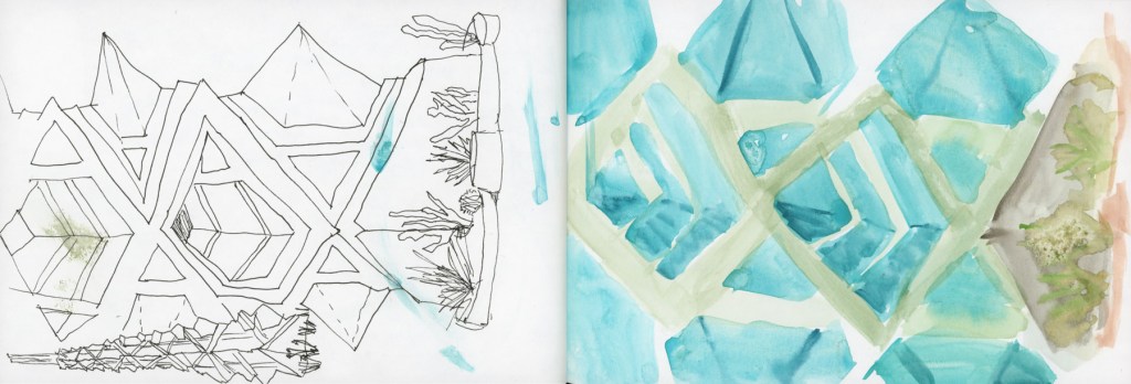
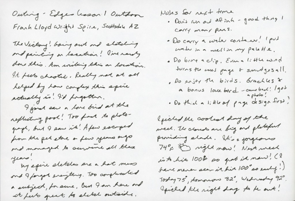
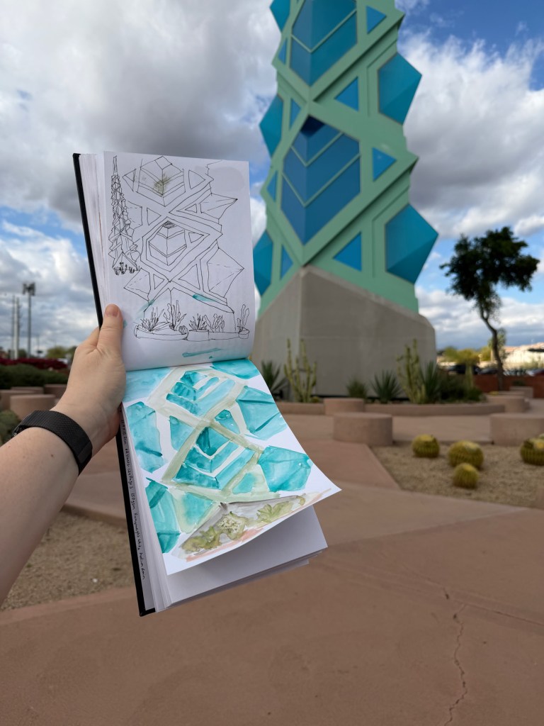
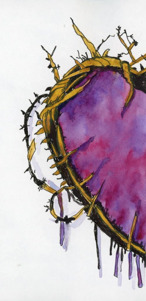
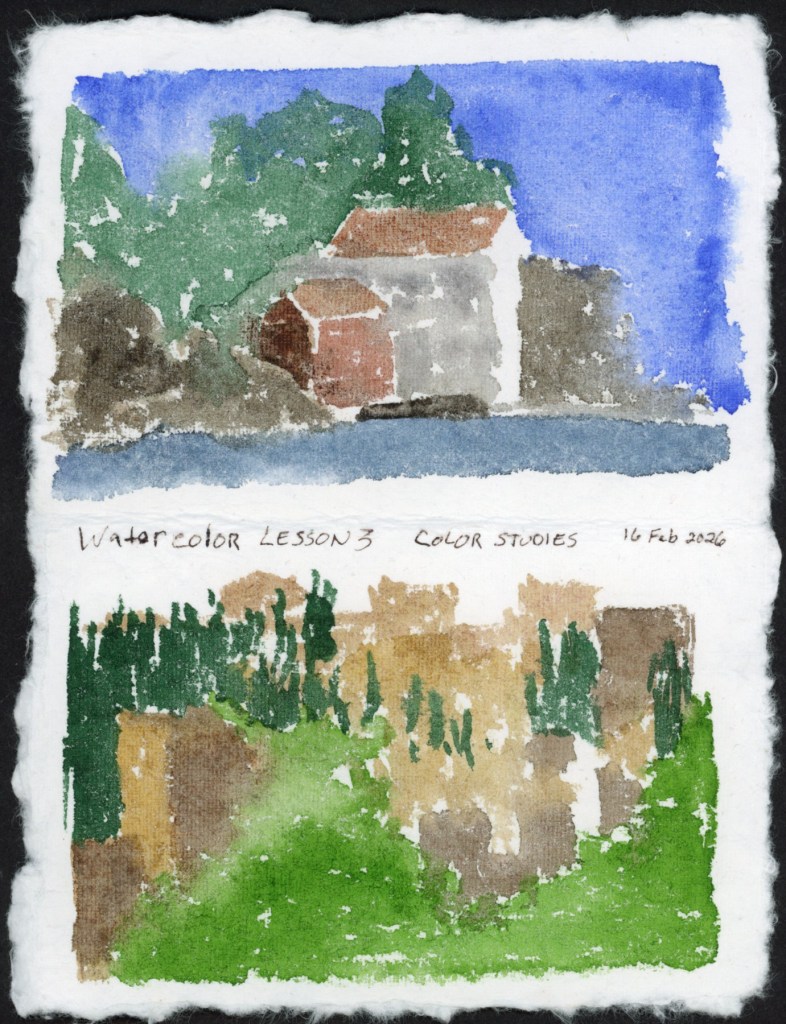
This is where the spire series lives in the sketchbook. Three attempts, ink through to direct watercolor. You can read more about that in the March Theme: Three post!
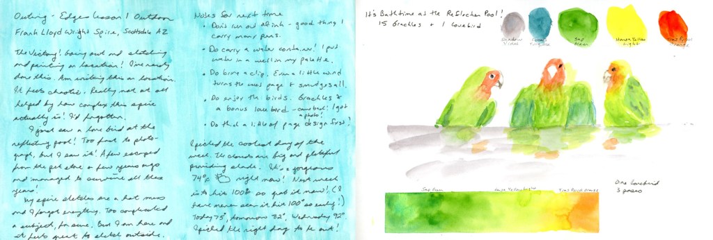
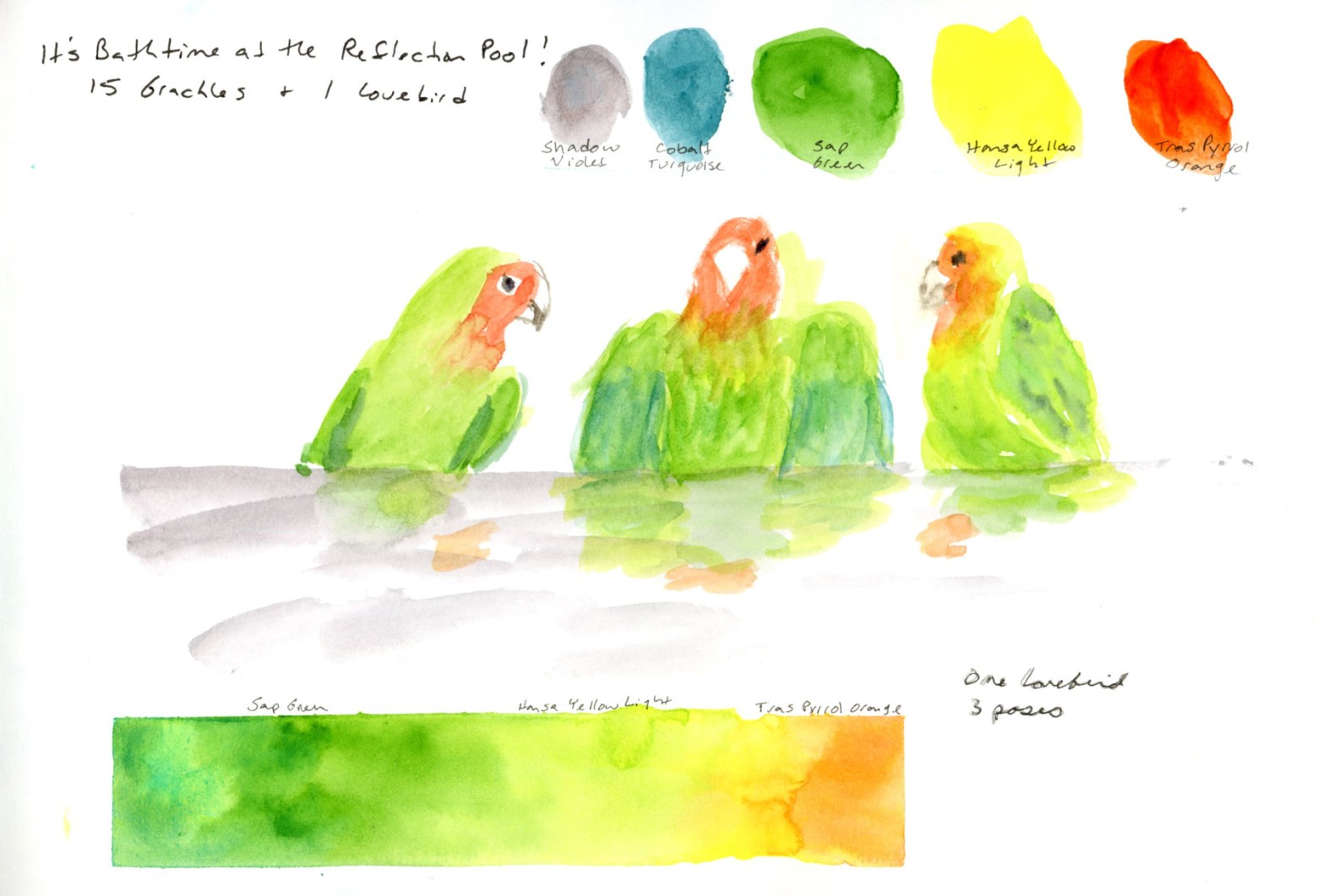
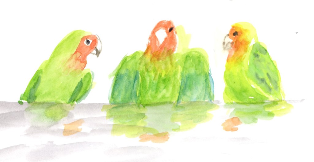
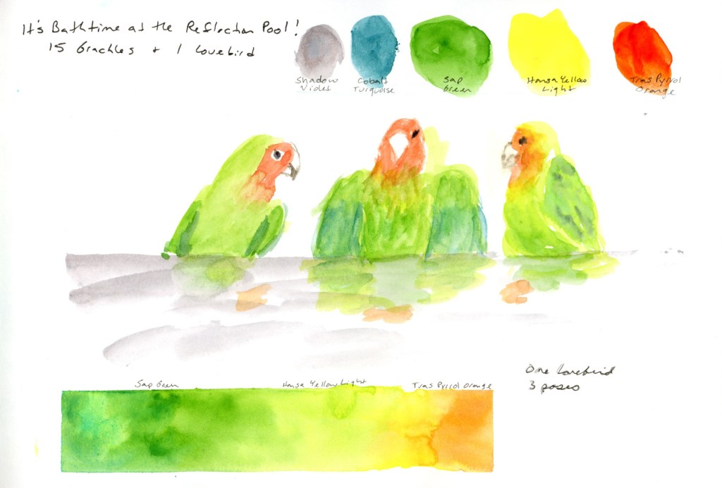
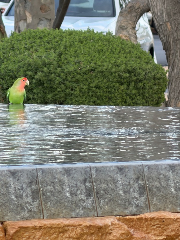
Sketch outing notes on a color block, and the lovebird page that ended up anchoring the Three post. One bird, three poses, with a watercolor gradient bar.
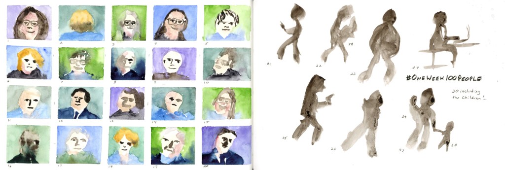
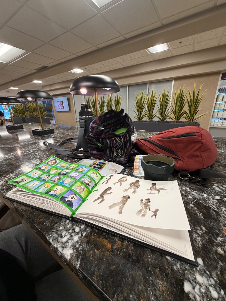
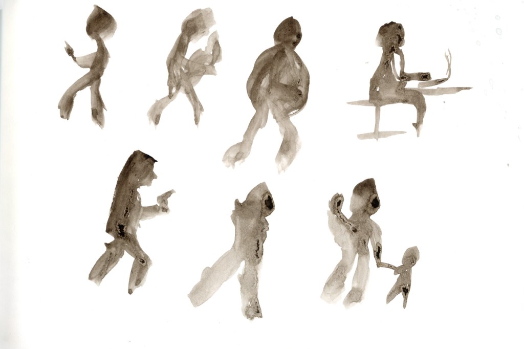
I did not do as much as I wanted for One Week 100 People, but I’m happy I got one day of sketching in!
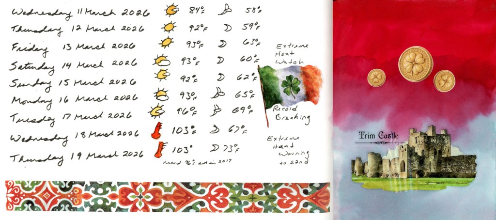
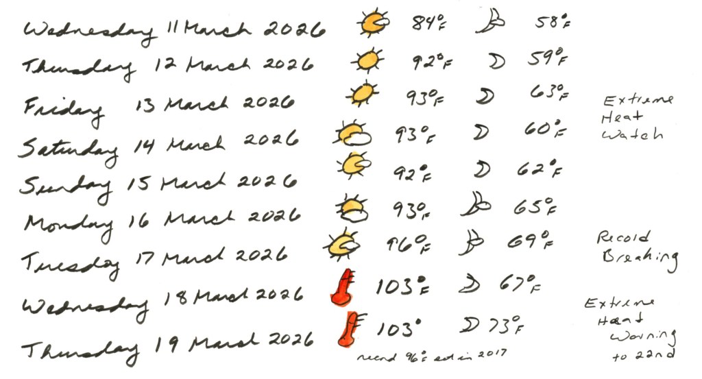
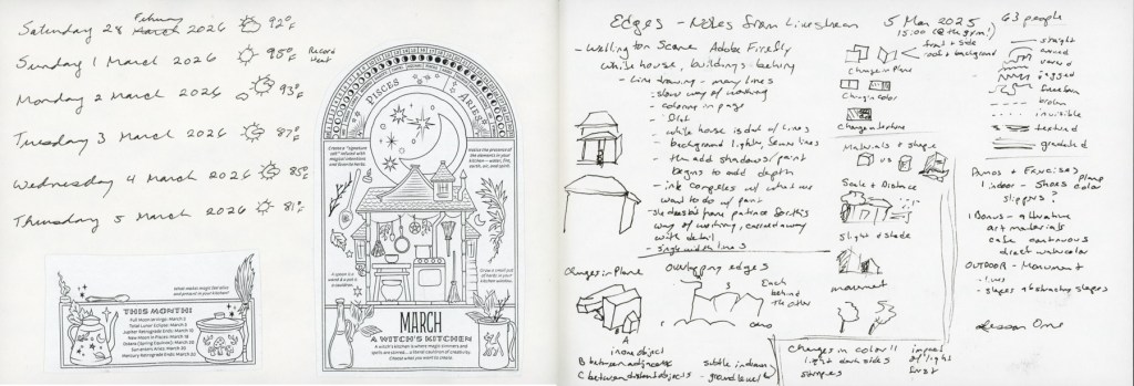
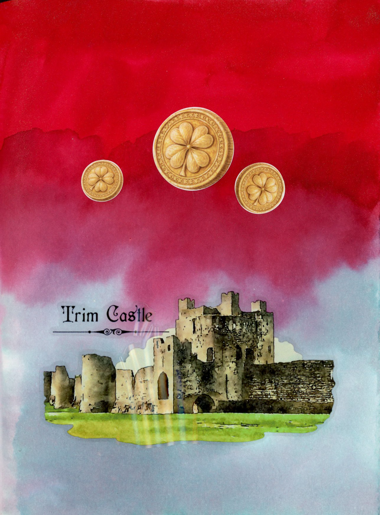
March broke heat records, by a lot! Over ten degrees above the previous records, some days. The washi border and Irish flag sticker are for St. Patrick’s Day — a little celebration tucked into the data. A dramatic sketchbook page with a deep red and soft teal ink background made with Diamine Ruby Taffeta and Diamine Overcast inks, with three gold shamrock coin stickers and a detailed Trim Castle sticker showing stone ruins against a green lawn. The stickers and washi tapes are from this month’s Cora Crea box.
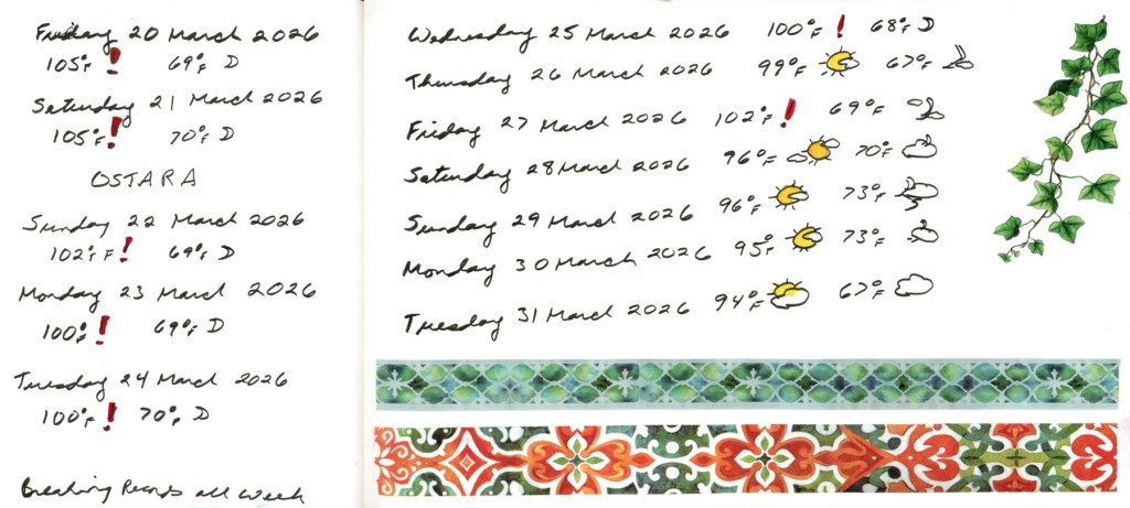
I wanted to sketch, but inflammation hit badly, so a string of dates and weather is all I managed. At least the weather is cooling off! Still unseasonably warm, and matching the record high temperatures.
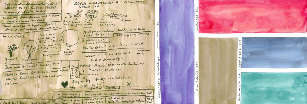
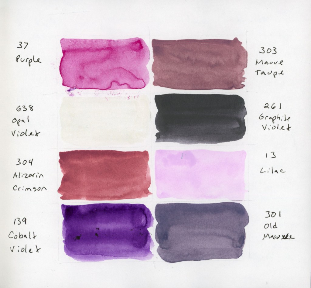
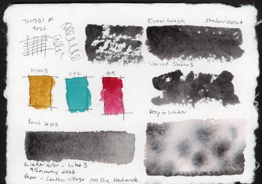
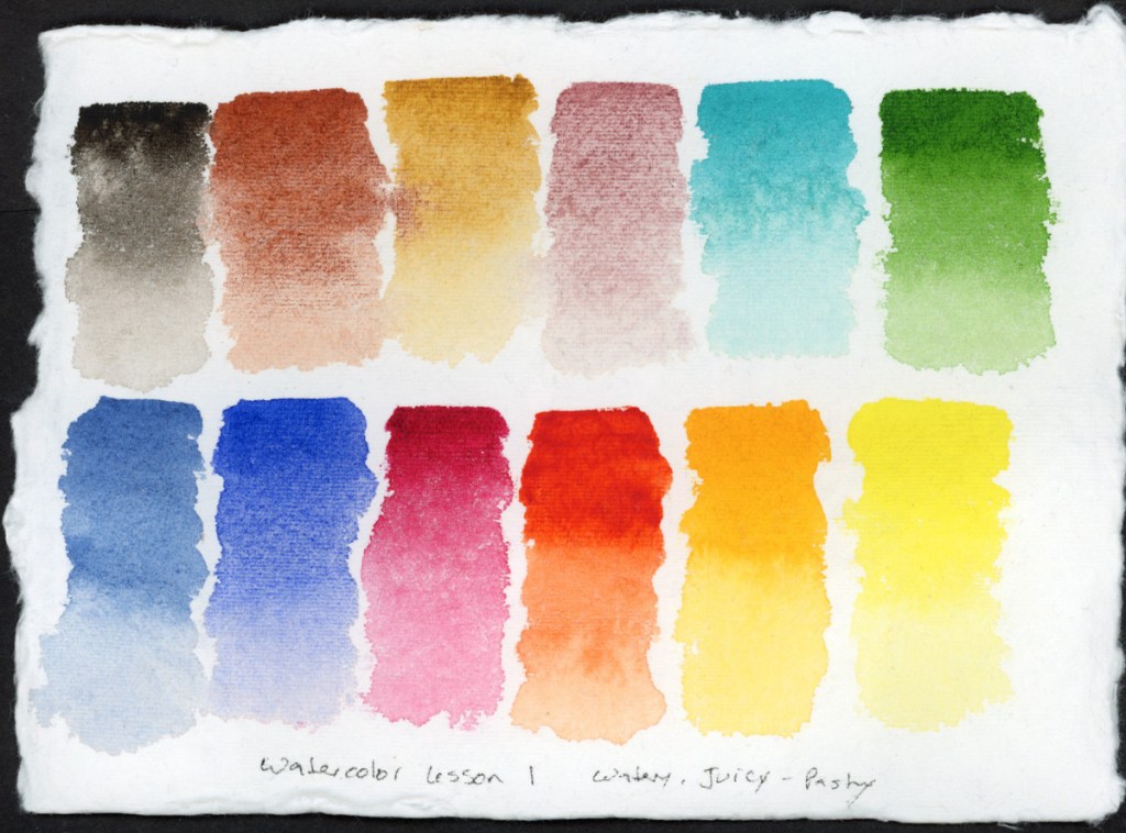
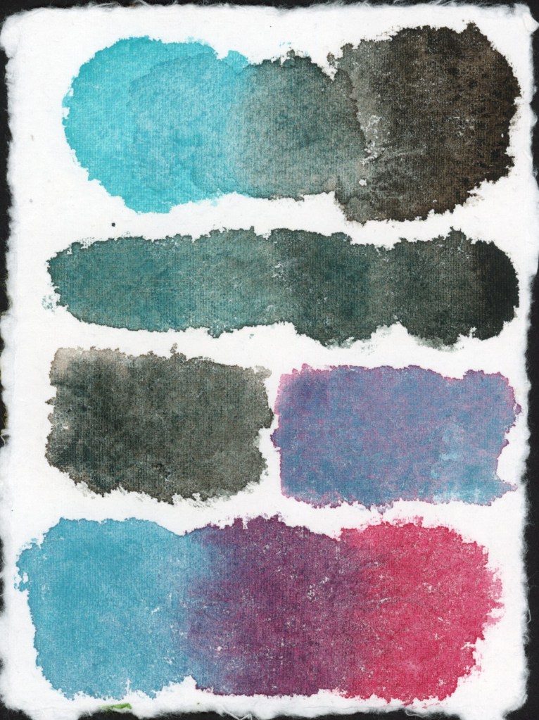
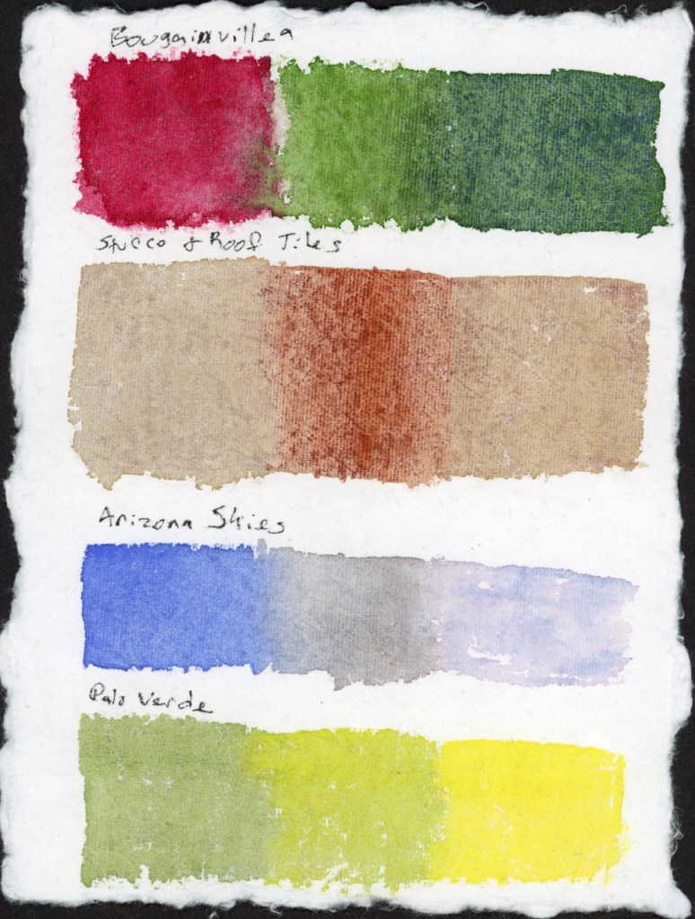
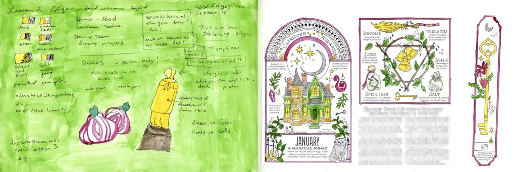
Ending the month with some notes from the second and final Edges livestream, then a little color exploration. I had to swatch out this Gansai Tambi Granulating 2 colors.
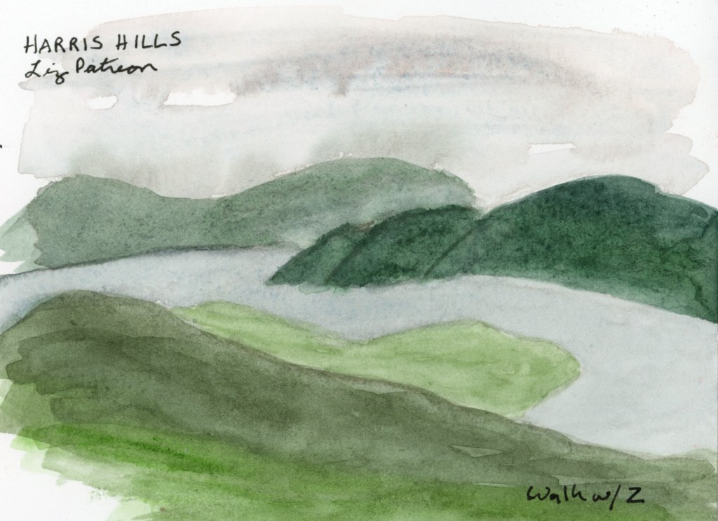
Like most of my sketchbook pages for the last several months, I have more notes than sketches, but it does capture life as it’s happening. Honestly, I’m surprised I have as many pages done as I do! That’s not nothing. Here is March, on the page.