Ponds and Pumpkins

Last week’s sketchbook pages had a lot more focus on sketchbook design since I am taking the class as an independent study program.

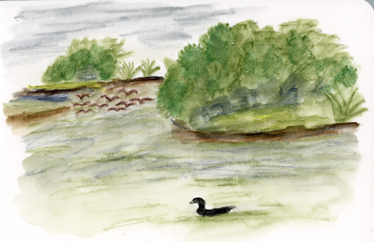
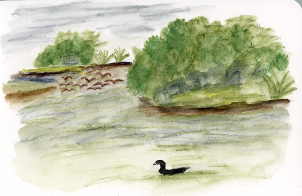
Having recently finished the Travel Sketching class, when I had the opportunity to walk Stonecreek, I brought my sketchbook with me, and tackled a scene that has long seemed very intimidating. This landscape view from the bottom of the pond. So I began with 5 shapes, and then added texture and details. Many of the details arrived while sketching. When the flock of Canadian geese flew in and landed on the water, so I had to add them in. When the American Coot swam up and gave me extended side-eye, perfectly posing for my sketch. He swam off just as I finished his addition! A cardinal in a tree branch, with the grey pond behind him, highlighting his colors. (He was so quick to fly off, I could only catch him via photo, and painted him later when I finished the page.)

I added the map, the titles, and the text block to finish off this page.

This also happens to be the first full spread page in my new sketchbook! I’m sticking with the 7.5×7.5-inch Stillman & Birn Softcover Alpha for now. The smaller pages are satisfying right now, and feel good. Keeping it simpler to encourage building a daily practice of sketchbook pages.
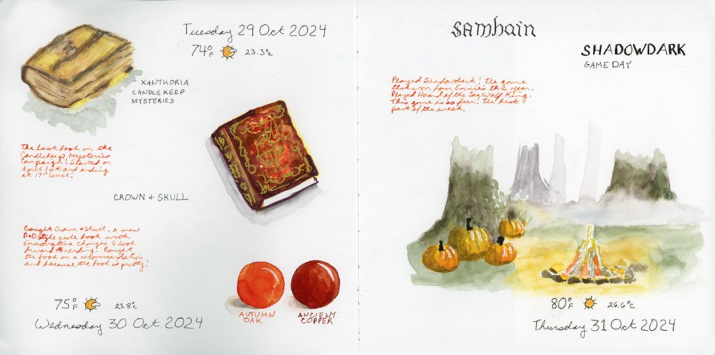
For this spread I used colored ink for extra notes, and the two ink color swatches to fill in a space. The ink is Diamine, and those are two of my favorite autumn colors.
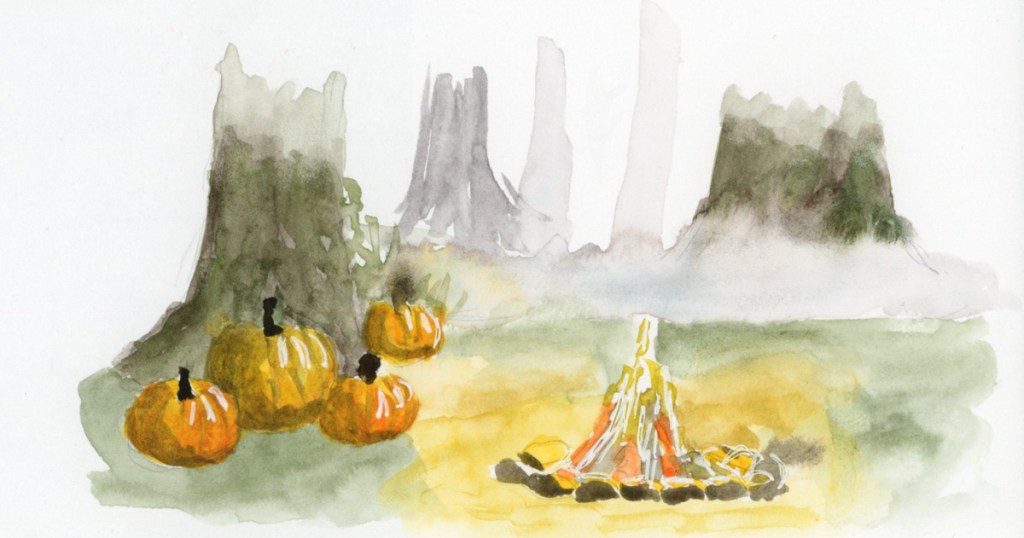
This is a part of an Alley of Ambience image. Drawing campfires is hard, but I may be in love with those pumpkins!

This page is a little more abstract. I love Elisabeth Alba’s art and I had these various stickers of hers. I’d also put the 5×7 prints I have of her work into a newly purchased portfolio album. This simple spread marks that for this week. The raven is also on a half sheet, which flips over for a second color block of transparent red oxide, which is fun and interactive in my sketchbook.

I will cut half pages sometimes when I have a lot of collage, to reduce the overall bulk in the finished sketchbook. It’s a fun way to do interesting pages.

As usual, my participation in the Sketchbook Design class has me sketching more pages, and putting a lot more thought into their layouts and designs. I love them even more when I’m putting in the extra effort and time! I also seem to have leveled up in my drawing ability! Don’t ask me how THAT happened! It seems to happen at random intervals and I’m sure it’s a product of practice. And the many lessons, of course. That Travel Sketching class really did seem to help me level up, didn’t it?

Onto the next week! The holiday season begins in earnest and I wonder what my sketchbook will capture next?
January Miscellany

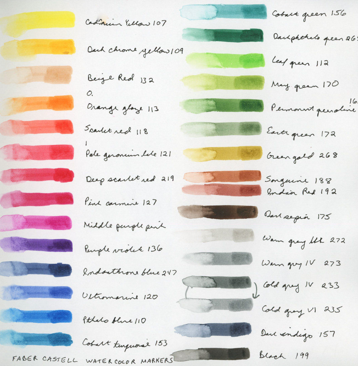
Watercolor Markers! Okay, I admit, I saw these and they were a total impulse purchase last month. I will also admit, I gleefully squeed when they finally arrived! I have not worked too much with markers, though I have some Copic markers. I’m excited to play with markers that won’t bleed through the paper! The colors are nice and vibrant.

Here brings me through the first half of January. I’m starting to pick up some momentum now, and excited about what it is to come!

Yule

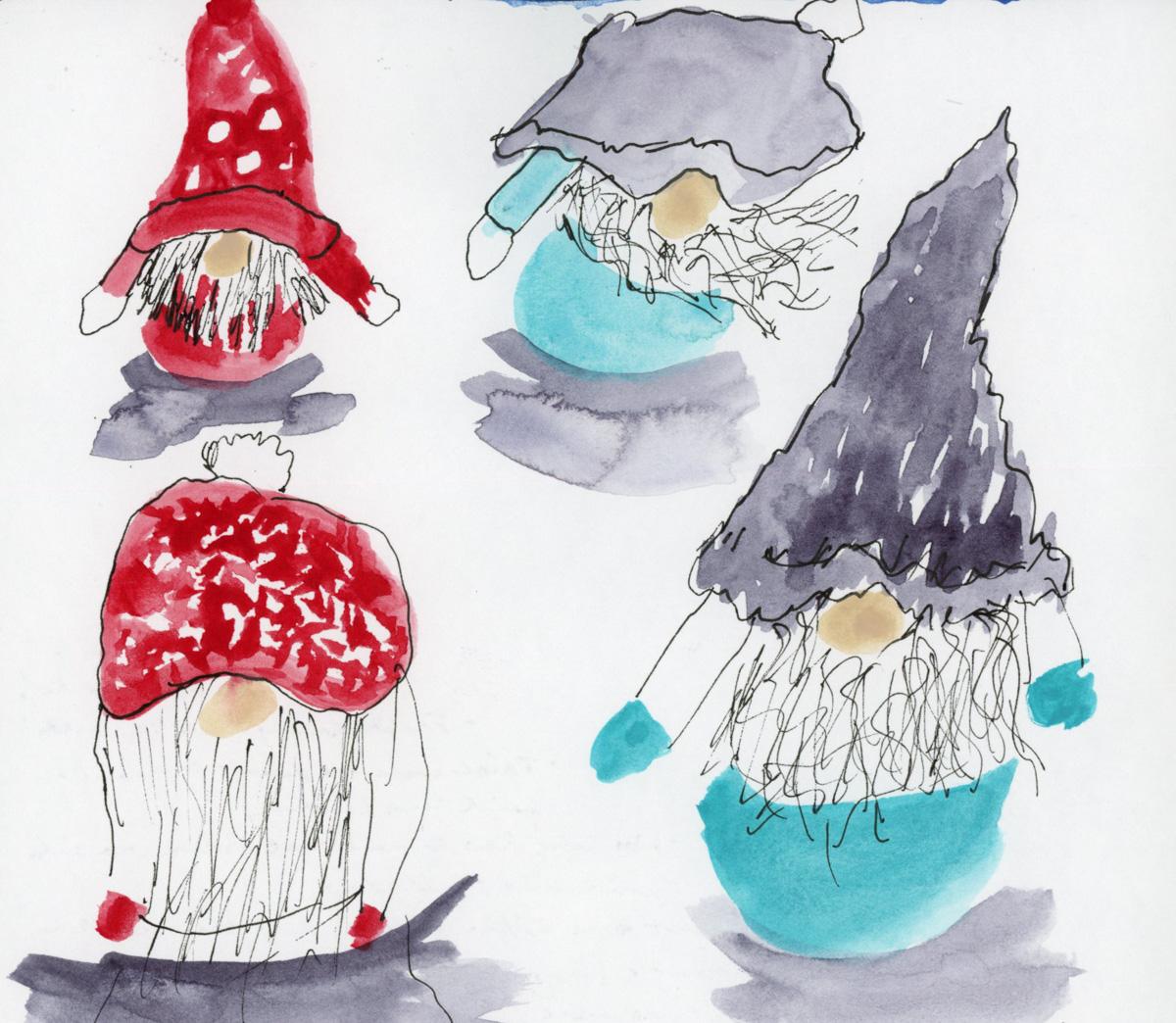
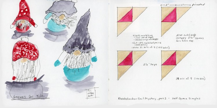
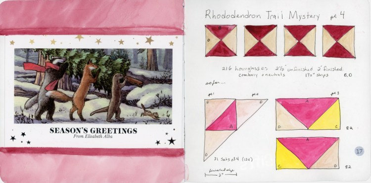
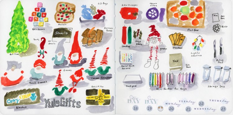
‘Tis the season, from holiday gnomes, to the annual quilt mystery! Capturing the bits and pieces during this cold, wintery season.

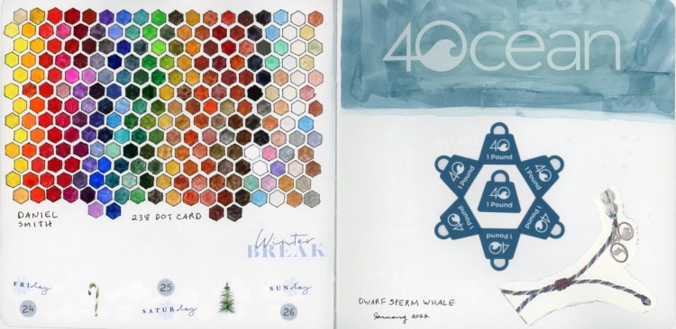
One of my gifts was 238 dot card set from Daniel Smith, so you know I had to make a color chart!

On the sketchbook design front, I noticed when I scanned these just how strongly I am still doing individual pages, and not really designing across the gutter. Only one of these four spreads utilizes both pages. I had not really noticed when I was making the pages, but I do when looking at the scans. This inspires me to think a bit more about my design, and layout in the future!

Happy Holidays everyone, and may your days be Merry and Bright! Happy New Year!

New Brushes, a Fountain

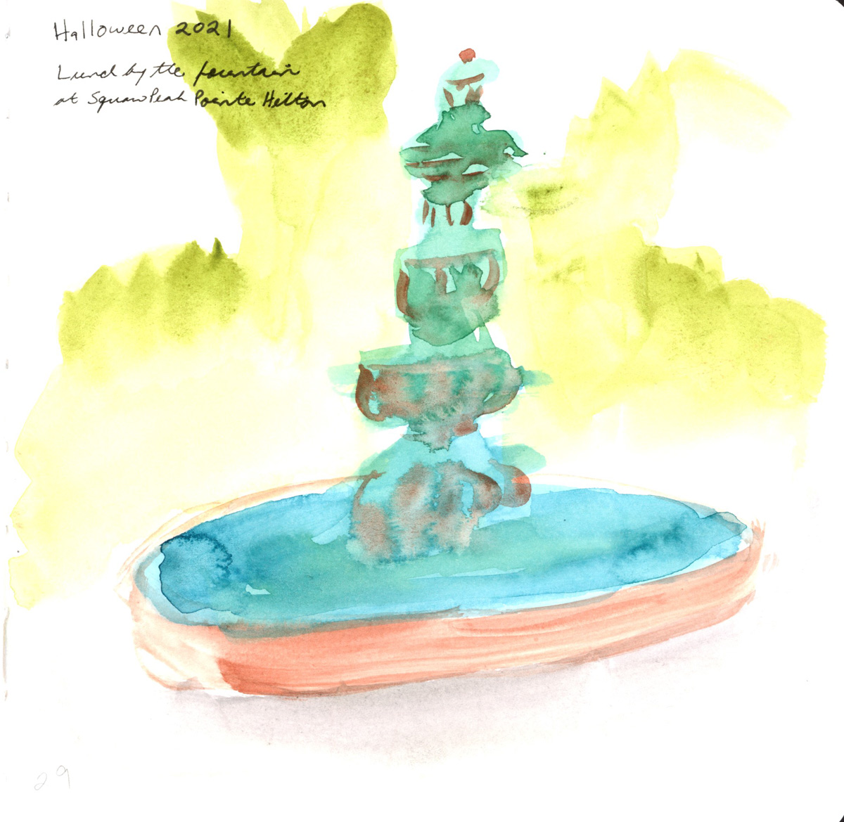
An actual, on location sketch of the fountain that I had a take-away lunch near.

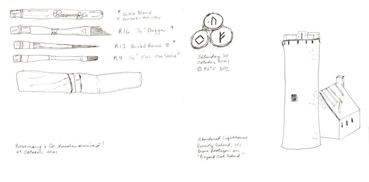
I very much want to develop a daily sketching habit and capturing the stories of the day and this is a page with that intention. The buildings were from the show I was streaming and is an abandoned lighthouse in Michigan. I was attempting to use my newly learned buildings sketching skills. No doubt the sketch would be better with some color and paint, but time moved on, and so I’m leaving it and the sketch of the new brushes that got delivered as line sketches. Not finishing being part of the story, too.

September 2021 Sketchbook

More lost days, then a little Bob Ross inspiration. Since I’m really keen to learn how to paint landscapes, I decided to try Bob Ross in watercolor. I learned a lot about how different oil paints are from watercolor! Ha!

Then a second attempt. Yep, I need a whole different set of techniques than Bob used!

These four were also my first “sequence of pages’ designed as a set for my Sketchbook design class.

I had a variety of subjects I knew I wanted in this sequence, including large landscapes, clothing sketches, and open line drawings. Originally I was going to group the clothes on one page, and the line drawings on another, since they were the same, but after this lesson I realized that it would flow so much better as a sequence of spreads if I broke the subjects up. So I therefore definitely needed a second large, contained landscape to complete the sequence.

I love it now! These pages seem to now tell a story in a much better way than they would have had I gone with my first method!

Additionally, I used the same date stamp and weather temperature as a unifying marker through the pages. I probably could have done more with headings or text, maybe even a color block with the clothes, though I do like the airy open white space I have. It is a nice contrast to the fully painted landscape pages.

I certainly learned a whole lot doing this! Now I just need to practice a lot more so it gets faster! Though all told, I think all four spreads took me about three or four hours in total, so really that’s not too bad at all.

Wrapping up September with a landscape of Piestewa Peak that I’m very, very pleased with. I even love the outrageous amount of white space!

Lockdown Blues

How long has it been since I scanned and posted? Since I sketched? I don’t even know. Far too long! In fact, I’m even going to cheat and post date an entry or two! So here is the rest of August, in my sketchbook, such as it was.

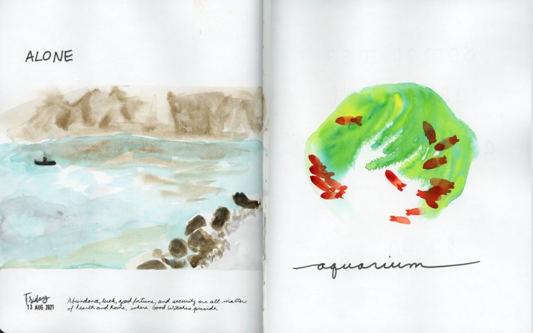
The landscape is a view from the television show Alone, and is of Chilko lake in Canada. The aquarium sketch is from a photograph. I was aiming for having lots of white space, which I certainly achieved. I’m thinking the page needed a little bit more variety, though. I’m thinking of these things, since I am taking Liz Steel’s Sketching Now Sketchbook Design course.

And thusly passed August, in my sketchbook.

Sketch Kit and Color Blocks

Things are moving a bit slow around here this past week. I’m back to a tighter lockdown situation as COVID-19 cases are on the rise and I’m in an “extreme high risk” area. I have lots of unfinished pages but a few finished ones.

Some random sketches and collage, little bits and pieces from my days. My current sketchbook is the Stillman and Birn Alpha softcover 8×10″ so that’s what I sketched for my assignment in Sketchbook Design.

I do love the Alpha books, they are great for pen and ink, and watercolor. I’ve never had a page bleed, no matter how wet I get it. But I do begin to wonder if some of the wet in wet techniques I’m seeming to want to achieve need a paper with some cotton content? I will have to experiment in the future, but for now this is the sketchbook I have, so this is the very best sketchbook! (The best sketchbook is the one you have with you. Ha!)

Continuing on, I sketched the most basic version of my current sketch kit. I haven’t really settled on which pens, or which brushes, so when in doubt I reach for the pocket brushes, my Lamy pens, and my current watercolor palette. The bag is the amazing Walkit bag, which is fantastic, with many loops for pens. I’m currently carrying too many pens! Really. I am.

I haven’t done a food sketch in a very long time, and I just had to document this delicious pesto pasta I had!

Hmmm, could that food sketch layout be improved with a border? Class has me thinking these things!

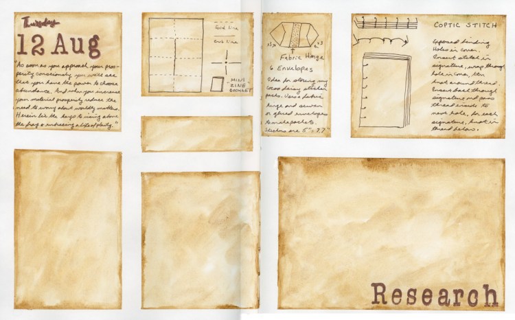
Speaking of class, did someone say color blocks? I was documenting the mix of things I had been researching that day, and decided to jazz up what would be fairly basic line diagrams and descriptions with some color blocks. I used washi tape to make crisp edges, and aimed to make these have a parchment look by using Daniel Smith’s Goethite watercolor. Apparently I should really learn to sketch larger since I ended up with a lot of unused color blocks. I thought about sketching in them a few random things, but in the end I’m moving on. The unfilled blocks tell even more the story of the day (and the week) than filling them in! Besides, it also celebrates how great that parchment effect was, and I’m pretty pleased about that!

Getting My Sketch Mojo Back

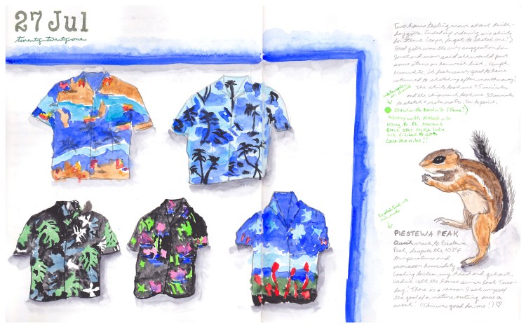
Time to get my sketching mojo back, and dust off the sketchbook. (And let go of my negative self-judgment about dropping the ball.) What better way to get back to it than to dive in with something colorful! There is little more colorful than Aloha Shirts!

I bought an alphabet stamp set for my dates. I got this Vintage Type set from Hobby Lobby. I’m snuck off to visit some chipmunks at Piestewa Peak, so had to sketch the little guy.

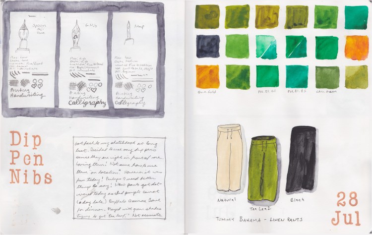
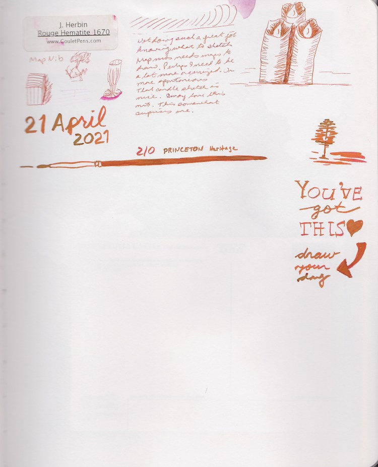
I am experimenting with drawing nibs, so here was a bit of a test and capturing my research. I got a set, and found myself wondering what are the differences in these nibs? Note to self: practice drawing nibs, they are surprisingly difficult!

My new pants arrived, and that green was so not even close to the right shade, so obviously I had to do some experiments in color matching. Never did quite achieve the right shade, but I did manage to color match that Pumpkin stamp ink! The resulting color blocks, which I really just did one square at a time, with no plan, as I was mixing in my palette, ended being surprisingly pretty.

This page could probably use a frame around those pants to pull it together? It sure does feel so good to be sketching again!

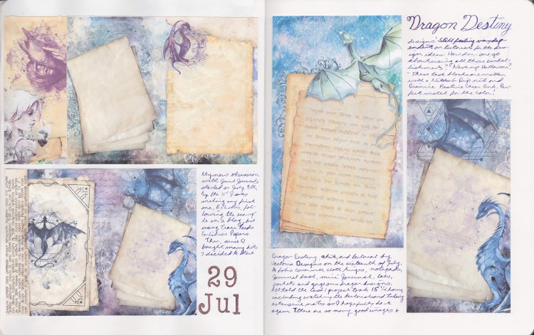
Collage page to document my other new obsession, Junk Journals! I made this gorgeous Dragon Destiny journal, designed by Vectoria Designs. Obviously something I loved doing so much had to be included in my sketchbook, and what better way than to collage some of my favorite images?

Sketchbook Design class by Liz Steel Sketching Now is starting next week and I’m so very excited! I’m eager to get into a daily habit of sketching, and really working on ways to pull my pages together. I find I sketch more when I have an idea how to put it on the page. I’m going to leave the next few spreads unfinished in preparation for class, so I may end up posting out of order for a bit. What fun I will be having in this class!

POV Sketch, Bougainvillea, and more

April, not much sketching happened, but some…

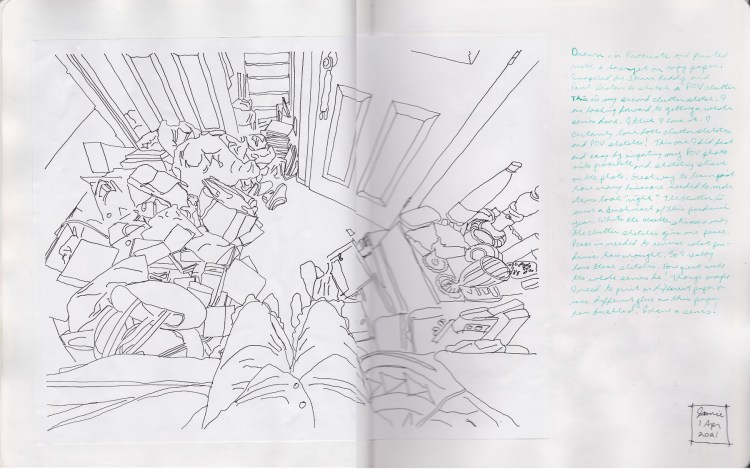
My second clutter sketch, and my first sketch using the POV method. Inspired by Stephen Reddy and Paul Heston for this one. I did sketch over a photograph on my iPad in Procreate in order to teach myself what kind of lines and drawing is needed to achieve this. I am happy with my efforts, and I refuse to consider it cheating. It captured the essence of the times so well, I can only love it.

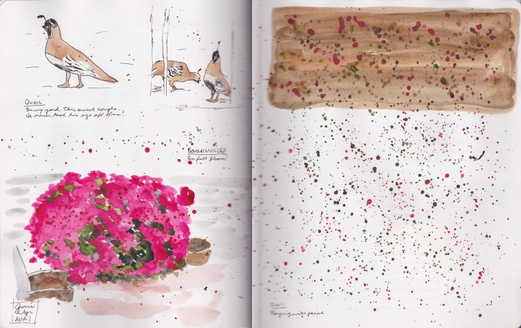
The bougainvillea in my backyard really is giving a most beautiful display this year! Stunning blooms. I love how this direct watercolor approach captured the fullness and richness of those pink blossoms. The whole thing inspired me to splash, and I went a little crazy, but Loved it! I got a visit from a pair of Gimbol quail so I snapped a photo and sketched them! This spread gives me such joy!

A half done page that now becomes testament to what was really going on, by virtue of white space and the voids created by where things fade.

The last bits and pieces of April. That Beltane design is by Amy Cesari. Here ends my volume 3 sketchbook.

Guano Happens!