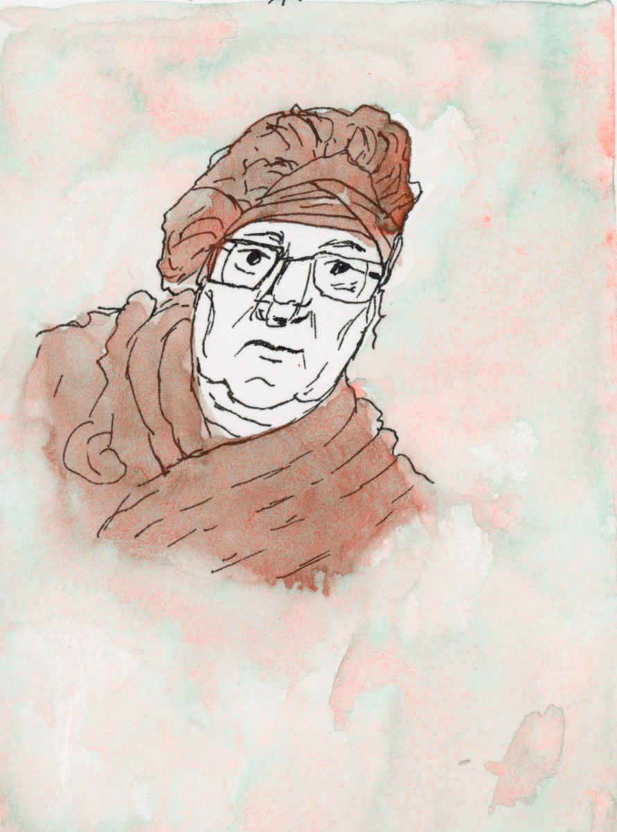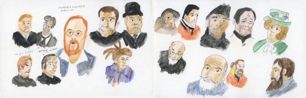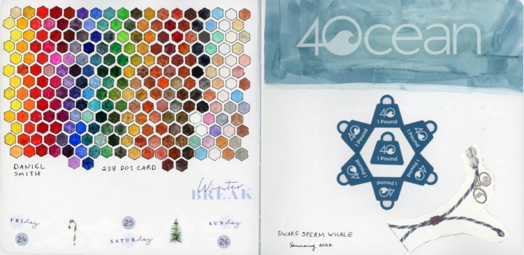
A very experimental week.


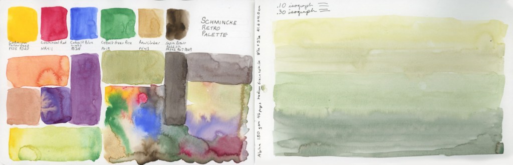
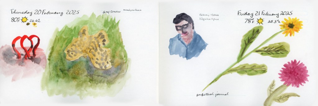
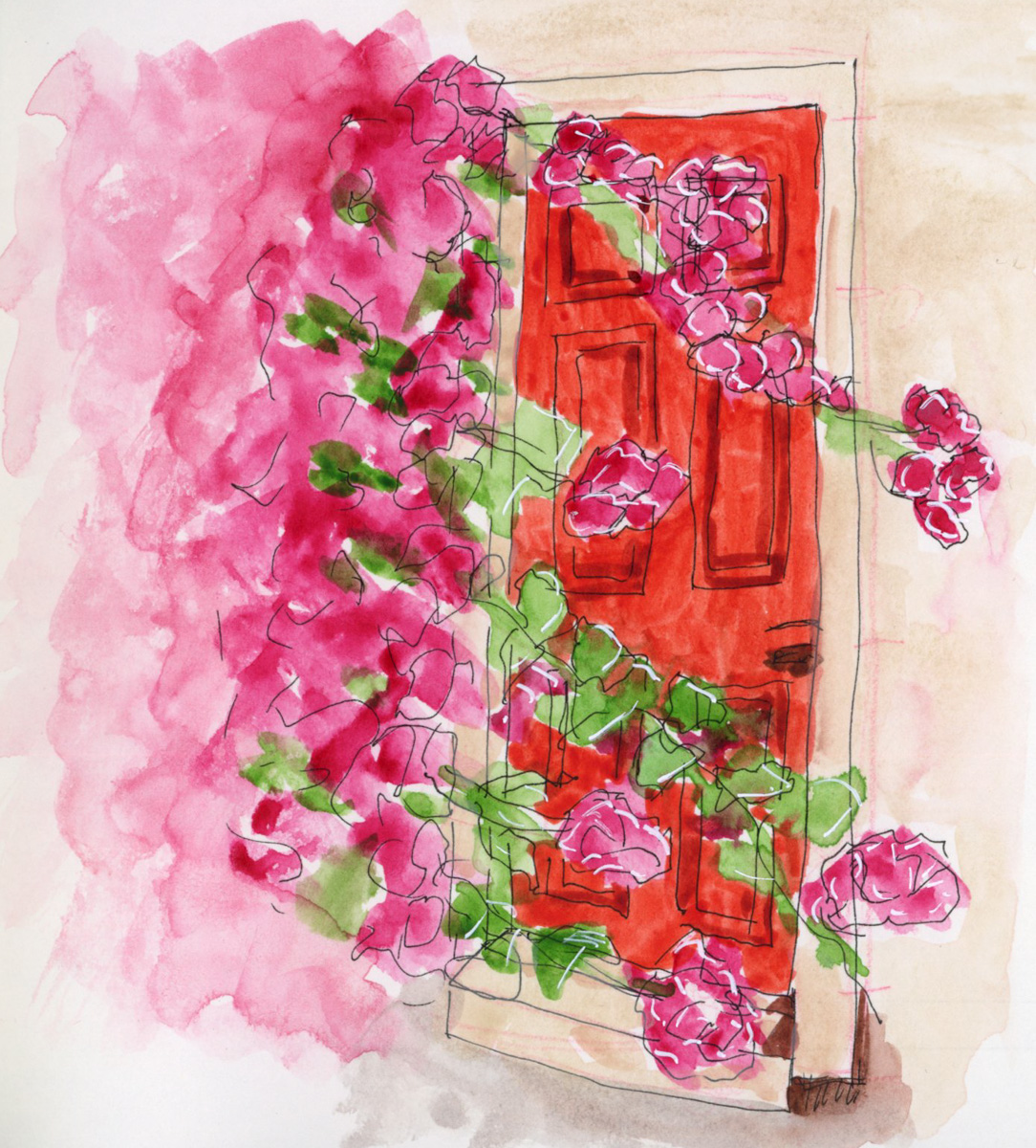
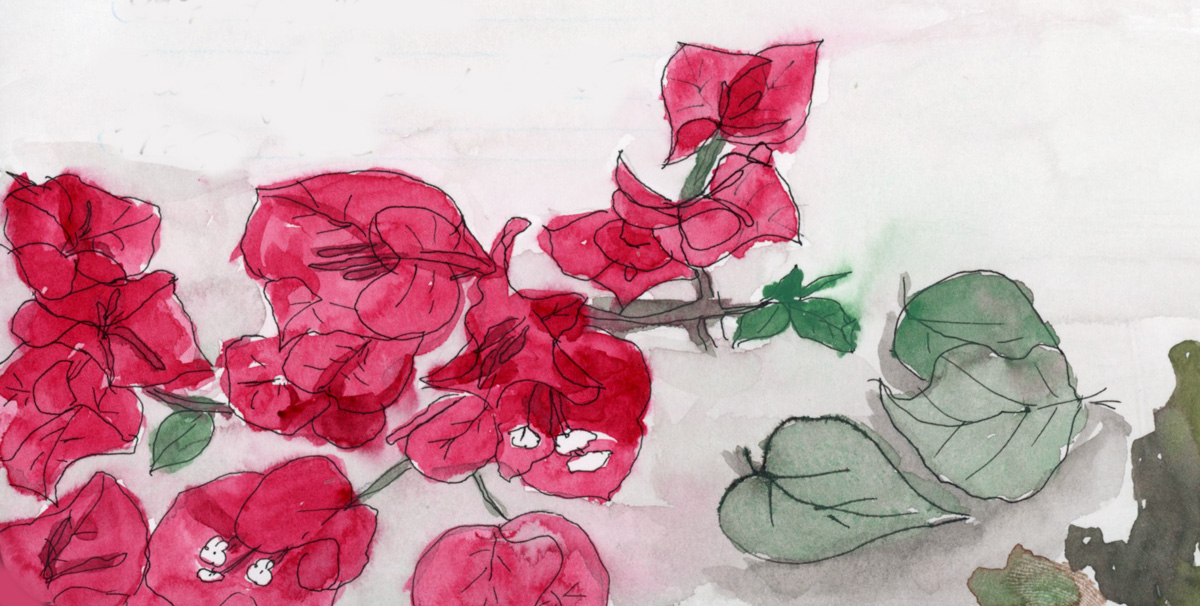
I first tried doing a Nature Journaling style of page inspired by a You Tuber named My Nature Diaries. I love her work. I had even cut a fresh branch off the Bougainvillea before I pruned it, for sketching from a live specimen. Plants are hard! I love the layout of the page. I used the Schmincke Retro Palette, but I feel the greens really dried super flat. That cochineal red is gorgeous by itself, but doesn’t not seem to hold its vibrance when mixed. I missed using Quin Rose for this.
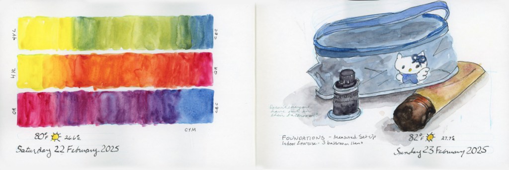
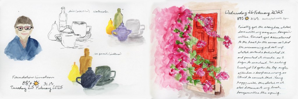
So I used Quin Rose for the pajamas and door sketch, and proved the vibrancy does hold up better when mixing. The color swatches was the paint left over in my palette from the Nature Journal page, and indeed have that muted, dull look, which is why I sketched a line drawing over it.
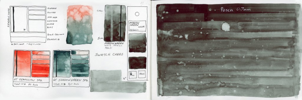
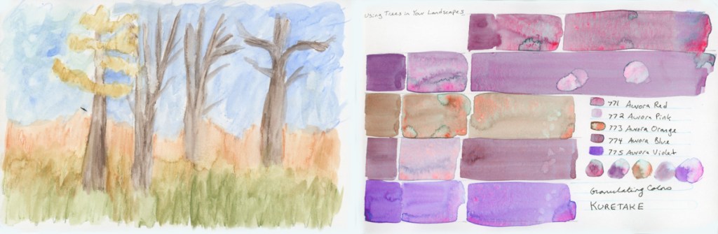
A color chart of the Art Nouveau Gansai Tambi palette. Instead of squares I was attempting merging the organic rounds, but my paper dried far too fast for any bleeds. So I did a second one attempting to add water. I did not get the results I thought I would, which definitely makes this a learning experience. I don’t hate how responsive Gansai Tambi is to water drops, actually. Then I did a second attempt at the sort of soft colors, and blended background I had tried in the Nature Journal page. Much better.
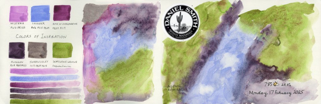
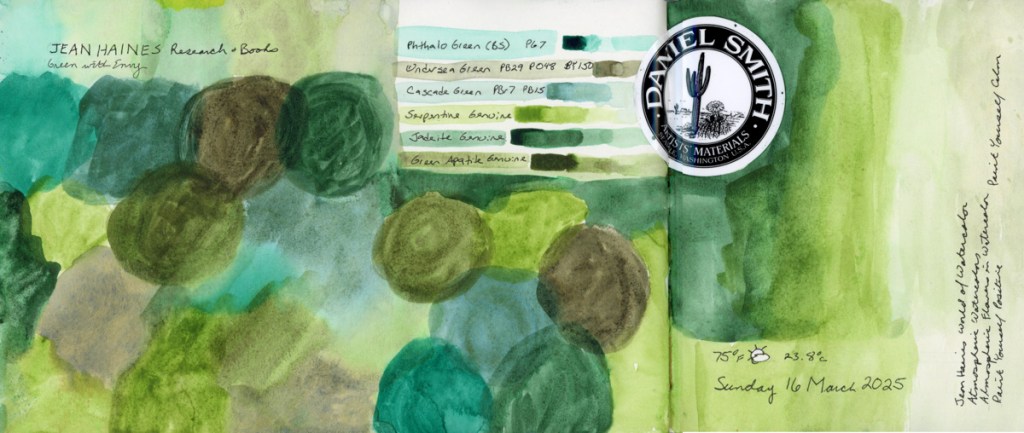
I also did a color chart, still attempting the organic circles, of the Green With Envy palette that Jean Haines did with Daniel Smith. Love, love, love these greens!
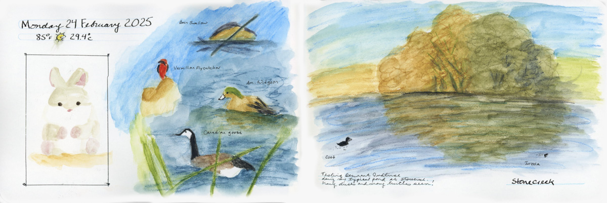
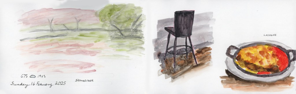
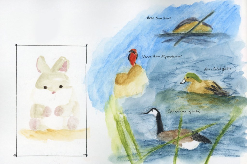
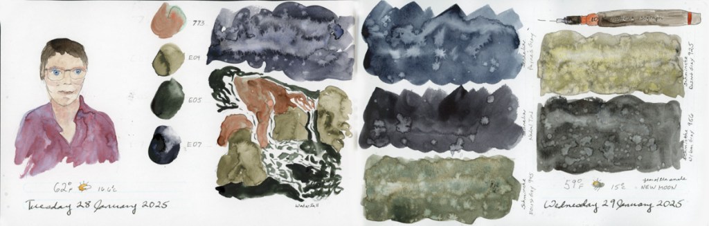
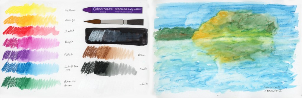
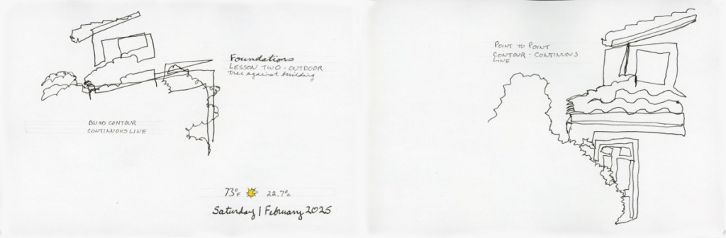
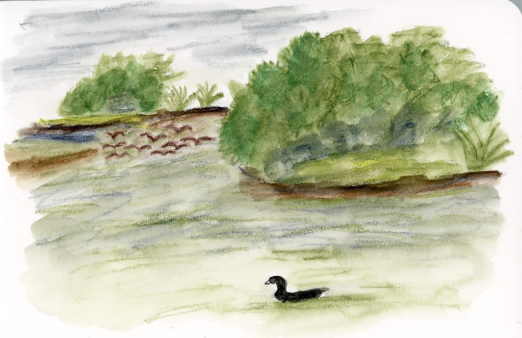
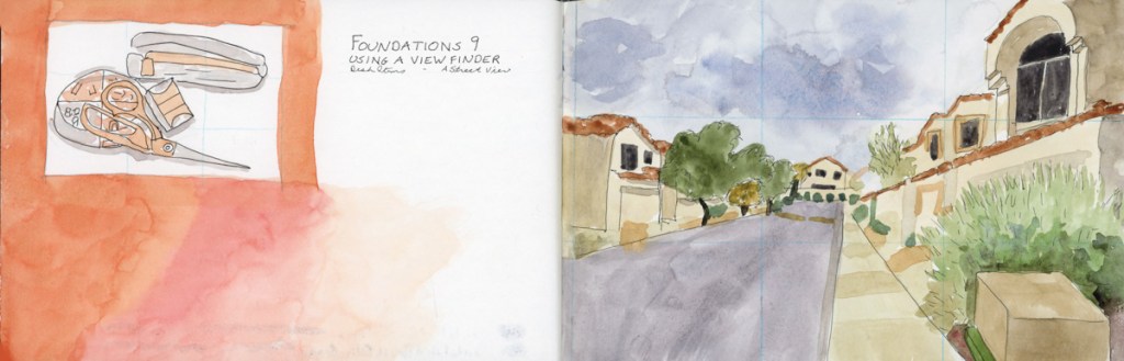
Pen tests, and Foundations exercises, and then another walk at Stonecreek. The Stonecreek page is an exploration of media. I used the Albrect Durer watercolor pencils for the birds, but then got curious how the Inktense would look next to it, so I extended the background using the Inktense. Then I decided to paint my usual Stonecreek Pond in Gansai Tambi. Love what the water effects did in the pond water. I did this at home, from a photo, as the Gansai Tambi are not easily transportable.

There were many turtle sightings in the pond on this particular spring day, so I had to document that with their little heads in the waters.