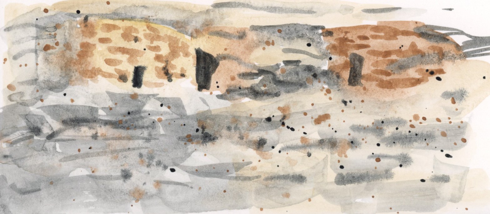


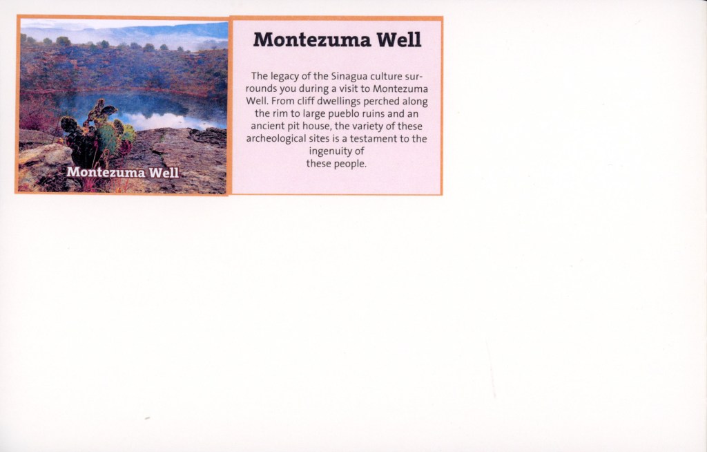


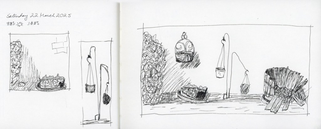
Struggling to sketch, but I did get this one scene from Montezuma’s Well painted onto that mostly empty page of my sketchbook. Still more to fill.
I did the Seven Lines exercise for Travel sketching, but felt the pages looked too barren in the flow of this particular sketchbook, so I gave those pages some background colors to also help differentiate the multiple sketches per page.
I am improving on doing these slightly textured background washes.
My family vacation was cut short, and between the chaos of getting ready, and the unexpected return, my sketching took a hit.

I do not even have the dates and weather yet for Friday through Sunday! Needless to say, I did not sketch on location anywhere. The struggle is real!
I am hoping I’ll have loads of time and fill in all sorts of sketches and memories from photos. Loads of time seems quite unlikely. So maybe I just do color abstracts that capture the sights and experiences? I could also just leave these pages as is, with the barest of dates and stickers. Turn the page and start clean. I’ll see how this week goes, but I know from experience I can’t let blank pages go too long or I stall out completely. I’ll give myself Monday to see how the week looks, and whether I think I can steal time to fill in sketches, or do those color abstracts.
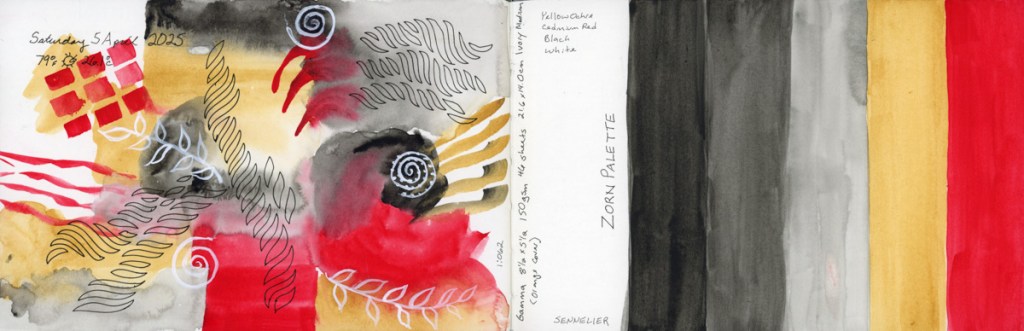
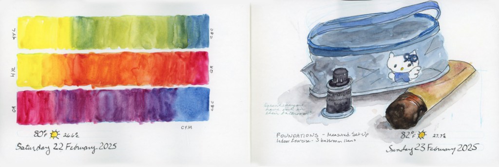
This week’s sketching. Not much sketching this week, actually, but plenty of color swatching.
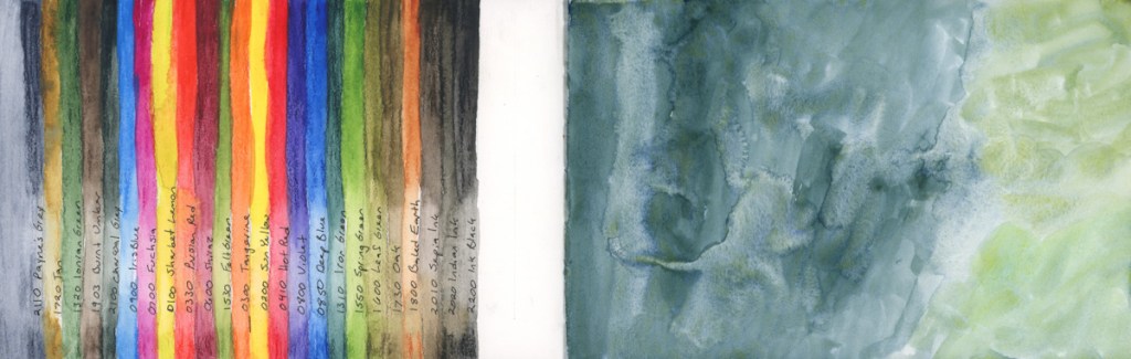
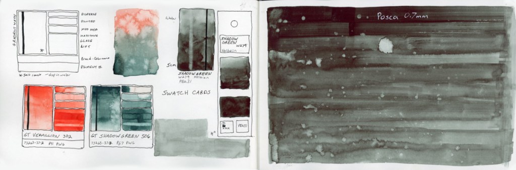
I swatched the rest of the supergranulating paints. I have had the big set for a couple years, and never swatched it, so now it is very nice to have that done.
I’m not sure what I think about these supergranulating paints. For the most part, they do granulate beautifully. A lot of them seem a little pale to me, unless I am really painting it pasty thick. There are a handful, however, that I thought were really interesting and lovely. But as ever, to really know a paint, it takes more than a color swatch. I haven’t color mixed, nor have I painted subjects with them.
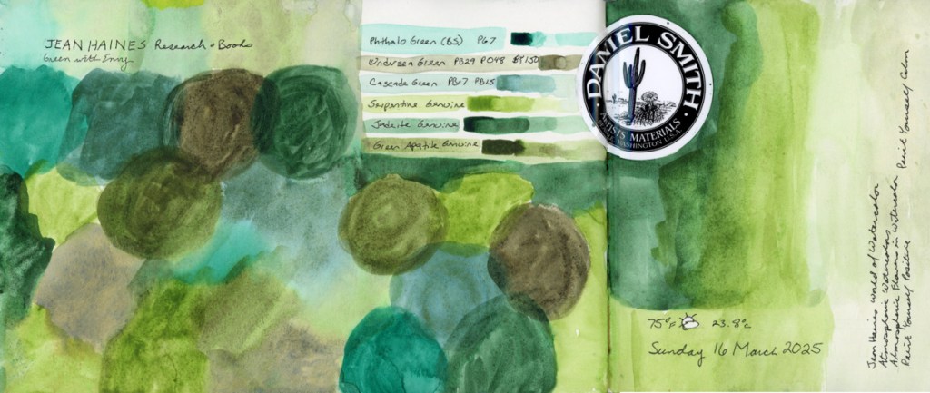
Color swatching, however, is a great calming activity. Like Jean Haines’ book title, Painting Yourself Calm. Though her technique is all about lots of water and flow, I find color swatching quite soothing, too.
I’ll be on a family vacation this next week or so. I intend to sketch, and I hope to post a bit about it while on vacation, but I don’t know if I’ll have the time, or the means. If not, I’ll certainly post afterwards. I haven’t actually travel sketched much, though I really want to. Travel sketching, and sketching on location, is a big mental block, so let’s see how I do next week!
If nothing else, I know I’ll take a lot of photos, and I can always sketch them later!
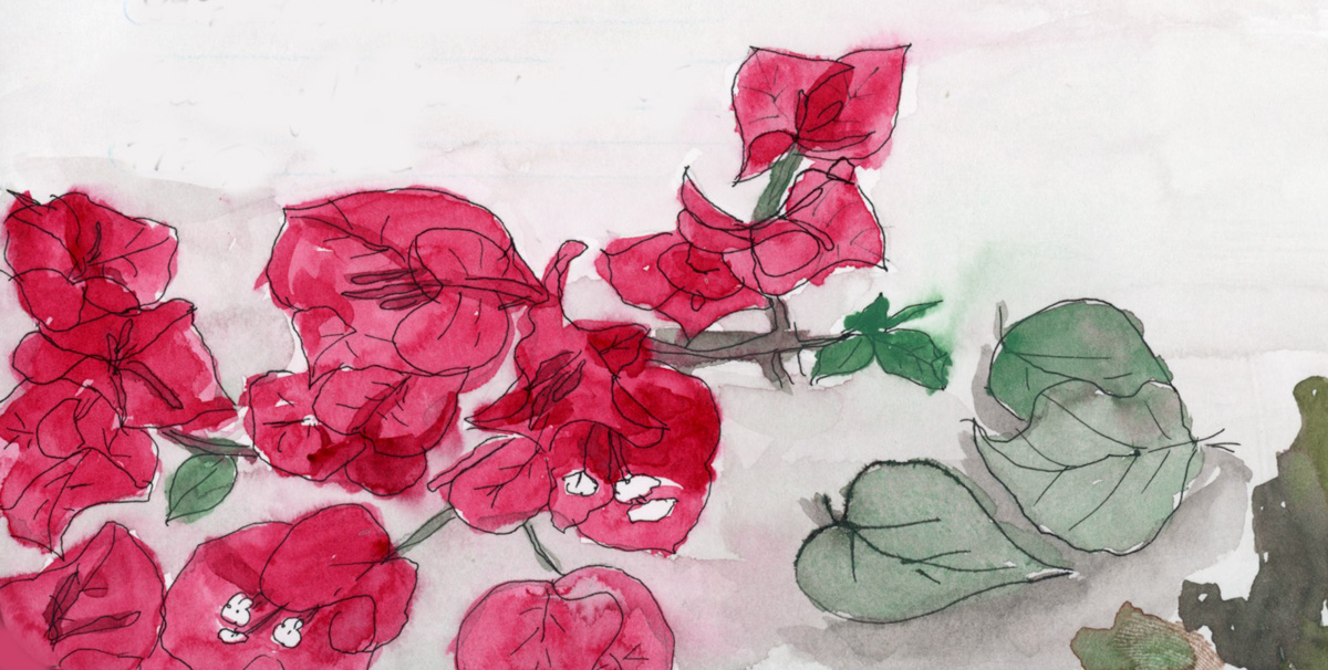
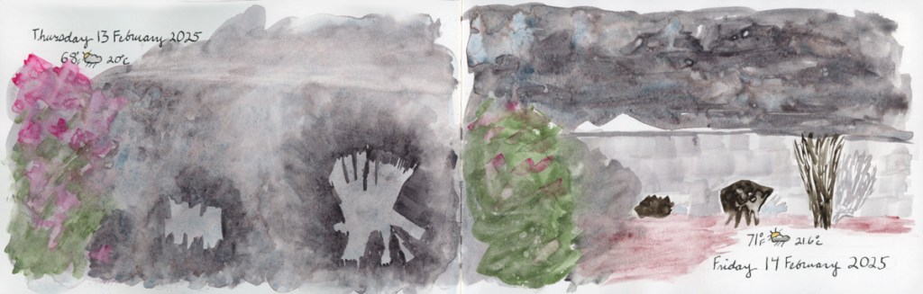
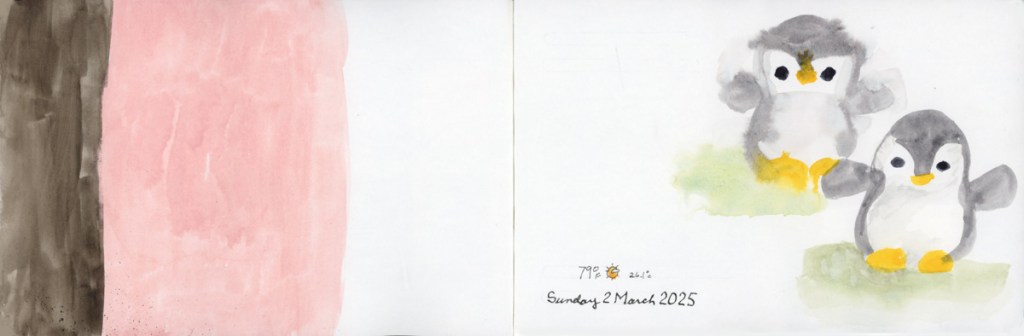
The Spring Greens have erupted on the trees and the entire island has lost all yellows and browns from the winter.
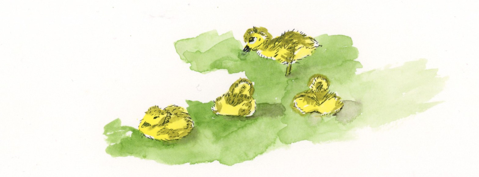
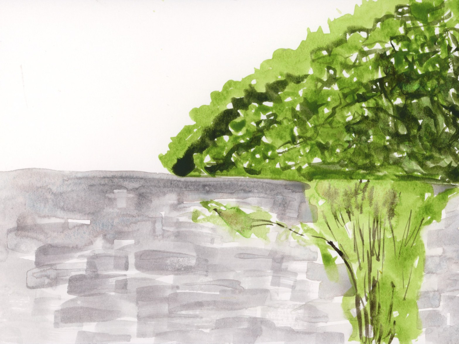
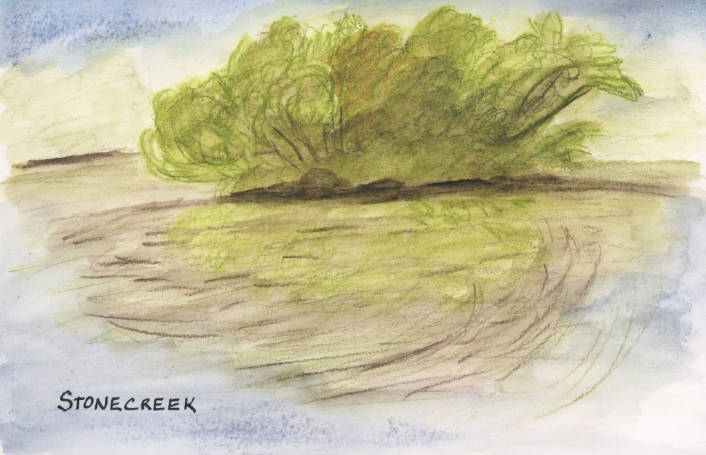
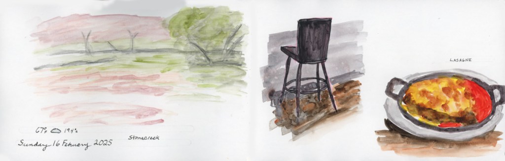
I sketched the island at the pond at Stonecreek with Inktense and I painted the goslings at home from a photo as my eyeballs do not zoom as much as a camera lens.(This is likely why the nature journalists like John Muir Laws carry binoculars!)

This sketch let me down. First my Inktense pencil was too bright, so I tried to tone it all down, but then ended up making it muddy. Not the spring green vibe I’m going for! While the photo was taken in a calm moment, most of the time the wind was rippling the pond water, which is what I captured in my sketch.
The Delta Series paper also let me down. To get a lighter shade of blue for the sky and reflection, I used a lot of water and the paper did this weird spotting thing. I had seen it do that in the previous pages, but since I was using supergranulating paint, I thought that was the granulation effect. Inktense does not granulate, so this is definitely the paper. Worse, those spots are showing through to the other side! Ack! I use this much water all the time with the Alpha Series, and Gamma Series papers, and that near bleeding, and changing of texture does not happen. Interesting difference!
I’m going to try watercolor over the top of this sketch to see if I can fix that muddy feeling to restore it back to that Spring Green vibe which is what I wanted to capture.
Well, I added watercolor over the top, and it is a better shade of green for the spring greens, but I can’t say I’d call this a very successful sketch. I do like it better now, at least.
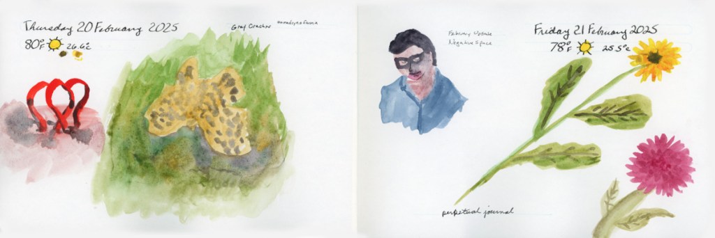
What I love on this page are the goslings I sketched! Cuteness!
I painted the goslings from a photo a couple days later, in ink and watercolor, and I’m super happy with these adorable little guys. They were young and still tiny little fluff balls who had to rest after every few steps. There were actually two families of goslings! One family had five who were slightly bigger than these four. What a treat of a day to see the goslings!
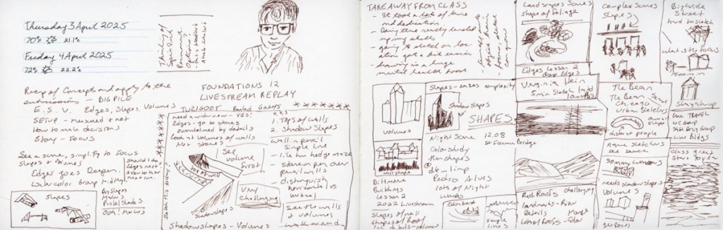
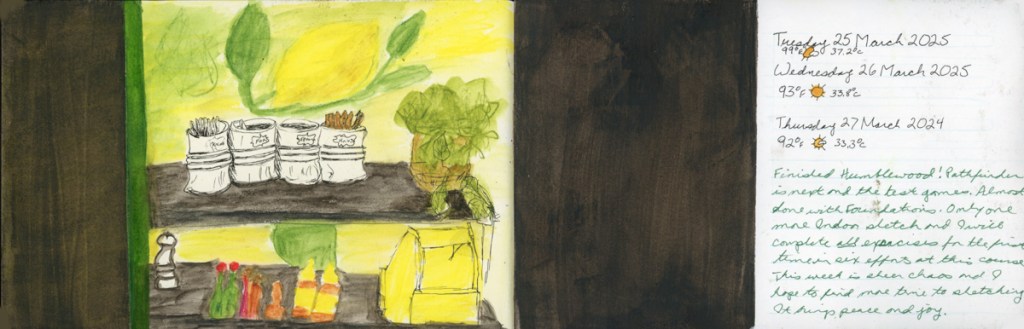
This week I finished Volume 19 of my sketchbook, and started Volume 20. I wrote a bit on these pages in the past few entries.
A lot of color explorations in these pages this week. I did not have much time to sketch, what with the leaking pipes in the kitchen (now repaired!) I find that color charts are great for soothing a stressed out brain!
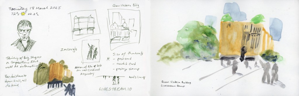
Sketching ruins, and foreshortening, and an exploration into creating abstracts, which I’ve already written about, was very fun.
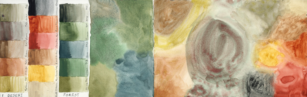
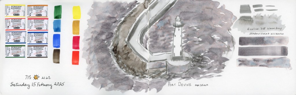
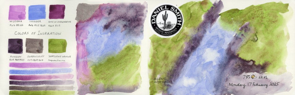
I am going to be traveling with family later in April, so I wanted to test the two desert paint palettes I have to see if I should bring them with me. One is the Schmincke Supergranulating Desert set. The other is Daniel Smith’s Earth Desert to Mountain. Then I decided to test the Schmincke Supergranulating Forest set, as I’ll also be among the pine trees. I haven’t decided what I’ll bring, but I certainly am beginning to feel the vibes here!
Since I had out the Supergranulating box, I noticed I hadn’t filled in the swatch card they provided with it, so naturally I had to begin swatching the rest of the colors! So I did another Haze page, and then Shire.
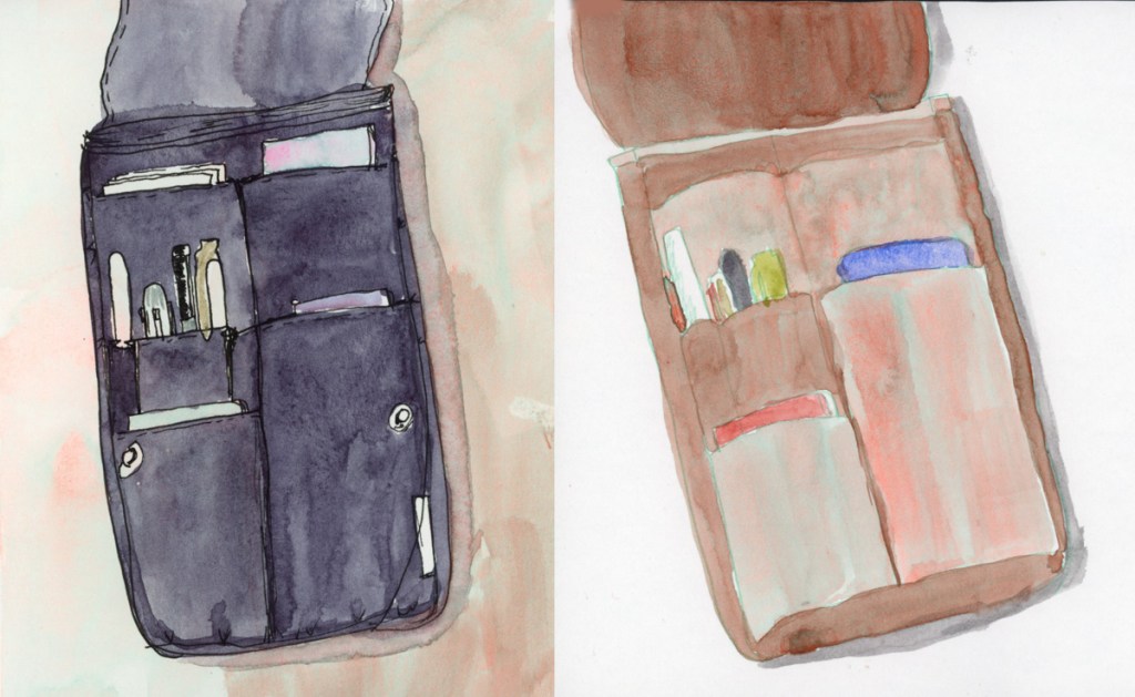
I had some paint left over from the shire tests, so I filled a page with that. I also wanted to put the Alex Boon recommended set of 24 as a reference in this Delta book. I could also test the different paper, which does seem to be surprisingly different for the pencils over the Alpha/Gamma paper.
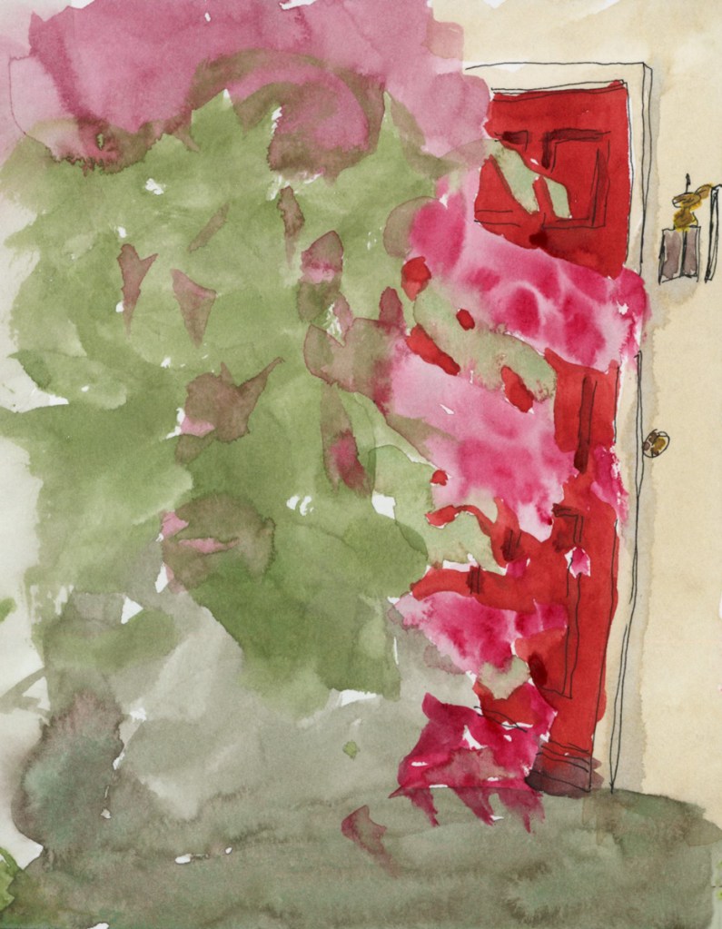
I may add text to these pages, or line sketches. Though I may not have the time, in which case, I’ll just opt to move on and leave the pages as is, capturing the busy-ness in slightly unfinished pages.
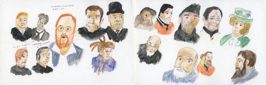
I’ve finished my 19th sketchbook. I have done a lot of color charts in this one, as well as Foundations coursework. I have sketches done from my Stonecreek walks. I have been rather experimental in doing more design with color charts, evolving into a new exploration of abstracts. I did 100 People in One Week in this sketchbook, too.
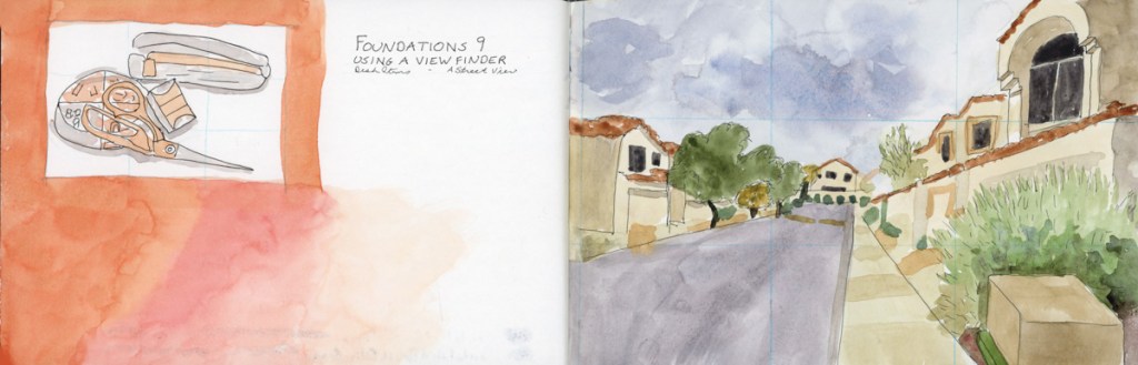
I begin the book with the Liz Steel Patreon community challenge to focus on negative spaces and painting. For the March challenge, I worked to the edge. April is foreshortening, and I end the sketchbook with a foreshortened view of Tuzigoot, which is also a nice finish to Foundations.
This book the Stillman and Birn Gamma softcover, 8.5 x 5.5 inches. 150 gsm, Ivory, Medium grain, with 46 sheets.. Same paper as the Alpha, but Ivory colored. I find I rather like the soothing ivory color. I did not particularly notice the color affecting my paint mixes for anything other than skin tones. Most of my sketchbooks have been Stillman and Birn Alpha, so this has been quite comfortable.
I continue my personal challenge to work through all of Stillman and Birn paper types, using this softcover 8.5 x 5.5 landscape size. Volume 20 will be the Delta series, with heavier weight paper, as I begin the Travel Sketching class. I’m not ready to let go of the Ivory paper, just yet. I’m also looking forward to experimenting with heavier water flow exercises like in the Painting Yourself Calm book by Jean Haines. With fewer pages, 26 sheets, I’ll move through it faster, which hopefully will be good timing for a new sketchbook to coincide with a family vacation I’ll be taking in mid-April.


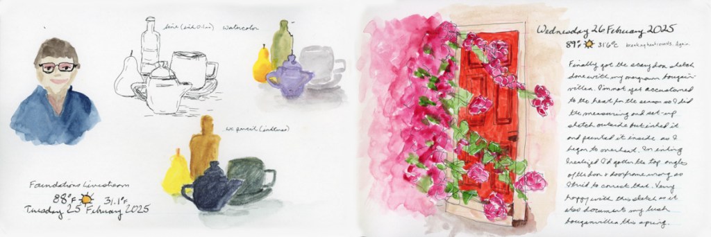


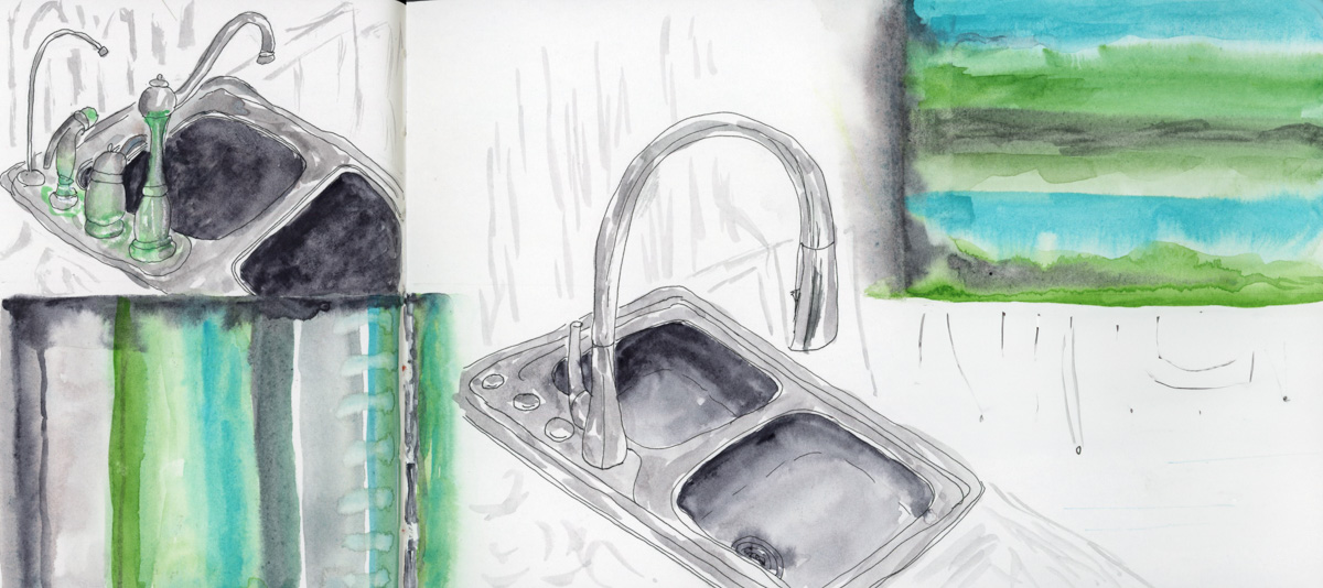
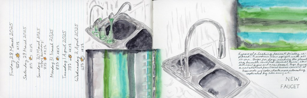
Not as much sketching this week as it was not only my birthday, but also a big week for plumbing issues in the house!
A leaky faucet got replaced, and I just had to document it with a couple sketches. These sketches were being done while the massive leaks underneath the sink were being repaired! (Plumber not sketched. Ha!)
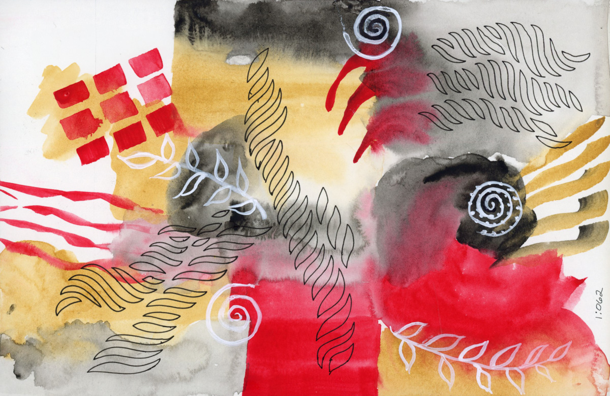
I did these abstract lines of the colors in the sketch, and rather like the look of them. I’m inspired by Creative Abstract Watercolor by Kate Rebecca Leach which I got for my birthday. Nice ways to showcase color charts! As well as add color to an otherwise gloomy page.


I read Jean Haines book, Painting Yourself Calm, and I loved it. Eager to try, I did her exercises in yellow. I think I can’t get her results unless I use full cotton paper, but the green streak on yellow really reminded me it was St. Patrick’s day, so I was off painting little shamrocks. Such a nice, festive page.
Sunsets really challenge me in painting them, so this time I went for a looser version just to capture the colors. I tried an exercise from the Paint Yourself Calm, but it seems to have ended up far more abstract that I originally intended. I kinda like it though. Maybe abstracts are a good way to document moods, and moments that don’t otherwise have objects or scenes to sketch? Interesting idea.
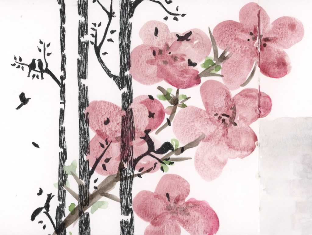
Fascinated by this upside tree I was watching in a television show, so I sketched it. I’m working on developing my pen and ink skills, too, and this was a great subject for that.
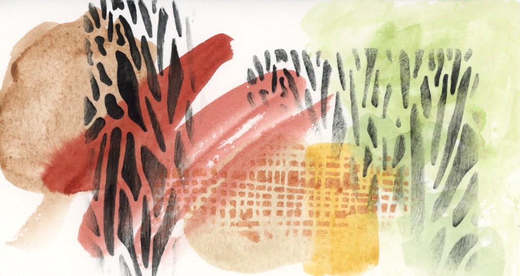
To celebrate the Spring Equinox, I used watercolor on a plastic stencil just to see what would happen. I did have some bleeding, but I was able to lift much of it, and clean it up. Good thing I used Serpentine Genuine, and not a staining pigment!
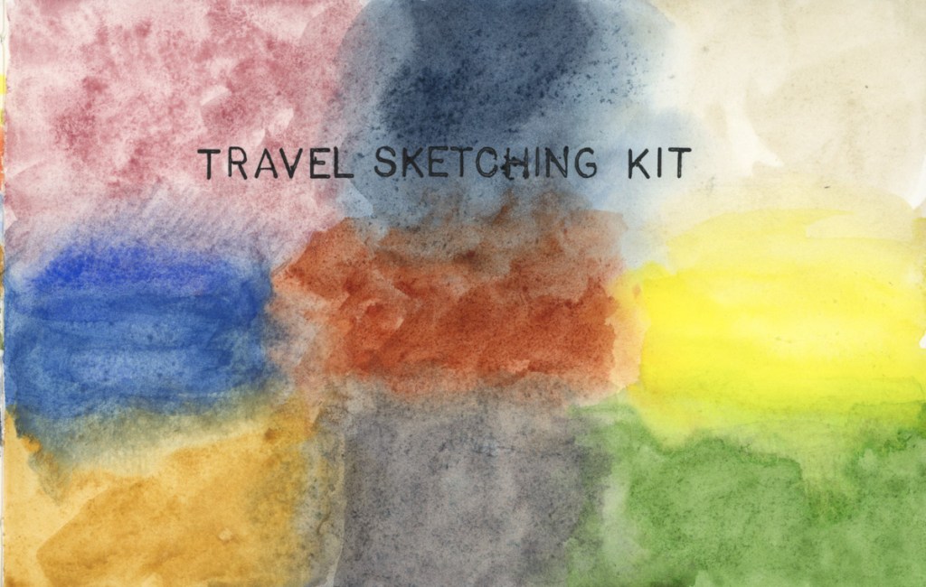
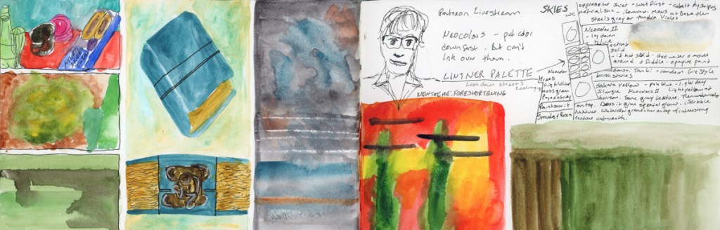
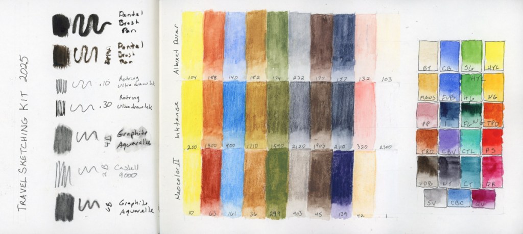
Foundations exercises, and a color chart of my kit for April’s Travel Sketching course. I dug out the neocolors I’d bought the last run of the class, in the class palette, but never used. I’m curious about Neocolor II, as they are quite popular.
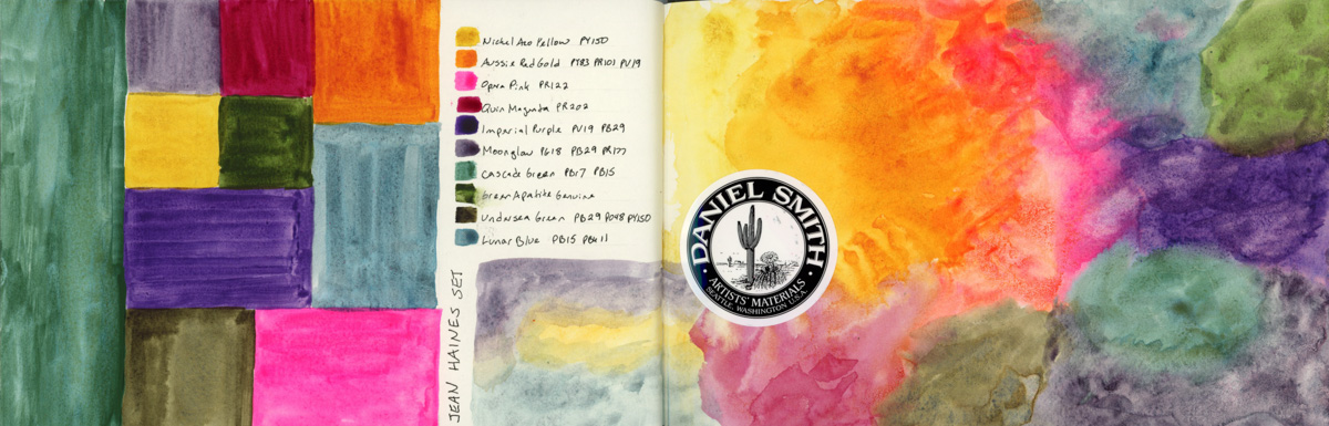
Of course I had to swatch the colors of Jean Haine’s palette. After doing the mosaic style of color sampling, I had to try another organic one, and I’m finally getting the kind of results I had in mind! There is something very cheerful and uplifting about this rainbow page.
More color charts and tests, and mosaic sampling, this time with a bit more gradients within. These are starting to be fun and I love how they look filling the page to the edge, which is the March challenge in the Liz Steel Patreon group.
Finally two color charts using the new Haze supergranualting paints from Schmincke. I have all the other supergranulating colors, so I couldn’t have an incomplete collection, now could I?
My color charts are evolving, and I rather like what’s happening on these pages.