I focused on achieving patterns, so my colors are off. I tried to use the granulation of Lunar Black to make the all black items have a little life in the sketch. I’m pretty happy with my results.
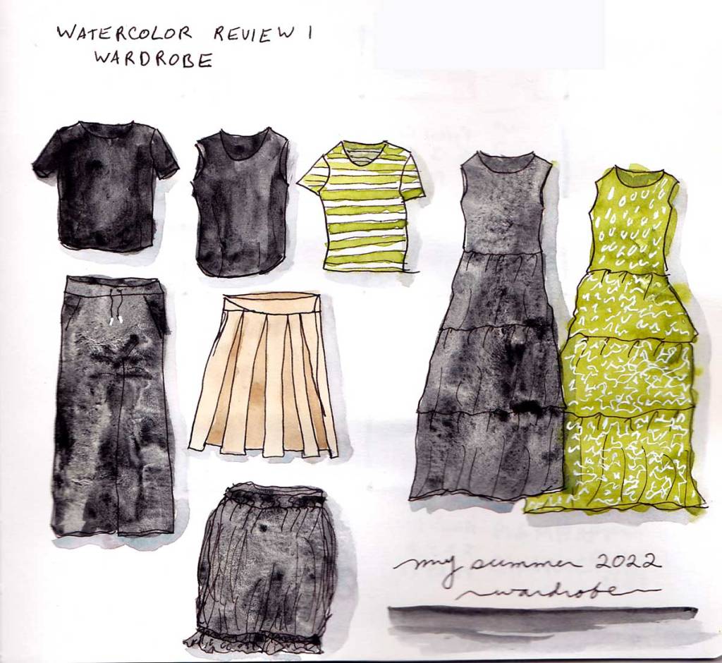
I focused on achieving patterns, so my colors are off. I tried to use the granulation of Lunar Black to make the all black items have a little life in the sketch. I’m pretty happy with my results.

For this class I’m using Jane Blundell’s Ultimate Mixing palette. I was surprised how few of these colors are transparent. Almost all of them are staining, as well. Fascinating. I’ve long been interested in pigments and I have really loved this lesson.

My First Harris Hills is a layered approach, where I started with watery layers of Hansa Yellow Medium, Burnt Sienna, and Cerulean Blue Chromium. When that had dried I mixed a green and layered it on top. My third layer were the details and shadows.

My second Harris Hills I worked fast for a wet in wet. I used no pencil lines so I lost the shapes. My paper dries super fast! Is it the Alpha paper or my desert climate? I did the entire painting in 12 minutes, not including drying time! I rather love the atmospheric mood of this wet in wet one. I might add ink lines to another one, just to see how it affects the landscape, but I love this one as is.

I did this Welsh landscape mostly wet in wet, though my foreground got too dry too quickly. I love what happened in the sky with the blooms and bleeds. This one took me just ten minutes, not including drying time! The grey background hill I’m quite happy with, and I’m definitely preferring using cobalt for skies over cerulean. My trees in the foreground had some trouble, and using some ink lines may help define them better.
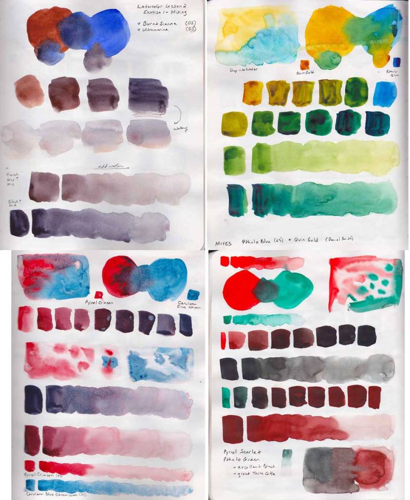
It was great to mix just two colors in a variety of ways on one large page (8×10 Stillman & Birn Alpha). There are some new to me colors in my palette that I haven’t mixed much previously, so I focused on those pigments, primarily. My first mix is with Burnt Sienna and Ultramarine (All my paints for this exercise are Daniel Smith) as I wanted to try to get that nice grey this pair can mix. My next mix is Quin Gold and Pthalo Blue (GS) to see what kind of greens I can get. I mixed Cerulean Blue Chromium with Pyrrol Crimson, as I haven’t worked much that red before. I was pretty pleased with the purples I cold get from it, as well as the crazy way the Cerulean exploded into the Pyrrol Scarlet. My favorite magic happening there! Last I mixed Pyrrol Scarlet with Pthalo Green and was surprised at what a lovely grey that made, as well as an excellent earth orange red that will be perfect for tile roofs!
I do so love drawing with a continuous line. It is so freeing! It reduces a complex subject into something utterly doable, and low pressure! I must remember to use this technique far, far more often!
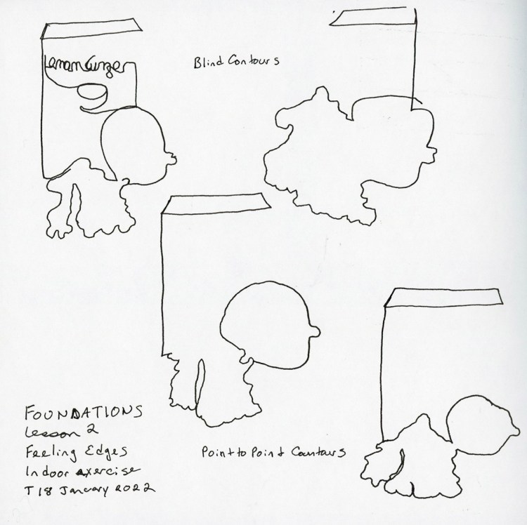
First was a few kitchen items. I grabbed a box of lemon ginger tea, a lemon, and fresh ginger root. Cute! The exercise was to do the outlines, and here they are. I had so much fun I had to do it a few times!
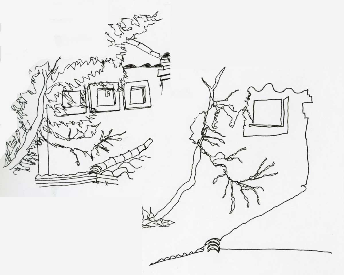
Next assignment was to sketch part of a house that had some foliage in front of it. At least that’s how I interpreted it. This was even more fun! I really love how easy these were, and the energy in the sketches. It capture something special my more careful sketches don’t.

Next time I look forward to trying an even more detailed version. Maybe add the roof tiles for some texture, over and above the tree limbs. My sketchbook page got a bit crowded, but that’s the fun of being “on location” and working with what you have! I am nearing the end of this 7.5 x 7.5 inch Stillman and Birn Alpha. I’ll have to decide what size I’ll be going with next!

I decided to dust off my food sketchbook. Since this is the week of continuous line, I had to apply it to the food sketches! Not all of these little sketches are in continuous line, but I found it super helpful to sketch the pasta and the chocolate chips. Subjects where the detail typically overwhelms me.

I am also working on my sketchbook design skills in the food sketchbook. It is a good subject to practice spanning the gutter, and varying layout options. I’m obviously heavily influenced by Liz Steel and her magnificent classes, especially Sketching Now Sketchbook Design.

Speaking of challenging subjects, I attempted drawing something I would never have tried before, and I sketched this view of the Natchez steamboat by using continuous line. I rather love it! The cathedral I sketched using what I learned in Sketching Now Buildings, and much to my surprise, it turned out so well. This might be my favorite sketchbook page of all time, and certainly my favorite in this sketchbook!
Thanks Liz! I couldn’t be doing this without you!
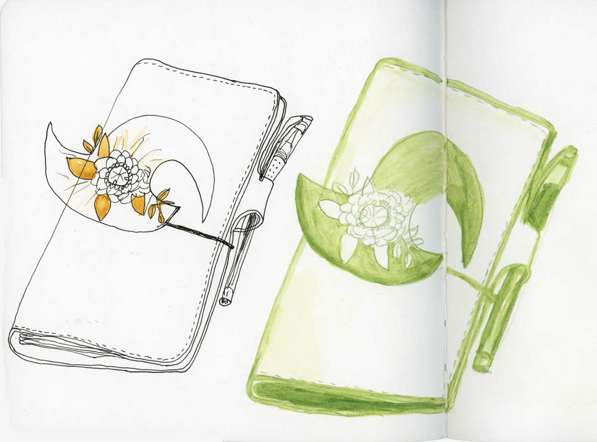
My assignment was to draw something on a table in public, using two different types of materials. One in pen only, with spot color, and the other in watercolor pencil. Well, due to the current massive surge in COVID cases in my city, I’m not doing anything in public! However, this TN was on my table and it is one of those objects I never think about sketching, because it’s always around. Perfect!
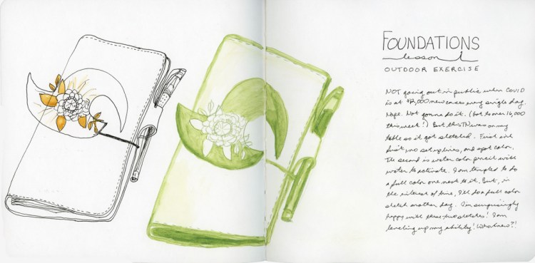
I do love sketching in pen (with no pencil set up lines) and the wonky pen in the sketch doesn’t even bother me. The spot color was a fun addition. I need to remember that more often! The watercolor pencil is easier to adjust and make corrections, especially when adding water to activate it and make it a bit more painterly. I was incredibly tempted to sketch and paint a full color version, but I was short on time. Some other day!
This was a really fun exercise, and I very much enjoyed how different each version is and how it adds interest to the page.
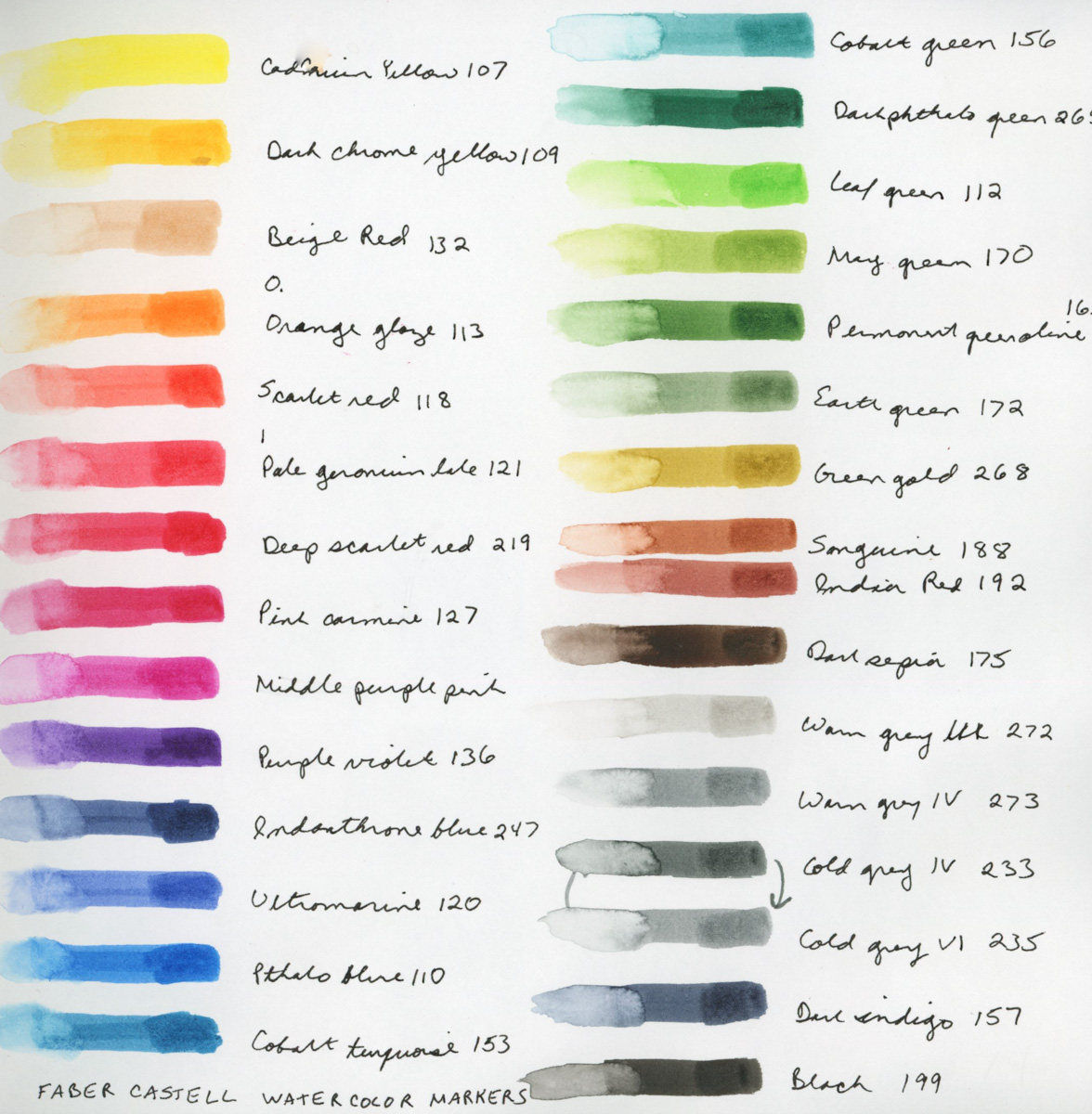
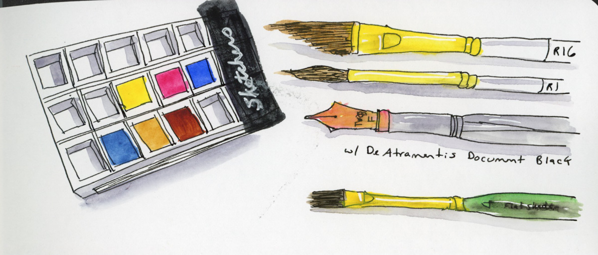
Watercolor Markers! Okay, I admit, I saw these and they were a total impulse purchase last month. I will also admit, I gleefully squeed when they finally arrived! I have not worked too much with markers, though I have some Copic markers. I’m excited to play with markers that won’t bleed through the paper! The colors are nice and vibrant.


Here brings me through the first half of January. I’m starting to pick up some momentum now, and excited about what it is to come!
Happy New Year!
I am so very excited about Foundations this year. As I was doing Buildings a lot of the basics really clicked for me in new ways, and thusly I’m quite excited to do Foundations, and focus on those basics, and allow my new depth of understanding to really be explored and practiced!
This is my fourth run through of Foundations! Hard to believe, isn’t it? I’ve never finished, (I say that a lot, don’t I?) but I always learn a lot. Obviously, I’m absolutely planning to complete everything! Naturally, I’m “behind” already. However, I love it no less!
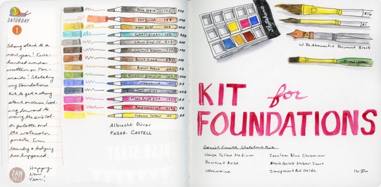
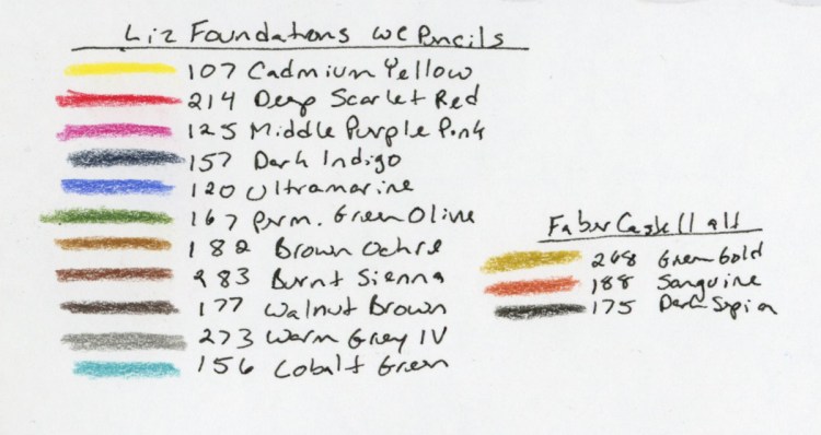
For the first time, I’m using the same kit as Liz Steel for her class. I am particularly excited to stick with the six color palette and practice my color mixing! I’m pretty good with my color mixing, so this will be fun. I also got a set of Faber Castell Albrecht Durer watercolor pencils for Yule. Thusly, for the first time, I have the full set of colors Liz uses in her kit! Woot!
I’ve experimented with the watercolor brands I had previously, and so far the Albrecht Durer are my favorites for color intensity and ease of use. I’m looking forward to getting a feel for how they work and what I can do with them.
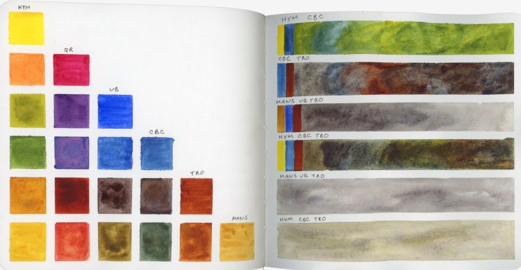

My six colors are all Daniel Smith.

I did a few color bars, aiming for some shades and watercolor magic, as well as capturing which colors were used in the blend. Greens, browns, and grays are all colors that one benefits from knowing how to mix quickly! These are my Lesson 1 Indoor assignments. I always love sketching art materials, and doing color charts! I think we all do!
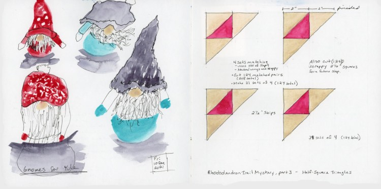
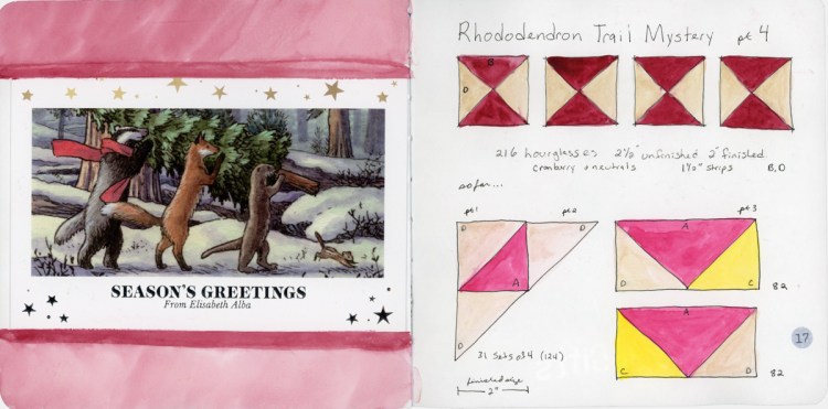
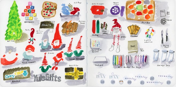
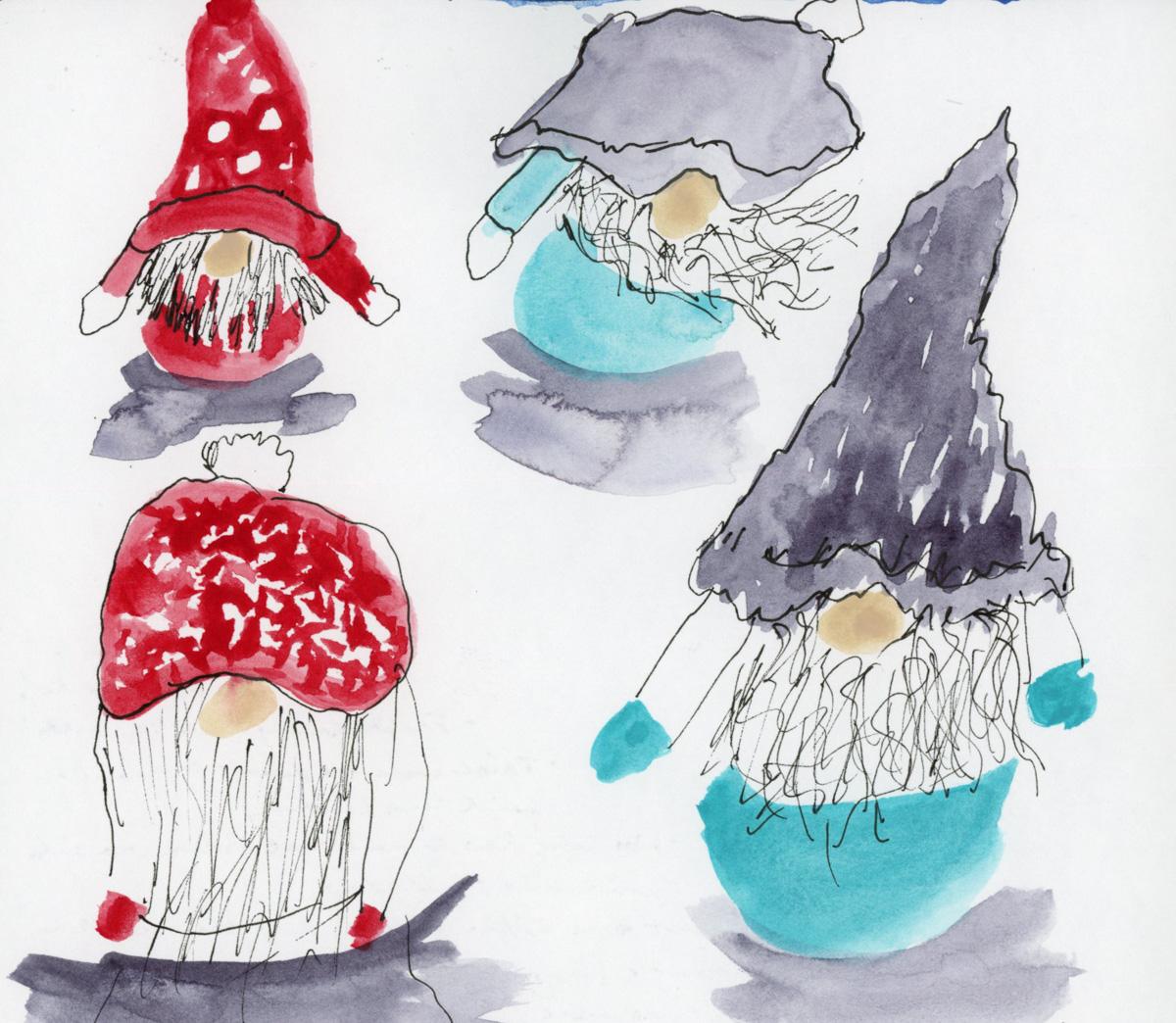
‘Tis the season, from holiday gnomes, to the annual quilt mystery! Capturing the bits and pieces during this cold, wintery season.
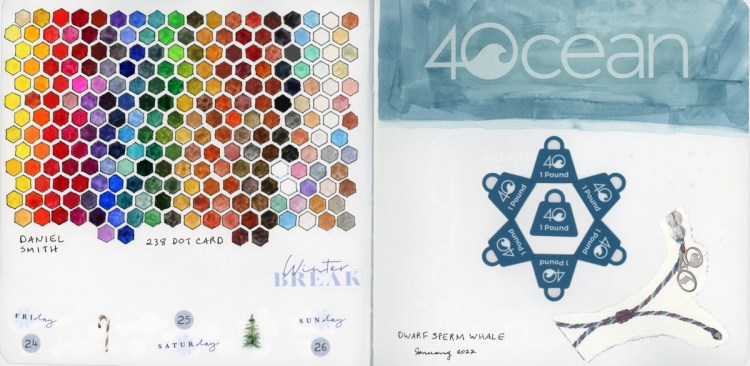
One of my gifts was 238 dot card set from Daniel Smith, so you know I had to make a color chart!
On the sketchbook design front, I noticed when I scanned these just how strongly I am still doing individual pages, and not really designing across the gutter. Only one of these four spreads utilizes both pages. I had not really noticed when I was making the pages, but I do when looking at the scans. This inspires me to think a bit more about my design, and layout in the future!
Happy Holidays everyone, and may your days be Merry and Bright! Happy New Year!
Buildings was great for me this year. I didn’t quite manage to finish. Again. But I got farther than I have in previous years, and had a number of breakthroughs. Seasonal depression is a thing, and in the middle of a pandemic its far worse, so I will be kind and forgiving with myself about not finishing. I loved every minute of class, every Livestream, and every sketch I did was the best I’ve yet done, and that’s a massive set of wins!
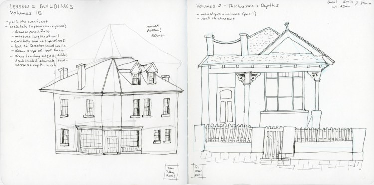
Getting better and better! My biggest success has to be in “thicknesses” and that there are a LOT more lines needed when drawing buildings! I’m getting so much more dimensionality. Even my angles and proportions, by far a big weakness of mine, are getting better! I really need to keep using pencil set up lines for that accuracy aid!

I actually sketched outside! On location! This was in a quiet neighborhood, so I didn’t have to worry about social distancing. I added the paint at home later, though, since the sun was a bit brutal by the time I was done. Next time, I need a hat! But I’ve only done “one location” sketching a few times, so every one is scary and a huge accomplishment.
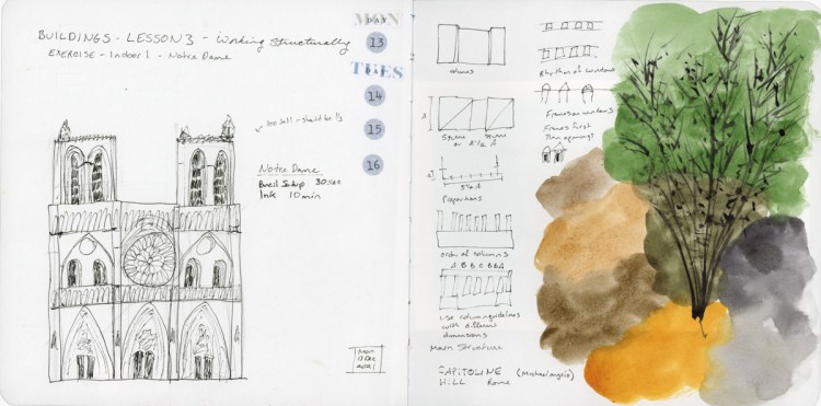
“Working Structurally” may be the best thing! I couldn’t believe how fast and accurately this little sketch of Notre Dame came together! I really have learned so much. Now the trick will be to remember those seven steps!
Next up is Foundations. This will be my fourth run through Foundations, though I’ve not done a great job of finishing that one, either. Hopefully I’ve learned just how much time those lessons really take so I can try to keep up next month!
I’ve decided to go for the six color palette that Liz Steel uses for the class. It feels refreshing and interesting to me to simplify my colors, and work on color mixing, I feel pretty strong with my color mixing, and I have so much fun with it!
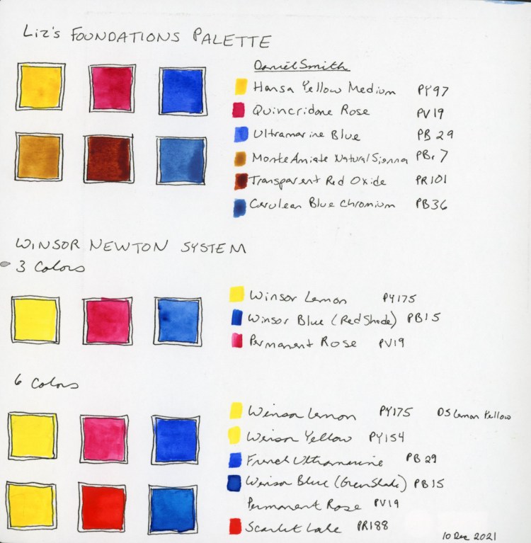
Once upon a time, when I got my first watercolors, I’d see a pamphlet that Winsor Newton put out about which of their colors they recommended for a six color palette, so I had to go research that and put it in my notes. However, I’ll be using Liz’s for class, particularly since I’m really curious how the earth colors will mix. Can I get “clear” tones? I’m excited to find out!
For the holidays I got a set of water color pencils! So, for the first time, I’ve got all the colors for the set in the Foundations class, and I’m so excited to be able to experiment with those, too! Never had them all in previous runs!
 Jamie's Sketchbook