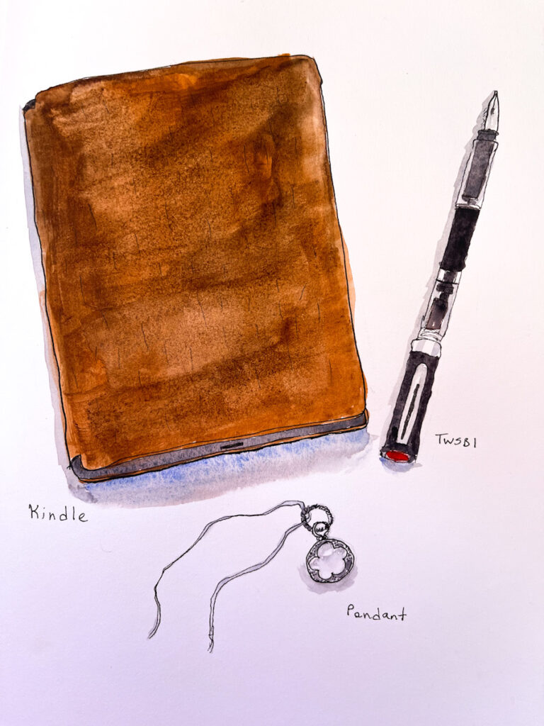
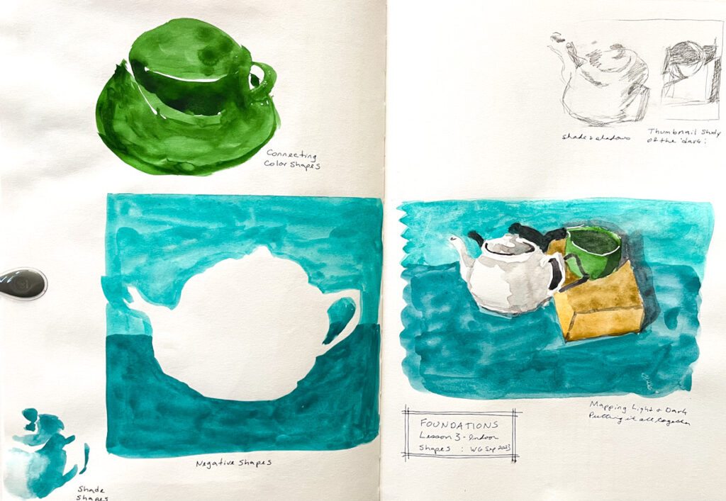
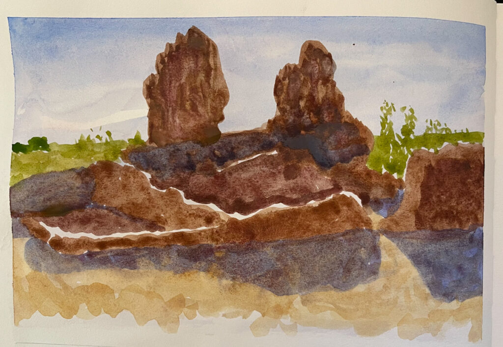
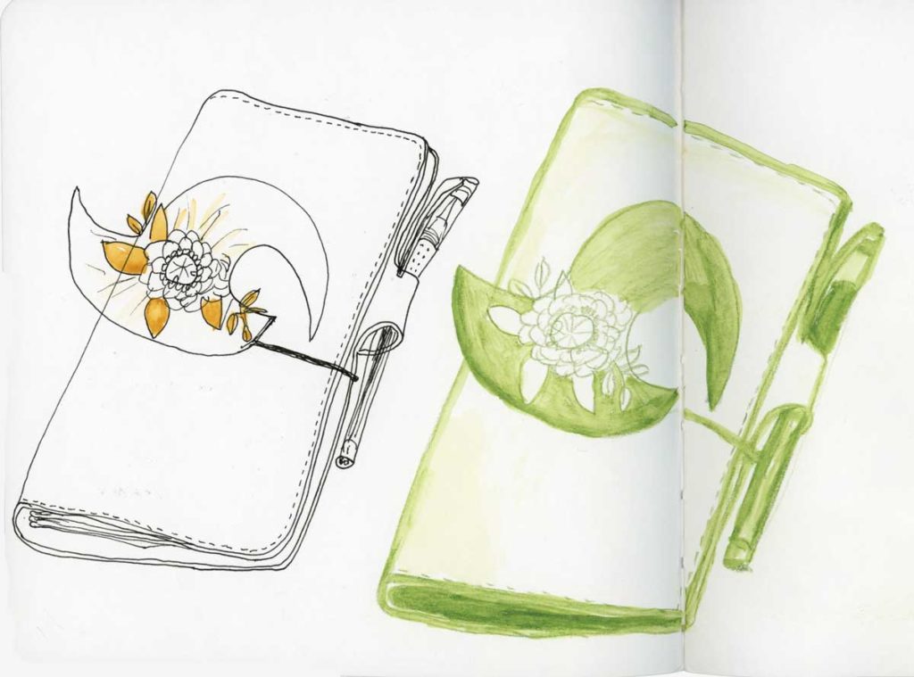
July 2023. I believe this was a group run through, not a live run. It was after the Teacups class, which really energized me and I felt I had really leveled up in my skills. I hit some health issues in August, which is why I fell off with my exercises.
However, despite being done from a photo, that shapes painting of the ruins at Casa Grande is one of my all-time favorite sketches!
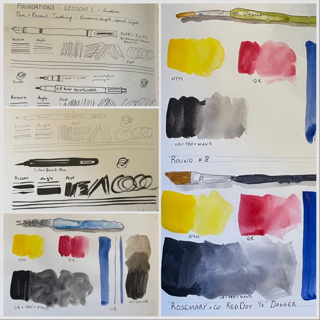
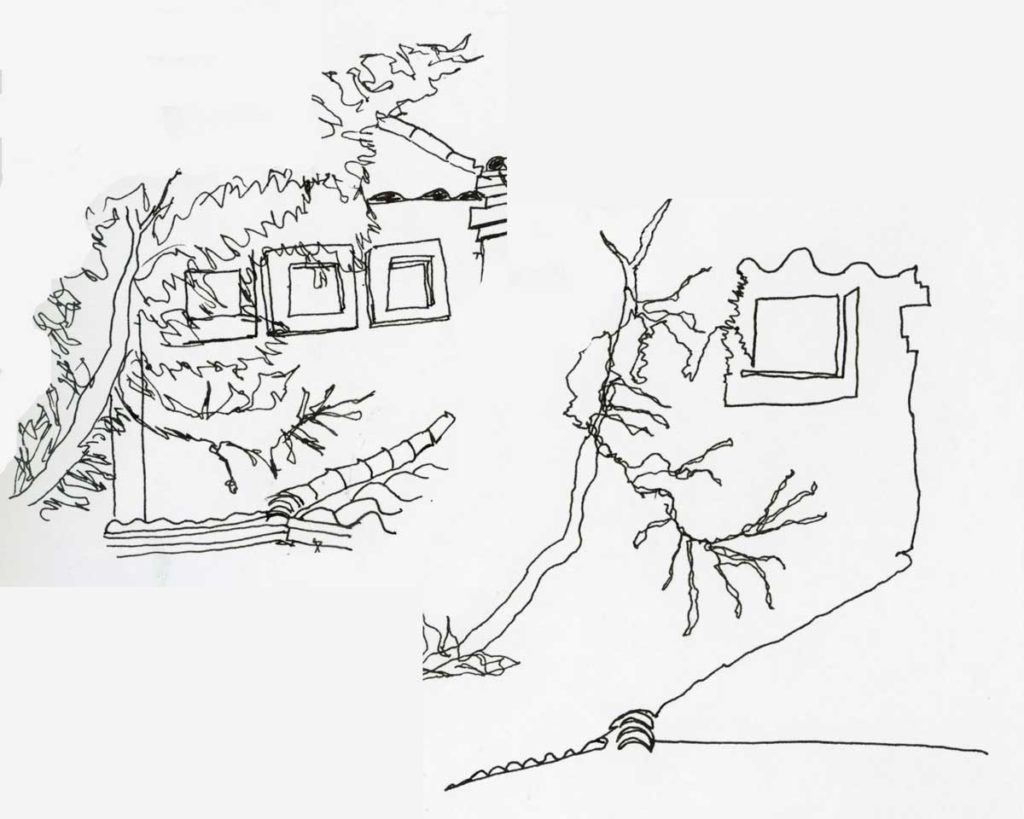
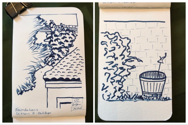
January 2020. Continuing my series on previous work I’ve done for Foundations. I don’t even remember what pen I used for those line drawings, but I like it!
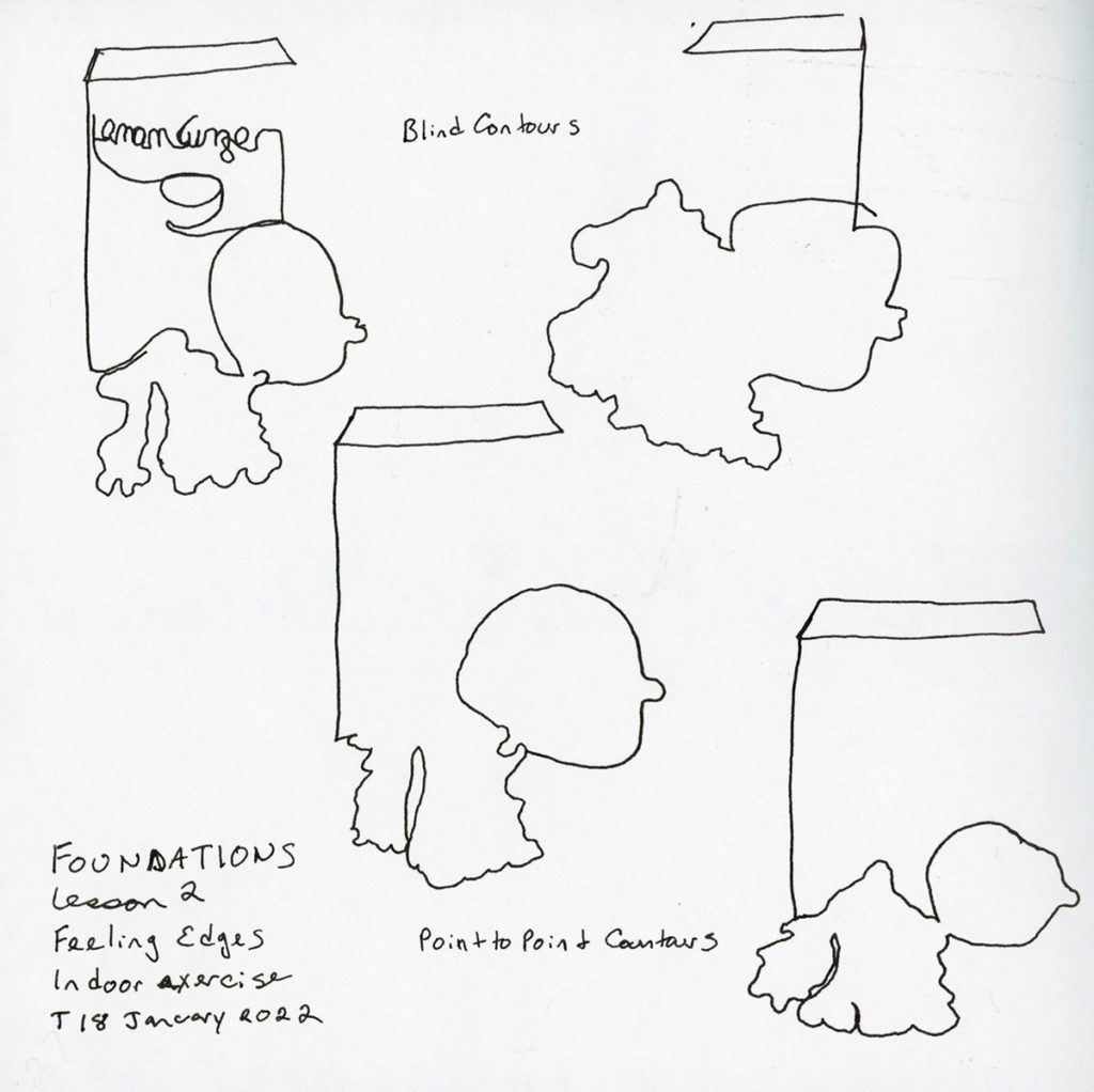
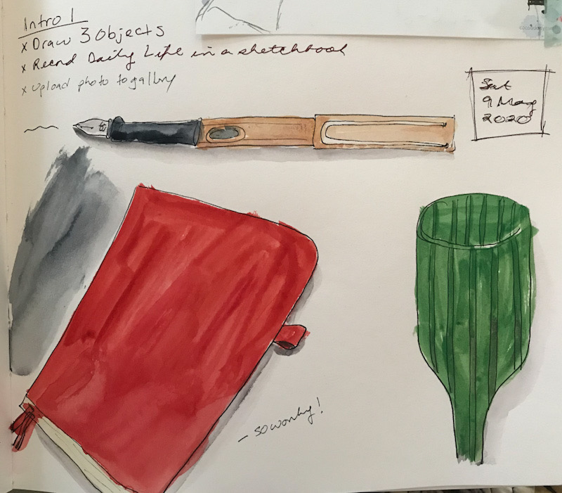
As Foundations begins again, and I embark on my sixth journey through it, I thought I’d create A Series to look back at my previous attempts at Sketching Now Foundations.
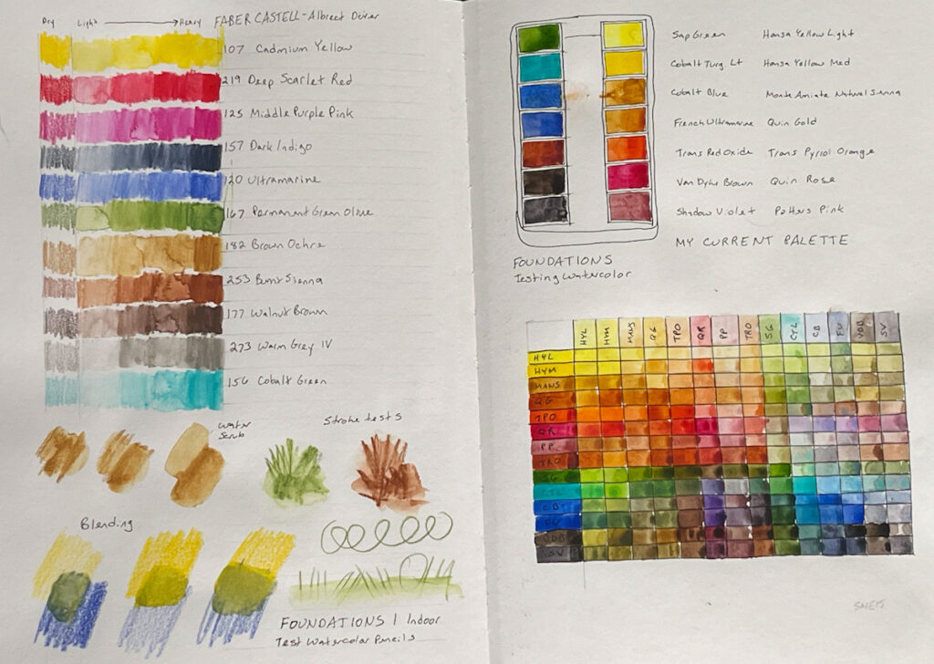
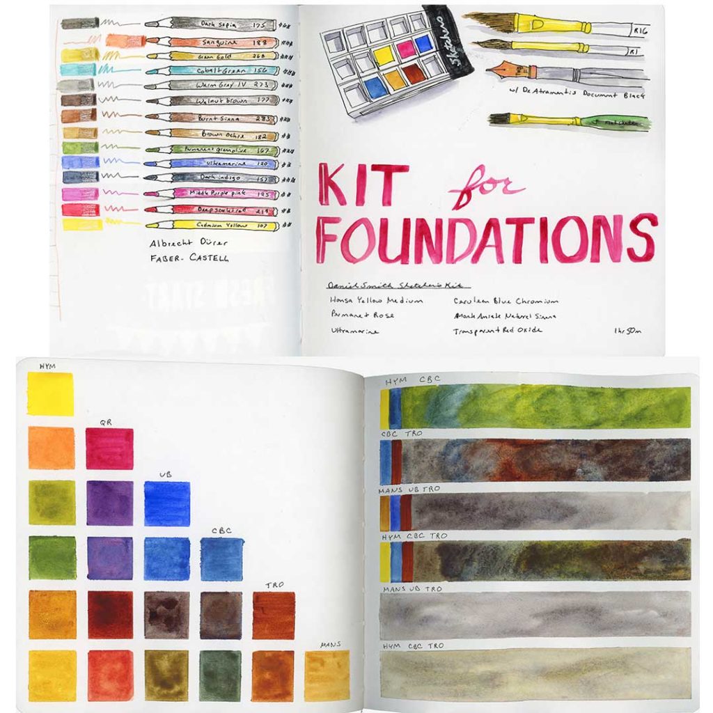
April 2019. I did not get very far, but I loved what I did at the time!
I did this class as an independent study. I’d really looked forward to it when it was scheduled, but then the schedule changed, and I wanted to do the class anyway so I stuck with it. Here is the wrap-up:
Hmm, apparently I haven’t uploaded many of the remaining pages for these either. Interesting. So here is some of it. I may have to edit this page at some point in the future.
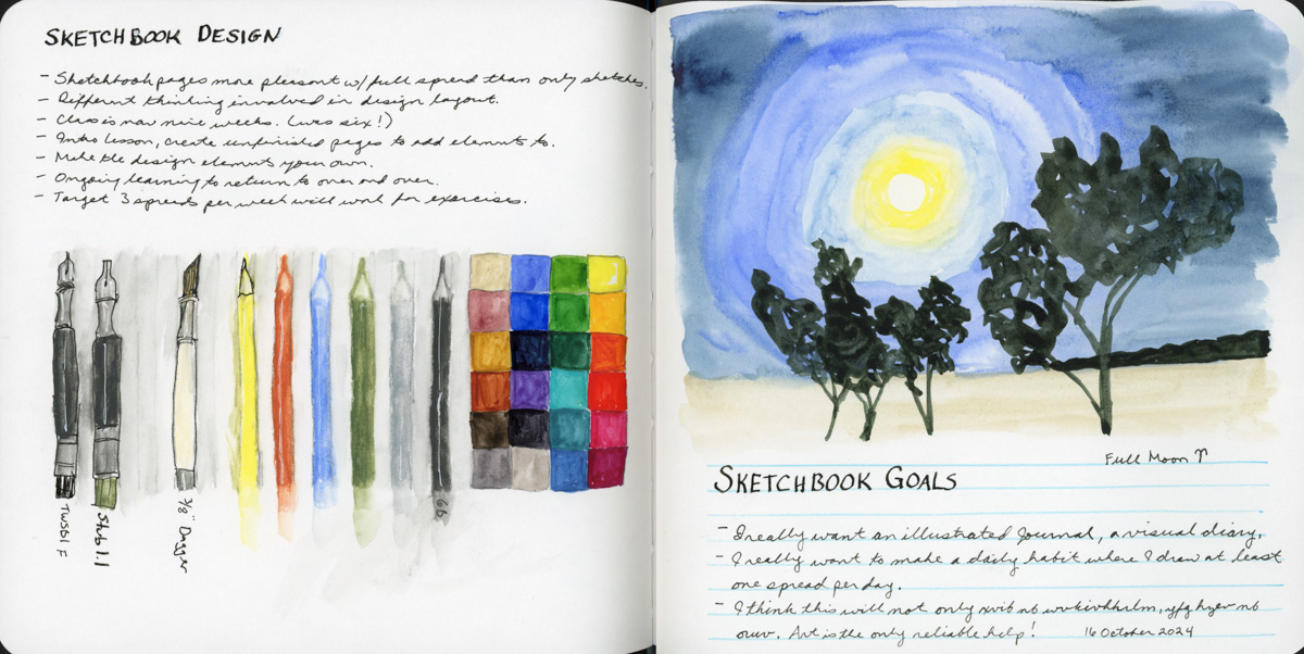
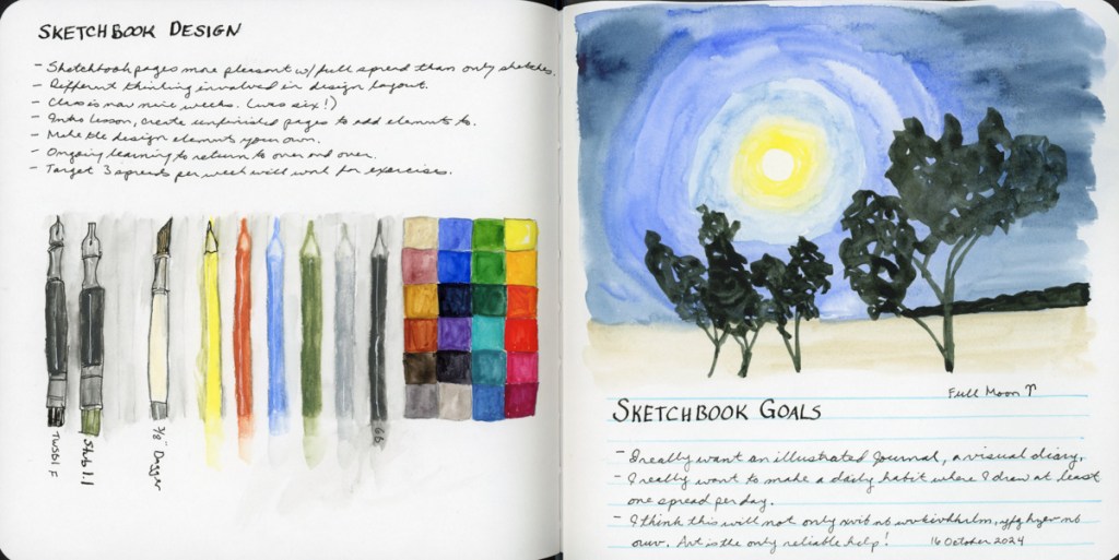
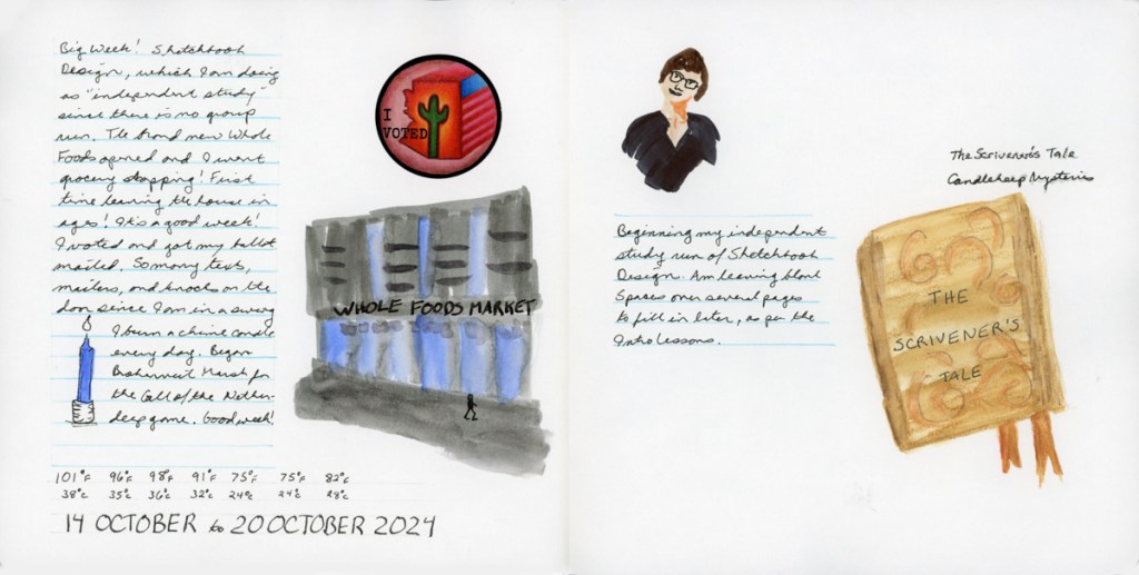
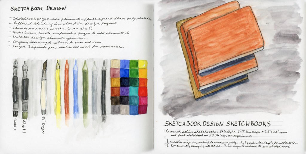
Last week’s sketchbook pages had a lot more focus on sketchbook design since I am taking the class as an independent study program.
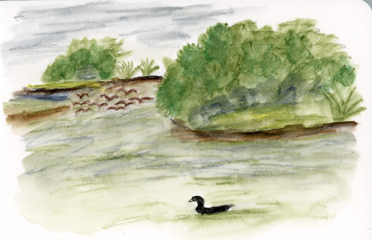
Having recently finished the Travel Sketching class, when I had the opportunity to walk Stonecreek, I brought my sketchbook with me, and tackled a scene that has long seemed very intimidating. This landscape view from the bottom of the pond. So I began with 5 shapes, and then added texture and details. Many of the details arrived while sketching. When the flock of Canadian geese flew in and landed on the water, so I had to add them in. When the American Coot swam up and gave me extended side-eye, perfectly posing for my sketch. He swam off just as I finished his addition! A cardinal in a tree branch, with the grey pond behind him, highlighting his colors. (He was so quick to fly off, I could only catch him via photo, and painted him later when I finished the page.)
I added the map, the titles, and the text block to finish off this page.
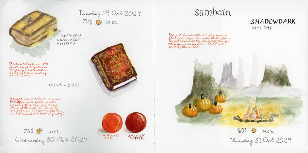
This also happens to be the first full spread page in my new sketchbook! I’m sticking with the 7.5×7.5-inch Stillman & Birn Softcover Alpha for now. The smaller pages are satisfying right now, and feel good. Keeping it simpler to encourage building a daily practice of sketchbook pages.
For this spread I used colored ink for extra notes, and the two ink color swatches to fill in a space. The ink is Diamine, and those are two of my favorite autumn colors.
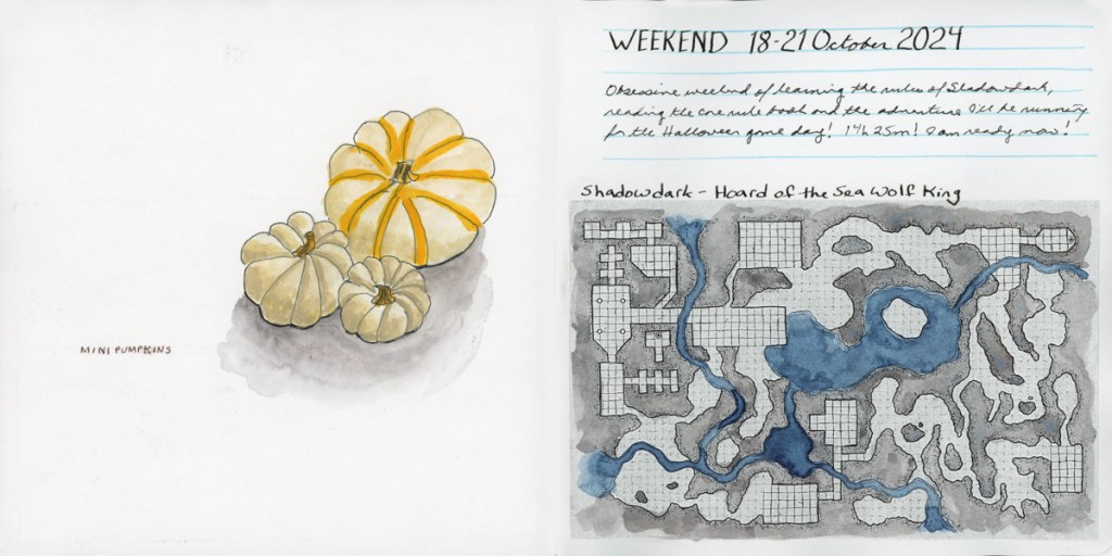
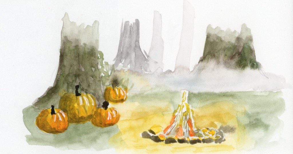
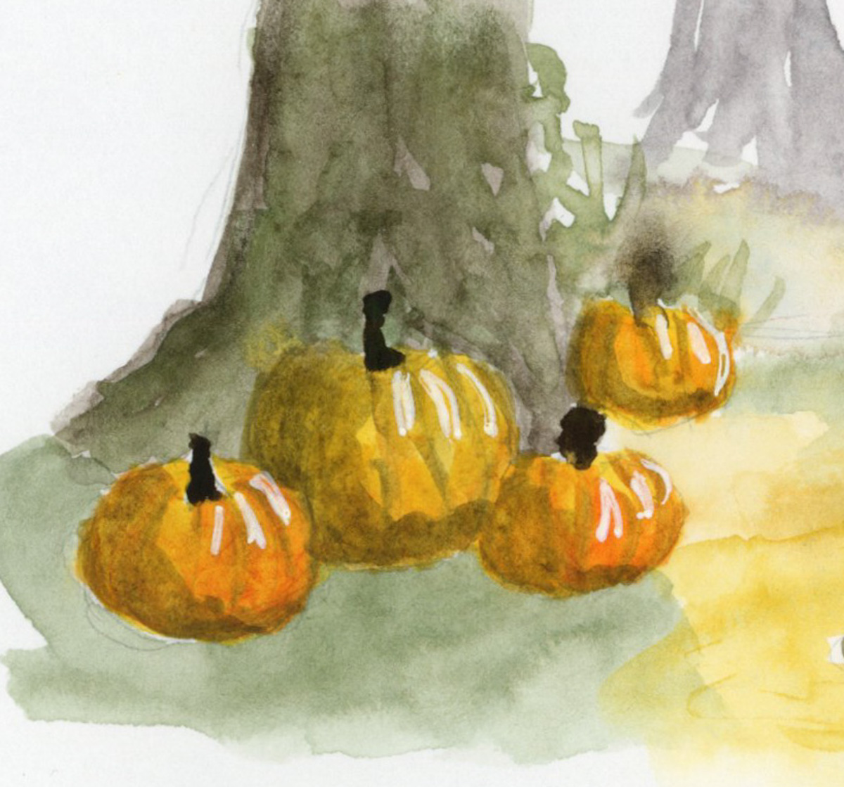
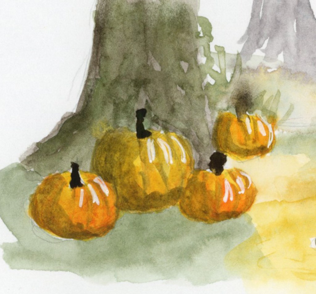
This is a part of an Alley of Ambience image. Drawing campfires is hard, but I may be in love with those pumpkins!
This page is a little more abstract. I love Elisabeth Alba’s art and I had these various stickers of hers. I’d also put the 5×7 prints I have of her work into a newly purchased portfolio album. This simple spread marks that for this week. The raven is also on a half sheet, which flips over for a second color block of transparent red oxide, which is fun and interactive in my sketchbook.
I will cut half pages sometimes when I have a lot of collage, to reduce the overall bulk in the finished sketchbook. It’s a fun way to do interesting pages.
As usual, my participation in the Sketchbook Design class has me sketching more pages, and putting a lot more thought into their layouts and designs. I love them even more when I’m putting in the extra effort and time! I also seem to have leveled up in my drawing ability! Don’t ask me how THAT happened! It seems to happen at random intervals and I’m sure it’s a product of practice. And the many lessons, of course. That Travel Sketching class really did seem to help me level up, didn’t it?
Onto the next week! The holiday season begins in earnest and I wonder what my sketchbook will capture next?
Adding elements really does round out a sketchbook page. One of my favorite elements to add are maps!
There is a public walkway next to a golf course that I like to walk at when the weather is cool enough. They have a manmade pond that attracts birds and other wildlife. Since the temperature dropped down to 93F/33C (finally!) I took a walk. The one-mile round trip walk from the parking lot to the end of the pond is a perfect map to draw for the sketchbook, and for this sketchbook design element.
Color Blocks are another one of the Sketchbook Design elements we are working with in Sketching Now Sketchbook Design class. Here I’ve used a simple color block to balance and add interest to this minimal page of the stickers I’d placed in my book.
I’m working my way through the seven elements. So far I’ve done one for text, white space, color blocks, and maps. Three more to go!
I’m really happy with how the text blocks makes this page look so complete! Without the text these disparate sketches looked adrift in the odd sea of the page. The headings and text blocks really make it look like there was a plan, when there wasn’t!
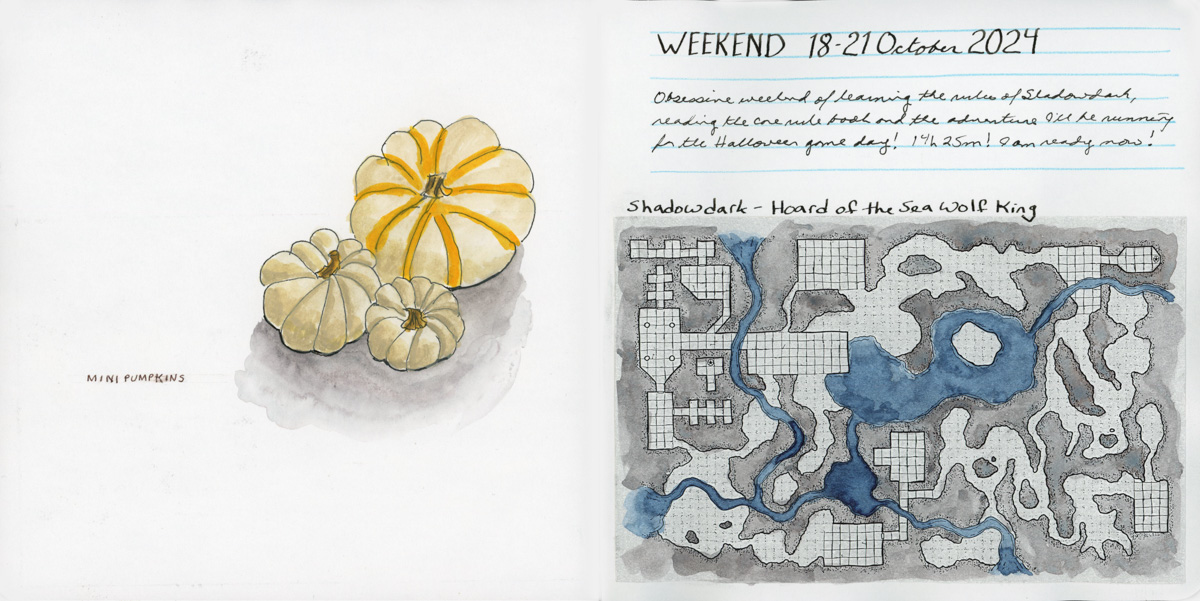
I realized that the white space on this spread really highlighted the sketch of the pumpkins and that I should definitely leave it alone and let it shine! I tend to struggle with white space, so being able to see this as I finished off the page is something I’ve learned!