A landscape, painted on location at the Japanese Friendship Garden.
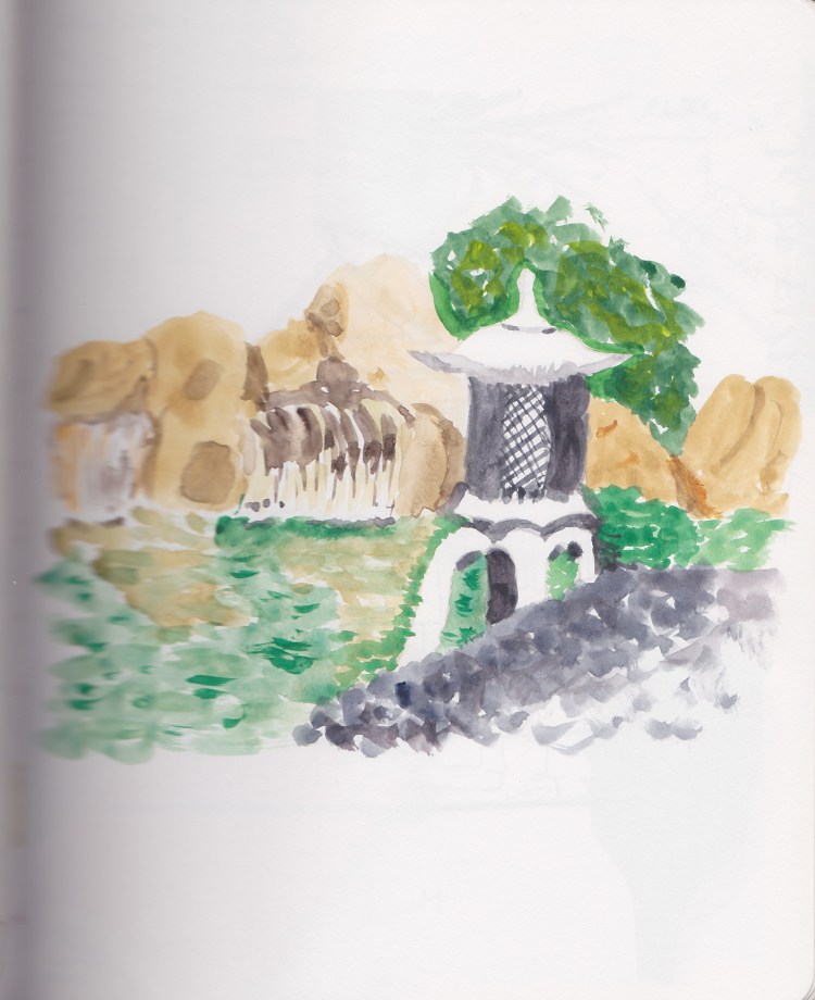
A landscape, painted on location at the Japanese Friendship Garden.
Time for some product tests!

Comparing the colors of Polychromos, Albrecht Durer, and Derwent Inktense to see how they compare and to find matches.

I had a variety of pens and items I’d received via my Sketchbox subscription, so I tested those out.


I was gifted an old set of Arteza brush pens, so here was my color chart and testing of those.

Testing various shades of grey, grey brush pens and pencils. I do love the warm greys!
Wardrobe sketches!

I really liked how Liz Steel sketched her garments and I copied it directly to try to figure out what made it work for me. It seems so much more dynamic than my typical wardrobe sketches! I decided the border line really helped, the outlined labels, and the shadows.

Two days later I would sketch some new clothing items I purchased and I used my usual style to compare.
Starting Liz Steel’s Sketching Now Foundations, again, and here is my Intro 1 assignment.

Painting landscapes is one of my dream goals. Every time I try it I loathe what I do. Then I go back a few months later and realize I actually like it. Now, a couple years after I made these first attempts I realize something I simply did not get when I started–there is a lot to learn! The learning curve is steep and long, and requires so much practice! Which makes me love these early attempts even more!

A pond in autumn, using the Autumn Palette I’d put together. I struggled a lot with the paper, though I wouldn’t understand that at the time. I think I want to do a lot more wet in wet here, and my paper just isn’t quite right for that.

Here I was doing a color study version, playing with a limited palette and experimenting with Phthalo Blue (green shade.)
Continuing on with my older sketchbooks, where I was still experimenting a lot in my pages.
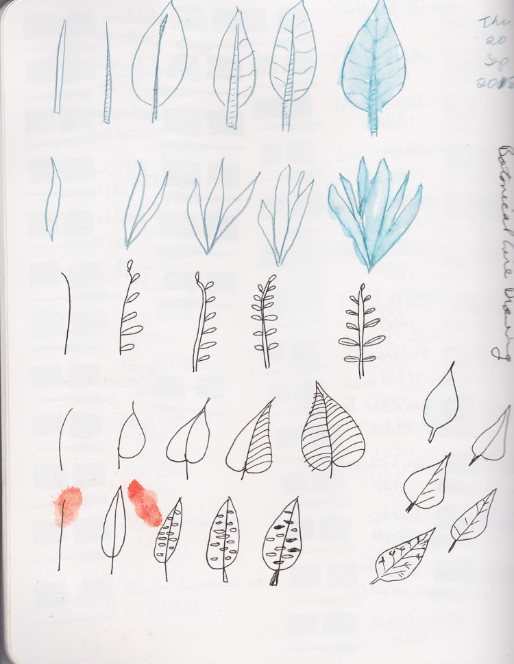

Since I sew and dye many of my own clothes, sketching my wardrobe is always a favorite for me! That green is not at all accurate for the clothes, so thus begins my eternal quest to match the perfect mixes for greens!

I was attempting to create a nice Autumn color palette and was testing some choices. Most of these colors were very new to me when I made this color test page!
How do Derwent Inktense pencils perform? How do Albrecht Durer Watercolor Pencils compare? Which do I want to use? Nothing like a good color test to find out!

Here I am learning the difference between water soluble and not with a small set of Faber-Castell Polychromos Pencils compared with Derwent Watercolor Pencils. I also wanted to see what happens with the watercolor pencils when activated with water.
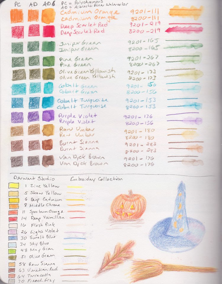
Then I wanted to find out of Polychromos pencils actually are the same shade as their Albrecht Durer Watercolor brethren. Sure enough, they really are! How great is that?! While I was at it, I had some Derwent Studio pencils, so I decided to check those out.

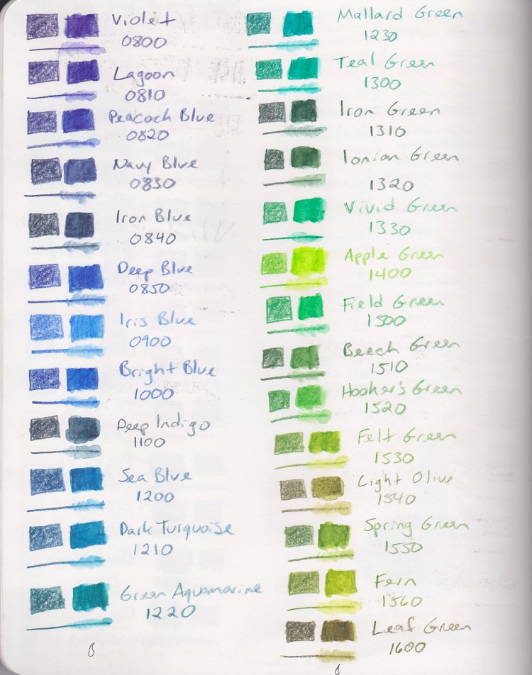
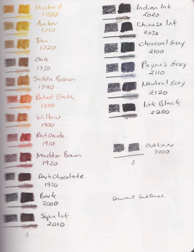
Since I had a big set of Inktense, next it was time to make a color chart. I sure do love to make color charts!


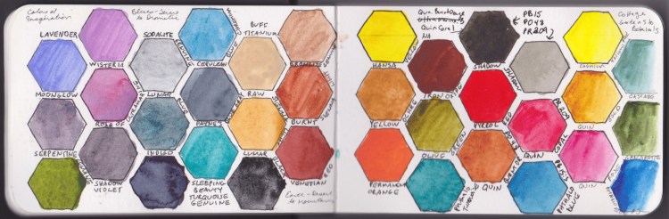
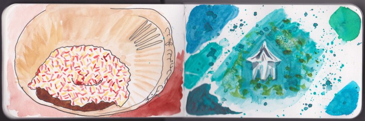

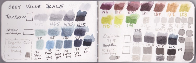


Watercolor Class, Buildings Class, and a few other sketches are in this little 3.5 x 5.5 inch Stillman & Birn Beta, softcover sketchbook. What a journey it has been! I learned so much!
I started Buildings by Liz Steel. These first lessons were done in the 3.5 x 5.5 Stillman & Birn Beta.
What an improvement in my sketching ability! It’s amazing!
Continuing in my Sketchbook 2 tour, I have some classwork from both Foundations, as well as Watercolor on Location.
This was a failed effort to paint a landscape while out on location. I realized that I still have much to learn, since I had no idea how to fix the issues I had.
This wine bottle and glass sketch is one of my favorite ever sketches!

