Early Landscapes

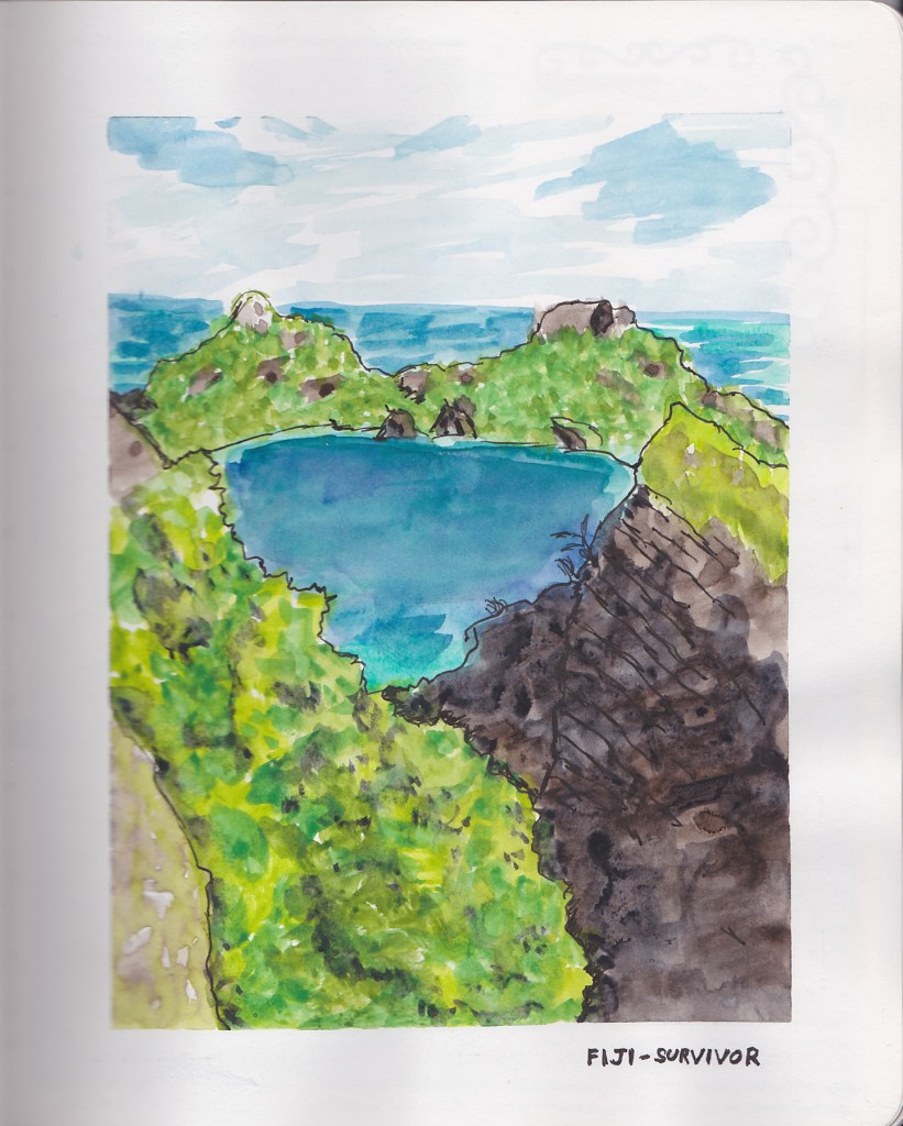
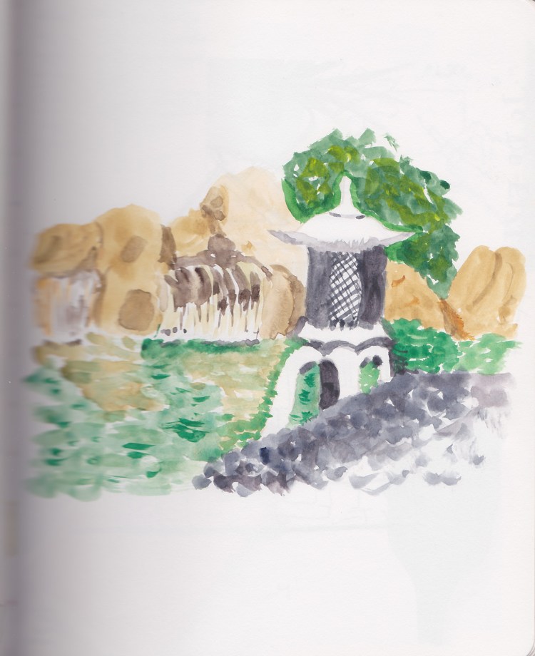
Painting landscapes is one of my dream goals. Every time I try it I loathe what I do. Then I go back a few months later and realize I actually like it. Now, a couple years after I made these first attempts I realize something I simply did not get when I started–there is a lot to learn! The learning curve is steep and long, and requires so much practice! Which makes me love these early attempts even more!

Autumn Pond Landscapes

A pond in autumn, using the Autumn Palette I’d put together. I struggled a lot with the paper, though I wouldn’t understand that at the time. I think I want to do a lot more wet in wet here, and my paper just isn’t quite right for that.

Landscape color study

Here I was doing a color study version, playing with a limited palette and experimenting with Phthalo Blue (green shade.)

Leaves, Clothes, and a Palette

Continuing on with my older sketchbooks, where I was still experimenting a lot in my pages.

Botanical Line Drawing
Wardrobe Sketches

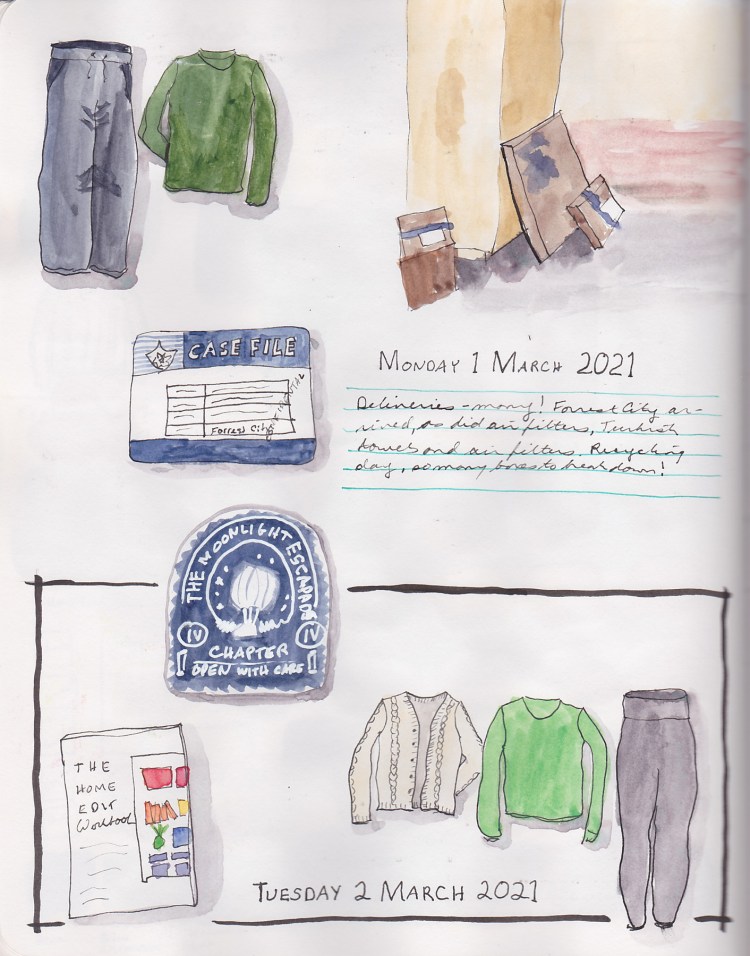
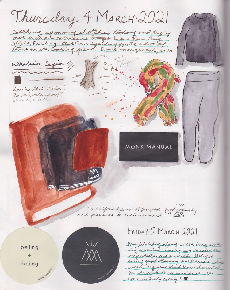
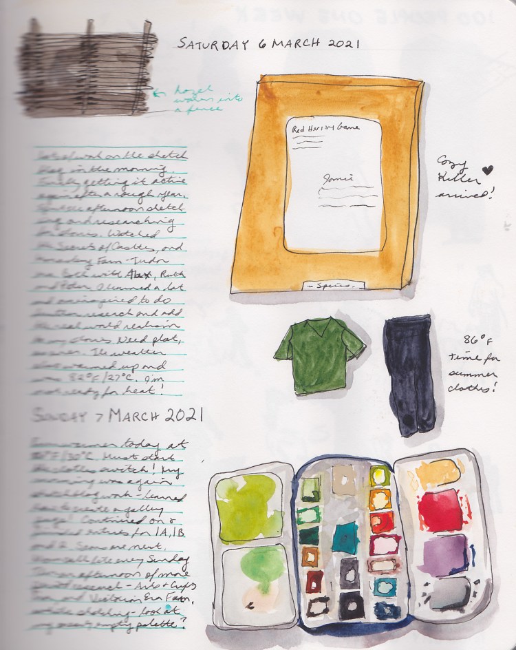
Since I sew and dye many of my own clothes, sketching my wardrobe is always a favorite for me! That green is not at all accurate for the clothes, so thus begins my eternal quest to match the perfect mixes for greens!

Autumn Palette

I was attempting to create a nice Autumn color palette and was testing some choices. Most of these colors were very new to me when I made this color test page!

Derwent Inktense Pencils

How do Derwent Inktense pencils perform? How do Albrecht Durer Watercolor Pencils compare? Which do I want to use? Nothing like a good color test to find out!

Derwent Watercolor vs Polychromos

Here I am learning the difference between water soluble and not with a small set of Faber-Castell Polychromos Pencils compared with Derwent Watercolor Pencils. I also wanted to see what happens with the watercolor pencils when activated with water.

Comparing Various Pencils

Then I wanted to find out of Polychromos pencils actually are the same shade as their Albrecht Durer Watercolor brethren. Sure enough, they really are! How great is that?! While I was at it, I had some Derwent Studio pencils, so I decided to check those out.

Derwent Inktense Pencils – Warm Colors
Derwent Inktense Pencils – Blues & Greens
Derwent Inktense – Neutrals

Since I had a big set of Inktense, next it was time to make a color chart. I sure do love to make color charts!

Classwork & More

Continuing in my Sketchbook 2 tour, I have some classwork from both Foundations, as well as Watercolor on Location.

This was a failed effort to paint a landscape while out on location. I realized that I still have much to learn, since I had no idea how to fix the issues I had.

This wine bottle and glass sketch is one of my favorite ever sketches!

Sketchbook 2 – Watercolor

When I started Liz Steel’s Watercolor course, I started this sketchbook. This one is a Stillman & Birn Beta 3.5 x 5.5 inch (8.9 x 14.0 cm) Softcover.

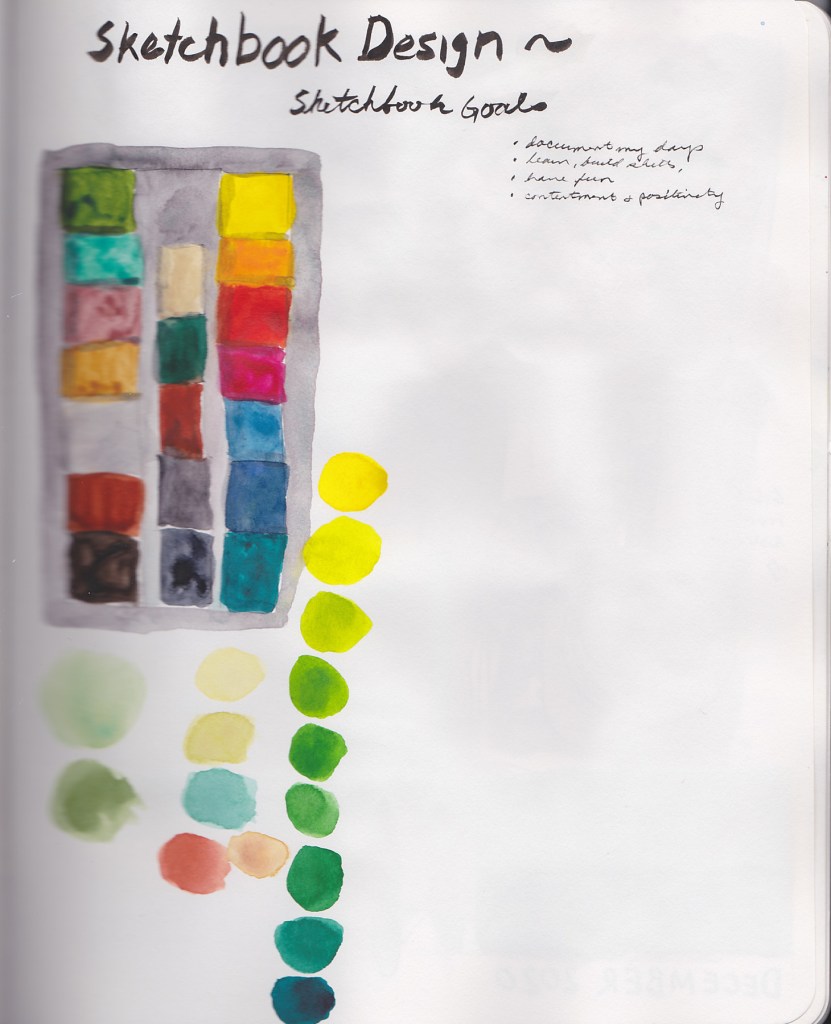
I wanted to do the lessons with two different palettes. I had purchased Marc Taro Holmes Direct Watercolor Palette, but I had never used it. I figured using two different palettes would really teach me about color. It did! So I did the same exercises twice, and in this sketchbook, volume 2, I did the Watercolor assignments using this palette.

Of course I put the palette on the first page!

Foundations & On Location

Wanting to improve my general drawing ability, I started Liz Steel’s Foundations Class. I continued on with the Stillman & Birn Beta sketchbook that I had started with her Watercolor class.

Later that year, I started Liz Steel’s Watercolor On Location class.

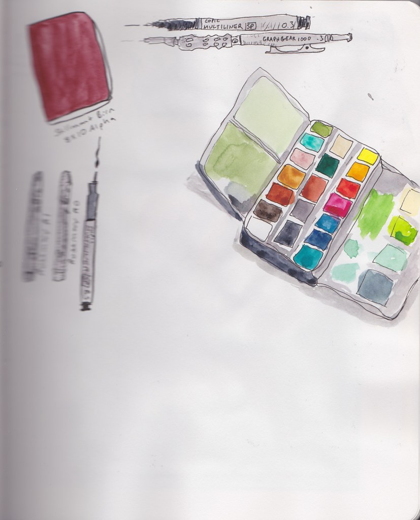
My kit for that class.

This was the first time I actually sketched out on location. It was also my first paint only sketch. I found I really loved the technique. I also felt wild and crazy just using two colors, and they were NOT the colors of the actual building! Mind blown!

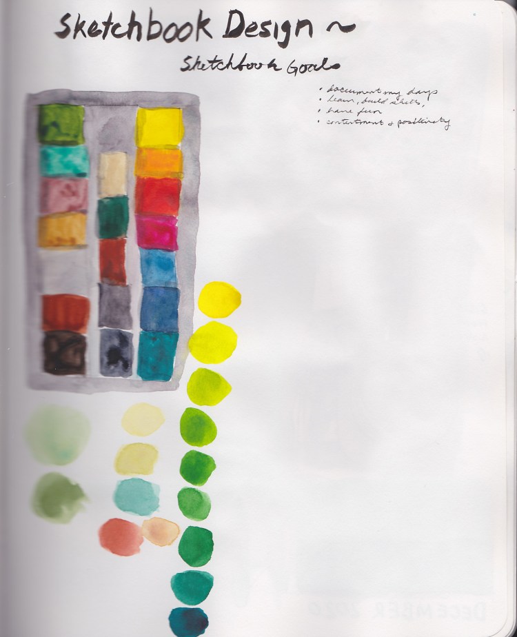
Here ends Sketchbook 1B, with a sketch of my palette as it was by then.