Ink Swatches and Garbage Bags

The date and the weather. Then a bit of text. Then a blank space for a sketch that never happened.

I was watching Edges lessons, scaling back after “losing” so many weeks of March and April. With class ending in a week, I was never going to catch up, so I gave myself permission to just absorb the main lesson videos only. I’ll take the course again when next it runs live. When Sunday came along, and I knew I wanted to sketch the decluttering, I decided to fill the blank spaces with ink that I haven’t swatched yet.

Have I mentioned I have a LOT of fountain pen ink?
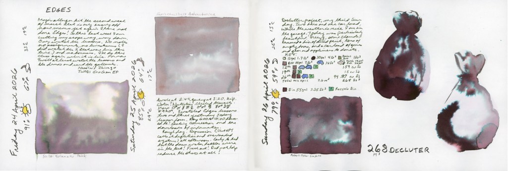
A double page spread in a Stillman and Birn Alpha sketchbook covering Friday 24 through Sunday 26 April 2026. The left section shows handwritten journal entries for Friday with the heading Edges and a Sailor Yurameku Seki ink wash swatch in a soft ethereal grey-purple. The center section shows a Ferris Wheel Press Adventurine wash swatch in dusty rosy grey with journal notes. The right section shows handwritten decluttering metrics and a symbol tracking chart alongside two large Robert Oster Graphite chromatography garbage bags, labeled 268 cu ft Declutter.
Ink swatches and decluttering — Sailor Yurameku Seki, Ferris Wheel Press Adventurine, Robert Oster Graphite — Stillman & Birn Alpha, 24–26 April 2026
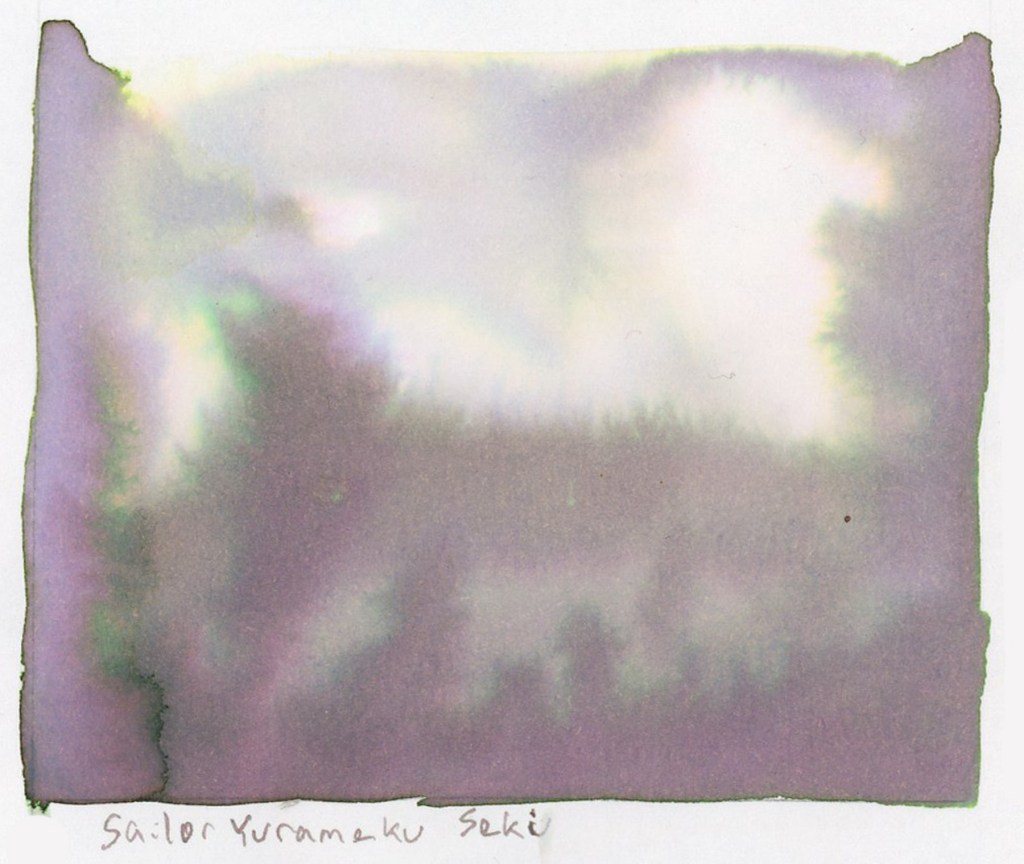
A large soft ink wash swatch on white sketchbook paper, labeled Sailor Yurameku Seki in the artist's handwriting below. The wash is a delicate ethereal grey-purple with soft pink undertones, blooming and pooling gently across the page in an irregular rectangular shape with slightly ragged edges. Stillman and Birn Alpha sketchbook.
Sailor Yurameku Seki — Stillman & Birn Alpha, 24 April 2026

The first swatch is Sailor Yurameku Seki. A sample I ordered, and hadn’t tested yet. It’s soft and a little ethereal, with a beautiful pink undertone that blooms in the wash. These Sailor Yurameku inks have such lovely softness and multiple colors that separate beautifully in water.
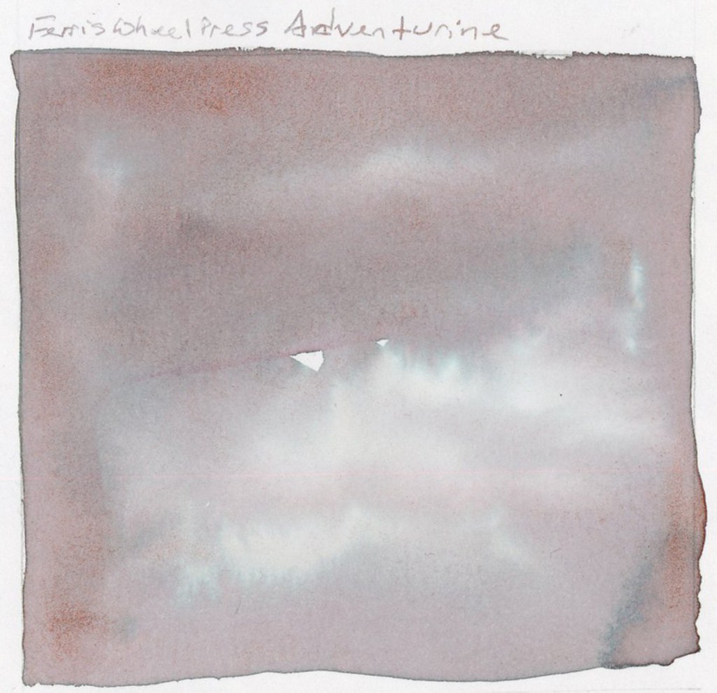
A large soft ink wash swatch on white sketchbook paper, labeled Ferris Wheel Press Adventurine in the artist's handwriting above. The wash is a dusty rosy grey with subtle shimmer and soft pink undertones, spreading in a slightly uneven rectangular shape with organic edges. Stillman and Birn Alpha sketchbook.
Ferris Wheel Press Adventurine — Stillman & Birn Alpha, 25 April 2026

Ferris Wheel Press Adventurine, and that pink is actually a shimmering metallic! So pretty! Ferris Wheel Press Ferritales inks are genuinely special, and Adventurine is a good example of why. I will say that Alpha paper loses some of the shimmer and sheen of the inks. I need to work with Tomoe River paper to really let them perform. That’s a future experiment.

Three weekends in a row in April I’ve been doing a big push to declutter the garage before it gets too hot and I have to wait another 9 months. I hauled out trash bags, banker’s boxes, recycling, donations. It’s one of those projects that’s hard to maintain momentum on. Sketching it helps. I love my clutter sketches, but I haven’t been doing those right now. I wanted to find a way to visually document the progress of the declutter in my sketchbook, not just in before and after photographs. I wrote and sketched about decluttering back in July 2025, but stopped. Here’s to resuming, and making it a regular feature now, both for my house and my sketchbook!
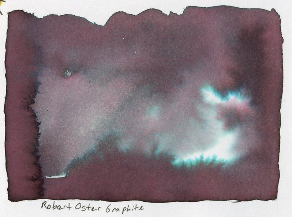
A large dramatic ink wash swatch on white sketchbook paper labeled Robert Oster Graphite below. The wash is a deep dark purple-brown with vivid teal and turquoise chromatography blooms spreading through the pigment as the ink dried, creating an atmospheric landscape-like effect with bright teal highlights against the dark base. Stillman and Birn Alpha sketchbook.
Robert Oster Graphite — Stillman & Birn Alpha, 26 April 2026
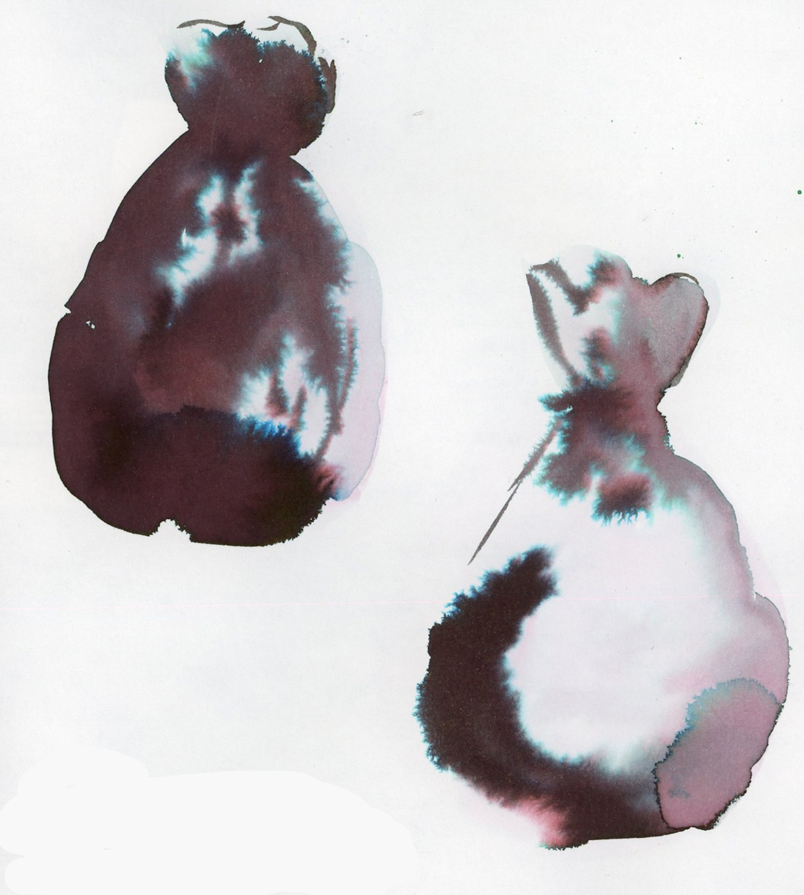
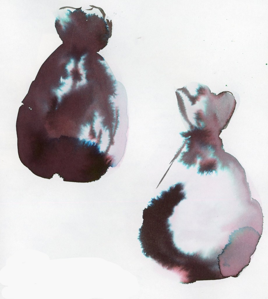
Two large ink washed garbage bags on white sketchbook paper, rendered in Robert Oster Graphite ink. The blobs are deep dark purple-brown with dramatic teal and turquoise chromatography blooms spreading through the pigment, giving each shape a moody atmospheric quality. Stillman and Birn Alpha sketchbook.
Robert Oster Graphite chromatography garbage bags — Stillman & Birn Alpha, 26 April 2026

Garbage bags are not pretty, but what a great subject for the inky chromatography! Black trash bags, black and dark grey inks that bleed into stunning colors! It’s a match made in heaven! Lay down heavy water, then drop in the ink, and let the ink do its magic. A lovely visual record is created.

But of course, I need to also track the metrics. A bit obsessively, perhaps. But hey, it’s very motivating to see the numbers build, for something that is often too easy to overlook and dismiss. You forget just how much you cleared out, because you get used to the look of the new space very quickly. So I also built a symbol chart to track the metrics. Trash bags by gallon size, banker’s boxes by cubic foot, trash and recycle bins, Car capacity for hauling. Everything converted into cubic feet, and also cubic meters for my international readers. (I’m thinking of you guys!) The 12th I got rid of 159 cubic feet, the 19th a more modest 15 (only my single bins were available. What an enormous difference in outflow!), and the 26th came in at 94. April’s total across three weekends: 268 cubic feet. 7.6 cubic meters. The garage is getting there! I’m racing the weather now, to finish the garage before it hits 100ºF/37ºC again!

I love how this page looks. The ink swatches filling the spaces where sketches didn’t happen, becoming a highlight feature I will absolutely use in the future. The decluttering inky garbage bags, and symbols tracking progress in the most dramatically beautiful way possible.
A Notes Page

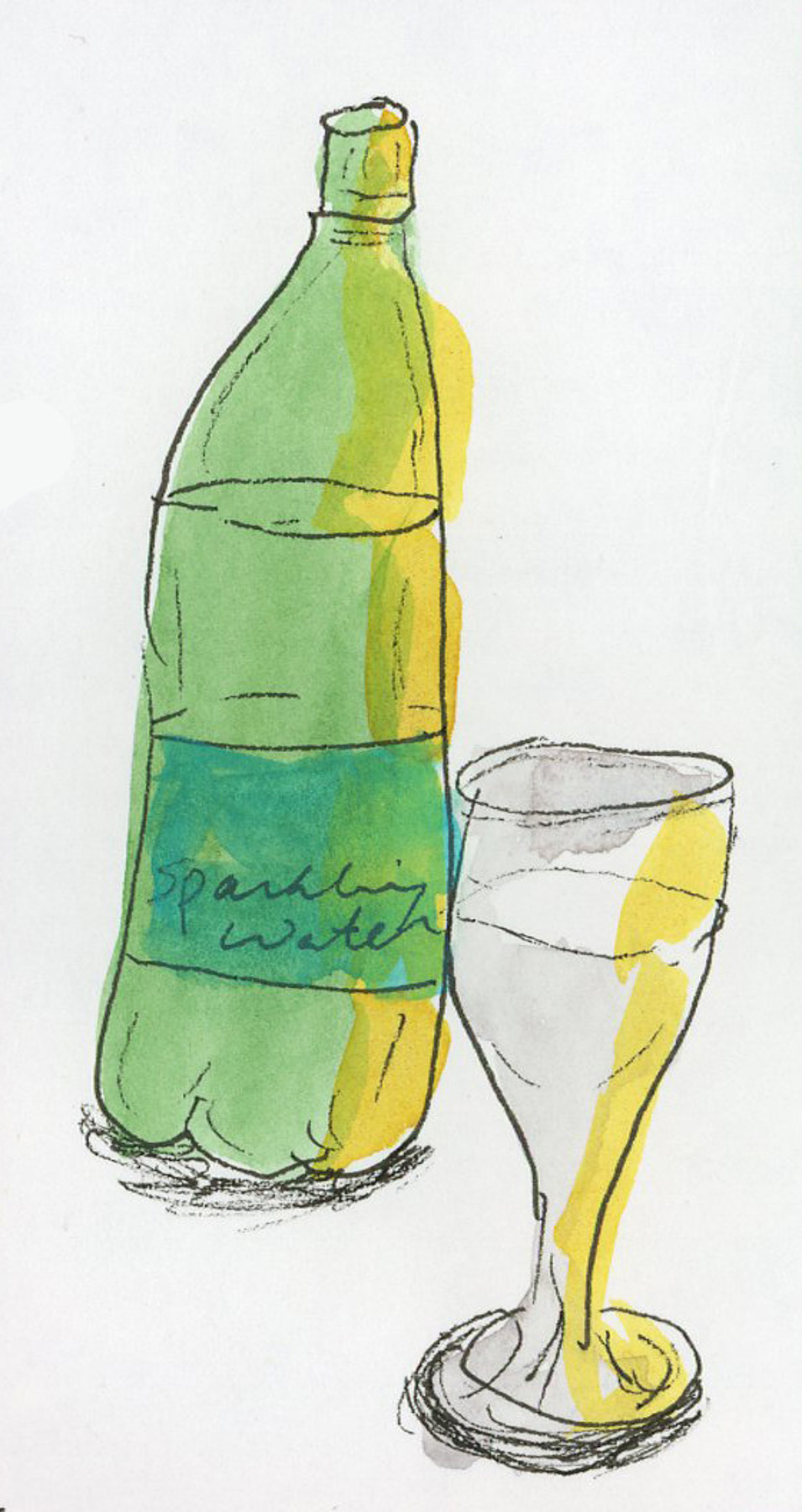
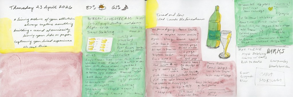
I was watching Liz Steel’s Patreon livestream and taking notes. I like kind of dense note-taking that fills a page and then adding color blocks to give it some life. While I was watching, I sketched my sparkling water that was sitting in front of me. This is my first sketch since April 7th! I’ve only done color charts since then. And I haven’t sketched anything not food since One Week 100 People! Now that seems crazy, but I look over my sketchbook pages, and there it is, in full color!

A double page spread in a Stillman and Birn Alpha sketchbook dated Thursday 23 April 2026. Both pages are densely covered in handwritten Patreon livestream notes on Travel Sketching, with blocks of yellow and pink color wash behind sections of text. A sketch of a sparkling water bottle and stemmed glass appears on the right side of the spread in ink and watercolor. Planning notes in the upper right corner list the May theme as Darks, with Caput Mortuum noted in a box below.
Patreon Livestream notes with sparkling water bottle sketch — Stillman & Birn Alpha, 23 April 2026

I miss the sketching, but I guess it’s been a rough season.

The livestream introduced Liz’s May theme: Darks. Oh, I like this one! She mentioned starting with darks, pushing the darks, and even night sketching! Should I try night sketching? It never occurred to me before.

Starting with darks is a very useful approach, especially with the shapes that I often start with also. Committing to your darkest values early gives a sketch structure and stops it from looking flat and cartoonish. Deepening the darks in a scene, and increasing the value range, is one of the most reliable ways to add depth and presence. It’s the kind of thing that makes a sketch look like a real object or scene. I’m thinking of darks in terms of ink lines, too, not just watercolor.

However, I did immediately think of Caput Mortuum. My new infatuation born from pulling the Travel Sketching Palette together. That deep, complex brownish, reddish, purple that sits somewhere between burgundy and iron oxide. I have the Goldfaber Aqua and PITT Artist Brush pen, and I ordered watercolors Winsor & Newton and Sennelier both. You know, I need both to compare, right? Right? They haven’t arrived yet. But I am fantasizing about the darks it might make for me. How would such a warm, deep dark work in sketches? Seems perfect for the desert, and for summer, when even the deepest shadows are still meltingingly hot.

Obviously there will be Caput Mortuum swatches when the paint arrives! Plus I might finally break open my Bloodstone Genuine and compare it to Van Dyke Brown. Last summer Liz had swapped her Van Dyke Brown for Bloodstone Genuine, and I’ve been curious about the comparison ever since.

It feels good to be getting excited about this coming theme. It feels good to sketch again, after a longer span of time when I didn’t. It feels good to be excited about the upcoming Travel Sketching course, too. May is shaping up to be quite fun in the sketching department!

Cherries, Icing, and Feeling Poorly

Time for a catch-up post on the food diary. I’m still using the Shikiori markers. Four days, four very different spreads, and a peek into what happens when I sketch under varying degrees of brain function.

First, the errata page.

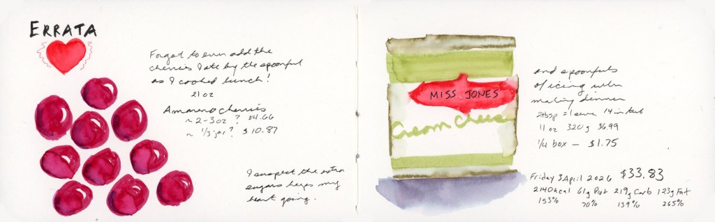
A double page spread in a Stillman & Birn Delta sketchbook labeled Errata in bold lettering with a red heart on the left page. Loose watercolor sketches of deep red Amareno cherries are scattered across the left page with handwritten notes about forgotten food entries. The right page shows a detailed sketch of a Miss Jones cream cheese icing container in green and red, with handwritten cost and nutrition data. Dated Friday 3 April 2026.
Friday 3 April 2026 — Errata — Stillman & Birn Delta

I forgot to log the Amareno cherries I ate by the spoonful while cooking lunch. Those deep jewel reds were so fun to paint, and drawing bigger than usual suited them. The Miss Jones cream cheese icing on the right got its own sketch too, because apparently I also ate several spoonfuls of that while making dinner. I have regrets. I suspect the extra sugar gets my heart going. And yes, for mysterious reasons I have been bingeing more sugar lately. Trying to rein that in.

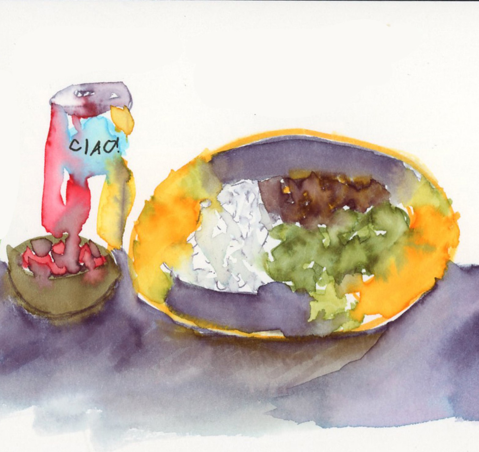
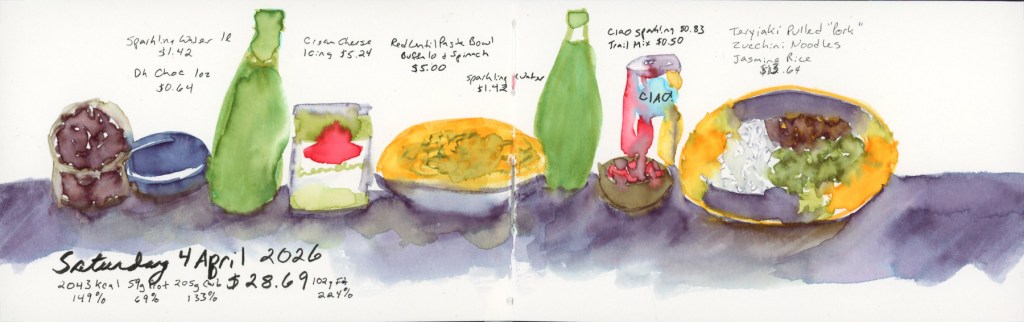
A double page food diary spread dated Saturday 4 April 2026. A lineup of food items sits along a deep purple watercolor horizon wash. Left to right: a dark chocolate bar and blue-lidded container, a tall green sparkling water bottle, a Miss Jones cream cheese jar in green and red, a golden bowl of red lentil pasta with spinach, a second green sparkling water bottle, a small bowl with a Ciao cherry sparkling water can, and a large golden oval plate with teriyaki pulled pork, jasmine rice, and zucchini noodles. Handwritten food names, costs, and nutrition totals below.
Saturday 4 April 2026 — Food Sketch in Stillman & Birn Delta

Saturday was a proper cooking day with teriyaki vegan pulled pork, jasmine rice, and zucchini noodles. It was very good and I was pleased with the sketch. I did this day’s sketches in the moment! My sunflower plate with the purple shadow wash underneath is one of my favorite things I’ve painted in this book so far. (And I didn’t forget to include the rest of the icing I finished off on the second day of it being open!)

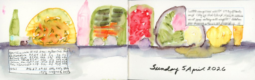
A double page food diary spread dated Sunday 5 April 2026. A loose watercolor lineup of food items stretches across both pages along a soft blue-grey horizon wash. Items include a pink sparkling water bottle, dark chocolate, a red lentil pasta bowl, a Summer Strawberry sparkling water bottle, two halves of a bento box — one with dolmas, baby carrots, hummus and herb garlic cheese, the other with cherry tomatoes and kalamata olives — followed by a plate of salmon with roasted vegetables and mac and cheese, lemon olive oil cake muffins, and a lemonade. Handwritten food names and nutrition data in the lower left. Stillman & Birn Delta sketchbook.
Sunday 5 April 2026 — Food Sketches Stillman & Birn Delta

Sunday was a big food day. Bento box with dolmas, baby carrots, hummus and herb garlic cheese (vegan) in one half, cherry tomatoes and kalamata olives in the other, then salmon with roasted vegetables and mac and cheese for dinner, finished off with lemon olive oil cake muffins and a lemonade. It looks like a cheerful parade of colorful shapes across the page, which is exactly what it was. 

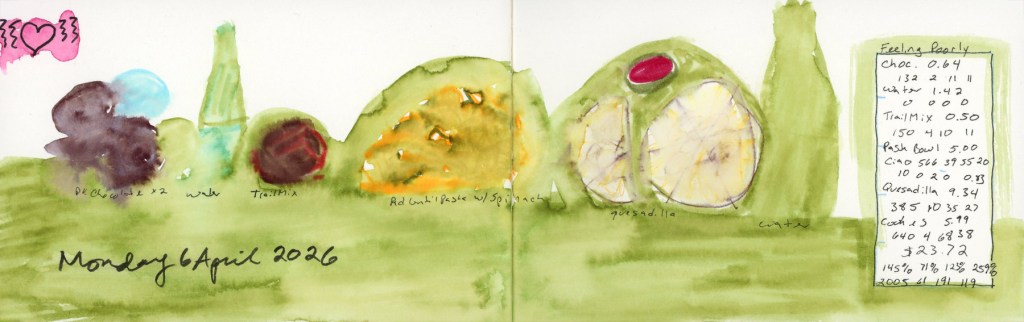
A double page food diary spread dated Monday 6 April 2026. Loose, expressive watercolor shapes sit against a broad green wash background. A pink heart doodle appears in the upper left corner. Items left to right include dark chocolate, sparkling water, trail mix, a red lentil pasta bowl with spinach, a quesadilla with enchilada sauce, and sparkling water. A handwritten food and cost summary box on the right is labeled "Feeling Poorly." Stillman & Birn Delta sketchbook.
Monday 6 April 2026 — Feeling Poorly Food Sketches Stillman & Birn Delta

And then Monday. I was not feeling well, and it shows. The whole spread went down in a loose green wash and I forgot to sketch the cookies entirely. The little pink heart in the corner was doing its best. Some days the diary is a beautiful detailed record, and some days it’s an honest green blob. That I’m keeping up is a miracle, when the bad brain hits. I blame the sugar and the allergens I had eating out on Sunday. Which is the whole reason I like to sketch my food, so it’s easier to find the culprits, when the body crashes or outbreaks or flares up days later. 

Sketchbook: March 2026

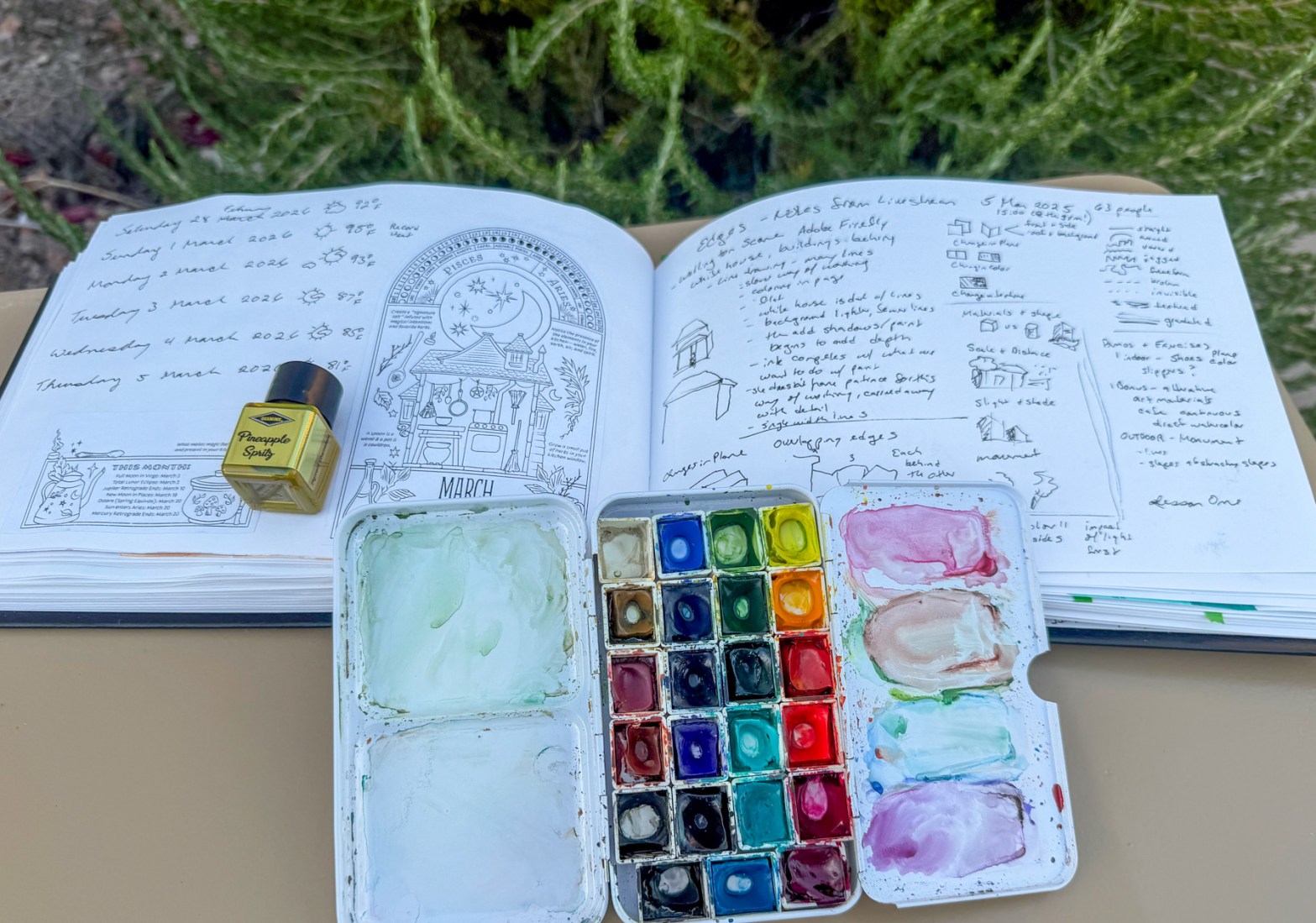
I started recording the weather alongside the daily dates in my sketchbook back in January 2023, Volume 12. Over three years now. It’s become one of those quiet anchors of my sketchbook. Even in the months where I sketched almost nothing else, the dates and weather hold the line. After an inflammation hit, or a hard week, or even death in the family, I come back and I catch up the weather. I fill in the gap from whenever I fell off to when I’m picking the sketchbook back up. There’s something grounding about that return.

It makes the sketchbook practice a living, breathing reflection of life itself and that is worth capturing. Here is the flow of the full sketchbook pages for the month.

I had such great energy and joy at the start of the month! I was feeling the spring bloom, and painting my pages with the Winsor Newton Sap Green. Edges class was starting and I was super excited about that.

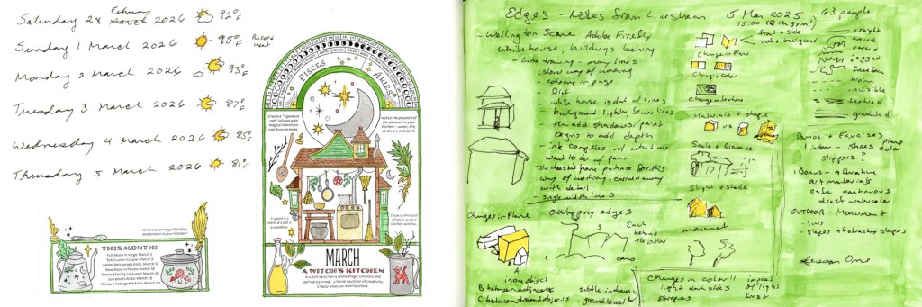
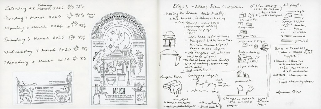
A dual page sketchbook spread — dates and weather log for Saturday 28 February through Thursday 5 March 2026 with moon phases and astronomical events on the left, and the March 2026 Coloring Book of Shadows page painted in greens, yellows, and warm browns depicting a witch's kitchen cottage, on the right, with Edges course notes on a bright green wash in the background
February tail end and March — A Witch’s Kitchen, CBOS 2026
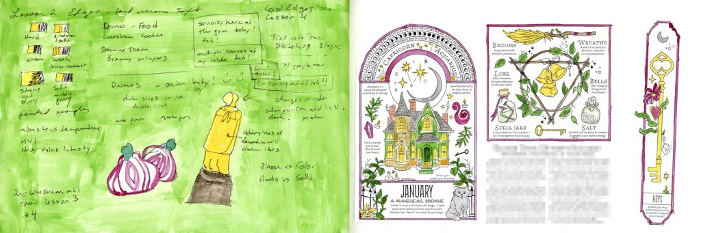
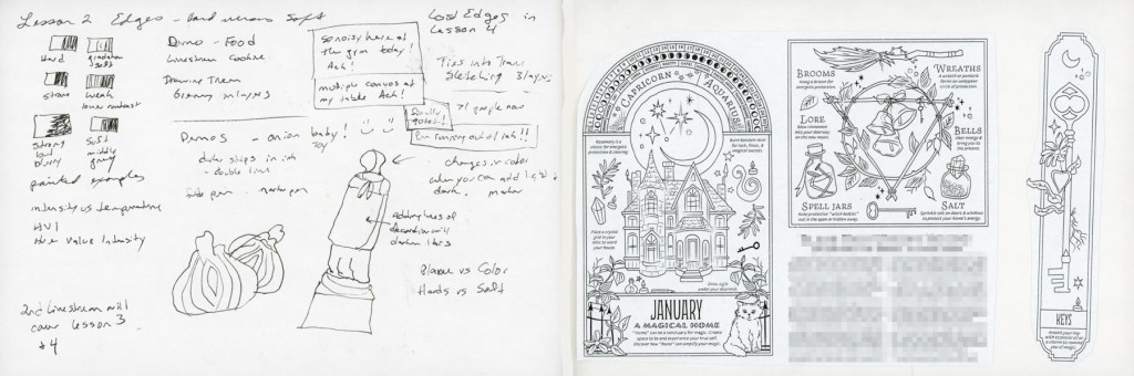
A dual page sketchbook spread — Edges Lesson course notes with painted examples including a red onion and a figure in yellow on a bright green wash on the left, and the January 2026 Coloring Book of Shadows page painted in purples, greens, and golds depicting a magical home with a cat, on the right
Edges Lesson notes and January CBOS — A Magical Home

Since I really want to include the Coloring Book of Shadows monthly designs in my sketchbook this year, myy completist brain couldn’t leave January and February’s pages missing from the record. So in they went. They really are so pretty when colored.

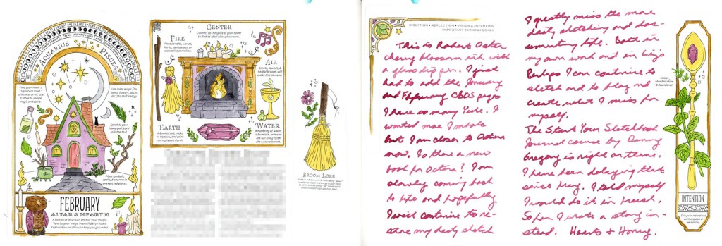
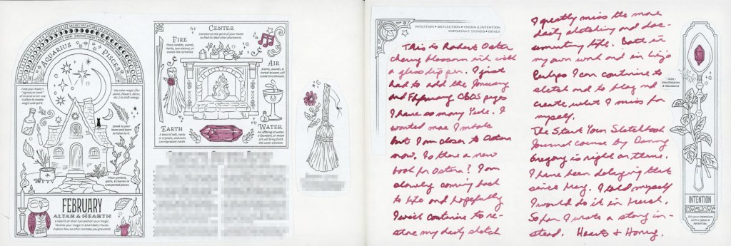
A dual page sketchbook spread — the February 2026 Coloring Book of Shadows page painted in purples and greens depicting an altar and hearth cottage on the left, and a handwritten journal entry in Robert Oster Cherry Blossom ink with small decorated collage images on the right
February CBOS — Altar and Hearth, with Cherry Blossom ink journaling

I’ve been making a deliberate effort to do more journaling in the sketchbook this year. Apparently I was doing journal notes back in January 2023 as well, and I just forgot! I like it, as it captures actual life, not just sketches. It is also a great excuse to use the large collection of fountain pen inks I have!

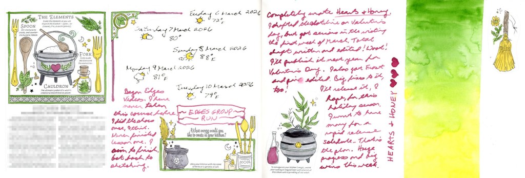
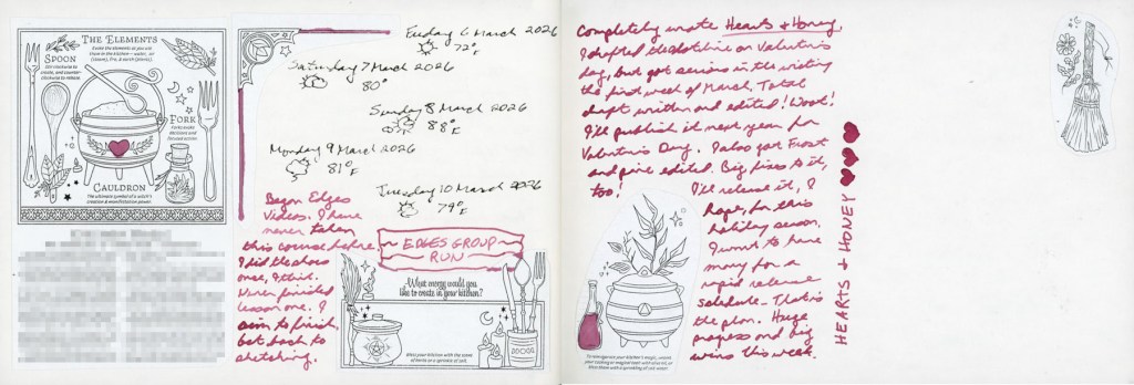
A dual page sketchbook spread — the March 2026 Coloring Book of Shadows elements page painted in greens and pinks with dates and weather log and journaling in Cherry Blossom ink on the left, and a bold watercolour gradient wash from Sap Green to Hansa Yellow Light with Hearts and Honey written vertically in Cherry Blossom ink and small painted collage images on the right
March CBOS — The Elements, and a Hearts & Honey gradient closing page

Hearts and Honey is the book I’m currently writing, and it’s very hard to document a writing project! They aren’t very sketchable unless I start doing storyboards (those are Hard!) but it’s a big part of my life and it deserves to be documented.

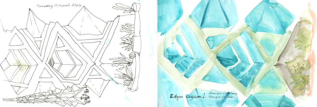
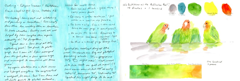
A dual page sketchbook spread — three sketches of the Frank Lloyd Wright Spire at Scottsdale Road and Frank Lloyd Wright Blvd on the left with handwritten location notes and journaling on a teal colour block wash, and a painted watercolour study of the spire with Edges course notes on the right
Frank Lloyd Wright Spire, three sketches

This is where the spire series lives in the sketchbook. Three attempts, ink through to direct watercolor. You can read more about that in the March Theme: Three post!

Bathtime at the Reflection Pool — Lovebird in 3 Poses, with Gradient Bar

Sketch outing notes on a color block, and the lovebird page that ended up anchoring the Three post. One bird, three poses, with a watercolor gradient bar.

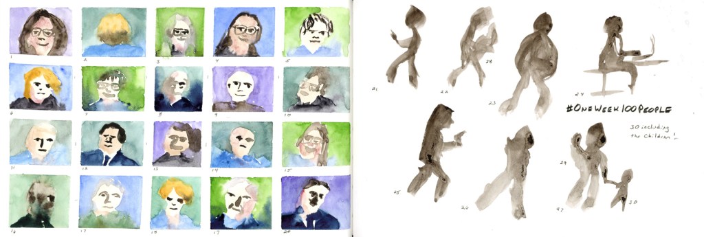
A dual page sketchbook spread — twenty watercolour portrait studies in small numbered grid squares on green and blue washes on the left, and ten loose ink figure studies in sepia on the right, labelled One Week 100 People, 30 including the children
One Week 100 People — 30 done, faces and figures

I did not do as much as I wanted for One Week 100 People, but I’m happy I got one day of sketching in!

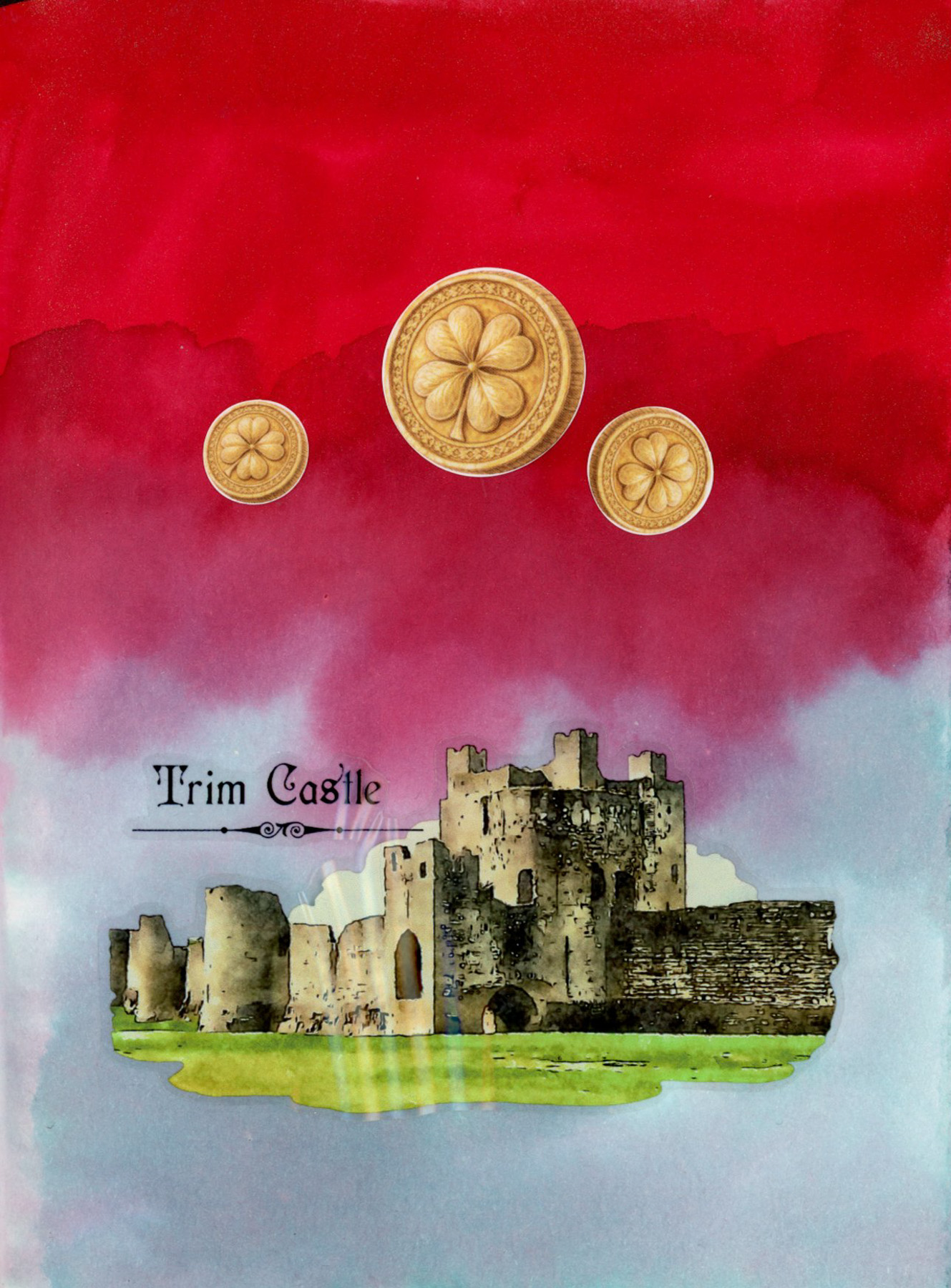
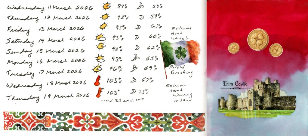
double page sketchbook spread. The left page shows a handwritten dates and weather log for March 11–19 2026, with weather icons and temperatures climbing from 84°F to 103°F, an Extreme Heat Watch notation, a watercolor Irish flag sticker with shamrock, and a decorative red and green tile washi tape border along the bottom. The right page has a dramatic background of Diamine Ruby Taffeta and Diamine Overcast inks in deep red and soft teal, with three gold shamrock coin stickers and a detailed Trim Castle sticker showing stone ruins against a green lawn.
Dates and weather 11–19 March, with a St. Patrick’s Day page in Diamine Ruby Taffeta and Overcast ink.

March broke heat records, by a lot! Over ten degrees above the previous records, some days. The washi border and Irish flag sticker are for St. Patrick’s Day — a little celebration tucked into the data. A dramatic sketchbook page with a deep red and soft teal ink background made with Diamine Ruby Taffeta and Diamine Overcast inks, with three gold shamrock coin stickers and a detailed Trim Castle sticker showing stone ruins against a green lawn. The stickers and washi tapes are from this month’s Cora Crea box.

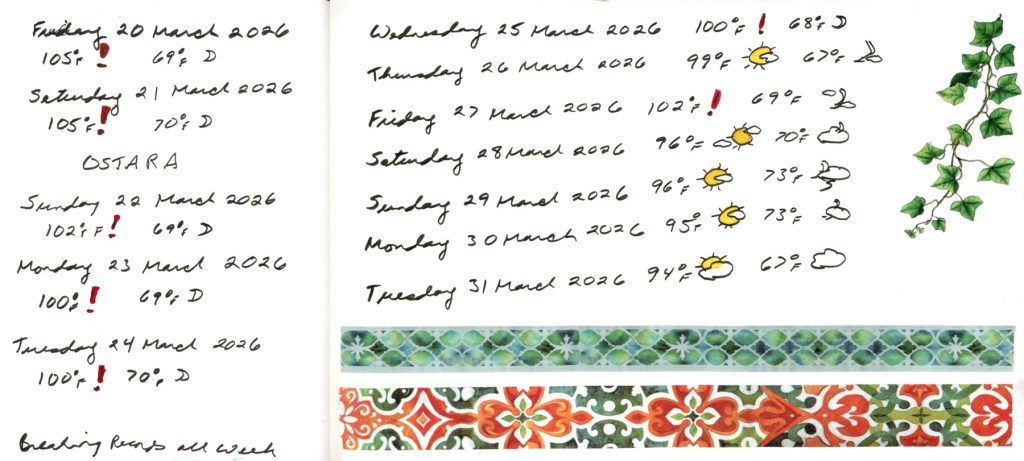
A double page sketchbook spread showing a handwritten dates and weather log for March 20–31 2026, with red exclamation marks on record breaking temperatures reaching 105°F, Ostara noted on March 21st, a trailing ivy sticker on the right side, and two decorative washi tape borders in blue-green tile and red tile patterns running along the bottom of both pages.
Dates and weather 20–31 March — breaking records all week. Ostara at 105°F.

I wanted to sketch, but inflammation hit badly, so a string of dates and weather is all I managed. At least the weather is cooling off! Still unseasonably warm, and matching the record high temperatures.

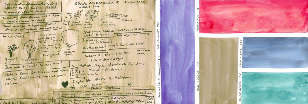
A double page sketchbook spread. The left page shows dense handwritten notes from Edges Livestream 2 covering lessons 3 and 4, written over a warm Gansai Tambi Cosmic Olive green wash, with small ink sketches illustrating concepts like foreground, middle ground, prioritizing tone, and lost and found edges. The right page shows five large granulating watercolour swatches of the Gansai Tambi Granulating 2 Cosmic palette, labelled Cosmic Violet, Cosmic Red, Cosmic Olive, Cosmic Blue, and Cosmic Green.
Edges Livestream 2 notes on a Cosmic Olive wash, alongside the Gansai Tambi Granulating 2 Cosmic palette swatches.

Ending the month with some notes from the second and final Edges livestream, then a little color exploration. I had to swatch out this Gansai Tambi Granulating 2 colors.

Like most of my sketchbook pages for the last several months, I have more notes than sketches, but it does capture life as it’s happening. Honestly, I’m surprised I have as many pages done as I do! That’s not nothing. Here is March, on the page. 

March Theme: Three

March Theme: Three

Liz Steel’s Patreon community theme for March was Three. Three sketches, three objects, three colors, a triad palette all counted, and it is a very versatile theme. I didn’t sketch as much this month as I wanted (hello inflammation hit!), but when I looked back through my sketchbook, three had been quietly showing up all along.

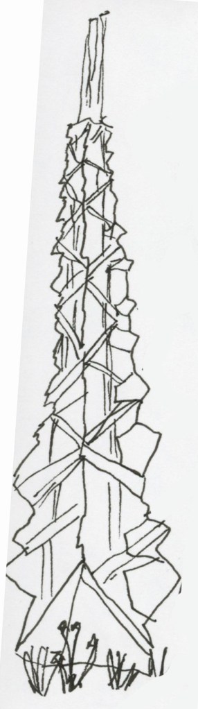
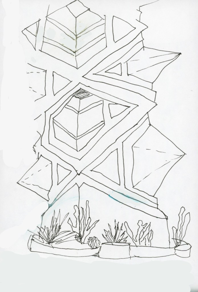
The most obvious was the Frank Lloyd Wright spire. I drew it three times. First just ink, getting acquainted with the energy of it. The second ink sketch was working on getting those complex angles and changes in plane. The spire has this wonderful jagged, faceted quality and it took real concentration to follow all those shifting surfaces. Much more challenging subject than I anticipated!

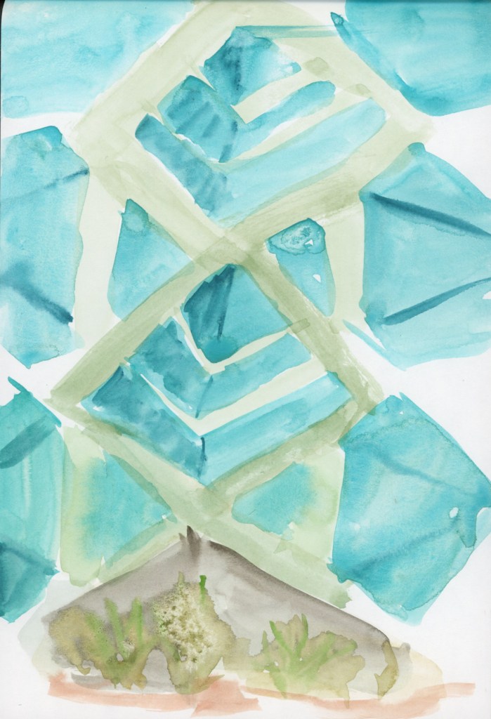
By the third, I went straight to direct watercolor. I always seem to love direct watercolour. It’s so much more forgiving! . There’s a looseness and confidence that comes from having already worked through the subject twice. Another aspect of three, was using just three colors: Winsor Newton Cobalt Turquoise Light, Winsor Newton Sap Green, and Daniel Smith Transparent Pyrrol Orange.

Something lovely happens when you sketch a single subject three times. I should do this more often. It looses you up, and you get more familiar with it.

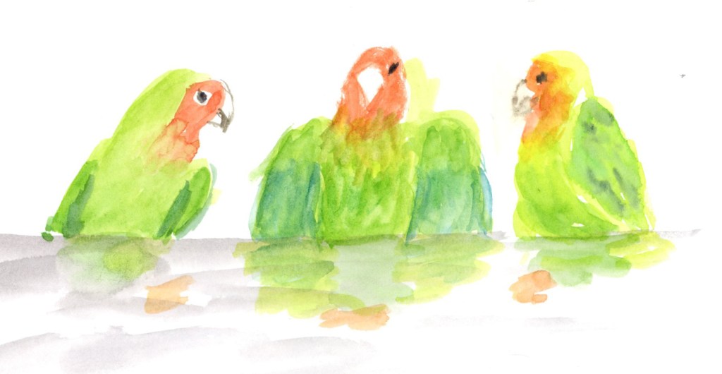
Three watercolour lovebirds painted in bright greens, orange and yellow, sitting along a grey perch with soft reflected colour below, on white paper
One lovebird, three poses — green, orange, and full of personality

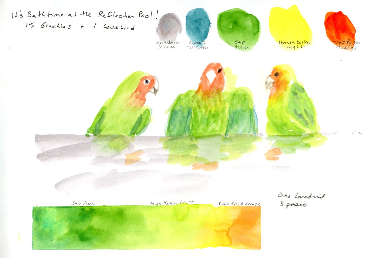
I loved this bird! One lovebird, in three poses, taking a bath. I drew these from photographs I took at the time. One sketch wasn’t enough to capture his fluttering energy during his bath at the reflection pool outside. Fifteen grackles were also present, focused on their own baths. Having those three poses meant I could tell the whole little story of this bath on a single page: the cautious approach, the full splashy middle, the ruffled aftermath.

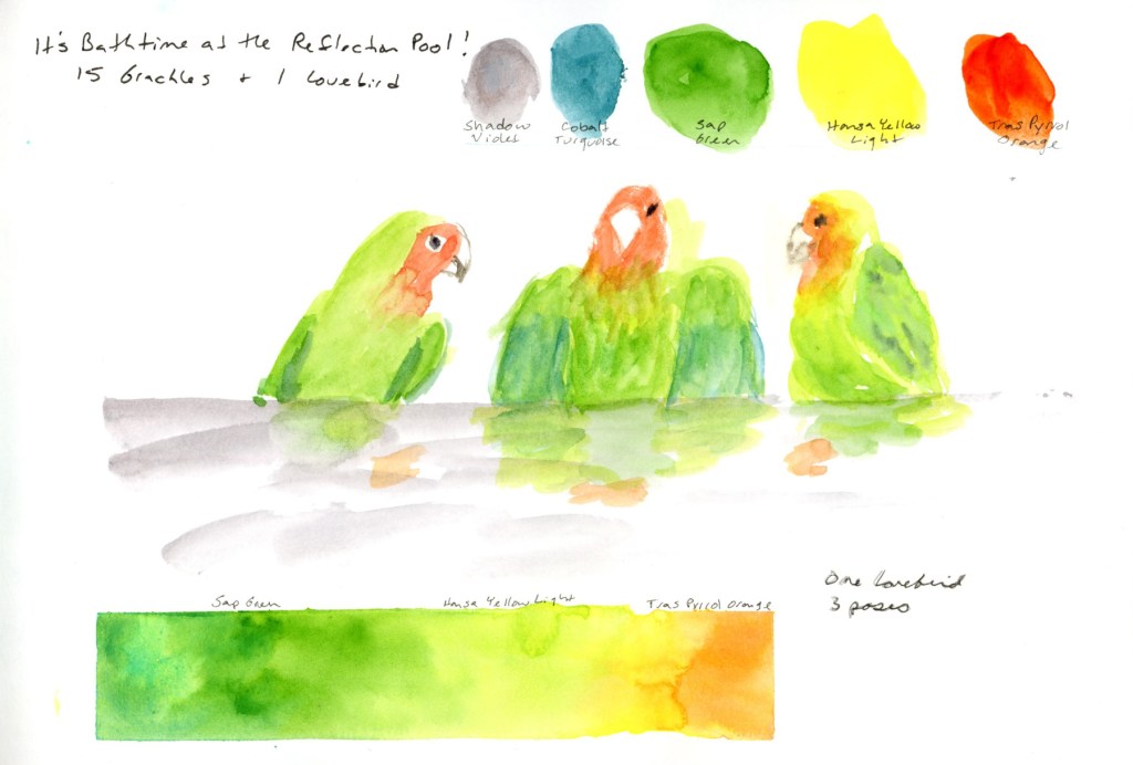
I worked with a very limited set of colors across both subjects. The spire was a three color palette of Cobalt Turquoise Light, Sap Green, and Transparent Pyrrol Orange. For the birds it was a three color palette of Hansa Yellow Light, Sap Green and Trans Pyrrol Orange. I did add a hint of Cobalt Turquoise for the dark shadows on those wing feathers, and of course, Shadow Violet quietly sneaking in for the water. Technically five colors. Spiritually still three. Ha!

A sketchbook page showing three lovebird poses in watercolour, with five painted colour swatches across the top labelled Shadow Violet, Cobalt Turquoise, Sap Green, Hansa Yellow Light, and Transparent Pyrrol Orange, a handwritten title reading "It's Bathtime at the Reflection Pool," and a green-to-orange gradient bar along the bottom.
One lovebird, three poses, in (almost) three colors.

Then I had to add three design elements to this page! So we have the color gradient. (I do love painting a nice color gradient! Been practicing those for years!), the color swatches, and, of course, the main subject of the sketch. My swatches might be over-large for the best page design, but I still like how it tells the story of the colors as well as the love bird. After all, his colors are what makes him so special!

So that’s my exploration of the theme of three for March. One spire, drawn three times. One bird, three poses. A page with three design elements. Lastly, a palette that tried very hard to stay at three colors and almost made it.

Bathtime at the Reflection Pool

Concluding The Messy Middle from last week, you saw a sketchbook in progress — pages waiting, spaces held open, intentions taped into place. This is the update. The pages are filled. Titles are added.

A dual page sketchbook spread — three sketches of the Frank Lloyd Wright Spire at Scottsdale Road and Frank Lloyd Wright Blvd on the left with handwritten location notes and journaling on a teal colour block wash, and a painted watercolour study of the spire with Edges course notes on the right
Frank Lloyd Wright Spire, three sketches

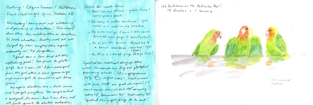
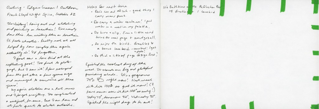
This is my Edges Lesson One outdoor outing — the Frank Lloyd Wright Spire at the little commemorative park at Scottsdale Road and Frank Lloyd Wright Blvd, sketched on location. I knew it was going to be the last good weather day for a while, so there was no hesitation — I had to get out there while I could.

The sketches are chaotic in the best way — three poses of the spire, which also happens to tie in perfectly with Liz Steel’s Patreon March Challenge of three things. The outing felt messy and alive, and I wrote all of it down right there on the page while I was still sitting in the shade. I finished this page by adding the date and the Title to it. I also tried to lift the wet paint transfer that the wind had put on the ink sketches.

A dual page sketchbook spread — handwritten journaling in black ink on a teal colour block wash on the left describing the Edges outdoor outing and the surprise lovebird sighting at the reflection pool, and three watercolour lovebirds painted in greens, oranges and yellows with the header Bathtime at the Reflection Pool on the right
Bathtime at the Reflection Pool — 15 grackles and 1 lovebird

But this is the page that made the whole outing. I’d gone to sketch the spire, and I found a lovebird.

Fifteen grackles and one lovebird, bathing at the reflection pool. A few escaped from a pet store years ago, apparently, and they’ve been surviving in the wild ever since. I spotted it, grabbed some photos, and left the blank page so I could paint these birds at home.

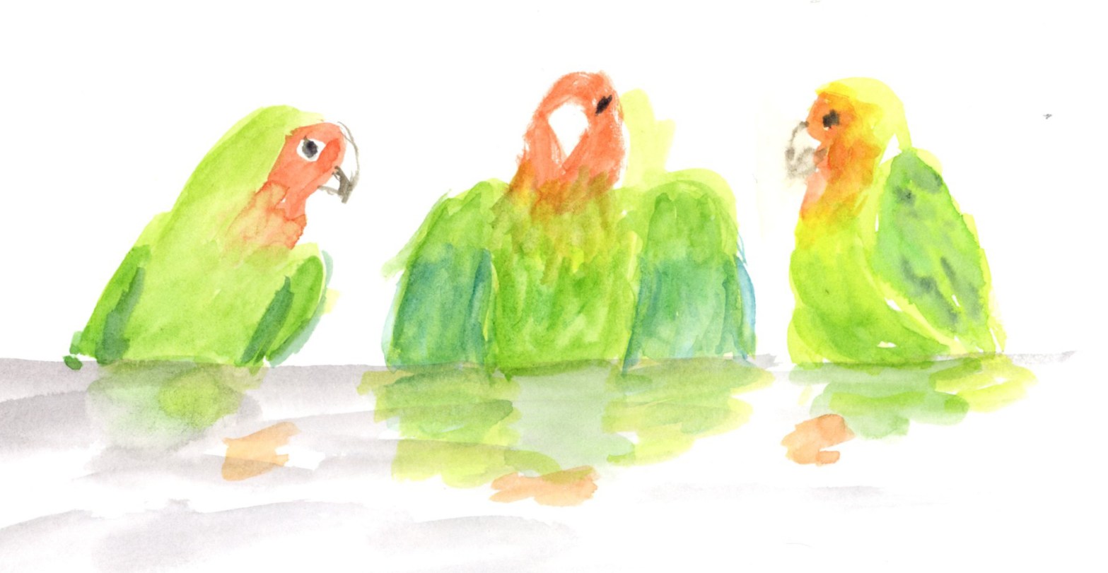
Three watercolour lovebirds painted in bright greens, orange and yellow, sitting along a grey perch with soft reflected colour below, on white paper
One lovebird, three poses — green, orange, and full of personality

Three lovebirds — one lovebird in three poses, because it was there taking a bath. They’re green and orange and yellow and absolutely full of personality. The journaling on the left is written in that teal colour block wash, and it holds the whole story of the outing: the victory of getting outside, the chaos of the spire, the unexpected gift of the birds.

A dual page sketchbook spread — twenty watercolour portrait studies in small numbered grid squares on green and blue washes on the left, and ten loose ink figure studies in sepia on the right, labelled One Week 100 People, 30 including the children
One Week 100 People — 30 done, faces and figures

The One Week 100 People page got its finishing touches too — thirty people including the children, faces in watercolour on the left, ink figures on the right. I added the numbers and the titles to finish off this page.

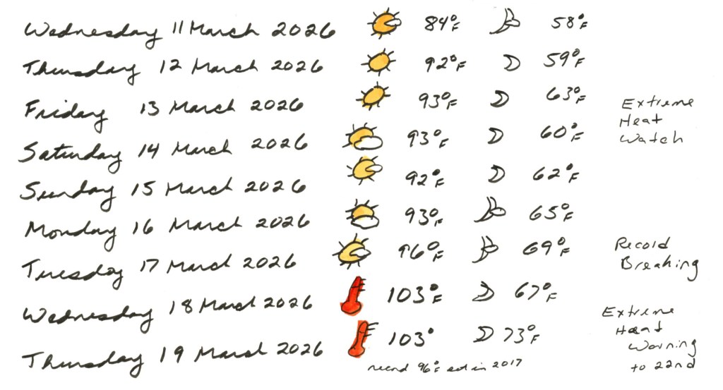
A handwritten weather log for Wednesday 11 March through Thursday 19 March 2026, with hand drawn weather symbols in yellow and red, noting temperatures rising from 84 degrees Fahrenheit to 103 degrees, with annotations reading Extreme Heat Watch, Record Breaking, and Extreme Heat Warning to 22nd
Weather log 11–19 March 2026 — record breaking heat in March

I knew my outing day was the last cooler day for awhile, but wow has the heat spiked! Breaking records by a mile! And it’s just going to get hotter, if you can believe that. I don’t usually see these kind of temperatures until May. We went from a warm pleasant 84°F on Wednesday the 11th to 103°F — record breaking — by Wednesday the 18th, with an Extreme Heat Warning extending through the 22nd. In March. The thermometer icon I drew in red says everything. And it’s only getting hotter!

Titles and notes help complete pages, and aid in telling the story of the everyday life I’m documenting with my sketchbook. This mini series of posts has shown a bit of the process for what is usually only shown completed. It’s easy to think I should complete pages in just one sitting, all perfect, but the truth is that isn’t how it’s done, really, if you are going to add a little sketchbook design to your pages.

What a Difference Color Makes

Last week I wrote The Messy Middle, with these pages in their unfinished state — collage laid down, journaling written, color promised but not yet delivered. Well. The color has arrived.

A dual page sketchbook spread — dates and weather log for Saturday 28 February through Thursday 5 March 2026 with moon phases and astronomical events on the left, and the March 2026 Coloring Book of Shadows page painted in greens, yellows, and warm browns depicting a witch's kitchen cottage, on the right, with Edges course notes on a bright green wash in the background
February tail end and March — A Witch’s Kitchen, CBOS 2026

This first spread is the one that started the catching up. Dates and weather for the last days of February and the first days of March, alongside the March Coloring Book of Shadows page — A Witch’s Kitchen. The facing page is still doing its job as an Edges course notes page, now with that bright green wash making all those handwritten diagrams and observations feel like a proper sketchbook page rather than a notepad.

A dual page sketchbook spread — Edges Lesson course notes with painted examples including a red onion and a figure in yellow on a bright green wash on the left, and the January 2026 Coloring Book of Shadows page painted in purples, greens, and golds depicting a magical home with a cat, on the right
Edges Lesson notes and January CBOS — A Magical Home

The January CBOS page finally got its color too — yes, in March, and I stand by it. The Edges Lesson Two notes on the left with the red onion and the figure in yellow are a good reminder that messy working pages can be beautiful ones.

A dual page sketchbook spread — the February 2026 Coloring Book of Shadows page painted in purples and greens depicting an altar and hearth cottage on the left, and a handwritten journal entry in Robert Oster Cherry Blossom ink with small decorated collage images on the right
February CBOS — Altar and Hearth, with Cherry Blossom ink journaling

This is the spread I’m most pleased with. The February CBOS page painted up beautifully, and the Cherry Blossom ink journaling on the right ties it all together. Reading back through what I wrote there — missing daily sketching, thinking about Ostara, the mention of Danny Gregory’s Start Your Sketchbook Journal course that I’ve been putting off since May — it’s a good reminder of why I keep this kind of sketchbook. It holds things.

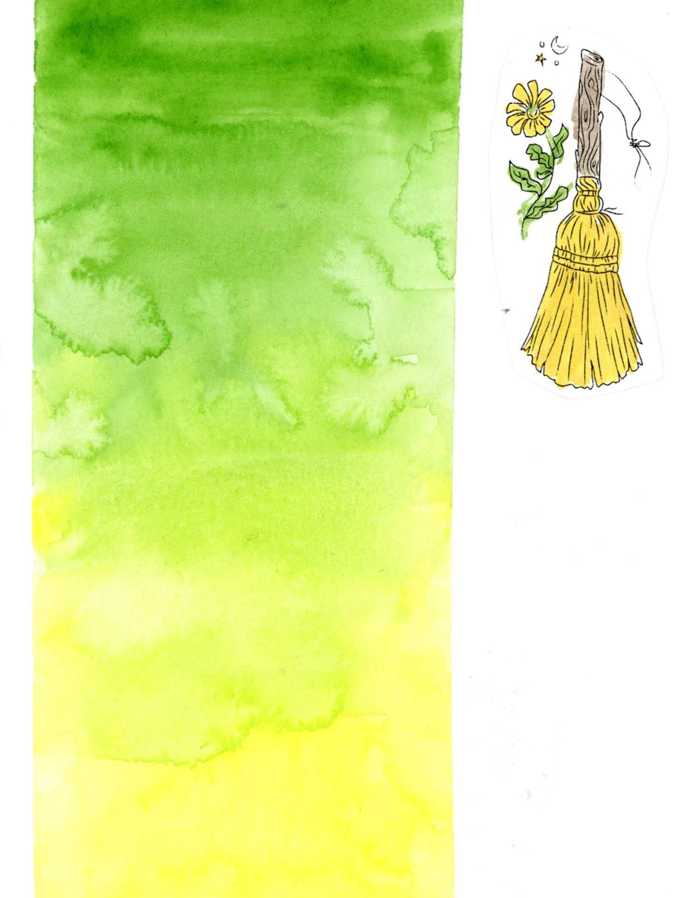
A dual page sketchbook spread — the March 2026 Coloring Book of Shadows elements page painted in greens and pinks with dates and weather log and journaling in Cherry Blossom ink on the left, and a bold watercolour gradient wash from Sap Green to Hansa Yellow Light with Hearts and Honey written vertically in Cherry Blossom ink and small painted collage images on the right
March CBOS — The Elements, and a Hearts & Honey gradient closing page

And this is the one that closed the loop. More dates and weather, more journaling about Hearts & Honey and the Edges group run, and that final wash of green fading to yellow with Hearts & Honey written vertically down the side. It’s the most designed page of the section and it feels like a proper ending. The pinks of February moving into the spring colors of March!

A note on materials: the bright yellow you see in the CBOS images is ink — Diamine Pineapple Spritz from the 2025 Inkvent calendar, and it is exactly as cheerful as it sounds. The rest is watercolor from my usual palette. The greens throughout — the frames, the notes pages, and that final gradient block — are Winsor & Newton Sap Green, with Daniel Smith Hansa Yellow Light pulling the gradient toward that warm yellow finish.

The pages aren’t perfectly painted. Some of the CBOS collage images have text I’ve blurred for copyright reasons, and there are spots where I rushed. But color does something that no amount of careful collage and journaling can do on its own.

The Messy Middle

Not every sketchbook page is ready for its close-up.

Right now my sketchbook is deep in what I’m calling the messy middle — pages that are made, but not finished. Collage laid down, journaling written, tape applied in anticipation. Color promised but not yet delivered. And I’ve decided that’s worth a post, because this is what a sketchbook actually looks like when it’s being lived in.

A dual page sketchbook spread in black ink — dates, weather, and temperature log for February 28 through March 5 with collage images from the 2026 Coloring Book of Shadows by Amy Cesari on the left, and handwritten notes and sketches from an Edges course livestream on the right.

I’m a little behind on my seasonal pages — this first spread catches up on the tail end of February and the first days of March. Dates, weather, temperatures. The facing page is covered in handwritten notes and sketches from the Edges course livestream. Messy and functional and very much in progress.

A dual page sketchbook spread in black ink — continued handwritten notes and sketches from an Edges course livestream on the left, and collage images from the January 2026 Coloring Book of Shadows by Amy Cesari on the right.

And speaking of catching up — that’s the January collage on the right. Yes, in March. I forgot it at the time, I like the images, so in it went. No apologies.

The collage images throughout these pages are from the 2026 Coloring Book of Shadows by Amy Cesari. They’re pasted in and waiting to be painted. That painted version is coming. Eventually is the operative word.

A dual page sketchbook spread — February collage images from the 2026 Coloring Book of Shadows by Amy Cesari with touches of spot color in Robert Oster's Cherry Blossom ink on the left, and a handwritten journal entry in the same pink ink with smaller collage images on the right.

This is where a little color starts sneaking in. I’ve been reaching for Robert Oster’s Cherry Blossom ink — a soft rosy pink — for both spot color on the collage images and for journaling. It wasn’t an accident. I’ve been thinking about sketchbook design, using a single ink color across multiple spreads to create a visual thread through this section of the book. Even in the messy middle, there are intentional choices happening.

A dual page sketchbook spread — March collage images from the 2026 Coloring Book of Shadows by Amy Cesari with spot color, dates and weather log for March 6 through 10, and a handwritten note in Robert Oster's Cherry Blossom ink on the left, and a handwritten journal entry in Cherry Blossom ink with small decorated collage images on the right, with  half of the page left blank.

The Cherry Blossom ink continues here — more dates and weather, a note marking the start of the Edges course, and a half page of journaling with small collaged images tucked into the corners. The pages are full. They’re just not painted yet.

There’s also a half page left blank — and I’m genuinely undecided whether that’s a space waiting for a sketch, or whether it should stay as white space. Sketchbook design is something I’m always thinking about and not always getting right. White space does not come naturally to me!

A dual page sketchbook spread — handwritten journal notes from an on location sketching outing to Frank Lloyd Wright Commemorative Park on the left, and a page header reading 'Bathtime at the Reflection Pool' with the remainder left blank and edges dotted with narrow green masking tape on the right.

You might recognize the right hand page from my last post — the header for the lovebird sketch that’s still waiting to be drawn. The green masking tape dotting the edges is there because the other side of the page is already taped up for something else. The blank space is intentional. It’s waiting.

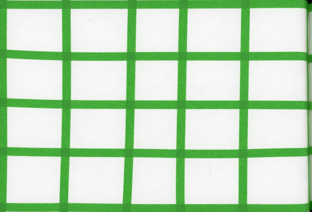
A single sketchbook page prepared with a 4 by 5 grid of narrow green masking tape, ready for the One Week 100 People sketching challenge.

And this is my favorite kind of messy middle image — a page that’s completely empty but completely ready. Narrow green masking tape laid out in a grid, waiting for this week’s One Week 100 People challenge. No sketches yet. Just intention and tape and anticipation.

This is what a sketchbook in motion looks like. Not every page is finished. Not every page is painted. Some pages are still becoming what they’re going to be.

And that’s fine. That’s actually the whole point.

End of a Series (and a lot of Red Lentil Pasta)

The End of a Series (and a Lot of Red Lentil Pasta)

It’s March, and I’m sketching food again. If you’ve been following along, you might notice that February and March seem to have a strange gravitational pull for sketching food! My first food sketchbook started 1 February 2020, my second picked up again 1 February 2021, and here I am in 2026, wrapping up my fifth. I genuinely did not plan that.

This post covers March 1–8, the final eight days in this little sketchbook — Volume 24 overall, Food Sketchbook No. 5. It’s a 3.5×5.5 inch Stillman & Birn Epsilon, softcover, 150gsm smooth white paper. I’ve used a few different Stillman & Birn papers across the five food sketchbooks, and this one has been a pleasant surprise — it handles ink beautifully, and the watercolor behaves better than you’d expect from a smooth paper. It allows for harder, crisper marks, which suits food sketching well.

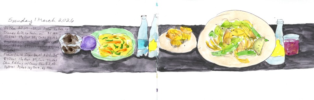
Watercolor and ink food sketch on a double page spread, Sunday 1 March 2026. Plates of food are arranged along a bold dark horizontal band across both pages, including a green plate of yellow pasta with orange and green vegetables, a small dark bowl, a purple shape, and a large oval plate with colorful vegetables. Handwritten notes on the left list foods, prices, and nutrition data.
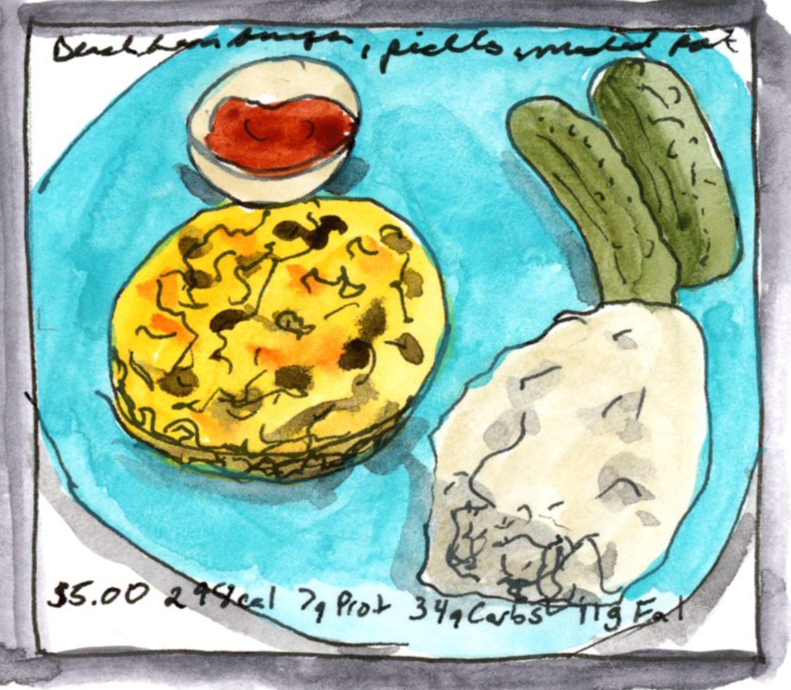
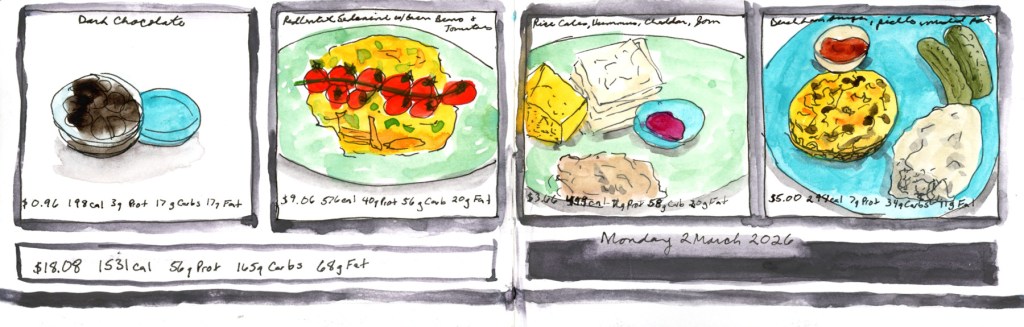
Watercolor and ink food sketch on a double page spread, Monday 2 March 2026. Four individual food portraits are arranged in a grid of framed panels across the top of both pages, showing dark chocolate, a green plate of red lentil pasta with roasted tomatoes, a plate of rice cakes with cheese and jam, and a blue plate with a bean burger and pickles. A framed panel at the bottom left shows the daily total cost and nutrition data.

These eight pages are a bit of a mixed bag stylistically, and I’ll be honest about why: I got behind and had to catch up. Six of the eight are loose, direct watercolor without nutritional data, because that’s simply much faster to do. The two more structured pages — the panoramic spread on Sunday March 1st, and the grid of four individual food portraits on Monday the 2nd — are closer to what I’d do if I had unlimited time. The Monday page even has the full daily cost and nutrition totals at the bottom, which is the whole point of the exercise, really.

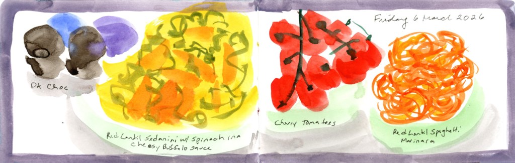
One ounce of dark chocolate chips is a must to start the day, of course. I do have a shocking amount of the red lentil sedanini every week, month, year. What can I say, it’s easier on the glucose hits, and carries a nut cheese sauce well. Food allergies, so I’m gluten free and vegan as much as possible. And let’s face it, scanning through sketches is far easier when finding a culprit!
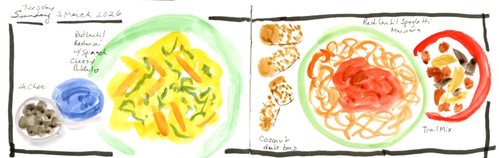
Watercolor and ink food sketch on a double page spread, Tuesday 3 March 2026, with a corrected date visible. A large bordered rectangle frames both pages. On the left, a small dark bowl of chocolate and a blue circle sit beside a large yellow pasta bowl on a green plate. On the right, small sketches of coconut date bars sit beside two more green plates — one with red lentil spaghetti marinara and one with trail mix. Food labels are handwritten throughout.
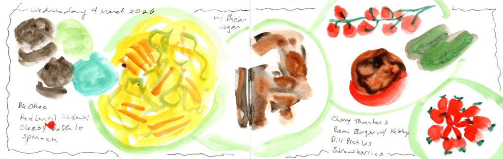
Loose watercolor food sketch on a double page spread, Wednesday 4 March 2026. On the left page, dark chocolate shapes and a teal oval sit beside a large yellow pasta bowl rendered in fluid, gestural brushwork. On the right, a loosely painted My Bacon sits centrally, with scattered sketches of cherry tomatoes on the vine, green cucumbers, a bean burger with ketchup, a bowl of strawberries, and more strawberries rendered in bright red. Handwritten food labels throughout.
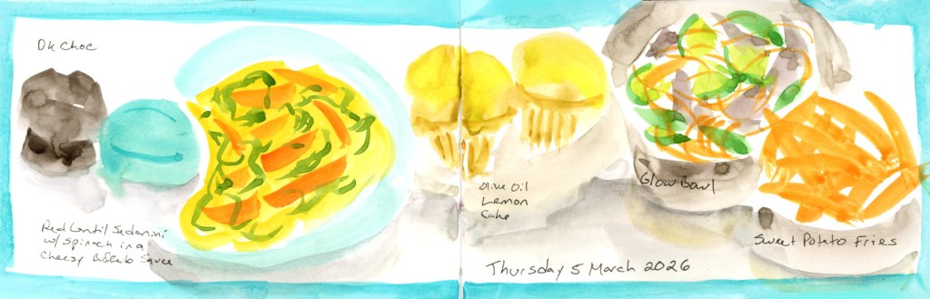
Watercolor food sketch on a double page spread, Thursday 5 March 2026, with a bright turquoise border wash across both pages. On the left, a dark chocolate piece and a blue oval sit beside a yellow pasta bowl on a turquoise plate. On the right, two golden olive oil lemon cakes sit beside a grey bowl with a colorful glow bowl of vegetables and a plate of bright orange sweet potato fries. Food names are handwritten on both pages.

The highlight of the week was Thursday, when I ate out at Flower Child with a friend who was heading off on vacation. The olive oil lemon cake on that page was hers — I did not eat two desserts, though I won’t say the thought didn’t cross my mind. The glow bowl and sweet potato fries were very good.

Watercolor and ink food sketch on a double page spread, Friday 6 March 2026, with a soft purple border wash. On the left page, dark chocolate pieces and blue-purple ovals sit beside a bold yellow and orange pasta bowl. On the right, a striking cluster of deep red cherry tomatoes on the vine dominates the center, with a plate of loosely painted orange red lentil spaghetti marinara beside it. Food names are handwritten below each item.
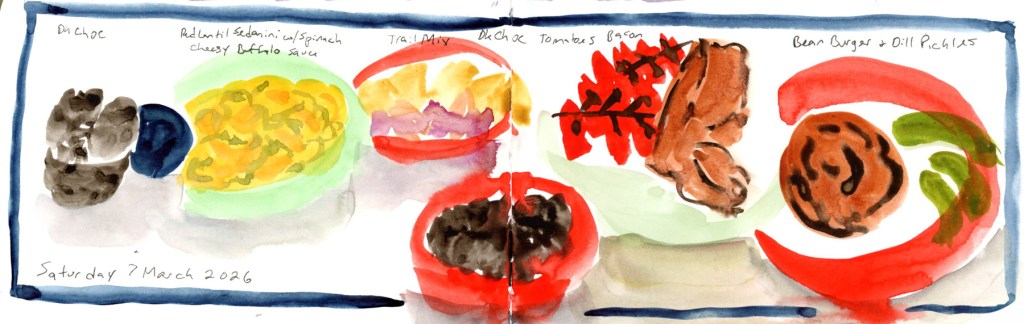
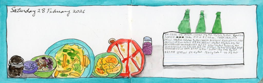
Watercolor and ink food sketch on a double page spread, Saturday 7 March 2026, with a blue border. A row of food items stretches across both pages: dark chocolate and a navy oval on the far left, followed by a green bowl of yellow pasta, a red-rimmed bowl of trail mix, a small dark bowl of chocolate, a sketch of tomatoes on the vine with strips of vegan bacon, and a red-rimmed plate with a bean burger and dill pickles. Food labels are handwritten above each item, with the date written at the bottom left.

Saturday brought a treat of a different kind: I’ve recently discovered My Bacon, a vegan bacon made from mycelium (soy-free, wheat-free, and genuinely delicious), and it shows up twice this week. Highly recommend if you’re navigating similar dietary constraints.

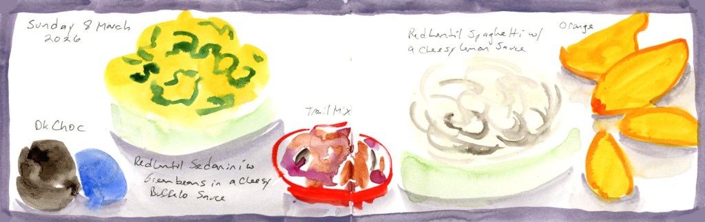
Watercolor food sketch on a double page spread, Sunday 8 March 2026, with a soft grey-purple border wash. On the left, dark chocolate pieces and a blue oval sit beside a large yellow-green pasta bowl. In the center, a small red-rimmed bowl holds a colorful trail mix. On the right, a pale grey bowl of red lentil spaghetti in a cheesy lemon sauce sits beside bright orange wedges of fresh orange. Food names are handwritten throughout.

And then Sunday the 8th, and that’s it. The book is full.

This is the fifth time I’ve filled one of these little landscape books with food, and I have no plans to stop — I’ll just be doing it within my regular daily sketchbook from here on, rather than in a dedicated volume. There will be one more post from this sketchbook: the wireframe page design diagrams I used to plan these layouts, which feels like a fitting way to close it out properly.

If you want to browse the whole food sketching journey, here are the starting points:

February Wrap-Up: Cupcakes and Color Swatches

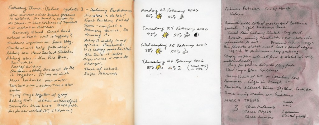
Spring is bringing better energy! Despite a challenging start to the year, I’m thrilled to announce I’ve officially wrapped up my Watercolor course. This month was all about marking moments—from Valentine’s cupcakes to the early blooms in my weed-filled (but vibrant!) backyard.

Watercolor Course Completed!

I’ve continued working through my Watercolor course, and I finally crossed the finish line! Honestly, completing this despite such a difficult couple of months feels like a huge win.

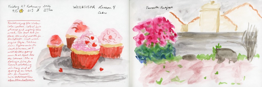
A completed sketchbook page featuring watercolor exercises from Lesson Four, including the cupcake sketch and backyard study integrated with handwritten notes.

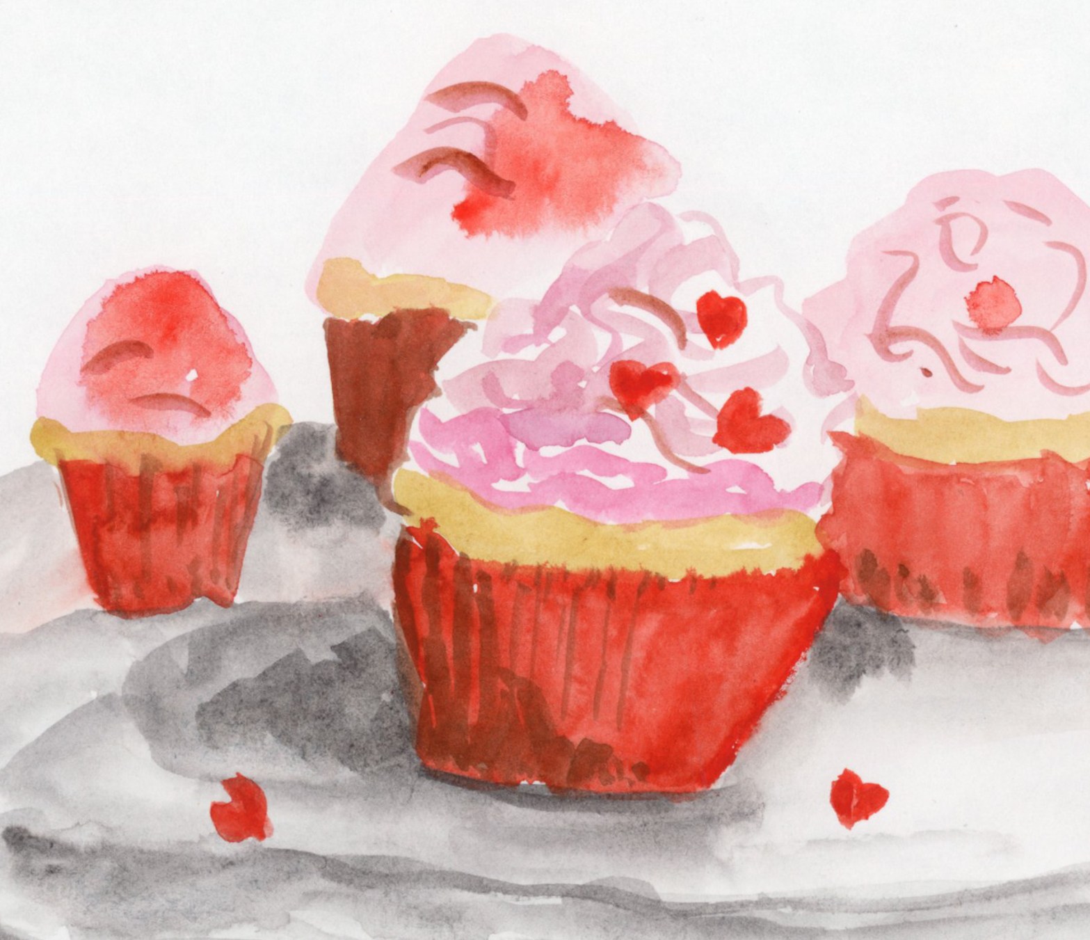
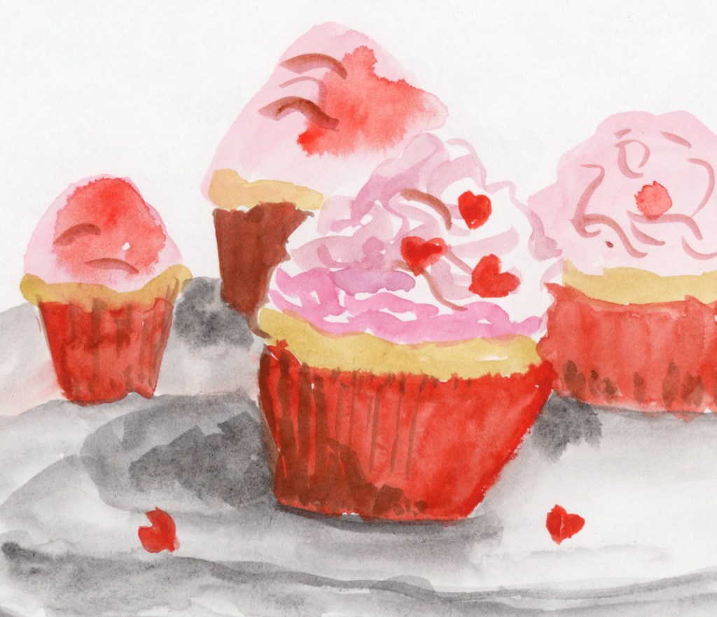
To celebrate, I painted these Valentine cupcakes from a photo I found online. It was a fun way to mark the holiday and just play with color (Quin Rose and Pyroll Scarlet.)

A cheerful watercolor sketch of four cupcakes with pink frosting and small heart-shaped sprinkles, painted from a reference photo to celebrate Valentine’s Day.

Record-Breaking Heat & Overgrown Weeds

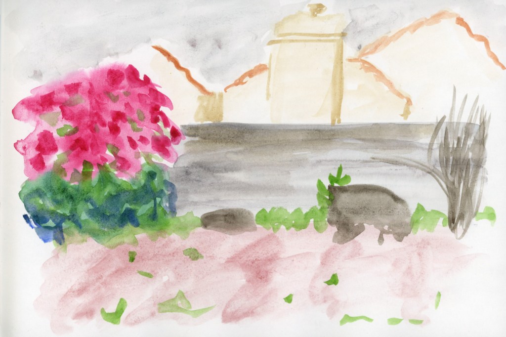
My yard has officially been taken over by weeds this year! We are experiencing record-breaking temperatures, so everything bloomed a full month earlier than usual. It’s a bit chaotic out there, but it makes for interesting sketching.

A loose watercolor sketch of a backyard featuring a vibrant pink blooming bougainvillea bush in Quinacridone Rose. The scene includes overgrown weeds, a leafless pomegranate bush, and a couple of broken-down planters, capturing the early spring growth.

Paint Experiments and Palettes

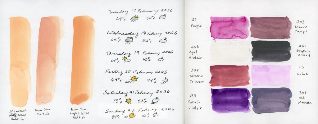
I spent some time diving into the technical side of things this month. I wanted to see the true differences between Naples Yellow Reddish from Schmincke and Roman Szmal, as well as The Tint (Roman Szmal). They look so similar at first glance!

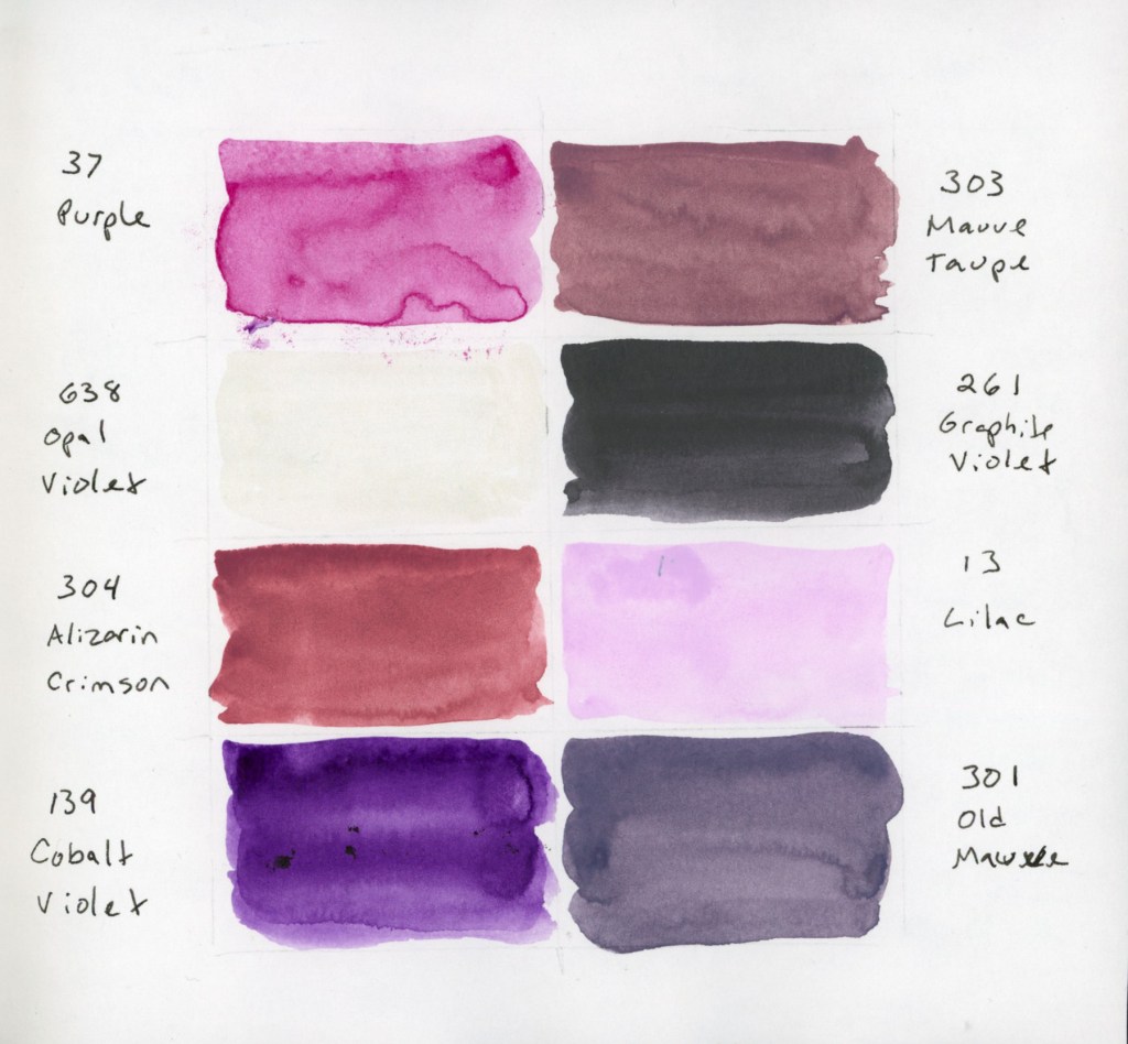
A double-page sketchbook spread. The left page features technical watercolor swatches of Naples Yellow Reddish (Schmincke vs. Roman Szmal) and The Tint. The right page displays an 8-color palette of Gansai Tambi paints in muted, dusty purple and violet shades, including a shimmering Opal Violet.

I also swatched a cute little 8-color palette of Gansai Tambi paints that I’d intended to use for February. Even though I only managed this one swatch page, these muted, dusty shades are so inspiring. The palette includes: Purple (37), Mauve Taupe (303), Opal Violet (638), Graphite Violet (261), Alizarin Crimson (304), Lilac (13), Cobalt Violet (139), and Old Mauve (301). That Opal Violet adds just the right hint of shine!

An 8-color palette of Gansai Tambi paints in muted, dusty purple and violet shades, including a shimmering Opal Violet.

For the color blocks over my notes, I also played with a gorgeous gradient between the two Naples Yellows Reddish. But the real star? Roman Szmal Lava. That shading and granulation are just incredible—what a fun, moody color to work with! 

A sketchbook page featuring a color-blocked text areas, one  painted with Roman Szmal and Schmncke Naples Yellow Reddish, and one with Roman Szmal Lava watercolor, showcasing its unique heavy granulation and earthy shading

The Return of Food Sketches

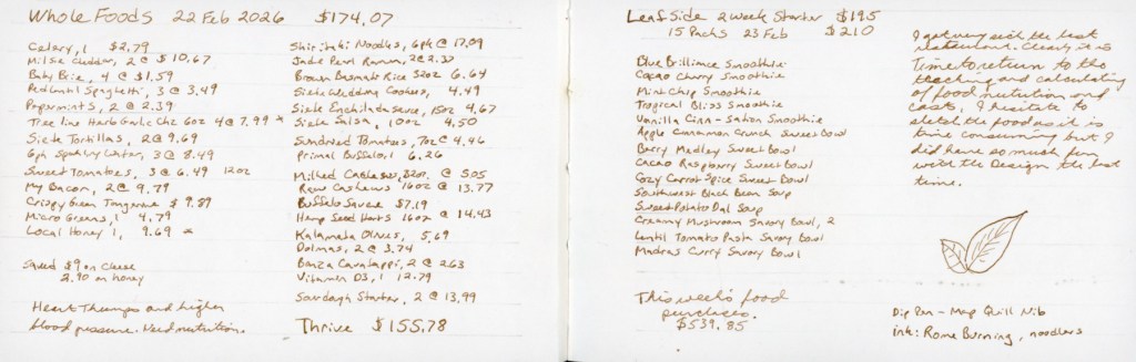
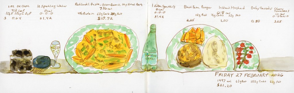
With my health still being a bit troublesome, I’ve decided to restart my food sketching habit. I’ve picked up my 3.5×5.5 Epsilon landscape book from last summer. I’m diving back in and focusing on making the page designs more visually interesting this time around.

A pocket sketchbook spread in an Epsilon landscape book featuring grocery costs.
A pocket sketchbook spread in an Epsilon landscape book featuring ink and watercolor sketches of daily meals, including handwritten nutritional data and grocery costs.

Looking Ahead

What’s next? The “Edges” course from Sketching Now starts next week! I’ve never made it past lesson one before, but I’m joining the group run this time to stay motivated. My skills feel a little rusty after the last few months, but I’m ready to get back into the flow.