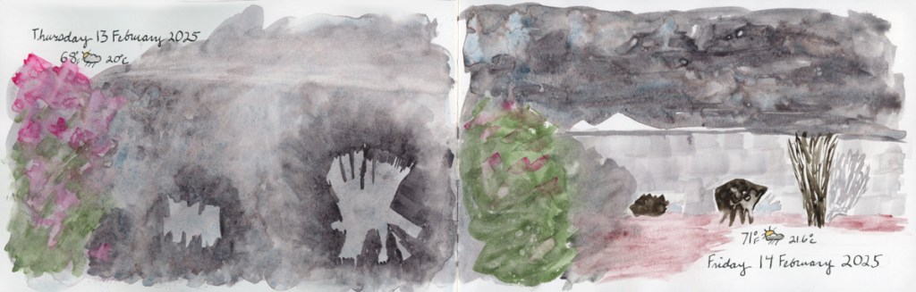
My family vacation was cut short, and between the chaos of getting ready, and the unexpected return, my sketching took a hit.
I do not even have the dates and weather yet for Friday through Sunday! Needless to say, I did not sketch on location anywhere. The struggle is real!
I am hoping I’ll have loads of time and fill in all sorts of sketches and memories from photos. Loads of time seems quite unlikely. So maybe I just do color abstracts that capture the sights and experiences? I could also just leave these pages as is, with the barest of dates and stickers. Turn the page and start clean. I’ll see how this week goes, but I know from experience I can’t let blank pages go too long or I stall out completely. I’ll give myself Monday to see how the week looks, and whether I think I can steal time to fill in sketches, or do those color abstracts.
This week’s sketching. Not much sketching this week, actually, but plenty of color swatching.
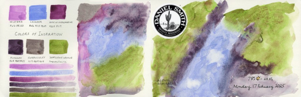
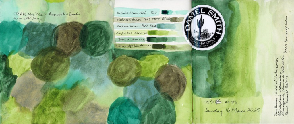
I swatched the rest of the supergranulating paints. I have had the big set for a couple years, and never swatched it, so now it is very nice to have that done.
I’m not sure what I think about these supergranulating paints. For the most part, they do granulate beautifully. A lot of them seem a little pale to me, unless I am really painting it pasty thick. There are a handful, however, that I thought were really interesting and lovely. But as ever, to really know a paint, it takes more than a color swatch. I haven’t color mixed, nor have I painted subjects with them.
Color swatching, however, is a great calming activity. Like Jean Haines’ book title, Painting Yourself Calm. Though her technique is all about lots of water and flow, I find color swatching quite soothing, too.
I’ll be on a family vacation this next week or so. I intend to sketch, and I hope to post a bit about it while on vacation, but I don’t know if I’ll have the time, or the means. If not, I’ll certainly post afterwards. I haven’t actually travel sketched much, though I really want to. Travel sketching, and sketching on location, is a big mental block, so let’s see how I do next week!
If nothing else, I know I’ll take a lot of photos, and I can always sketch them later!
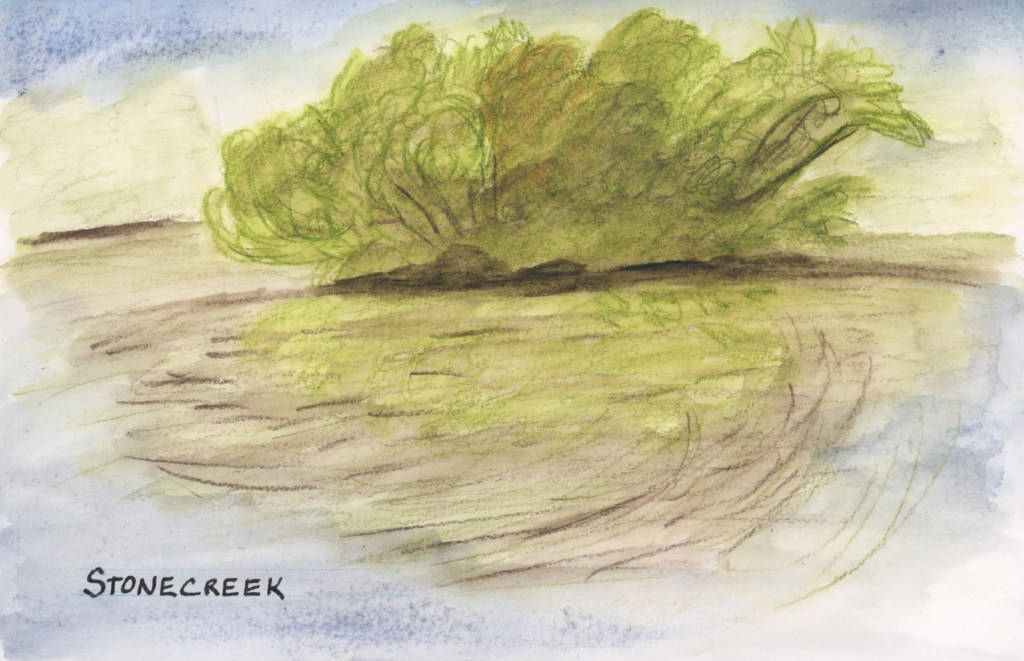
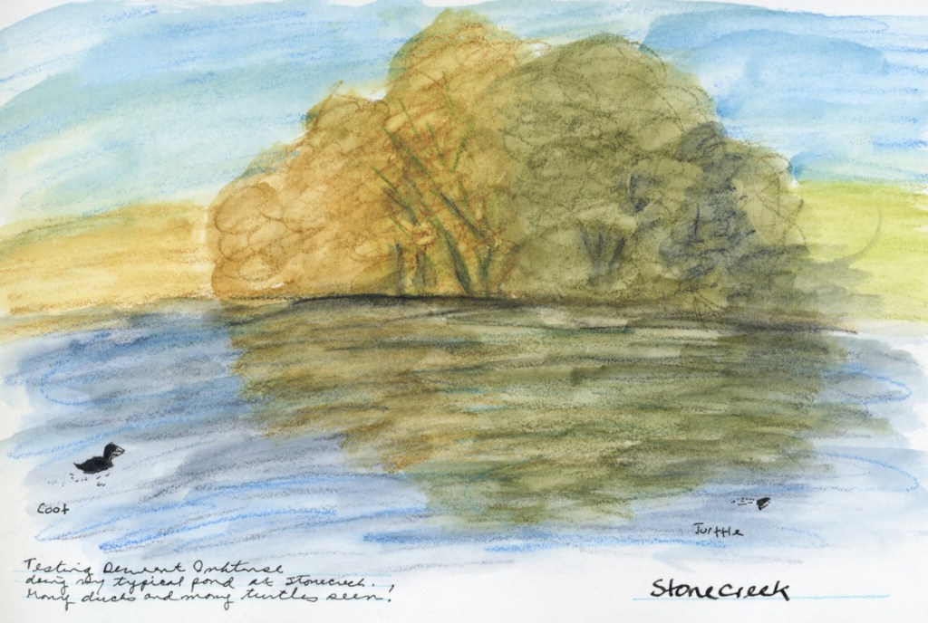
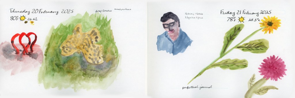
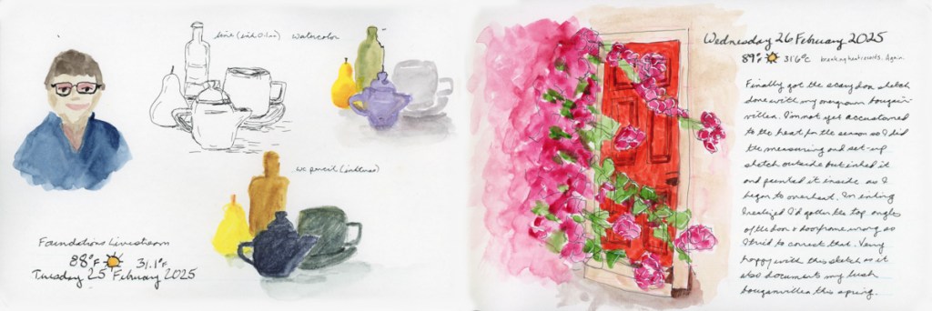
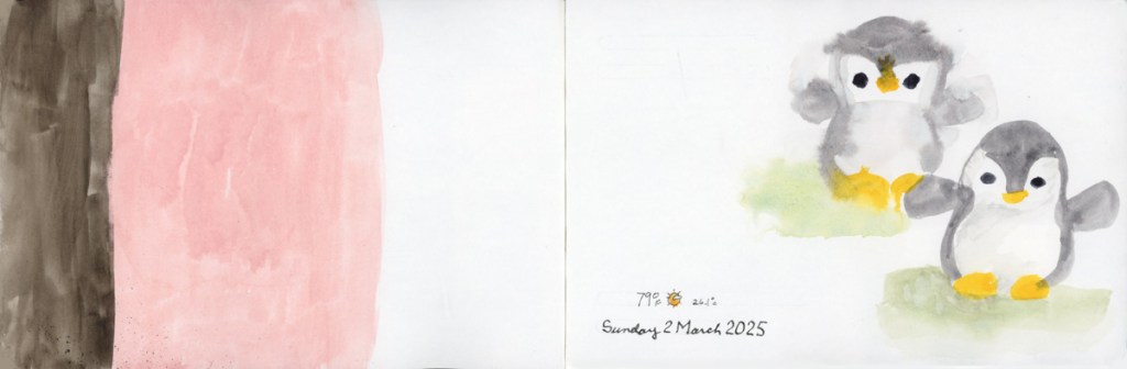
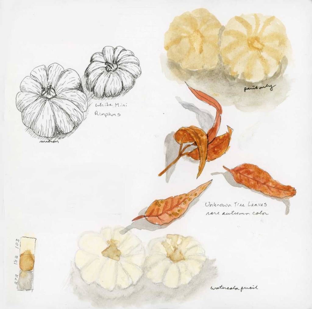
The Spring Greens have erupted on the trees and the entire island has lost all yellows and browns from the winter.
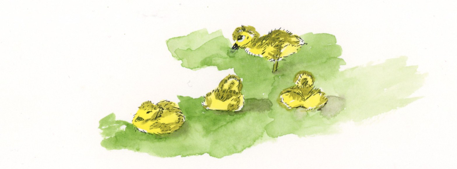
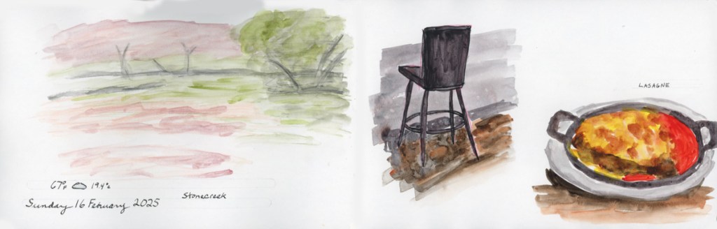
I sketched the island at the pond at Stonecreek with Inktense and I painted the goslings at home from a photo as my eyeballs do not zoom as much as a camera lens.(This is likely why the nature journalists like John Muir Laws carry binoculars!)
This sketch let me down. First my Inktense pencil was too bright, so I tried to tone it all down, but then ended up making it muddy. Not the spring green vibe I’m going for! While the photo was taken in a calm moment, most of the time the wind was rippling the pond water, which is what I captured in my sketch.
The Delta Series paper also let me down. To get a lighter shade of blue for the sky and reflection, I used a lot of water and the paper did this weird spotting thing. I had seen it do that in the previous pages, but since I was using supergranulating paint, I thought that was the granulation effect. Inktense does not granulate, so this is definitely the paper. Worse, those spots are showing through to the other side! Ack! I use this much water all the time with the Alpha Series, and Gamma Series papers, and that near bleeding, and changing of texture does not happen. Interesting difference!
I’m going to try watercolor over the top of this sketch to see if I can fix that muddy feeling to restore it back to that Spring Green vibe which is what I wanted to capture.
Well, I added watercolor over the top, and it is a better shade of green for the spring greens, but I can’t say I’d call this a very successful sketch. I do like it better now, at least.
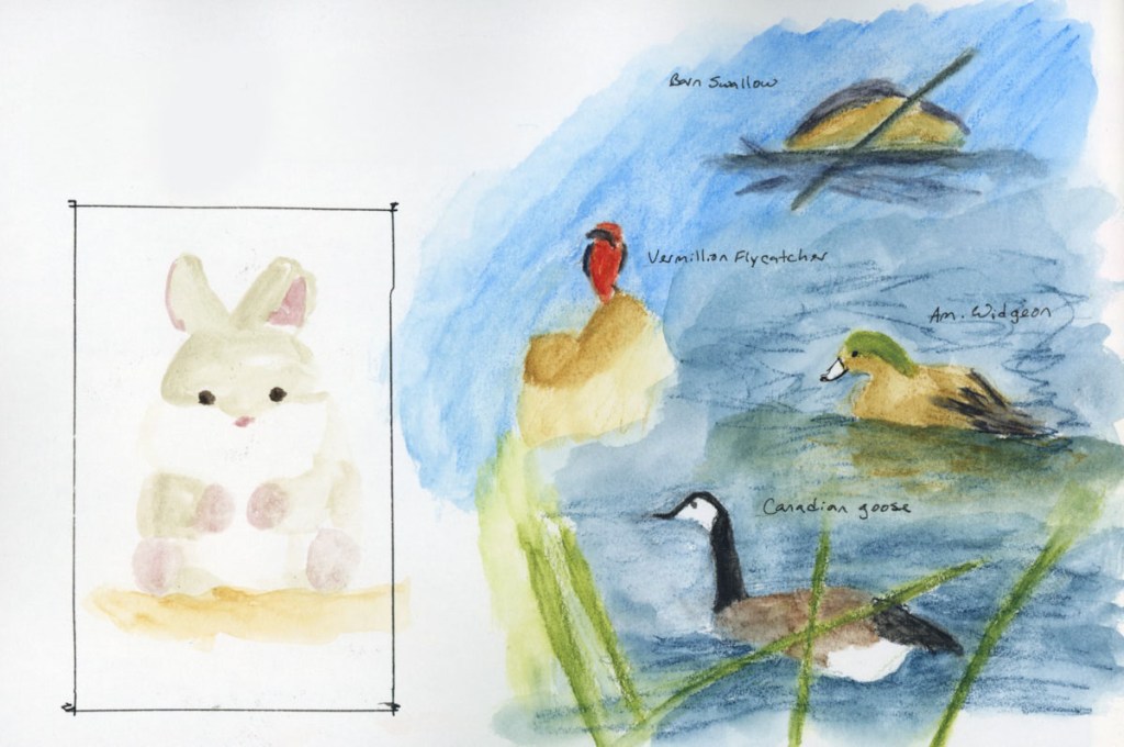
What I love on this page are the goslings I sketched! Cuteness!
I painted the goslings from a photo a couple days later, in ink and watercolor, and I’m super happy with these adorable little guys. They were young and still tiny little fluff balls who had to rest after every few steps. There were actually two families of goslings! One family had five who were slightly bigger than these four. What a treat of a day to see the goslings!
This week I finished Volume 19 of my sketchbook, and started Volume 20. I wrote a bit on these pages in the past few entries.
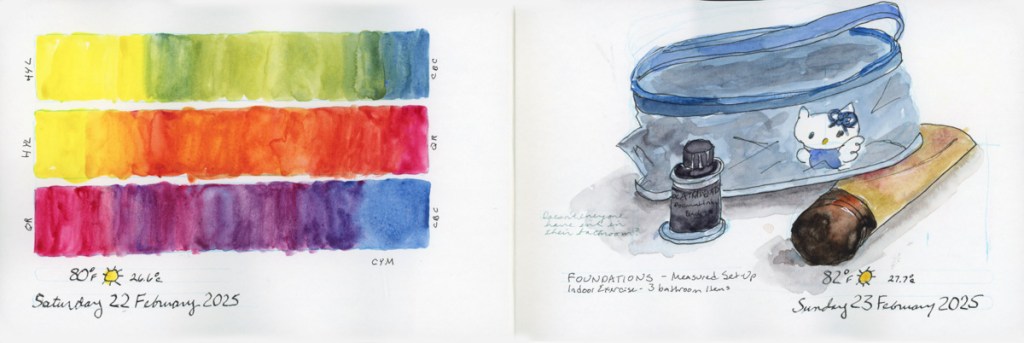
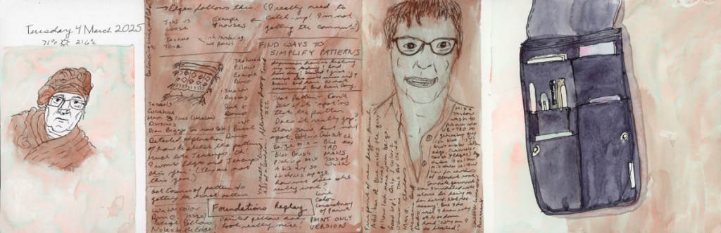
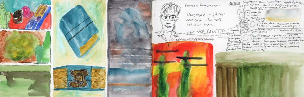
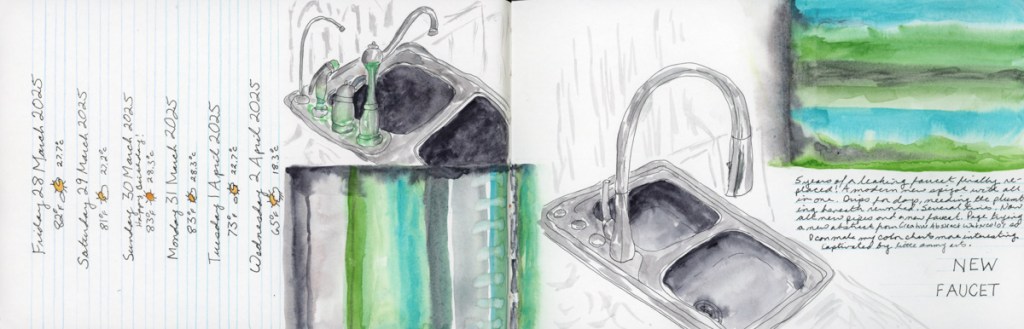
A lot of color explorations in these pages this week. I did not have much time to sketch, what with the leaking pipes in the kitchen (now repaired!) I find that color charts are great for soothing a stressed out brain!
Sketching ruins, and foreshortening, and an exploration into creating abstracts, which I’ve already written about, was very fun.
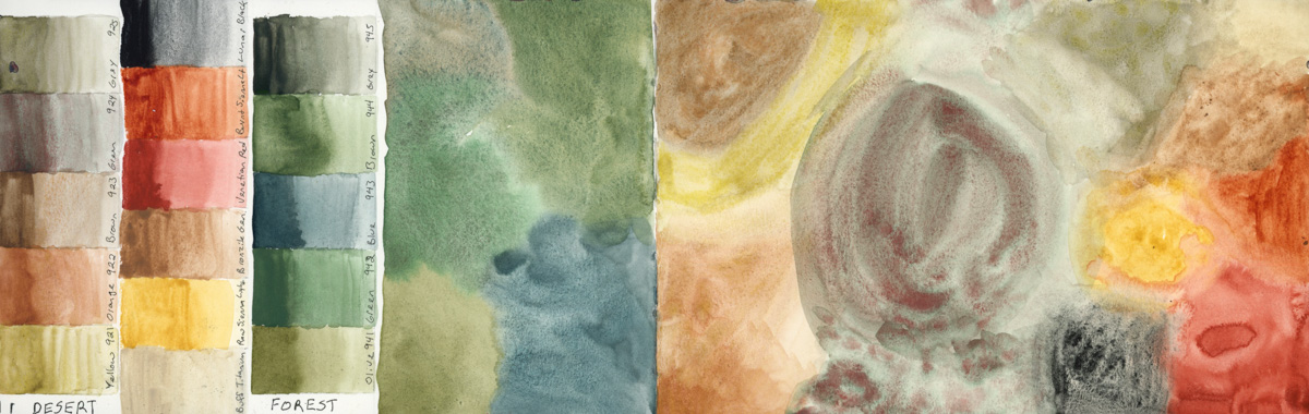
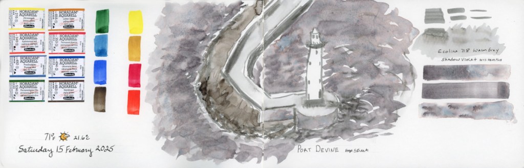
I am going to be traveling with family later in April, so I wanted to test the two desert paint palettes I have to see if I should bring them with me. One is the Schmincke Supergranulating Desert set. The other is Daniel Smith’s Earth Desert to Mountain. Then I decided to test the Schmincke Supergranulating Forest set, as I’ll also be among the pine trees. I haven’t decided what I’ll bring, but I certainly am beginning to feel the vibes here!
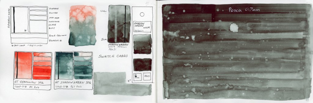
Since I had out the Supergranulating box, I noticed I hadn’t filled in the swatch card they provided with it, so naturally I had to begin swatching the rest of the colors! So I did another Haze page, and then Shire.
I had some paint left over from the shire tests, so I filled a page with that. I also wanted to put the Alex Boon recommended set of 24 as a reference in this Delta book. I could also test the different paper, which does seem to be surprisingly different for the pencils over the Alpha/Gamma paper.
I may add text to these pages, or line sketches. Though I may not have the time, in which case, I’ll just opt to move on and leave the pages as is, capturing the busy-ness in slightly unfinished pages.
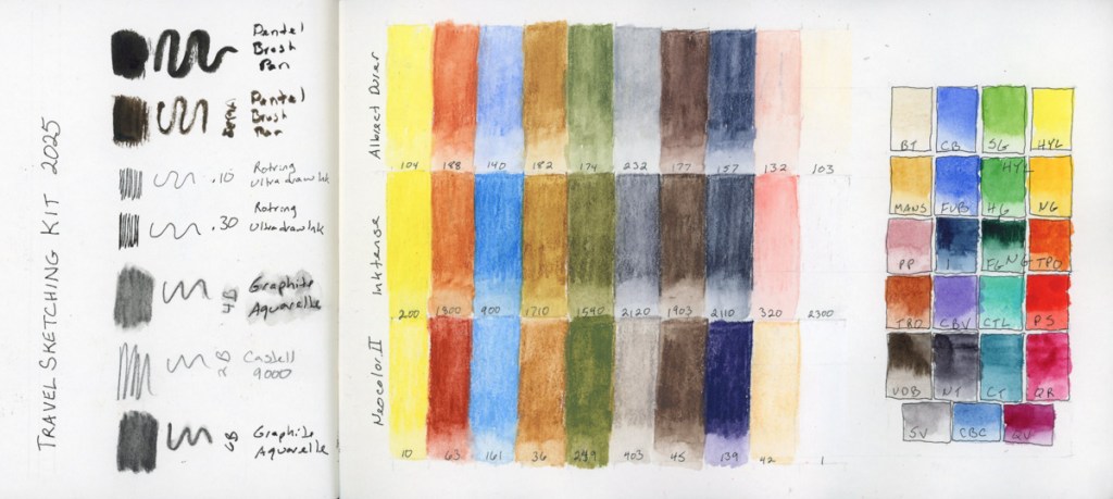
My second run through Liz Steel’s Travel Sketching course and I’m excited about it. I learned so much the first time! This year I’ll be traveling one of the weeks of the course, so I hope to use the skills I learned last time, refresh the skills this time, and hopefully get some real travel sketching done on location!
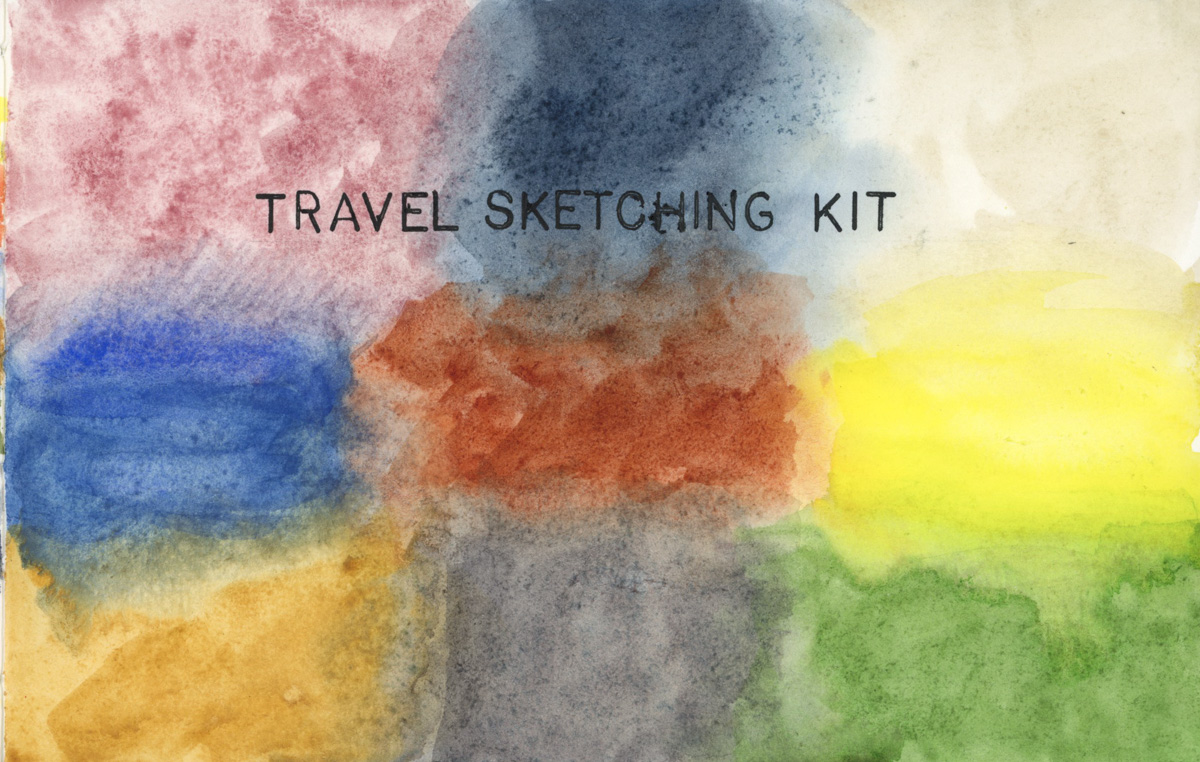
Here are my materials for the class. I’m using the same palette of watercolor pencils as she recommends. I’ve been using this palette since the first run of the class, and they are excellent. I am adding the same palette in Inktense pencils, and in Neocolor II so I can learn the differences in the media, while keeping my familiarity with the colors.
I’m using my standard watercolor palette that I’ve been using for a few years now. While I want to make a few changes to this, I won’t before my trip, or before class, so I can use what I know. I’ll be using the recommended A5 book size, with a Stillman and Birn 8.5 x 5.5 inch softcover Delta Series. The paper is ivory colored, cold press surface, and 270 gsm.
Another color chart with the Travel Sketching Palette, this time on the Delta Series paper. Very interesting, and different results over the Alpha or Gamma Series papers. I’m surprised. The page did not curl when wet with paint. It developed this very interesting granulating effect. I thought the paper was disintigrating, at first, but then I realized it’s just taking on that texture when painted. It seemed my paints appeared less pigments, but the colored pencils appeared more pigmented. All three types of dry media look more vivid on this paper, it seems.
I continue to be surprised by the Neocolor II. They are so smooth and easy to work with. I have only done one sketch with them, so I look forward to learning more. They activate with water beautifully, too, as seen above.
I’m tempted to pull out this same palette of colors in the Gansai Tambi, too. That could be good fun. The same palette, many media.
I’ve been in a lot of conversations lately about Inktense, and heard a lot of questions about them, which makes me very curious to learn the answers. I’ve done a couple sketches with them, but my goal has mostly been to compare them with Albrect Durer watercolor pencils. One question I’ve heard is what makes them different from watercolor pencils. This is perhaps the question I seek to answer first.
They lay down like watercolor pencils. The lead is a little softer than Albrect Durer, so sharp tips break off. However, sharpening with a knife or using the sticks could fix that. I find it challenging to find which color I’m looking for in my kit bag, when I’m on location, because the pencils barrels are painted black, and the leads don’t always look like the color they put down. (I’m looking at you Amber and Tan whose leads look green, but they lay down as muted yellows.) The color indicator on the end could help, but I am reluctant to store my pencils tip down, especially with a soft lead. Maybe a roll-up pencil case is the solution?
Because it is a softer lead, it is maybe easier to lay down a thick layer, when I want strong color. Once they are activated, the literature says they are permanent like ink. I haven’t tested that with applications like watercolor over the top. They are vibrant, intense colors with strong pigment, which I like. The pastels I tend to get with watercolor pencils is nice, but I yearn for more color. That might just be my own lack of skill showing, however.
Once the Inktense is activated with water, I find it much easier to put a second layer on top once it is dry, than I do with Albrect Durer. That makes it easier to keep working with them in layers. Especially on location, as I live in the desert, and my pages dry very quickly.
These are my first observations on them. I’ve owned my Inktense pencils for a very long time, and rarely used them, so I’m quite keen to make use of them and learn more.
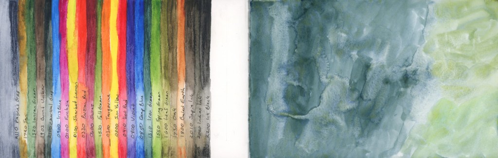
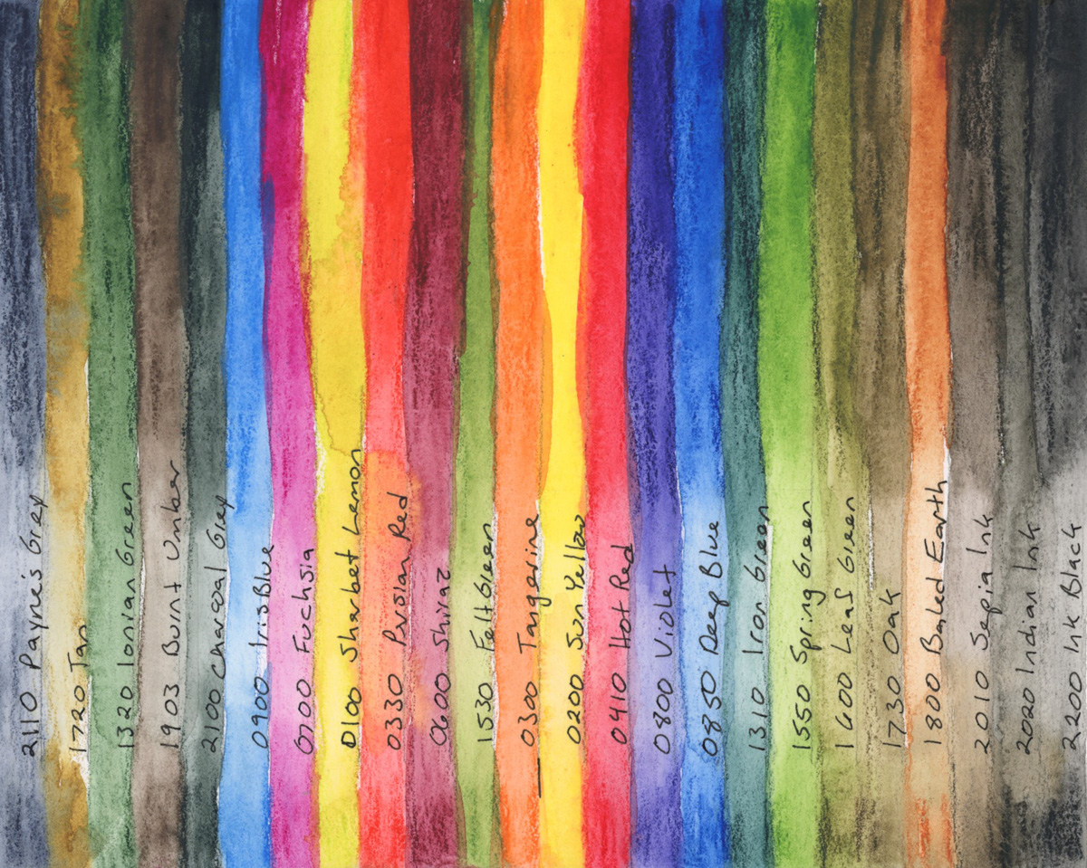
Alex Boon Art on You Tube has been very helpful for me in selecting colors for a palette to carry. He is a Nature Journalist, and he has a few limited palette recommendations. Here are his 12 and 24 color recommendations.
For 24, also add: 0200 Sun Yellow, 0850 Deep Blue, 0410 Hot Red, 0800 Violet, 0850 Deep Blue, 1310 Iron Green, 1550 Spring Green, 1600 Leaf Green, 1730 Oak, 1800 Baked Earth, 2010 Sepia Ink, 2020 Indian Ink, 2200 Ink Black.
I wanted to see how they work on the Delta paper, so I did another color chart.
I begin to think the Delta paper is working better for the Inktense pencils! The colors seem richer, and they definitely smooth out with water more easily. Interesting.
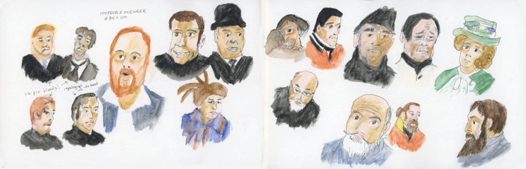
I’ve finished my 19th sketchbook. I have done a lot of color charts in this one, as well as Foundations coursework. I have sketches done from my Stonecreek walks. I have been rather experimental in doing more design with color charts, evolving into a new exploration of abstracts. I did 100 People in One Week in this sketchbook, too.
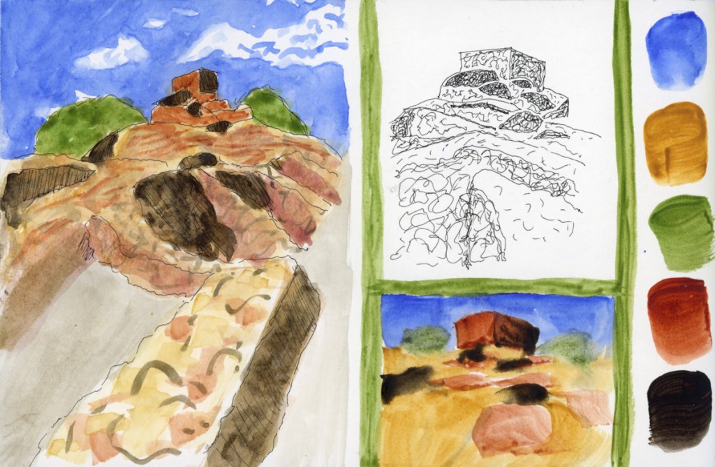
I begin the book with the Liz Steel Patreon community challenge to focus on negative spaces and painting. For the March challenge, I worked to the edge. April is foreshortening, and I end the sketchbook with a foreshortened view of Tuzigoot, which is also a nice finish to Foundations.
This book the Stillman and Birn Gamma softcover, 8.5 x 5.5 inches. 150 gsm, Ivory, Medium grain, with 46 sheets.. Same paper as the Alpha, but Ivory colored. I find I rather like the soothing ivory color. I did not particularly notice the color affecting my paint mixes for anything other than skin tones. Most of my sketchbooks have been Stillman and Birn Alpha, so this has been quite comfortable.
I continue my personal challenge to work through all of Stillman and Birn paper types, using this softcover 8.5 x 5.5 landscape size. Volume 20 will be the Delta series, with heavier weight paper, as I begin the Travel Sketching class. I’m not ready to let go of the Ivory paper, just yet. I’m also looking forward to experimenting with heavier water flow exercises like in the Painting Yourself Calm book by Jean Haines. With fewer pages, 26 sheets, I’ll move through it faster, which hopefully will be good timing for a new sketchbook to coincide with a family vacation I’ll be taking in mid-April.
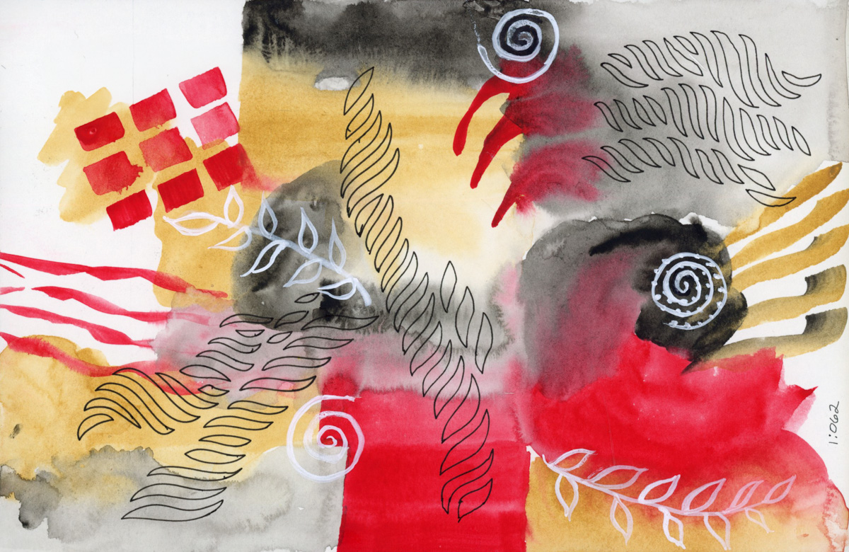
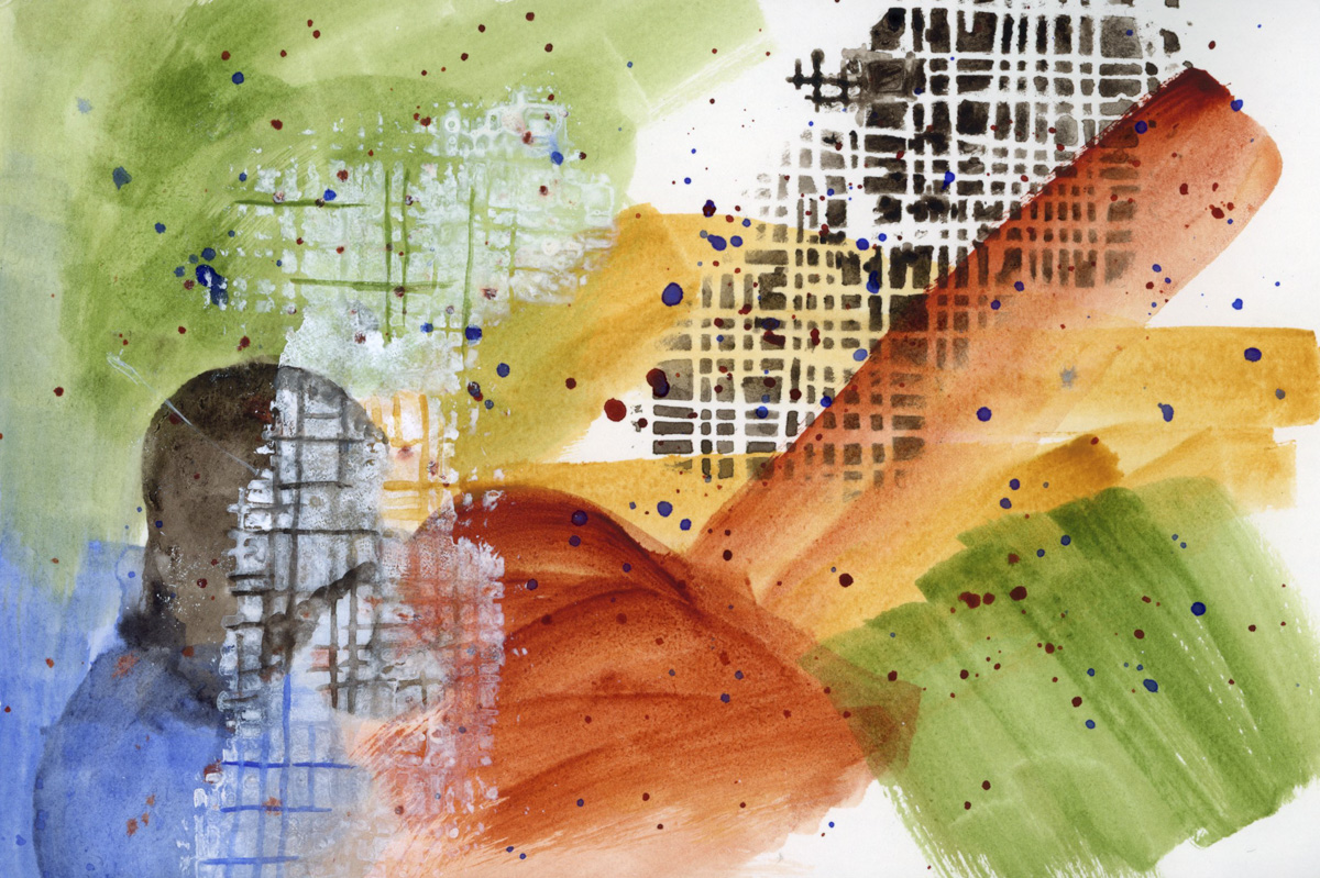
I’ve been working toward increasingly abstract options for my color chart examples. I have read a couple books, and been inspired by a couple artists. So I dove in to attempting a fully abstract, color exploration abstracts. The first was done because I really liked the colors I used for the Tuzigoot sketches, so I wanted to explore the same color combination in an abstract. I really love this one.
I also tried a plastic stencil with watercolor. The first effort, which is the Van Dyke Brown, worked great. I used a dry brush. The second effort was the white Acryla Gouache, which bled more because my brush wasn’t dry enough. I think I can get these stencils to work pretty well, though. I like how they look.
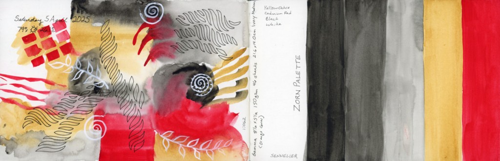
My second abstract attempt was using the Zorn color palette. Anders Zorn, a Swedish painter born in 1860, is attributed with this very limited color palette because he excelled at it. He worked with oil paints, using Yellow, Red, Black, and White.
I used a set of Sennelier paints: Bright Red (NR), Yellow Ochre (PY43), and Ivory Black (PBk9). The white doodles painted on top are done with Acryla Gouache.
Though I did not attempt any color mixing for these abstracts, from my research the Zorn palette is amazing at skin tones, and I’m definitely curious to try that. I do wonder what red pigment he actually used, however. One source said he used yellow ochre, ivory black, vermilion and lead white. Modern substitutions recommended are Cadmium Red Light, and Titanium White. I may have to explore the Zorn palette more fully.
Here are the full page spreads with these abstracts. I painted three values of the Ivory Black, plus the Yellow Ochre, and Bright Red.
I will definitely be doing more of these abstracts.
Wow! I did it! I completed every single exercise. I learned a lot about why I have not been successful in the past, and it’s mostly to do with life interference, and health issues.
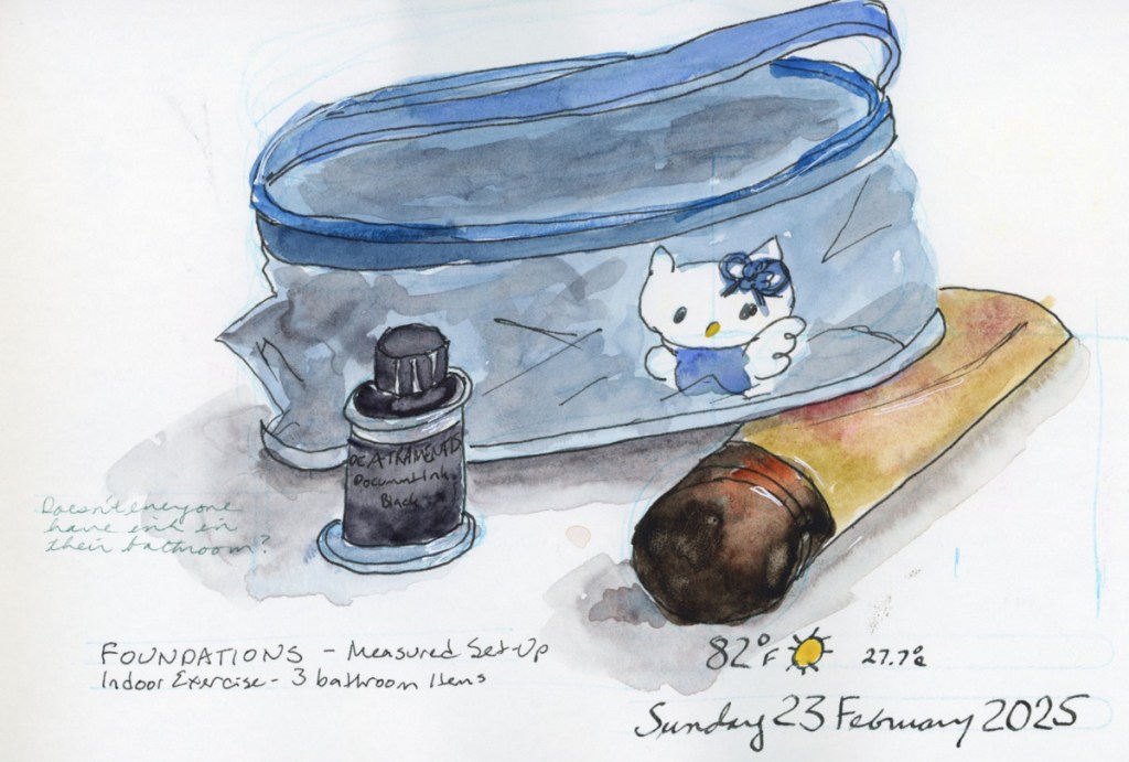
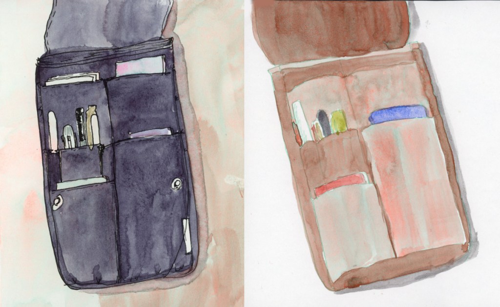
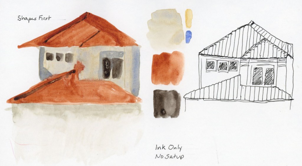
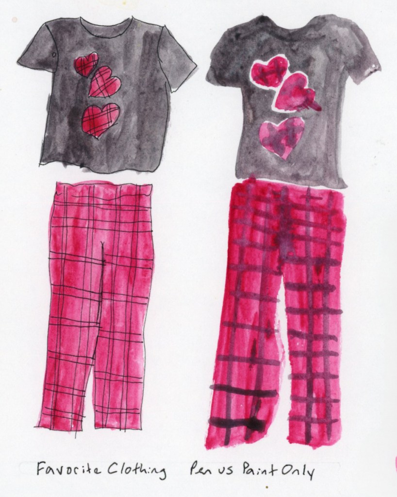
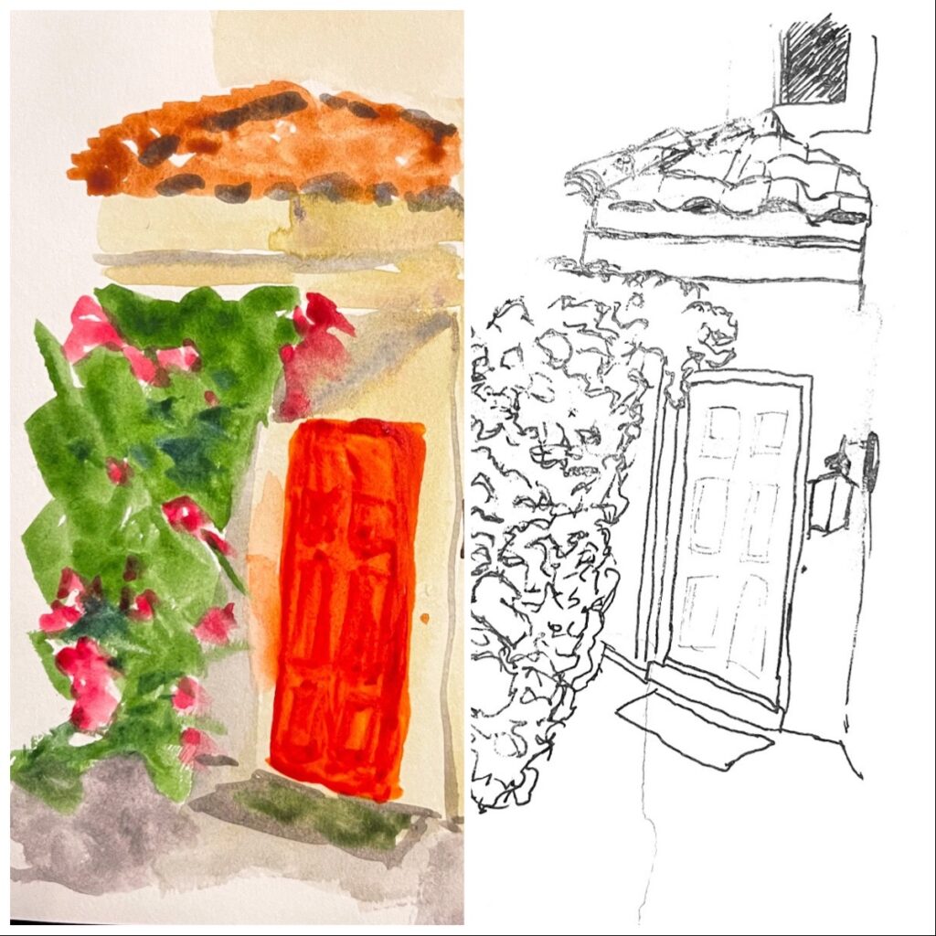
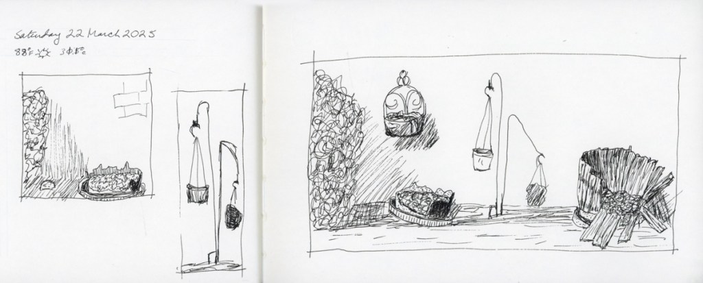
20253 bathroom itemsa doorDoorsBackyardPark at PV
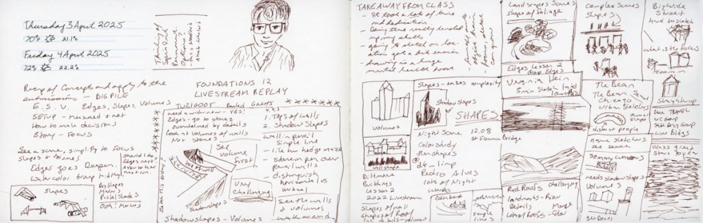
Here is the whole collection of exercises and I am so grateful for all I’ve learned and how much my drawing has leveled up. I’m not sure I can put what I’ve learned into three takeaways that relate to the lessons themselves, as much as to what pushing through to complete these assignments taught me. My skills certainly improved, but having taken the class five times before, I can’t say the words were new. Applying it massively helped. Pencil miles helped, as John Muir Laws calls it.
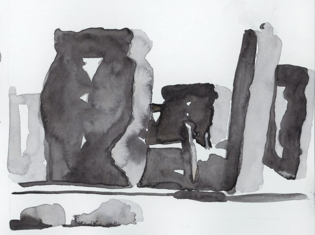
Many of my sketches still don’t have the look I really want to achieve, but I finally do understand that is about skill and practice. I need to learn and continue to improve things like depth, and dimension in my drawings. I also realize those are lifelong pursuits, not a once and one sort of learning. The learning spiral, as Liz Steel describes it in her class. I’m really proud of some of these sketches, as they definitely represent a level up of my skills. Particularly the chair, Stonehenge, and the sink.
On to the next. Travel Sketching is running as a live class in April. I will be traveling the first week of it, so I’m going to try to get those lessons done ahead of time. I will also try to apply the techniques to my travel sketches while on an actual vacation! I tend to not due to anxiety, but we shall see. I begin to realize that lots of practice in advance might be the secret to having the skills to overcome the on location challenges.
I may also do Edges as an independent study. I’ve never done that course, and I think it comes next in terms of building skill. I haven’t decided yet. If not now, I’ll certainly join it when Liz next runs it.
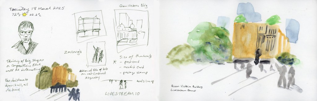
For the final livestream of class we were asked to submit a scene we thought was very challenging to sketch and she would select a couple to discuss for our final review. I was lucky enough that she chose my photo of Tuzigoot National Monument.
I took notes, and then attempted to sketch this view following her advice, and the techniques learned in class.
Not bad for my first attempts. I actually learned a lot by doing three versions in a row. One thing I certainly learned is I need more practice drawing these kinds of ruins, if I want them to make any sort of sense to understand what is going on. All that stone on stone on stone, yet to create the depth and shading to visually represent the many rooms, and layers. Plenty to practice!