Using ink sketches for today’s people. It is certainly faster, but not exactly easier. When you get a line wrong, it really shows! Unless it’s in the hair. Hair gets lots of lines, so a wrong one doesn’t show as much! Ha!
I’ve done 48 sketches so far, in 3 days! I don’t think I got that far last year, but I’d have to look it up. I haven’t scanned that sketchbook yet, either, so I can’t share them now. The first year I tried it, I did gestures, and I only did 47 of them, but there were fun to do!
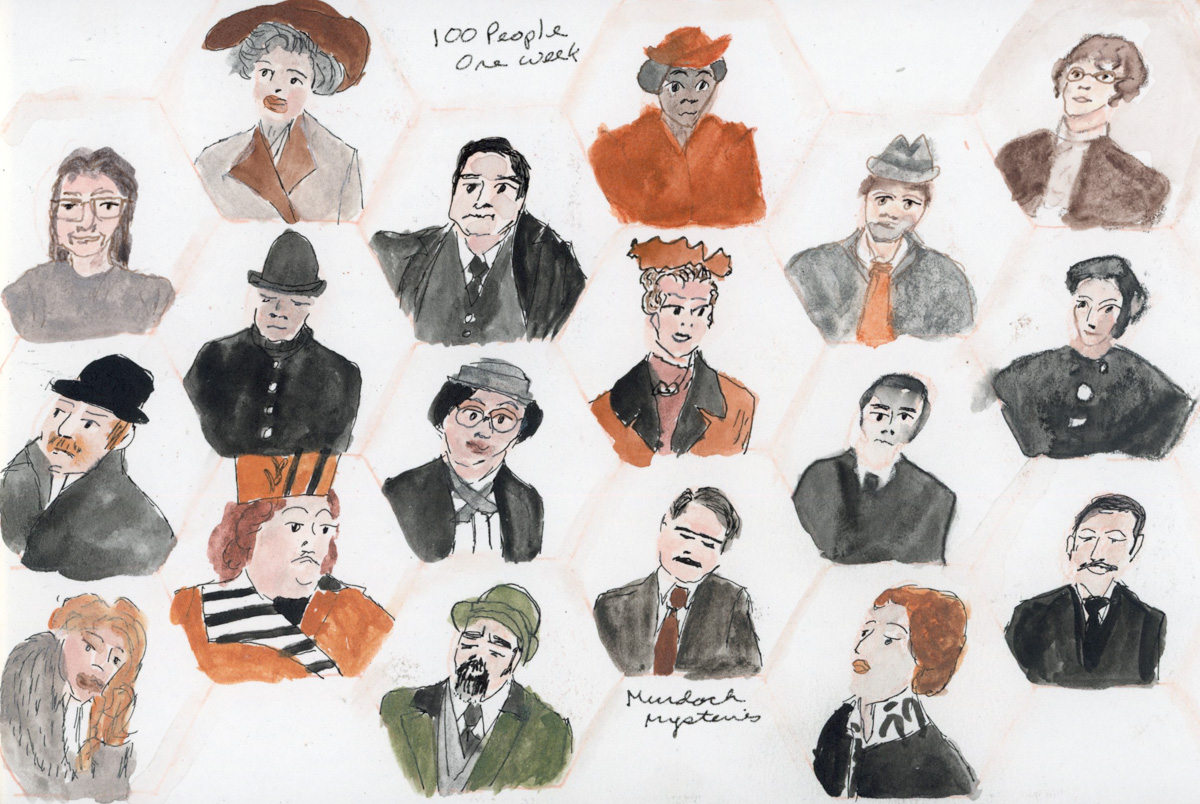
I’m participating in two challenges this month. One is the annual 100 People One Week challenge hosted by Liz Steel and Marc Taro Holmes. Last year I surprised myself by doing better people sketches than I thought I’d be able to, so I have to do it again!
The second challenge is from Liz Steel’s Patreon Community which is To the Edge. Take your sketches to the edge of the page. I’m intrigued by this one, because I do usually keep a border.
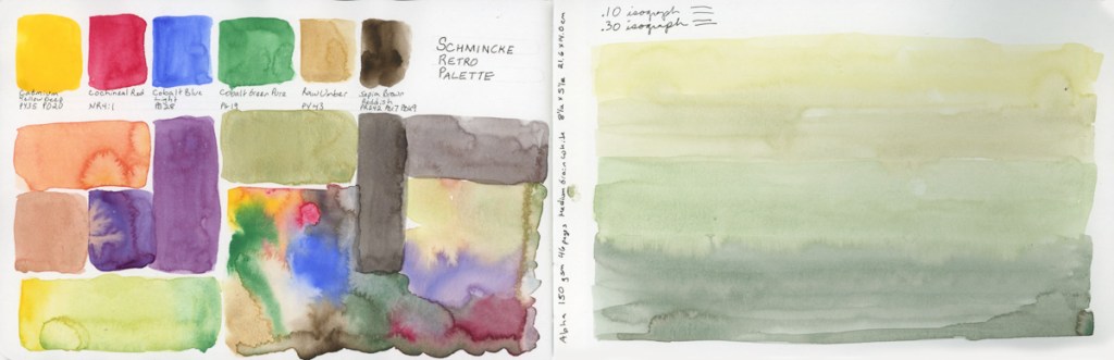
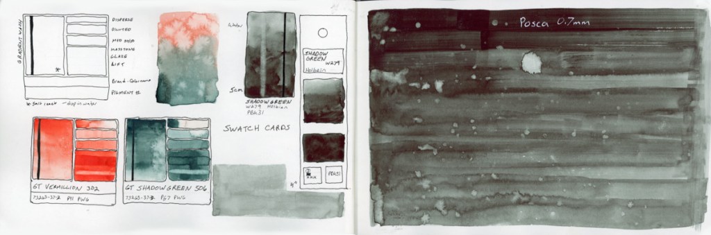
Naturally, I started by swatching paints. I decided to swatch the latest purchase of watercolors I made a couple weeks ago. I took the design element to the pages edges and really like the look of that.
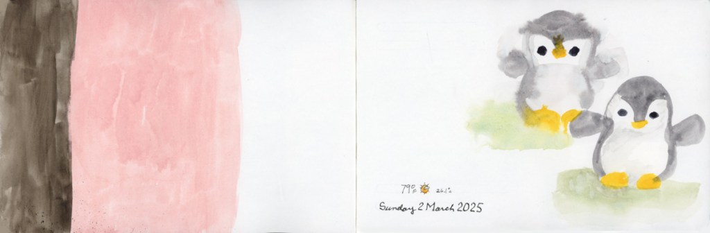
Color blocks to use up left over paint. I was going to sketch a line drawing on the color block, but then I didn’t, and now I’ll just leave as it is. I did paint my cute little penguin. I painted it twice, and I laugh because the wet on wet technique (resulting bleed) to the paint on the head, gives it a more tufted look. Somehow, just that one error, and it looks like I painted an owl! This makes me smile, so I left it.
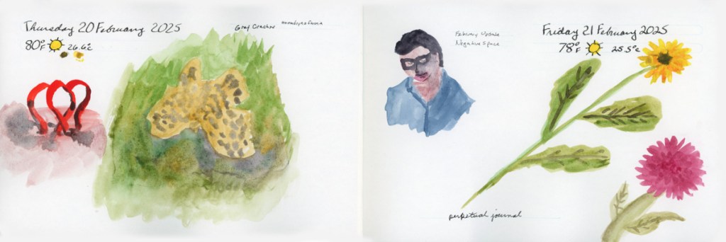
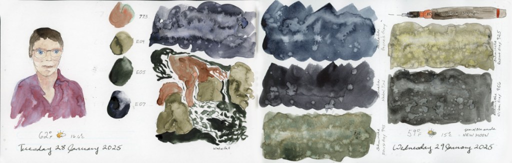
I color swatched my newest purchase, the Derwent Shades and Tones color palette (it has a combination of inktense paints, tinted charcoal, and more in it.) I wanted to sketch something else with this palette, so what better than the current week’s 100 People One Week challenge? So I set to sketching Murdoch Mysteries, which I was watching. (I also did one self-portrait. I’ll try to do at least one per day.)
Loving these people. This took more time to be so careful, but it was worth it for the first day! I’ll be using speedier techniques and different mediums each day, or each page. We’ll see.
The next day, I put an effort to not only speed up, but test the difference between the two pencils: Derwent Drawing Terracotta, and Faber Castell Pitt Pastel Sanguine. More Murdoch Mysteries portraits (and one self-portrait.) The pastel pencil is chalkier, as expected, but richer in color. To keep these from smudging too badly in the sketchbook when I close it, I use fixative when I’m done drawing.
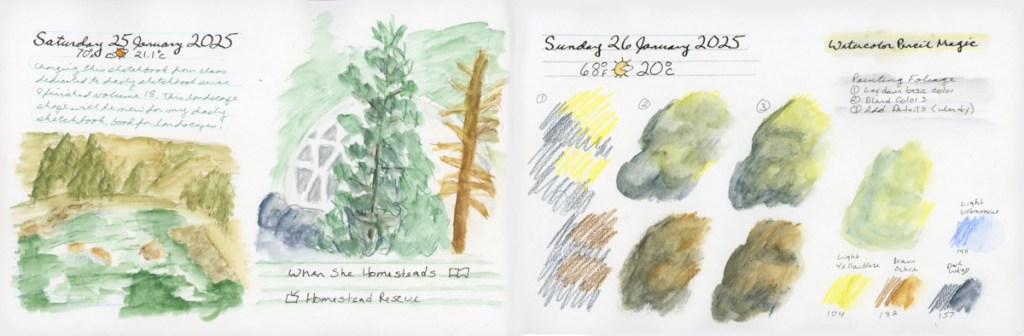
I started the new sketchbook, volume 19, with a Stillman and Birn Gamma, 8.5 x 5.5 inch, softcover landscape. This book has Ivory pages, but is the same weight and texture as the Alpha paper I usually use. I’m curious to see how the ivory paper goes for me.
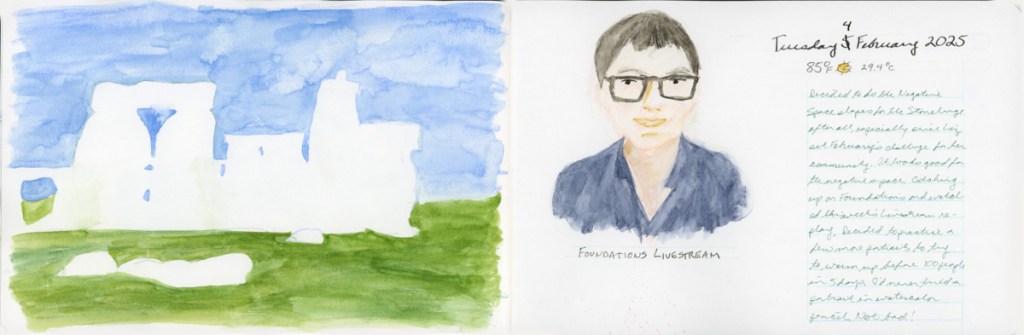
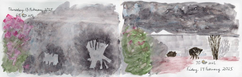
This month has a challenge suggested within Liz Steel’s Patreon, to paint using negative shapes. So I tried that with my backyard on a very grey and rainy day. Not sure I got the planters very well, using negative shapes, but they are certainly expressive of the grey day!
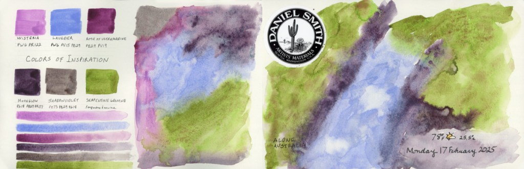
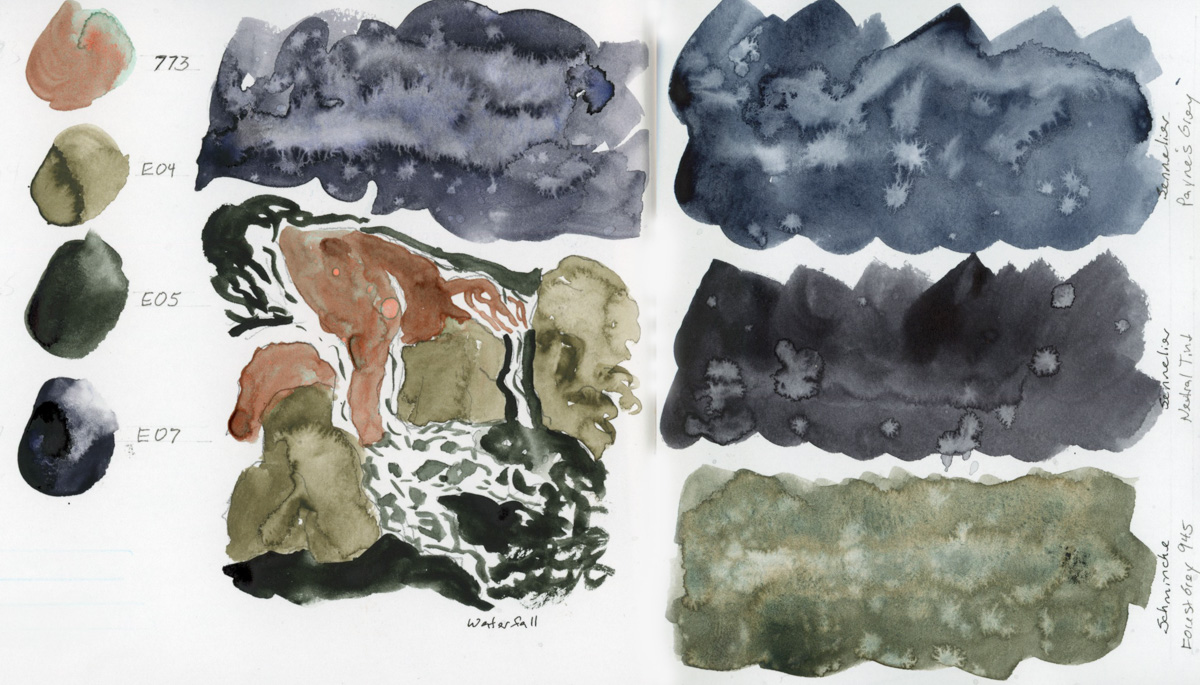
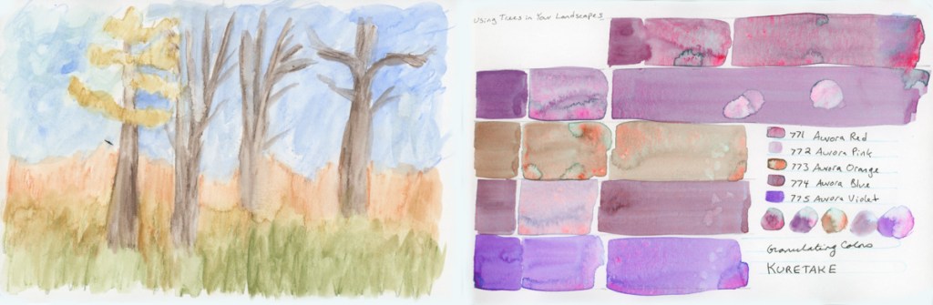
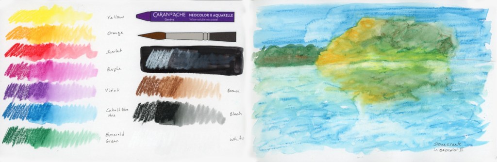
I really began to explore a lot of color charts, and palettes, from a variety of media. With the color charts, I am beginning to explore means of using the colors in some sort of painting to see what they can do. The Colors of Inspiration watercolor palette from Daniel Smith. Gansai Tambi paints are quite interesting to work with. I warmed up with a couple people sketches, since the 100 People One Week challenge is coming up the first week of March. I swatched my current set of Inktense pencils, as I’m curious how are they different from watercolor pencils?
I did select colors to match the Travel Sketching Palette of pencils I’ve been using, so I could do a fair test of like colors.
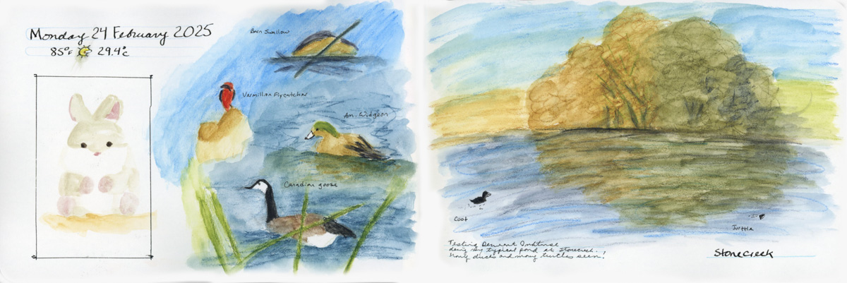
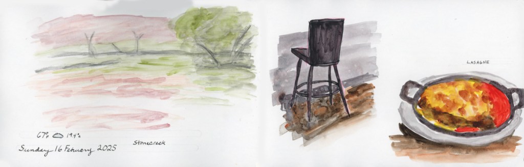
To test them out, I took them out for my walk to Stonecreek and used them where I’ve been using the Albrect Durer pencils. They are a bit softer of a lead, and it easier to go over them after they’ve been activated with water. Once they dry the literature says they are permanent. I rarely go back over work, but it’s good to know. You can get the same vibrancy of color with both, but it perhaps takes less work with the Inktense.
I started my sketchbook volume 19 with a 6×9-inch Stillman and Birn Gamma softcover sketchbook. This is the same paper as the Alpha (150 gsm, Medium grain) but in an ivory color. I thought that I might try each type of paper, starting with the various offerings of Stillman & Birn, using the same size, to really learn how the papers work for me. It’s a nice small size, so I can go through them quickly.
The Ivory paper is nice, it seems softer to me, somehow. I don’t actually notice the difference much, except for portraits. I have to adjust for the yellow when I try to do skin tones.
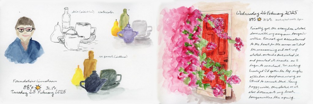
I’ve been warming up on portraits in preparation for the 100 People One Week challenge the first week in March. So far with the captive subject of Livestream portraits. Not a bad way to document that I had a livestream, as it turns out.
My main subjects are the Foundations exercises, my livestreams, the weekly walk at Stonecreek Golf Course, and a lot of color swatching. (Great for those bad brain days!)
Here are my pages so far, from the Gamma sketchbook:
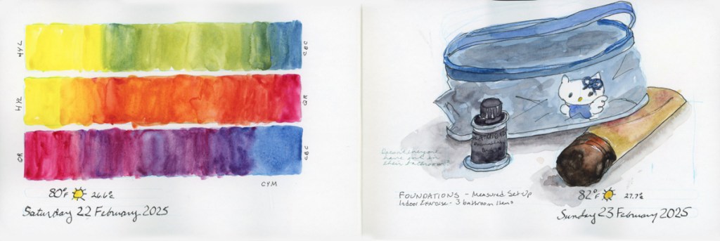
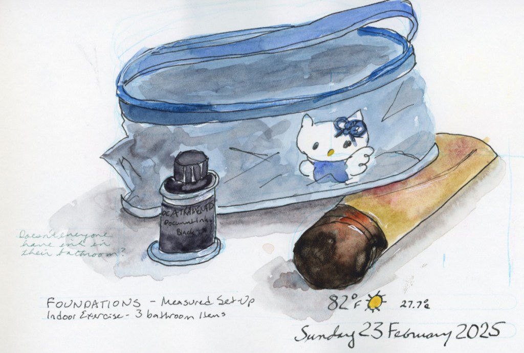
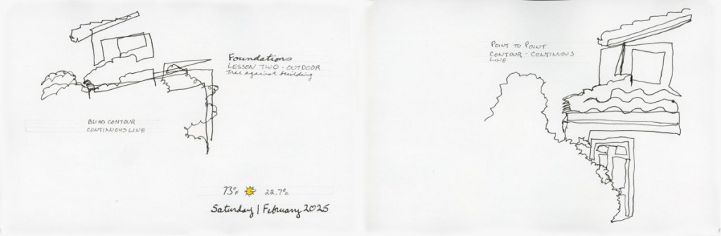
Using a measured set-up is so helpful in getting placement and proportions and even angles more accurate. I typically forget to do it, so this lesson in my Foundations class was quite helpful.
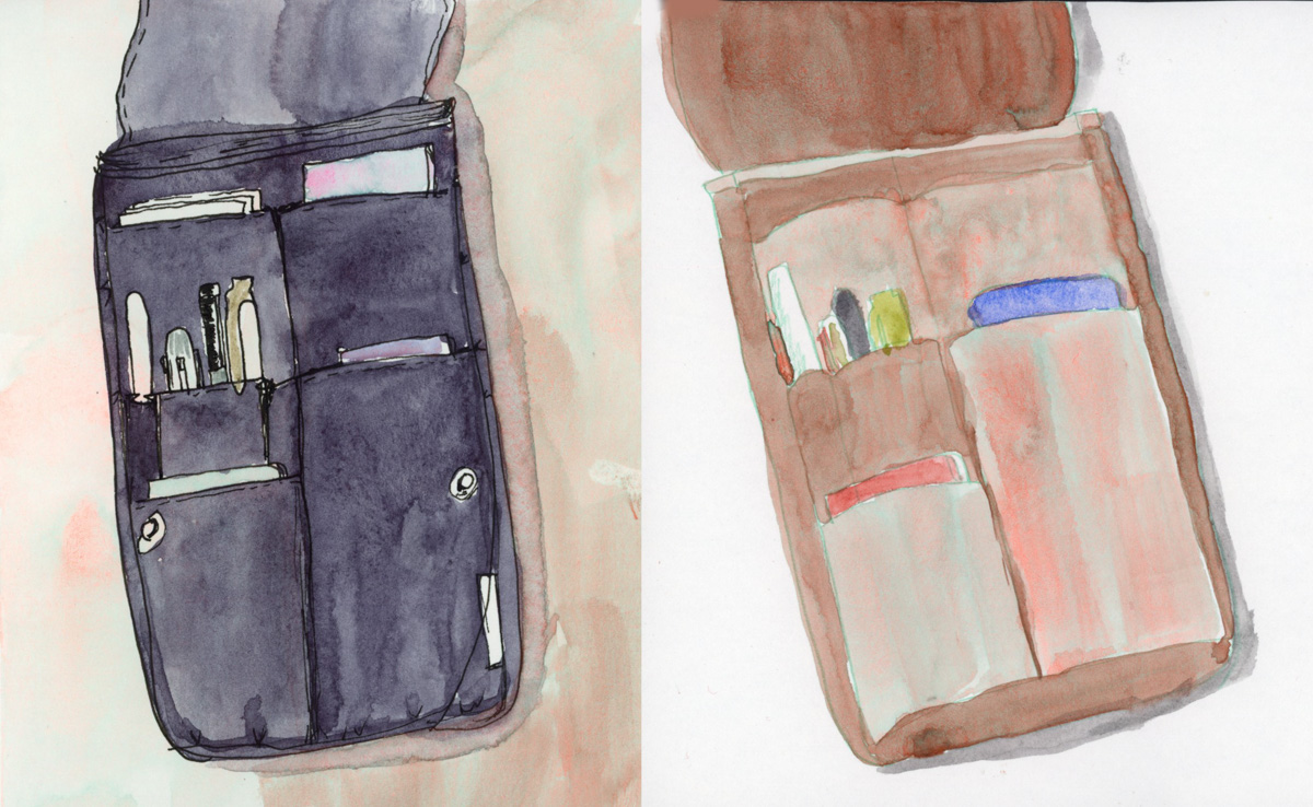
3 bathroom itemsa door
It really helped me get the foreshortened tube more accurate, as well as the door.
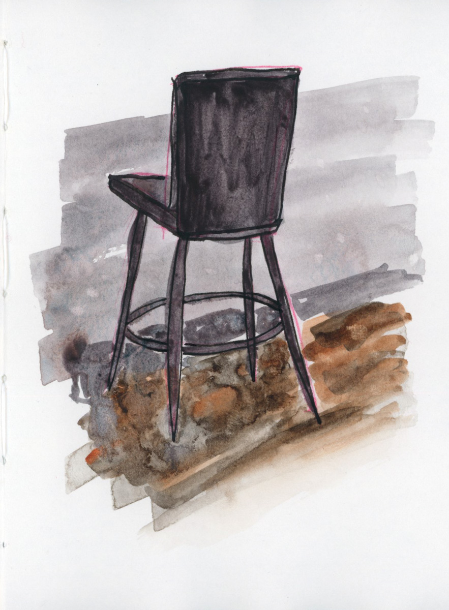
Draw a chair. Seems like such a simple exercise. This is the one that has stalled me out every time I’ve taken this class. It’s been quite the challenge to sort out all the reasons this exercise was my breaking point five times in the past.
I am thrilled that I found myself out (getting out is one of my obstacles to these exercises) and there was this fabulous chair with no one in it, right across from me, screaming to be drawn and telling me this chair is perfect for this lesson. (Which I am once again behind on for a good three weeks. Stalling out again!)
I am determined to complete all lessons for this run of Foundations, however. Even if it is taking a lot of mental work to sort through all the thoughts, blocks, and things!
My volumes guidelines are not too apparent in set up sketch, but I did draw this as a series of boxes. It really did help get the proportions more accurate.
This feels like a breath through! If nothing else, because the sixth time is the charm in completing this!
All Foundations exercises after this will be new. I’ve always gotten stuck right here, and so I’ve never completed the remaining lessons! I’m determined, however. I may be three weeks behind, but with any luck, getting through this particular block it will now get easier? Especially since I rather love this little chair sketch.
Draw a stack of books is the exercise for drawing with volumes. Books and all those angles are a very challenging subject! Likely why I’ve only accomplished this assignment twice!
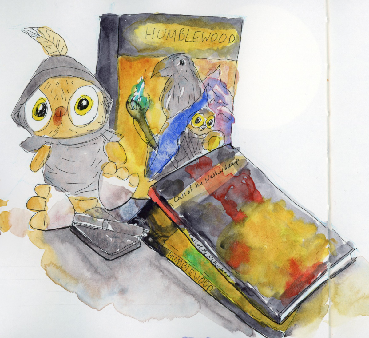
Since I chose D&D books two years ago, after I had just begun playing again. So I chose the same subject matter, only with the current campaign books I’m playing. This recording of life, and the sketches to reflect that make these pairings quite special. This is why I want to sketch and learn to sketch so much. To capture life in such special ways.
Learning tools like sketching using volumes to aid in tackling such hard subjects as stacks of books is why I keep at the classes. I am ever surprised that drawing really is such a skill that takes decades of practice to learn. People who are skilled at it make it look so easy and effortless!
When I finished sketchbook 18, I decided to make the second half of sketchbook 17 into my daily sketchbook. I’d had the first half dedicated to the Travel Sketching course, and then to working through the Watercolor Pencil Magic exercises. However, by this time I was tired of carrying two sketchbooks!
There are a lot of color tests, particularly of different palettes and paints. I was enjoying testing the various new brands, colors, etc. Exercises for Foundations, a couple portraits to warm up for March’s 100 People One Week challenge.
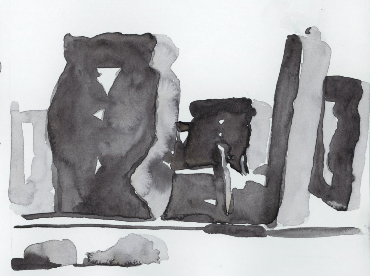
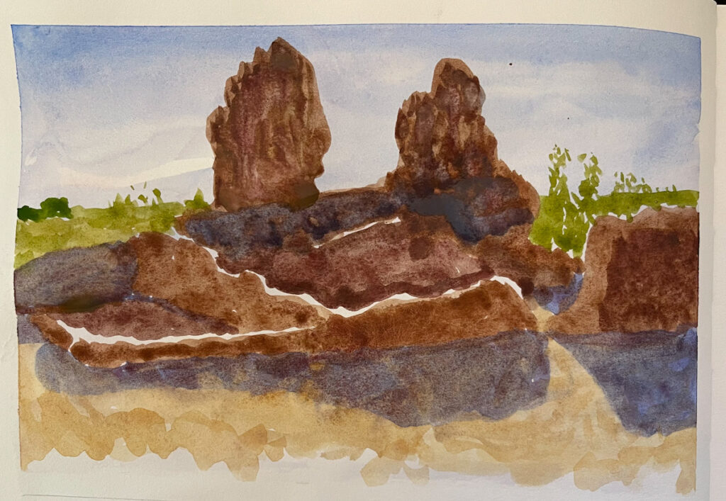
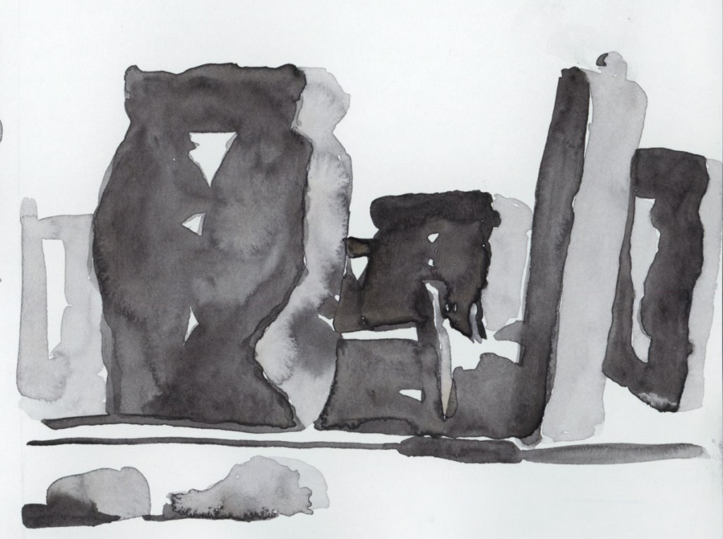
I always seem to do much better with shapes as a drawing technique than any other method. A couple years ago I was shocked how nicely the sketch of the ruins turned out. So this year I decided to try the same technique on an old travel photo I took of Stonehenge back in 2000.
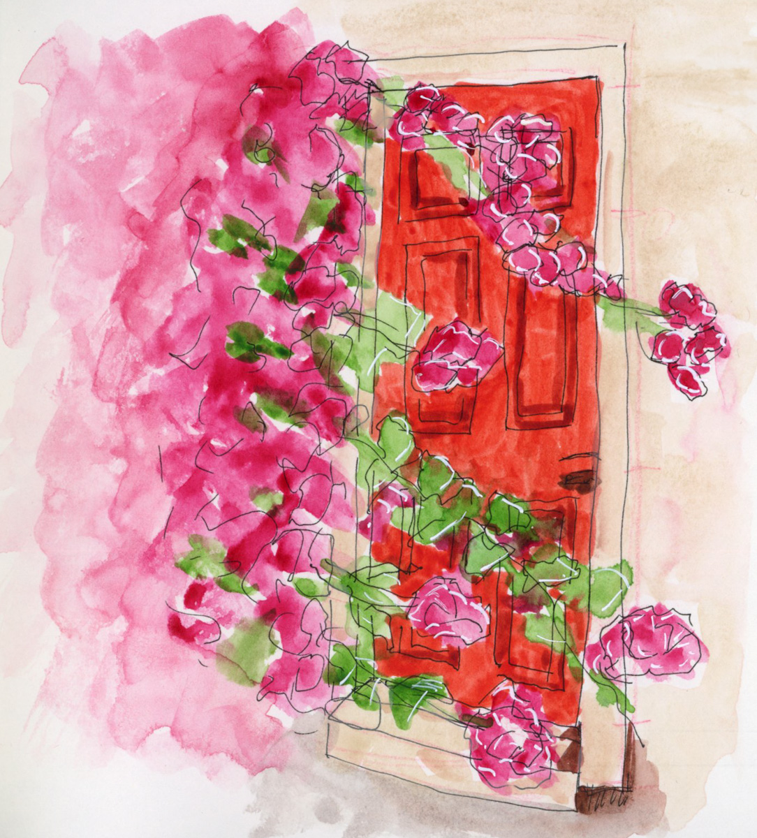
Loving how the blooms in the watercolor help add to the atmospheric nature of this sketch.
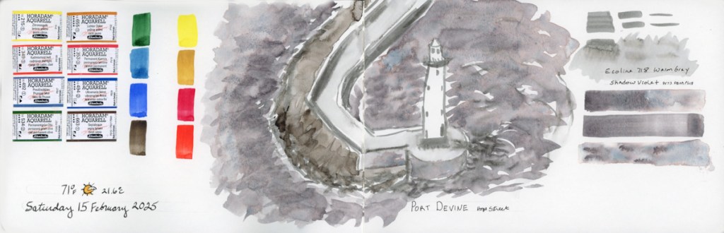
The paint is Daniel Smith Joseph Z’s Warm Grey. I had been testing grays a few days ago, and this paint was still in my palette, so I used it. I’m becoming obsessed with monochrome sketches, so I may be exploring that more in the future. What might this sketch look like in the toned Kuretake Gansai Tambi Sumi or Graphite or Blackish paints that I was swatching this weekend, for example?