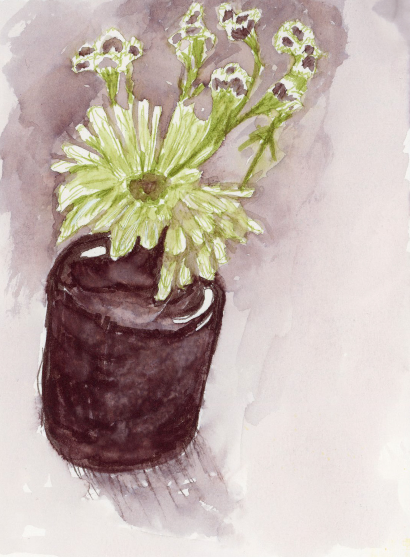
Finally, a new pair of sketches! I was heading out, and I brought my sketchbook with me. In order to get back into the swing of things, I thought I could try to push to just draw something every day. The May challenge in the Liz Steel Patreon this month is a limited palette, I decided to go pretty extreme with it, and I brought with me only two pens.
I drew the flowers on the table with just two colors of pen. These are Sailor Shikiori Dual Sided pens in colors Doyou, and Waka-Uguisu. To get the pale washes I used a palette, and a water brush, scribbling with the pen onto the palette to make a small pool of ink. I did the full sketch on location, and only did the faded background once I got home, since the white petals needed a background to show up.
My second sketch was of my grocery bags. With costs rising, I like to have some sort of record, and grocery sketches are a fun way to do that, and still get a sketch in!
Perhaps I should wait and post these with whatever wonderful sketches I will do this week? Perhaps I should not post these at all? Most would not. But I’m a completist, and I’m far more likely to give myself grace and room to perhaps sketch something after having completed this struggle week and moved on.
I love watercolor, and even simple watercolor blocks give joy.
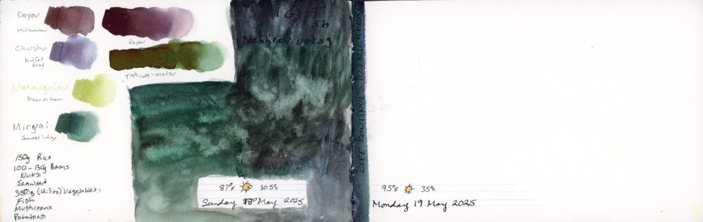
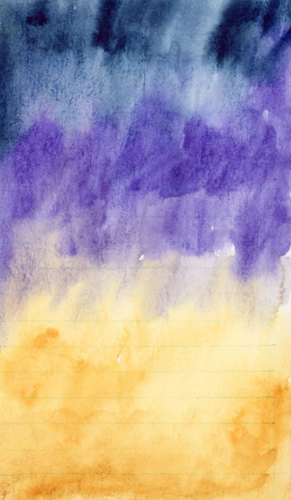
This one does a good job of showing the difficulty in smooth blends using this Stillman & Birn Delta Paper. This was actually wet on wet, but you can’t tell! These sunset colors are Indigo, Cobalt Blue Violet, and Quin Gold, all Daniel Smith.
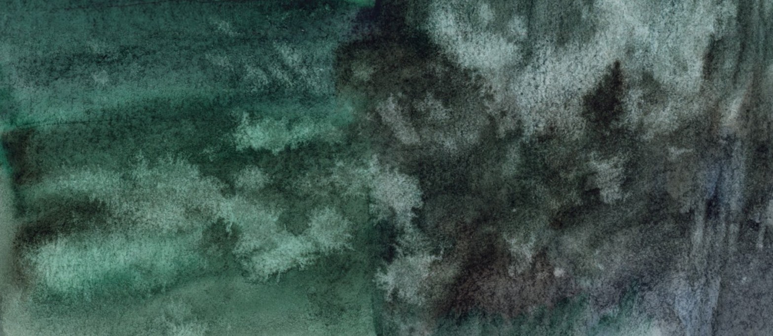
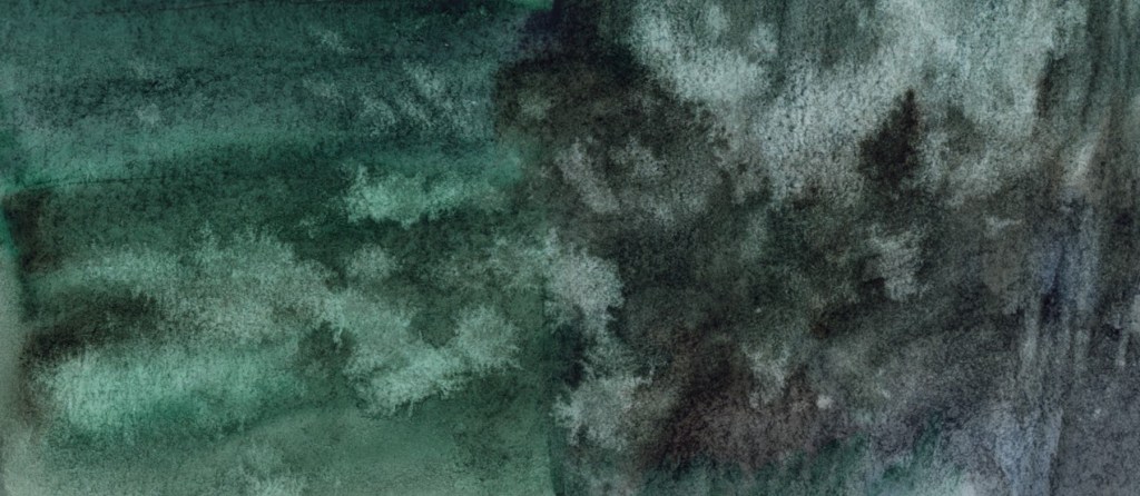
This one, I love. I used a favorite green pigment, Forest Green by Sennelier, along with Daniel Smith Van Dyke Brown, and a little Indigo to make a dark grey/black. I splashed it with water to add texture. Just playing with watercolor is a lot of fun.
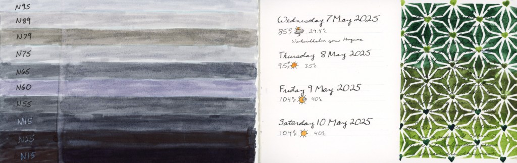
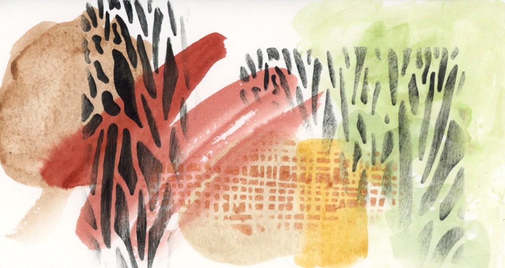
Trying to catch-up on blank pages in the sketchbook, while still struggling to sketch. So I’ve used some stencils and abstracts to get going again.
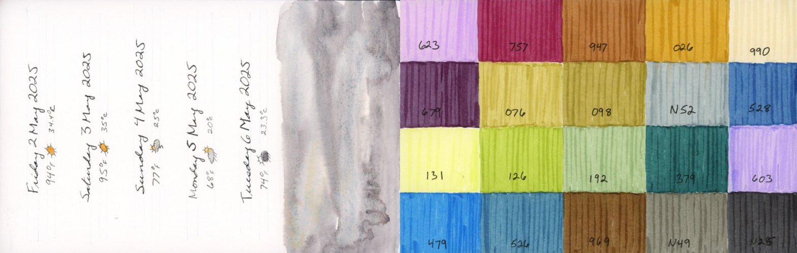
Simple color blocks representing the environment and colors around me for those days.
Here I used a stencil with watercolor paint. This works surprisingly well. I would have expected more bleeding and runs under the stencil since I’m using a wet media, but I really like the results. A flower pattern stencil to represent Easter. I faded into a gentler background wash with the idea of writing a text block there, but I didn’t get to it. I used Hansa Yellow Light, Hansa Yellow Medium, Quin Gold, Quin Rose, and Shadow Violet.
A pure abstract using the desert color palette. Daniel Smith’s Earth: Desert to Mountains. With the addition of Serpentine Green, because I live for greens. Add a blue, and I think this palette would be a perfect limited color palette for painting the desert.
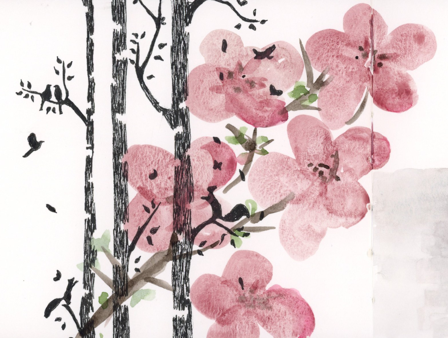
Feeling the spring vibes for May, so I took a stencil and inked it black, then painted these loose, free-hand blossoms over it. I used Potter’s Pink, Van Dyke Brown, and Serpentine Green.
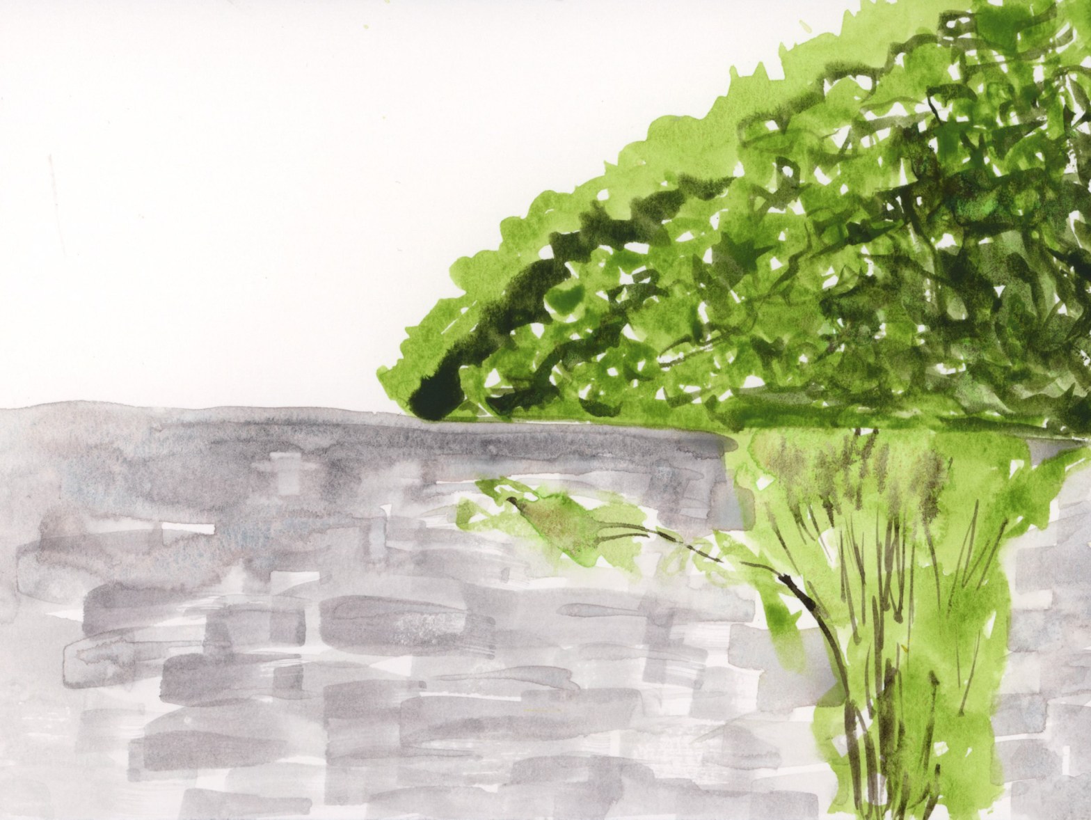
The sun was glowing on these bushes, so I had to try to capture that spring green light. Serpentine Green, and Apatite Genuine. I painted the foliage and bushes with a rigger 4 brush. I haven’t used riggers like this before, and I enjoyed it. The cinderblock wall was done with 1/2″ flat brush, trying to get the texture without overwhelming this paint only, direct watercolor sketch.
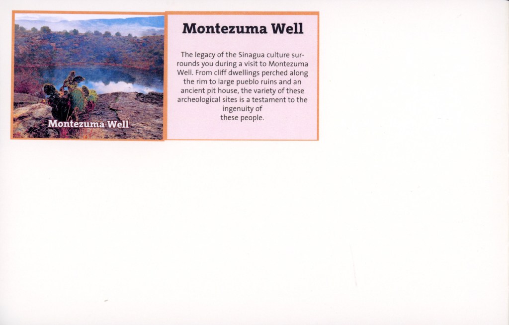
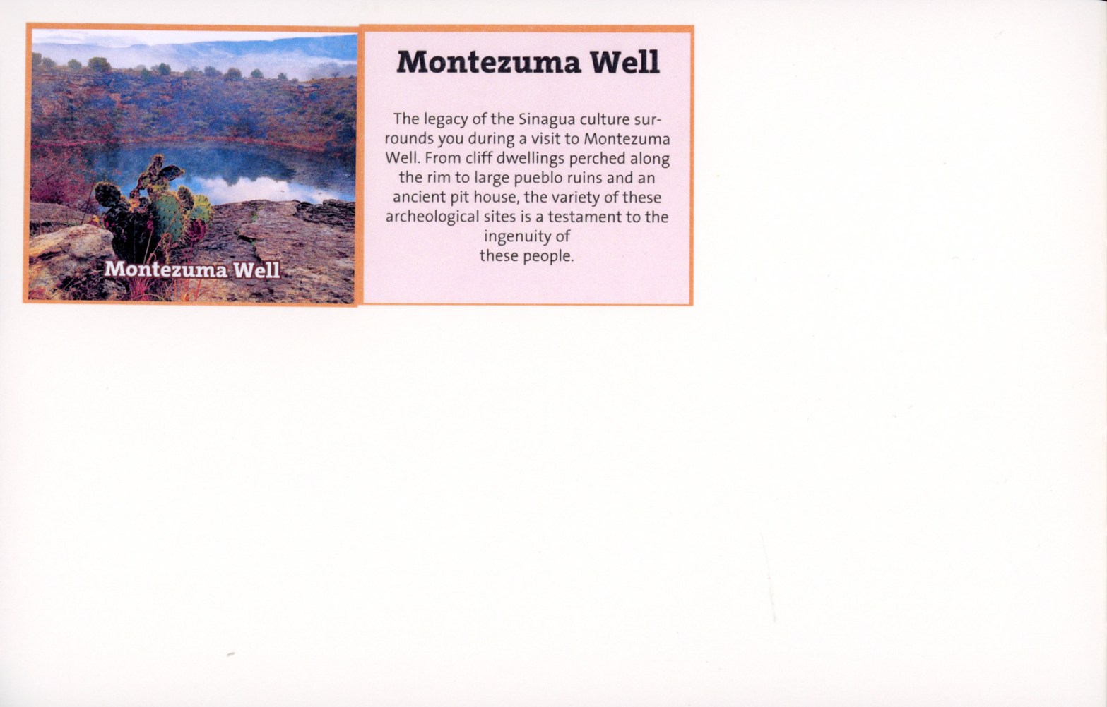
I still have the blank spaces for the Montezuma’s Well and Montezuma’s Castle to fill, but this week I filled all other blank areas. Here are the full pages:
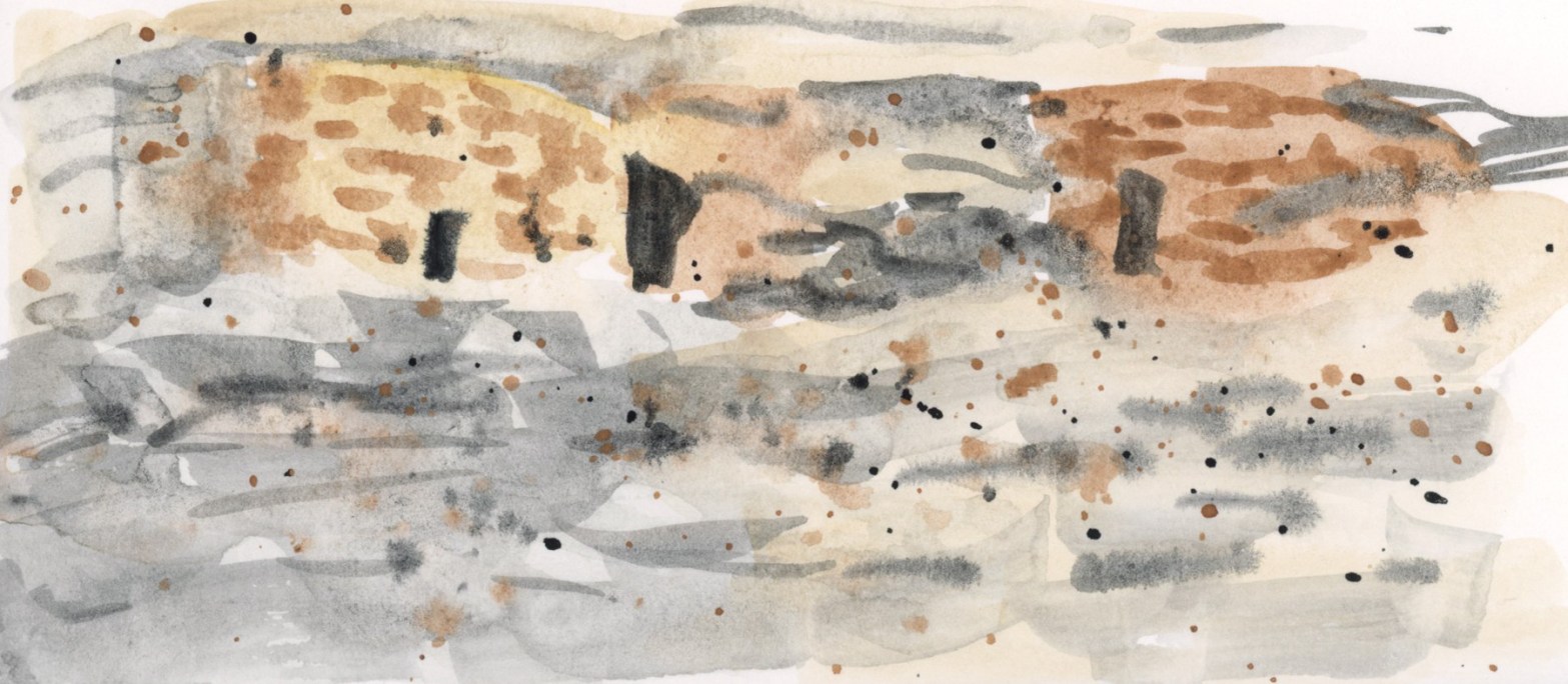
Struggling to sketch, but I did get this one scene from Montezuma’s Well painted onto that mostly empty page of my sketchbook. Still more to fill.
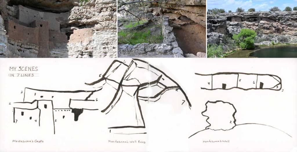
I did the Seven Lines exercise for Travel sketching, but felt the pages looked too barren in the flow of this particular sketchbook, so I gave those pages some background colors to also help differentiate the multiple sketches per page.
I am improving on doing these slightly textured background washes.
Travel Sketching has begun, and I’m definitely needing the practice! I recently traveled and did not sketch on location. Still working on that! It was so crowded I feared I’d be in the way too much, hogging a bench, etc. Therefore practicing very fast techniques should help in the future.
My family vacation was cut short, and between the chaos of getting ready, and the unexpected return, my sketching took a hit.
I do not even have the dates and weather yet for Friday through Sunday! Needless to say, I did not sketch on location anywhere. The struggle is real!
I am hoping I’ll have loads of time and fill in all sorts of sketches and memories from photos. Loads of time seems quite unlikely. So maybe I just do color abstracts that capture the sights and experiences? I could also just leave these pages as is, with the barest of dates and stickers. Turn the page and start clean. I’ll see how this week goes, but I know from experience I can’t let blank pages go too long or I stall out completely. I’ll give myself Monday to see how the week looks, and whether I think I can steal time to fill in sketches, or do those color abstracts.
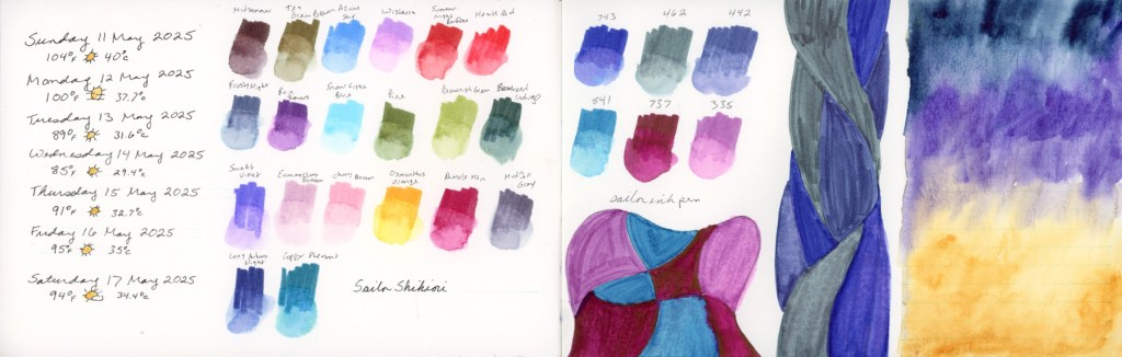
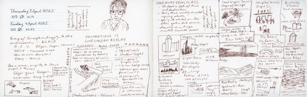
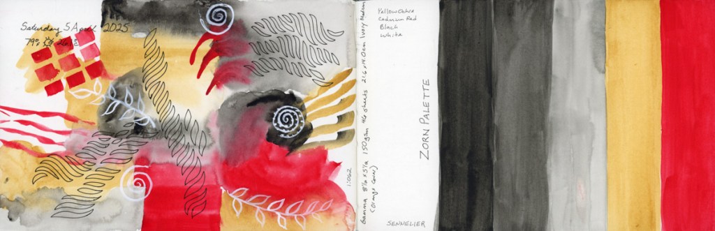
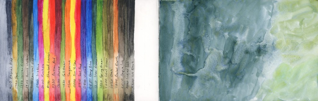
This week’s sketching. Not much sketching this week, actually, but plenty of color swatching.
I swatched the rest of the supergranulating paints. I have had the big set for a couple years, and never swatched it, so now it is very nice to have that done.
I’m not sure what I think about these supergranulating paints. For the most part, they do granulate beautifully. A lot of them seem a little pale to me, unless I am really painting it pasty thick. There are a handful, however, that I thought were really interesting and lovely. But as ever, to really know a paint, it takes more than a color swatch. I haven’t color mixed, nor have I painted subjects with them.
Color swatching, however, is a great calming activity. Like Jean Haines’ book title, Painting Yourself Calm. Though her technique is all about lots of water and flow, I find color swatching quite soothing, too.
I’ll be on a family vacation this next week or so. I intend to sketch, and I hope to post a bit about it while on vacation, but I don’t know if I’ll have the time, or the means. If not, I’ll certainly post afterwards. I haven’t actually travel sketched much, though I really want to. Travel sketching, and sketching on location, is a big mental block, so let’s see how I do next week!
If nothing else, I know I’ll take a lot of photos, and I can always sketch them later!
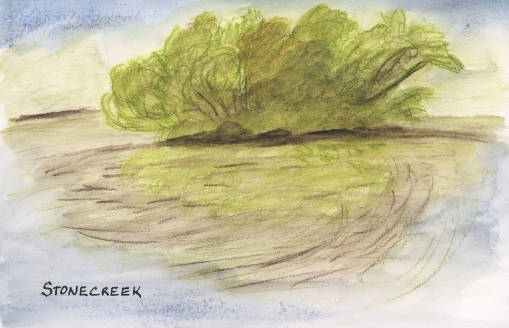
The Spring Greens have erupted on the trees and the entire island has lost all yellows and browns from the winter.
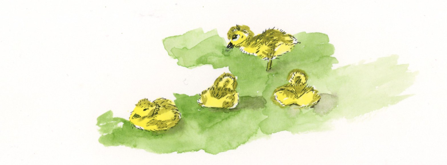
I sketched the island at the pond at Stonecreek with Inktense and I painted the goslings at home from a photo as my eyeballs do not zoom as much as a camera lens.(This is likely why the nature journalists like John Muir Laws carry binoculars!)
This sketch let me down. First my Inktense pencil was too bright, so I tried to tone it all down, but then ended up making it muddy. Not the spring green vibe I’m going for! While the photo was taken in a calm moment, most of the time the wind was rippling the pond water, which is what I captured in my sketch.
The Delta Series paper also let me down. To get a lighter shade of blue for the sky and reflection, I used a lot of water and the paper did this weird spotting thing. I had seen it do that in the previous pages, but since I was using supergranulating paint, I thought that was the granulation effect. Inktense does not granulate, so this is definitely the paper. Worse, those spots are showing through to the other side! Ack! I use this much water all the time with the Alpha Series, and Gamma Series papers, and that near bleeding, and changing of texture does not happen. Interesting difference!
I’m going to try watercolor over the top of this sketch to see if I can fix that muddy feeling to restore it back to that Spring Green vibe which is what I wanted to capture.
Well, I added watercolor over the top, and it is a better shade of green for the spring greens, but I can’t say I’d call this a very successful sketch. I do like it better now, at least.
What I love on this page are the goslings I sketched! Cuteness!
I painted the goslings from a photo a couple days later, in ink and watercolor, and I’m super happy with these adorable little guys. They were young and still tiny little fluff balls who had to rest after every few steps. There were actually two families of goslings! One family had five who were slightly bigger than these four. What a treat of a day to see the goslings!