


I read Jean Haines book, Painting Yourself Calm, and I loved it. Eager to try, I did her exercises in yellow. I think I can’t get her results unless I use full cotton paper, but the green streak on yellow really reminded me it was St. Patrick’s day, so I was off painting little shamrocks. Such a nice, festive page.
Sunsets really challenge me in painting them, so this time I went for a looser version just to capture the colors. I tried an exercise from the Paint Yourself Calm, but it seems to have ended up far more abstract that I originally intended. I kinda like it though. Maybe abstracts are a good way to document moods, and moments that don’t otherwise have objects or scenes to sketch? Interesting idea.
Fascinated by this upside tree I was watching in a television show, so I sketched it. I’m working on developing my pen and ink skills, too, and this was a great subject for that.
To celebrate the Spring Equinox, I used watercolor on a plastic stencil just to see what would happen. I did have some bleeding, but I was able to lift much of it, and clean it up. Good thing I used Serpentine Genuine, and not a staining pigment!
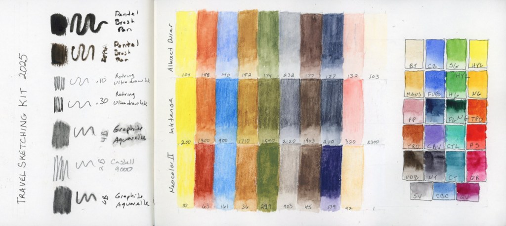
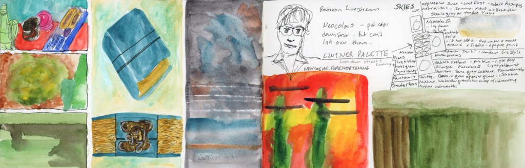
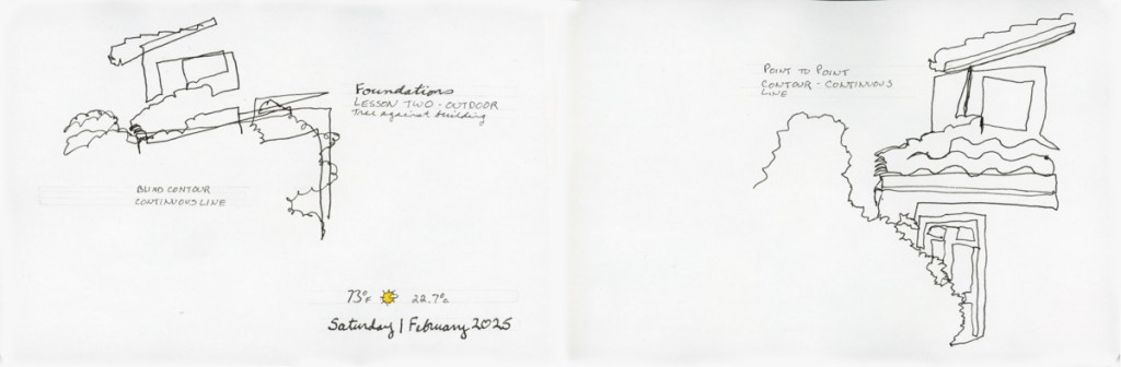
Foundations exercises, and a color chart of my kit for April’s Travel Sketching course. I dug out the neocolors I’d bought the last run of the class, in the class palette, but never used. I’m curious about Neocolor II, as they are quite popular.
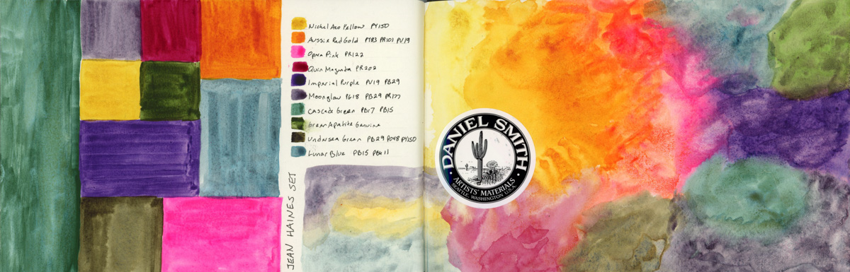
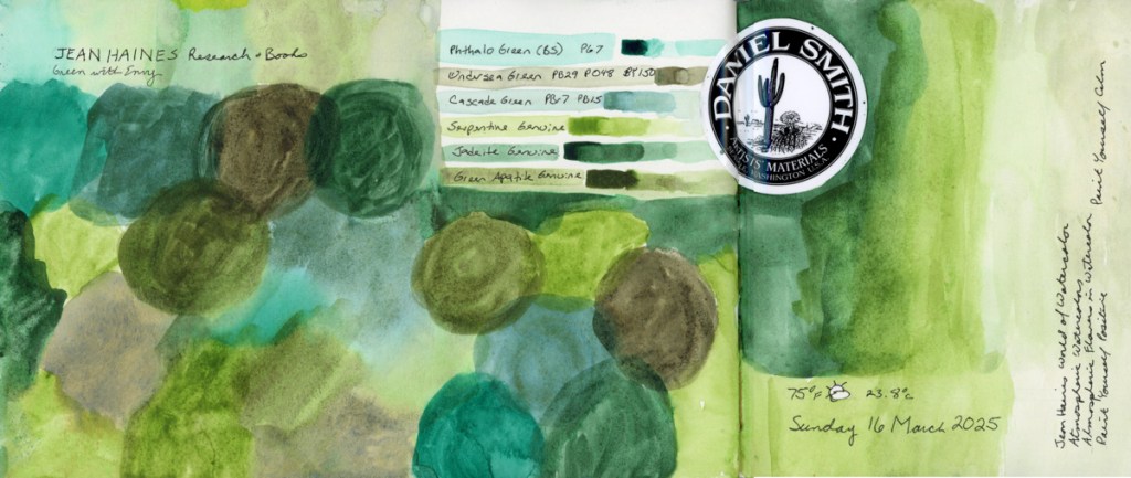
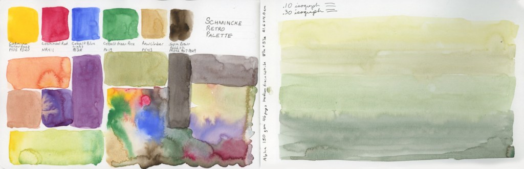
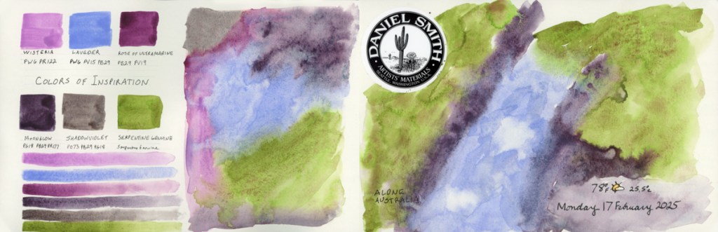
Of course I had to swatch the colors of Jean Haine’s palette. After doing the mosaic style of color sampling, I had to try another organic one, and I’m finally getting the kind of results I had in mind! There is something very cheerful and uplifting about this rainbow page.
More color charts and tests, and mosaic sampling, this time with a bit more gradients within. These are starting to be fun and I love how they look filling the page to the edge, which is the March challenge in the Liz Steel Patreon group.
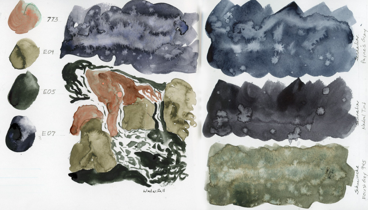
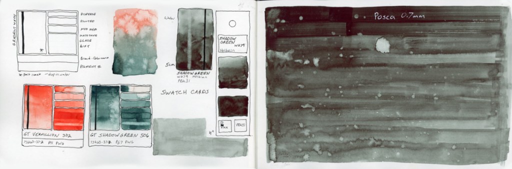
Finally two color charts using the new Haze supergranualting paints from Schmincke. I have all the other supergranulating colors, so I couldn’t have an incomplete collection, now could I?
My color charts are evolving, and I rather like what’s happening on these pages.
A very experimental week.
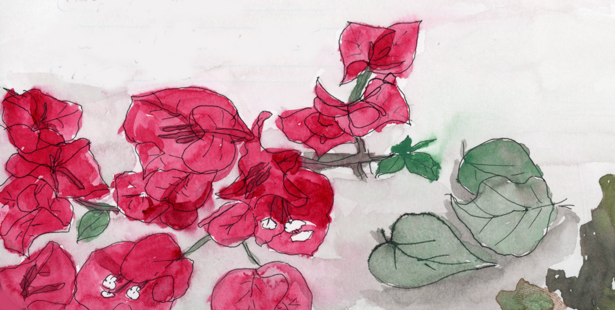
I first tried doing a Nature Journaling style of page inspired by a You Tuber named My Nature Diaries. I love her work. I had even cut a fresh branch off the Bougainvillea before I pruned it, for sketching from a live specimen. Plants are hard! I love the layout of the page. I used the Schmincke Retro Palette, but I feel the greens really dried super flat. That cochineal red is gorgeous by itself, but doesn’t not seem to hold its vibrance when mixed. I missed using Quin Rose for this.
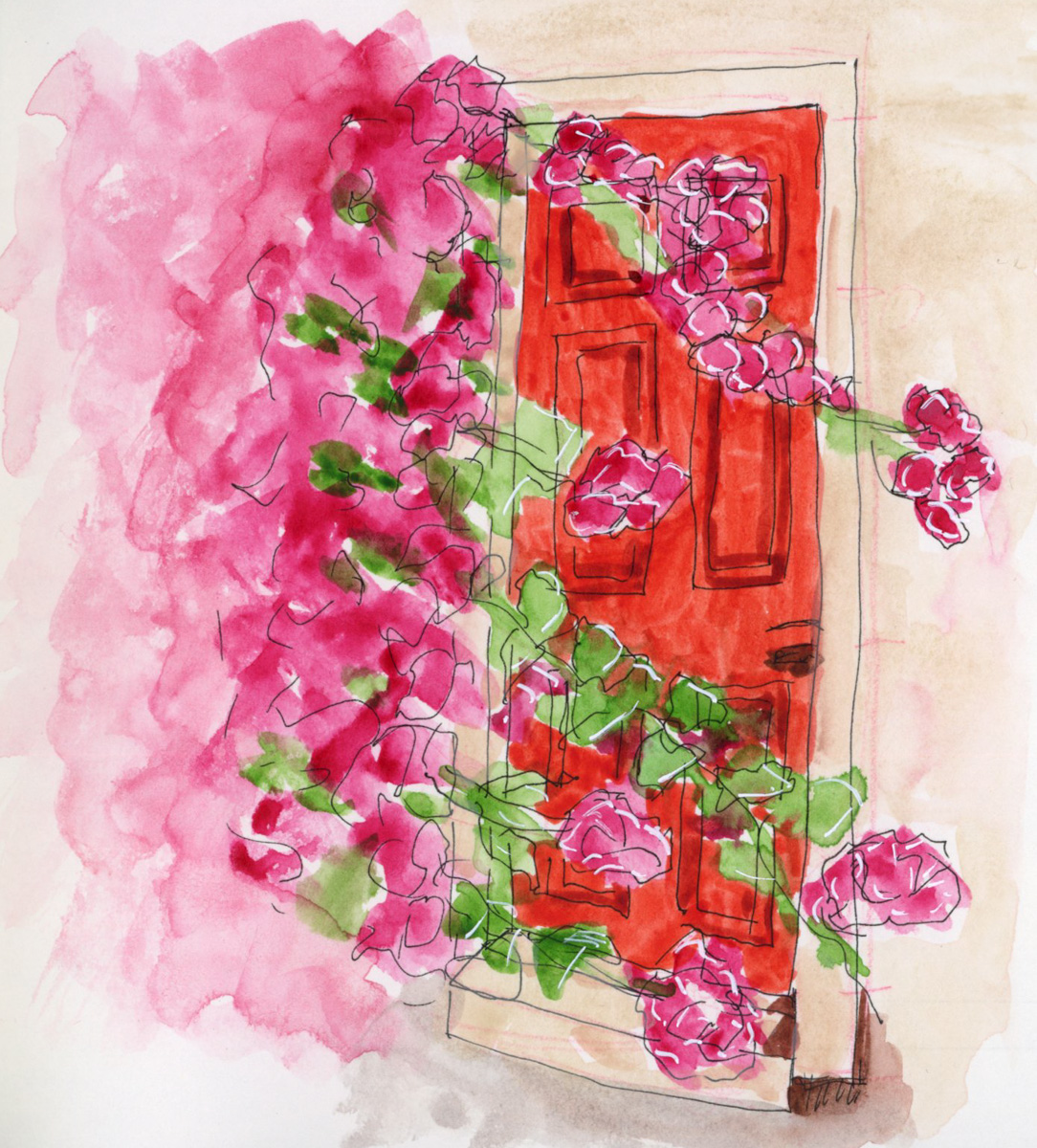
So I used Quin Rose for the pajamas and door sketch, and proved the vibrancy does hold up better when mixing. The color swatches was the paint left over in my palette from the Nature Journal page, and indeed have that muted, dull look, which is why I sketched a line drawing over it.
A color chart of the Art Nouveau Gansai Tambi palette. Instead of squares I was attempting merging the organic rounds, but my paper dried far too fast for any bleeds. So I did a second one attempting to add water. I did not get the results I thought I would, which definitely makes this a learning experience. I don’t hate how responsive Gansai Tambi is to water drops, actually. Then I did a second attempt at the sort of soft colors, and blended background I had tried in the Nature Journal page. Much better.
I also did a color chart, still attempting the organic circles, of the Green With Envy palette that Jean Haines did with Daniel Smith. Love, love, love these greens!
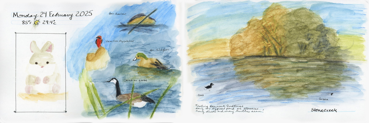
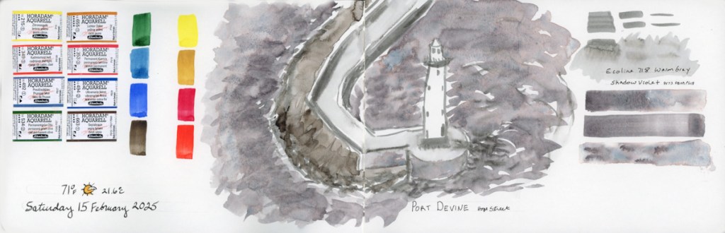
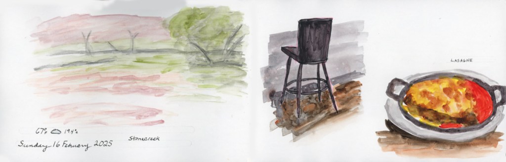
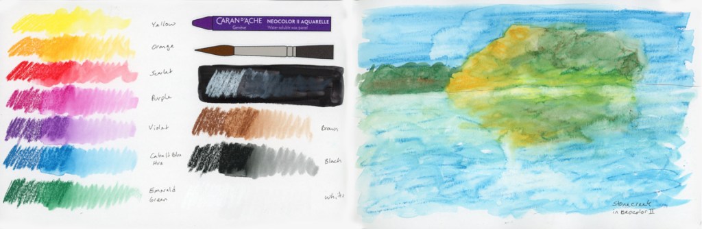
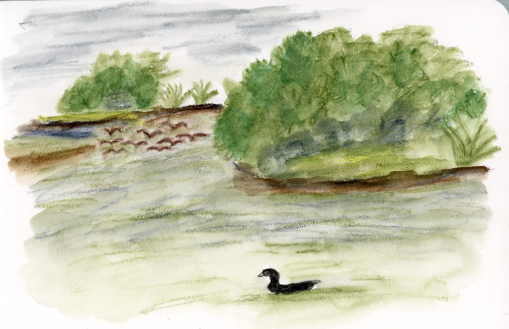
Pen tests, and Foundations exercises, and then another walk at Stonecreek. The Stonecreek page is an exploration of media. I used the Albrect Durer watercolor pencils for the birds, but then got curious how the Inktense would look next to it, so I extended the background using the Inktense. Then I decided to paint my usual Stonecreek Pond in Gansai Tambi. Love what the water effects did in the pond water. I did this at home, from a photo, as the Gansai Tambi are not easily transportable.

There were many turtle sightings in the pond on this particular spring day, so I had to document that with their little heads in the waters.
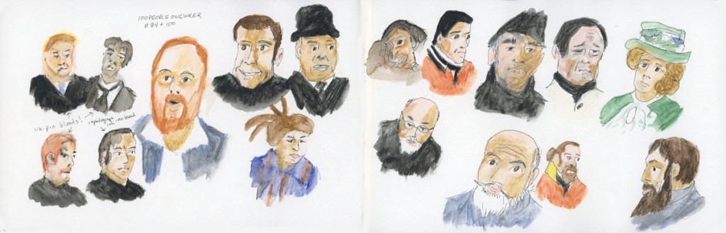
Color charts, with mosaics worked to the edge. 100 People One Week, and a little bit of Foundations thrown in.
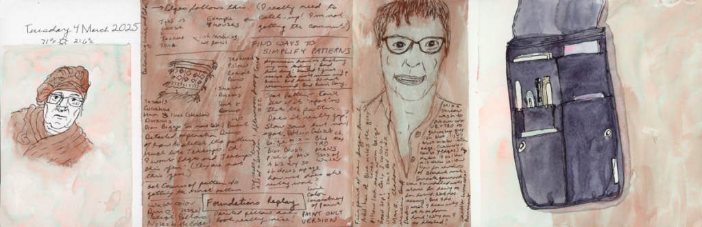
This week was dominated by the very rewarding 100 People One Week challenge. I did a couple Foundations lessons, and a color chart of the new Inktense pencils that arrived.
I’m really starting to enjoy the challenge of building these mosaic displays of the colors I swatch. I’m considering ways in which to do them more organically. I love the quilt block look, but I’d like to try other methods as well.


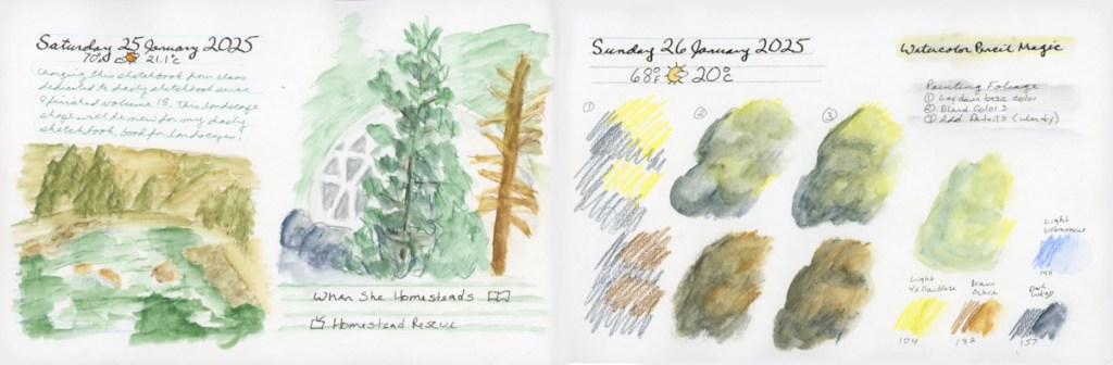
I started the new sketchbook, volume 19, with a Stillman and Birn Gamma, 8.5 x 5.5 inch, softcover landscape. This book has Ivory pages, but is the same weight and texture as the Alpha paper I usually use. I’m curious to see how the ivory paper goes for me.
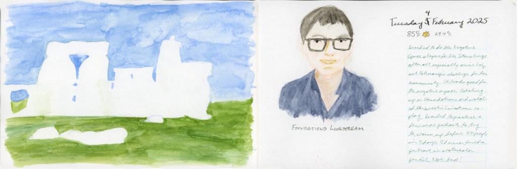
This month has a challenge suggested within Liz Steel’s Patreon, to paint using negative shapes. So I tried that with my backyard on a very grey and rainy day. Not sure I got the planters very well, using negative shapes, but they are certainly expressive of the grey day!

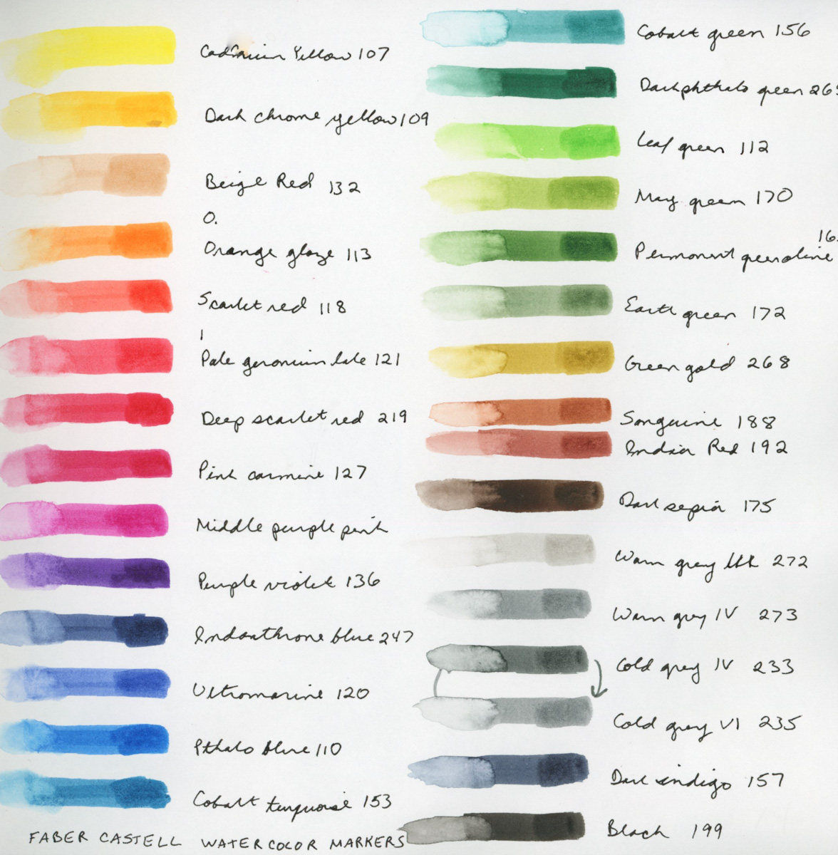
I really began to explore a lot of color charts, and palettes, from a variety of media. With the color charts, I am beginning to explore means of using the colors in some sort of painting to see what they can do. The Colors of Inspiration watercolor palette from Daniel Smith. Gansai Tambi paints are quite interesting to work with. I warmed up with a couple people sketches, since the 100 People One Week challenge is coming up the first week of March. I swatched my current set of Inktense pencils, as I’m curious how are they different from watercolor pencils?
I did select colors to match the Travel Sketching Palette of pencils I’ve been using, so I could do a fair test of like colors.
To test them out, I took them out for my walk to Stonecreek and used them where I’ve been using the Albrect Durer pencils. They are a bit softer of a lead, and it easier to go over them after they’ve been activated with water. Once they dry the literature says they are permanent. I rarely go back over work, but it’s good to know. You can get the same vibrancy of color with both, but it perhaps takes less work with the Inktense.
I started my sketchbook volume 19 with a 6×9-inch Stillman and Birn Gamma softcover sketchbook. This is the same paper as the Alpha (150 gsm, Medium grain) but in an ivory color. I thought that I might try each type of paper, starting with the various offerings of Stillman & Birn, using the same size, to really learn how the papers work for me. It’s a nice small size, so I can go through them quickly.
The Ivory paper is nice, it seems softer to me, somehow. I don’t actually notice the difference much, except for portraits. I have to adjust for the yellow when I try to do skin tones.
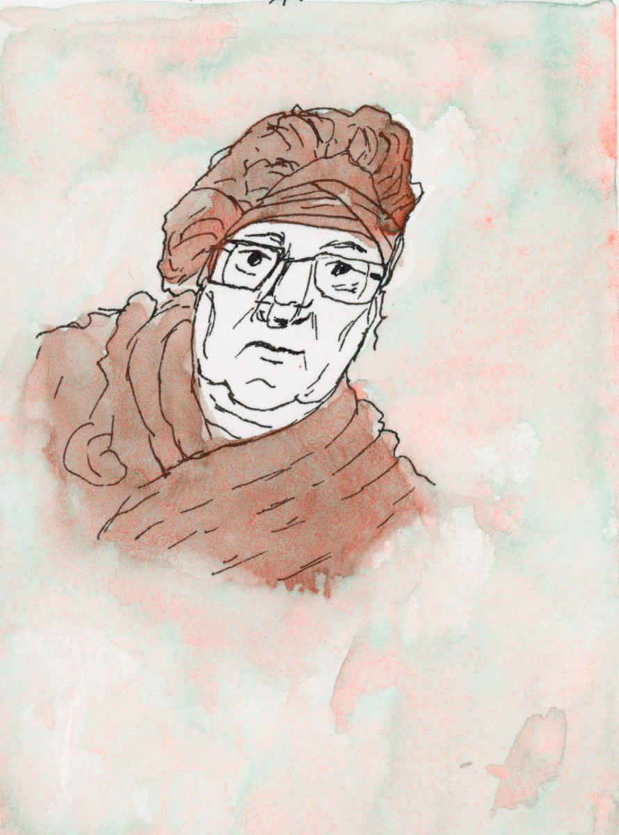
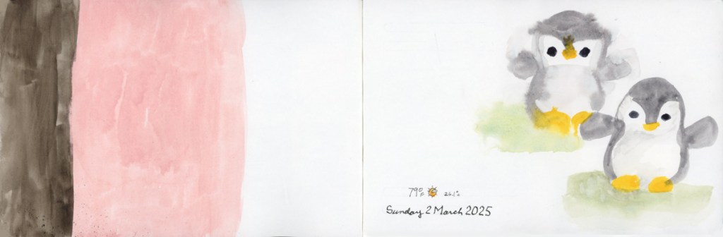
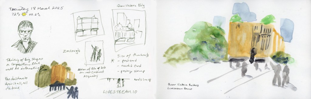
I’ve been warming up on portraits in preparation for the 100 People One Week challenge the first week in March. So far with the captive subject of Livestream portraits. Not a bad way to document that I had a livestream, as it turns out.
My main subjects are the Foundations exercises, my livestreams, the weekly walk at Stonecreek Golf Course, and a lot of color swatching. (Great for those bad brain days!)
Here are my pages so far, from the Gamma sketchbook:
When I finished sketchbook 18, I decided to make the second half of sketchbook 17 into my daily sketchbook. I’d had the first half dedicated to the Travel Sketching course, and then to working through the Watercolor Pencil Magic exercises. However, by this time I was tired of carrying two sketchbooks!
There are a lot of color tests, particularly of different palettes and paints. I was enjoying testing the various new brands, colors, etc. Exercises for Foundations, a couple portraits to warm up for March’s 100 People One Week challenge.


Last week’s sketchbook pages had a lot more focus on sketchbook design since I am taking the class as an independent study program.
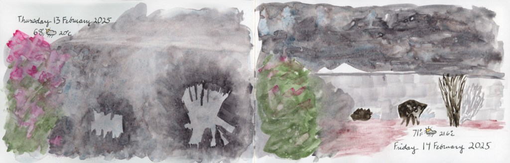
Having recently finished the Travel Sketching class, when I had the opportunity to walk Stonecreek, I brought my sketchbook with me, and tackled a scene that has long seemed very intimidating. This landscape view from the bottom of the pond. So I began with 5 shapes, and then added texture and details. Many of the details arrived while sketching. When the flock of Canadian geese flew in and landed on the water, so I had to add them in. When the American Coot swam up and gave me extended side-eye, perfectly posing for my sketch. He swam off just as I finished his addition! A cardinal in a tree branch, with the grey pond behind him, highlighting his colors. (He was so quick to fly off, I could only catch him via photo, and painted him later when I finished the page.)

I added the map, the titles, and the text block to finish off this page.
This also happens to be the first full spread page in my new sketchbook! I’m sticking with the 7.5×7.5-inch Stillman & Birn Softcover Alpha for now. The smaller pages are satisfying right now, and feel good. Keeping it simpler to encourage building a daily practice of sketchbook pages.
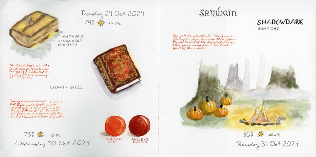
For this spread I used colored ink for extra notes, and the two ink color swatches to fill in a space. The ink is Diamine, and those are two of my favorite autumn colors.
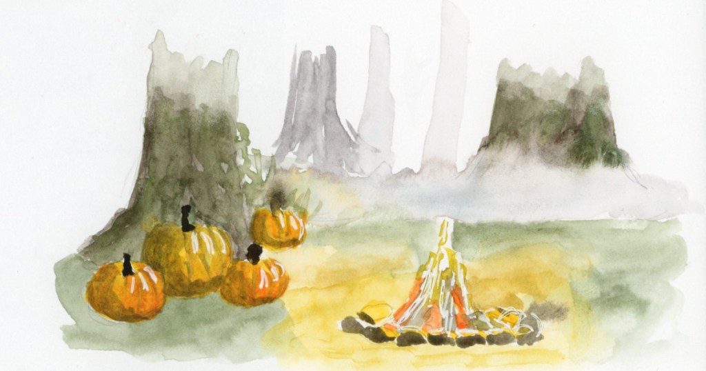
This is a part of an Alley of Ambience image. Drawing campfires is hard, but I may be in love with those pumpkins!

This page is a little more abstract. I love Elisabeth Alba’s art and I had these various stickers of hers. I’d also put the 5×7 prints I have of her work into a newly purchased portfolio album. This simple spread marks that for this week. The raven is also on a half sheet, which flips over for a second color block of transparent red oxide, which is fun and interactive in my sketchbook.
I will cut half pages sometimes when I have a lot of collage, to reduce the overall bulk in the finished sketchbook. It’s a fun way to do interesting pages.
As usual, my participation in the Sketchbook Design class has me sketching more pages, and putting a lot more thought into their layouts and designs. I love them even more when I’m putting in the extra effort and time! I also seem to have leveled up in my drawing ability! Don’t ask me how THAT happened! It seems to happen at random intervals and I’m sure it’s a product of practice. And the many lessons, of course. That Travel Sketching class really did seem to help me level up, didn’t it?
Onto the next week! The holiday season begins in earnest and I wonder what my sketchbook will capture next?
Watercolor Markers! Okay, I admit, I saw these and they were a total impulse purchase last month. I will also admit, I gleefully squeed when they finally arrived! I have not worked too much with markers, though I have some Copic markers. I’m excited to play with markers that won’t bleed through the paper! The colors are nice and vibrant.


Here brings me through the first half of January. I’m starting to pick up some momentum now, and excited about what it is to come!