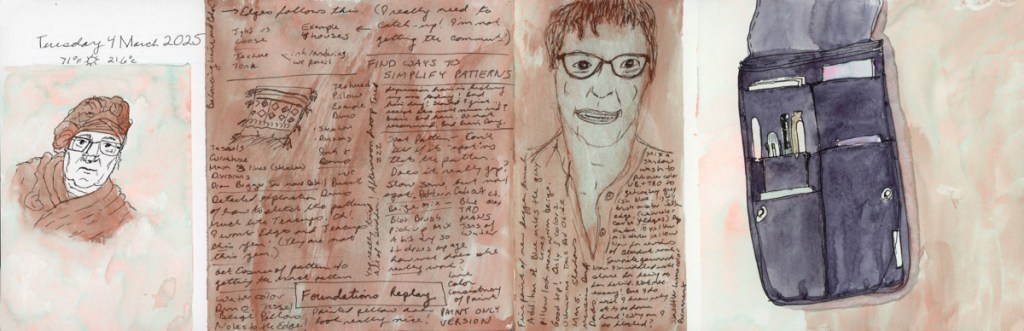
My final sketching assignment for Foundations! Can you believe it? After SIX times, I have finally succeeded in doing ALL the sketching assignments for this course! Woot!
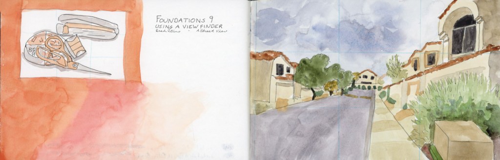
Sketching from a focus is such a great way to be able to sketch what is important first, and it’s okay when you run out of time!
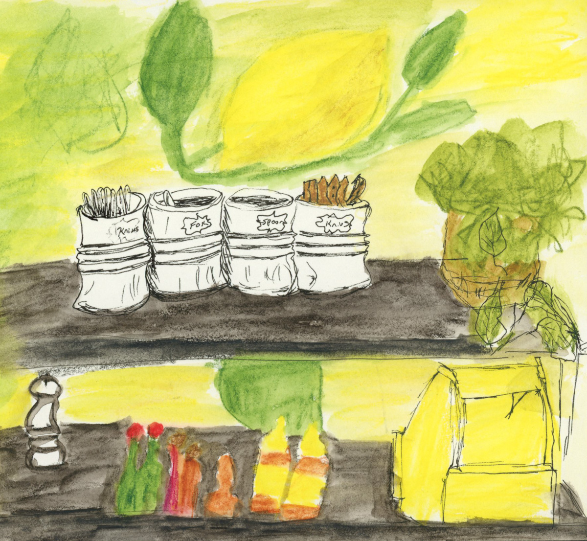
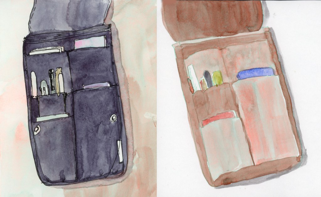
I ran out of time sketching this little sideboard at the the restaurant, so the one side of the shelving unit just did not get sketched. My focus was on the tubs of utensils, so they are in more detail, and I let the rest be less detailed.
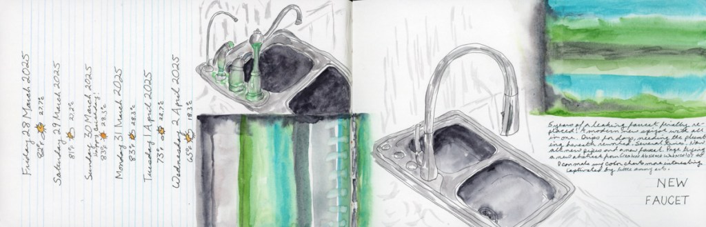
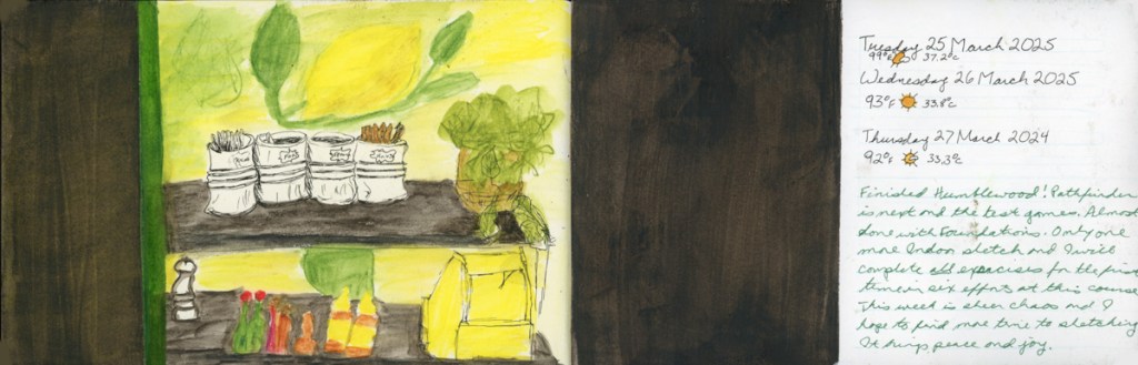
I did have a major week of plumbing issues get involved, so I decided to make sketching the faucet part of my assignment, focusing on the faucet itself, and greatly minimizing the clutter behind with only suggested lines.
Doing multiple thumbnails to tell different stories, and create a focus was a great deal of fun.
BackyardPark at PV
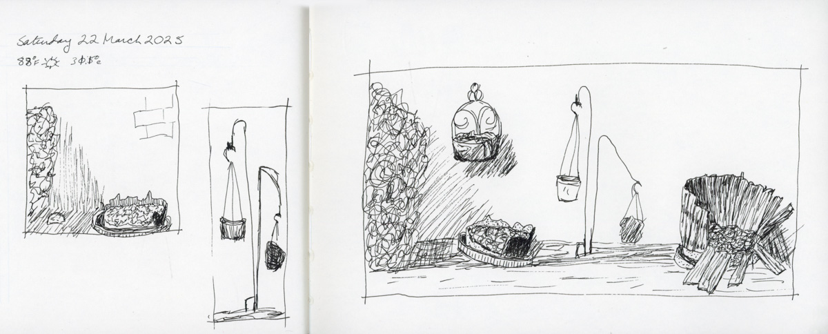
I actually managed to get out and sketch on location for the outdoor assignment. I was rushed, and found the scenes overwhelming, but it was definitely rewarding to try. I look forward to being able to do more sketching on location!
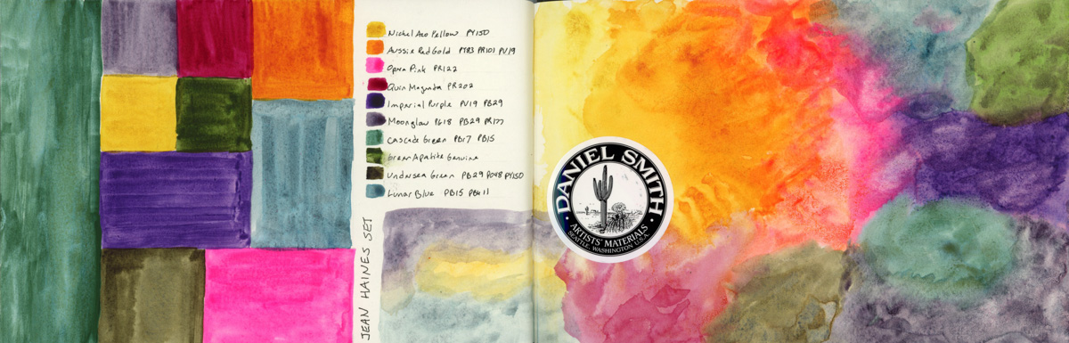
I read Jean Haines book, Painting Yourself Calm, and I loved it. Eager to try, I did her exercises in yellow. I think I can’t get her results unless I use full cotton paper, but the green streak on yellow really reminded me it was St. Patrick’s day, so I was off painting little shamrocks. Such a nice, festive page.
Sunsets really challenge me in painting them, so this time I went for a looser version just to capture the colors. I tried an exercise from the Paint Yourself Calm, but it seems to have ended up far more abstract that I originally intended. I kinda like it though. Maybe abstracts are a good way to document moods, and moments that don’t otherwise have objects or scenes to sketch? Interesting idea.
Fascinated by this upside tree I was watching in a television show, so I sketched it. I’m working on developing my pen and ink skills, too, and this was a great subject for that.
To celebrate the Spring Equinox, I used watercolor on a plastic stencil just to see what would happen. I did have some bleeding, but I was able to lift much of it, and clean it up. Good thing I used Serpentine Genuine, and not a staining pigment!
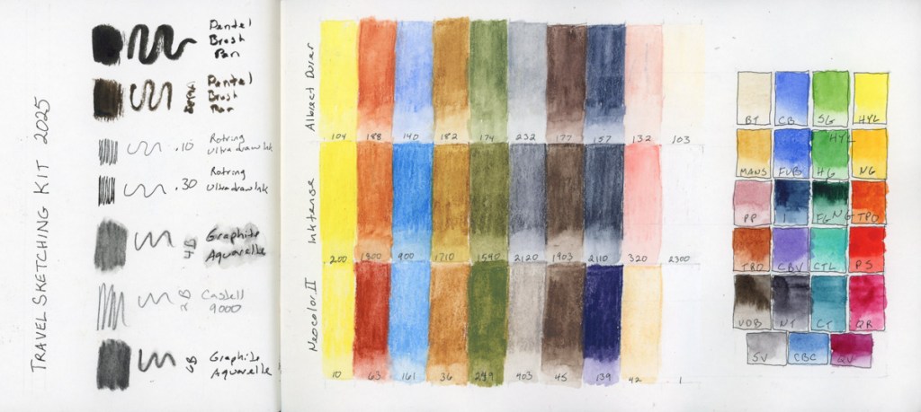
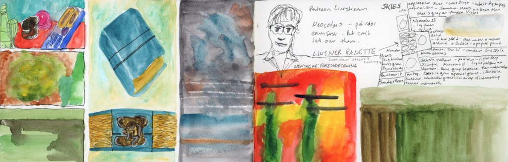
Foundations exercises, and a color chart of my kit for April’s Travel Sketching course. I dug out the neocolors I’d bought the last run of the class, in the class palette, but never used. I’m curious about Neocolor II, as they are quite popular.
Of course I had to swatch the colors of Jean Haine’s palette. After doing the mosaic style of color sampling, I had to try another organic one, and I’m finally getting the kind of results I had in mind! There is something very cheerful and uplifting about this rainbow page.
More color charts and tests, and mosaic sampling, this time with a bit more gradients within. These are starting to be fun and I love how they look filling the page to the edge, which is the March challenge in the Liz Steel Patreon group.
Finally two color charts using the new Haze supergranualting paints from Schmincke. I have all the other supergranulating colors, so I couldn’t have an incomplete collection, now could I?
My color charts are evolving, and I rather like what’s happening on these pages.
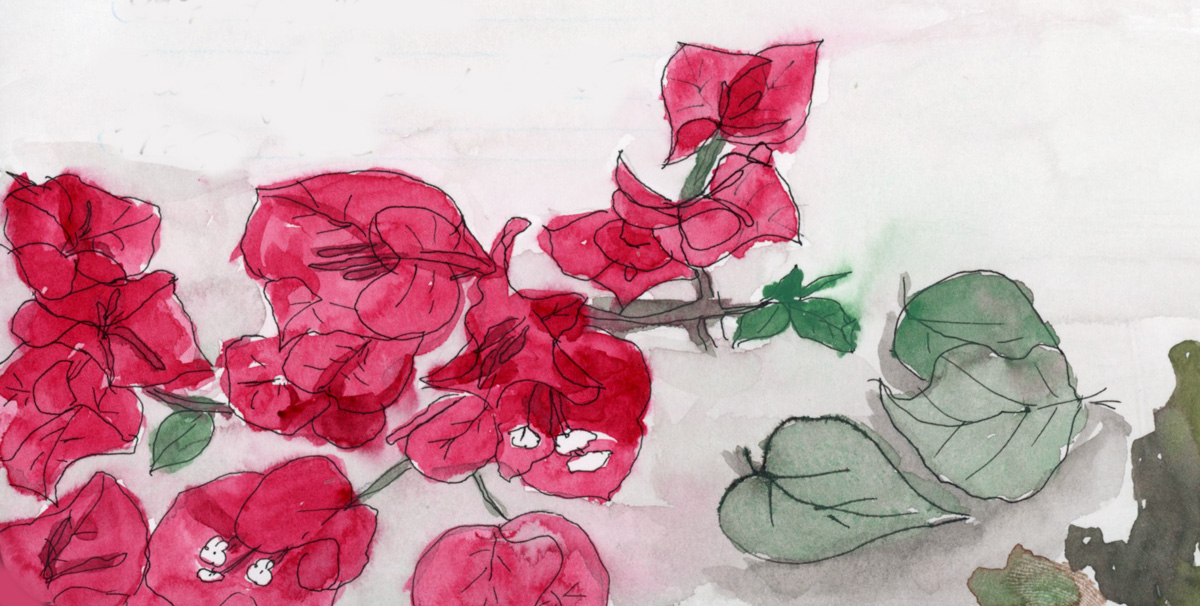
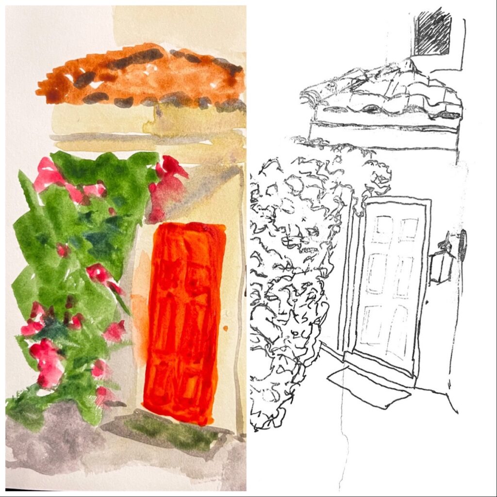
I first tried doing a Nature Journaling style of page inspired by a You Tuber named My Nature Diaries. I love her work. I had even cut a fresh branch off the Bougainvillea before I pruned it, for sketching from a live specimen. Plants are hard! I love the layout of the page. I used the Schmincke Retro Palette, but I feel the greens really dried super flat. That cochineal red is gorgeous by itself, but doesn’t not seem to hold its vibrance when mixed. I missed using Quin Rose for this.
So I used Quin Rose for the pajamas and door sketch, and proved the vibrancy does hold up better when mixing. The color swatches was the paint left over in my palette from the Nature Journal page, and indeed have that muted, dull look, which is why I sketched a line drawing over it.
A color chart of the Art Nouveau Gansai Tambi palette. Instead of squares I was attempting merging the organic rounds, but my paper dried far too fast for any bleeds. So I did a second one attempting to add water. I did not get the results I thought I would, which definitely makes this a learning experience. I don’t hate how responsive Gansai Tambi is to water drops, actually. Then I did a second attempt at the sort of soft colors, and blended background I had tried in the Nature Journal page. Much better.
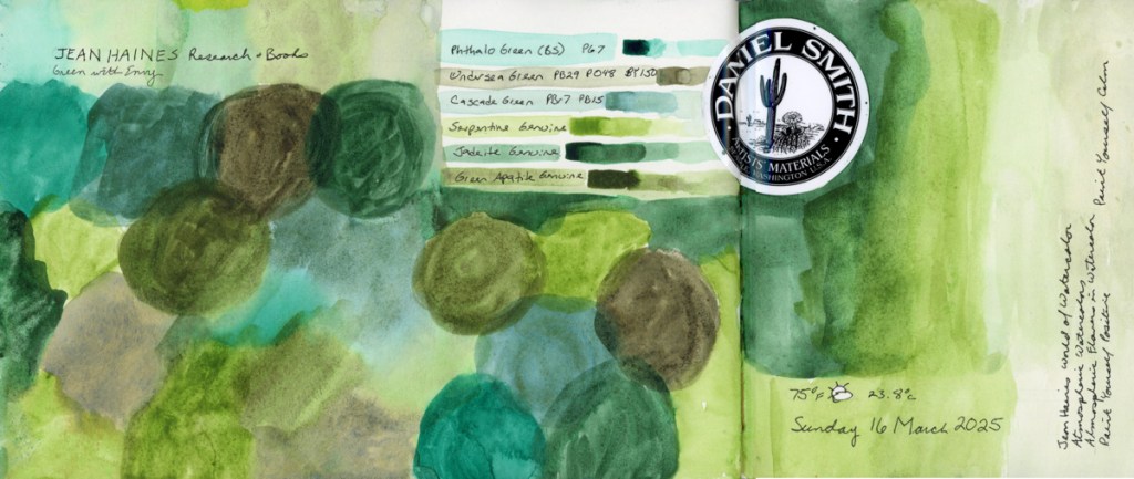
I also did a color chart, still attempting the organic circles, of the Green With Envy palette that Jean Haines did with Daniel Smith. Love, love, love these greens!
Pen tests, and Foundations exercises, and then another walk at Stonecreek. The Stonecreek page is an exploration of media. I used the Albrect Durer watercolor pencils for the birds, but then got curious how the Inktense would look next to it, so I extended the background using the Inktense. Then I decided to paint my usual Stonecreek Pond in Gansai Tambi. Love what the water effects did in the pond water. I did this at home, from a photo, as the Gansai Tambi are not easily transportable.
There were many turtle sightings in the pond on this particular spring day, so I had to document that with their little heads in the waters.
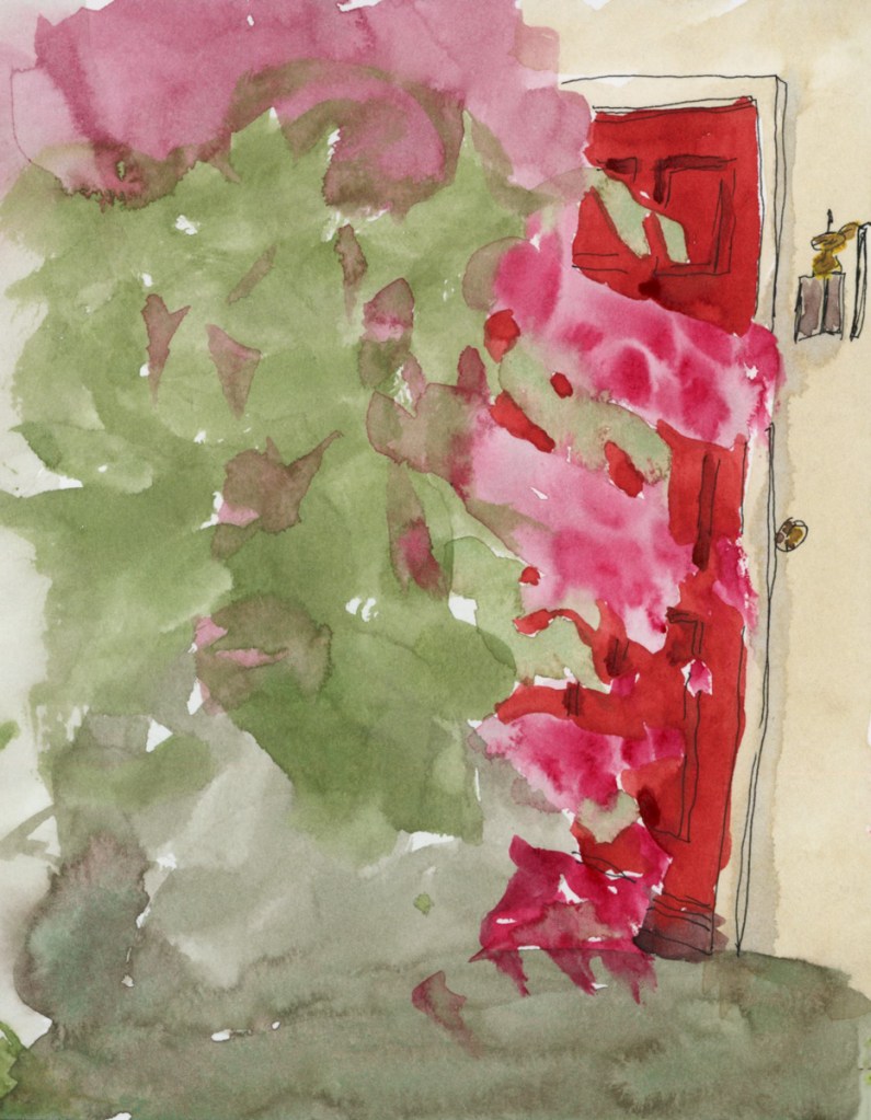
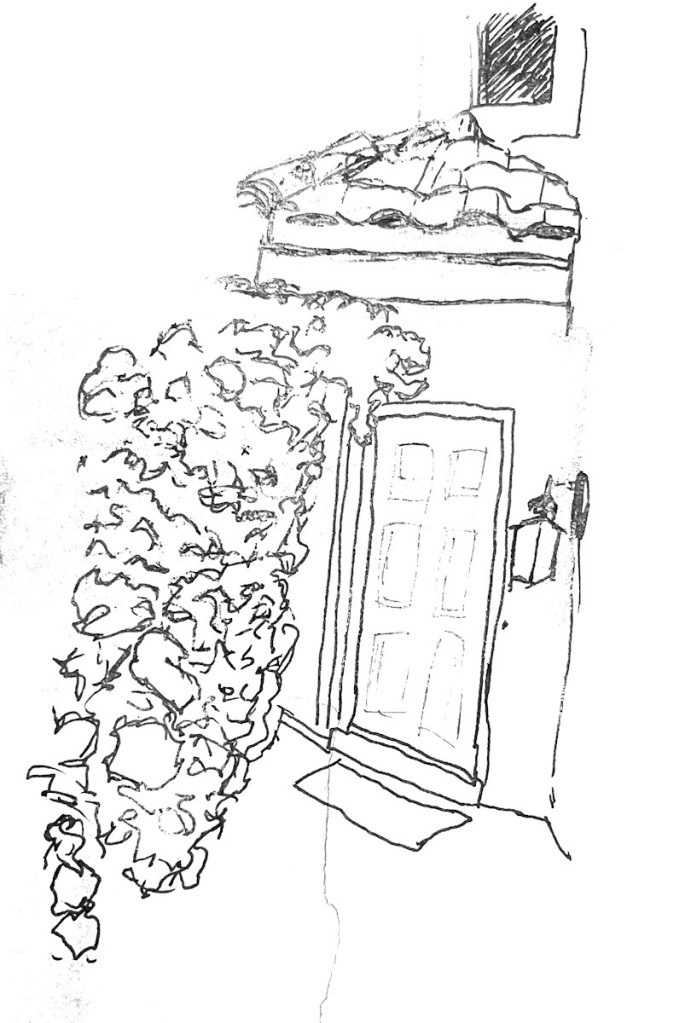
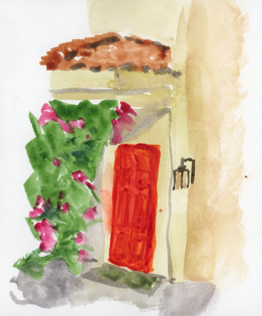
The most sketched subject I did this year in Foundations was my front door, apparently. From foliage against a building, to a door assignment, as something seasonal, and lastly for the line and color exercise, I’ve sketched my door.
a door
As the months have passed, my bougainvillea has grown, encroaching further and further into the walkway in front of my door. It had more flowers, and was predominantly pink, then fewer flowers, and more green, but also more overgrown. Until finally it got cut back to appease the HOA. (I waited as long as I could in order to enjoy the best bloom season!)
Artistically, this door has been sketched and painted with a variety of techniques, each skill building on itself. I even got better and began to include the lamp, which seemed too hard to draw at first.
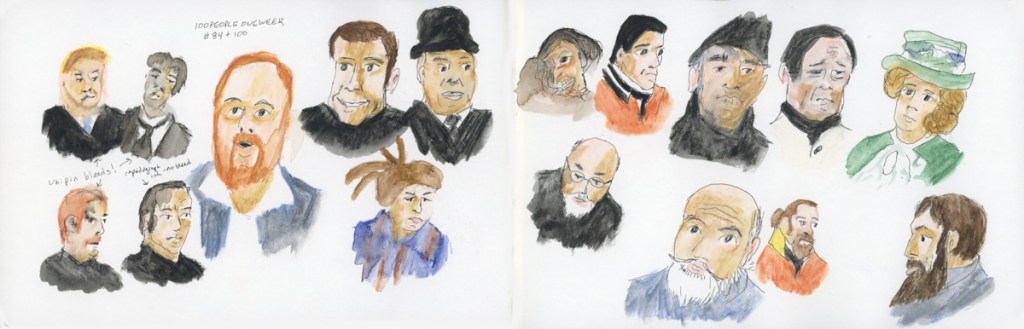
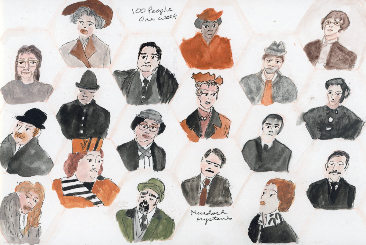
Color charts, with mosaics worked to the edge. 100 People One Week, and a little bit of Foundations thrown in.
This week was dominated by the very rewarding 100 People One Week challenge. I did a couple Foundations lessons, and a color chart of the new Inktense pencils that arrived.
I’m really starting to enjoy the challenge of building these mosaic displays of the colors I swatch. I’m considering ways in which to do them more organically. I love the quilt block look, but I’d like to try other methods as well.
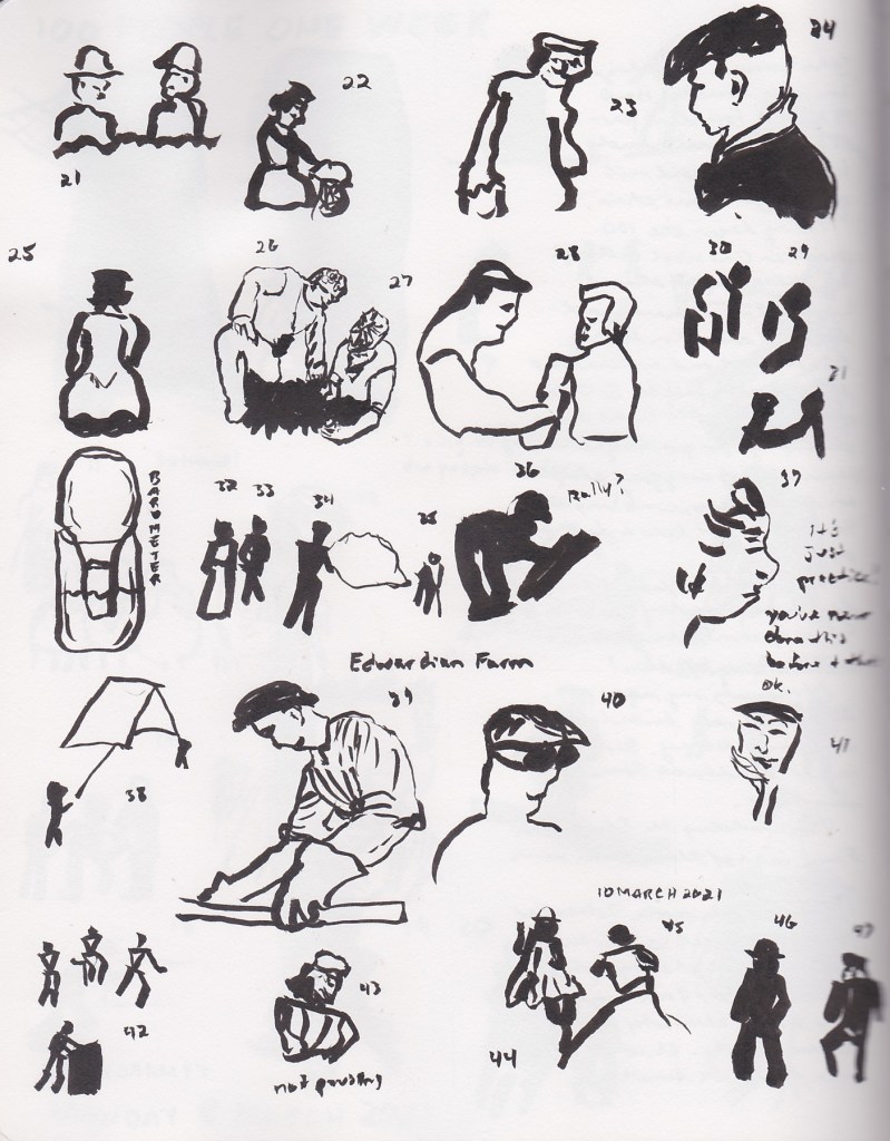
I did it! I sketched 100 people in one week! I sketched mostly from television, mostly Murdoch Mysteries (costumes are fun to draw!) I used a variety of media and enjoyed the exploration. The first page took me 3 hours to complete, the Pitt Pastel Sanguine page, took 1 hour. The rest fell somewhere in the middle.
100 People One Week — 2025
I did it! I sketched 100 people in one week!
Well — one week spread across a few sessions, with a lot of good television keeping me company. This was my most experimental year yet, and I loved every messy, discovery-filled minute of it.
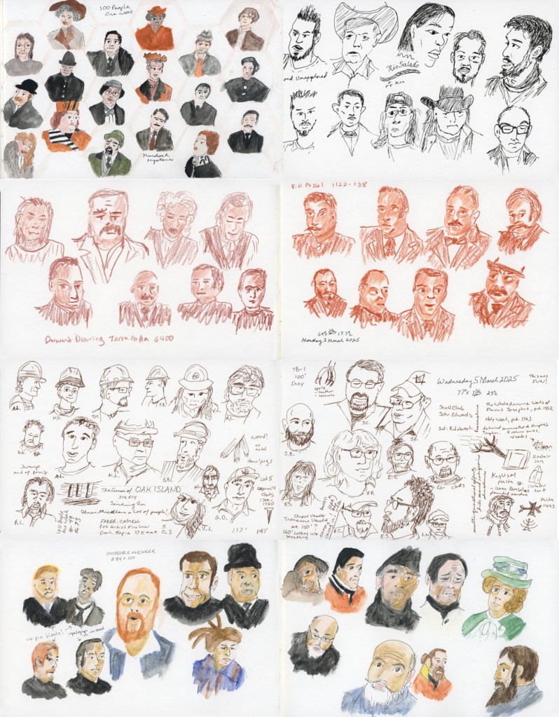
I sketched mostly from television — mostly Murdoch Mysteries, because the costumes are just so fun to draw — but also The Curse of Oak Island, and a show called Unexplained and Unexplored, which turned out to be surprisingly good drawing material. Lots of interesting faces.
The Materials
This was a mixed media year, and I leaned into that fully. I used more different tools and materials than any previous year, and I learned things along the way.
The anchor of the year was the Derwent Shade and Tone Mixed Media Set — a gorgeous set with a full range of warm and cool tones across Inktense, Graphitint, Tinted Charcoal, and Pastel Shade media. The first page I completed used this set, with the Murdoch Mysteries faces arranged in a light hexagon grid. That page took about three hours. I also did detailed color swatches of the entire set — all twelve colors and media — which became its own little design on the left page.
I also worked with the Derwent Drawing Terracotta 6400 — a rich sanguine drawing pencil — and the Pitt Pastel 1122-138, a sanguine pastel. Both on the same spread, one page each. That spread took one hour. The difference between the two is fascinating — the pencil gives fine detail, the pastel is looser and warmer. Both are entirely in that beautiful terracotta red.
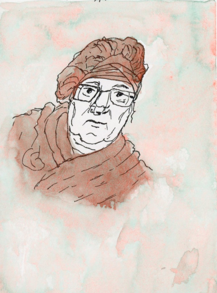
One of my favorite pages featured the Gansai Tambi Granulating Aurora Orange — such a gorgeous paint! I used it for the background wash and the portrait itself. The granulating effect it makes in the skin tones is just beautiful. This is my third self-portrait, and I remain unconvinced it looks much like me, but I love the page.
For the Oak Island pages I switched to the Faber-Castell Pitt Artist Fineliner in Dark Sepia 175 — a lovely warm brown line that suits those weathered, cap-wearing Oak Island faces perfectly. This spread is packed — faces, notes, measurements, show details. It has a wonderful chaotic energy.
I found a new favorite paint on the Thursday pages — Holbein Sepia watercolor, which I tested in a set of swatches alongside more Unexplained and Unexplored pen drawings on the left and Murdoch Mysteries faces in the Shade and Tone set on the right.
The page featuring faces from Unexplained and Unexplored also has a little painted pencil case and color block done in that Aurora Orange — I was clearly smitten with that paint all week. Look at those colors, the oranges and greens, all from one paint!
The final pages brought everything together — portraits 84 through 100, Murdoch Mysteries again, using the Shade and Tone set with a little blue and green watercolor for accent. I also made a useful discovery: Unipin pens bleed with watercolor, but Rapidograph ink does not. Noted for next time!
Best year yet! And the first time I did all 100 people! I did it! One hundred people. And I already can’t wait to do it again.
Using ink sketches for today’s people. It is certainly faster, but not exactly easier. When you get a line wrong, it really shows! Unless it’s in the hair. Hair gets lots of lines, so a wrong one doesn’t show as much! Ha!
I’ve done 48 sketches so far, in 3 days! I don’t think I got that far last year, but I’d have to look it up. I haven’t scanned that sketchbook yet, either, so I can’t share them now. The first year I tried it, I did gestures, and I only did 47 of them, but there were fun to do!