One Week 100 People 2024

Wonderful! Here’s the cleaned-up final draft:


One Week 100 People — 2024

I came back to this challenge after two years away. Life happened, as it does. But in 2024 I finally sat back down with a sketchbook and committed to One Week 100 People again.

There was one big difference from 2021. Last time, I drew tiny gestural figures — whole bodies, loosely suggested, no faces to speak of. This year I decided to actually draw faces. Properly. Or as properly as I manage anything.

I treated myself to a new marker set to mark the occasion: the Faber-Castell Goldfaber Aqua Dual Marker Portrait set, with six warm tones — Apricot 116, Pale Pink 114, Sand 281, Vintage Pink 195, Terra Cotta 185, and Burnt Sienna 283. A small, muted palette. The warmest browns ended up doing a lot of heavy lifting, since Burnt Sienna was my only real dark — every head of hair, every jacket, every shadow ended up in that rich brown. I didn’t mind at all.

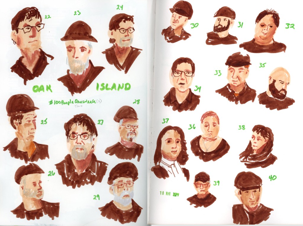
My companions for the week were Murdoch Mysteries, The Curse of Oak Island, and Death in Paradise. Good, comfortable television. The kind you can pause.
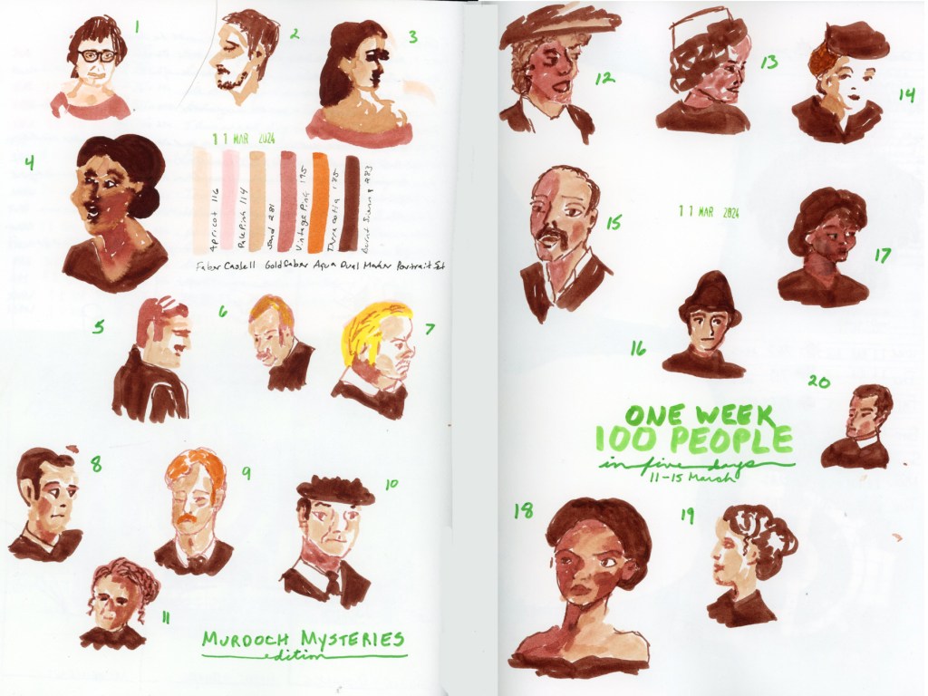
A double page sketchbook spread of faces drawn in warm tones with the Faber-Castell Goldfaber Aqua Dual Marker Portrait set, sketched from the TV show Murdoch Mysteries. Faces are scattered loosely across the pages, alongside named color swatches and the handwritten title 'One Week 100 People, in five days, 11–15 March.'

Somewhere around portrait 21, I drew someone live for the first time — a friend, sitting for me properly. It was more careful than the TV portraits, and it actually looks like him. Not a perfect likeness, but close enough that someone who knows him would recognize him. That felt like a milestone.
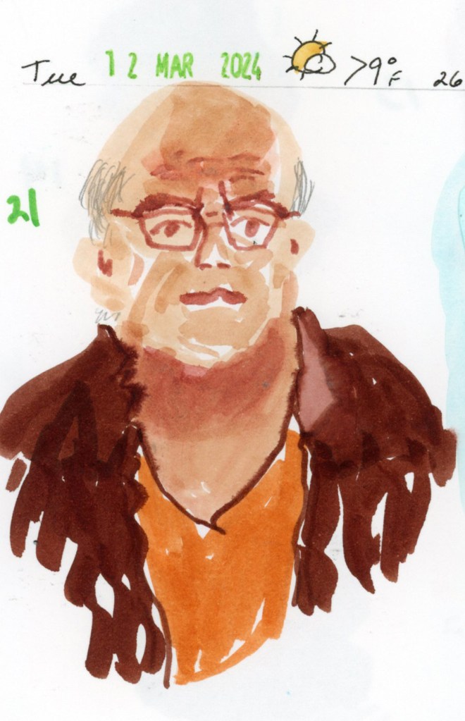
A single sketchbook page featuring portrait number 21, drawn from life with the Faber-Castell Goldfaber Aqua Dual Marker Portrait set. A bald man with glasses wears an orange shirt under a dark brown jacket. A handwritten date stamp at the top reads Tuesday, March 12, 2024.
A double page sketchbook spread of faces drawn in warm tones with the Faber-Castell Goldfaber Aqua Dual Marker Portrait set, sketched from the TV show The Curse of Oak Island. Portraits numbered 22 through 40 are scattered across the pages, with the handwritten label 'Oak Island' and a date stamp reading 19 March 2024."
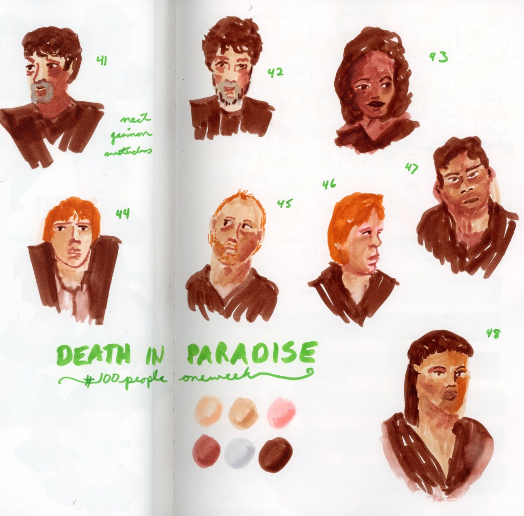
A double page sketchbook spread of faces drawn in warm tones with the Faber-Castell Goldfaber Aqua Dual Marker Portrait set, sketched from the TV show Death in Paradise. Portraits numbered 41 through 48 are scattered across the pages, alongside six unnamed color swatches and the handwritten title 'Death in Paradise, #100 People One Week.'

Portrait 49 is one of my favorite pages from the whole challenge. I added water to the markers and got the most beautiful blooming effects in the skin tone — soft and loose and a little unpredictable. Exactly the kind of happy accident that makes me love this medium. My first ever self-portrait, which looks nothing like me. But I do love the effects of the water on the marker and the blooms created.
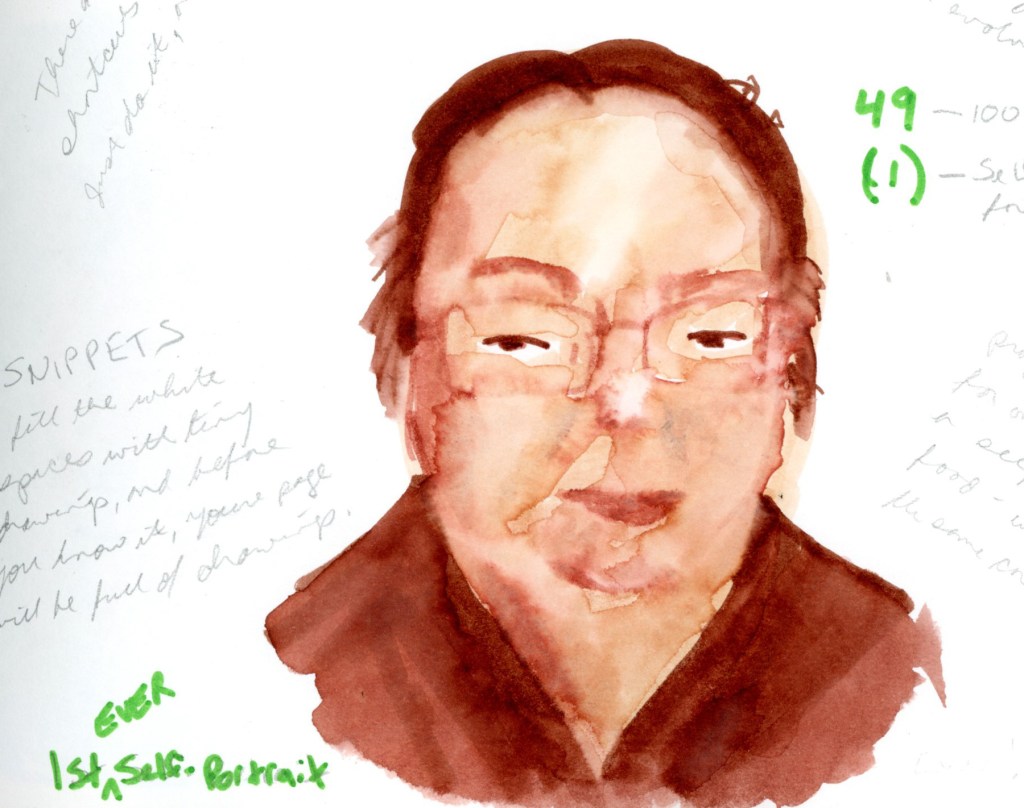
I stopped at 56, which is my second ever self-portrait. Also looks nothing like me. My people sketches were spread across three weeks, and I am completely fine with that.
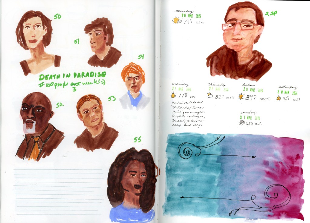
A double page sketchbook spread. The left page features six faces from Death in Paradise, numbered 50 through 55, drawn with the Faber-Castell Goldfaber Aqua Dual Marker Portrait set, with the crossed-out heading '#100 People One Week' corrected to 'three weeks.' The right page features a self-portrait labeled 2SP, date stamps and weather notes spanning Tuesday March 26 through Sunday March 31 2024, a handwritten journal note, and a painted gradient in teal and magenta with pen flourishes."

What surprised me most was how easily the faces came. I’d been nervous — faces are intimidating. But once I started, something loosened up. I was better at it than I thought I would be. Though I was happy if it just looked like a person, and not too distorted. I didn’t mind if it didn’t actually look like the person!

I’m glad I did this challenge this year. I’ll definitely do it again next years!
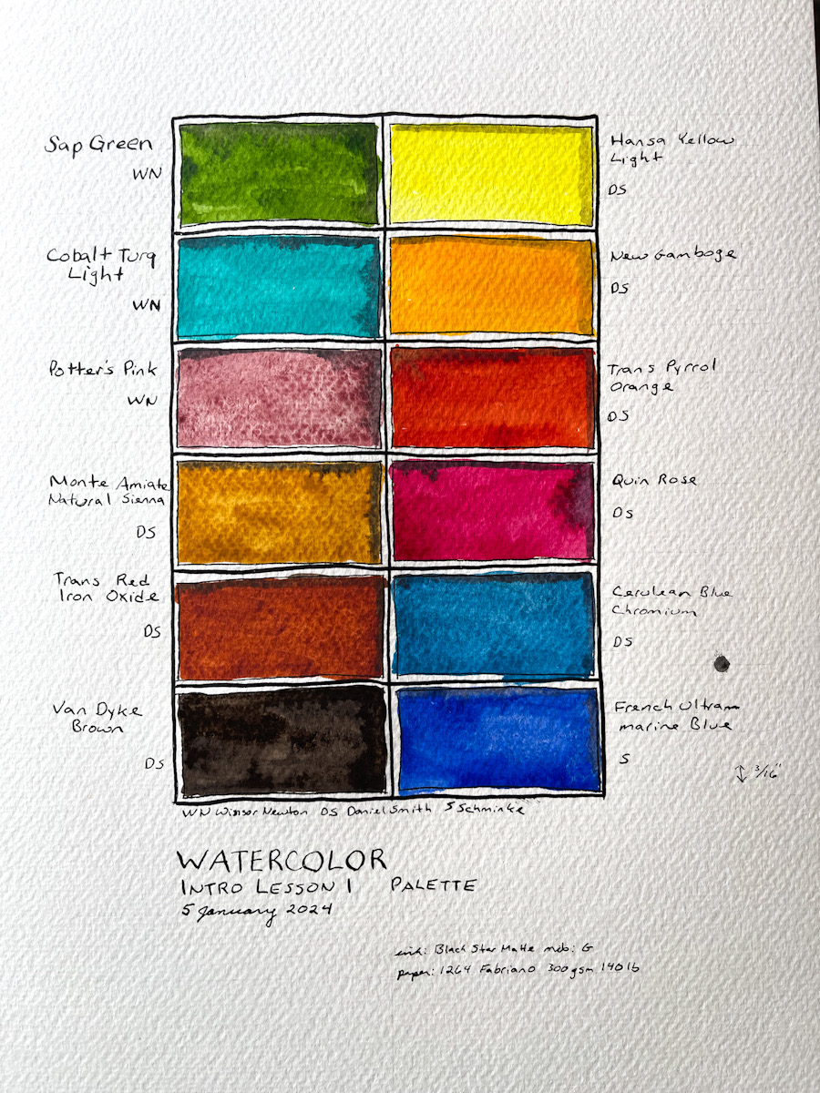
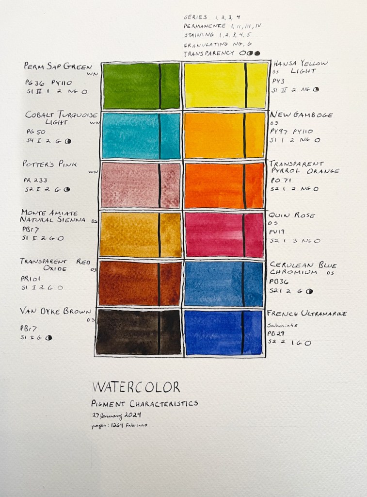
Watercolor Intro 1

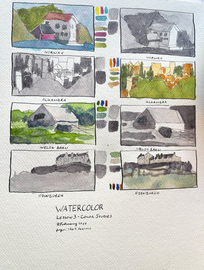
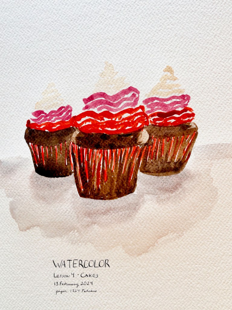
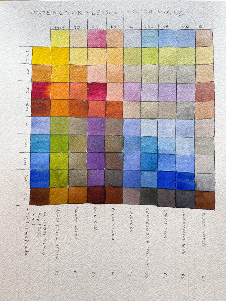
Starting my Watercolor class at Sketching Now with Liz Steel. Thus will be my fifth time taking it! I swear I learn more every single time! Last time I tested the exercises with two different palettes. This time I think I’ll add page design to my efforts. I’m keen to work on shadows and dimension as well. I know from experience I tend to run short on time, so wish me luck!
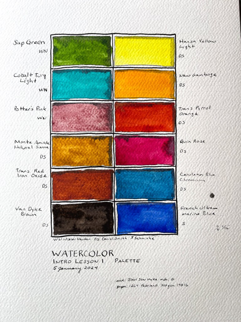
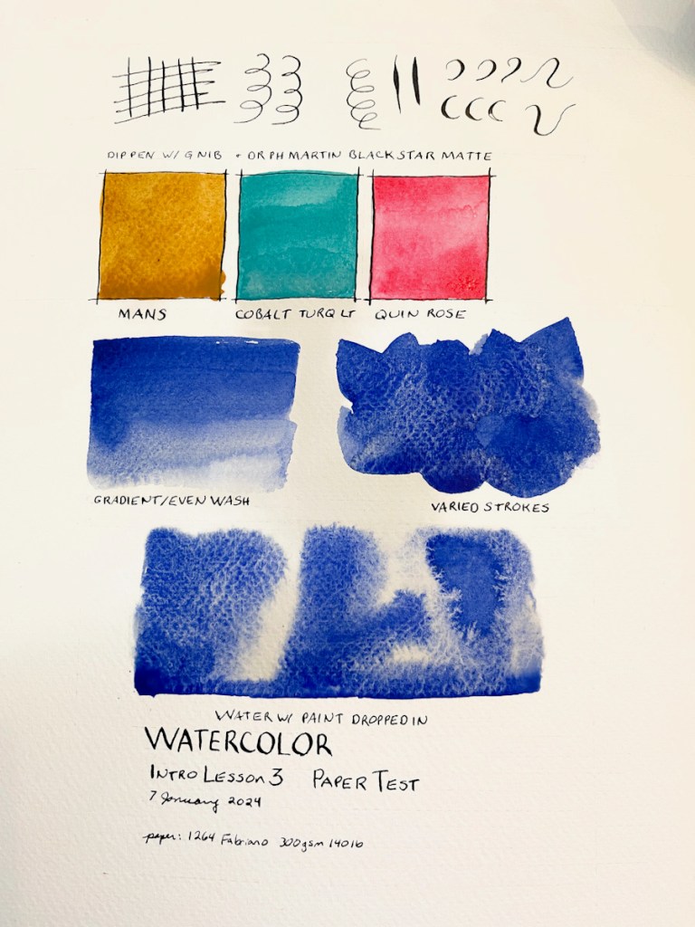
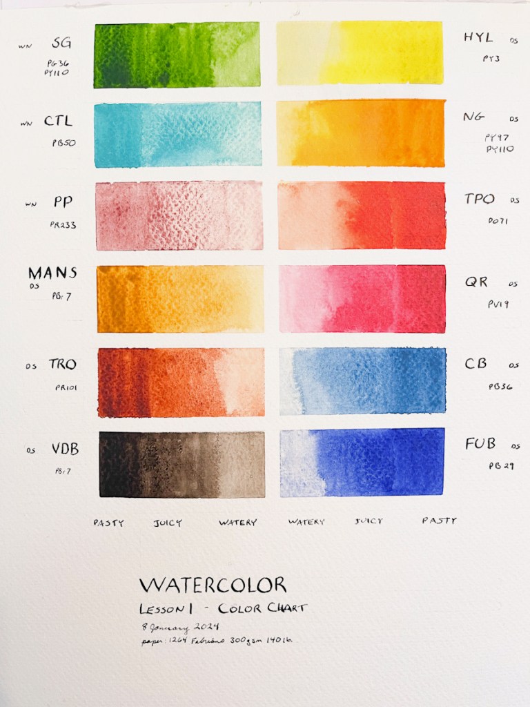
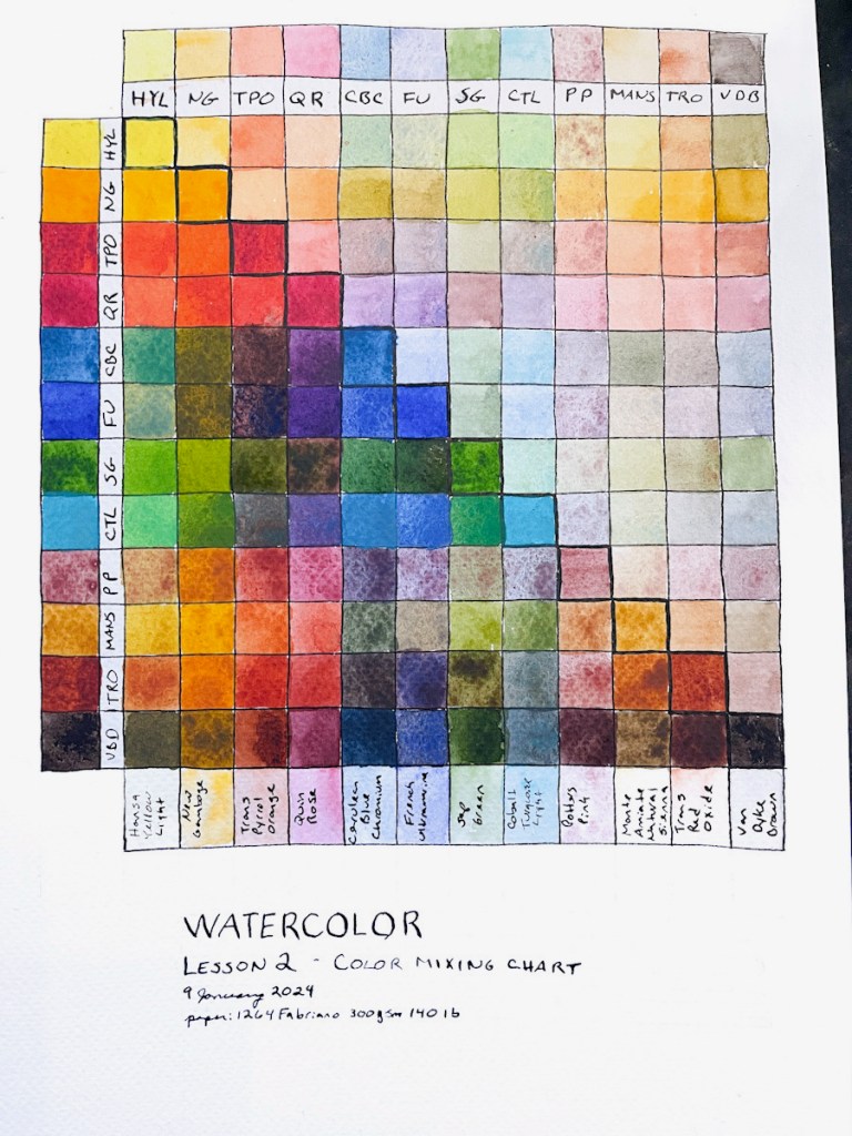
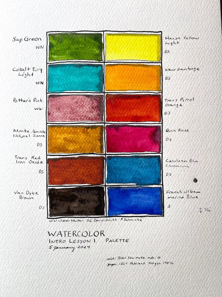
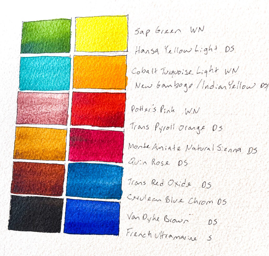
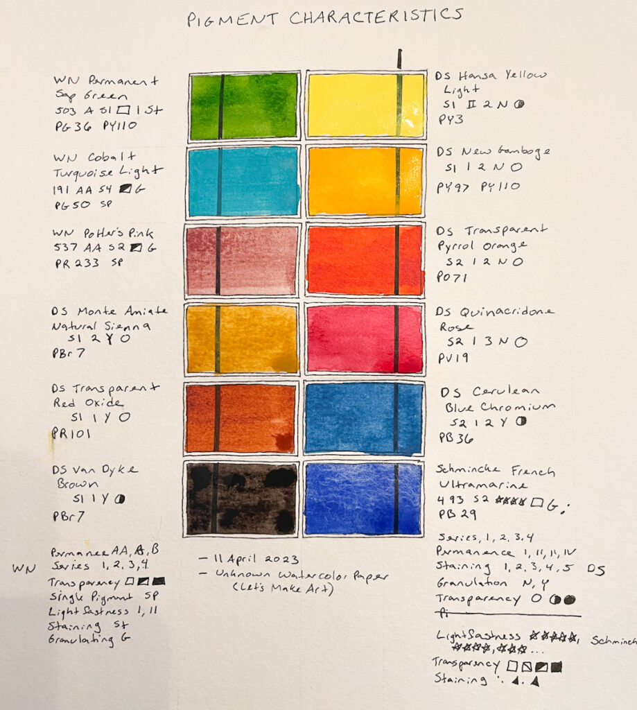
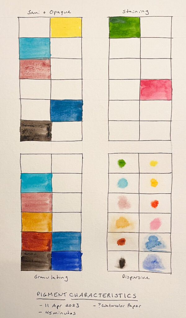
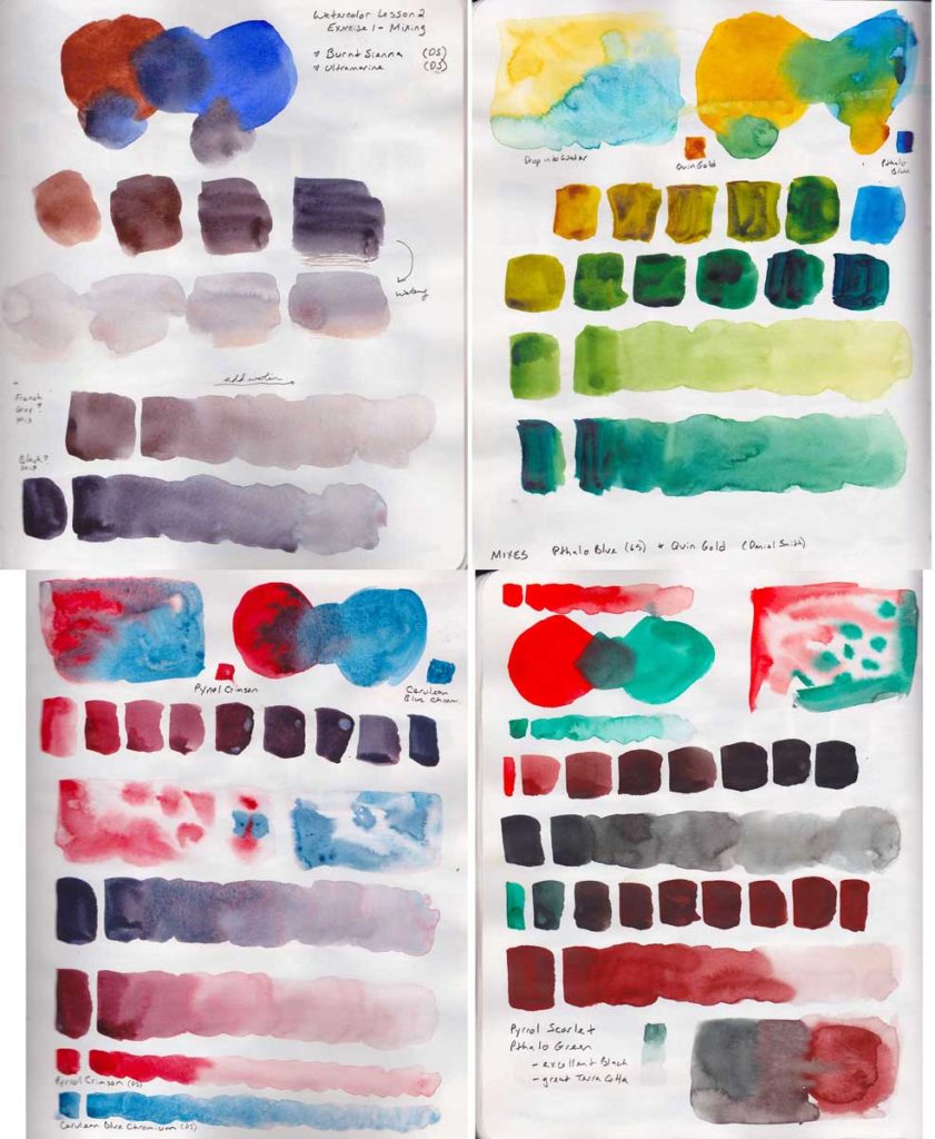
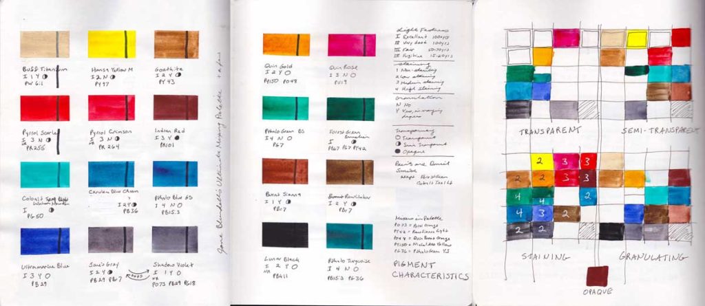
My 12 color palette for this class. Same as my last round through this course. I think I’m finally settling on some favorite pigments. I do find I like the transparency and granulation best. This 1264 Fabriano watercolor paper (9×12) is new to me. Very textured, and very thirsty, but the results are quite nice. I’m experimenting with a dip pen and a G nib here. Worked better on the watercolor paper than I expected. The ink is Dr Ph Martin Black Star Matte. According to the ink tests I did last week, it is the most brush proof as well as waterproof.

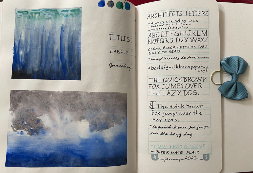
Sketchbook Design January 2023

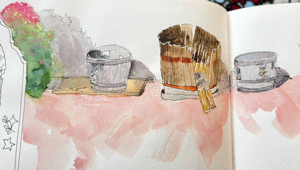
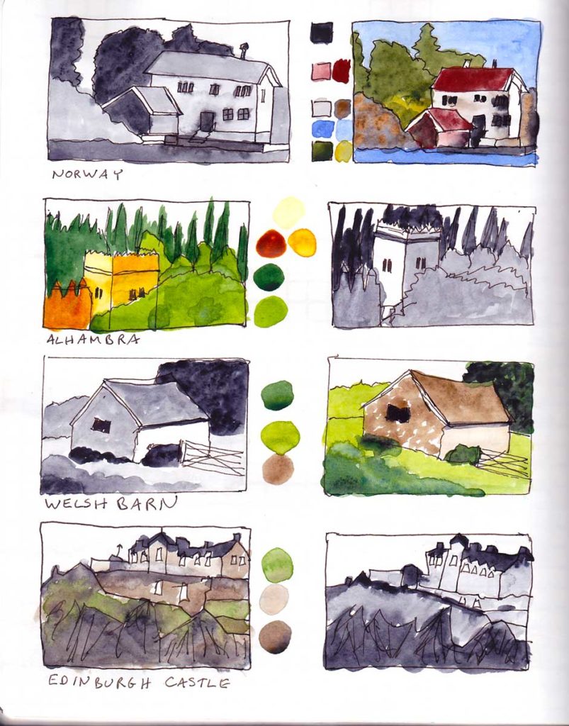
Here’s the wrap-up of my third run of this course. This class remains, by far, my absolute favorite, and it never fails to inspire and elevate my sketchbook practice.

I appear not to have uploaded the other pages from this run of the class, so maybe I’ll update this page at some point, if I do upload the rest.

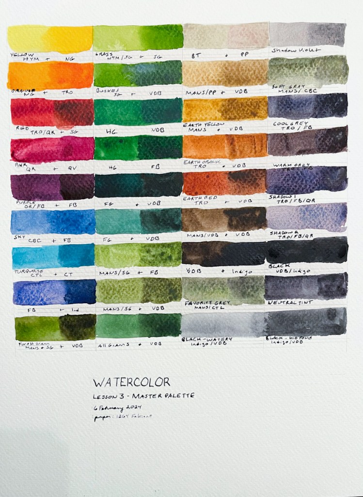
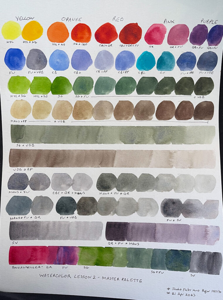
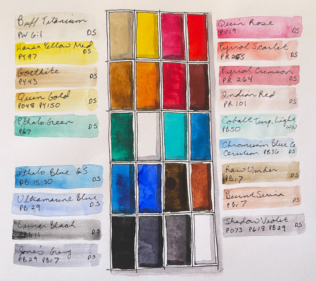
Master Palette

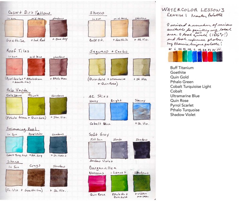
For my Master Palette exercise I decided to take “local color” quite literally. I took a walk around my Phoenix, Arizona neighborhood looking at the colors and taking some photographs. (A very short walk, it was 106F/41C!) What IS the color of the tile roofs, the stucco, the cactus, the palo verde, the bougainvillea? I could call the results my Phoenix, Arizona Palette! I really enjoyed doing this. It took some work and a fair amount of trial and error to get the right shades of green, but I really was able to get both the bright greens of the leafy plants, and the muted greens of the cactus.