Date and Weather Notecards

If nothing else this month (or two), I finally attempted to draw little aged note cards to give my weather pages a bit more design. Even when I’m not sketching, or doing much of anything else, I like to keep the weather notes and dates in my sketchbook to mark the passage of time. They serve as a record of when the going was more pitted gravel than smooth highway.

A sketchbook spread on white paper. The left page shows a handwritten weather diary for seven days (Wednesday May 20 through Tuesday May 26, 2026), with each entry recording the date, high and low temperatures in both Fahrenheit and Celsius, and a small hand-drawn weather icon — sun, partial cloud, or crescent moon. Temperatures range from 95°F to 98°F for highs. At the top right of the page, handwritten notes read "GoFun White No 101" and "Flax Beige No 401." The right page features a collage of three tarot-style cards at the bottom left — one showing a rose, one showing roses with swords, one labeled "Blades of Destiny" with a skull — and a large decorative print in the upper right: an intricate compass rose surrounded by botanical illustrations, pressed flowers, and heart motifs in black, grey, and dusty pink.
Weather diary, May 20–26.

I’m currently working in a new Stillman & Birn 7.5″ square Alpha. Remarkably, this page marks only the fourth spread in volume 30. Thirty!

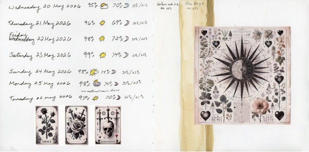
Recently, my printer stopped working, (too old for modern networks!) which forced me to pivot. I ended up getting a new one, and since I had a junk journal kit on hand, I decided to test print with it. When I didn’t end up sketching anything else to capture the days, I used those pages for collage. I became captivated by that specific shade of aged paper and wondered if my Gansai Tambi paints could match it.

  • Gofun White 101: A perfect match for the natural shade of the Alpha paper.
  • Flax Beige 401: Has great potential for an “aged” look, but didn’t quite match these specific printed sheets.

Shifting Plans & Playing with Color

A sketchbook spread dominated by a vivid, mottled watercolor background in loose washes of yellow, green, teal, blue, purple, and red-orange. Scattered across both pages are twelve small handwritten note cards, each recording the date, high temperature, low temperature, and weather icon for one day from Wednesday May 27 through Sunday June 7, 2026. Some cards also note a wake-up time. The cards appear slightly irregular, as if hand-torn, and are drawn to look aged, with outlined borders. Temperatures climb from the mid-90s°F into the low 100s°F
Weather diary, May 27–June 7.

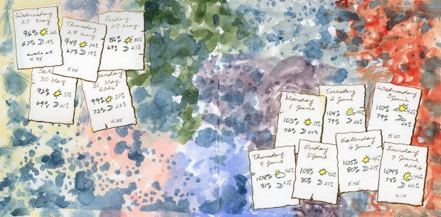
I had plans for sketching, but as the days slipped away, I simply played with watercolor and stencils. I used the Holbein watercolors that I assembled into my Travel Sketching palette (which I talked about in my last post). The dark blue spots were stenciled with watercolor over the color blocked background.

Crafting the Aged Look

A sketchbook spread with a dark, smoky purple-grey watercolor background on the left page, and a soft solid yellow on the right page (left blank). Scattered across the dark left side are twelve small handmade note cards in warm amber-yellow tones, each recording weather data for one day from Monday June 8 through Friday June 19, 2026. Several cards note a wake-up time (5:30, 4:50, 4:00, 4:45, 3:30). The cards are hand-drawn to look aged and yellowed, with dark outlines. Temperatures range from 103°F to 112°F.
Weather diary, June 8–19.

Really diving into how to make these note cards look aged, I used the Holbein palette:

  • Yellow Ochre: Used for that weathered, historic feel.
  • Eurasian Jay Rose Grey: The moody background complementary color to make the cards pop.
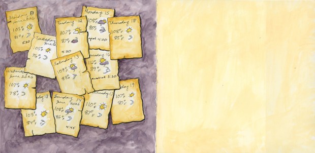
  • Jaune Brilliant 1: The yellowed wash on the facing page.

I originally intended to sketch something specific for the summer solstice, but I suspect now that this solid wash of color will remain as my tribute to the day.
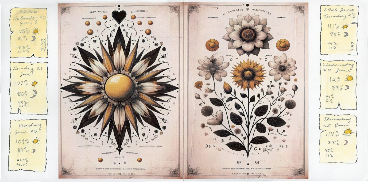
Solstice Collaging

A sketchbook spread with a clean white background. Three small handmade weather diary cards in pale yellow are arranged vertically along the left margin (Saturday June 20, Sunday June 21, Monday June 22), and three more along the right margin (Tuesday June 23, Wednesday June 24, Thursday June 25). The center two pages are occupied by two large collaged prints: on the left, an ornate botanical mandala with a sunflower-like starburst in black, white, and gold, surrounded by small decorative flourishes; on the right, a botanical illustration plate showing detailed flowers and foliage in black ink and amber tones, with scientific-style annotations. Temperatures on all six cards range from 105°F to 114°F.
Weather diary, June 20–25.

Fortunately, this junk journal page felt incredibly fitting for the solstice, so I collaged it in alongside the Jaune Brilliant 1 note cards.

That opacity gave me some trouble over the text. With opaque paints I should probably paint my background first, or stick to a much more transparent paint!

Even when energy is low, keeping a visual record, an illustrated diary is important to me. I miss it, but at least I’ve captured this era in these small ways.