Lesson two of Liz Steel’s Sketchbook Design course is Contained Compositions. Draw your frames first and design the page before you sketch, then find things to put in the boxes. That’s my favorite way to do it. Then one can get more varied (vertical, horizontal, round, asymmetrical), and eventually try dropping the borders altogether. The one rule is no overlapping.
I loved it. I even wrote “Grids make me happy!” on one of my journal cards! Having a plan makes it all so much easier. No analysis paralysis!
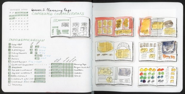
A planning page to start with. I started these planning pages for this course, and they have made my life so much better! I will never stop making these! It has the October calendar, the lesson checklist, and a tiny tracker grid for each spread (daily spread, scan, post, comment, blog). Looking at it now, the planning page is itself a contained composition. On the right are six thumbnails where I was thinking on the page. I sketched many options in pencil before deciding on the final layout.
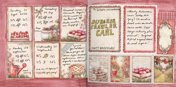
This one is a tidy grid of apple orchard cards. (The Junk journal ephemera is from Vectoria Designs “Apple Orchard” kit.) I cover the last days of September: weather, flood warnings, and finally getting some sleep. Opposite is a hand-lettered Dungeon Crawler Carl cover and a quick review. It’s utterly hilarious, a bit gory, and Jeff Hays’s narration is phenomenal. I’m so glad to have a good book again. Normally I’d layer this kind of ephemera all over itself, but for this assignment, I kept it strictly gridded. Every piece got its own space.
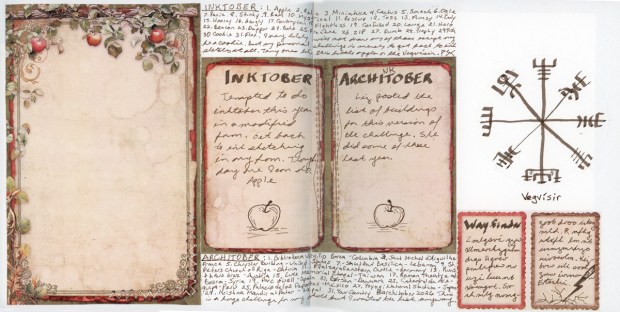
Next came varied shapes: a tall fold-out panel, two cards side by side, a circle for the Vegvísir, and two little cards tucked in the corner. The Inktober and Architober prompt lists ended up working as borders along the top and bottom. I’m doing a modified Inktober this year, and my real challenge is just getting back to ink sketching at all. Day one was an apple. The Architober list is a huge stretch for my skills, but I wanted it anyway. Not my favorite spread in this set, and I could not figure out what to draw in the big collaged note page, but I am moving on. It documents my not knowing, which is also part of the month I had.
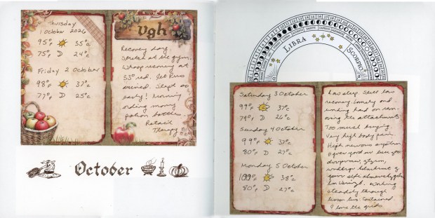
This one has fewer frames. No painted background, just cards floating on white paper, with “October” lettered on the open page among a witch’s hat, a cauldron, a candle and a pumpkin. It wasn’t a great week. Some of it went into the journaling in code, and some of it went into ordering potion bottles. Retail therapy! I was really happy to practice calligraphy. Determined to begin to sketch again, I drew the small icon-like images. I have missed sketching!
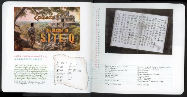
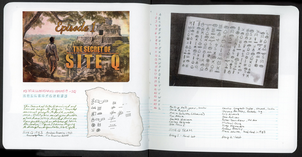
Then no borders at all. This is my favorite of these contained pages, and I think I leveled up in how I think about them. The Secret of Site Q arrived, and I spent three hours trying to decipher the symbols. I haven’t cracked them yet. Nothing on this spread is framed, but nothing overlaps either. The grid is implied. I had so much fun adding the two collage elements, and I hand-drew the coded slip of paper, which turned out so great!
What I did differently: I designed the page first and filled it second. I left gutters, I gave everything room, and I resisted the urge to tuck one thing under another. Well-filled, grid-based pages will always be my go-to. However, I’m starting to see how a little more white space leaves some breathing room and lets certain items shine. The Site Q page feels like a bit of a breakthrough for me, and I’m eager to keep going!


Keep going Jamie! Very interesting. I like the idea of laying out the composition in boxes first and then filling them.
LikeLike