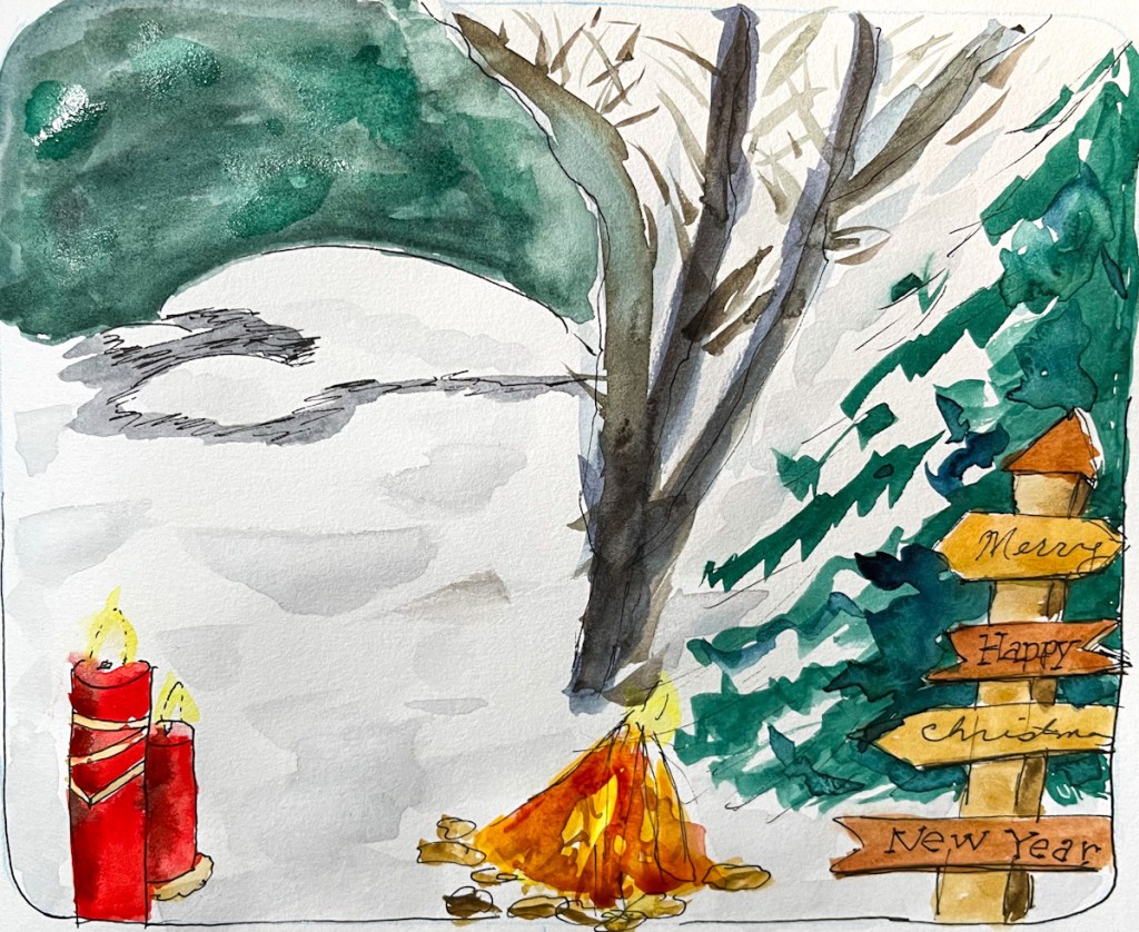
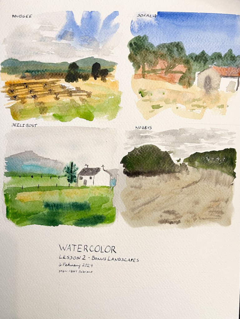
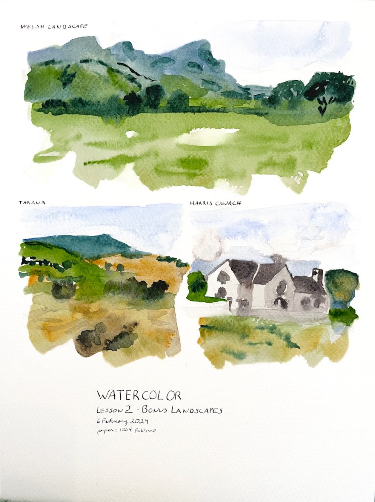
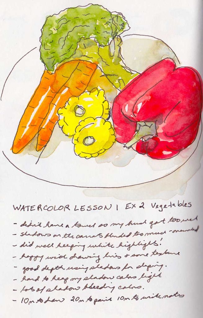
My fifth run through Sketching Now Watercolor. I had fun this year, and made a page design formula. I also did this year on loose watercolor paper, Fabriano 1264, which is a student grade watercolor paper I had in stock.
My previous runs through this course were in 2018, 2021, 2022, and 2023.
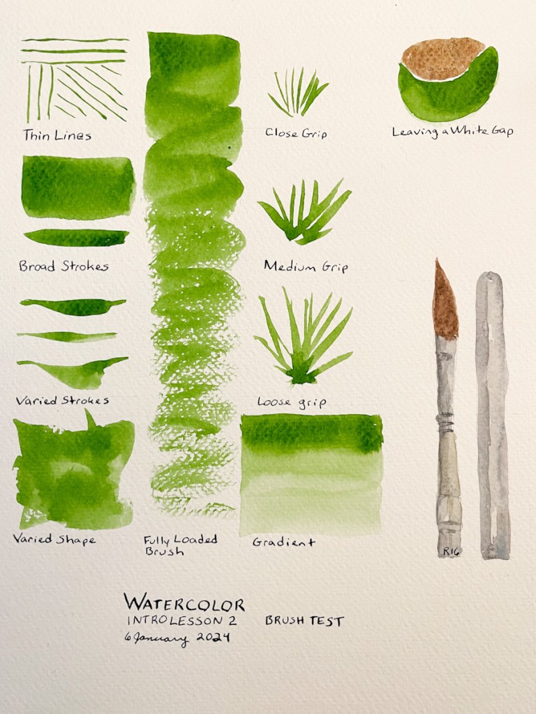
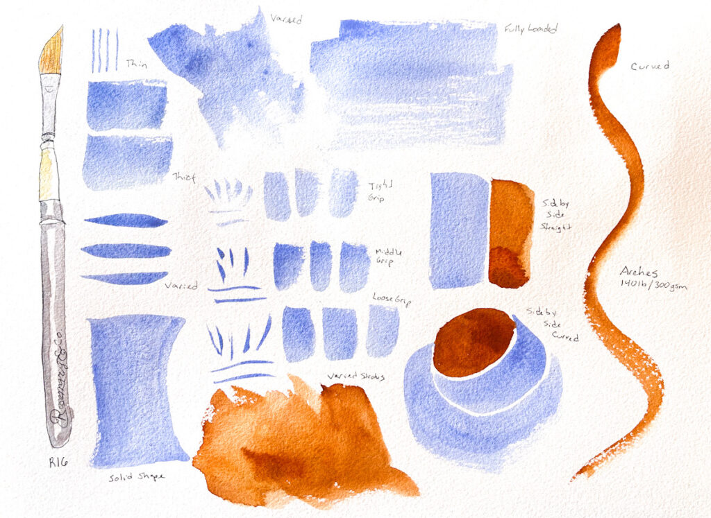
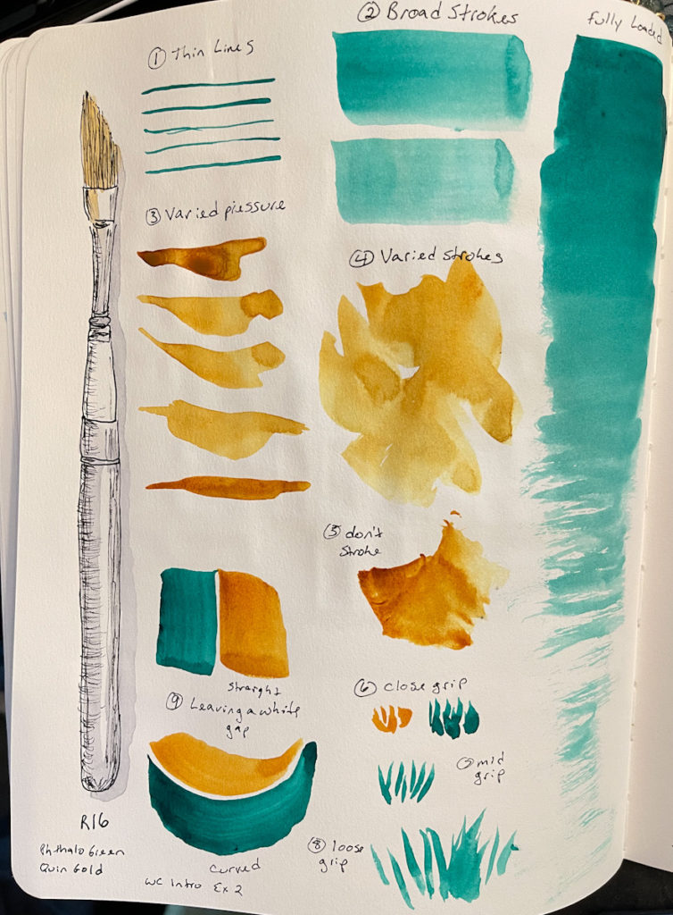
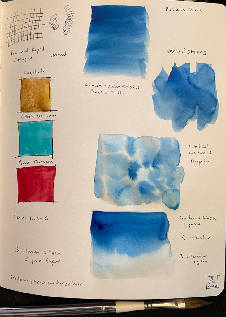
Testing the Rosemary & Co. R16 brush for Sketching Now Watercolor Class. Paper is 1264 Fabriano 140lb 300gsm. These kinds of tests are always so fun to do!
Starting my Watercolor class at Sketching Now with Liz Steel. Thus will be my fifth time taking it! I swear I learn more every single time! Last time I tested the exercises with two different palettes. This time I think I’ll add page design to my efforts. I’m keen to work on shadows and dimension as well. I know from experience I tend to run short on time, so wish me luck!
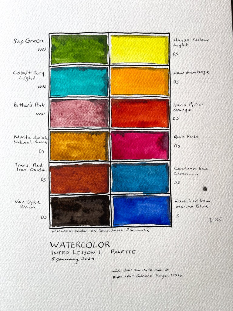
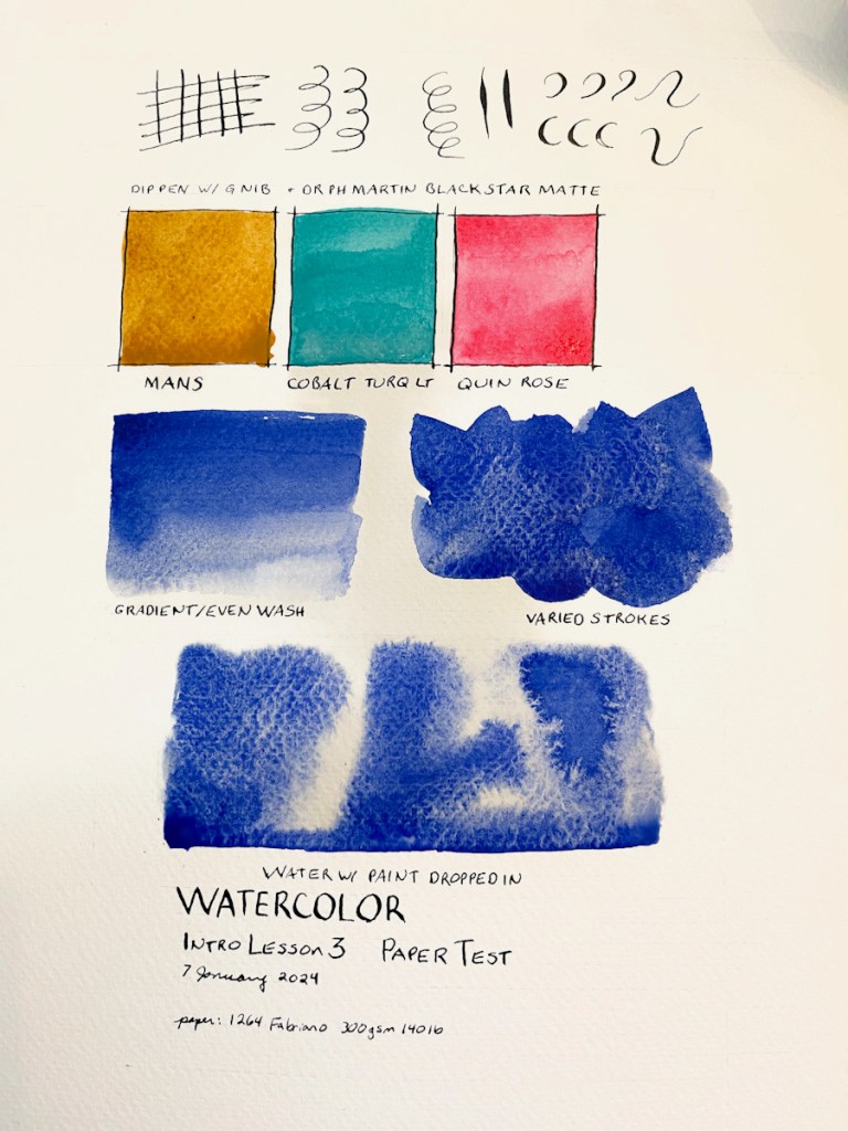
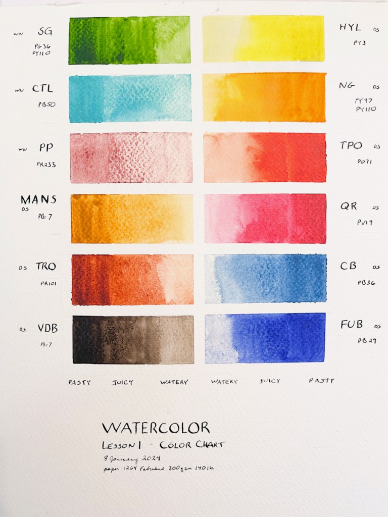
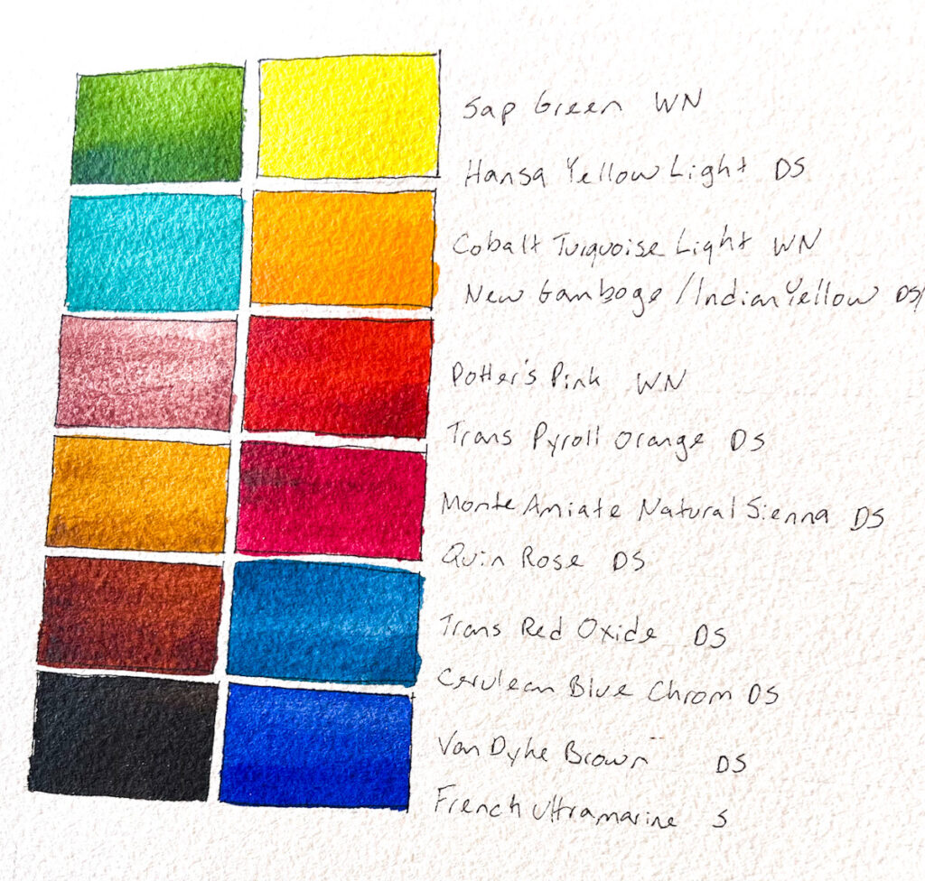
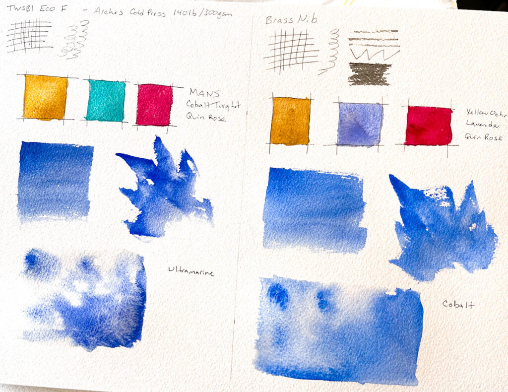
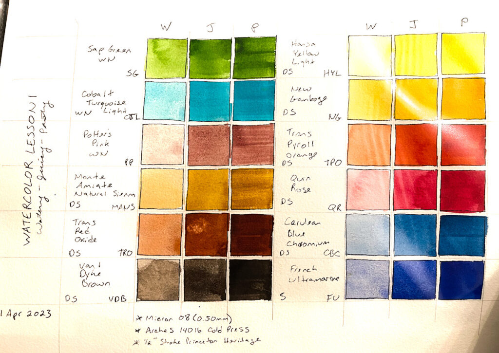
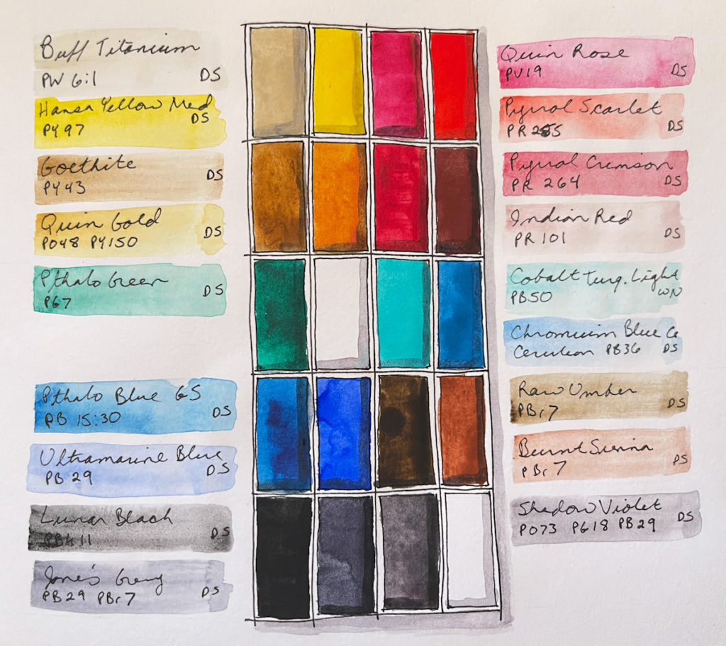
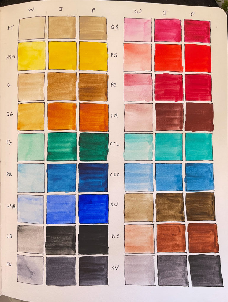
My 12 color palette for this class. Same as my last round through this course. I think I’m finally settling on some favorite pigments. I do find I like the transparency and granulation best. This 1264 Fabriano watercolor paper (9×12) is new to me. Very textured, and very thirsty, but the results are quite nice. I’m experimenting with a dip pen and a G nib here. Worked better on the watercolor paper than I expected. The ink is Dr Ph Martin Black Star Matte. According to the ink tests I did last week, it is the most brush proof as well as waterproof.
Here’s the wrap-up of my third run of this course. This class remains, by far, my absolute favorite, and it never fails to inspire and elevate my sketchbook practice.
I appear not to have uploaded the other pages from this run of the class, so maybe I’ll update this page at some point, if I do upload the rest.
This my third run through Sketching Now Watercolor. Previously I took this course in 2018 and in 2021, though I did not finish it the last time. I can really see how much my watercolor has improved since I first took this course!
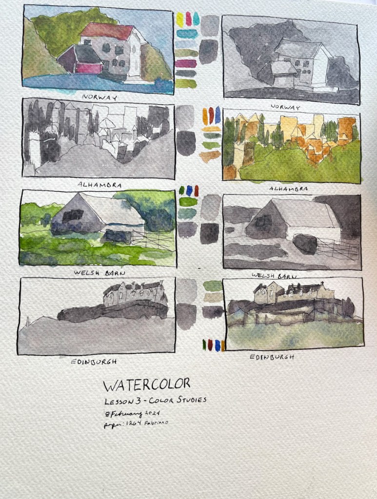
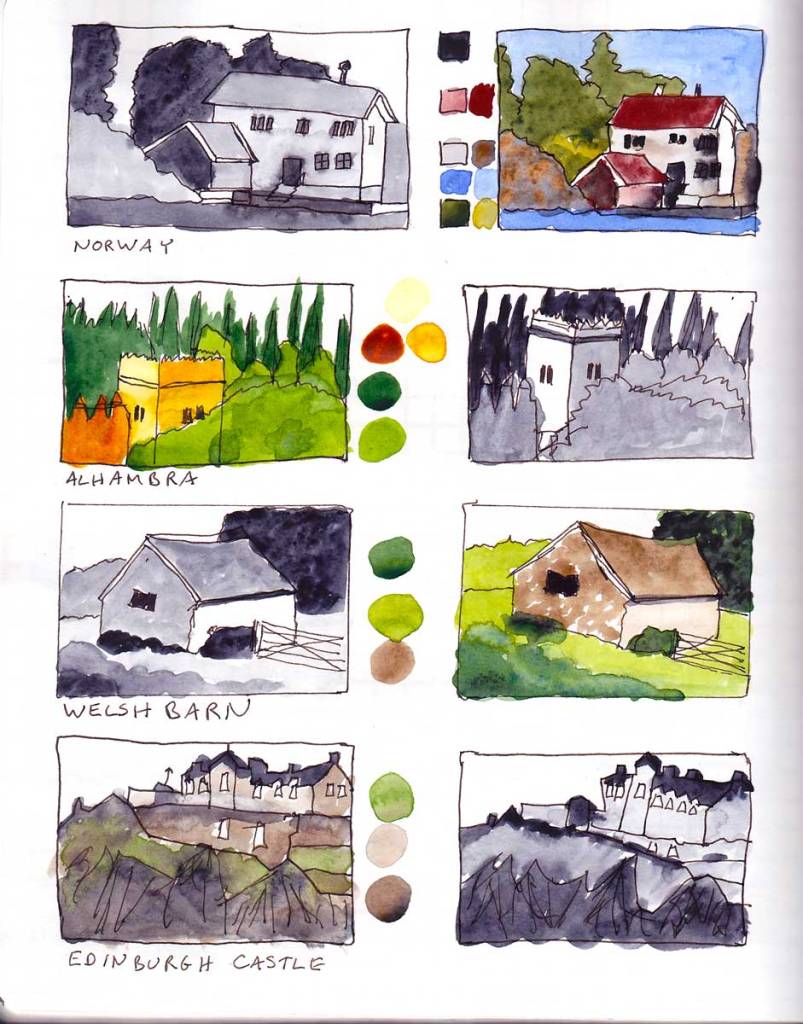
These value and color studies were harder than I thought they would be! Especially Edinburg! Such a valuable exercise to train the eyes into seeing values and how to achieve those values with color!
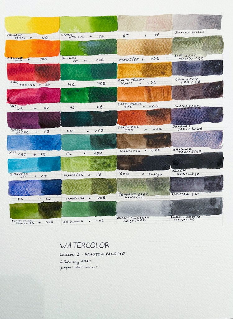
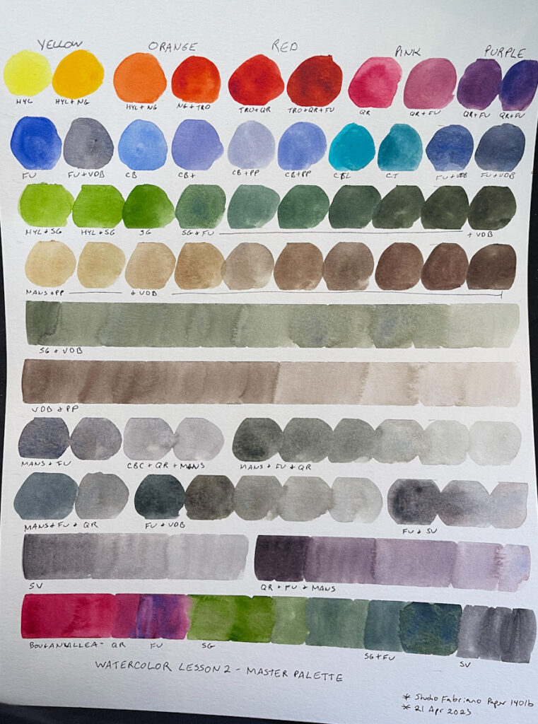
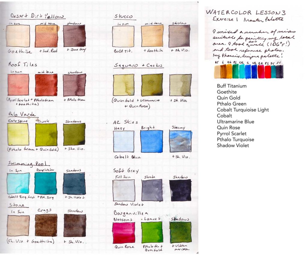
For my Master Palette exercise I decided to take “local color” quite literally. I took a walk around my Phoenix, Arizona neighborhood looking at the colors and taking some photographs. (A very short walk, it was 106F/41C!) What IS the color of the tile roofs, the stucco, the cactus, the palo verde, the bougainvillea? I could call the results my Phoenix, Arizona Palette! I really enjoyed doing this. It took some work and a fair amount of trial and error to get the right shades of green, but I really was able to get both the bright greens of the leafy plants, and the muted greens of the cactus.
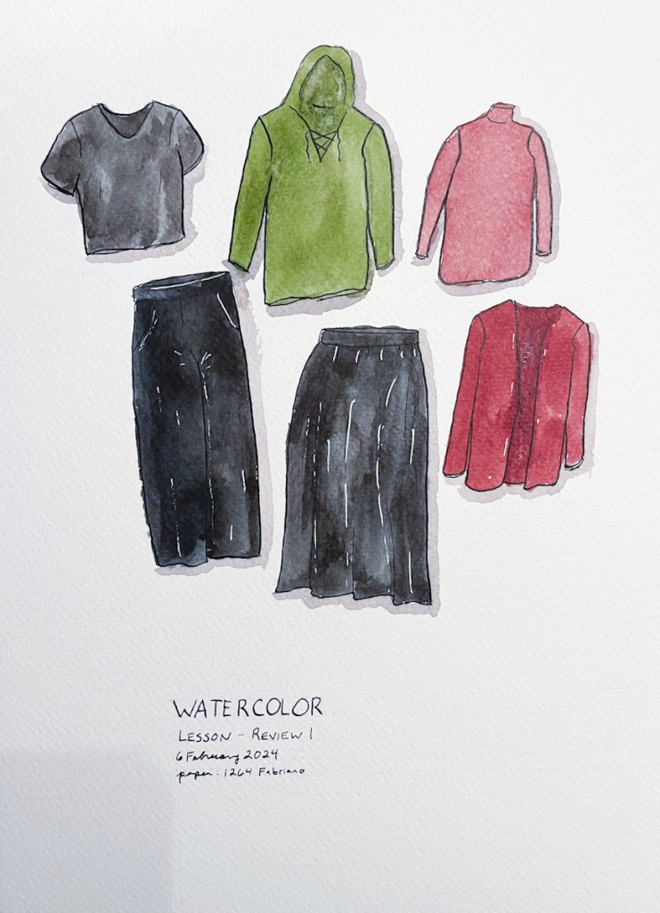
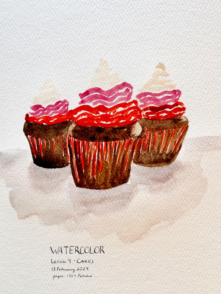
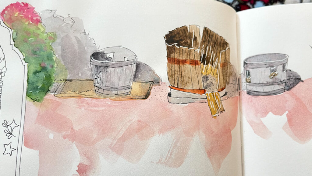
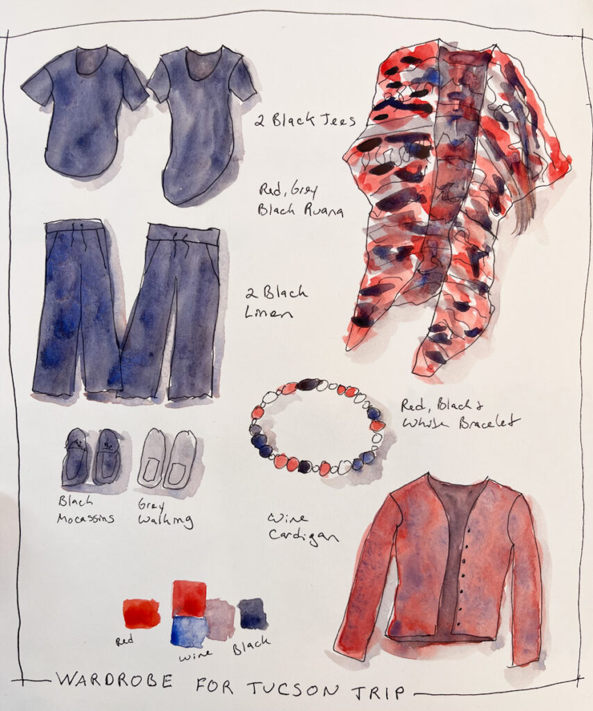
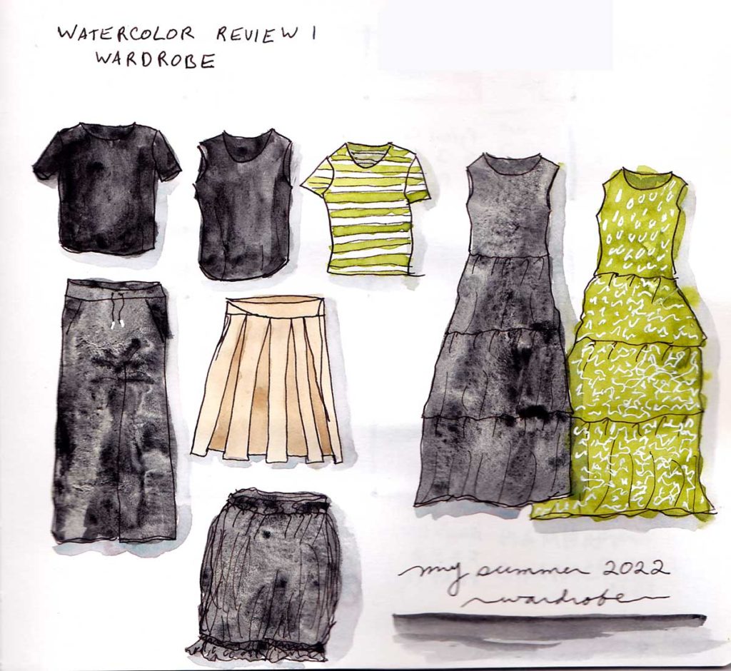
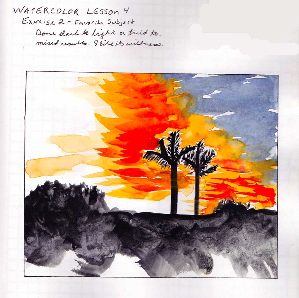
I focused on achieving patterns, so my colors are off. I tried to use the granulation of Lunar Black to make the all black items have a little life in the sketch. I’m pretty happy with my results.
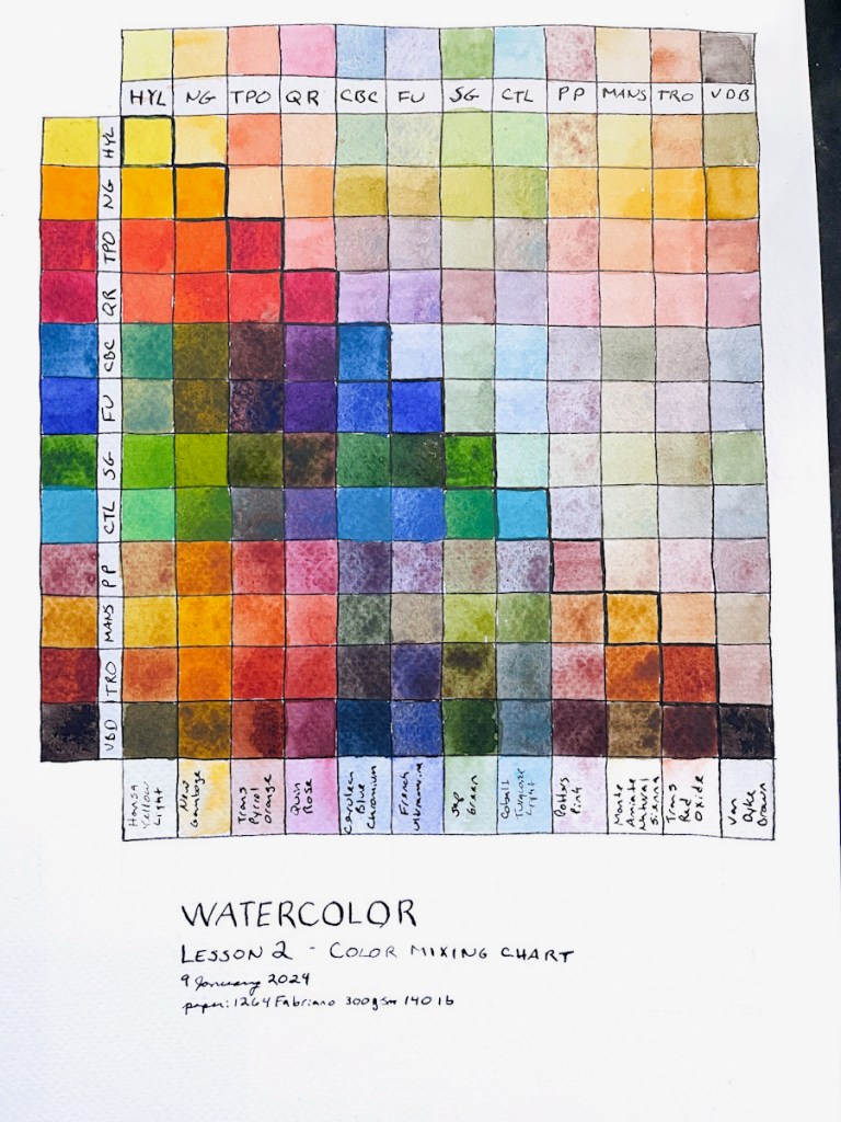
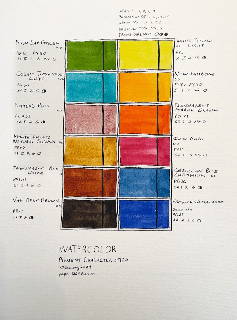
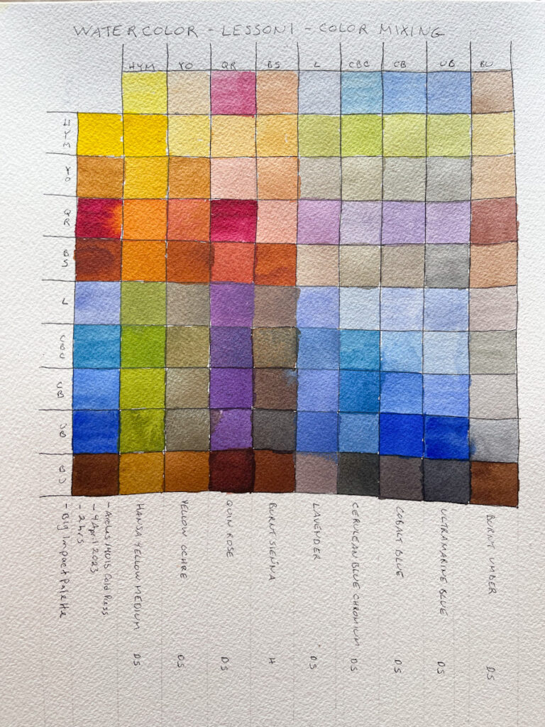
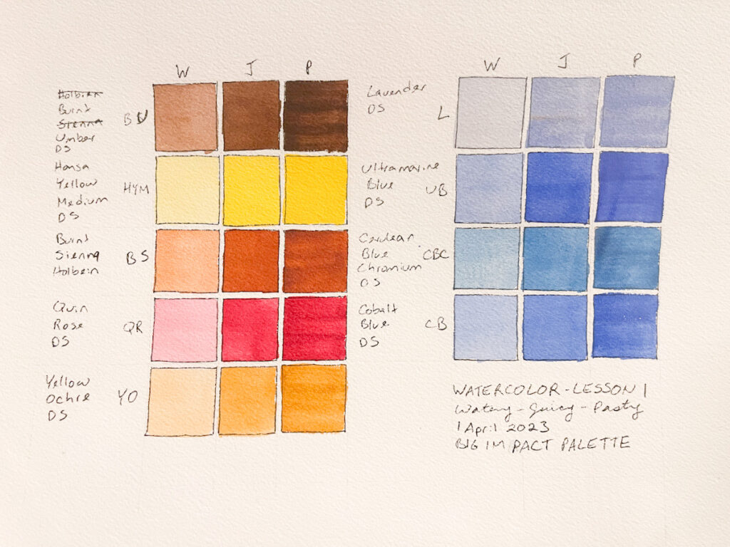
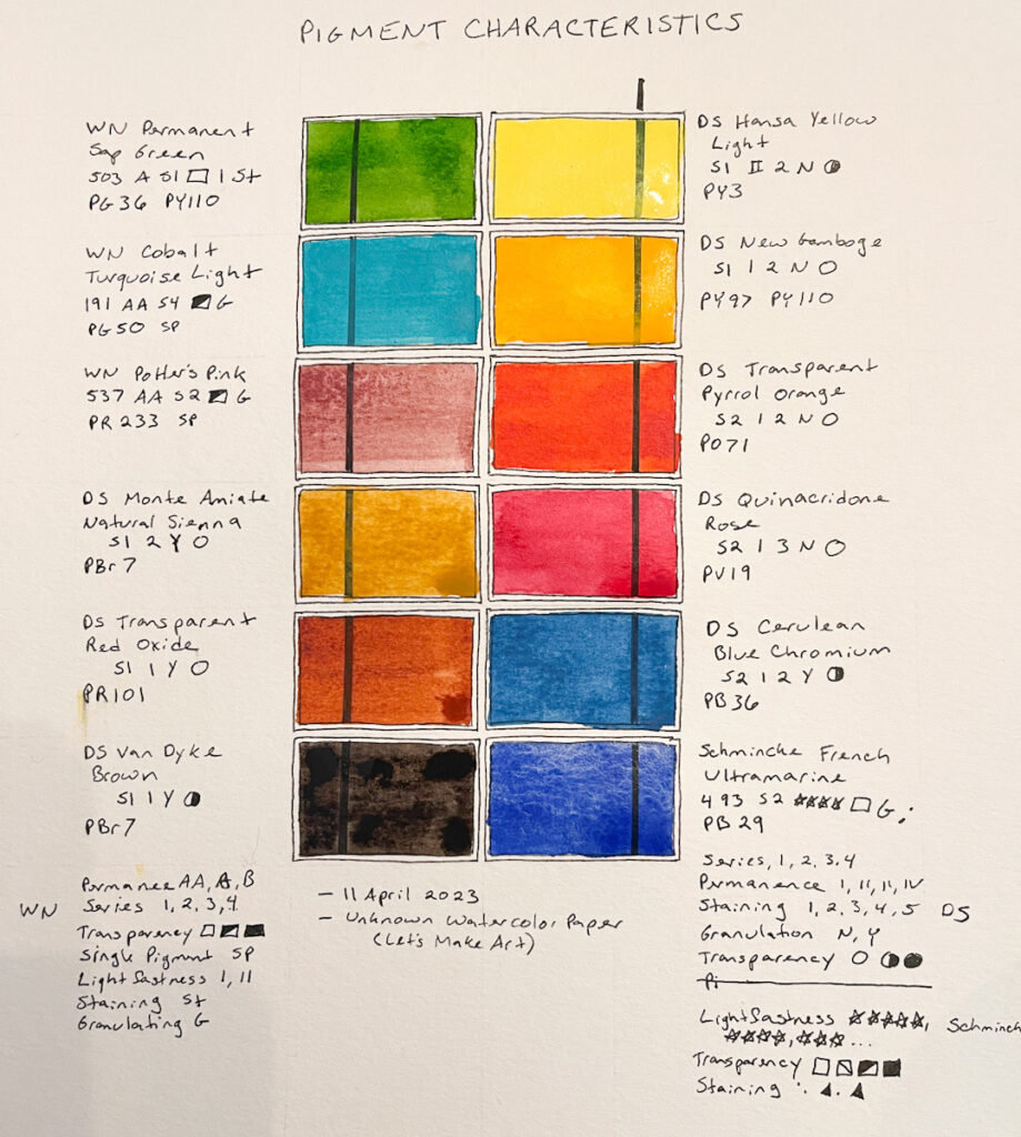
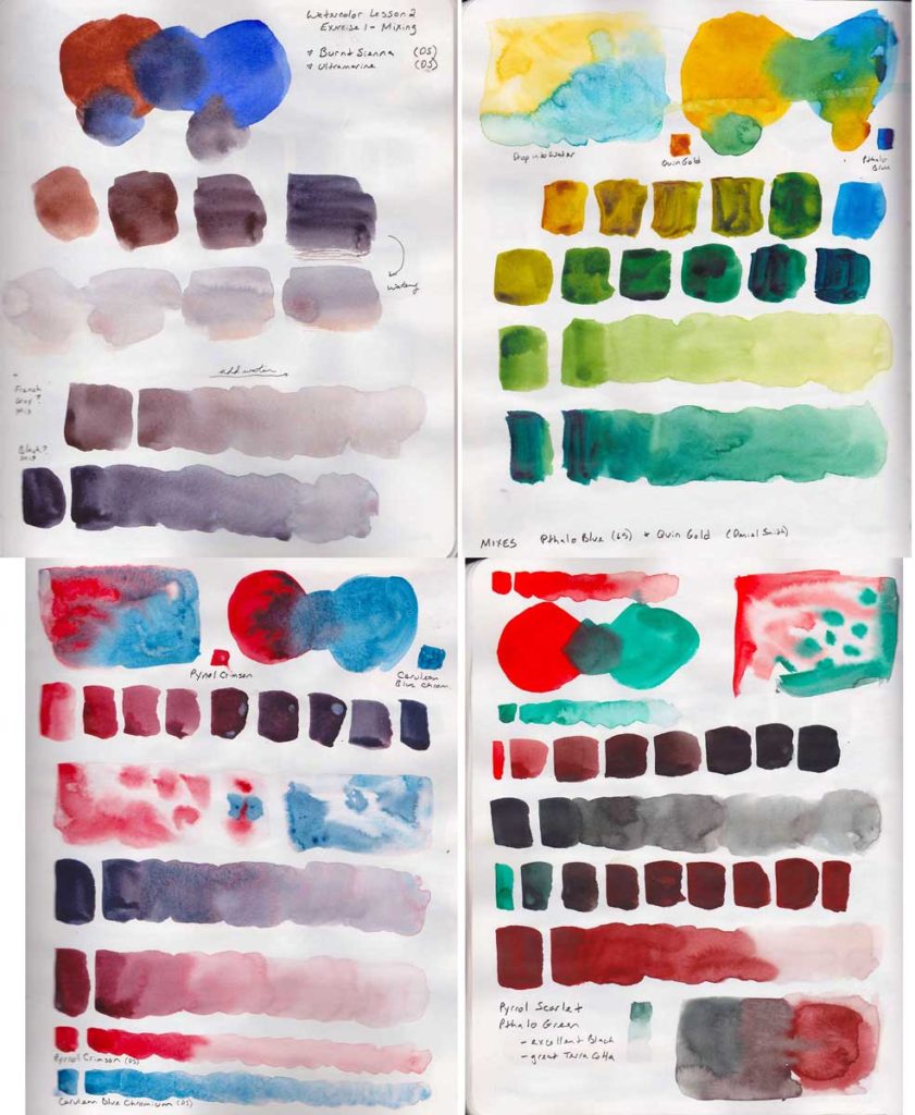
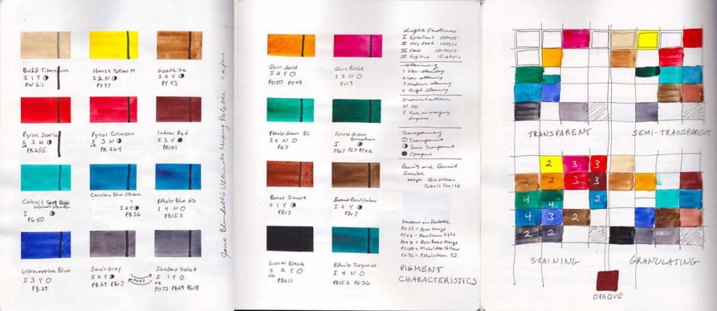
For this class I’m using Jane Blundell’s Ultimate Mixing palette. I was surprised how few of these colors are transparent. Almost all of them are staining, as well. Fascinating. I’ve long been interested in pigments and I have really loved this lesson.