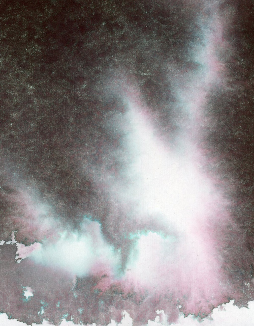
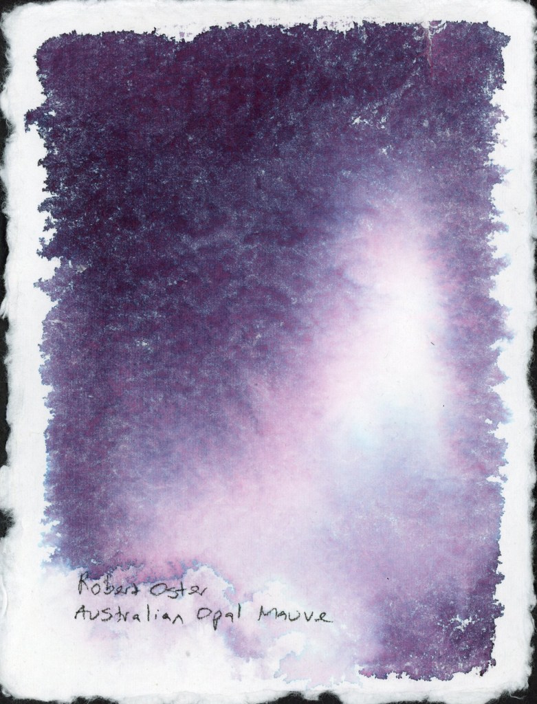
Before I put my handmade paper ink swooshes into the portfolio book, I wanted to use the backs of the cards. Can’t have blank paper! What’s the fun in that? Plus the chromatography aspect is so much fun, and what would happen if I had more paper to work with for a larger separation potential?
So I did what had to be done. I made a mess. A beautiful, atmospheric, very satisfying mess. I even had water and ink dripping off the page!
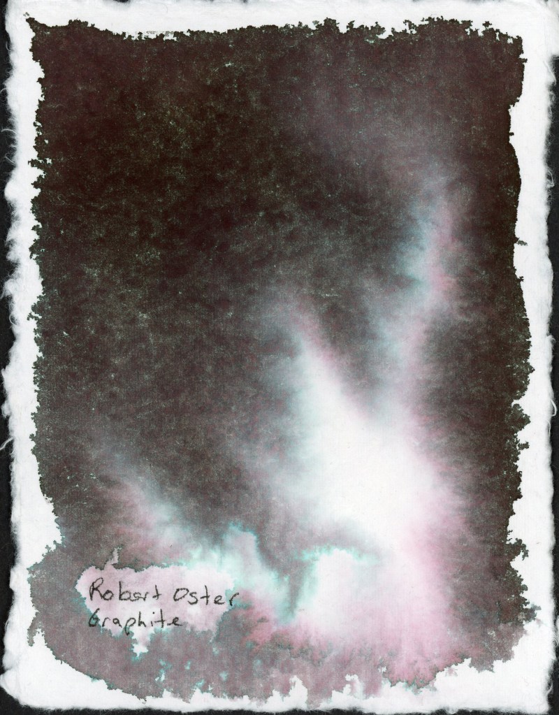
Robert Oster Graphite was one of my favorites from the chromatography lesson I posted about recently. That deep complex near-black opens up into the most beautiful teal and rose separation in the lighter areas. It looks like a nebula. I’m a little bit in love with it.
Then I wanted to see what this particular handmade paper does with some of my granulating watercolors. Granulating watercolors behave very differently depending on the paper. how much separation the pigments have causing that elusive “watercolor magic.” This handmade paper is cotton, and it does a very good job of having very even washes once it is dry. So watercolor magic? Not so much.
The granulation is visible, but the paper holds the pigments fairly close together rather than letting them really spread and separate. It’s a quieter, more even look. Perfect when you want smooth washes.
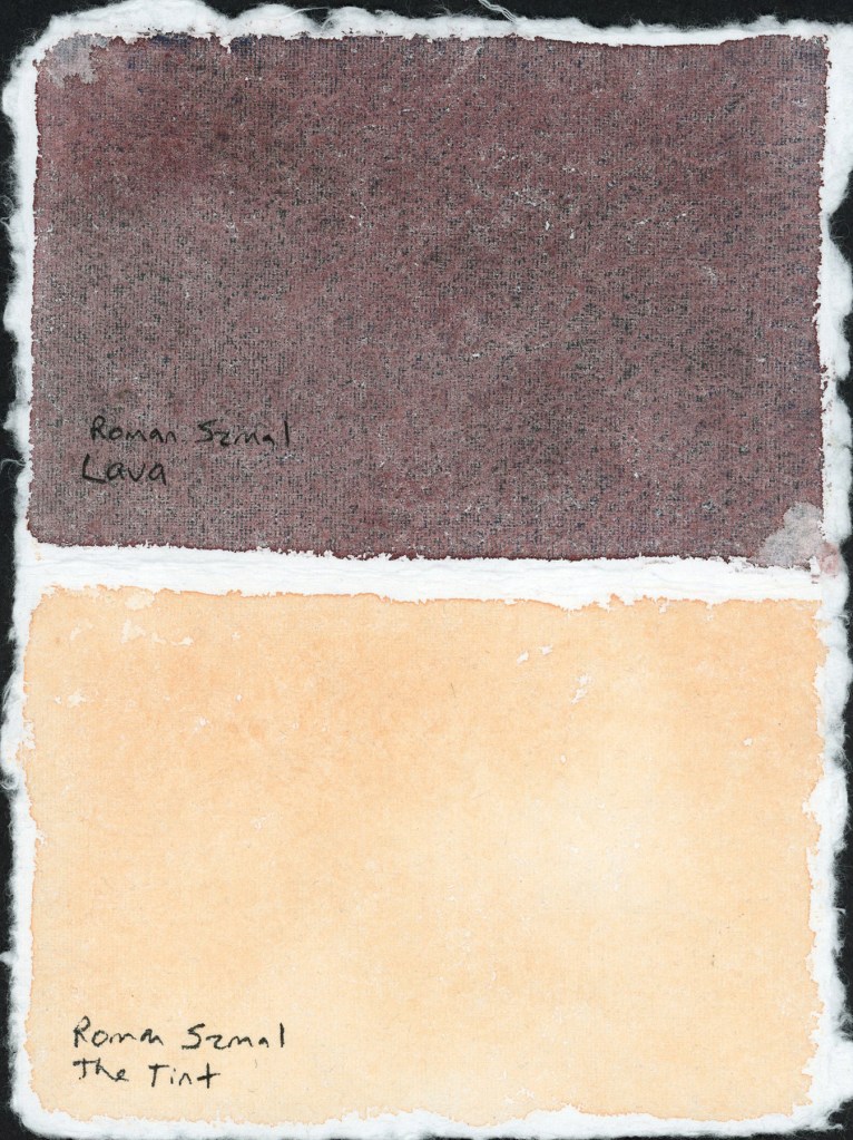
I’m loving that Roman Szmal Lava in particular. I’m looking forward to using it a lot more. That dark reddish color, and it has lovely granulation on different paper.
I tested The Tint alongside it, to sample how pink versus yellow is it on this paper. A nice striking pair on the page.
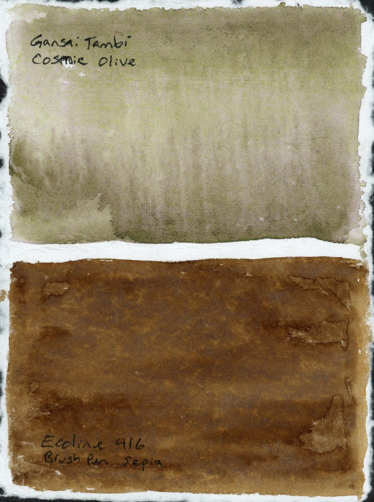
The Cosmic Olive did not separate nearly as much as it does on other papers, and the Ecoline 416 Sepia marker turned out surprising flat. I expected more blooming when I added water.
In the food sketchbook, the Delta, I’ve been using the Shikiori markers to sketch my food, so it was time to do a full color chart. Beautiful colors and they react strongly to water. I love that.
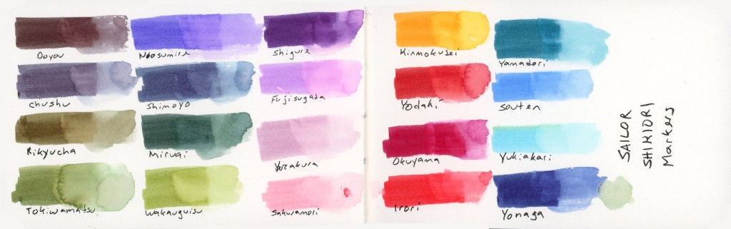
The Shikiori markers do something I find absolutely lovely, add water and they bloom outward in that soft, spreading way that reminds me of how Faber-Castell watercolor markers behave. Very satisfying, very painterly. It’s easy to make a lovely watery mess, and I adore that. The Delta paper the results were clean and bright, and holds up well to markers and lots of water.
The Shikiori line takes its name from 四季織 — shikiori — meaning “weaving of the four seasons,” and the color names live up to that. They’re all Japanese seasonal and nature words, and I think they’re worth listing out properly because they’re just so beautiful:
Doyou — midsummer · Chushu — mid-autumn · Rikyucha — tea-brown, named for the tea master Sen no Rikyū · Tokiwamatsu — evergreen pine · Neosumire — sleeping violet · Shimoyo — frosty night · Miruai — meeting of seaweed · Wakauguisu — young bush warbler · Shigure — autumn rain shower · Fujisugata — shape of Mount Fuji · Yozakura — night cherry blossoms · Sakuramori — cherry blossom grove · Kinmokusei — osmanthus flower · Yodaki— night waterfall · Okuyama — deep mountain · Irori — hearth fire · Yamadori — copper pheasant · Souten — blue sky · Yukiakari — snow light · Yonaga — long night
Such beautiful and inspiring names!

Leave a comment