I’ve been in a lot of conversations lately about Inktense, and heard a lot of questions about them, which makes me very curious to learn the answers. I’ve done a couple sketches with them, but my goal has mostly been to compare them with Albrect Durer watercolor pencils. One question I’ve heard is what makes them different from watercolor pencils. This is perhaps the question I seek to answer first.


They lay down like watercolor pencils. The lead is a little softer than Albrect Durer, so sharp tips break off. However, sharpening with a knife or using the sticks could fix that. I find it challenging to find which color I’m looking for in my kit bag, when I’m on location, because the pencils barrels are painted black, and the leads don’t always look like the color they put down. (I’m looking at you Amber and Tan whose leads look green, but they lay down as muted yellows.) The color indicator on the end could help, but I am reluctant to store my pencils tip down, especially with a soft lead. Maybe a roll-up pencil case is the solution?
Because it is a softer lead, it is maybe easier to lay down a thick layer, when I want strong color. Once they are activated, the literature says they are permanent like ink. I haven’t tested that with applications like watercolor over the top. They are vibrant, intense colors with strong pigment, which I like. The pastels I tend to get with watercolor pencils is nice, but I yearn for more color. That might just be my own lack of skill showing, however.
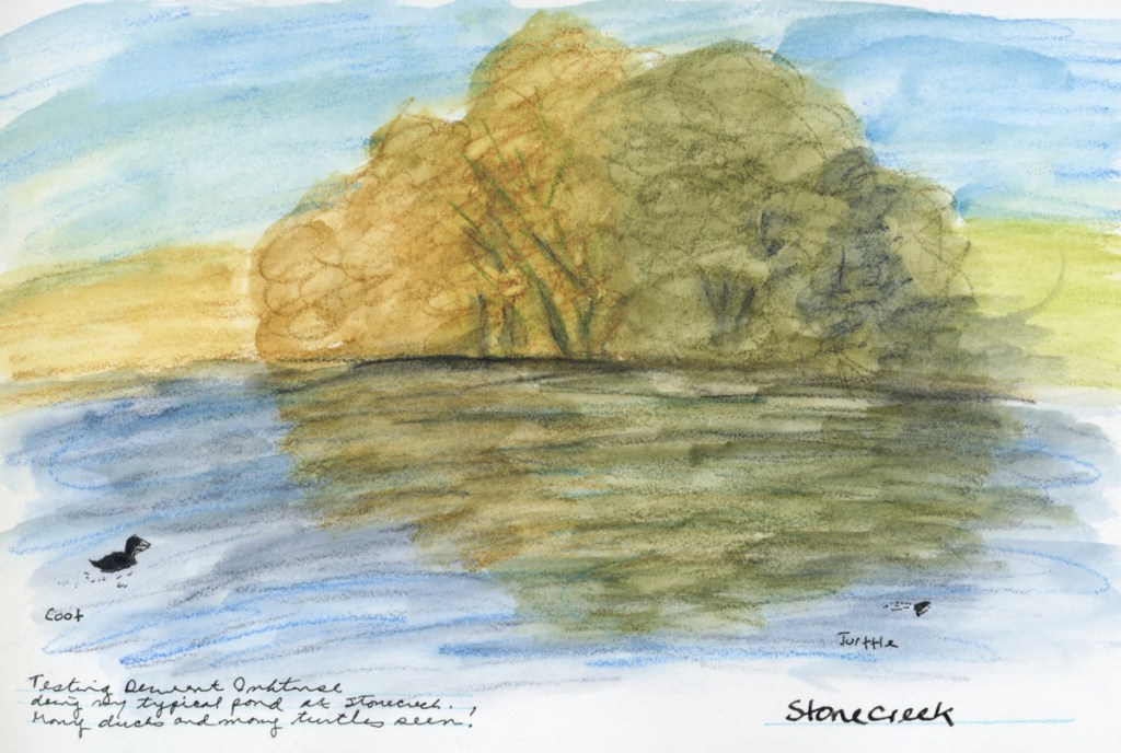
Once the Inktense is activated with water, I find it much easier to put a second layer on top once it is dry, than I do with Albrect Durer. That makes it easier to keep working with them in layers. Especially on location, as I live in the desert, and my pages dry very quickly.
These are my first observations on them. I’ve owned my Inktense pencils for a very long time, and rarely used them, so I’m quite keen to make use of them and learn more.
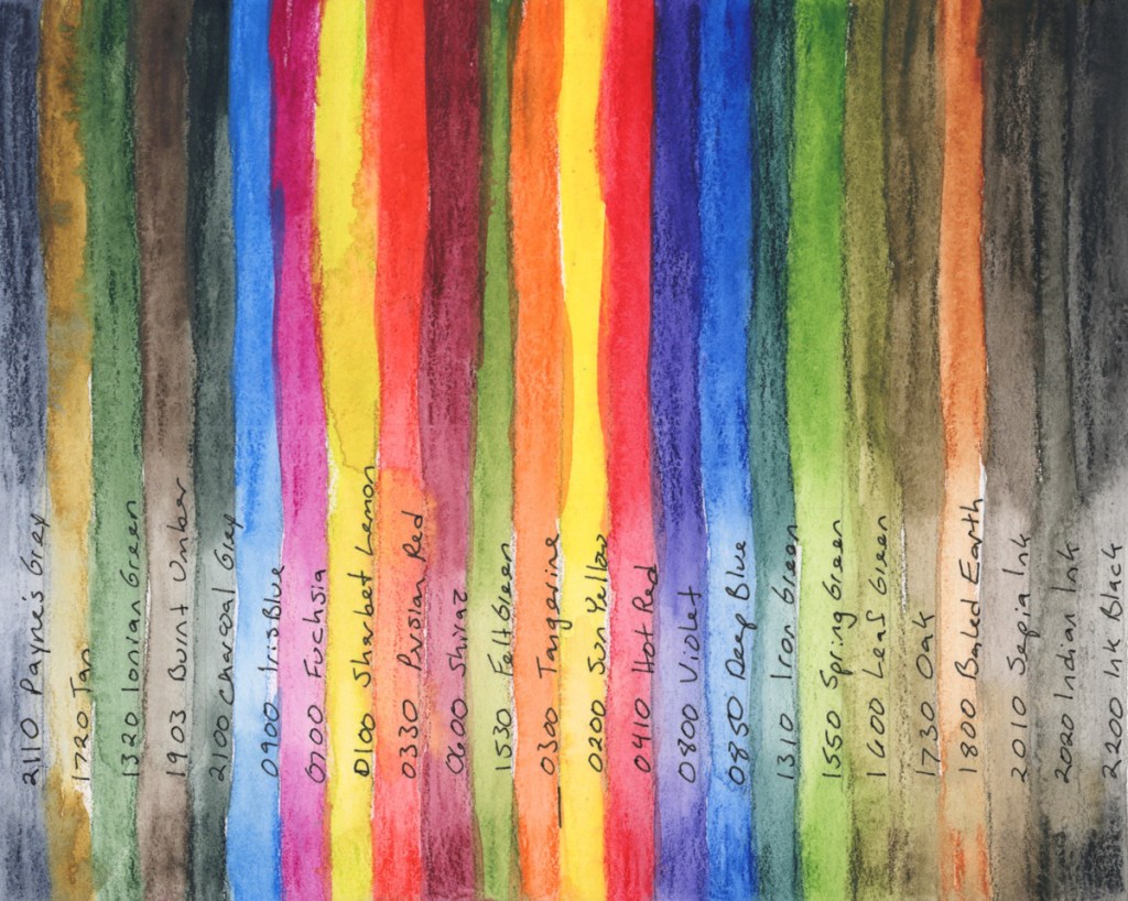
Alex Boon Art on You Tube has been very helpful for me in selecting colors for a palette to carry. He is a Nature Journalist, and he has a few limited palette recommendations. Here are his 12 and 24 color recommendations.
The 12 pencil set: 2100 Payne’s Grey, 1720 Tan, 1320 Ionian Green, 1903 Burnt Umber, 2100 Charcoal Grey, 0900 Iris Blue, 0700 Fuchsia, 0100 Sherbet Lemon, 0330 Persian Red, 0600 Shiraz, 1530 Felt Green, and 0300 Tangerine.
For 24, also add: 0200 Sun Yellow, 0850 Deep Blue, 0410 Hot Red, 0800 Violet, 0850 Deep Blue, 1310 Iron Green, 1550 Spring Green, 1600 Leaf Green, 1730 Oak, 1800 Baked Earth, 2010 Sepia Ink, 2020 Indian Ink, 2200 Ink Black.

I wanted to see how they work on the Delta paper, so I did another color chart.
I begin to think the Delta paper is working better for the Inktense pencils! The colors seem richer, and they definitely smooth out with water more easily. Interesting.

Leave a reply to Ginie Cancel reply