I’ve been working toward increasingly abstract options for my color chart examples. I have read a couple books, and been inspired by a couple artists. So I dove in to attempting a fully abstract, color exploration abstracts. The first was done because I really liked the colors I used for the Tuzigoot sketches, so I wanted to explore the same color combination in an abstract. I really love this one.

I also tried a plastic stencil with watercolor. The first effort, which is the Van Dyke Brown, worked great. I used a dry brush. The second effort was the white Acryla Gouache, which bled more because my brush wasn’t dry enough. I think I can get these stencils to work pretty well, though. I like how they look.
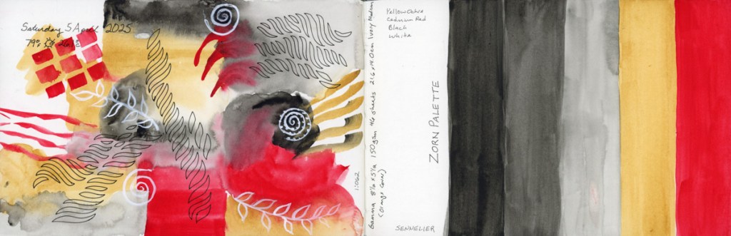
My second abstract attempt was using the Zorn color palette. Anders Zorn, a Swedish painter born in 1860, is attributed with this very limited color palette because he excelled at it. He worked with oil paints, using Yellow, Red, Black, and White.

I used a set of Sennelier paints: Bright Red (NR), Yellow Ochre (PY43), and Ivory Black (PBk9). The white doodles painted on top are done with Acryla Gouache.
Though I did not attempt any color mixing for these abstracts, from my research the Zorn palette is amazing at skin tones, and I’m definitely curious to try that. I do wonder what red pigment he actually used, however. One source said he used yellow ochre, ivory black, vermilion and lead white. Modern substitutions recommended are Cadmium Red Light, and Titanium White. I may have to explore the Zorn palette more fully.
Here are the full page spreads with these abstracts. I painted three values of the Ivory Black, plus the Yellow Ochre, and Bright Red.

I will definitely be doing more of these abstracts.

Leave a reply to Ginie Cancel reply